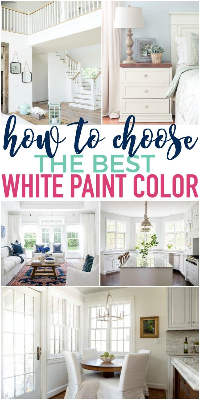
If you've ever tried to pick out a white paint color, you know this for a fact: not all whites are created equal. But if you've never had to choose one before, you probably think white is white is white. Nope. It's a surprisingly complicated color.
I remember the first time I needed to pick a white paint. I was painting the lower portion of my living room to prepare for my board and batten installation. I wanted something that would match my existing trim. Well, the trim looked just plain old white. And I'd heard so many of my favorite home decorators say that "off the shelf" white was their go-to color.
PRO Tip
Whenever you choose a new paint color, you need to test the real paint color in your home first!
The easiest and quickest way to do that is with Samplize! I use them exclusively for paint samples now. There's no mess and no leftover sample pots of paint. Plus these no-mess, peel-and-stick rectangles are made from real paint, so they're easy to move around the room and easy to save for future reference!
Order REAL Paint Samples
NOTE: If you're painting the room yourself, these tools will help tremendously. And this post will give you my best tips for painting a room in 5 easy steps.
So I took my naive self to the hardware store, grabbed a can of white paint straight off the shelf, and headed home to start my project. When I painted that first stroke, I almost had a stroke. (Not really. I'm just slightly dramatic.) It was a fluorescent, blinding white. Not a match for my existing trim AT ALL.
That's when I realized that finding the right color for my walls was going to be a process.

Tips for Choosing the Best White Paint Color
1. Find the Colors Online
My first step when looking for the right paint color is to find rooms online that are painted in that color. That helps me make a rough first decision. A wall color seen online will give you an idea of how it looks, but it won't be exact. Just search Pinterest or Google.
2. Look at White Color Swatches Online
With whites, it's really hard to judge tones and shades online. Photos can be edited so differently, so once you find colors you like online, I'd suggest looking at online swatches to see what their undertones are.
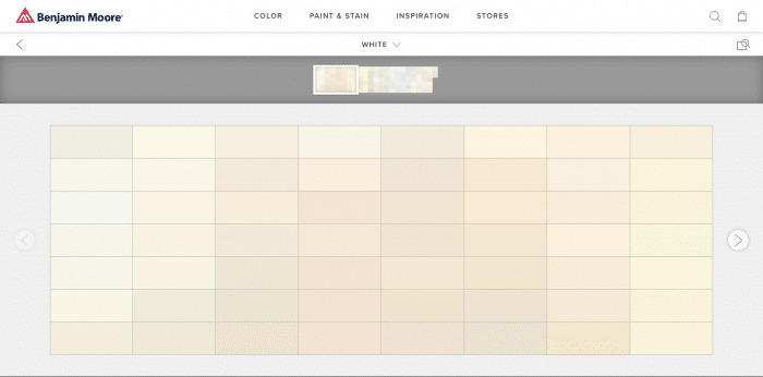
The white swatches you see online won't even look white. Instead, you'll really be able to see their subtle undertones. Once these colors are on the wall they'll look white, but in certain lights they'll skew green, blue, yellow and so on. This will help you see how they might shift on your walls.
3. Get Samples & Create Sample Swatches on the Wall
Since white is so hard to get right, it's a MUST to bring a sample home and try it on your walls, cabinets, wherever you plan to paint. If you can't paint a test area, then paint a large poster board with the sample white and tape it to the wall for a few days to see how it looks in different lights.
And if you need help choosing a white that works with your existing colors, or building a color palette from scratch, you'll want to read my How to Choose a Whole House Color Palette post. It will help you decide whether you need a cool white or a warm white.
Personally, I find that slightly warm whites (not too yellow) look best on walls and play well with other colors.
Top 10 Favorite White Paint Colors for Your Home
Since white is so tricky, I've tried to take some of the guesswork out of it for you. I've rounded up some of my favorites along with the most popular white paint colors out there today. No need to stand in front of eleventy-bajillion paint swatches at the store and grab them at random. This way you can narrow the selection and have a plan before you start flinging paint on the walls.
Here are some of my favorite white paint colors out there today. And I'll tell you which one is my all-time favorite, too!
1. Decorator's White by Benjamin Moore
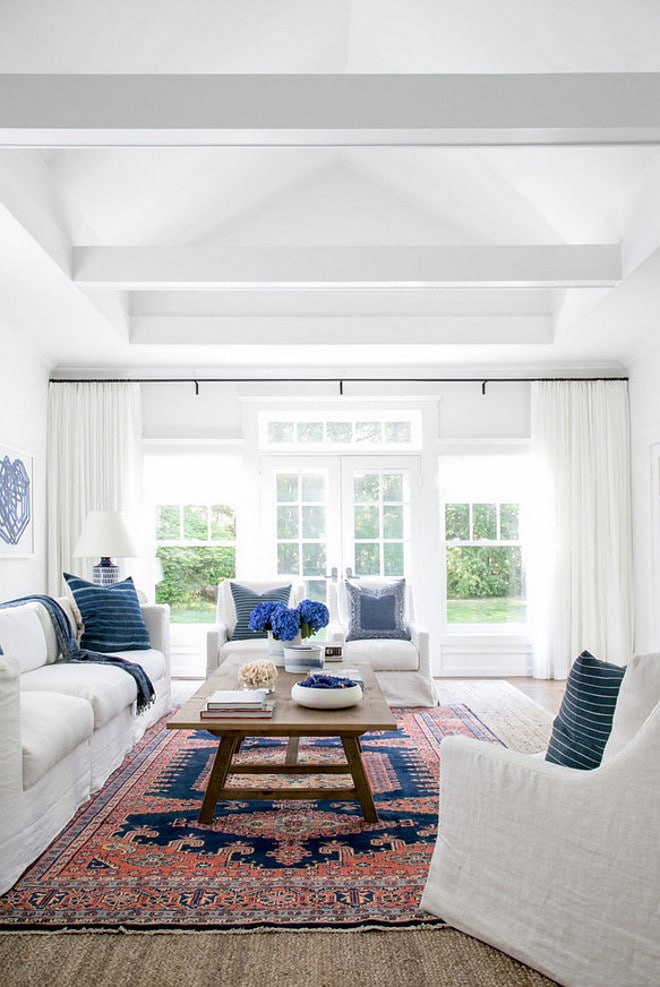
This white has the subtlest undertones, but it still leans cool with a gray cast. It works perfectly with the rustic coffee table and blue accents in the picture above. It reads as a true white in almost all lighting and is one of the most popular whites used consistently by builders and designers.
2. Shoji White by Sherwin Williams
Shoji White is less of a bright white and more of a soft, subtle gray-white. It reads almost as a very pale gray in the image below, but I've seen others where it reads more white and can even look like a very pale bottled green.
Definitely one to test on the walls before buying a full gallon. It's super popular, especially paired with Urbane Bronze or Iron Ore (Sherwin Williams).
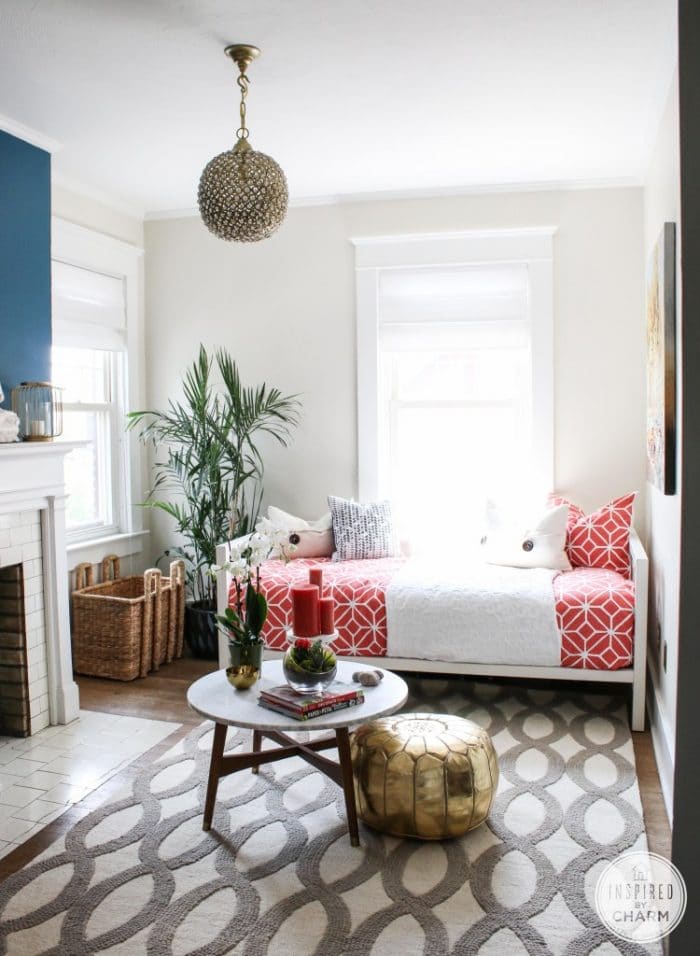
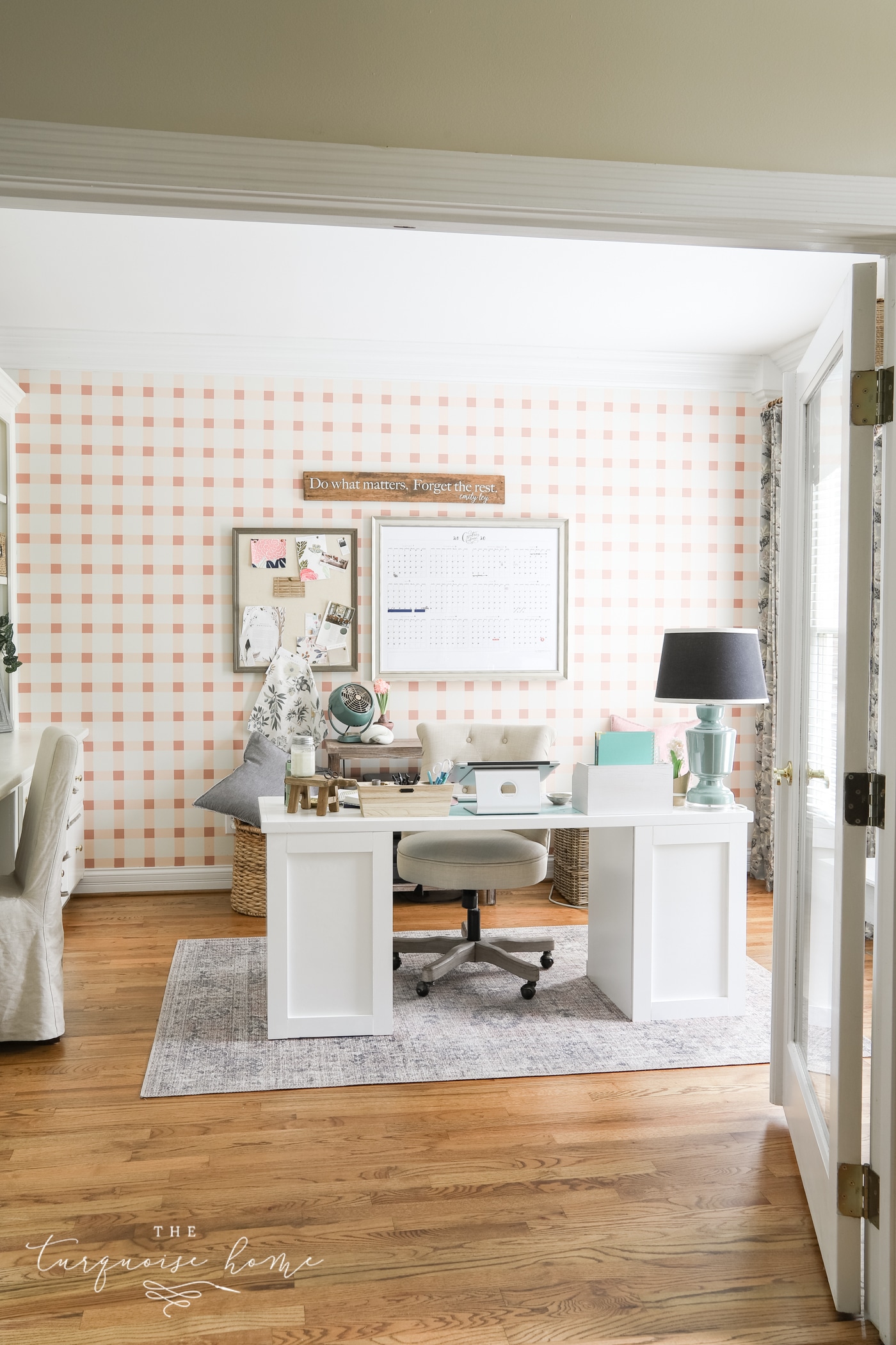
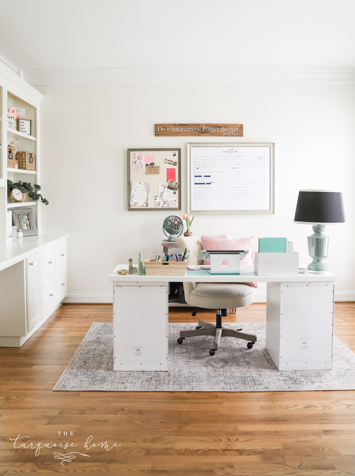
I recently painted my new office Shoji White and I LOVE it! It definitely reads as a subtle gray-white in there, which makes me so happy. It has just the right amount of "color" while still looking white.
3. Extra White by Sherwin Williams
If you're going for pure white and want your colors to pop off the walls, this is your color! A gorgeous, bright white for sure!
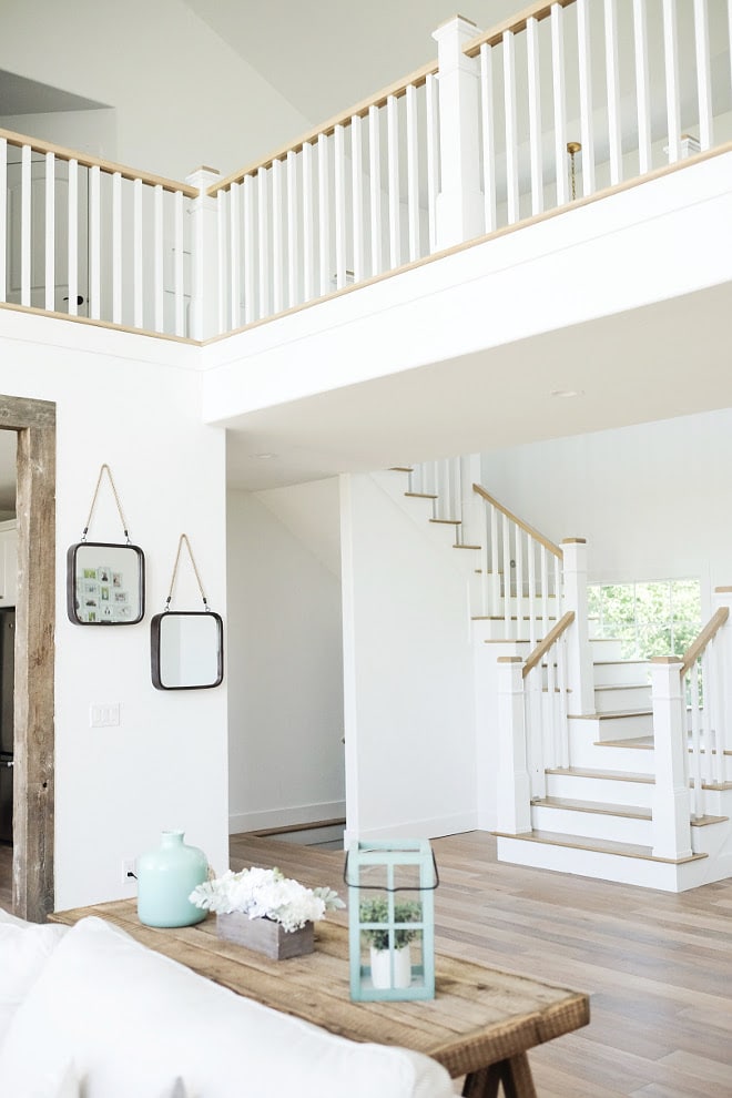
4. White Dove by Benjamin Moore
White Dove is a perfectly cool white with a very slight undertone that most people can't pick out. There's virtually no yellow in it, so it sometimes reads as an ever-so-slightly grayed white. It ranks among the top 10 most popular Benjamin Moore paint colors and is a go-to for many designers and builders.
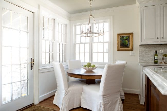
5. Simply White by Benjamin Moore
Simply White is my go-to white paint color. It covers my kitchen cabinets, the board & batten treatment in my living room and my guest bedroom walls. I didn't paint the trim in my home, but it's a close match. I LOVE this color.
It was Benjamin Moore's 2016 Color of the Year and will remain my color of the year for years to come. Ha! It's a subtle warm white that gives off a beautiful glow but never reads yellow!
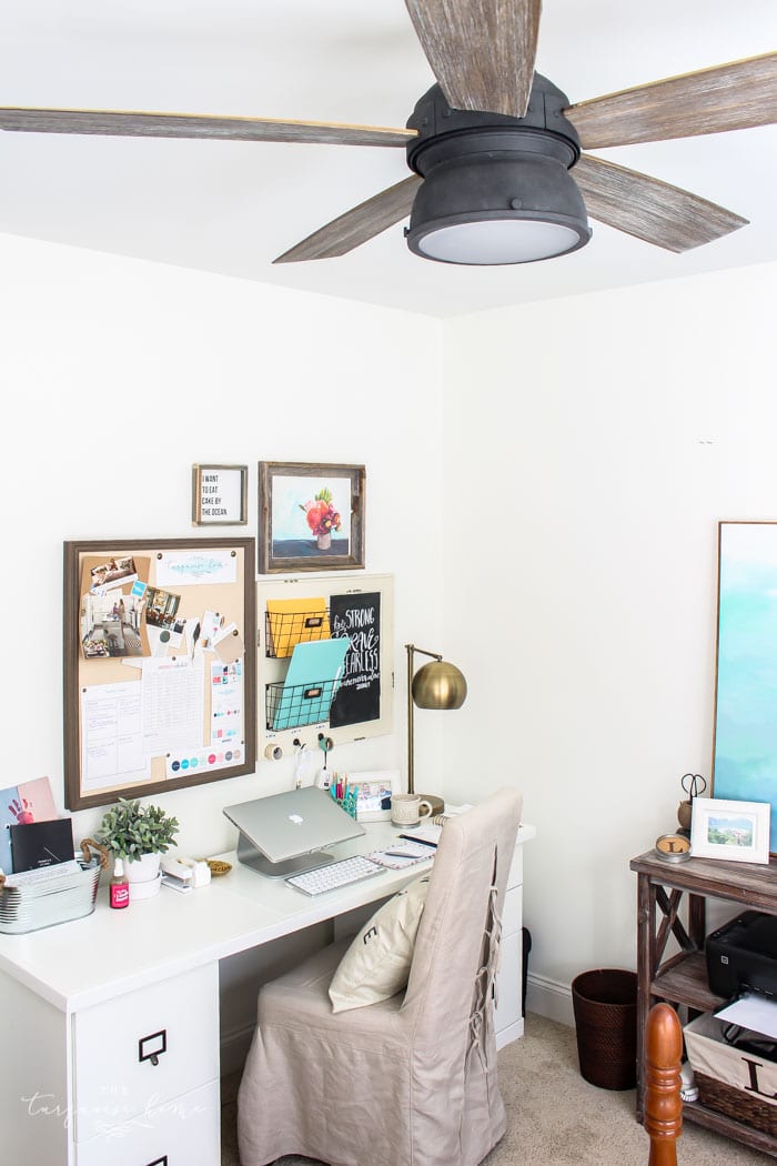
6. Paper White by Benjamin Moore
This one leans more toward a pale gray and looks gorgeous paired with other cool tones like blues, violets and grays. Paint it on the walls and pair it with crisp white on the trim. It'll look so good!
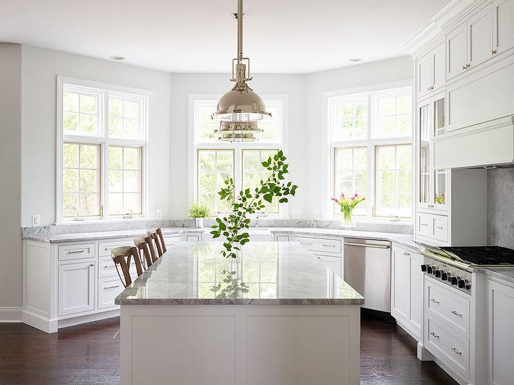
7. Dover White by Sherwin Williams
A slightly warm white that looks great on cabinets, as seen in the photo above. Since I tend to love a warmer white, I really like this color.
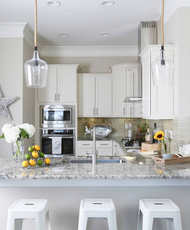
8. Alabaster by Sherwin Williams
This color is more of an off-white than a true white, but since it was SW's 2016 Color of the Year, I wanted to include it. I also love how it pairs with Dover White in the two photos above!
These are from the same home, which used Alabaster on the walls throughout. It has a slightly warm yellow undertone. (Don't confuse it with Benjamin Moore's Alabaster, which has a pink undertone.)
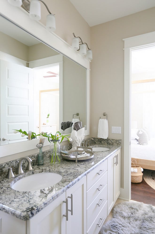
9. Antique White Sherwin Williams
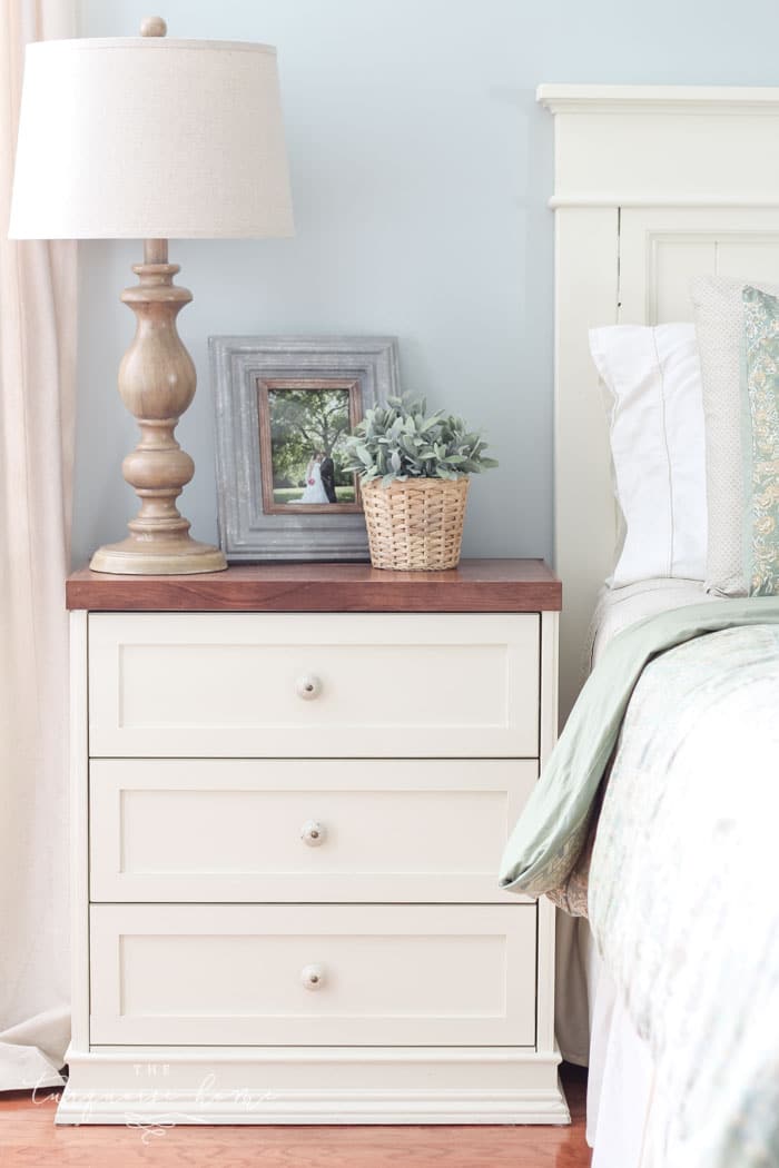
The name pretty much gives this one away. When something becomes an antique, what color does it turn? More yellow, of course. This white has a warm, creamy undertone. It's subtly creamy, soft and delicious.
I chose it for my nightstands and headboard in my primary bedroom. It's definitely more of an off-white, but I love it, especially on furniture in older homes or in a home going for the farmhouse look.
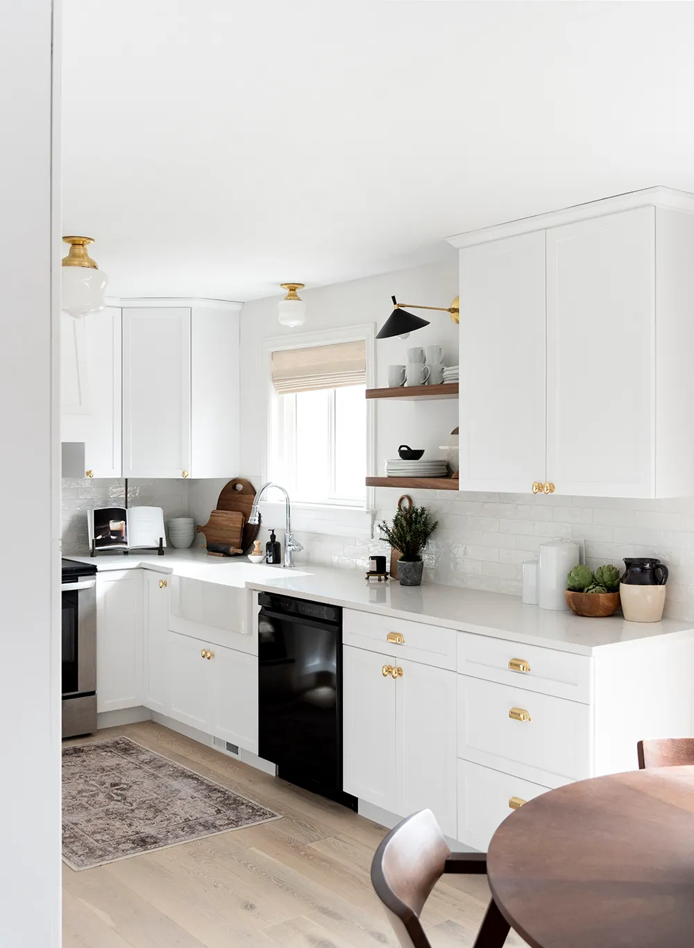
10. Snowbound by Sherwin Williams
This soft white has an off-white quality, so it's light enough to read as white without glaring in natural light. Snowbound is a slightly warm white with subtle gray undertones and is a popular shade for walls, ceilings, trim and exteriors!
Yay! I hope that helps you choose the perfect white paint color for YOUR home! I know you're going to knock it out of the park, and you'll love the color you pick!
Bonus TIP: When you paint walls white, it can be tricky to match the trim and wall color. The tendency is to use two different whites. But do you know what? When you use the same color in different sheens (eggshell for walls & semi-gloss for trim), they don't look like the same color! Yet they flow together seamlessly because they are, in fact, the same. Yay!
More of the Best Home Decor Paint Colors:
Tips for Painting a Room Yourself
I've gathered some of the best tools for painting a room yourself. First, check out this post I wrote: Painting a Room in 5 Easy Steps. These are the top tools I use when painting my own rooms, which is how they get painted 95% of the time!
- Paint Brush – These brushes cost a little more than basic ones, but they're worth it! I've used them for more than a decade, and if you wash them out well after each use, they'll last for years.
- Painter's Tape – a MUST have for taping off edges. You'll want to tape off all edges if you don't have a steady hand.
- Drop Cloths – a must have if you don't already have some lying around the house.
- Paint cup – Sure, you could use any old cup, but I've come to swear by this one. The magnetic piece holds your brush neatly in place when you need a break. And it fits my hand perfectly, so it doesn't cramp.
- Roller Tray – I've found the only paint tray I'll ever use again. The magnetic piece is great for holding the roller in place. The liners are a luxury, but I won't paint without them because they make cleanup a breeze!
More Posts You Will Love:
- The Best Green Paint Colors For Your Home
- Best Living Room Paint Colors
- The Best Bedroom Paint Colors
- How to Paint Outlet Covers
- Beautiful Interior Door Paint Colors
SaveSaveSaveSaveSaveSaveSaveSaveSaveSaveSaveSaveSaveSaveSaveSaveSaveSaveSaveSave