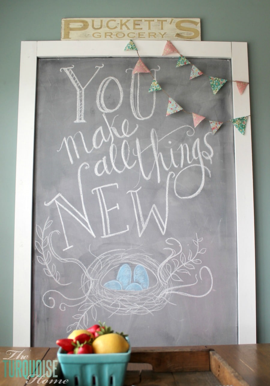
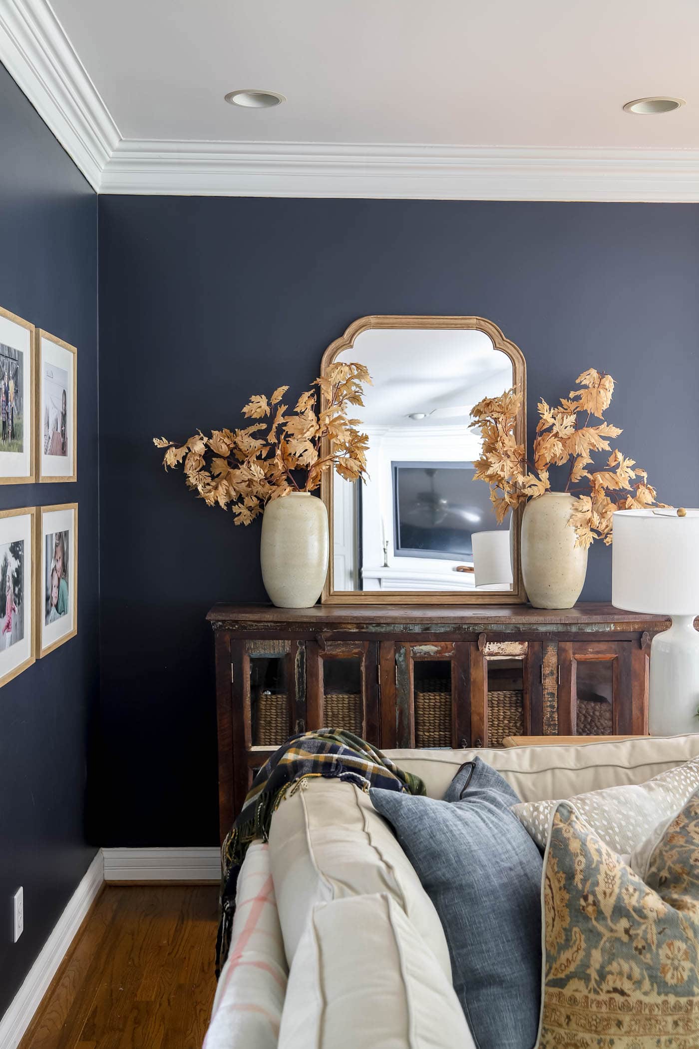
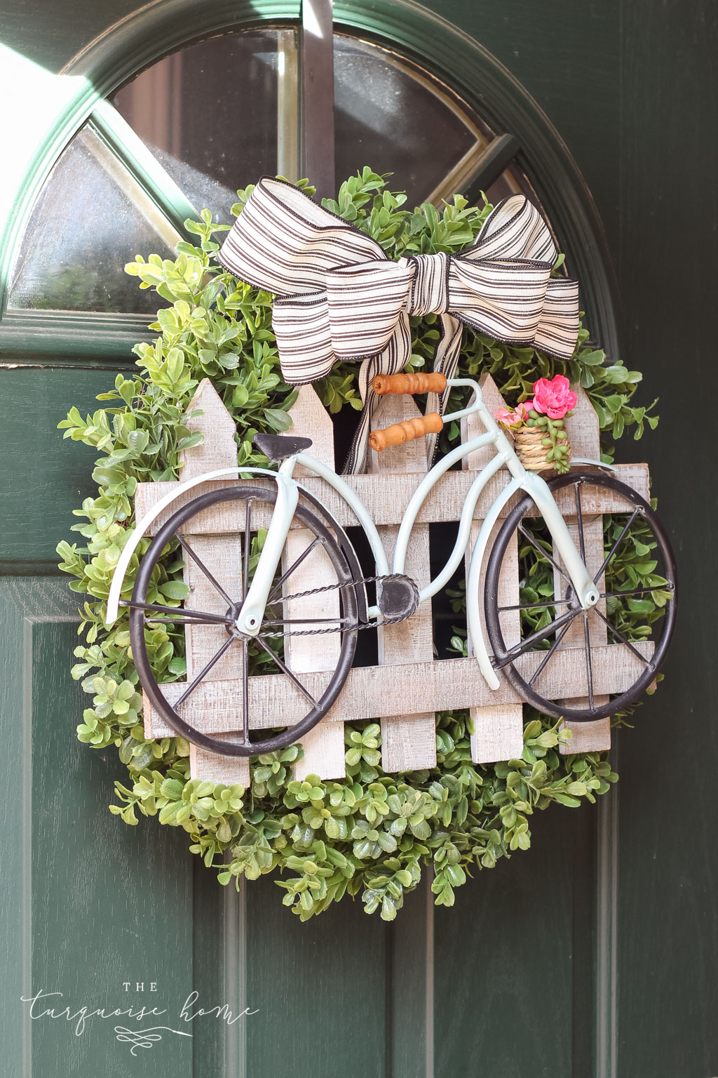
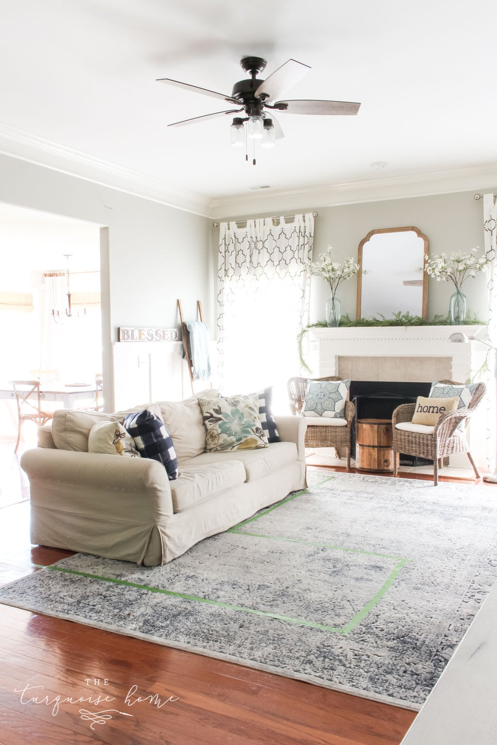
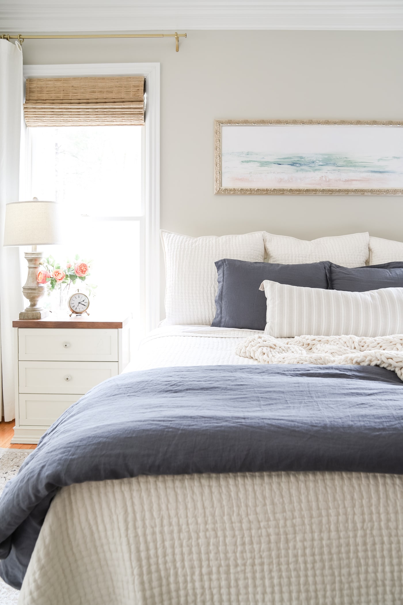
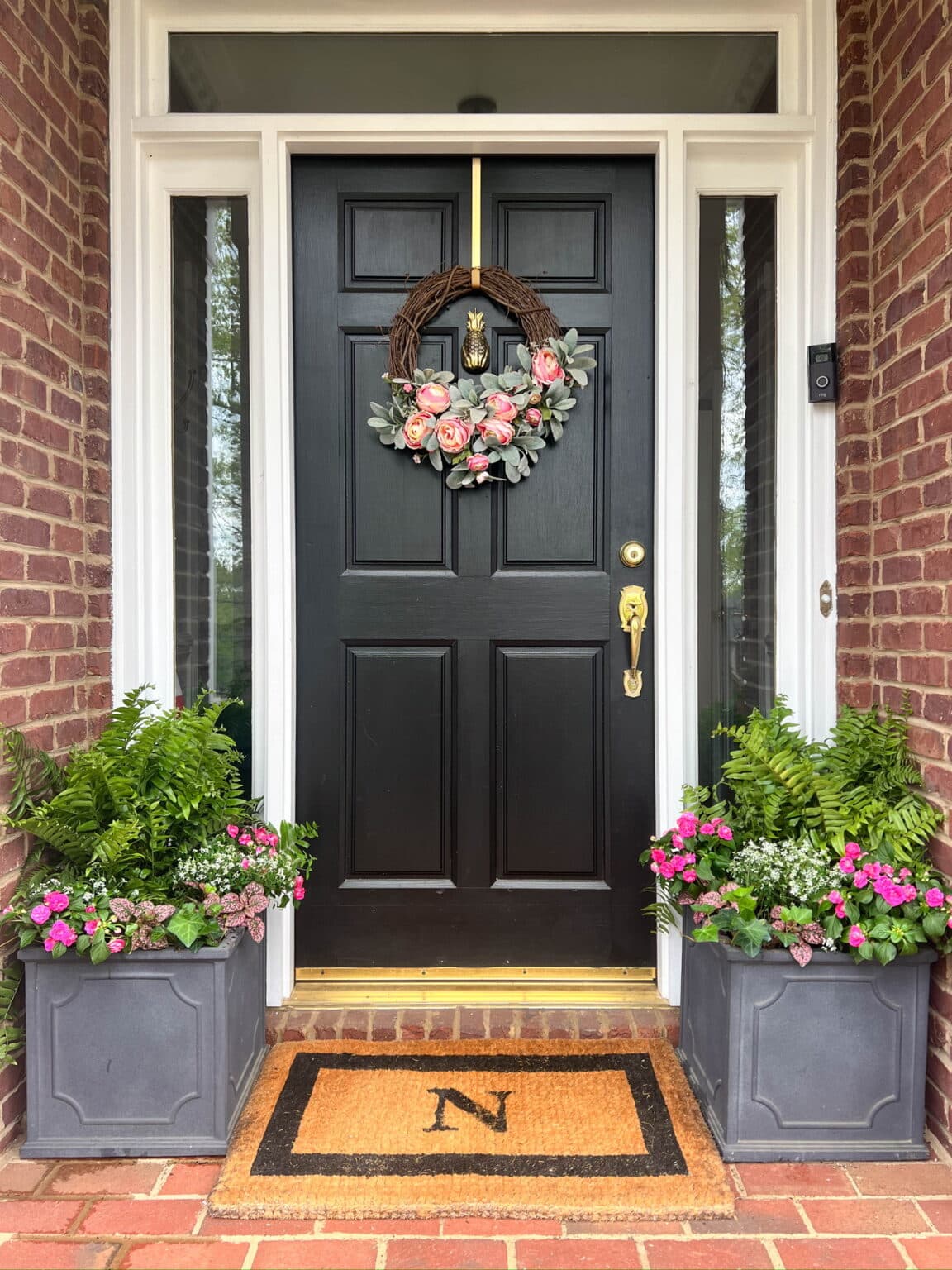
Wythe Blue by Benjamin Moore is a lovely blue-green paint color with gray undertones. As part of the historical collection, Benjamin Moore Wythe Blue is a go-to choice for farmhouse, traditional, and coastal decor styles.
I'm so excited to talk about one of my all-time favorite paint colors, Wythe Blue from Benjamin Moore! Spoiler alert: I liked this shade so much it earned a very prominent spot in one of my latest room makeovers.
You'll notice it the moment you walk into my home. After reading about the shade and looking at the photos, I'm sure you'll love it too.

Benjamin Moore introduced Wythe Blue in 1976 as part of its Historic Color collection. This beautiful shade has a timeless appeal that works in traditional and modern houses, along with historic ones. It was even named BM's "color of the year" back in 2012:
Blue is much more versatile than you might think, and it's truly a classic color. It has universal appeal, never goes out of style, and is consistently chosen as a favorite across North America. It evokes the sea and sky, calms us down, and symbolizes trust and commitment. Because of the influence blue has in our world today, we chose Wythe Blue (HC-143) as Benjamin Moore's 2012 Color of the Year. It's a beautiful, calming hue with an element of heritage that offers grounding, rootedness, and comfort.
Benjamin Moore
Wythe Blue is a calm blue-green that can fill a room or be used as an accent to draw the eye. Here's everything you need to know about this pretty color, plus plenty of examples of the shade in real homes.
NOTE: If you're painting the room yourself, these tools will help tremendously. And this post will give you my best tips for painting a room in 5 easy steps.

Benjamin Moore Wythe Blue Undertones
On a swatch, Benjamin Moore Wythe Blue shows heavy gray and green influences. Once it's on your walls, though, the blue stands out clearly, with green or gray undertones playing a supporting role depending on the lighting and other accents.
Wythe Blue picks up on gray accents and furniture in the room and reflects more gray undertones. Gray will also come through if there's nothing in the room or not enough light to bring out the green.
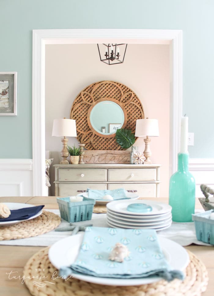
The green undertones of Wythe Blue show up in west-facing rooms, where warm, yellow natural light washes the walls. To draw out the green, you'd need a setup like white fixtures and flooring in a bathroom with greenery outside. My dining room faces west, which is why it looks so green!
Another way to see more green is to pair Wythe Blue with a lighter blue. The lighter shade generally draws out the green tones in Wythe Blue. Green also becomes more noticeable at night, when the colors look richer.
PRO Tip
Whenever you choose a new paint color, try the real paint color in your home first!
The easiest and quickest way to do that is with Samplize! I use them exclusively for paint samples now. There's no mess and no leftover sample pots. Plus, these no-mess, peel-and-stick rectangles are made from real paint, so they're easy to move around the room and easy to save for later!
Order REAL Paint Samples
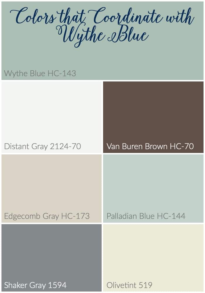
Colors That Pair Well with Benjamin Moore Wythe Blue
Wythe Blue isn't too dark or too light. It sits right in the middle of the Light Reflectance Value scale, which runs from absolute black to pure white on a 1 to 100 scale. Thanks to that middle ranking, Wythe Blue can pair well with most colors. A few suggestions from Benjamin Moore to try are:
- Olivetint 519
- Shaker Gray 1594
- Van Buren Brown HC-70
- Distant Gray 2124-70
- Palladian Blue HC-144
- Edgecomb Gray HC-173
Wythe Blue also pairs well with most whites. You'd be hard-pressed to find a commonly used decor paint that Wythe Blue doesn't work with in some form. I used it with Simply White OC-117 in my bathroom, and it looks great with it!
This shade of blue also works beautifully as an accent color. Brilliant reds pop in rooms styled with Wythe Blue. Yellows and greens complement each other even more than usual with Wythe Blue in the room. Believe it or not, tangerine makes a surprisingly vivid pairing with this shade too.
Wythe Blue vs. Other Blue-Green Paint Colors
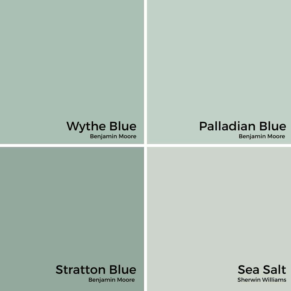
Wythe Blue vs. Palladian Blue
If you're choosing between Benjamin Moore Wythe Blue and Palladian Blue, you're in good company! They're both lovely and timeless options.
At first glance, Wythe Blue and Palladian Blue might seem alike with their soft blue-green vibe. Here's the difference: Palladian Blue leans a bit lighter and airier, with stronger green undertones. It feels like a soft sea breeze, perfect for a light and coastal look.
Wythe Blue, on the other hand, has more gray in its base. It's deeper, richer, and feels a little more grounded. I'd describe it as a "grown-up" version of Palladian Blue, ideal if you want a touch more sophistication and depth.
- Palladian Blue: lighter, fresher, coastal vibe
- Wythe Blue: deeper, more muted, timeless charm
Real-life tip: If your room gets plenty of natural light, Palladian Blue stays bright and beachy. For cozy, moody spaces, Wythe Blue brings a beautiful, calming richness.
Wythe Blue vs. Stratton Blue
Next up, let's chat about Wythe Blue versus Stratton Blue: two stunning options, but not twins!
Stratton Blue is darker and moodier. It has a bold, saturated feel with a stronger green undertone, which makes it a gorgeous choice for a dramatic, cozy room or a statement accent wall. My former kitchen was painted Stratton Blue for a hot minute, and it was so pretty!
Wythe Blue, in comparison, feels softer and more versatile. It walks the line between blue, green, and gray beautifully. It's light enough to use on all four walls without feeling heavy, yet still has plenty of personality.
- Stratton Blue: deeper, bolder, more green
- Wythe Blue: lighter, softer, a perfect all-over color
Real-life tip: Think about the vibe you want! For a moody library or a bold powder room, Stratton Blue is stunning. For an inviting entryway or a serene bedroom, Wythe Blue is my pick every time.
Wythe Blue vs. Sea Salt
Let's compare Wythe Blue to one of my other tried-and-true favorites: Sherwin Williams Sea Salt.
While both are calming, spa-like colors with blue-green undertones, Sea Salt reads much softer and lighter overall. It leans slightly more toward green and can even look like a soft sage in certain lighting.
Wythe Blue has a bit more richness and gray in its mix, giving it a more traditional, historic vibe than the breezy, casual feel of Sea Salt.
- Sea Salt: light, airy, green-leaning
- Wythe Blue: deeper, more neutral, a blue-gray-green balance
Real-life tip: For a fresh, beachy feel in a bathroom or laundry room, Sea Salt is a dream. But if you want a color with more grounding depth, like in a dining room or on a front door, Wythe Blue offers that classic, timeless look.
Rooms Painted with Benjamin Moore Wythe Blue
Wythe Blue is richer than most blues and can be used in many rooms throughout a home. It's playful enough for kids' rooms, formal enough for dining rooms, and neutral enough for exteriors. Here are some of my favorite examples from around the web.
Wythe Blue in Bedrooms
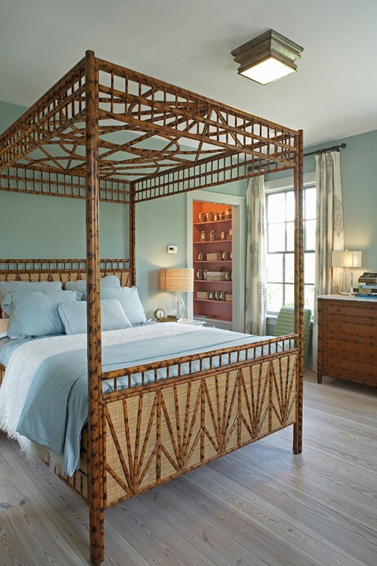
This first bedroom with Wythe Blue is crisp and clean. This photo from House of Turquoise shows how green undertones can be present without being overpowering or muddy.
BM Wythe Blue in Bathrooms
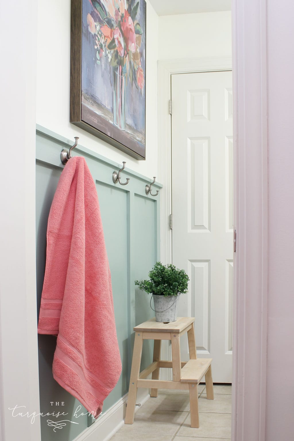
I have a real soft spot for a bathroom styled in Wythe Blue! In fact, it's the color I recently chose when I gave my girls' bathroom a makeover. How pretty is this board and batten? Every time I walk into this room, it brings me joy. Sappy, I know.
This bathroom shows Wythe Blue with gray undertones in a dark setting. You can see how the shade moves from green to gray depending on where the light hits.
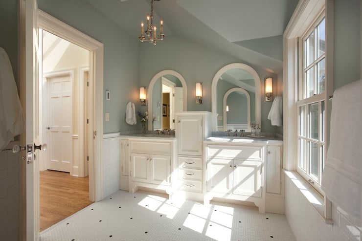
The green undertones really stand out in this dreamy, spa-like Wythe Blue bathroom from the design team at Avenue B Design. Used as an accent in a room with darker lighting, Wythe Blue brings out the green, as you can see.
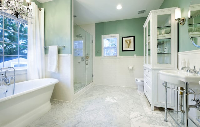
Kitchens with Wythe Blue
This kitchen has a lot going on. The bright red accents stand out against the white and gray fixtures and cabinets. What ties this House of Turquoise kitchen together is Wythe Blue. Used sparingly, it helps center your eye on specific areas of the kitchen. It's interesting to note that the shade works well with every other color in this room!
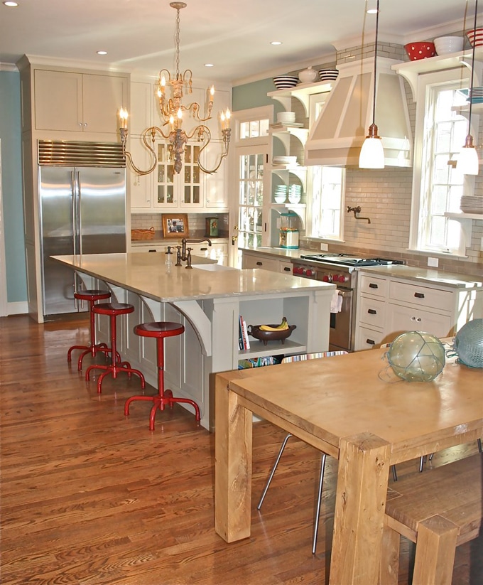
If you compare this kitchen with the Wythe Blue one directly above, you'll see how versatile this color is and how well it works with any style. It fits right in with this country home. The dark gray island makes the blue really pop.
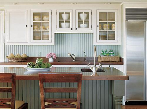
Wythe Blue Painted Living Rooms
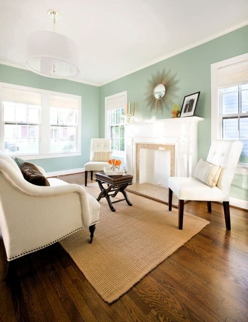
This living room shows Wythe Blue in a great mix of blue, green, and gray. Studio Ten 25 used soft light to help Wythe Blue feel neutral and even a little warm.
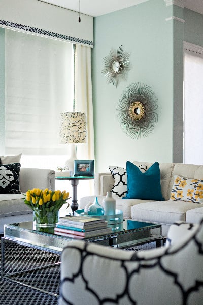
This Wythe Blue living room shows green undertones on the left-hand side and a bluer tone in the center. It's a good example of how light really plays on Wythe Blue.
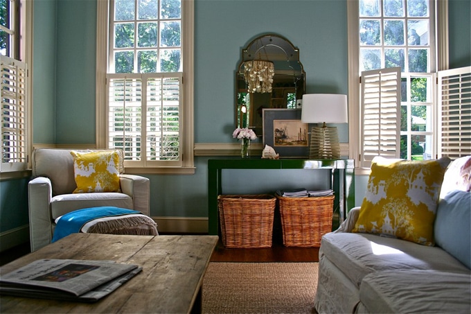
In contrast, this living room with Wythe Blue from The Decorologist has an airy green-blue feel. Natural light fills the room and helps the dark wood bring out the green. Notice that it's not as crisp as some of the other rooms.
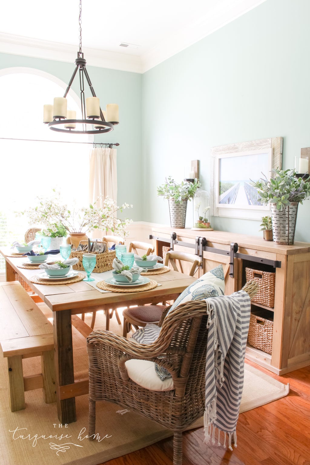
My Dining Room with Wythe Blue Walls
My very own dining room is painted in this rich, soothing color, because I fell in love with it right around the time we moved into our home 7 years ago. Since my room faces west and has a lot of yellow and brown tones, it definitely pulls green. And I love it!
Exteriors with BM Wythe Blue
If you just want a hint of Wythe Blue on your exterior, add some personality by painting your front door. It's a welcoming, timeless color that adds a little spark of joy each day. A door painted this shade is what made me fall in love with it!
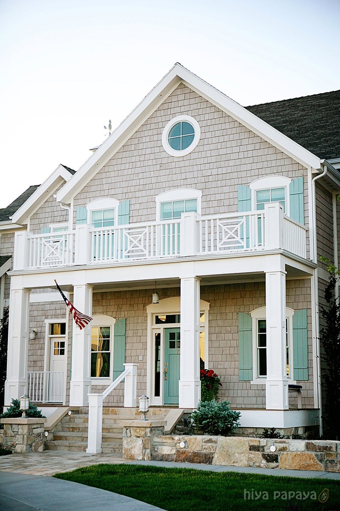
Are you convinced yet? Which room will you add Wythe Blue to? I'm partial to the bathroom, but the front doors in this hue will have my heart forever, too.
Don't forget to check out these other fantastic paint colors!
Tools to Help You Paint a Room Yourself
I've gathered some of the best tools for painting a room yourself. First, check out this post I wrote: Painting a Room in 5 Easy Steps. These are the top tools I reach for when painting my own rooms, which is how they get painted 95% of the time!
- Paint Brush – These brushes cost a little more than a basic one, but they're worth it! I've used them for more than a decade, and if you wash them out well after each use, they'll last for years.
- Painter's Tape – a MUST have for taping off edges. Unless you have a steady hand, you'll want to tape off all the edges.
- Drop Cloths – a must have if you don't already have some lying around the house.
- Paint cup – Sure, you could use any old cup, but I've come to swear by this one. The magnetic piece holds your brush neatly in place when you need a break. And it fits my hand perfectly, so it doesn't cramp.
- Roller Tray – I've found the only paint tray I'll ever use again. The magnetic piece is great for holding the roller in place. The liners are a luxury, but I won't paint without them because they make cleanup a breeze!
More Posts You Will Love: