If you’re after a stunning greige, you should really consider Edgecomb Gray from Benjamin Moore! It’s a creamy neutral that looks lovely in well-lit spaces. This clean beige-gray shade feels refreshing and inviting in certain rooms of your home.
Benjamin Moore’s Edgecomb Gray is not only one of my favorite greige paint colors, it’s also incredibly versatile and sets the stage for a gorgeous look in any room.
This is a great go-to color! While it has an earthy, almost muddy tone, it’s light enough to pair nicely with so many other colors.

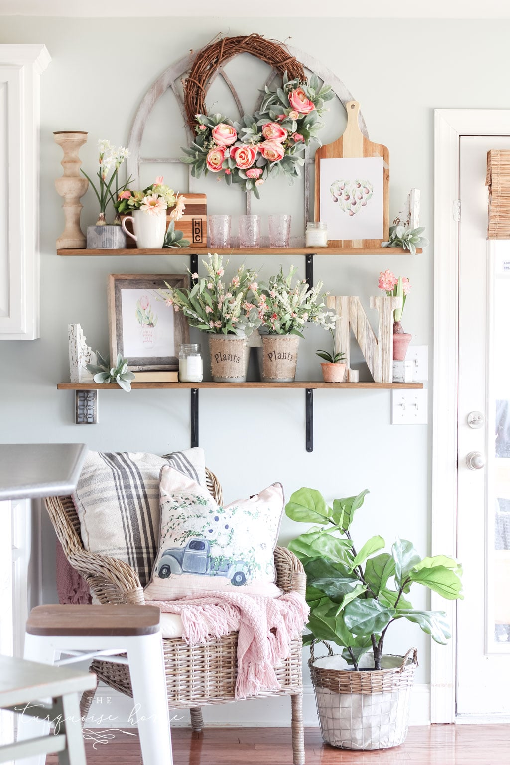
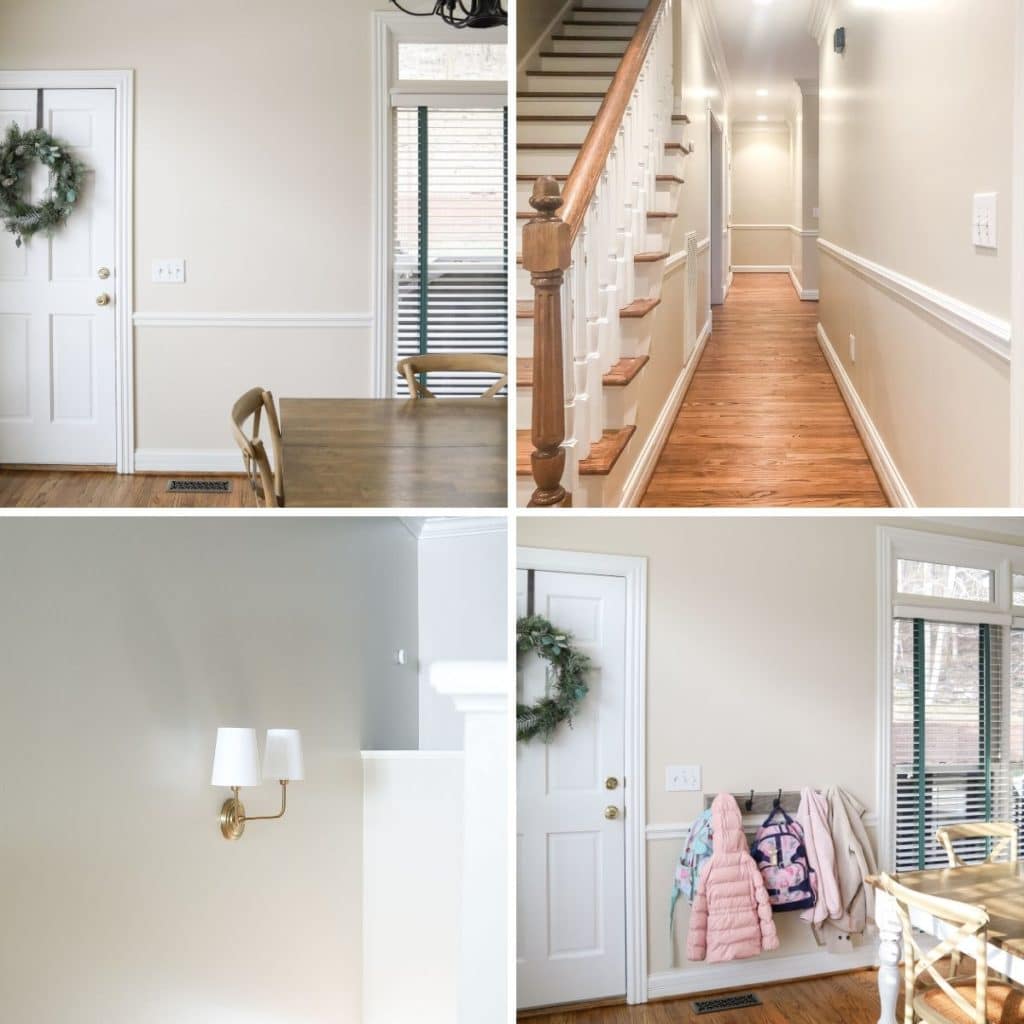
I just painted this color throughout the common spaces that flow together in my new home: the kitchen, hallways, stairwell, entryway and upstairs loft area.
It’s beautiful, but it definitely leans warm gray in some lighting and beige in other lighting, which makes it a true greige. As a chameleon color, I love Edgecomb Gray.
Whether you want a cozy, inviting living room or a serene bedroom retreat, Edgecomb Gray can provide the perfect backdrop for your design scheme. It’s a versatile, classic color that works in both traditional and modern spaces.

What color is Edgecomb Gray?
Edgecomb Gray is a popular neutral paint color from Benjamin Moore. It’s a warm greige (a mix of gray and beige) that has become a favorite for its versatility and timeless appeal.
It has a lightness and warmth that make it a great choice for any room in the house, especially those that get lots of natural light. Because of its neutral undertones, Edgecomb Gray pairs well with a variety of accent colors, making it ideal for anyone who likes to switch up their decor often.
Here are the quick highlights to know about this great shade:
- Warm-leaning green beige with neutral undertones
- Light shade with an LRV of 63.88
- A wonderful and popular choice for walls, kitchen cabinets, doors, exteriors and more
- Versatile, neutral color that works with any home decor and style, but is especially great with modern and transitional spaces.
- Makes a room feel timeless and cozy
Color Undertones
As I’ve mentioned before, Edgecomb Gray is a great blend of light gray and beige. It’s a creamy neutral with undertones of beige and yellow and a hint of green. It’s wonderful at picking up other colors and making each one pop.
If you put BM Edgecomb Gray next to red (like red brick outside your windows!), it will take on more of a pink tint than it does beside green, where the green undertones really show through.
This paint color looks fabulous in any room, but it often looks best in a well-lit space. Whether your room has plenty of natural light or mostly artificial light, Edgecomb Gray will look terrific. So it’s a no-brainer to add this to your list of favorite paint colors.
Some might not like it in rooms without any natural light, but I love it in my upstairs loft area, which has no windows. It does, though, have plenty of artificial light from can lights, so that helps!
LRV of BM Edgecomb Gray
Light reflectance value (LRV) measures how much light a paint color reflects or absorbs. A higher LRV means the color reflects more light (rather than absorbing it). In other words, an LRV of 100 is pure white, and an LRV of 0 is pure black.
Edgecomb Gray has a Light Reflectance Value of 63.
This shade sits firmly in the medium-to-light category. It’s light enough that it can wash out in very bright natural light, but it has enough saturation that it will never look like a variation of white.
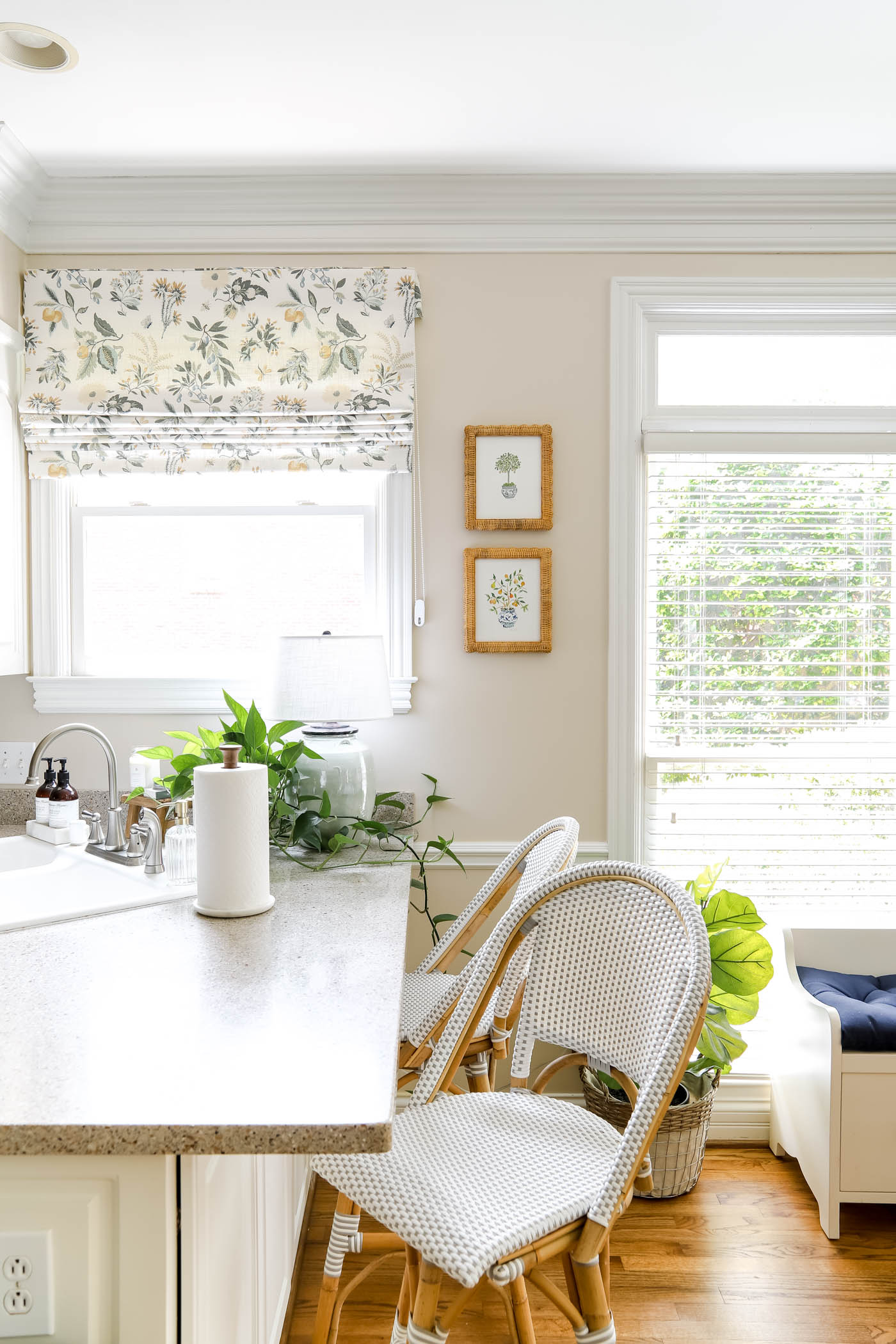
Is Edgecomb Gray Cool or Warm?
Edgecomb Gray from Benjamin Moore is considered a warm color.
It has warm undertones of beige and yellow that give it a cozy, inviting feel. While it’s a neutral gray, the warm tones add a bit of warmth, making it ideal for creating a comfortable, welcoming space.
However, keep in mind that colors can look different depending on lighting and surrounding colors, so it’s always a good idea to test a paint sample in your space before committing.
PRO Tip
Any time you’re choosing a new paint color, you need to try out the real paint color in your home first!
The easiest, quickest way to do that is with Samplize! I use them exclusively for paint samples now. There’s no mess and no leftover sample pots of paint. Plus, these no-mess, peel-and-stick rectangles are made from real paint, so they’re easy to move around the room and easy to save for future reference!
Order REAL Paint Samples
Do you like warm paint colors? Check these out!
Edgecomb Gray vs. Revere Pewter
Benjamin Moore Revere Pewter is a crisp gray that actually pairs well with Edgecomb Gray. Revere Pewter is a true gray and tends to work well with blue hues as well as reds.
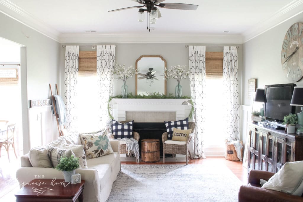
While Revere Pewter is slightly darker than Edgecomb Gray, it’s not too dark. And you could always lighten Revere Pewter to 50% if you wanted that color, just lighter. I used Revere Pewter as my main neutral in my previous home and loved it.
Revere Pewter is one of Edgecomb Gray’s complementary colors because they look splendid together. When you use the two together, you’ll find that Revere Pewter really brings out those gorgeous gray undertones in Edgecomb Gray.
What Colors Go With Edgecomb Gray
Let’s talk about some coordinating colors that will look amazing with this gray, so you can start your next project! These are some of the other colors that work well with Edgecomb Gray:
- White Dove
- Swiss Coffee
- Nickel
- Chelsea Gray
- Ashley Gray
- Simply White
- Hale Navy
- White Chocolate
- Revere Pewter
- Kendall Charcoal
Because this color is so versatile, you can pair it with many different colors to create your very own color palette. You could paint the walls in this greige with White Dove trim to make your room look fantastic! You can also go bolder and pair it with a color like Hale Navy or Kendall Charcoal.
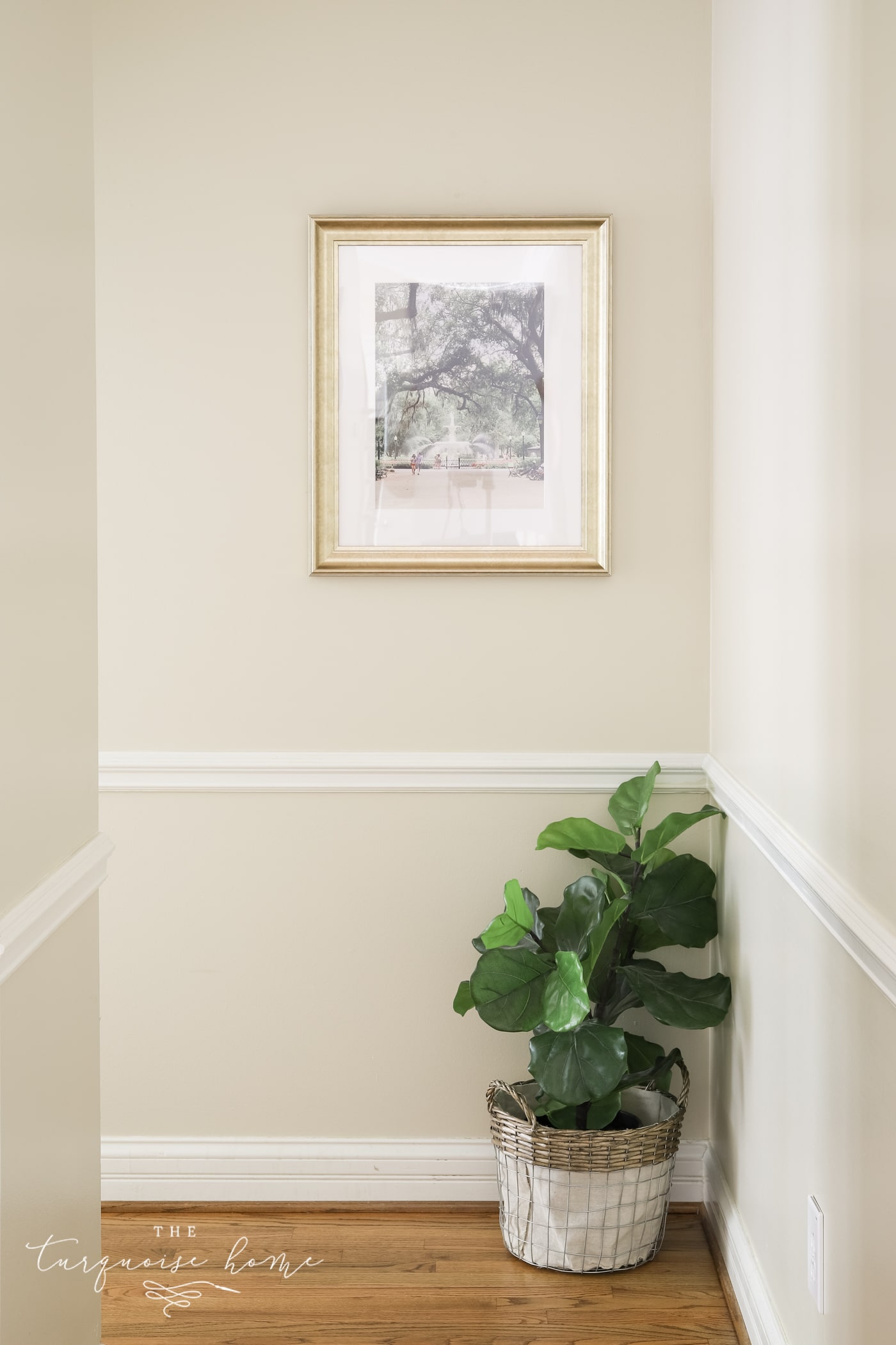
The Best Trim Colors to Pair with Edgecomb Gray
Choosing the right trim color for Edgecomb Gray can make all the difference in creating a cohesive, stylish look. Since Edgecomb Gray is a warm greige, it’s important to pick a trim color that complements its warmth and doesn’t clash with it.
Here are some trim color options that work well with Edgecomb Gray:
- White Dove: This is a classic, timeless trim color that pairs beautifully with Edgecomb Gray. It has warm undertones that complement the warmth of Edgecomb Gray.
- Simply White: Another great option for a warmer trim color is Simply White. It has a slight creamy yellow undertone that works well with the beige undertones of Edgecomb Gray.
- Decorators White: For a cooler trim color, Decorators White is a great choice. It has a subtle gray undertone that complements the neutral gray of Edgecomb Gray.
- Chantilly Lace: This is a great warm white that will look like a true white next to Simply White, which is a little darker. I like to use it for my ceiling paint colors, but it would work well as a trim color, too!
In the end, the best trim color for Edgecomb Gray depends on your personal style and design preferences. It’s always a good idea to test a few options in your space to see which one looks best with your specific lighting and decor.
Adding Edgecomb Gray To Your Space
One thing I can’t get over with Benjamin Moore’s Edgecomb Gray is that it truly looks terrific in almost every space! It’s as if they found the perfect greige that never looks bad in bright spaces.
Okay, maybe it could look bad somewhere, but I have NEVER seen it look anything but welcoming and inviting. Check out these photos to see how amazing this color really is.
Entry Way
Nothing adds charm and makes guests feel welcome like a beautiful entryway or foyer. Edgecomb Gray adds the subtle touch of color this room needs without feeling overwhelming when you walk in.
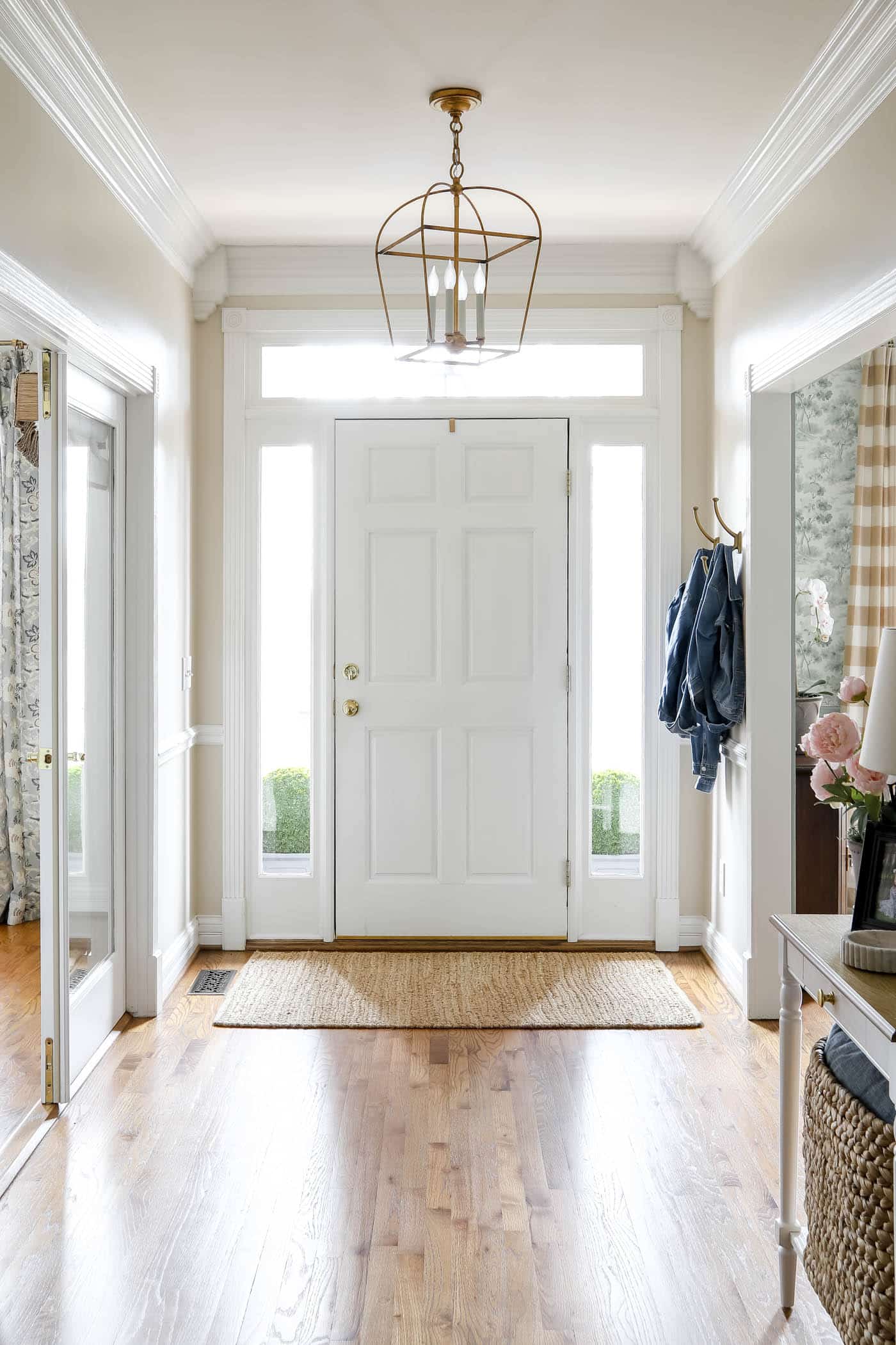
When you see this lovely foyer below, you can tell it has character, and you can really see how fantastic Edgecomb Gray looks with Kendall Charcoal. It’s a wonderful combination, and Nina Hendrick did a tremendous job pairing these colors!
In The Kitchen
As you can see in this photo, the kitchen cabinets have taken on a darker tone next to the Edgecomb Gray, and it’s incredible. They complemented the wall-hanging cabinets by using the contrasting color Ashley Gray on the island.
Don’t you just love this combination that 2 Cabinet Girls created?
Decor Pad shares a photo of Edgecomb Gray showing off its ability to look so light and neutral. It shows you can easily use Edgecomb Gray from floor to ceiling and still make a space look beautiful and airy.
Living Room
Most of us spend the bulk of our time in our living rooms, family rooms and kitchens, so it makes complete sense to add this neutral to those spaces. Check out how A Pop of Pretty completed the look.
Laura Nicole Design at Magnolia Paint Company knocked it out of the park with this stunning living room featuring Edgecomb Gray with white trim. As you can see, she used white paint to complement the greige, and the pops of blue throughout the space are gorgeous.
Edgecomb Grey in the Bedroom
Your bedroom will feel even more relaxing if you paint it with Edgecomb Gray, as KCS Residential Design did. You can see from all the natural light that Edgecomb Gray takes on a very beige tone in this room, and it’s perfect! They used a lot of earthy tones to pair with it, and it’s a very inviting space.
Another option by KCS Residential is this bedroom. It’s a smaller room but still looks spacious with Edgecomb Gray on the walls. All the natural light streaming in through the bedroom windows adds a refreshing look that invites you to come in and stay awhile.
Exterior
You can see why someone would want this gorgeous color on the exterior of their home. It’s a magnificent way to add charm without being overwhelming. House of Turquoise gives you a great tour featuring this easy-to-use color.
I think the only room we didn’t cover today is the dining room, but it would be a beautiful color in there as well!
More Paint Colors to Try
Choosing the right paint colors doesn’t have to be stressful or painful. I’ve reviewed many popular paint colors, and I recommend taking a look at them for inspiration on your next project!
- Wythe Blue by Benjamin Moore
- Gray Owl by Benjamin Moore
- Sea Salt by Sherwin Williams
- Repose Gray by Sherwin Williams
- Agreeable Gray by Sherwin Williams
More Posts You Will Love: