Accessible Beige is one of those rare neutral paint colors that has stayed popular through shifting design trends. Its versatility and warm undertones give it a timeless charm that suits both traditional and modern homes.
Sherwin Williams Accessible Beige (SW 7036) may bring to mind the beige of the 1990s and 2000s, but this is NOT your mom's beige!
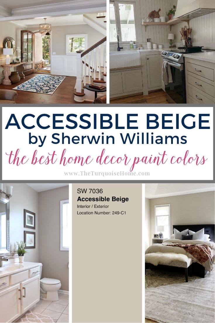
This gorgeous, earthy beige is a modern take on the classic. Its flexibility has kept it a top contender for years, and it remains popular today.
Considered a warm neutral, Accessible Beige feels mature and polished. Unlike other beiges, it doesn't give off that golden, desert-sun glow. Instead, it brightens a room with just the right touch of warmth and gray undertones.
Keep reading to see whether Accessible Beige belongs in your home color palette.
Updated July 2026: I've fully refreshed this guide with new room examples, coordinating colors, common mistakes to avoid and answers to the most frequently asked questions about Sherwin Williams Accessible Beige.

Considering painting with Sherwin Williams Accessible Beige? Here's what you'll learn:
- Why Accessible Beige has stayed one of Sherwin Williams' most popular neutral paints
- How its beige, gray and subtle green undertones shift throughout the day
- Which rooms, decor styles and fixed finishes it suits best
- The biggest mistakes homeowners make before picking it
- How to test the color with confidence before buying gallons of paint
Sherwin Williams Accessible Beige: What You Need to Know
If you're thinking about Accessible Beige from Sherwin Williams for your home, you're definitely not alone. Sherwin Williams Accessible Beige (SW 7036) has been one of the most popular neutral paints for years because it's incredibly versatile and suits a wide range of homes and decorating styles.
Despite its name, Accessible Beige isn't a true beige. It's considered a warm greige, a lovely blend of beige and gray that creates a soft backdrop without looking overly yellow or too cool. It also carries subtle taupe and green undertones that show up more or less depending on your home's lighting, which is why I always suggest testing a sample before committing to gallons of paint.
One of my favorite things about Sherwin Williams' Accessible Beige is how adaptable it is. It pairs beautifully with warm wood floors, creamy white trim, natural stone, brass accents, woven textures and layered neutral decor. It feels just as at home in traditional, transitional, farmhouse, cottage and modern organic spaces, which makes it a great choice if your style evolves or you're decorating one room at a time.
View this post on InstagramA post shared by SARA LE (@withsarale)
Like any paint color, Accessible Beige SW 7036 isn't one-size-fits-all. Natural light, your home's orientation, flooring, countertops, furniture and even your light bulbs can all change how it looks. In bright, south-facing rooms it often appears lighter and warmer, while north-facing rooms tend to bring out more of its gray undertones.
If you want a warm neutral that feels cozy and sophisticated without looking trendy, Accessible Beige Sherwin Williams is well worth a look. In the rest of this guide, I'll share real-life examples, coordinating colors, comparisons with other popular neutrals and my favorite testing tips so you can decide with confidence whether it suits your home.
Quick Facts About Accessible Beige
| Color | Accessible Beige |
|---|---|
| Brand | Sherwin Williams |
| Color Number | SW 7036 |
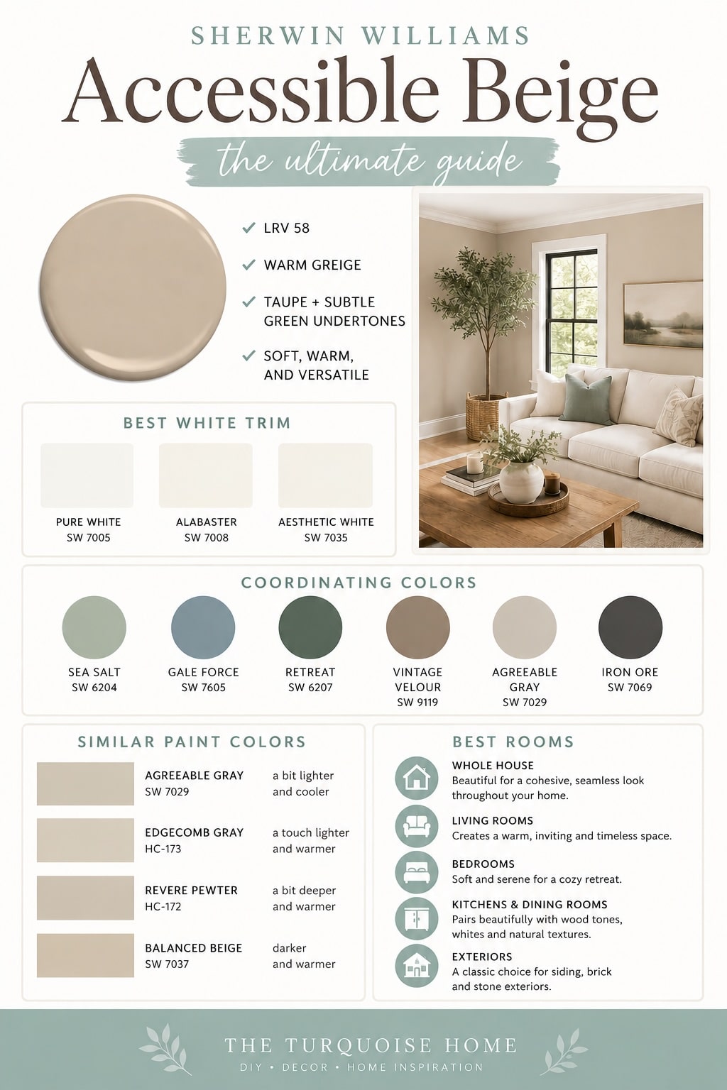
| LRV | 58 |
| Undertones | Warm greige with taupe and a subtle green hint |
| Ideal For | Whole-house painting, living rooms, bedrooms, exteriors |
| Works With | Pure White, Sea Salt, natural wood, warm whites |
The Undertones of Accessible Beige
Looking at Sherwin Williams' Accessible Beige, you can tell it's different from many other beiges. Most beiges carry plenty of golden tones, and at times they can feel quite yellow. Those are the beiges you would have seen in homes during the 2000s.
Accessible Beige is a warm color, but it isn't a true beige, since it has taupe undertones. That makes it look grayer than its predecessors. The taupe keeps it warm without that overly yellow feel. It leans toward greige, sitting between beige and gray without being fully either.
In certain lighting, you may also notice a hint of green that gives the paint a more earthy feel. I find it's most noticeable beside other greens and pinks. You can bring out whichever undertone you like simply by choosing what you pair it with.
Light Reflectance Value (LRV) of Accessible Beige Paint
When shopping for paint, Light Reflectance Value (LRV) can reveal a lot about how a color will perform in your room. Depending on the lighting, every color can feel and look quite different.
Accessible Beige has an LRV of 58 (with 1 being pure black and 100 being pure white). That means it reflects a good amount of light.
Don't expect it to brighten a dark room, but it won't make a room look darker than it is either. Overall, it behaves like a medium tone.
Many people see it as a transitional color that changes through the day as natural light shifts. In dim spaces, whether lit naturally or artificially, it feels a little deeper because the color looks richer. It never feels gloomy or moody, though.
North- and south-facing rooms look completely different in Accessible Beige. South-facing rooms pick up that hint of green. They don't feel too warm, since no hidden yellow tones come through. North-facing rooms feel noticeably grayer.
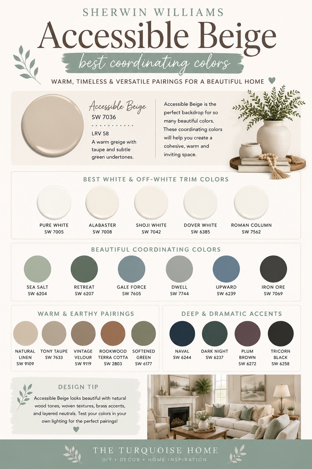
Sherwin Williams Accessible Beige Coordinating Colors
SW Accessible Beige and earthy colors are truly a perfect match. Since it's already earthy, it looks best alongside other earthy shades. Any natural colors work, such as browns, greens, blues and creams. It serves as the main neutral, while other shades add pops of color and accents.
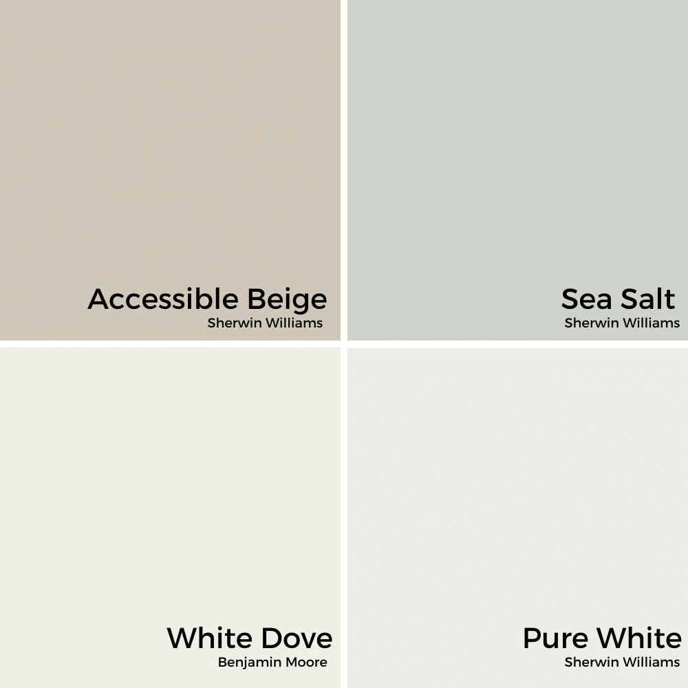
By default, it doesn't look its best with bright colors. For balance, choose muted versions of complementary hues. For example, Sherwin Williams Sea Salt has a delightful blue-green feel that works very well.
When choosing coordinating cream colors, pick ones that don't lean too heavily toward yellow. Sherwin Williams Pure White is a good example, and it doesn't feel overly stark.
Other grays complement Accessible Beige nicely. Just avoid any gray (or greige) lighter than it. You want a warm gray with an LRV below 58.
PRO Tip
Whenever you choose a new paint color, try out the real paint color in your home first!
The easiest, quickest way to do that is with Samplize! I use them exclusively for paint samples now. There's no mess and no leftover sample pots. Plus, these peel-and-stick rectangles are made from real paint, easy to move around the room and easy to save for future reference!
Order REAL Paint Samples
Agreeable Gray vs. Accessible Beige
Two of the most popular greige paints are Accessible Beige and Agreeable Gray. They're easy to mix up, but you can trust their names! As the comparison photo below shows, Accessible Beige leans more beige while Agreeable Gray leans more gray!
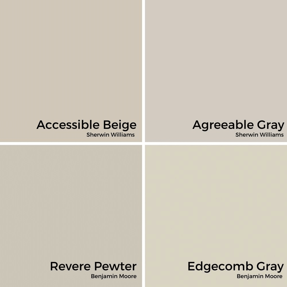
I also compared the ever-popular Revere Pewter with Accessible Beige, and threw in Edgecomb Gray for good measure. You can see that Revere Pewter and Edgecomb Gray carry even more of a green undertone than the top two colors.
All of these are hugely popular whole-home paint colors, and you can't go wrong with any of them. Just look at the other items in your home and decide whether you want more beige or gray undertones.
Accessible Beige in Different Rooms of the Home
Nobody can deny the versatility of Accessible Beige. As a soft neutral, it works with many colors and with features you already have at home. It has enough richness that your walls won't feel boring either.
I'd say it can go pretty much anywhere. With that said, here are some examples of it in different rooms.
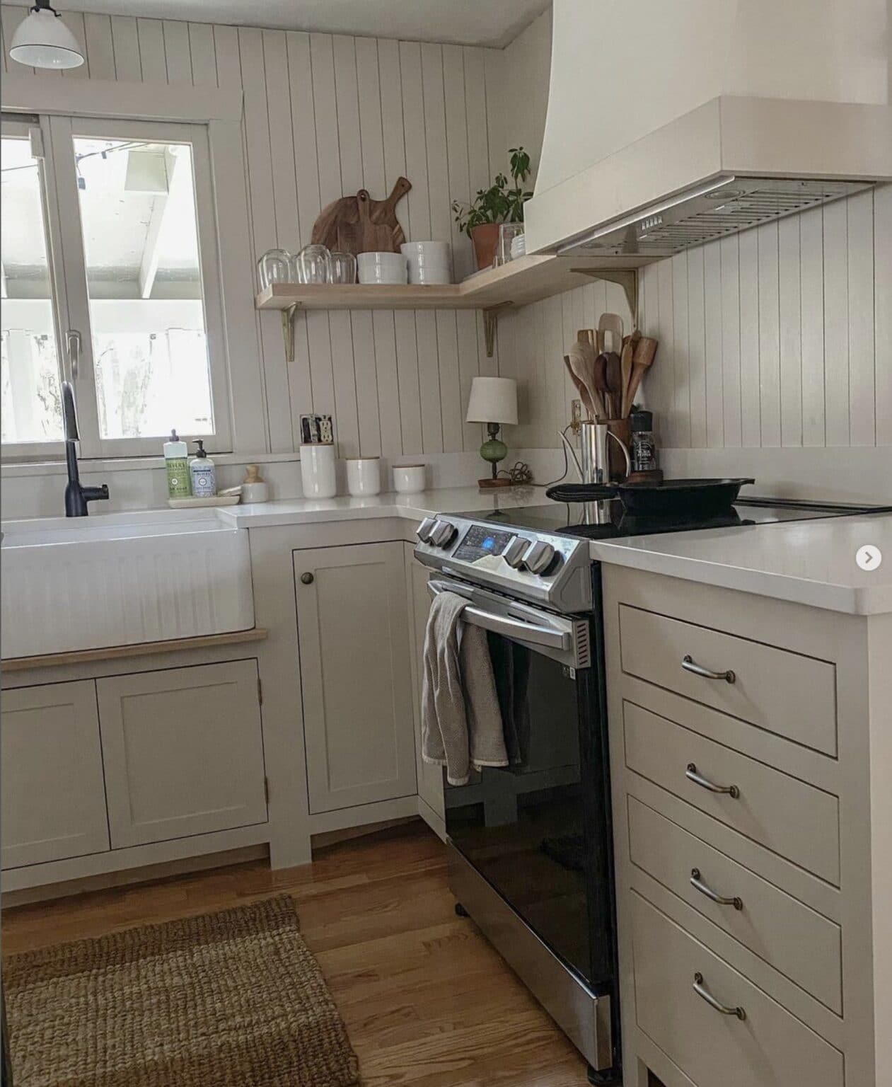
Kitchen
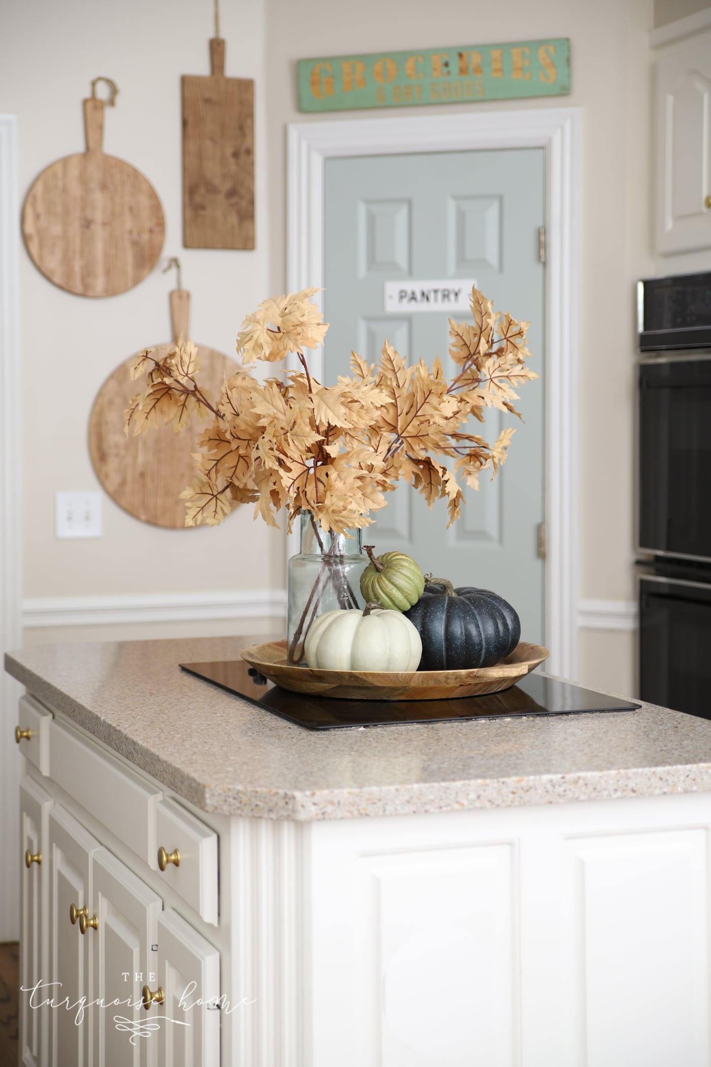
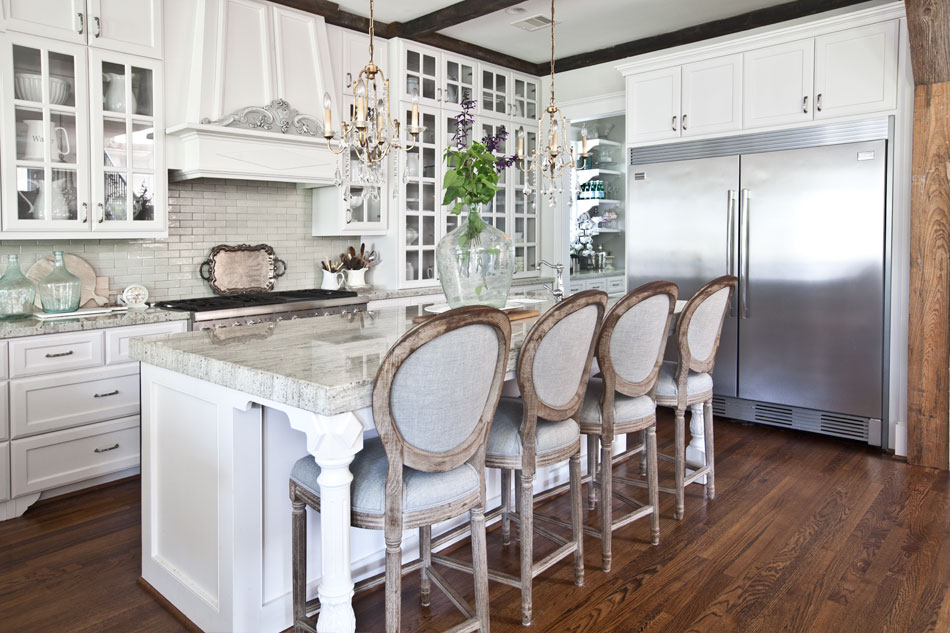
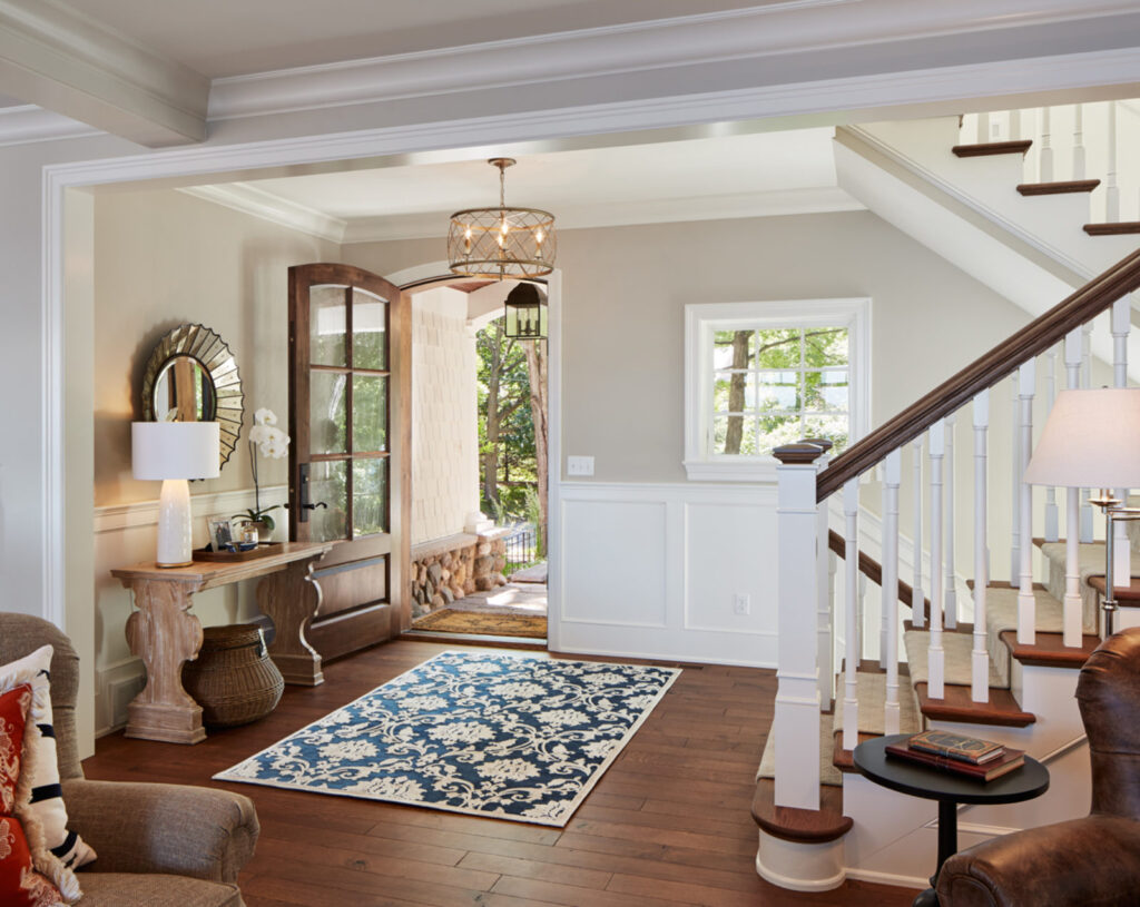
A farmhouse-style kitchen pairs beautifully with Accessible Beige. Since both are proving to be timeless design choices, it's a low-risk paint pick. Because it's light and warm, it works well with lightly stained wood floors and white cabinets or walls and trim.
Bedroom
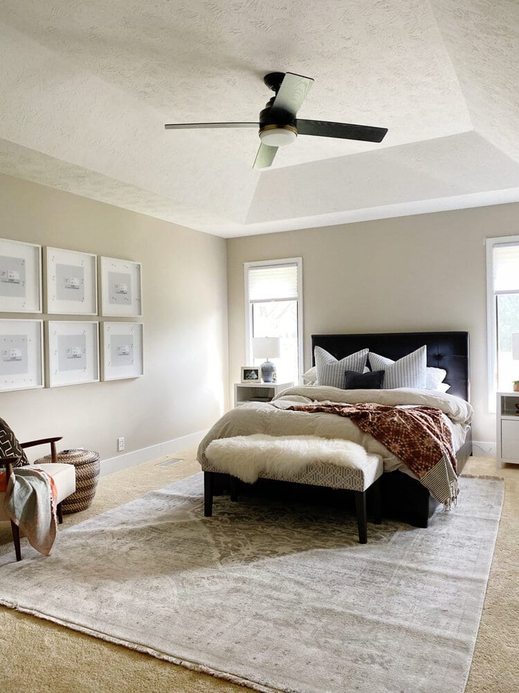
I love bedrooms that help you unwind and don't overstimulate the senses at bedtime. Accessible Beige brings a soft, cozy feel. It looks wonderful with white bedding and lets the art and furniture bring in more color. If you're stuck on how to paint your guest bedroom, you can't go wrong with SW Accessible Beige.
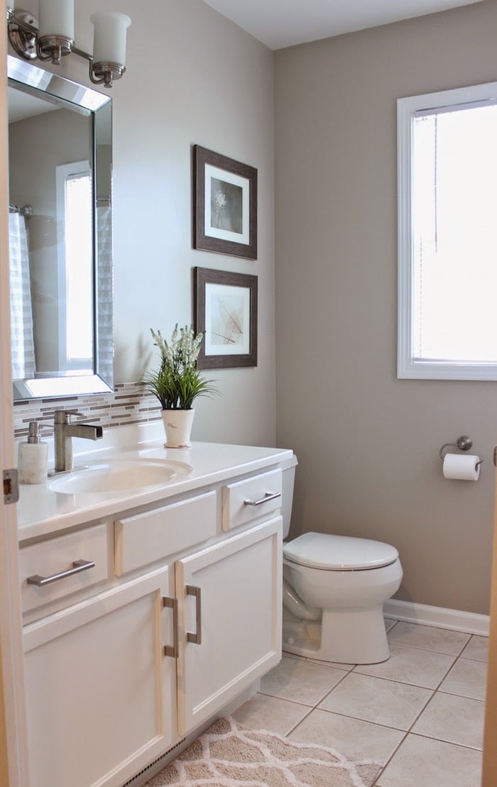
Bathroom
Bathrooms painted in Accessible Beige give me spa-like vibes, and that's certainly not a bad thing! For a simple guest bathroom or powder room, use this paint and pair it with a white vanity and trim. Have fun with artwork, shower curtains, bath mats and other decor.
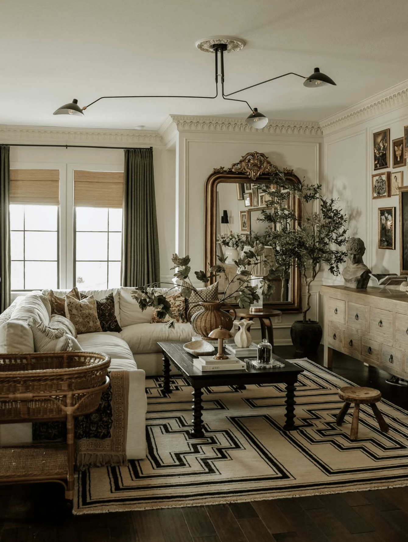
Living Room
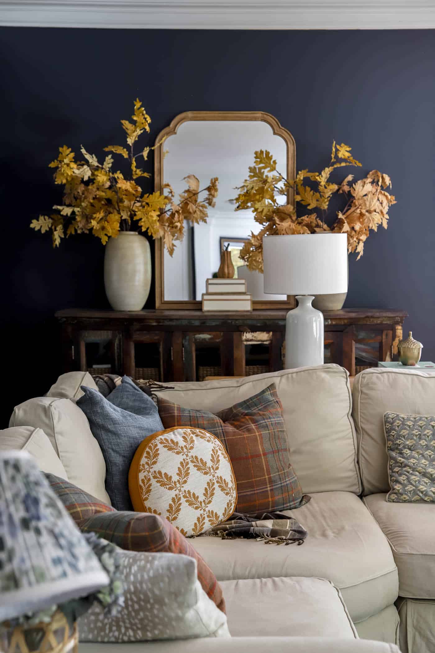
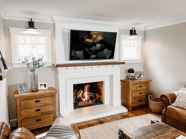
Accessible Beige forms the perfect backdrop for a cozy, layered living room like this one. Its warm greige undertones complement the rich wood furniture, woven textures and vintage accents while keeping the space light and inviting. It's a timeless neutral that lets your furnishings and decor shine without competing for attention.
Trim Painted in Accessible Beige
Accessible Beige isn't just a lovely wall color. It also works wonderfully on trim and doors, especially alongside darker cabinetry or accent walls. In this mudroom, the warm greige trim softens the contrast with the black built-ins while complementing the light oak bench and flooring for a welcoming, curated look.
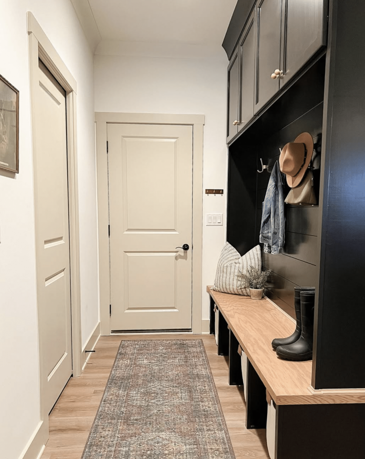
The darker trim and lighter walls combination was trendy a few years ago, but it can still look great in certain styles of home, such as farmhouse and modern.
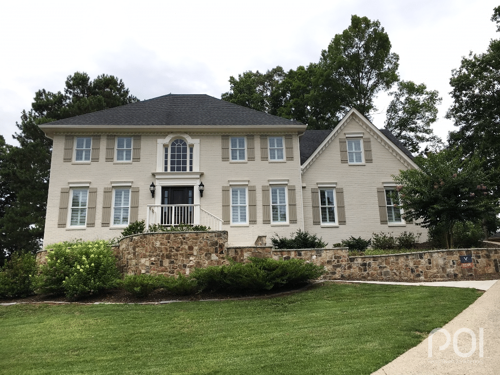
Exterior
Many people think of Accessible Beige as strictly an interior color, but it looks amazing outside as well. In bright light it reads more like greige and almost an off-white. Pair it with other soft colors and earthy tones, such as dark brown trim, and your house will be the envy of the neighborhood. Stained wood decks and stonework also look exceptional beside siding painted Accessible Beige.
Common Mistakes to Avoid
1. Skipping the Sample
I've said it a million times: never skip sampling a paint color in the room you plan to paint! Paint a sample on poster board, or grab a sample swatch. (Order your Accessible Beige sample swatch here.) Move it around the room onto different walls throughout the day and watch how it shifts with position and light.
2. Using Bright, Cool Whites
Accessible Beige looks best beside softer whites such as Pure White, Shoji White, Simply White or Aesthetic White, rather than icy ones.
3. Overlooking Your Flooring
I always tell people to look at their flooring before choosing a wall color. Floors are one of the largest fixed elements in a room, and they'll shape how Accessible Beige reads throughout the day. If your floors have warm golden or neutral undertones, Accessible Beige will likely feel right at home. If your flooring leans cool gray or has strong pink or red undertones, paint a large sample board and check it under different lighting before deciding.
4. Assuming Every Room Will Look the Same
North-facing rooms will look different from south-facing ones. That's not a bad thing, just expect the difference. (I saw this when I painted most of the open areas of my home Edgecomb Gray. The walls in my kitchen, which gets lots of natural light, look different from my upstairs loft, which gets none.)
5. Picking the Wrong Sheen
Get your paint sheen right with my helpful paint sheen guide.
Frequently Asked Questions About Sherwin Williams Accessible Beige
Is Accessible Beige still popular?
Yes!! Accessible Beige peaked during the gray-dominated 2010s, but it's warm enough to deserve praise as a great all-around neutral that has lasted for decades. In my opinion, it has stood the test of time because it isn't overly trendy. It adapts beautifully as decor styles change, so whether your home leans traditional, farmhouse or transitional, you can enjoy it for years without it feeling tied to one decade.
Is Accessible Beige more gray or beige?
Accessible Beige leans more beige than gray, but it isn't a true beige. Sherwin Williams Accessible Beige (SW 7036) is considered a warm greige, blending the warmth of beige with the softness of gray. The gray mutes the yellow undertones common in traditional beige paints, giving it a more modern, versatile look.
Does Accessible Beige look green?
Sometimes, yes, but usually only under certain lighting. Sherwin Williams Accessible Beige has subtle green undertones that stand out more in rooms with limited natural light or beside cool-toned flooring, countertops or furnishings. Most of the time, though, it reads as a warm greige rather than green.
Does Accessible Beige work with oak cabinets?
Yes! Sherwin Williams Accessible Beige pairs beautifully with many oak cabinets, especially light to medium oak finishes. Its warm greige undertones complement the wood's natural warmth rather than fighting with it, creating a timeless, inviting look. With honey oak or white oak cabinets, Accessible Beige can make them feel fresher while still showing off their natural beauty.
The key is to pay attention to the undertones in your cabinets. Accessible Beige works best with oak that has golden or neutral undertones, though it can also look lovely with medium oak finishes. If your cabinets have strong orange or red undertones, or are very dark, test a sample first, since the pairing may look warmer than you'd like.
I especially love Accessible Beige in kitchens with oak cabinets paired with creamy white trim, warm brass hardware, natural stone countertops and soft white backsplashes. Together these elements create a warm, layered space that feels classic rather than dated.
My tip: If you want to update an older kitchen without painting the cabinets, Accessible Beige is one of the first paint colors I'd reach for. It's warm enough to complement oak but modern enough to give the whole room a fresh feel.
What trim color goes with Accessible Beige?
Sherwin Williams Accessible Beige pairs best with warm white trim colors that complement its soft greige undertones. My top pick is Sherwin Williams Pure White (SW 7005), which offers a clean, fresh contrast without feeling too stark or icy. It's a classic combination that works beautifully in traditional, transitional, farmhouse and cottage-style homes.
If you'd like an even softer, more monochromatic look, Alabaster (SW 7008) or Aesthetic White (SW 7035) are lovely choices too. These warmer whites create a subtle contrast that feels cozy and sophisticated, especially in homes with plenty of natural wood tones and layered neutrals.
Is Accessible Beige darker than Agreeable Gray?
Yes, but only slightly. Sherwin Williams Accessible Beige has a Light Reflectance Value (LRV) of 58, while Agreeable Gray has an LRV of 60. That means Agreeable Gray reflects a little more light and usually looks just a touch lighter on the walls.
The biggest difference between these two popular paints isn't their depth but their undertones. Accessible Beige is a warm greige with stronger beige and taupe undertones, giving it a cozier, more inviting feel. Agreeable Gray leans a bit cooler with more gray in the mix, making it the better pick if you want a lighter, more contemporary neutral.
Which Colors Coordinate with Accessible Beige?
Accessible Beige coordinates beautifully with warm whites like Pure White and Alabaster, soft greens like Sea Salt, muted blues, earthy browns, natural wood tones, brass finishes and black accents. Its versatility makes it easy to pair with both traditional and contemporary palettes.
Does Accessible Beige work with black windows?
Yes! Sherwin Williams Accessible Beige pairs beautifully with black windows because the warm greige walls soften the bold contrast of the black frames. Rather than feeling stark or industrial, the combination looks balanced, warm, timeless and inviting.
What LRV is Accessible Beige?
Sherwin Williams Accessible Beige has a Light Reflectance Value (LRV) of 58. LRV measures how much light a paint color reflects on a scale from 0 to 100, with 0 being pure black and 100 being pure white. At 58, Accessible Beige sits in the light-to-medium range, reflecting a moderate amount of light while still adding warmth and depth to a room.
Final Thoughts
If you're looking for a warm neutral that's versatile, timeless and easy to decorate around, Sherwin Williams Accessible Beige is well worth considering. Its soft greige undertones strike a lovely balance between beige and gray, making it a great choice for everything from living rooms and bedrooms to kitchens, bathrooms and even exteriors.
That said, no paint color is perfect for every home. Natural light, flooring, countertops and surrounding finishes can all shape how Accessible Beige looks, so I always recommend testing a large sample in your own space before committing to gallons of paint. That extra step can give you confidence that you'll love the color for years to come.
Whether you're painting one room or your whole home, Accessible Beige remains one of my favorite warm neutrals because it's flexible, timeless and easy to decorate around. With the right lighting and coordinating finishes, it's a color you'll likely love for years.
Wishing you happy painting!
Related Paint Colors You May Like:
- Sherwin Williams Agreeable Gray Review
- Benjamin Moore Revere Pewter Review
- Benjamin Moore Edgecomb Gray Review
- Sherwin Williams Sea Salt Review
- My Favorite Greige Paints
- The Best White Paint Colors
- Whole-House Paint Color Ideas
- The 15 Best Neutral Paint Colors
- Paint a Room Like a Pro in 5 Simple Steps