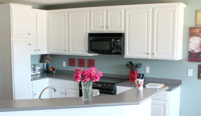
Sherwin Williams Alabaster White (SW 7008) is prized for its soft, creamy tone and has been a favorite for years. Sherwin Williams even named it their 2016 Color of the Year.
Don't assume the trend has faded! SW Alabaster White has clearly stood the test of time. It's still one of their most popular whites, and I can see why!
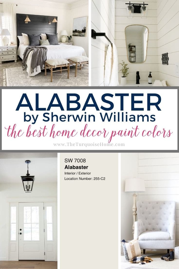
White walls are always a safe choice for a home. Neutrals stay on top no matter the decade, which is why white walls never go out of style.
Pro Tip
Whenever you choose a new paint color, test the real paint in your own home first!
The simplest, quickest way to do that is with Samplize! I use them exclusively for paint samples now. There's no mess and no leftover sample pots. These peel-and-stick squares are made from real paint, are easy to move around the room, and simple to keep for future reference!
Order Real Paint Samples
What I love most about Sherwin Williams Alabaster White is how subtle its undertones are, so it suits almost any setting. It's one of the first colors I suggest to anyone searching for that elusive perfect white.
As a bonus, it looks great inside, outside, and on kitchen cabinets. You really can't go wrong with this one!

What Color Is Alabaster?
In the words of Sherwin Williams' color marketing director, Alabaster lands between harsh and too warm, offering a subtle, appealing white.
It's a gentle white that is neither warm nor cool, so it pairs nicely with warm brass and wood finishes, as well as the grays and blues that are trending now.
Understanding Alabaster's Undertones
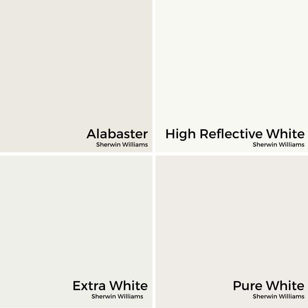
Although Alabaster White is technically a warm color, it never veers into yellow. It pairs remarkably well with both warm and cool shades, because its undertones are so subtle and don't favor any single hue.
Some people pick up greige undertones, a blend of gray and beige. Depending on the light, either the gray or the beige may stand out more.
A true white usually shows cool or blue undertones. Alabaster's greige undertones lend it a creamy quality, though it never gets too rich and keeps a nicely balanced look.
Differences between whites really only show when you compare them directly. On its own, Alabaster reads as a white, though not a pure one.
Alabaster White's LRV
Light reflectance value (LRV) measures how much visible light a paint color reflects or absorbs. The higher the number, the more light it bounces back. So where does Alabaster land on that scale?
Alabaster White has an LRV of 82. In practical terms, it bounces back a great deal of light.
How it looks depends on the room and the daylight it gets. In north-facing rooms, paint tends to look cooler and more subdued, though the shift is slight with Alabaster.
South-facing rooms give warm tones a glow, so Alabaster's warmth really comes through. East- and west-facing rooms behave similarly, though you'll get the most warmth in a west-facing room.
Alabaster White Compared to White Dove and Simply White
Alabaster often competes with other favorite whites, such as Benjamin Moore's White Dove and Simply White.
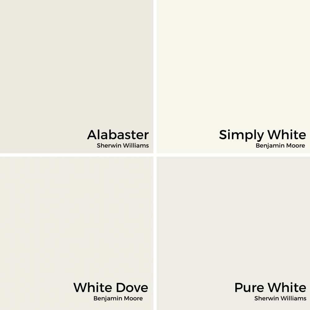
Alabaster White is just a touch darker and warmer than White Dove (LRV 85), and less yellow than Simply White. If you prefer Benjamin Moore, White Dove is a very close match to Alabaster!
Colors That Complement SW Alabaster White
Alabaster White keeps things simple and pairs with nearly any color. Still, always test before committing to painting everything. It's certainly a great place to begin your search!
Try pairing it with a neutral from the opposite hue family. For example, the cool, blue-gray tones of Sherwin Williams' Sea Salt work nicely.
Set it against a darker color and Alabaster White looks even brighter by contrast. One of my favorite deep, bold shades is Benjamin Moore's Hale Navy.
Sherwin Williams itself suggests Townhall Tan (7690) and Dakota Wheat (9023). But in my opinion, there are countless other wonderful color combinations to explore!
Using Alabaster White Paint Around the Home
Walls
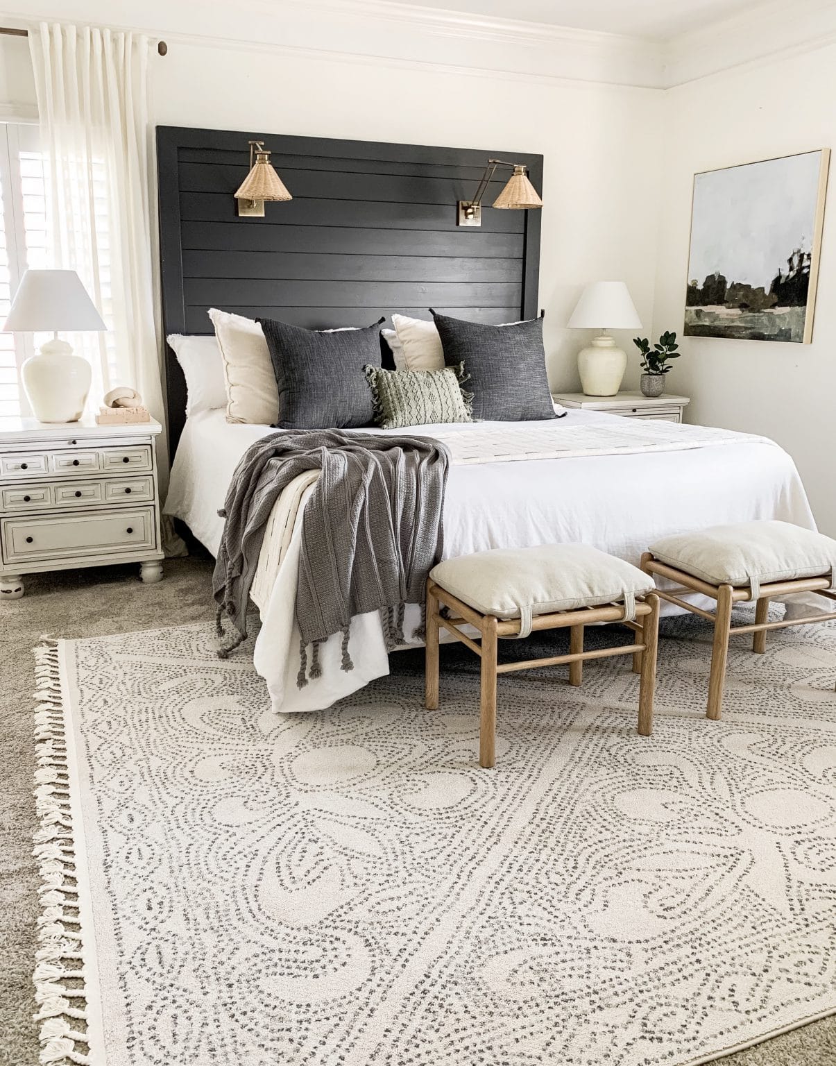
Alabaster is a near-foolproof choice for almost any wall. It's popular for good reason: it's extremely versatile and easy to work with. Though bright, it never glares, and it still leaves room to play with color elsewhere in the room.
If matching and keeping everything cohesive gives you a headache, Alabaster White makes life easier for any designer, including you.
When it comes to decor, it steps back and lets your pieces take center stage. As a neutral that works with both warm and cool tones, it pairs with almost anything.
If you love switching things up like I do, you can swap decor and furniture without worrying about matching the walls. It always works!
Choosing a Trim Finish
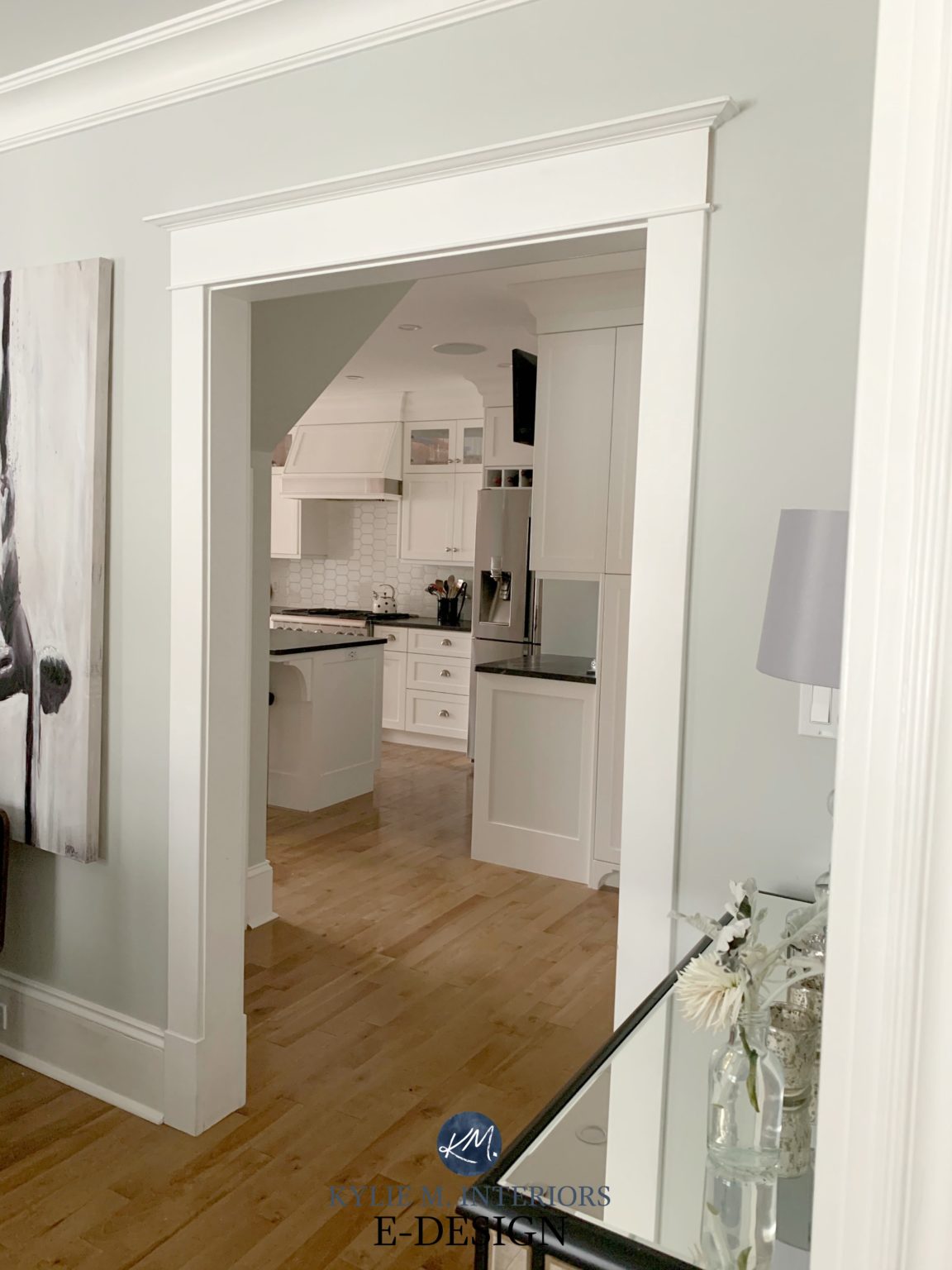
Beyond the walls, Alabaster also works beautifully on a room's trim and molding. Pairing two different whites in one room creates a subtle but meaningful design effect.
Choosing a different finish for the trim, such as a semi-gloss, makes it look even more refined. Thanks to its versatility, Alabaster pairs with most paint colors if you just want to refresh the trim.
Cabinetry
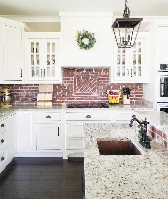
Cabinets get a starring role too. Use Alabaster White in the kitchen, bathroom, laundry room, or anywhere else you'd like cabinetry. White cabinets make a lovely contrast against wall color, and because Alabaster isn't a pure white, it won't feel harsh or bold.
Shiplap
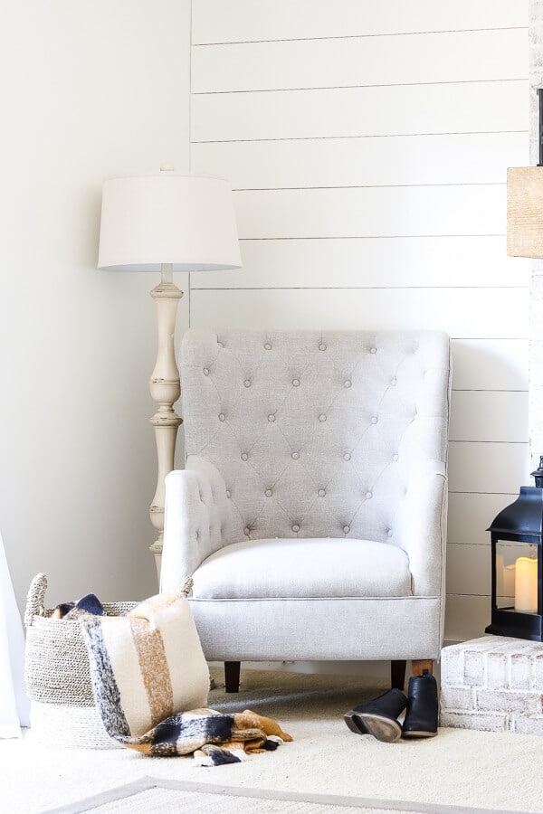
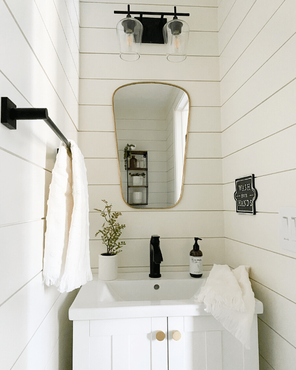
Do you have shiplap at home? Farmhouse style and Alabaster White seem made for each other. As with cabinetry, a pure white can look stark on shiplap, and Alabaster's warmth offers a softer alternative.
Exterior
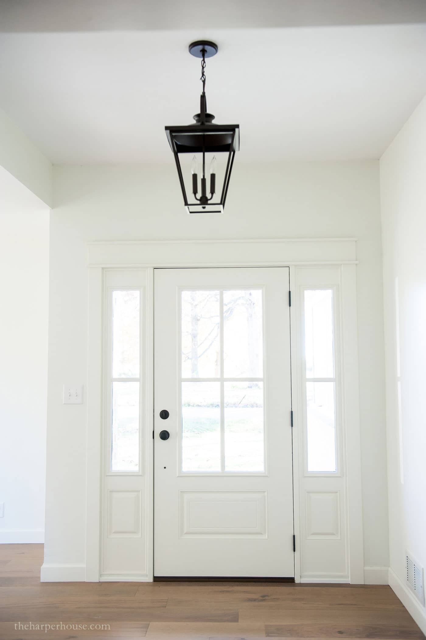
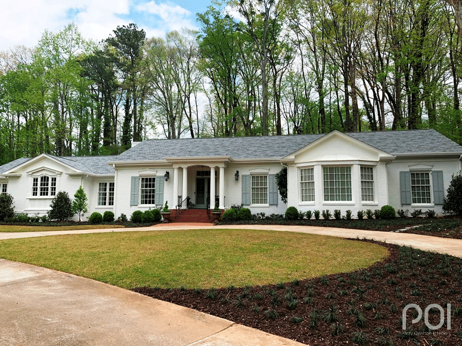
Alabaster White works outdoors too. Outside, you won't notice that it isn't pure white, since it looks bright and clean without blinding glare. Its high LRV keeps it looking fresh and beautiful, even on homes that sit in shade most of the day.
Have I convinced you yet? Let me know if you plan to try Sherwin Williams Alabaster White in your home!
Be sure to check out these other great paint colors too!
MORE POSTS YOU'LL ADORE: