Still deciding, or hunting for the best sage green paints? I've written a guide to the top sage shades for your home. We've been hearing about greens, sage in particular, for a few years now, and they aren't leaving anytime soon, if ever.
Sage took center stage in 2022, when Sherwin Williams and Benjamin Moore each named a sage-toned color of the year. Other brands spread the green trend too, in their own variations.
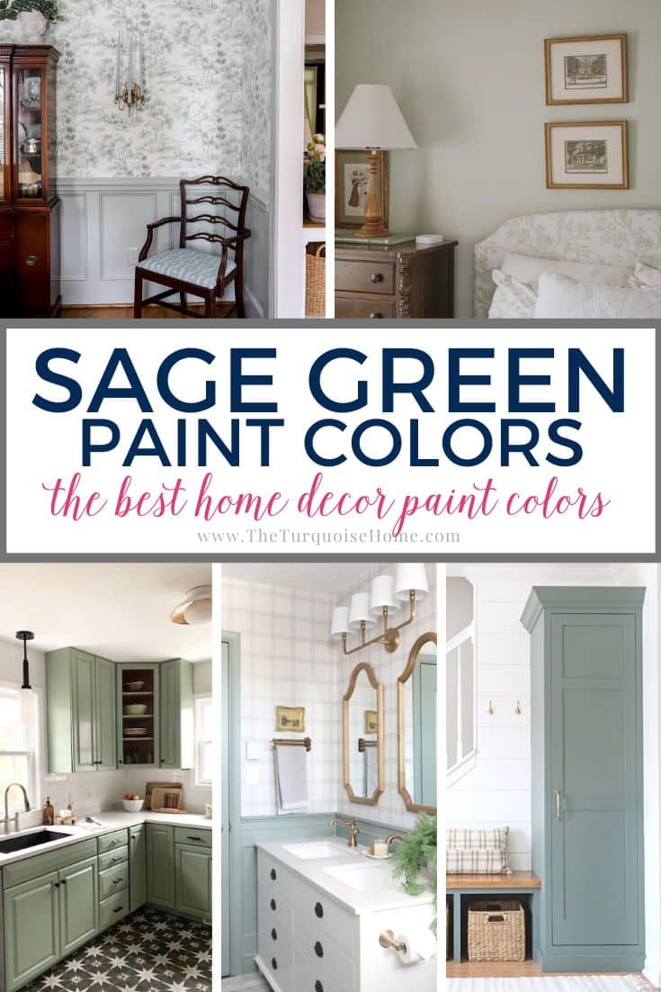
Green has a lasting appeal, and its popularity tends to rise during economic and cultural change. It stands for renewal, growth, and prosperity, all upbeat, hopeful feelings.
Why not surround yourself with that every day? Having brought sage shades into my own house, I can say they strike a rare balance between trendy and calming.
Part of the reason this paint trend will last is that sage is incredibly adaptable. It sits comfortably beside many other hues and natural materials, which has made it something close to a new neutral. Below, we'll compare sage with true neutrals, look at the colors that suit it best, and cover how lighting affects the shade you choose.
Is Sage a Neutral?
Sage often acts like a neutral, but it isn't a "true" one, since it has clear green and gray undertones. True neutrals, such as whites, off-whites, grays, beiges, and greiges, are the most versatile because they lack those undertones. Sage's subtle shifts keep it firmly in the green family.
Put simply, once you understand those undertones, sage works beautifully as a neutral even though it isn't one by definition. It has more nuance than true neutrals (see my favorite neutrals for 2024), yet designing with it is nearly as simple. Choose the shade that fits the mood you want, then build the rest of your palette around it.
Pro Tip
Whenever you pick a new paint color, test the actual paint in your own space first!
Samplize is the quickest way to do it, and it's my only go-to for paint samples these days. Nothing gets messy and no leftover pots pile up. These peel-and-stick sheets are made from real paint, so you can shift them around the room and keep them for later reference!
Get Real Paint Samples
Which Colors Complement Sage Green Paint?
Sage is a balanced mix of citron and slate. On the color wheel it falls between blue and yellow. In simple terms, citron comes from blending orange with green, and slate comes from mixing violet with green.
Typical Sage Green Paint Undertones
- Gray undertones give a subdued, gentle, refined, and neutral mood.
- Blue undertones add a cool, soothing quality, much like the blues found in nature.
- Warm undertones add touches of yellow or brown for an earthy, cozy glow.
- Muted undertones tone down the brightness for a quieter, timeless look.
- Olive undertones bring depth and richness for a verdant green.
Although sage can pair with nearly anything, it usually looks best alongside ivory, cream, light gray, taupe, and brown.
Plenty of modern rooms team it with dark woods, and it looks great with black too. Add a splash of color here and there with a couple of bold accent pieces.
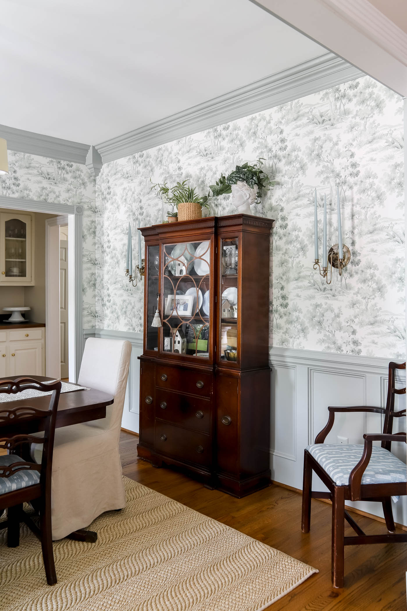
Since green sits across the color wheel from red, I reach for greens whenever flooring or furniture has red undertones. In my dining room, for example, a sage wall paired with my great-grandmother's dark wood furniture, and it really softened the red tones.
How Does Lighting Affect Sage Green Paint?
Have you noticed how outdoor greens shift through the day? Sage paint does the same. In daylight it looks fresh and lively, often bringing out its yellow notes. As the day darkens, though, your interior lighting will change the color considerably. My post on picking the right light bulbs covers this in more detail.
Also, check the light reflectance value (LRV) listed for each sage shade below. A higher number means the paint bounces more light back, so it needs less daylight or lamp light to feel bright. A lower number means it soaks up more light, so pay close attention to your light sources if you want an airy feel.
These picks should help you narrow things down, but nothing beats seeing for yourself! Put up swatches large enough to study, and watch how the color changes at different times of day and in different spots around the room.
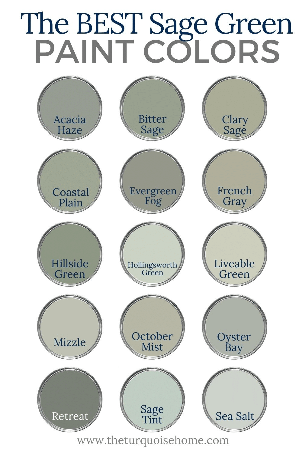
17 Best-Loved Sage Green Paint Colors
As promised, here are the top sage paint colors. They run from muted to warm, so you're bound to find one that fits your plan.
1. Benjamin Moore October Mist
A classic from the company's Classics Collection®, Benjamin Moore October Mist 1495 balances gray and yellow undertones into a peaceful green. Its LRV of 46 makes it especially earthy in warm, natural light, adding coziness to bedrooms and living rooms and calm to home offices. Thanks to its gray undertones, it reads noticeably more silvery under artificial light.
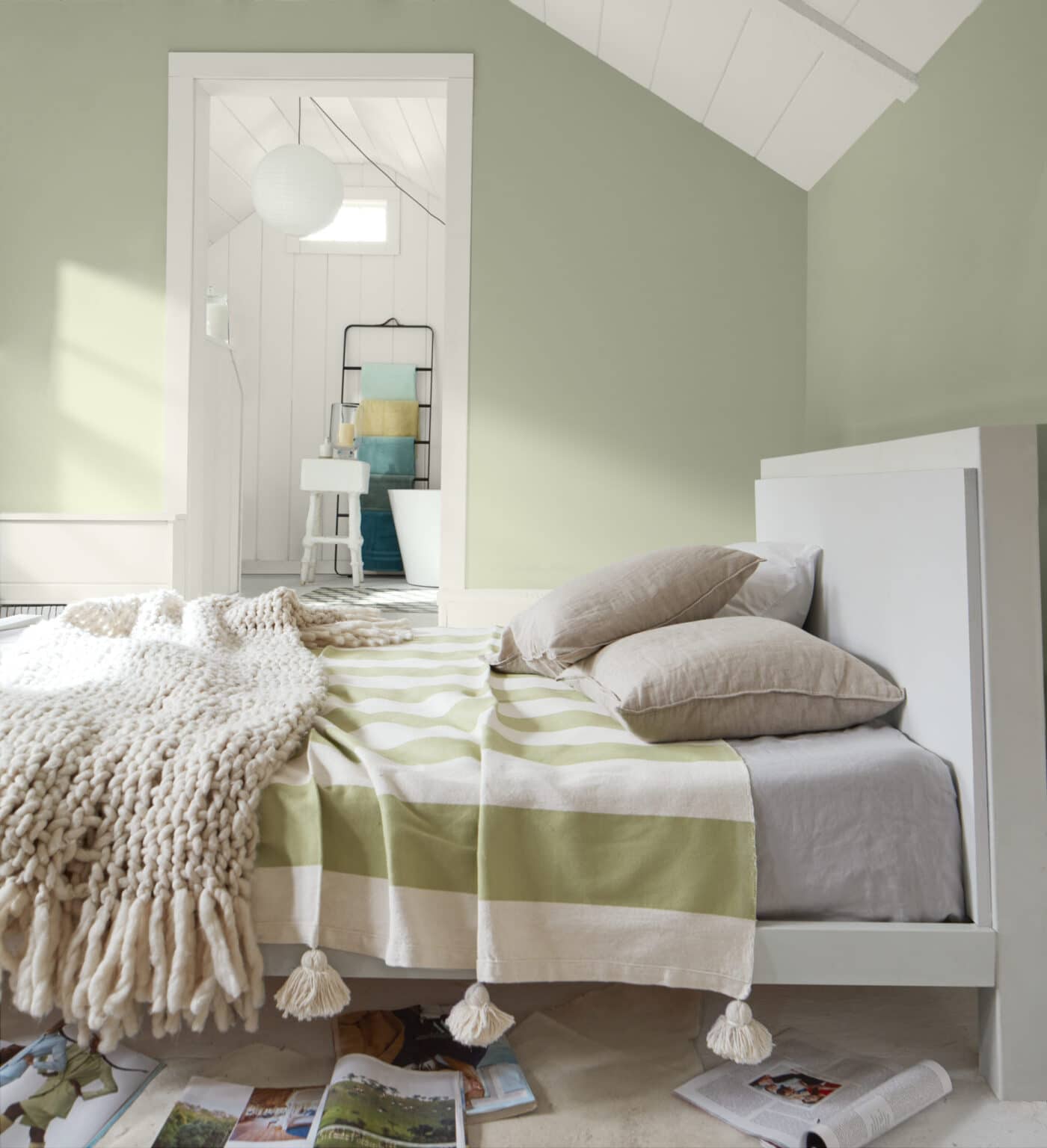
This versatile shade also suits kitchens, particularly when set against crisp whites or contrasting cabinets.
2. Benjamin Moore Saybrook Sage
Benjamin Moore Saybrook Sage HC-114 is a distinctly cool sage with strong gray undertones that give it a silvery finish. Its LRV of 46 pairs effortlessly with most neutrals, whites, and soft blues.
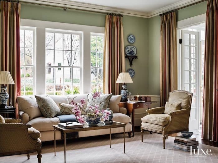
Its calm, refined, and classic character suits traditional living rooms, bedrooms, and kitchens. It sits effortlessly beside neutrals, whites, and soft blues, feeling polished yet welcoming.
3. Benjamin Moore Hollingsworth Green
Benjamin Moore Hollingsworth Green HC-141 has a high LRV of 63.25, so it feels fresh and airy even in dim rooms. Its blend of green, blue, and gray works nicely with crisp whites, creams, and soft grays.
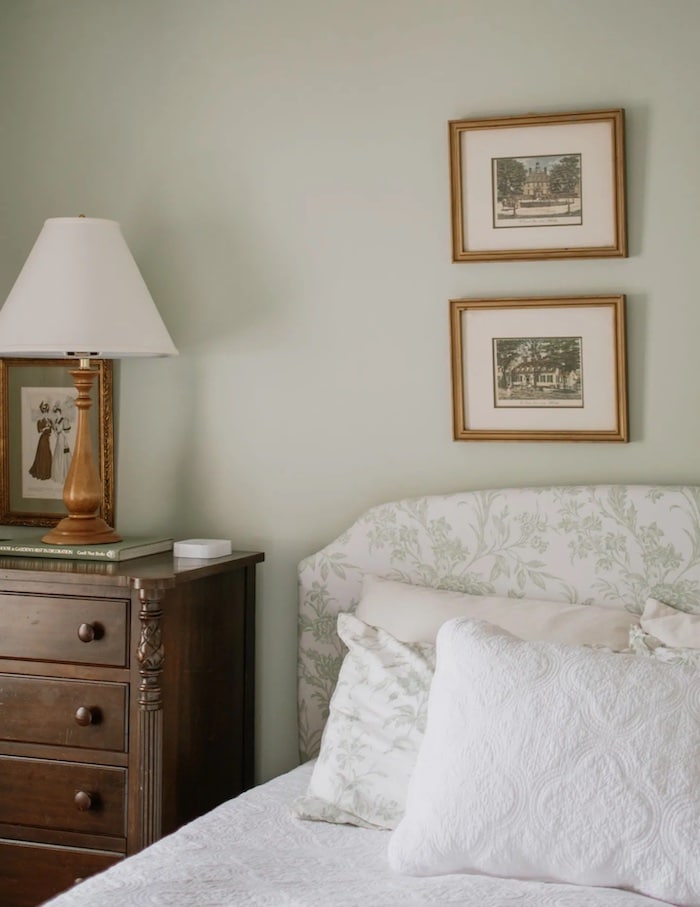
This airy, plant-inspired shade brings a peaceful, uplifting feel that can turn living rooms and bedrooms into elegant retreats.
4. Benjamin Moore Sage Tint
Benjamin Moore Sage Tint 458 is another light option, with an LRV of 57.85 that drifts between blue, green, and gray, almost minty in tone. Paired with soft neutrals, blues, or warm grays, it creates a calm, subdued mood.
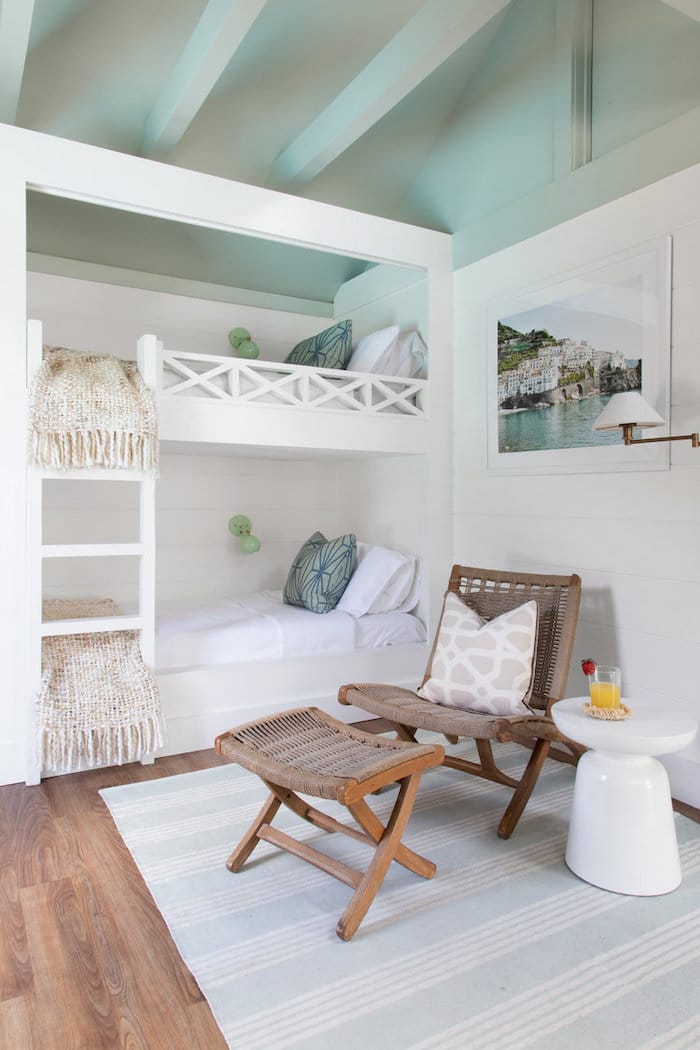
Teamed with crisp, cool whites and natural woods, Sage Tint feels livelier, as this clean, beachy cabana design shows.
5. Benjamin Moore Silver Sage
Benjamin Moore Silver Sage 506 is one of the two lightest colors on my list, with an LRV of 63.26. It fills rooms with a soft, silvery glow and pairs well with nearly every white, gray, and muted blue. It feels refined yet still has plenty of character.
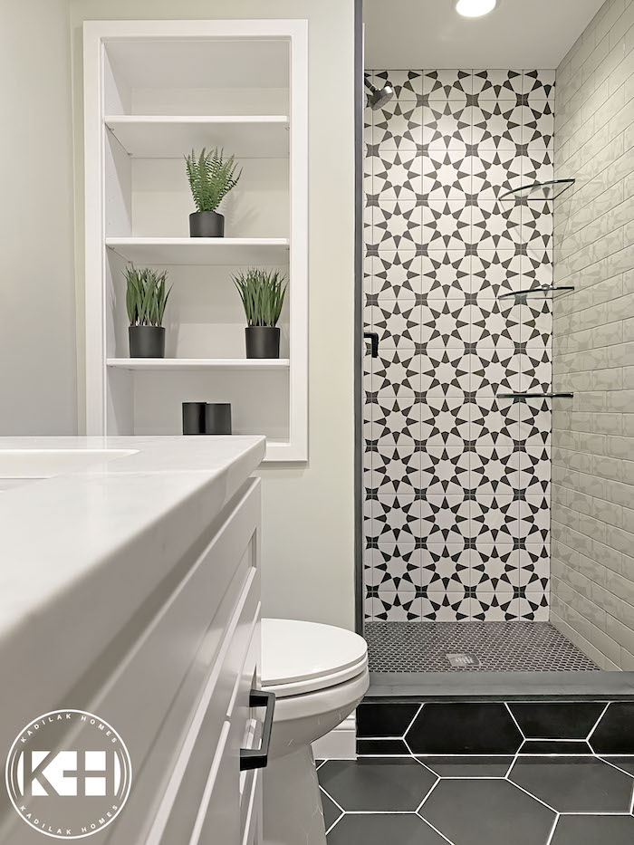
This space shows how well Silver Sage works with bold tile patterns and undertones. Here it complements the gray-green subway tiles and lets the black-and-white contrast tiles stand out even more.
6. Sherwin Williams Clary Sage
Sherwin Williams Clary Sage 6168 is a rich, herbal green. Yellow undertones and an LRV of 41 give it an inviting, plant-like character.
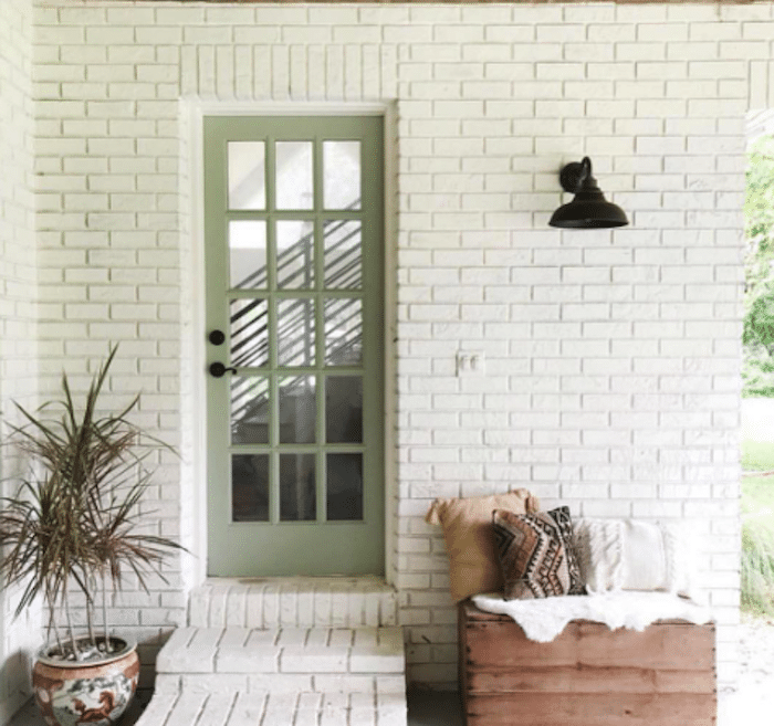
I've said before that its intensity might be a lot for my indoor spaces, but I can picture Clary Sage on an accent wall, trim, or a statement piece of furniture. One of my favorite examples is this exterior door, where it pairs beautifully with white brick, natural wood, textured neutrals, and a lovely potted plant.
7. Sherwin Williams Evergreen Fog
Sherwin Williams Evergreen Fog 9130 is the second Color of the Year on this list, the company's top pick for 2022. With an LRV of 30, it stands out for its depth and flexibility. Well suited to living rooms and bedrooms, it blends easily with neutrals, whites, dark gray-brown, cool blues, and metallic accents, giving a polished, grounding presence.
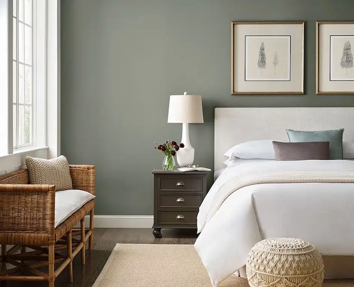
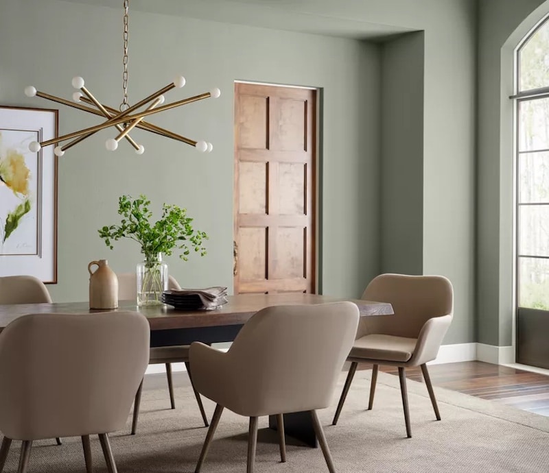
I picked two photos for Evergreen Fog to show how well it suits different looks, from traditional to mid-century modern.
8. Sherwin Williams Oyster Bay
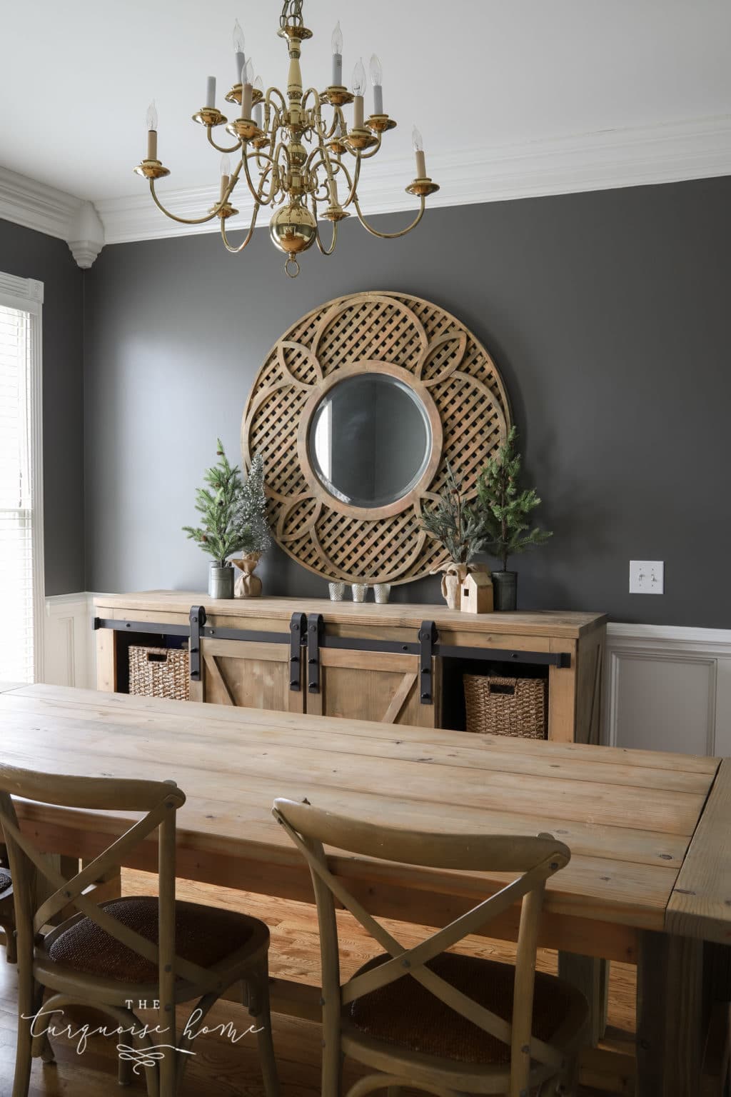
Sherwin Williams Oyster Bay 6206 is the first of two sage greens I've been delighted to use at home. Its strong slate-blue undertones give it a crisp, cool neutrality. Like most sage shades it works well in bedrooms and bathrooms, but I found it was just right for my traditional dining room.
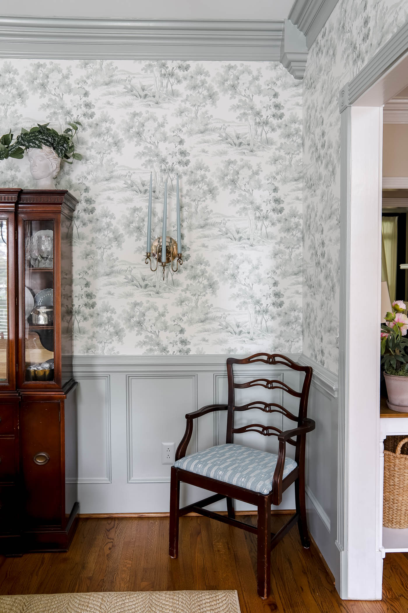
It's a calming gray-blue green with plenty of saturation and an LRV of 44. I wanted it to showcase my grandmother's lovely dining set and soften the red tones in the wood, and I also wanted to bring in some favorite blues. Even though the room is traditional, the choice pushed me beyond my comfort zone. I couldn't be happier with how it turned out.
9. Sherwin Williams Sea Salt
Sherwin Williams Sea Salt 6204 is the second-lightest color on this list (LRV of 63), and the second sage I've used personally in my home. I painted my last kitchen with it, and it's in the primary bathroom of our current house.
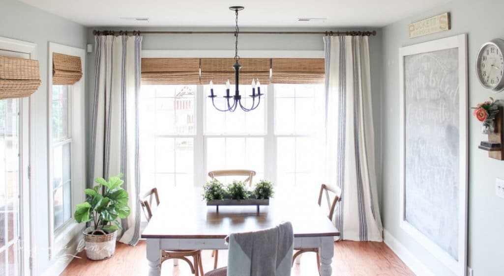
It creates a peaceful, airy feel, ideal for anyone who wants a sage look without a deep shade.
As the name suggests, depending on the light it can read more blue than green. Pair Sea Salt with crisp, pure whites for a clean, classic contrast, or with warm whites that have hints of cream or beige for extra warmth.
10. Sherwin Williams Coastal Plain
Sherwin Williams Coastal Plain 6192, with an LRV of 37, brings a warm, grounded feel to a room, and it sits best with earthy tones, warm whites, and soft neutrals. Neutrals with beige undertones and a gentle warmth suit it well, as do other blue-green neutrals.
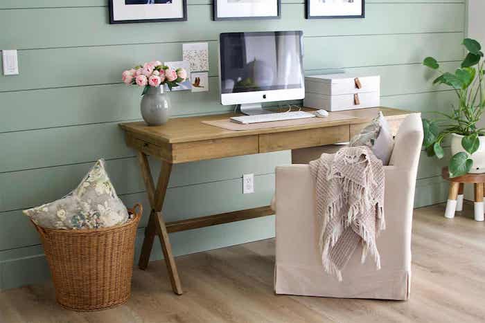
I love how Coastal Plain makes this shiplap in an office feel fresh, cozy, and welcoming.
11. Sherwin Williams Acacia Haze
Sherwin Williams Acacia Haze 9132 is a subdued, warm gray with an LRV of 32. It suits warm neutrals, soft grays, and earthy tones, creating a cozy atmosphere in a variety of rooms.
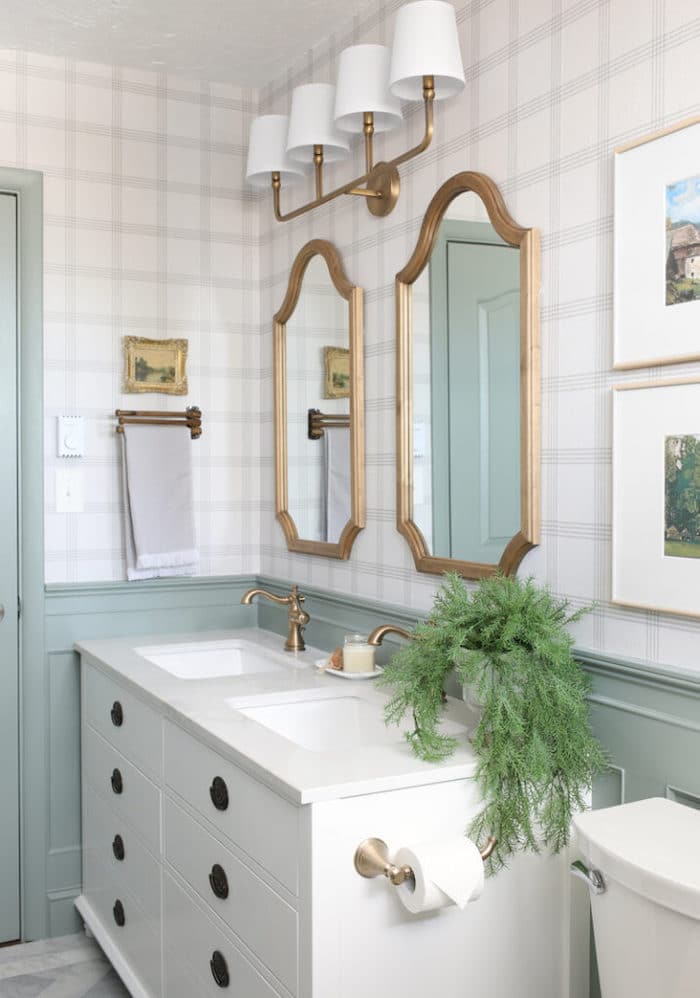
Take this English cottage bathroom, for example, where Acacia Haze covers the wainscoting, door, and trim. I'm still searching for a spot to use this color at home. I especially love how it looks alongside warm wood tones and brass fixtures.
12. Sherwin Williams Liveable Green
Sherwin Williams Liveable Green 6176 gives a fresh, welcoming feel with plenty of warmth. Its yellow-gray undertones lean it toward the warm side, but the bright LRV of 61 makes it easy to pair with most whites, soft neutrals, and natural textures. Its lightness also sets off selective black accents nicely.
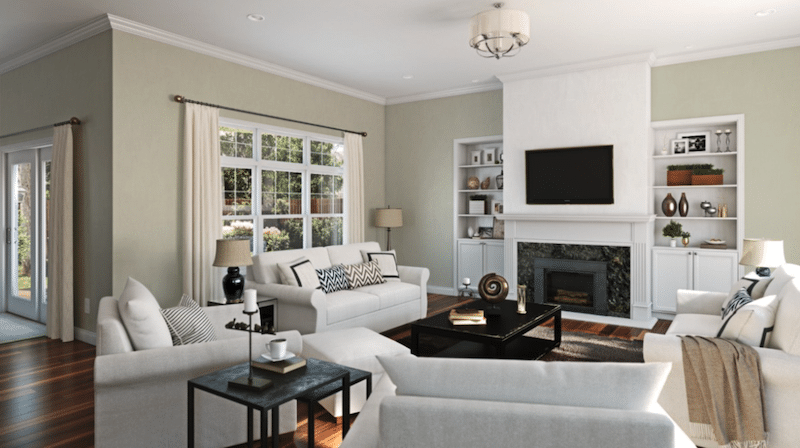
Liveable Green has a name that suits it well. It feels airy, light, organic, and cozy. It's perfect for a living room and a solid pick for other spaces too.
13. Sherwin Williams Retreat
Sherwin Williams Retreat 6207 takes the blue-gray green of Oyster Bay further, with a low LRV of 21. It feels rich and comforting, and suits cozy bedrooms, a calm study, or other intimate spaces.
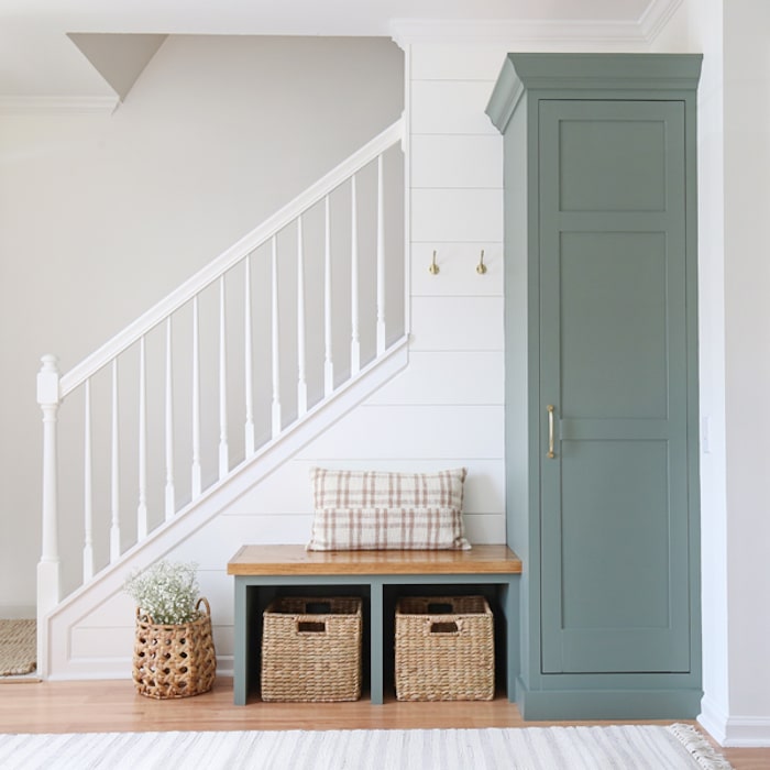
Now look at Retreat used in an entryway. The name may seem an odd fit, but this space shows that the retreat within your home begins right at the door. Slip off your shoes and jacket and make yourself at home! I love how it stands out against the white shiplap walls!
14. Farrow & Ball French Gray
Farrow and Ball's French Gray No. 18 elegantly mixes green and gray, drawing on the traditional palettes of 19th-century French interiors. With a medium LRV of about 44, it suits exterior woodwork and front doors well. In most settings it looks greener than gray, and it changes noticeably with the light and time of day.
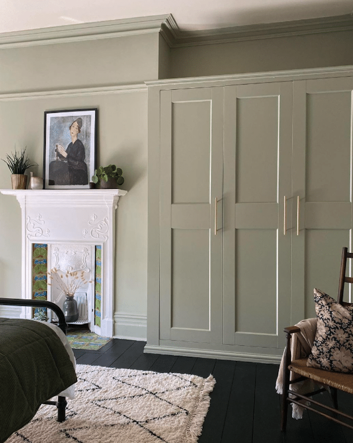
Although it's recommended for exterior woodwork, especially where there's lots of greenery, I love how it looks in this tidy bedroom, where mostly neutrals are punctuated by the lively hearth tiles.
15. Farrow & Ball Mizzle
Farrow and Ball's Mizzle No. 266 is misty and soothing, with a moderate glow and an LRV of 52. The company says its unique grey-green tone was inspired by the mist and drizzle of England's West Country evenings, which is where the name comes from.
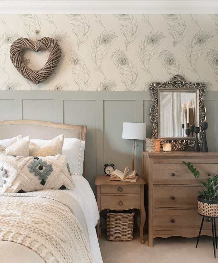
Unlike many other greens, it has no cool blue tones, which makes it a lighter, calmer shade that pairs best with mid-tone neutrals.
16. Behr Bitter Sage
Behr Bitter Sage N390-4 offers a subtle light-to-mid green with a warm glow. Its color depth and fairly low LRV of 34 give rooms a richer feel. It reminds me a little of Clary Sage in saturation, though it leans much more blue-green.
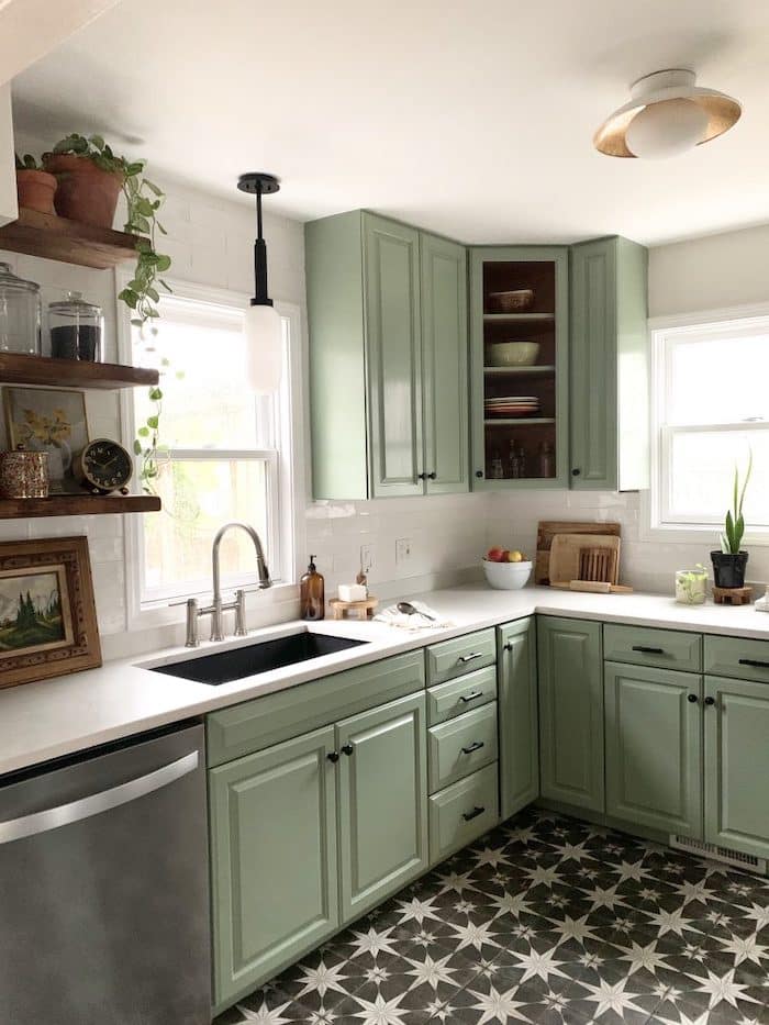
Bitter Sage works beautifully here alongside light white counters, contrasting tile, minimal wood accents, and touches of metal. Together they give this compact kitchen a polished, designer look.
17. Behr Hillside Green
Behr Hillside Green PPU11-17 has blue and gray undertones that set it apart from the much warmer Benjamin Moore shade of the same name. It brings cool, calming energy to any room. With a lower LRV of 30, it works best where there is plenty of light to show off the color.
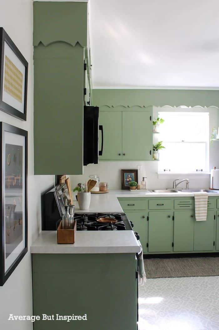
I included this example to show Behr's Hillside Green and how much difference paint can make, especially on a budget. Paint and lighting are probably the most valuable cosmetic investments you can make. Just look at this fresh update of a traditional 1950s kitchen.
If you're painting it yourself, these tools will make a big difference. For the best results, also check out my top tips for painting a room in 5 easy steps.
My Go-To
Painting Essentials
- Paint Brush – they'll stay usable for years
- Drop Cloths – catch drips before they reach the floor
- Roller Tray – the only paint tray I'll ever need
- Painter's Tape – an absolute essential
- Paint cup – sits comfortably in your hand
- Tray Liners – a bit of a luxury, but I adore them!
Closing Thoughts
I hope you've enjoyed exploring the best sage green paints, from the calm feel of Benjamin Moore's October Mist to the chic elegance of Farrow and Ball's French Gray. Most of all, I hope you've picked up some inspiration. Get in touch and tell me about your favorite sage shades.
More Posts You'll Enjoy: