Searching for the ideal light gray for your house? Let me introduce you to Sherwin Williams Mindful Gray! Designers and homeowners both adore this widely chosen shade, and with good reason: it is a flexible neutral with no hidden color cast. Keep reading to see whether Mindful Gray is the right paint color for your home!
Mindful Gray from Sherwin Williams (SW 7016) is a lovely light to medium warm gray that stays neutral enough to suit a wide range of decor styles and color schemes.
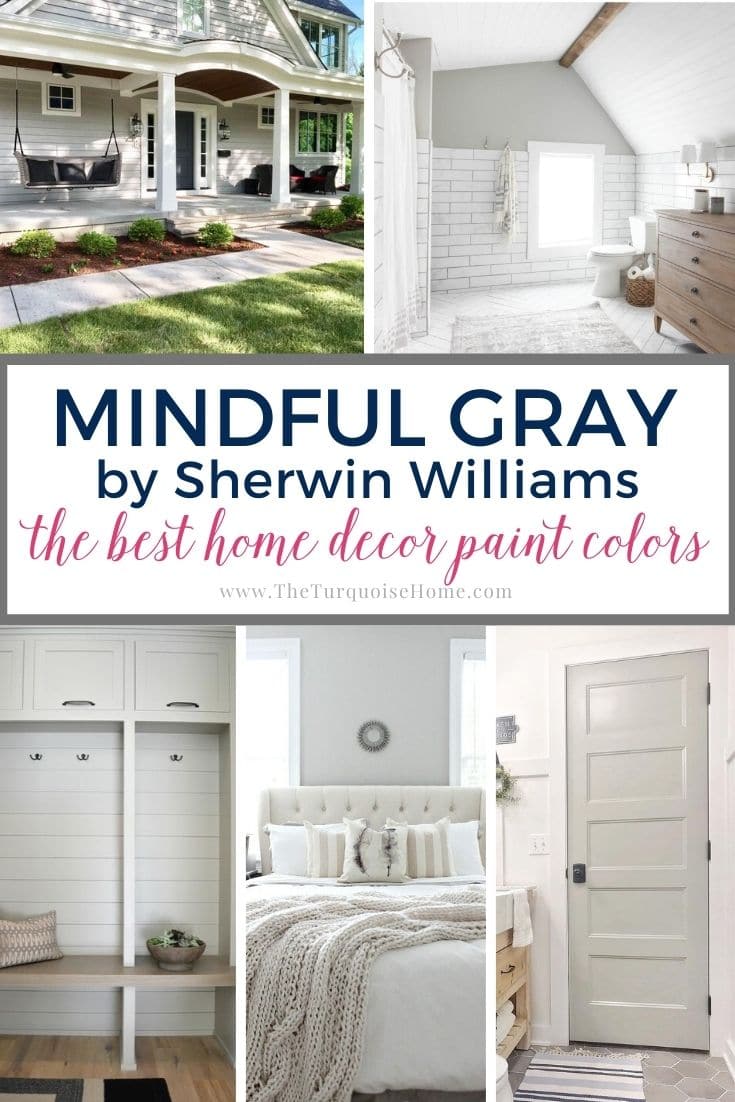
Add a little beige into the mix and it reads as a soft greige.
Light gray paint feels airy and bright, and it works in nearly every room. Still, finding the right shade of gray can be tricky, which is why I put together a full guide on how to do it!
What I appreciate most about SW Mindful Gray is that it avoids the strong cast many light grays have. Imagine choosing a shade you love, then watching it turn lilac once the whole room is painted. With Mindful Gray, that letdown is very unlikely.
So how can you tell whether Mindful Gray is the right light gray for your house? Keep reading to learn more about this very adaptable neutral.

Light Reflectance Value of Mindful Gray
Mindful Gray has a Light Reflectance Value, or LRV, of 48.
So what does that number mean? LRV measures how much light a paint color reflects, on a scale from 0 (pure black) to 100 (pure white). Colors with a low LRV look deeper, while higher numbers produce lighter shades.
Sitting at 48, Sherwin Williams Mindful Gray falls roughly in the middle of that scale, so it reads as light to medium. It leans a touch warm, yet it is neutral enough to sit comfortably beside both warm and cool palettes.
Once it is on the wall, it can look cooler than the swatch suggested, depending on the lighting and the other colors in the room.
Undertones in Mindful Gray
If you’re at all familiar with gray paint, you’ll know that no matter which shade you pick, there’s always an undertone in there somewhere.
Mindful Gray is different because its undertone is hard to pin down. Walk into a room painted in it and you will not get that strong Kermit the Frog green cast.
Its makeup holds a faint trace of brown or beige, which nudges it toward greige. It still reads as a true gray, though. You will not find the yellow or green undertones that make beiges and greiges so frustrating.
Interestingly, even though it leans warm, a slight blue note sits underneath. That coolness balances warmer finishes like off-white trim and honey-toned wood. It never turns chilly or icy the way some grays do.
Now and then Mindful Gray may show very faint traces of green or purple, but these simply add to its character. They will never throw off the balance of a room.
PRO Tip
Whenever you pick a new paint color, test the real paint color in your own home first!
The quickest route is Samplize! I rely on them for all my paint samples these days. Nothing gets messy and there are no leftover pots cluttering the shelf. These peel-and-stick swatches are made from real paint, slide easily around a room, and are simple to keep for future reference!
Order REAL Paint Samples
Which Colors Pair Well With Mindful Gray?
SW Mindful Gray is so flexible that it works with a long list of shades. It looks especially good as a wall color next to white trim.
It works with bright white or any number of off-whites (Sherwin Williams Alabaster is a favorite). Mindful Gray also works on interior siding, where it can be set off by white, dark gray or black trim.
Here are a few other colors that complement Mindful Gray beautifully.
- Pearly White by Sherwin Williams
- Homburg Gray by Sherwin Williams
- Sherwin Williams Eider White
- Halcyon Green by Sherwin Williams
- Warm Stone by Sherwin Williams
- Sherwin Williams Gauntlet Gray
- Peppercorn by Sherwin Williams
- Alabaster by Sherwin Williams
Mindful Gray versus Agreeable Gray
Shoppers compare these two popular colors all the time, and Agreeable Gray is another well-loved Sherwin Williams shade with warm undertones.
Agreeable Gray, with an LRV of 60, bounces more light around than Mindful Gray, so it will look brighter! Many fans have called Sherwin Williams Agreeable Gray “the perfect greige,” a shade that strikes a balance between gray and beige. Like all greiges, its base is a warm, creamy gray tint (and I'll admit, it really is agreeable!).
My take: Mindful Gray suits a single room best, while Agreeable Gray is the better pick for a larger open space or several connected rooms.
Mindful Gray versus Repose Gray is another common matchup.
Rooms Painted in Mindful Gray
Now for the fun part: seeing Sherwin Williams Mindful Gray in real homes!
Tools to Help You Paint a Room Yourself
Before I share some examples, here are some of the best tools for painting a room on your own.
To start, take a look at my post: Painting a Room in 5 Easy Steps. These are the tools I reach for when I paint my own rooms, which is how they get painted 95% of the time!
- Paint Brush – These brushes cost more than a basic one, yet they are worth every penny. I have used the same ones for over ten years, and if you rinse them well after each use, they will last for years.
- Painter’s Tape – Essential for taping off edges. Unless your hand is rock steady, tape off every edge.
- Drop Cloths – A must-have if you don't already have some lying around the house.
- Paint cup – Any old cup would do, but this is the one I now swear by. The magnetic piece holds the brush steadily in place during breaks, and it fits my hand perfectly so my fingers don't cramp.
- Roller Tray – This is the only paint tray I will ever use again. The magnet keeps the roller in place. The liners are a bonus, but I would never paint without them because they make cleanup a breeze!
If you need help choosing a paint sheen: Which Interior Paint Finishes to Use? And Where to Use Them!
Okay, NOW on to the rooms.
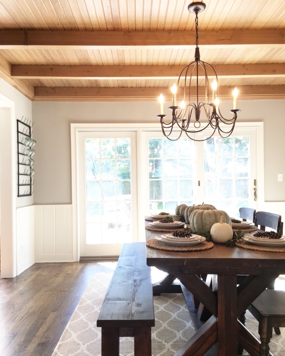
Mindful Gray in Dining Rooms
Warm golden light, both natural and artificial, fills this softly lit dining room from Mindfully Gray. The richly toned wooden ceiling is meant to be the star of the space, so the walls need a quiet, neutral shade.
That's where Mindful Gray comes in. It looks soft, warm and creamy in this room, and it pairs nicely with the off-white door trim and wainscoting.
Mindful Gray in Living Rooms
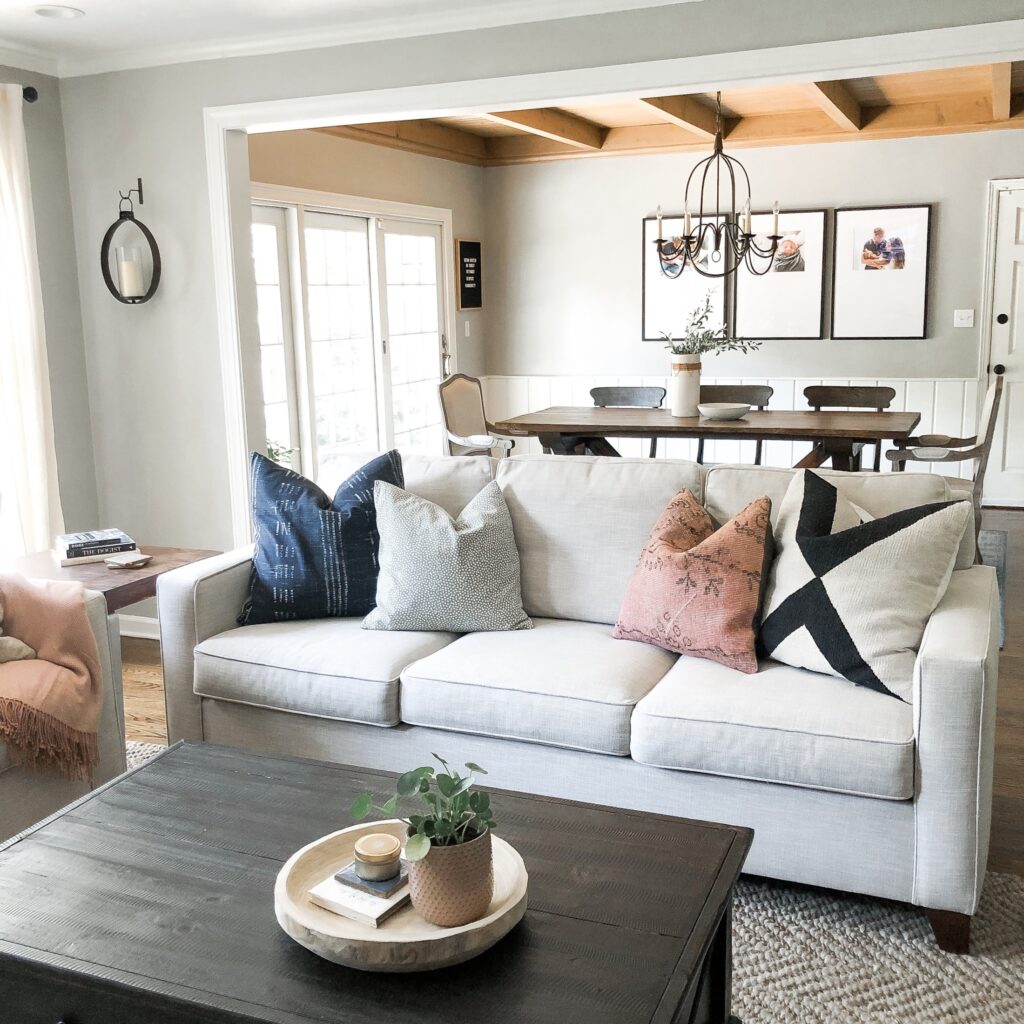
I absolutely adore this sweet, cozy living room from Mindfully Gray! Mindful Gray plays a supporting role here, echoing the warm wood ceiling in the dining room. It adds just enough contrast against the white trim.
Notice how the wall color strikes a calm balance between warm and cool.
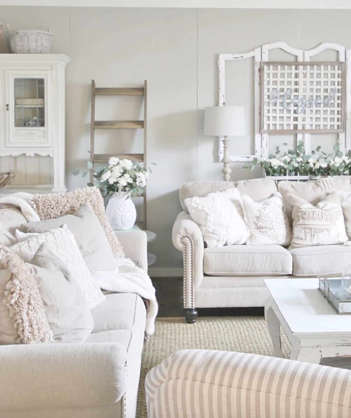
In a bright room like this one from Thistlewood Farms, Mindful Gray looks softer but still holds its own. It serves as the perfect backdrop for the off-white palette and rustic-inspired decor.
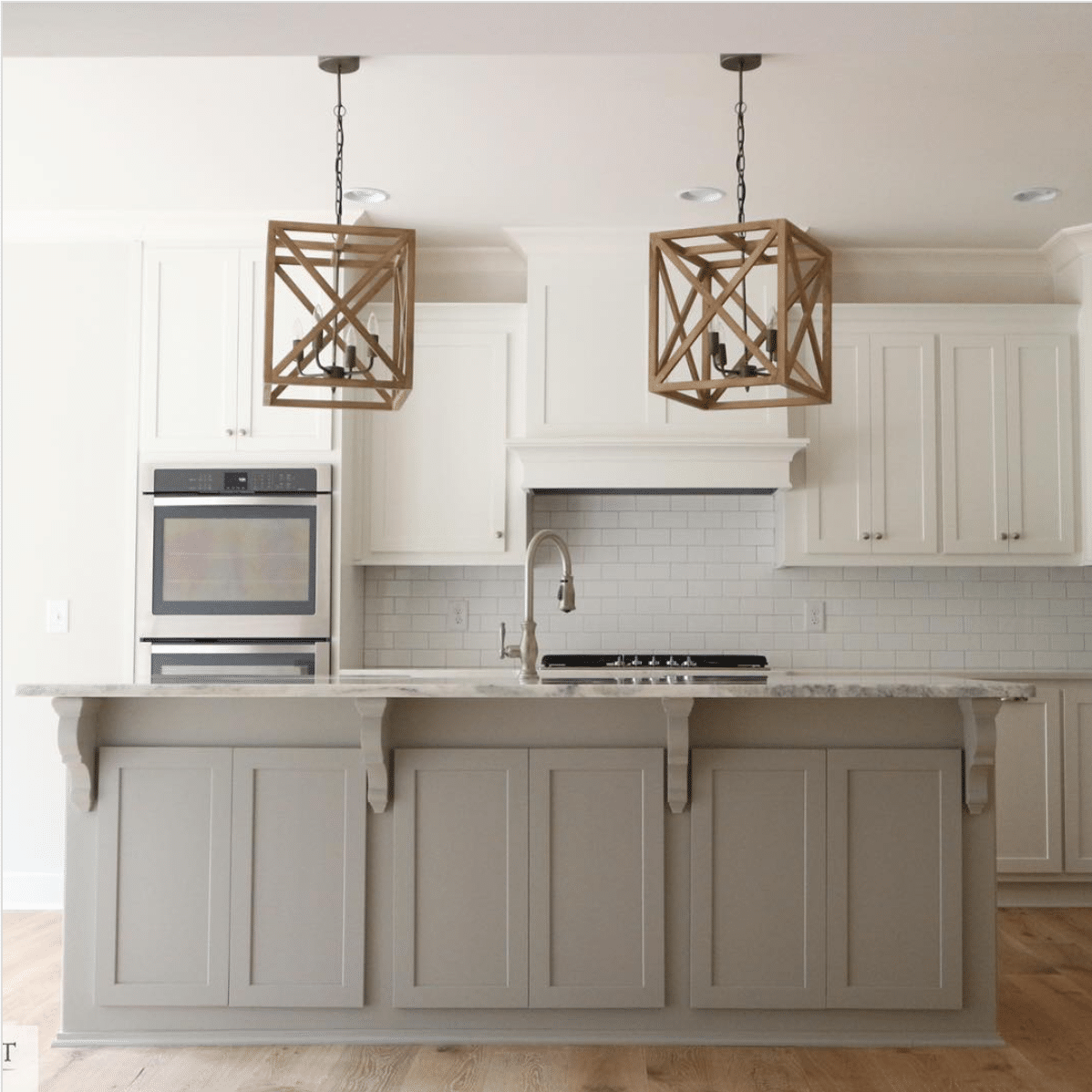
Mindful Gray in Kitchens
SW Mindful Gray is an excellent shade for kitchen cabinets. This island stands out against the white perimeter cabinets without being bold or dramatic.
Mindful Gray in Bedrooms
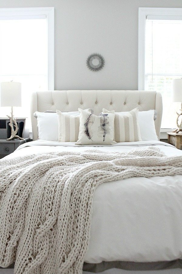
Looking for a light gray that creates a calm bedroom, like this one from Refresh Restyle? Mindful Gray stays grounded as a neutral wall shade and complements the layered off-white and neutral decor.
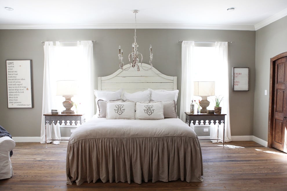
This bedroom from Made by Mood uses a similar decor palette to the last one, but Mindful Gray looks noticeably deeper on the wall. When light isn't hitting the surface directly, the color shows a little more body.
Here, it reads as a mid-toned true gray with just a bit of warmth.
Mindful Grays in Bathrooms
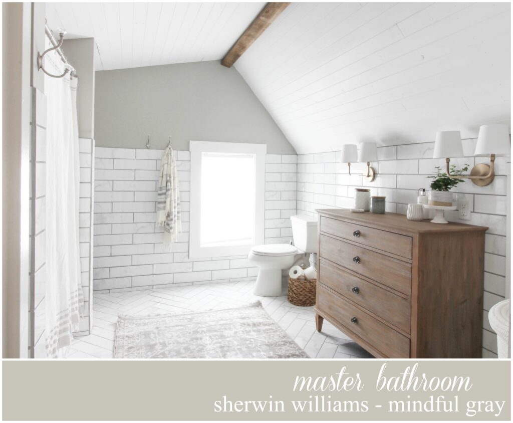
With such a unique architectural shape, it would be a shame not to highlight it.
This restful bathroom from Rooms For Rent Blog plays up soft gray and white tones, with a few carefully placed wood accents. Though neutral, Mindful Gray adds a touch of character and draws attention to the interesting wall shape.
Mindful Gray in Other Spaces
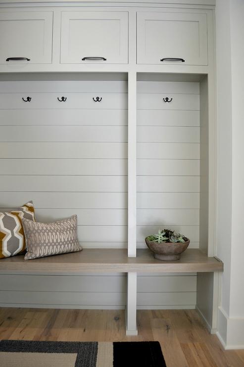
This simple, elegant mudroom from Mawr Design features a built-in bench and cabinets in Mindful Gray. Against a white wall, it is the ideal neutral for adding some visual interest.
Still, it isn't too dark or too bold.
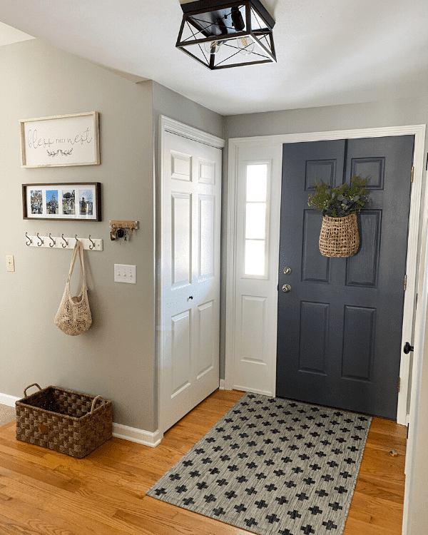
In this welcoming entryway from Lizzy Designs Blog, Mindful Gray feels warm and inviting as a wall color. It pairs beautifully with Sherwin Williams Alabaster trim and an interior door in Peppercorn!
Mindful Gray as an Exterior Color
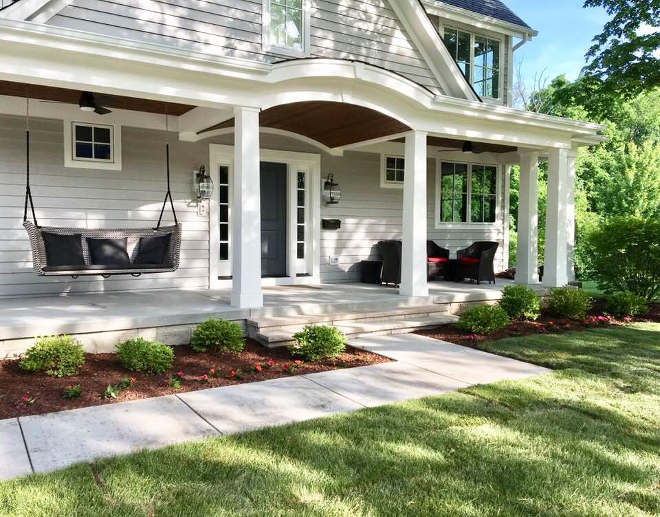
This charming craftsman-style home uses Sherwin Williams Mindful Gray with Alabaster on the trim. I love how the front door stands out in Peppercorn.
Thanks for joining me for this in-depth look at Sherwin Williams Mindful Gray! It is a genuinely versatile neutral that works in almost any space. Where would you try this paint color in your home?
Be sure to check out these other fantastic paint colors!
Need more help choosing a paint color? Check out this video all about Mindful Gray!