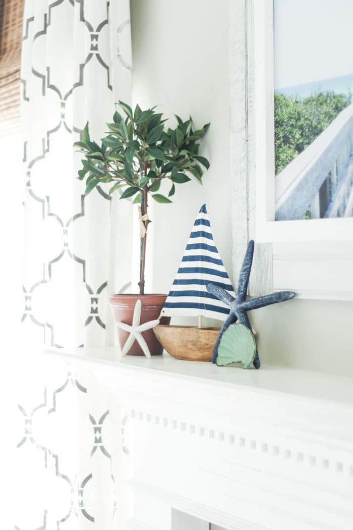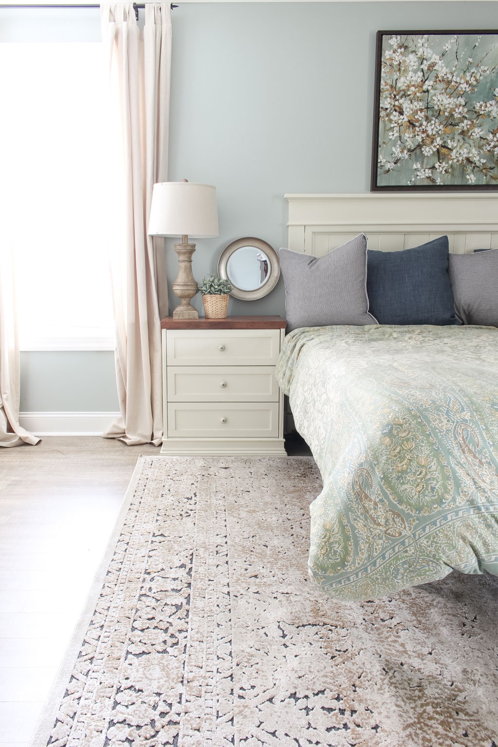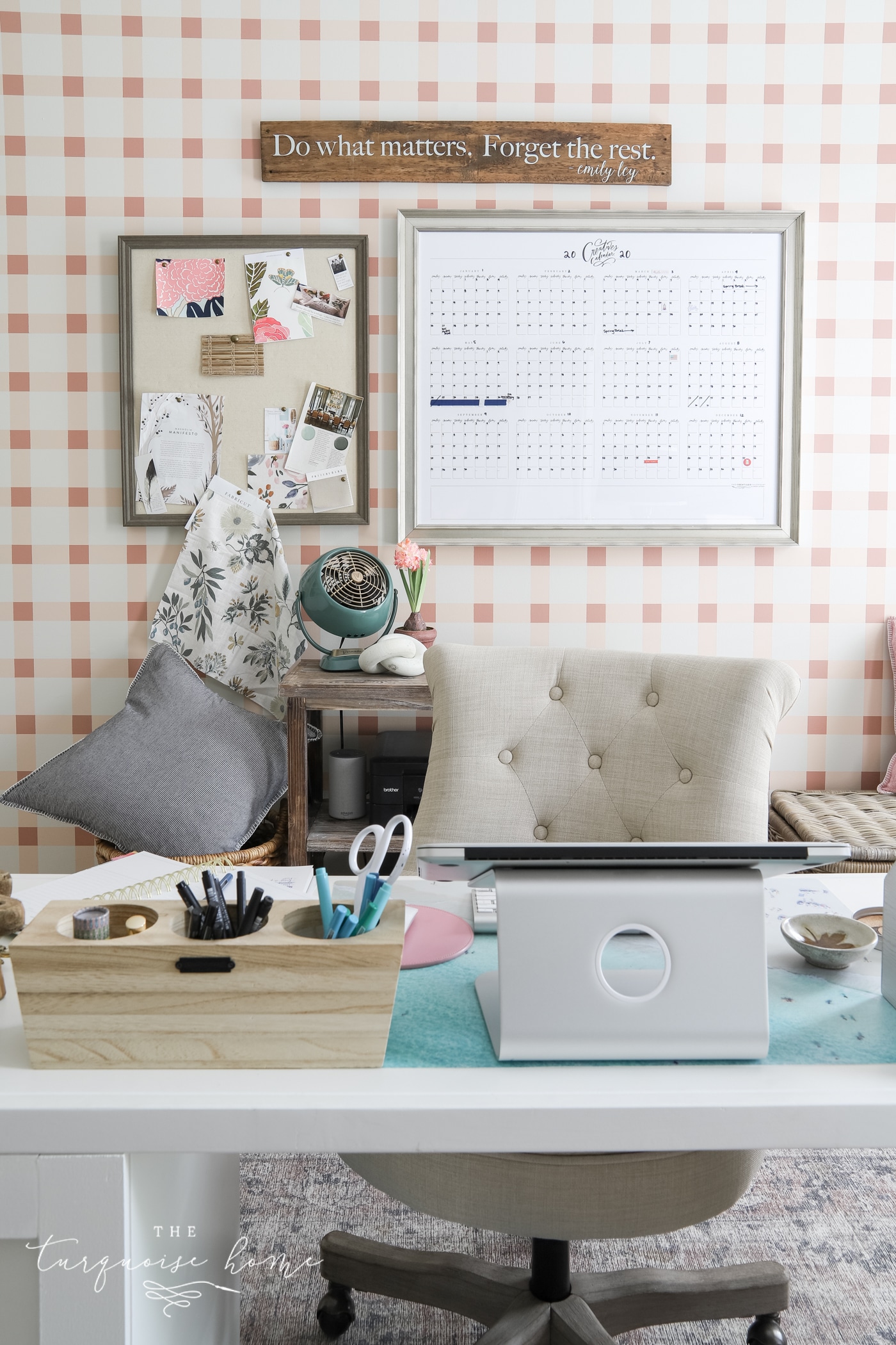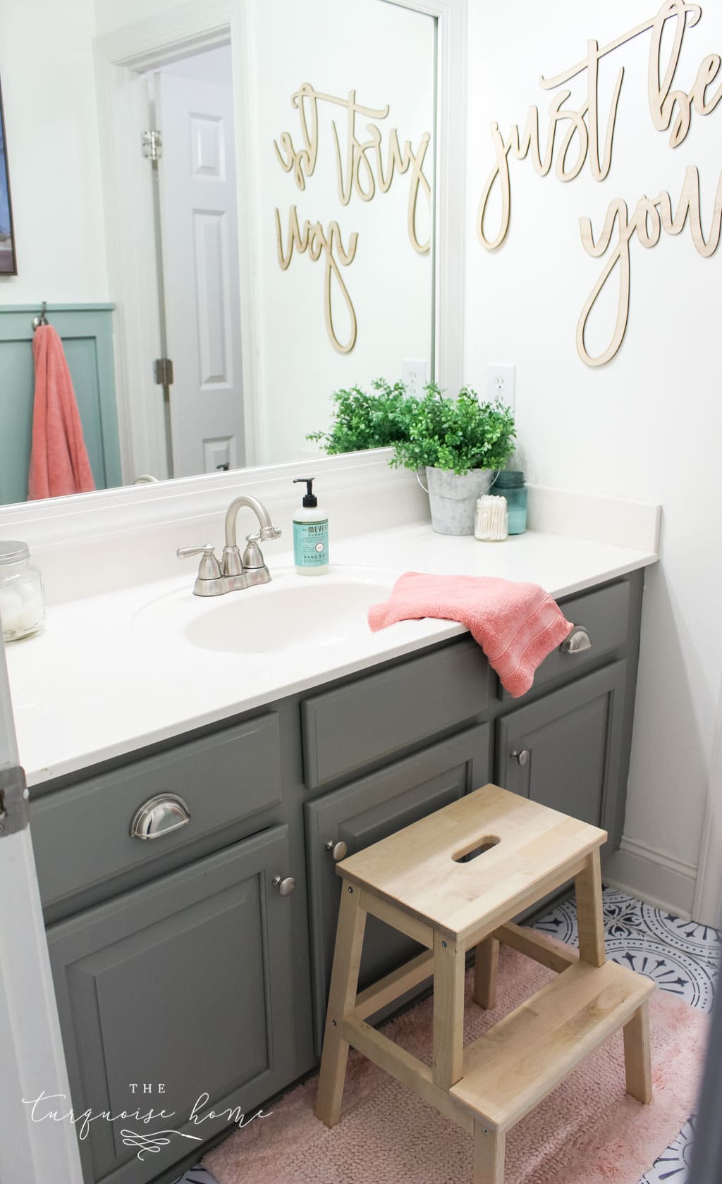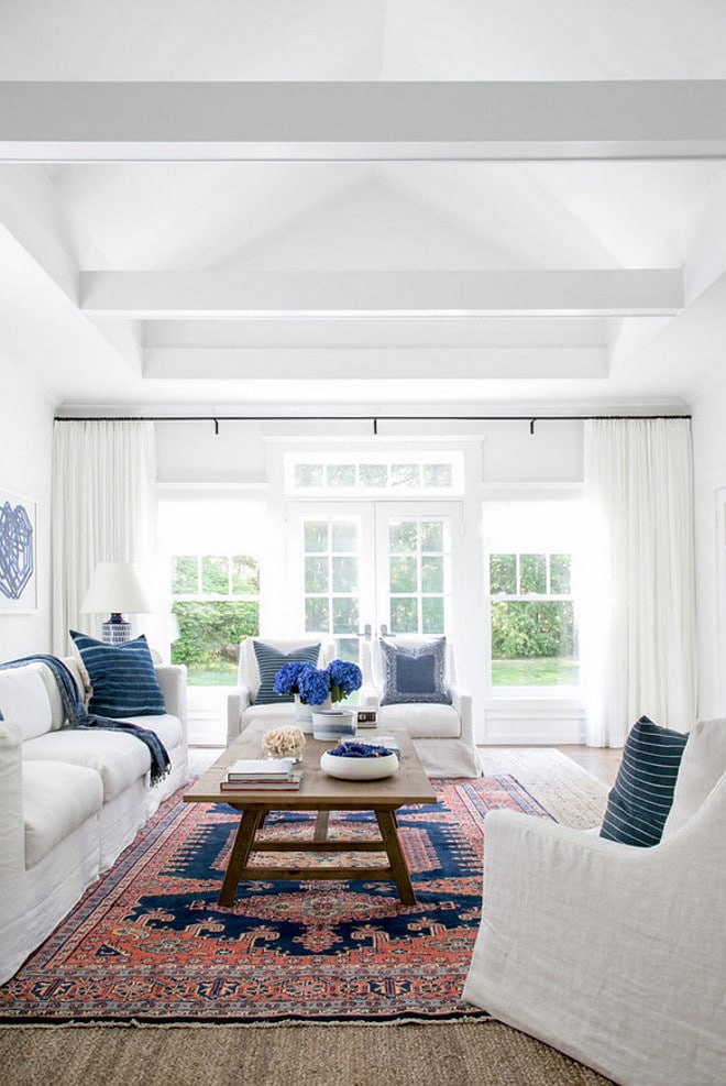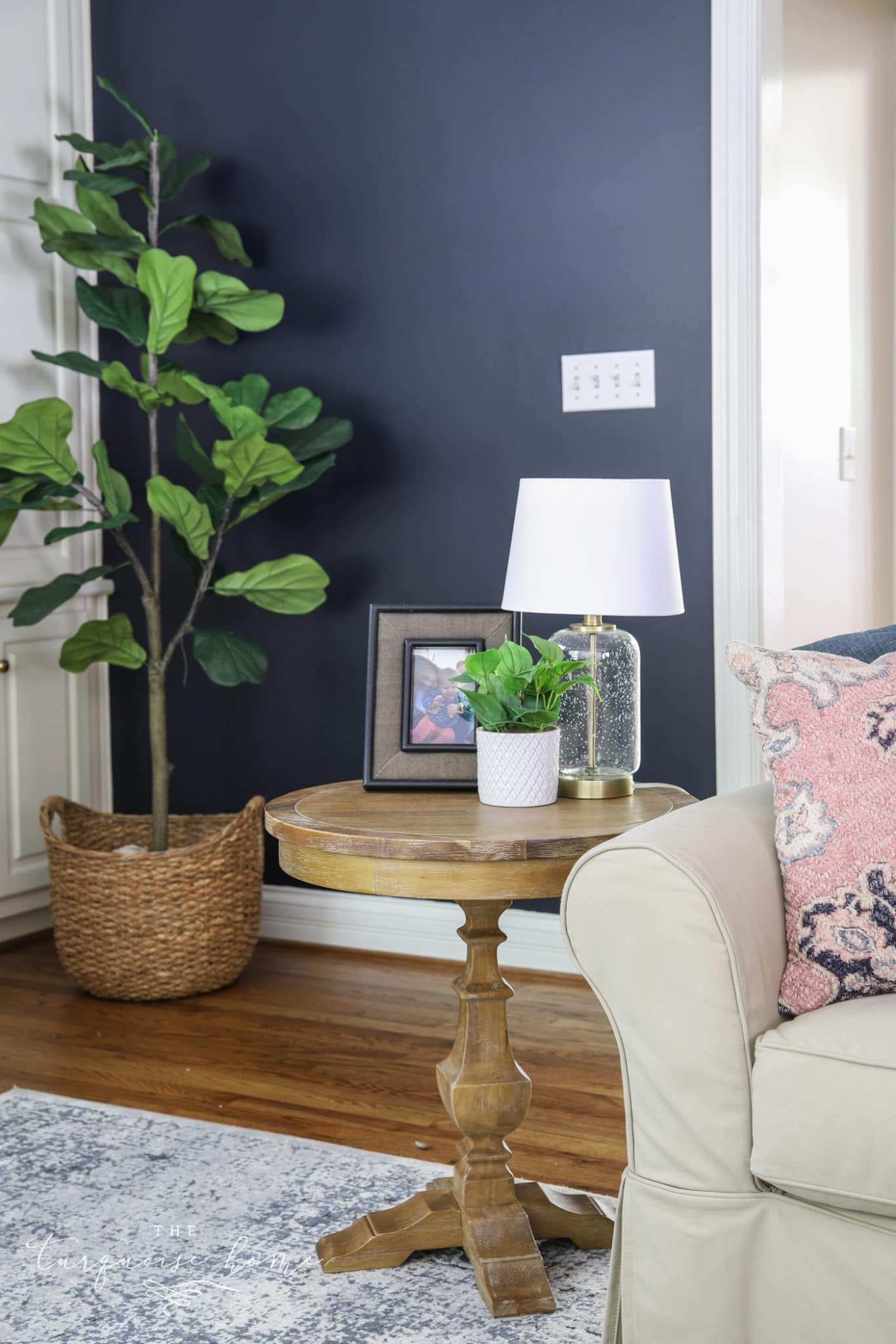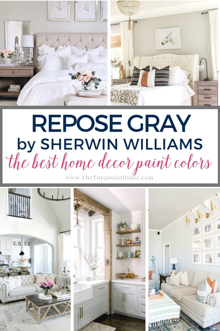
Repose Gray by Sherwin Williams is one of the most popular gray shades for a very good reason: it works almost everywhere. No matter the style of home, the lighting or the accents, Repose Gray makes everything look good.
Sherwin Williams Repose Gray
Repose Gray is a very livable color that never feels sterile or stark. It's a slightly warm gray with a faint taupe undertone. While there's no such thing as a true gray-gray, this color comes pretty close! Like every paint color, it will look different in every room, but it works every single time.
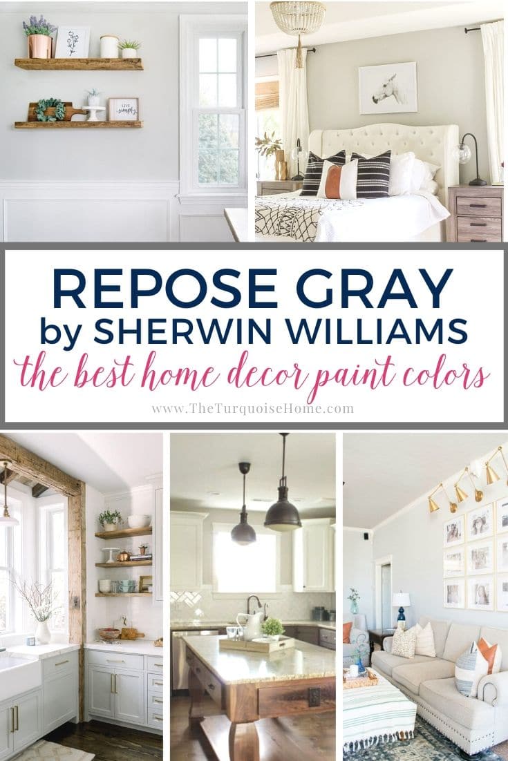
For example, in north-facing rooms with lots of greenery outside (trees, shrubs and so on), the paint picks up that undertone and looks very slightly greenish-gray.

Depending on the lighting, you may also notice subtle purple undertones. That purple hue is what gives Repose Gray its cozy, livable feel.
NOTE: If you're painting the room yourself, these tools will make a big difference. And this post shares my best tips for painting a room in 5 easy steps.
PRO Tip
Whenever you choose a new paint color, try out the real paint color in your home first!
The easiest, quickest way to do that is with Samplize! I use them exclusively for paint samples now. There's no mess and no leftover pots of paint. Plus, these no-mess, peel-and-stick rectangles are made from real paint, easy to move around the room and easy to save for future reference!
Order REAL Paint Samples
What Colors Go with Repose Gray?
Almost every color imaginable looks good with Sherwin Williams Repose Gray. However, the company specifically highlights these three coordinating colors:
- Elder White SW 7014
- Pavestone SW 7642
- Coral Clay SW 9005
Repose Gray vs. Revere Pewter
Repose Gray and Revere Pewter are the two top home paint choices for a gray/beige (or greige) interior. When someone is staging a home for sale, I always recommend one of these two for an appealing, all-over look. Honestly, I still choose one of these colors for rooms in my own home. They work so well with both warm and cool palettes.
Both colors are a great choice if you're looking for an all-over neutral for your whole-home color palette.
BUT they aren't the same. Repose Gray leans more toward gray than Revere Pewter, which leans more greige with taupe undertones.
I painted our last living room in Revere Pewter, and our current master bedroom is Revere Pewter too.
Repose Gray Room Examples
Now for the fun part: let's look at Repose Gray in real rooms! Nothing replaces painting a swatch on your wall and seeing how it looks in your home, but these rooms will give you a good starting point.
Kitchens with Repose Gray
Very few paint colors work as a wall paint, a trim paint and a cabinet paint. Repose Gray is one of those rare unicorns.
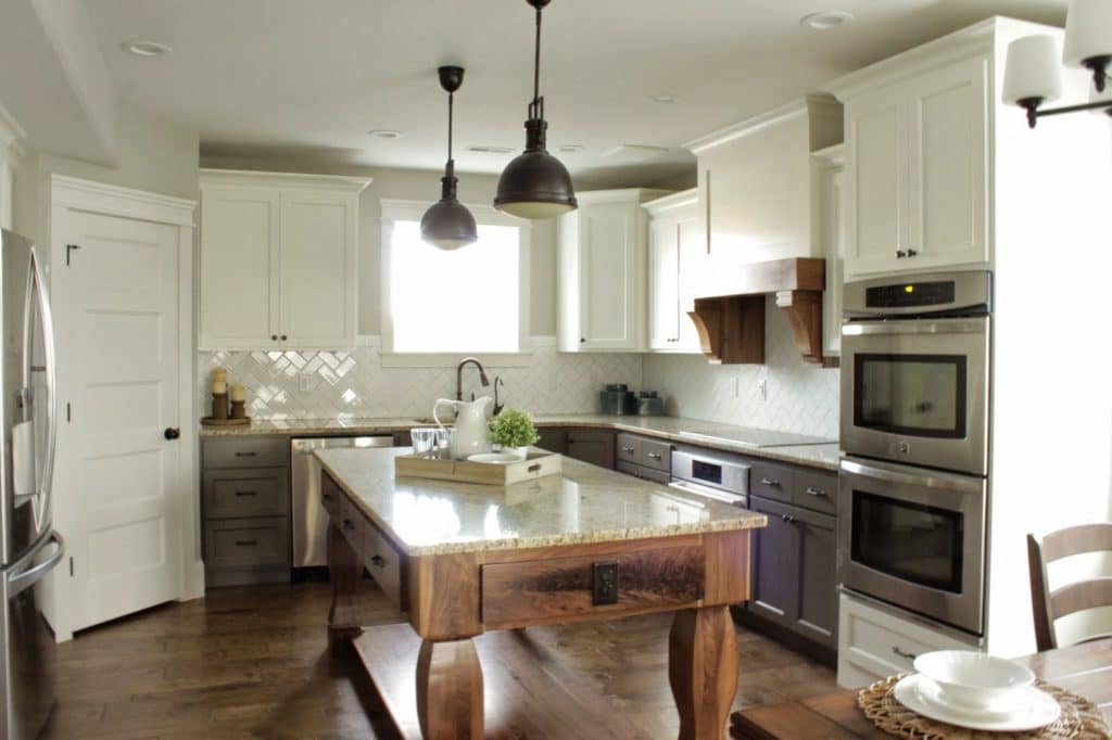
This kitchen from Numbered Street Designs uses Repose Gray as the wall paint to make the white cabinets really pop. It wraps onto the ceiling as well, which I love. It makes the whole room feel warm and inviting.
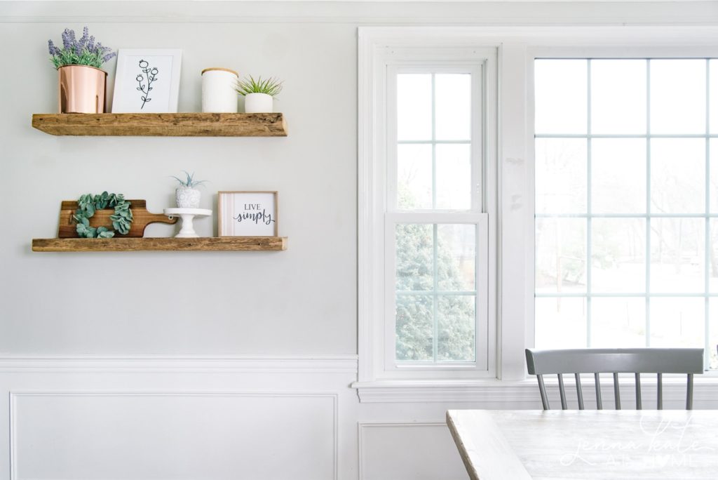
I've always loved the blog from Jenna Kate at Home, and her kitchen is no exception. You all know I'm a big fan of open shelving in the kitchen, and I love how her wooden shelves stand out against the Repose Gray backdrop.
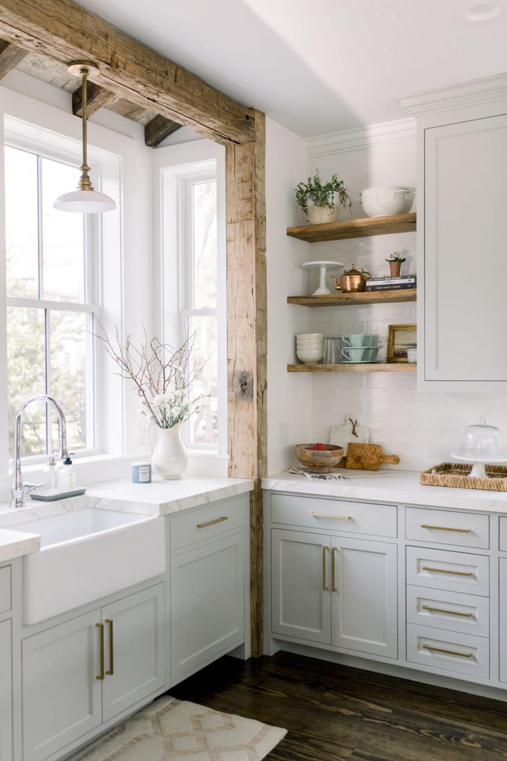
Now let's look at Repose Gray kitchen cabinets! This kitchen from Finding Lovely is stunning. I love the wood accents, the marble counters and, of course, the Repose Gray cabinets. This color works so well with marble, so put it at the top of your list if you're doing a kitchen makeover with new counters.
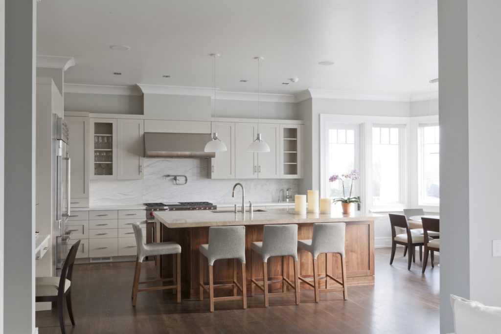
Here's another example of why Repose Gray is the best gray for a kitchen. In this home from Architecture Digest, the kitchen walls are painted Repose Gray. It looks fantastic with the cabinet color, Eider White by Sherwin Williams, one of the coordinating colors listed above.
Repose Gray in Living Rooms
If you have an open floor plan and want a whole-house color, Repose Gray is an excellent choice. It's airy enough to keep your home from feeling heavy, but it has enough depth to add visual interest.
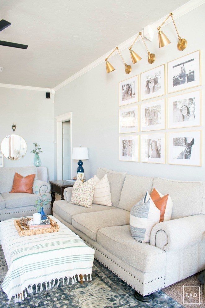
Even if your living room isn't an open floor plan, Repose Gray still looks wonderful. In this room you can see a bit more of the green undertones we talked about earlier, but only just. It's still a soft gray overall. I don't see it paired with gold accents often, but I really like how Project Allen Designs put it all together.
Project Allen Designs
Repose Gray in Bedrooms
Repose Gray is one of those neutral paints that dreams are made of. You don't want anything too distracting or colorful in a room where you plan to sleep and rest.
For example, this bedroom looks like the perfect spot to curl up for a long nap. Designing Vibes packed in a lot of elements I really like, and Repose Gray is the perfect backdrop for all of them.
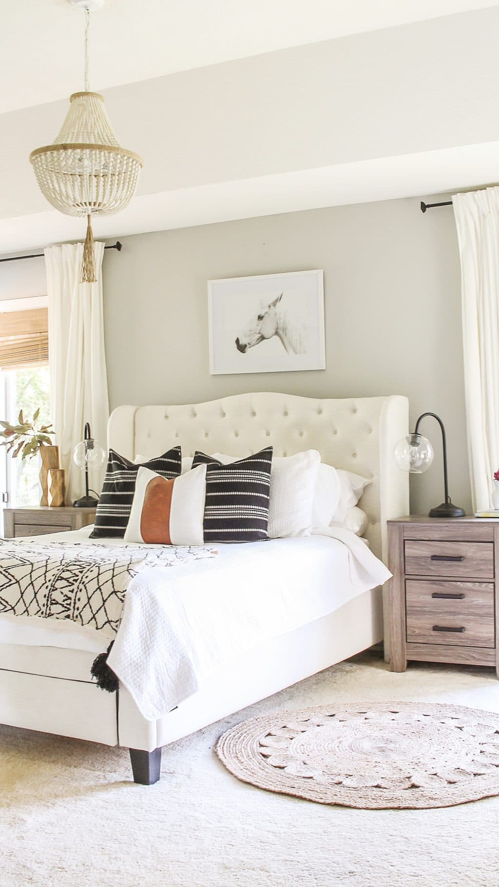
When I choose a paint color, I often look for one that allows me to play with accessories freely. The last thing I want is a color that I can only use baby blues or deep greens with. And this one is so versatile that you can choose any accent color that you want!
So, have I convinced you yet? Grab a can of Repose Gray and try out a swatch or two to see the magic for yourself.
More of the Best Home Decor Paint Colors:
Tips for Painting a Room Yourself
I've gathered some of the best tools for painting a room yourself. First, check out my post: Painting a Room in 5 Easy Steps. These are the top tools I use when painting my own rooms, which is how they get painted 95% of the time!
- Paint brush – These are a bit pricier than basic brushes, but they're worth it! I've used these for more than a decade. If you wash them thoroughly after each use, they'll last for years.
- Painter's tape – an absolute must for taping off edges. Unless you have a steady hand, you'll want to tape off every edge.
- Drop cloths – a must if you don't already have some lying around the house.
- Paint cup – Sure, you could use any old cup, but I've come to swear by this one. The magnetic piece holds your brush neatly in place when you take a break. And it fits my hand perfectly, so it doesn't cramp me.
- Roller tray – This is the only paint tray I'll ever use again. The magnetic piece is great for holding the roller in place. The liners are a luxury, but I won't paint without them because they make cleanup a breeze!
More Posts You Will Love: