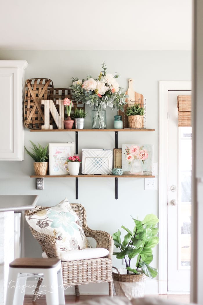
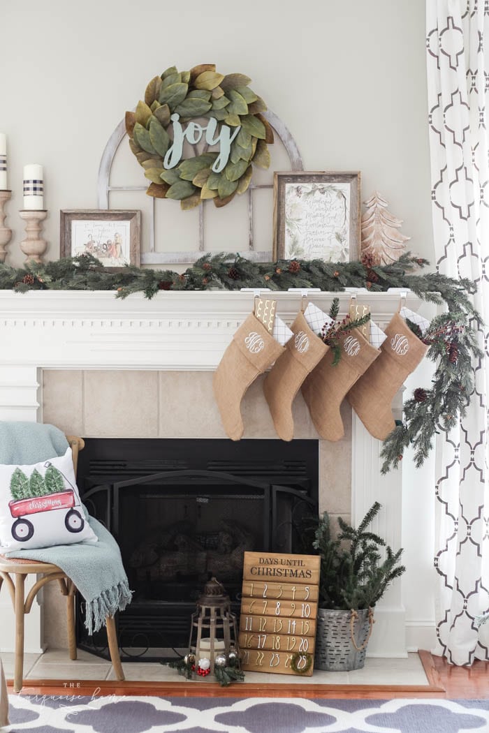
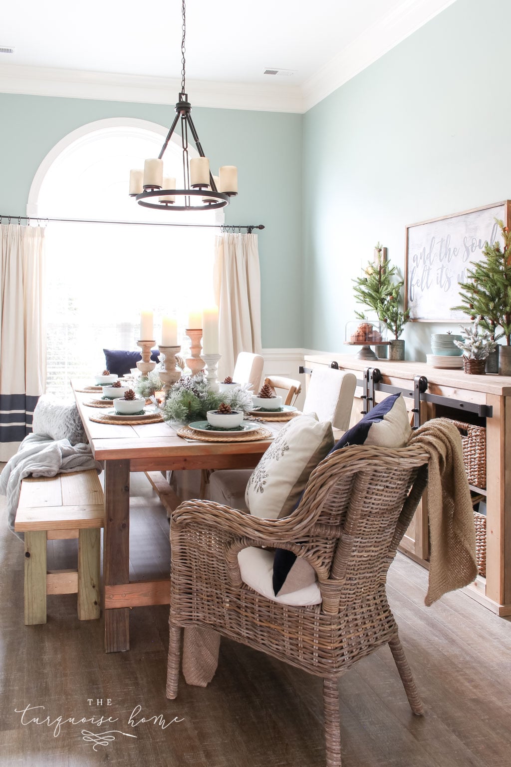
Today I'm introducing a color you may not have heard of but really should check out: Sherwin Williams Comfort Gray. Read on to learn everything about this lovely gray, including how it looks in different rooms.

When you want to make a major but relatively easy change to your decor, I always suggest starting with paint. It's an affordable refresh that's simple to change later on. And it costs far less than new furniture (or a new house!).
Still, the tough part of painting a room is, as you can guess, picking the color!
Warm or cool... gray or beige... greige or white? Before you know it, your brain is spinning and you haven't made any progress toward a fresh look.
That's exactly why I write this paint color series and highlight beautiful, no-fail shades. I want to help you spin your wheels less and enjoy picking a color more, because it can be so much fun!
PRO Tip
Whenever you're choosing a new paint color, test the real paint color in your home first!
The quickest, easiest way to do that is with Samplize! I use them exclusively for paint samples now. There's no mess and no leftover sample pots. Plus, these peel-and-stick rectangles are made from real paint, easy to move around the room and simple to save for future reference!
Order REAL Paint Samples
Choose the Best Color for You
I'm a big fan of a good neutral – Edgecomb Gray, anyone? But one family of colors that's getting well-deserved attention right now is the blue-green family. A good blue-green (or green-blue!) paint can be pure bliss in your space if you take the time to pick the right one.
Enter: Sherwin Williams Comfort Gray.
When I see Comfort Gray in action, I instantly have an "ahhhhhh" moment as calm washes over me. It's a color that really encourages relaxation and has a peaceful, zen quality.
Just the name "Comfort Gray" brings serenity to mind, doesn't it?

Comfort Gray in My Home
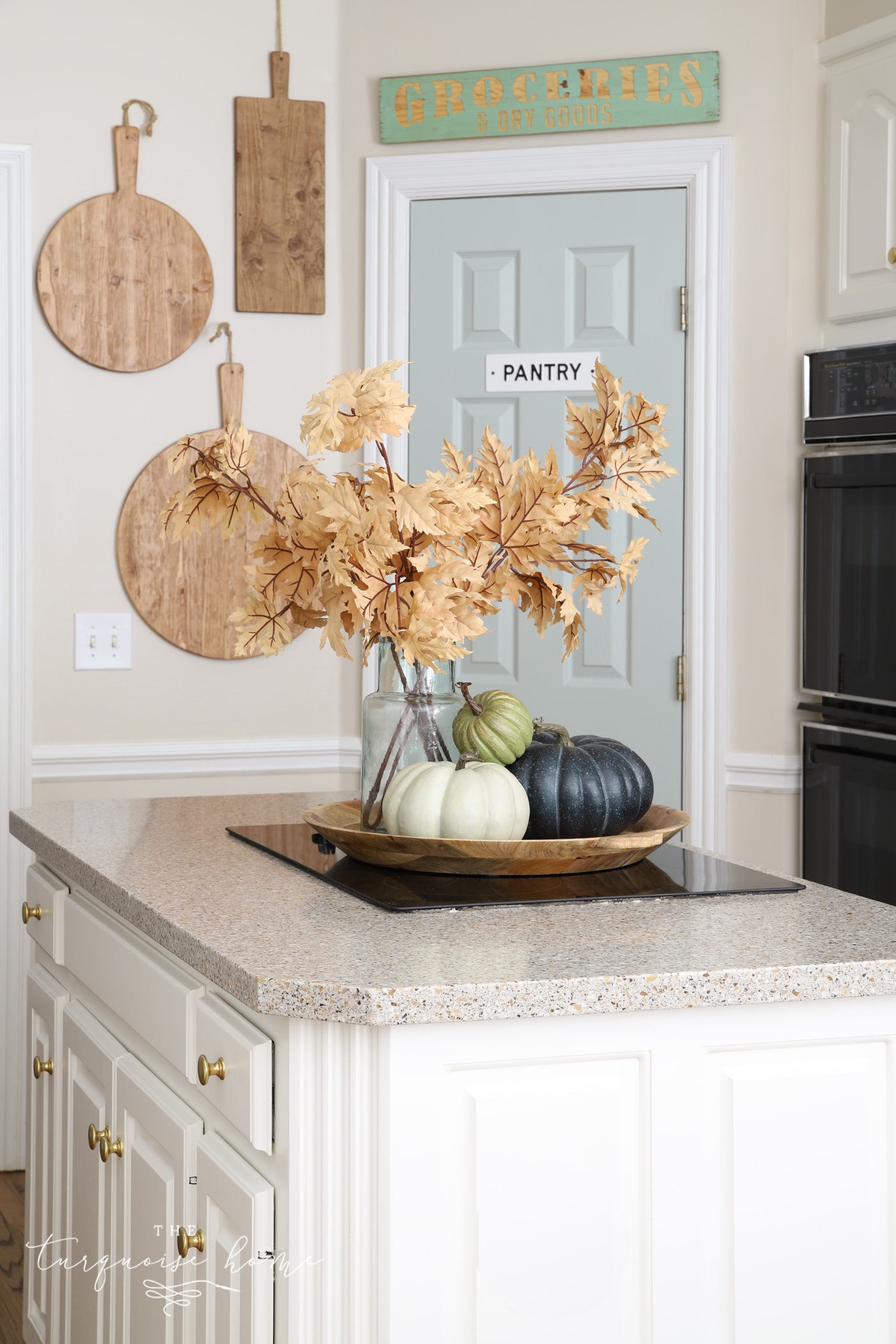
I recently fell for this color while I was searching for a pantry door shade. Isn't it fun to paint a door a different color and let it bring fresh life and color into a room? I don't know if I'll keep this color forever, but I absolutely love it in my kitchen!
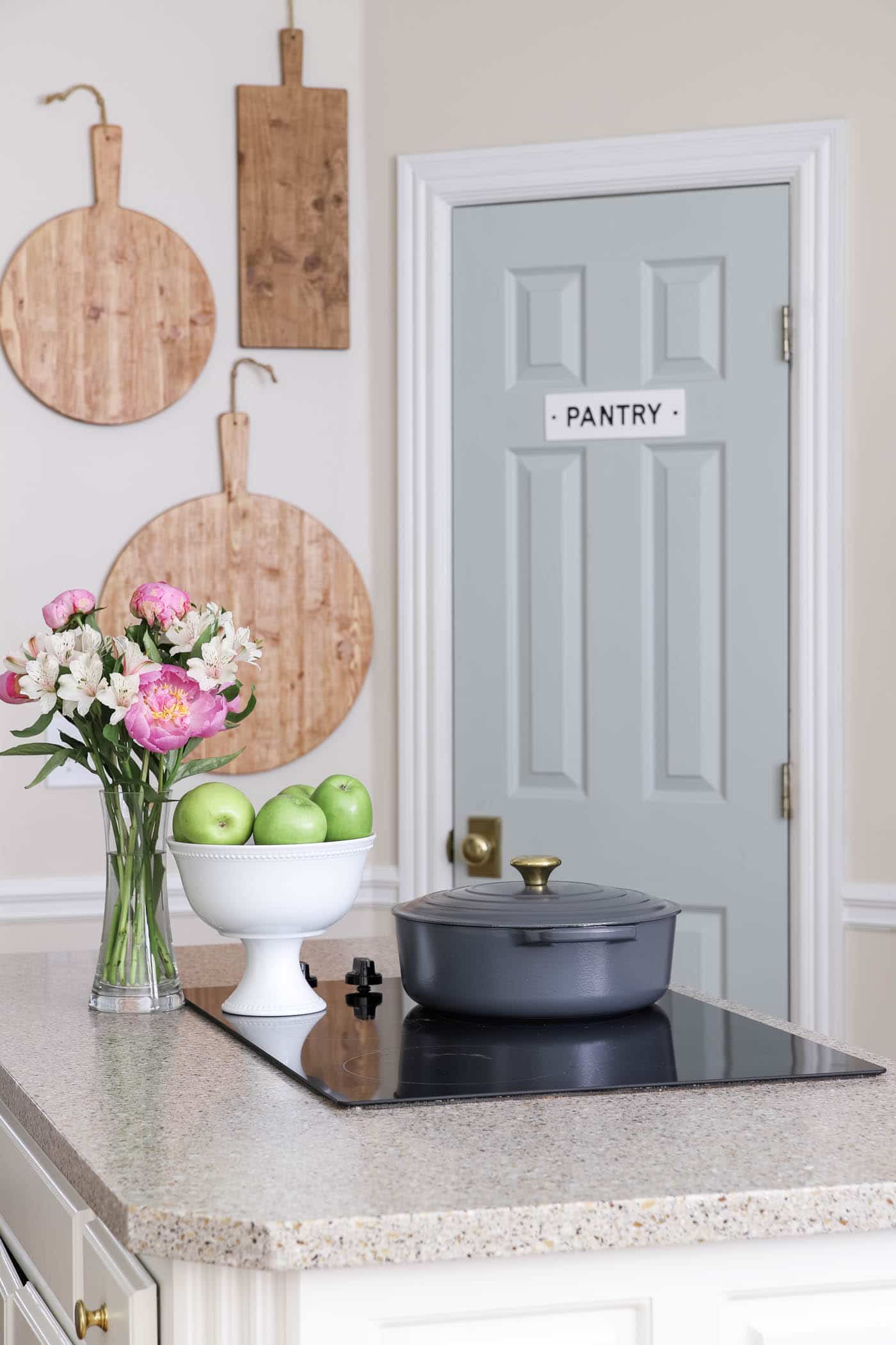
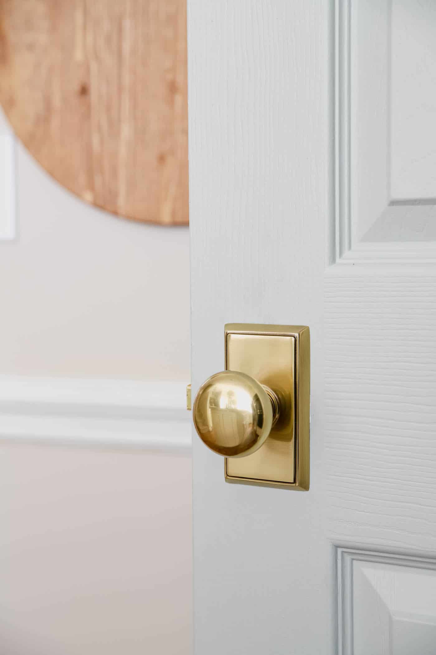
The color looks lovely with this brass doorknob.
What You Need to Know About Sherwin Williams Comfort Gray
At first glance, Comfort Gray may look "mint" to some people. But it's really so much more than that. It has layers.
Comfort Gray is a bit of a chameleon. It isn't gray, blue or green, yet it's a very popular color that shifts between blue-green in some areas and green-blue in others, depending on the light.
When you look at Comfort Gray, you may think of Sherwin Williams Sea Salt (another favorite of mine!), and I completely understand why. In fact, Comfort Gray is essentially a slightly deeper version of Sea Salt. It reminds me of that gray-green sea glass you can find on beaches all over the world.
It's a cooler color and works really well to balance out the warm light in south-facing rooms (much like blue sea glass balances against the warm tones of sand).
Comfort Gray Undertones
Comfort Gray is definitely in the gray family, but its green and blue undertones make it an appealing option for anyone who wants a neutral paint with a hint of color.
It's that perfect ever-changing shade that adds variety for those who crave it, while still providing a neutral backdrop for your decor.
What Colors Coordinate with Sherwin Williams Comfort Gray
One of the best things about Comfort Gray is how versatile it is. Thanks to its chameleon nature, it pairs well with many different colors.
In general, this lovely shade works well with many sand tones, caramel, bronze shades, teal and terra cotta, as well as bright colors like watermelon or coral.
If you're looking for specific colors to pair with Comfort Gray, check out:
- Dover White (SW 6385)
- Spare White (SW 6203)
- Snowbound (SW 7004)
- Foxy (SW 6333)
- Bagel (SW6114)
- Moody Blue (SW 6221)
- Greek Villa (SW 7551)
- Amazing Gray (SW 7044)
- Rain (SW 6219)
- Retreat (SW 6207)
- Special Gray (SW 6277)
- Balanced Beige (SW 7037)
- Virtual Taupe (SW 7039)
- Mystical Shade (SW 6276)
Comfort Gray is seriously versatile. A list of every color it would look great with would be overwhelming and not very helpful! Just know that many other colors can look amazing when paired with Comfort Gray.
If you have a particular color in mind, put a sample next to SW Comfort Gray in the room you want to paint and see for yourself.
Comfort Gray in Action in Different Rooms
The best way to start narrowing down your color choices is to see your picks in action. I've gathered several examples of Comfort Gray in different rooms of the house and under different types of lighting so you can see how it behaves.
Sherwin Williams Comfort Gray in Kitchens
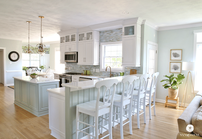
If you love a bright, relaxed coastal look, Comfort Gray is your go-to color, as in this kitchen from Sand and Sisal. You don't need to live at the beach to enjoy that fun coastal vibe in your own home!
You can also add it in small doses, like I did in my kitchen below by painting only the door! I love how it pairs with my Edgecomb Gray walls.
Comfort Gray in the Dining Room
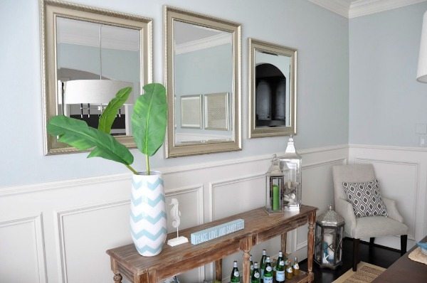
Honey We're Home used Comfort Gray, and thanks to the lighting, it reads more blue than green here. Pair it with silver and blue accent pieces for a gorgeous look.
SW Comfort Gray in Bedrooms
Comfort Gray is so versatile that it works with all the different tones in this bedroom. An excellent color choice by the Schell Brothers. It takes one seriously flexible color to work with gold, brown, white, black and rose all at the same time!
Many grays and beiges just can't pull that off, and that's what I love most about Comfort Gray.

Bedrooms should be serene spaces where you can unwind and recharge. Comfort Gray turns a space from ordinary to peacefully serene in a way few other colors can. Look how calming and beautiful this primary bedroom by Carolina Design Associates, Inc. is.
Bonus: the room doesn't feel too bright, even with all the natural light it gets from its many windows.

Comfort Gray in Living Rooms
I love decorating the living room in a nice, neutral way so it helps bring together the decor from around the house. Neutral doesn't have to mean boring, as this example from Bardi Designs shows.
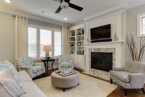
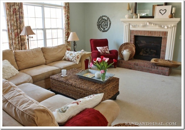
Comfort Gray may be known as a coastal decor color, but it works quite well in traditional and transitional designs too. Sand and Sisal did a terrific job pairing warm, sand-like tones with the Comfort Gray walls in this living room.
Sherwin Williams Comfort Gray in Bathrooms
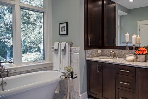
Comfort Gray shines in this bathroom from Home Bunch and beautifully ties together the browns, whites and grays found all around the room. It's striking yet light, almost pastel, thanks to the lighting!
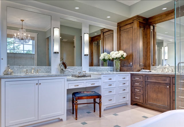
Here's another lovely bathroom example from Allard & Roberts Interior Design, Inc. In this lighting, Comfort Gray reads as gray with green undertones. It's soothing and very chic.
Comfort Gray Stairways
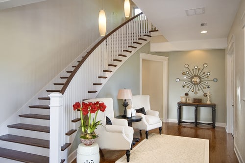
Comfort Gray is subtle, elegant and hardworking in this entry and stairway area by Dibros Design and Construction. It does a standout job of complementing the browns, blacks, pewters, creams and whites.
Honestly, Sherwin Williams Comfort Gray looks amazing in almost any room. Are you ready to give this great color serious thought?
More Favorite Paint Colors in the Best Home Paint Colors Series: