If you're thinking about Sherwin Williams Sea Salt for your kitchen, you're in good company. It keeps showing up for good reason.
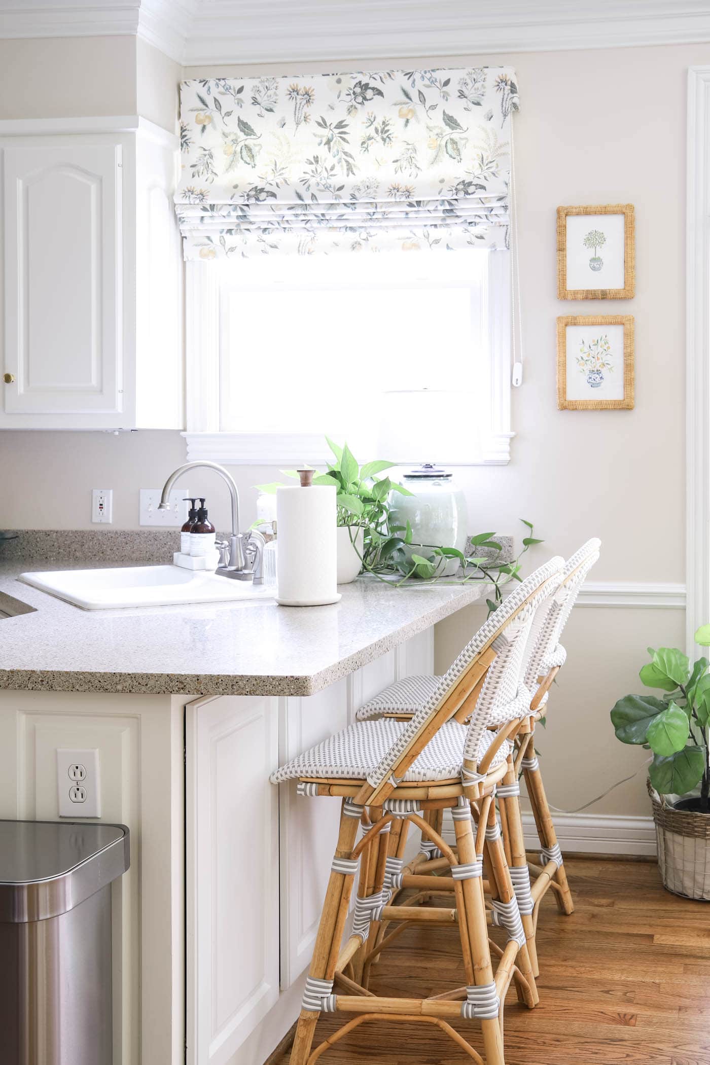
When we painted our kitchen Sea Salt, I wanted something soft and airy without feeling stark. I wanted color, just not a loud one. I was after something calm, layered, and lived-in!
But here's what I've learned after living with it: this color is a bit of a chameleon. Depending on the lighting, cabinets, and finishes, it can lean blue, green, or even soft gray. That's exactly why so many people have questions before they commit. Today I'm sharing real-life photos of my Sherwin Williams Sea Salt kitchen, what its undertones really look like, how it shifts in different lighting, and what I'd tell you before you open that paint can.
I've since used this color in several more rooms, including the haint blue ceiling on my new back porch and my current primary bathroom. It's lovely and versatile for many spaces in your home.
Let me show you around!

What Color and Undertones Does Sherwin Williams Sea Salt Have?
Before we get into the photos and how I chose to paint the walls, let's cover Sea Salt. I've written a full deep dive on this color in my paint color spotlight. For now, here are some quick notes on its color and undertones.
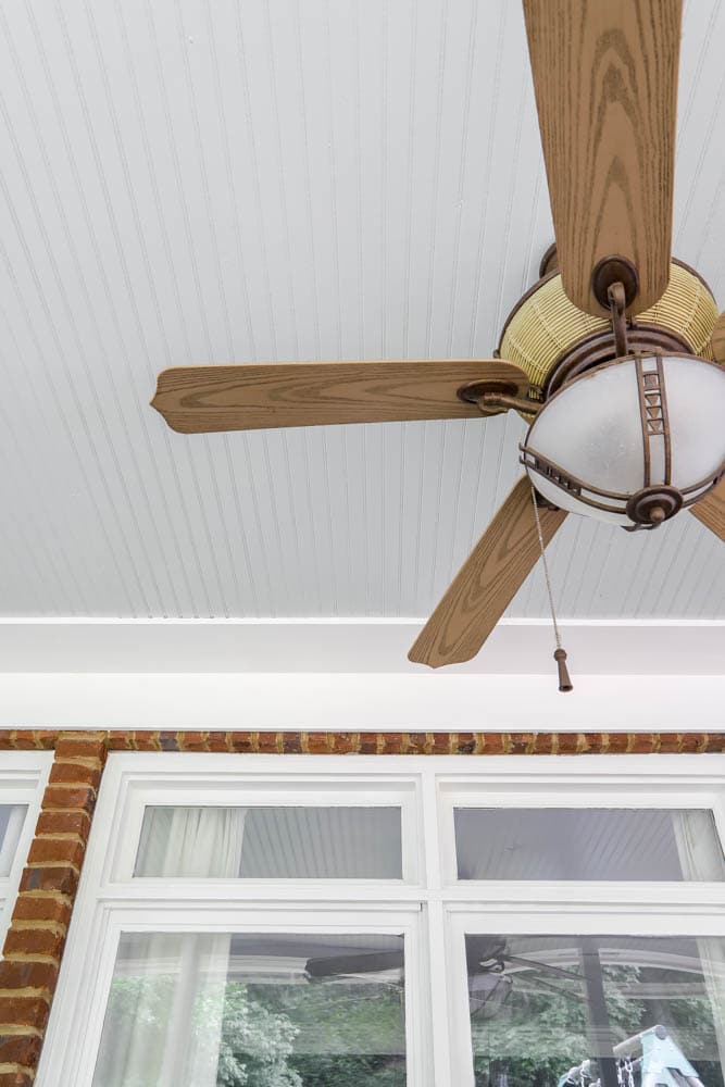
Sherwin Williams Sea Salt is a soft blue-green with a gentle gray base that keeps it from feeling bright or beachy.
People often call it a chameleon because it shifts beautifully with the light. In bright natural light it can lean toward an airy blue, while in warmer or dimmer light the green undertones come forward. Thanks to its subtle gray foundation, it always looks muted and livable rather than bold or saturated. It strikes a balanced mix of calm, coastal, and classic, which is why it suits kitchens and open living areas so well.
Why I Picked Sherwin Williams Sea Salt for My Kitchen
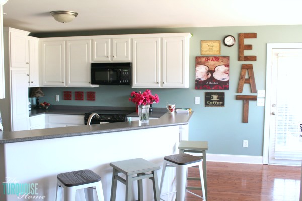
My kitchen is now painted Sea Salt! Hooray! A few months ago I painted the cabinets Simply White (Benjamin Moore), and then decided that the old wall color was too dark.
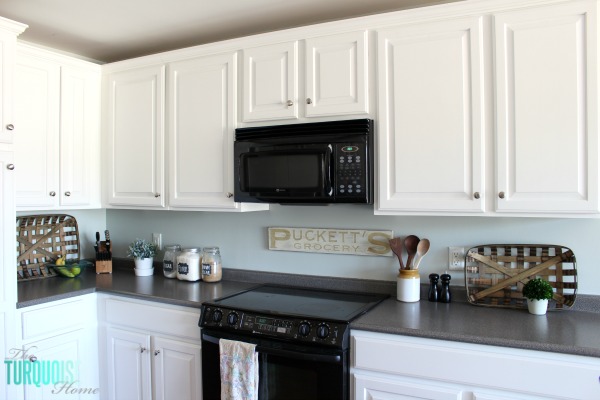
The old color was Benjamin Moore Stratton Blue. Once the cabinets were white, it created too stark a contrast, so I set out to find a lighter blue-green with a similar feel.
I looked at many light blue-green shades and narrowed the list to these two:
Sea Salt (Sherwin Williams) … versus … Palladian Blue (Benjamin Moore).
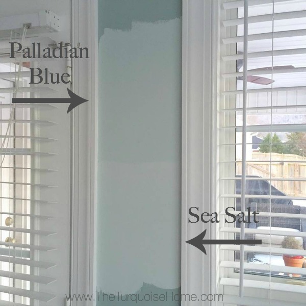
I followed my process for choosing the right paint color from the start. I'm very glad I did, because otherwise I would have picked the wrong shade. This way I got it right the first time, and I absolutely love it!
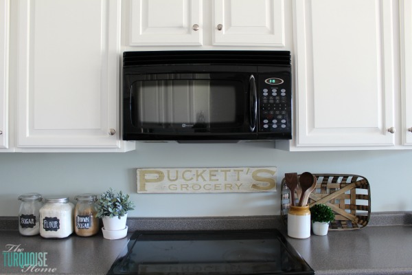
My mom came over last week while my husband was off for Spring Break and could watch the kids. We finished the job in one day. Woohoo! (Thanks, Mom!)
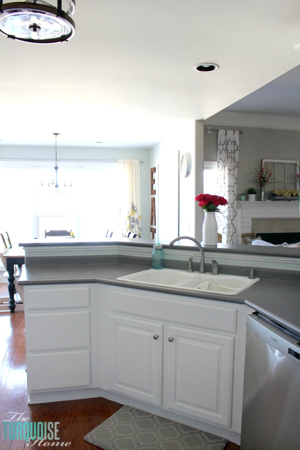
I love how light and bright the new color makes the kitchen feel.
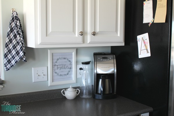
Okay, so here's the fun part.
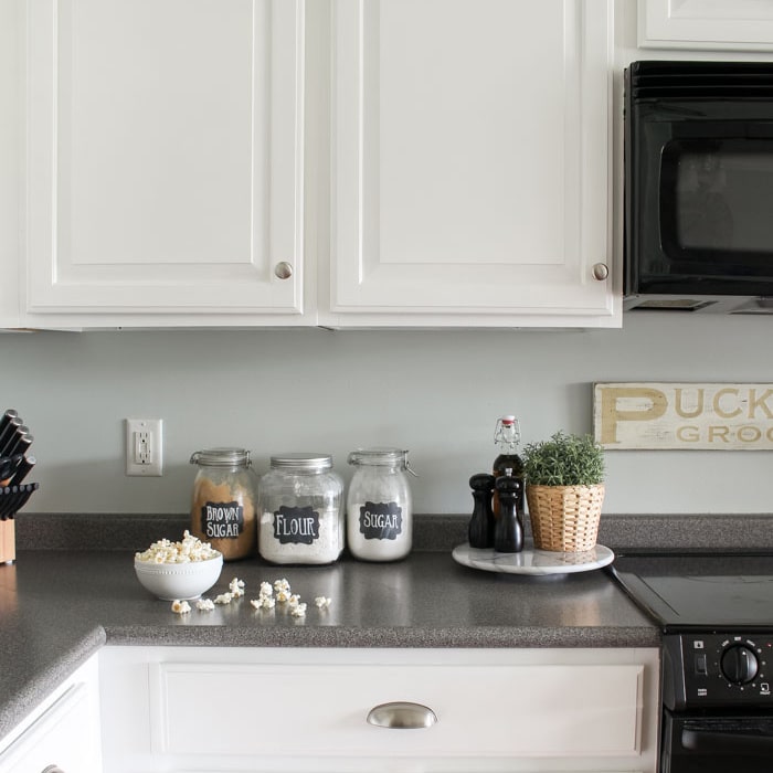
I've wanted to replace my countertops since we moved into this house. Back then the walls were beige and the cabinets were honey oak, and the dark gray countertops just never worked. They looked so out of place.
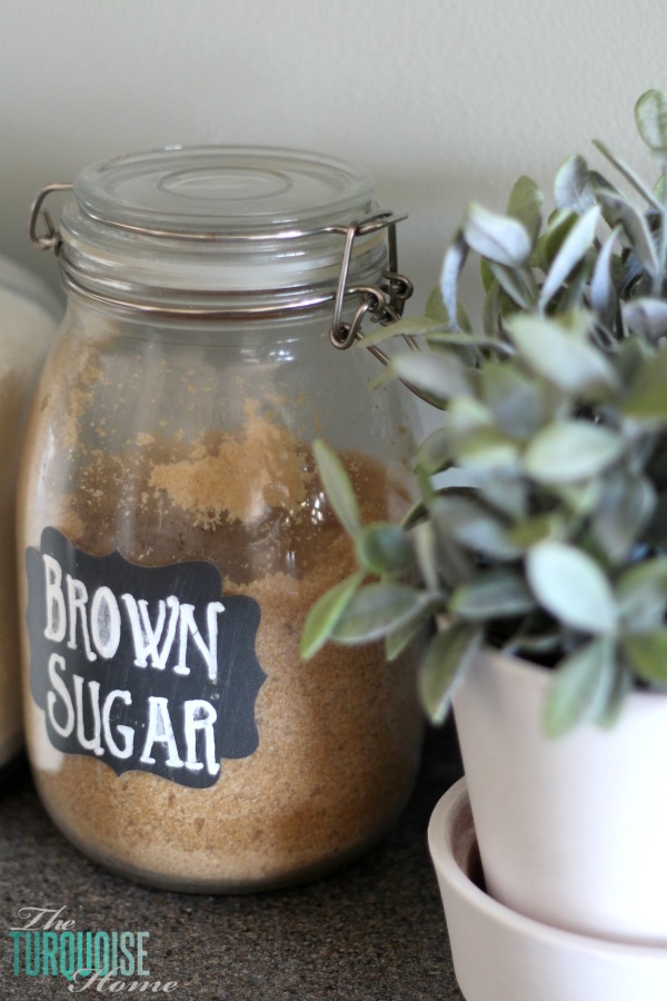
Back then we had blue-green walls, oak cabinets, and gray countertops. Once we painted the cabinets white, the countertops were acceptable.
Now that the walls are Sea Salt, I almost like them… at least a lot more than before!
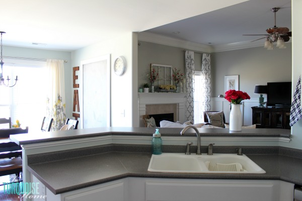
I'm thinking about keeping them for now.
Sure, they're laminate and not in the best shape, but until we can afford new ones along with a new sink and faucet, I think we'll leave them be.
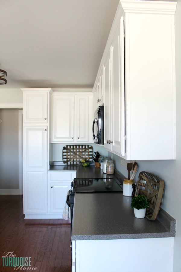
Okay, here's where I need your help. I've always wanted a white subway tile backsplash. My options are:
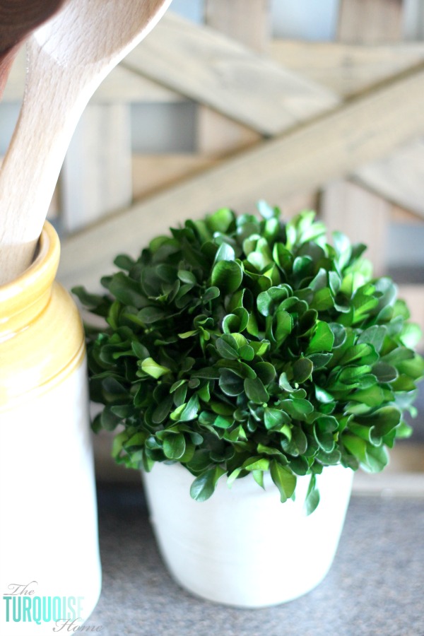
- Install the subway tile now with the current countertops, even though I'll eventually replace the small backsplash attached to them. That would leave a gap between the tile and the new countertops, which means I'd have to go back later to finish the backsplash.
- Wait to install the subway tile until I have my dream countertops, and enjoy the Sea Salt walls above the counters in the meantime.
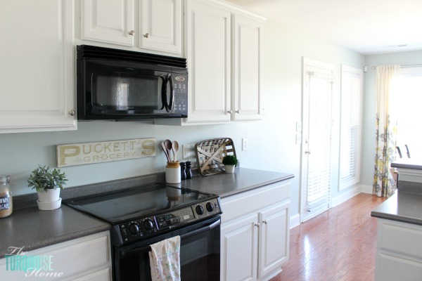
So tell me in the comments which option you'd choose. I already have a leaning, but I'd love to hear your take. Your opinions have changed my mind before!
Until I decide, I'll enjoy the new wall color back there.
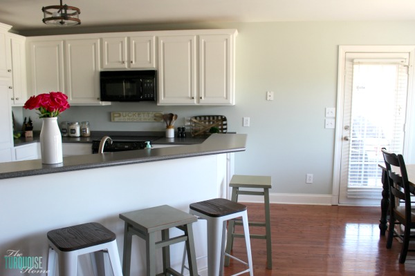
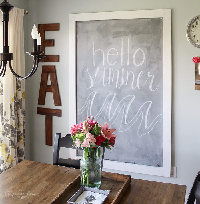
I still have a few more updates planned. I'm not sure the old curtains suit the new color, so I'll keep an eye out for something else.
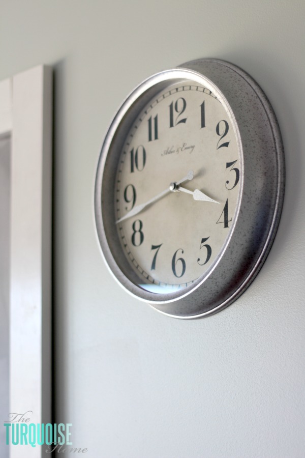
One new addition since painting is this cute clock with a galvanized finish from Target. It's actually plastic with a galvanized coating. I love it! I'll add a few more things to that wall and then call it finished.
I also want to refinish the table and chairs, though I'll probably need Mom back to help with that project. I may tackle it this summer while Coach is off from school.
More Posts You Might Enjoy: