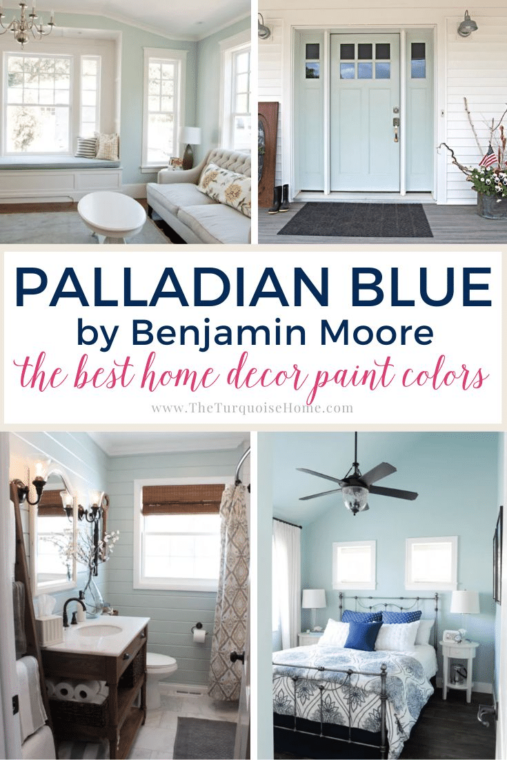
Palladian Blue by Benjamin Moore is a very popular muted blue-green paint color. This shade is a go-to light hue that brings a sense of calm and restfulness to any space.
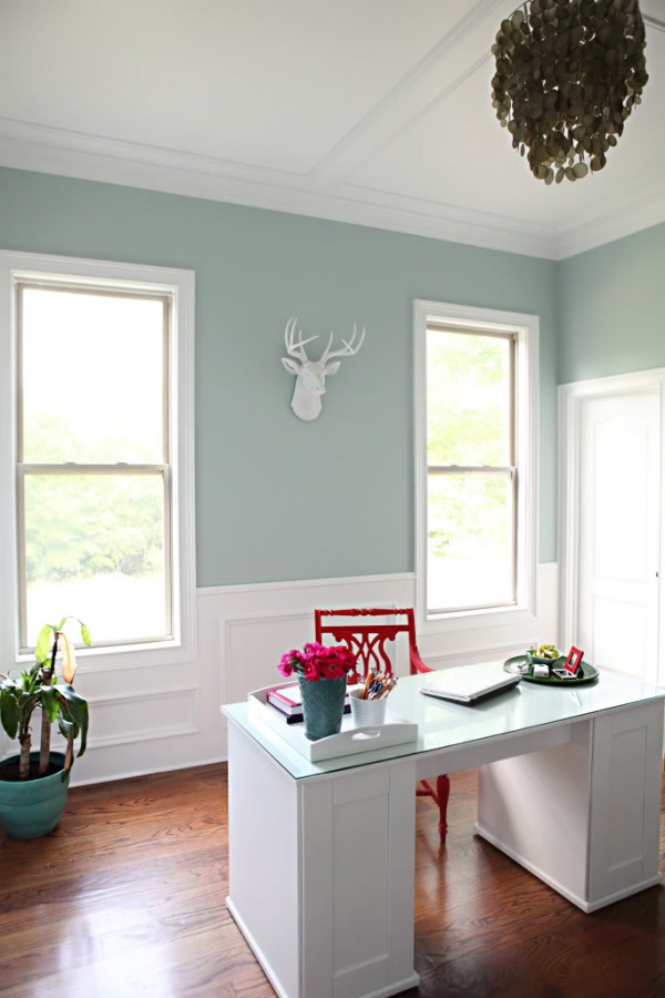
Benjamin Moore's Palladian Blue (HC-144) is a cool-leaning blue-green with gray undertones, giving it a crisp color that never looks too cold.
If you're looking for a paint color that will look effortlessly chic in any style of home, look no further than today's featured hue! BM Palladian Blue is a versatile muted blue-green (similar to but darker than Sea Salt) that has become one of Benjamin Moore's most popular shades.
I also seriously considered it for my kitchen. It took me a long time to choose between Sea Salt and Palladian Blue, and in the end I picked Sea Salt for my kitchen, mainly because of the lighting and decor in that room.
That being said, Palladian Blue still holds a special place in my heart!
Let's take a deep dive into Palladian Blue and explore this beautiful paint color. Try a sample of Palladian Blue here!
What color is Benjamin Moore Palladian Blue?
Here are the quick highlights to note about this great shade:
- Cool-leaning blue-green with gray undertones
- Light shade with an LRV of 60.4
- A wonderful and popular choice for walls, kitchen cabinets, doors, and more
- Versatile, neutral color that works with any home decor and style
- Makes a room feel calm and spa-like
Palladian Blue Undertones
This paint color is a versatile muted blue-green. Since it blends so many colors, it has a lot of flexibility. At times (especially in cool lighting), it will look bluer or more muted. In warm lighting, you'll notice more green.
NOTE: This beautiful shade pairs effortlessly with many colors, although I recommend not pairing it with shades that have purple undertones. But before you commit, swatch! Paint swatches are the best friend you never knew you had when pairing colors together!
PRO Tip
Any time you choose a new paint color, try out the real paint color in your home first!
The easiest and quickest way to do that is with Samplize! I use them exclusively for paint samples now. There's no mess and no leftover sample pots of paint. Plus, these no-mess, peel-and-stick rectangles made from real paint are easy to move around the room and easy to save for future reference!
Order REAL Paint Samples
LRV of BM Palladian Blue
Light reflectance value (LRV) is the amount of light a paint color reflects or absorbs. A higher LRV number means the color reflects more light (rather than absorbing it). In other words, an LRV of 100 is pure white, and an LRV of 0 is pure black.
Palladian Blue has a Light Reflectance Value of 60.4.
This shade sits firmly in the medium-to-light category. It's light enough to wash out in very bright natural light, but it has enough saturation that it will never look like some version of white.
Benjamin Moore Palladian Blue Coordinating Colors
BM Palladian Blue goes well with SO many colors! Benjamin Moore recommends pairing it with:
- Elmira White
- Persimmon
- Willow Creek
- Wood Grain Brown
In general, this shade looks terrific with whites, creams, greiges, grays, dark browns, corals and more. I especially love pairing it with a few of my personal favorites, such as:
- Hale Navy
- Revere Pewter
- Silver Satin
- Beach Glass
- Storm
- Comfort Gray
- Chelsea Gray
- Kendall Charcoal
- Sea Salt
What trim colors should I use with Palladian Blue?
If you decide you love Palladian Blue for your walls, I recommend a clean white for your trim (and ceilings) to create crisp contrast. Two good options are Benjamin Moore Chantilly Lace or Benjamin Moore White Dove.
Benjamin Moore Palladian Blue vs. Sherwin Williams Sea Salt
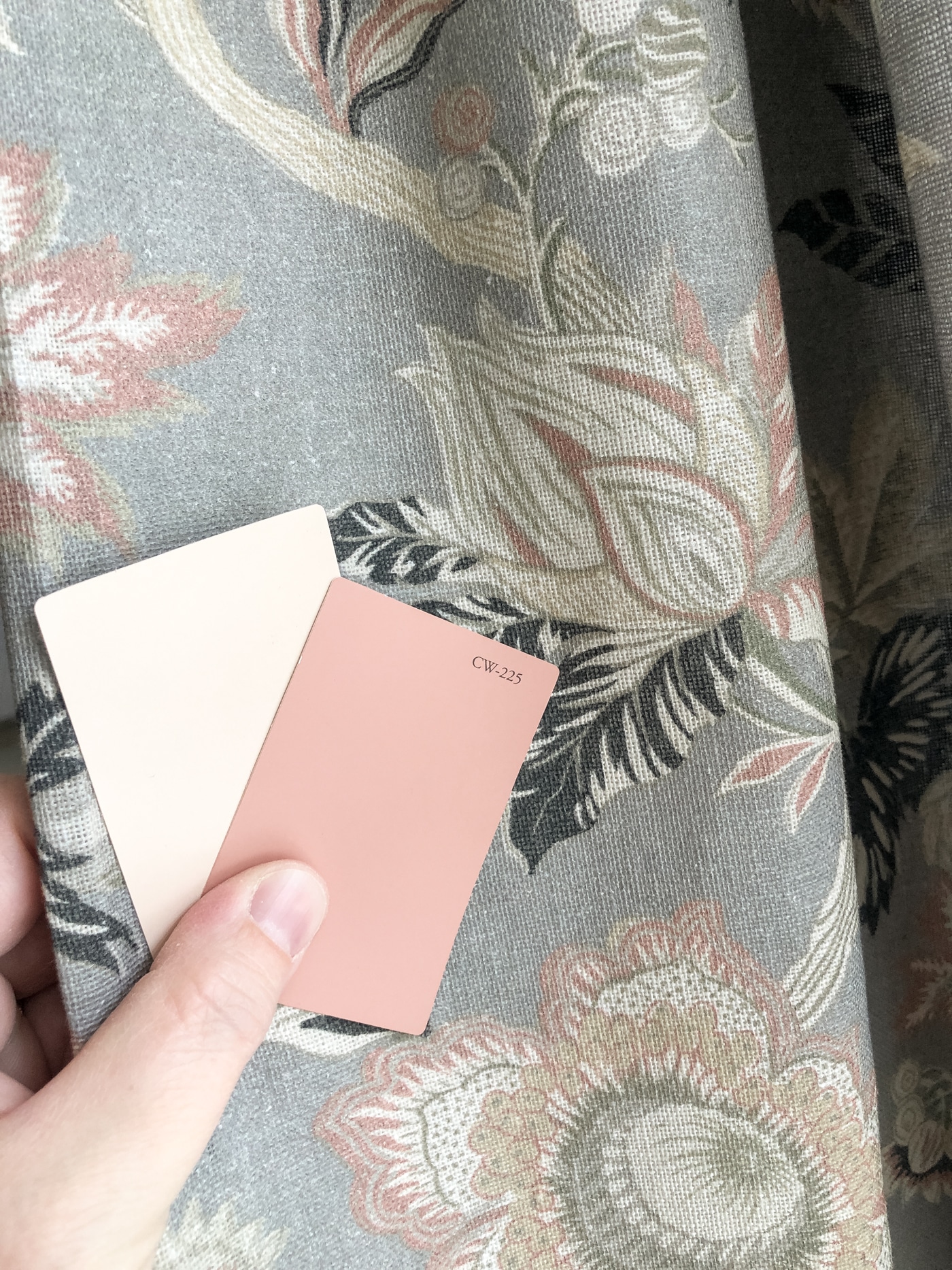
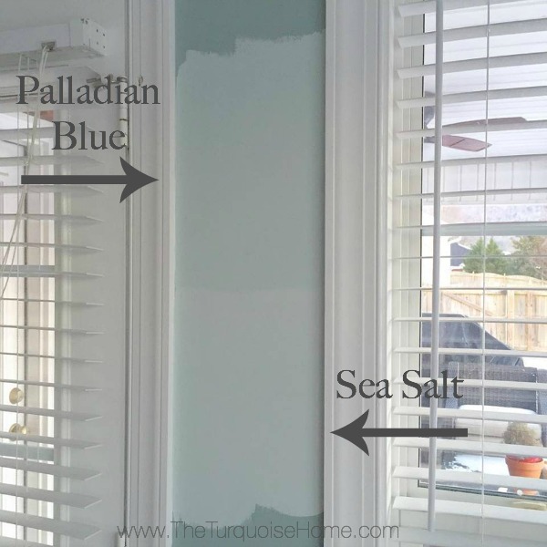
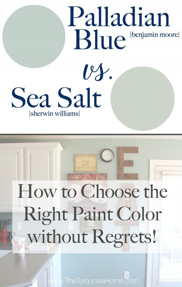
Sea Salt is a slightly lighter, airier blue-green than Palladian Blue, as you can see in my samples below. Sea Salt has an LRV of 63 and leans less blue than green.
Years ago I chose between these two colors for my kitchen. I originally painted the walls Stratton Blue (Benjamin Moore), but it felt too dark after I painted the cabinets white.
So the obvious choice was something similar to Stratton Blue, but lighter. Palladian Blue fit that bill! It's a shade lighter than Wythe Blue, and I just knew it would be perfect.
After sampling Palladian Blue and SW Sea Salt on the walls, I knew Sea Salt was the right choice.
I still LOVE Palladian Blue, and it would have looked beautiful on the wall, but this just shows how important it is to sample colors on the wall before choosing!
Benjamin Moore Palladian Blue vs. Wythe Blue
Sherwin Williams Wythe Blue has an LRV of 48, which makes it the darker of these two colors. Since Palladian Blue is brighter, it's a little more versatile than Wythe Blue because it doesn't need as much natural light to keep from looking too dark.
However, if you're looking for a paint color for a bright room that has some depth, Wythe Blue may be the better choice.
I used Wythe Blue in my former dining room.
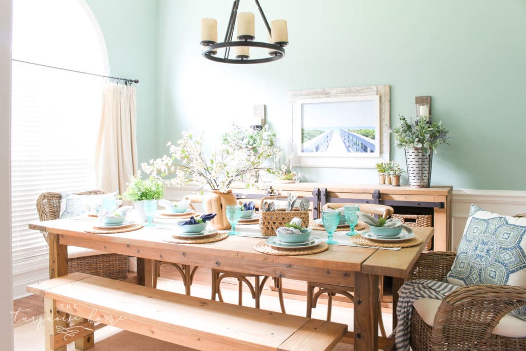
Where can you use Benjamin Moore Palladian Blue?
Palladian Blue is one of the most popular and versatile blue paint colors from Benjamin Moore. You can use it almost anywhere! Use it for:
- Walls
- Kitchen cabinets
- Vanities
- Accents
- Exteriors
- Ceilings
- Interior doors
Home Styles that Work with Palladian Blue
- Traditional
- Transitional
- Coastal
- Farmhouse
- Classic
- And more!
Room Examples using Palladian Blue HC-144
I think seeing paint colors in real-life examples is one of the best ways to rule a color in or out of your list of top choices. Here are a few examples of BM Palladian Blue in a variety of settings and rooms.
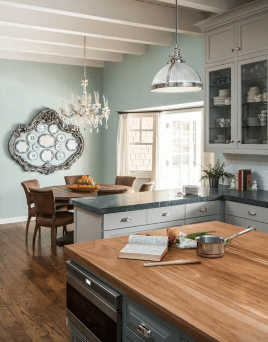
Kitchens Painted with Palladian Blue
Although I thought Palladian Blue was a little too dark for my kitchen, I adore how it looks in House of Turquoise's kitchen! Its gray undertones make it versatile enough to tie together the wood floors, white beam ceilings, gray counters and silver fixtures. Gorgeous!
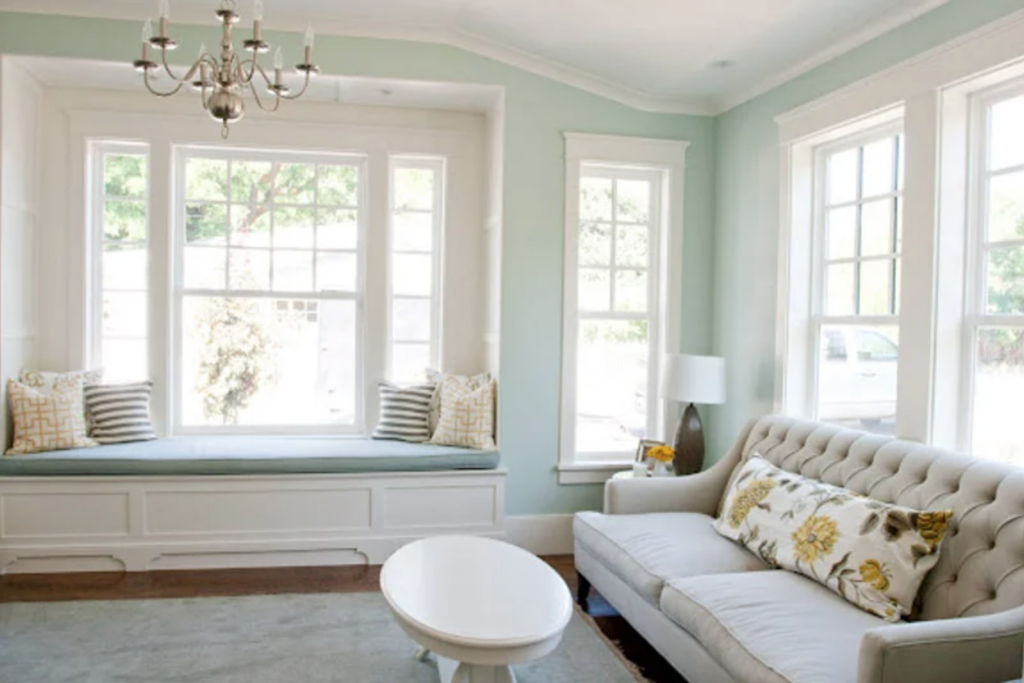
Palladian Blue Living Room
Whether your home is traditional, coastal or even modern farmhouse, bright natural light will make Palladian Blue look soft, with just the right pop of serene color. Use clean white trim, as Caitlin Creer did, for beautiful contrast.
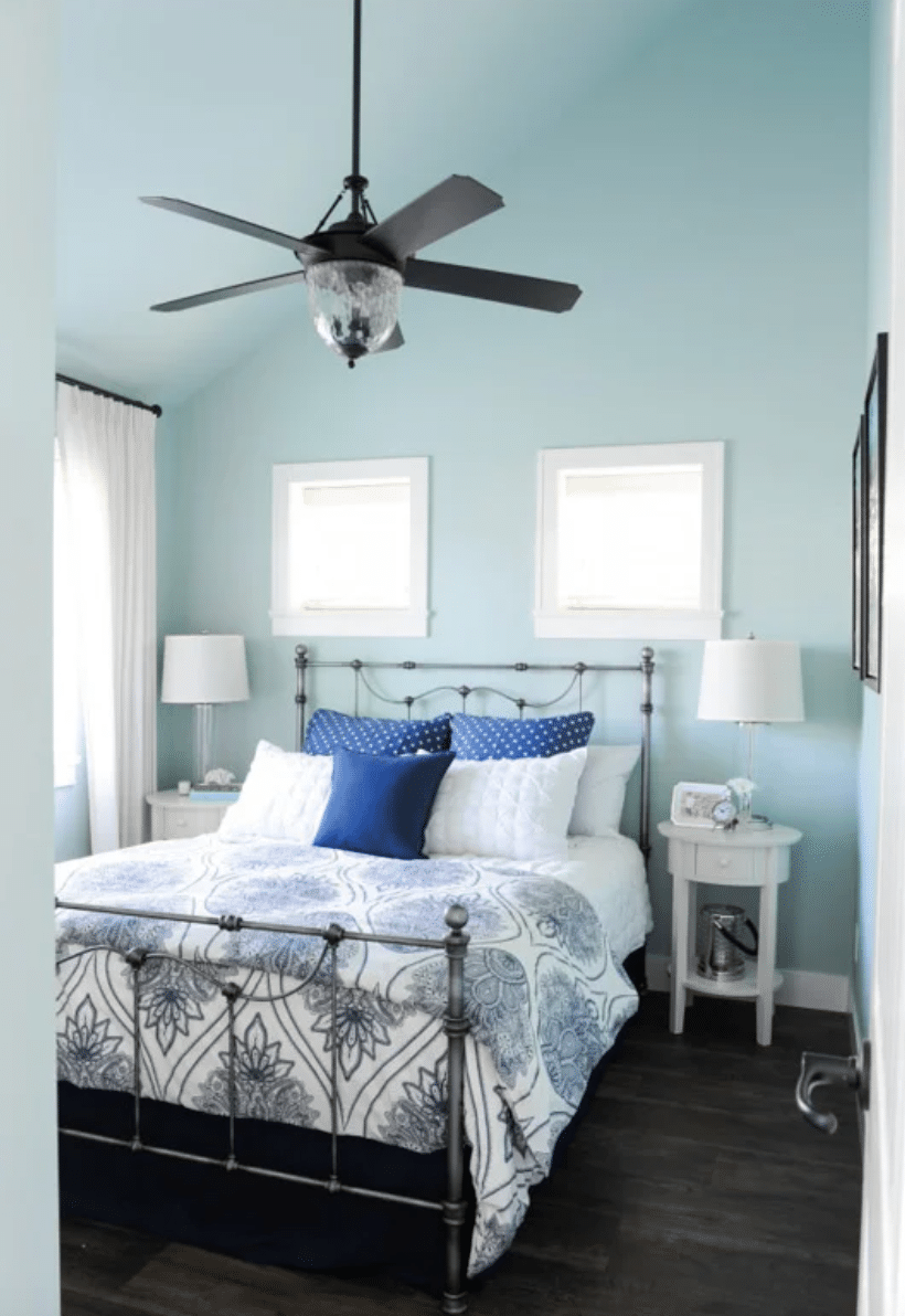
Bedroom in Benjamin Moore Palladian Blue
Maria Killam shows just how blue Palladian Blue can look under cool-tinted lighting. The dark blue accents in the room also push the green undertones into the background so the blue can shine through.
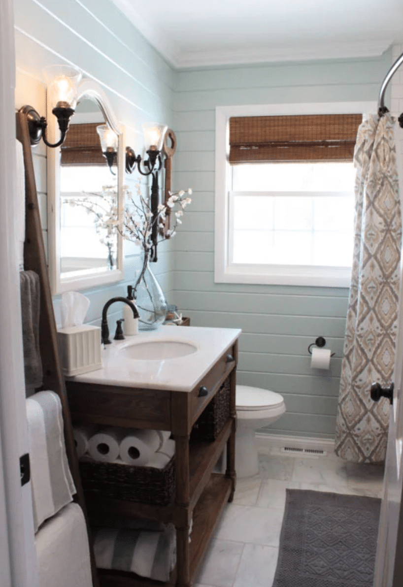
Bathroom Painted BM Palladian Blue
I am in love with this bathroom from 12 Oaks Blog! The texture of the shiplap walls gives the paint added depth and dimension, transforming this small room into something truly swoon-worthy.
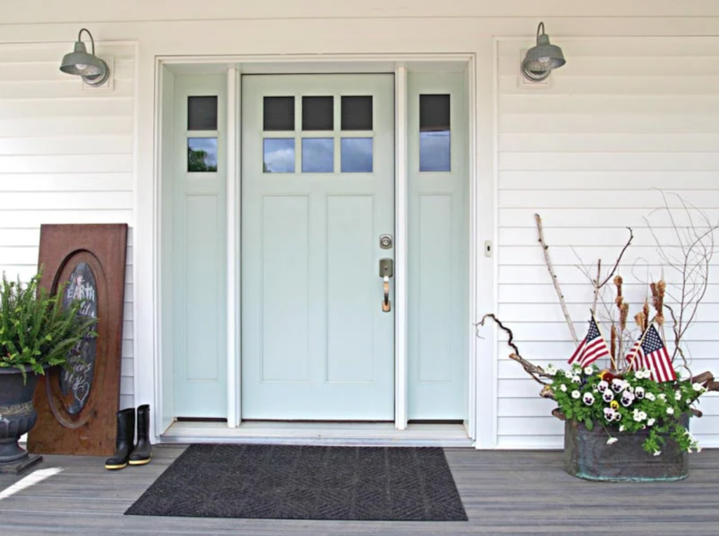
Benjamin Moore Palladian Blue Exterior Front Door
Palladian Blue also works beautifully on exterior doors like this one from Renew My Home! It's a fun, subtle pop of color that suits any style of house.
Frequently Asked Questions
Is Benjamin Moore Palladian Blue warm or cool?
Palladian Blue is a cool-leaning blue-green-gray. Although it leans cool, it's never so cool that it will make your home feel cold.
Is Palladian Blue more green or blue?
This shade is actually a fairly balanced mix of both, so it moves between them. At times it looks like a soft, muted blue, while at others it reads as a muted green.
Isn't Palladian Blue lovely? After seeing how versatile and chic it looks, it's no wonder it's one of Benjamin Moore's most popular blue paint colors!
How to Choose a Paint Color
Choosing paint colors for your home is a challenging task! Many people give up and just pick a color without really vetting it first, then end up frustrated when it doesn't look the way they had hoped.
I find the best approach to picking paint in any color family is to research several shades and then use paint swatches to confirm they look terrific before you buy! Then use your swatches to create a whole-house color palette.
Check out these popular paint color families to help narrow down your choices:
- Neutral Paint Colors
- Greige Paint Colors
- Blue Paint Colors
- Blue-Gray Paint Colors
- Green Paint Colors
More Paint Colors
Don't forget to check out some of my other favorite paint shades:
Tools to Help You Paint a Room Yourself
I've gathered some helpful tools for painting a room yourself. I recommend starting with my tips for painting a room in 5 easy steps. I do nearly all of my own painting, and I use these tools to make the job easier and get professional-looking results!
- Paint Brush – These brushes cost a bit more than a basic brush, but they're worth it! I've used them for more than a decade, and if you wash them thoroughly after each use, they'll last for years.
- Painter's Tape – A MUST-have for taping off edges. Unless you have a rock-steady hand, you'll want to tape off all the edges.
- Drop Cloths – A must-have for protecting flooring and furniture from drips.
- Paint Cup – Sure, you could use any old cup, but I've come to swear by this one. The magnetic piece holds your brush neatly in place when you need a break, and it fits my hand perfectly, so it doesn't cramp.
- Roller Tray – This is the only paint tray I'll ever use again. The magnetic piece holds the roller in place nicely. The liners are a luxury, but I won't paint without them because they make cleanup a breeze!
More Posts You Will Love:
- Which Interior Paint Finishes to Use? {+ Where To Use Them}
- What Color Walls Go with Dark Wood Trim?
- Best Living Room Paint Colors
PinPin