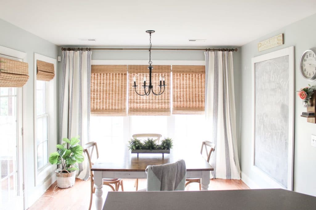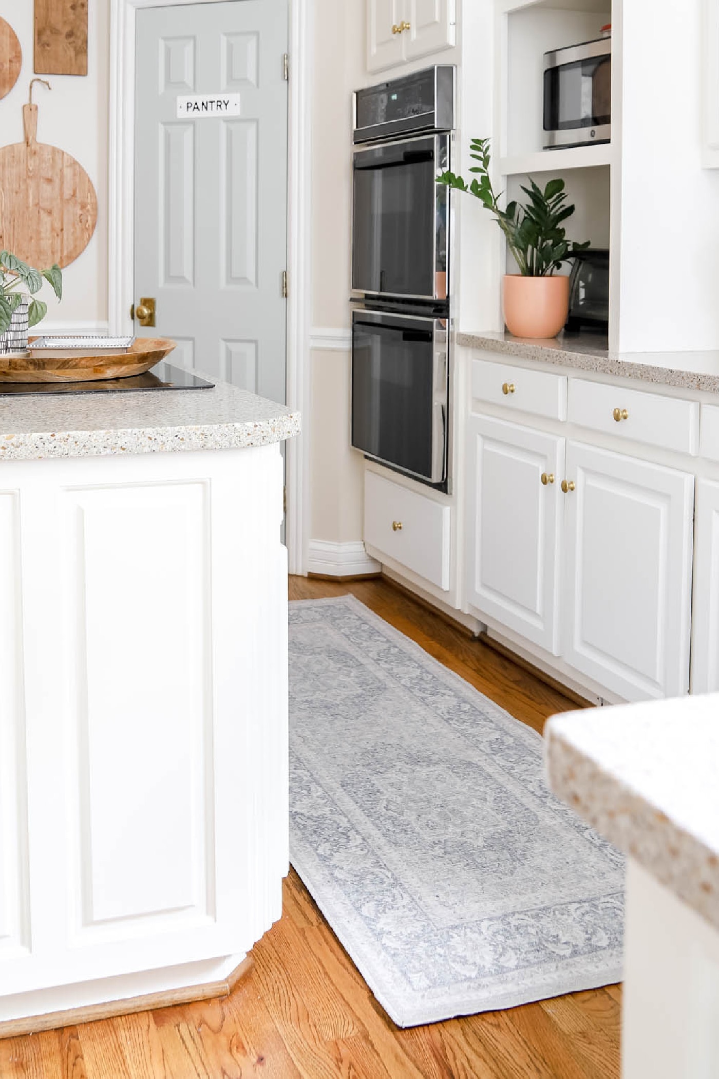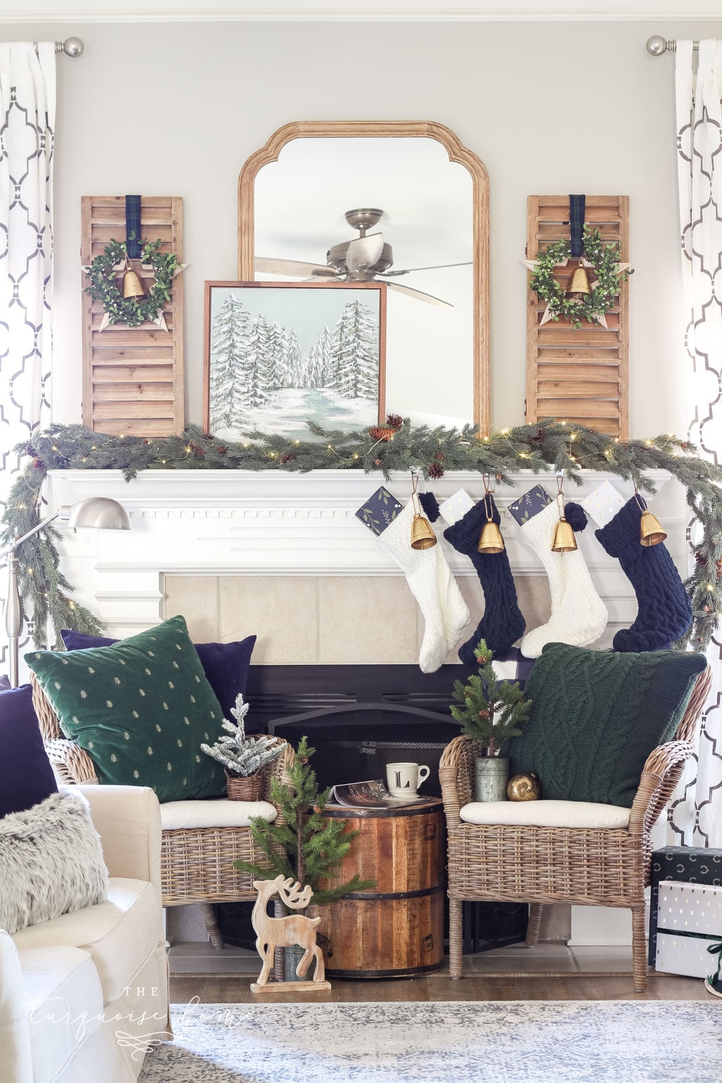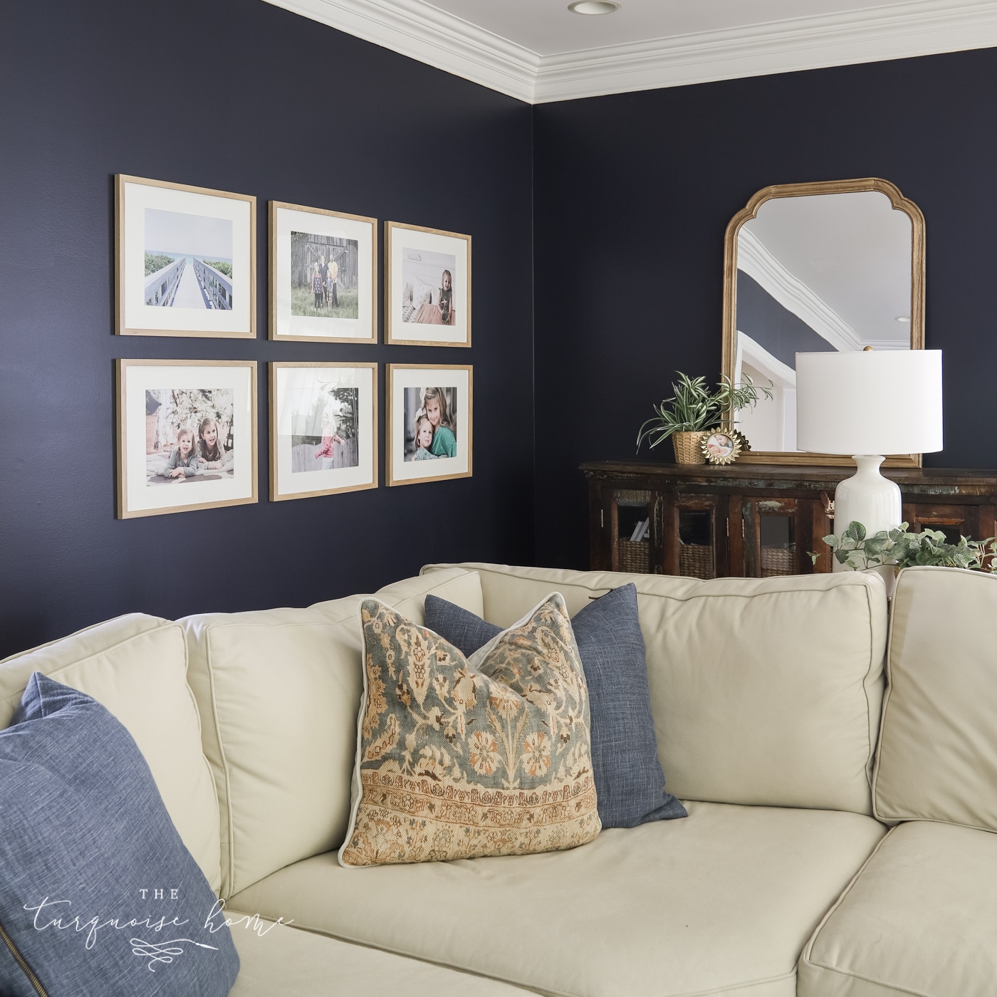
Few colors are as adaptable as blue gray. Whether you want something quiet for the bedroom or a bold statement in the living room, this list has a choice for everyone.
If you're after something calm and cozy, blue gray could be the answer. If you usually avoid color but want to experiment, blue gray is a great starting point. The blue adds a touch of color, while the gray softens it so it never feels too bright or overpowering.
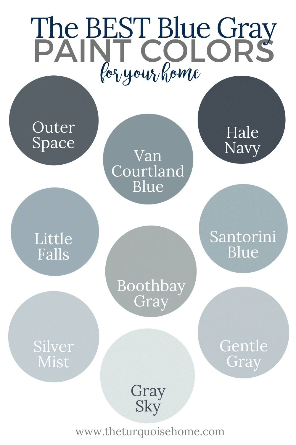
Thanks to their gray undertones, many shades below work as neutrals. Most lean toward blue, though a few are more gray. Think of the rich tone of your favorite pair of denim jeans. Many of these blue grays pair easily with other colors.
Explore and find your ideal blue gray for any room in the house!

What Exactly Is Blue Gray?
Put simply, blue gray is either a gray with strong blue undertones or a blue with strong gray undertones. To spot the undertones, look at the whole swatch and focus on its darkest shade. If that shade is a navy or charcoal, you're on track!
You'll often want to avoid green undertones that could push the color into the blue/green paint color family. (We adore those shades too, though!)
Why Are Blue Gray Paint Colors Popular?
Blue is calming, but without gray it can look childish or pastel. A true blue gray keeps that calm feeling while staying flexible for any home.
Blue and white is a timeless pairing, so white trim with blue walls is a reliable choice. The combination suits bedrooms and bathrooms especially well. Blue gray is also excellent for cabinetry, and even for kitchens and laundry rooms!
Blue gray also looks great in a boy's bedroom. You have plenty of strong options when adding one of these lovely shades to your home!
The Most Loved Gray Blue Colors for Your Home
These colors may look alike at first, but side by side you'll spot subtle differences.
Browse the blue grays listed below and then pick up swatches. Once you've narrowed the field, buy a sample pot and paint a small patch of wall before committing.
I've included the Light Reflectance Value (LRV) for each color. LRV measures how much visible light a paint reflects versus absorbs: the higher the number, the more light it bounces back. I've grouped the colors into dark (LRV 0-15), medium (LRV 15-45) and light (LRV 45-100).
Deep Blue Gray Paint Colors
LRV range: 0-15
Hale Navy by Benjamin Moore (LRV: 6.3)
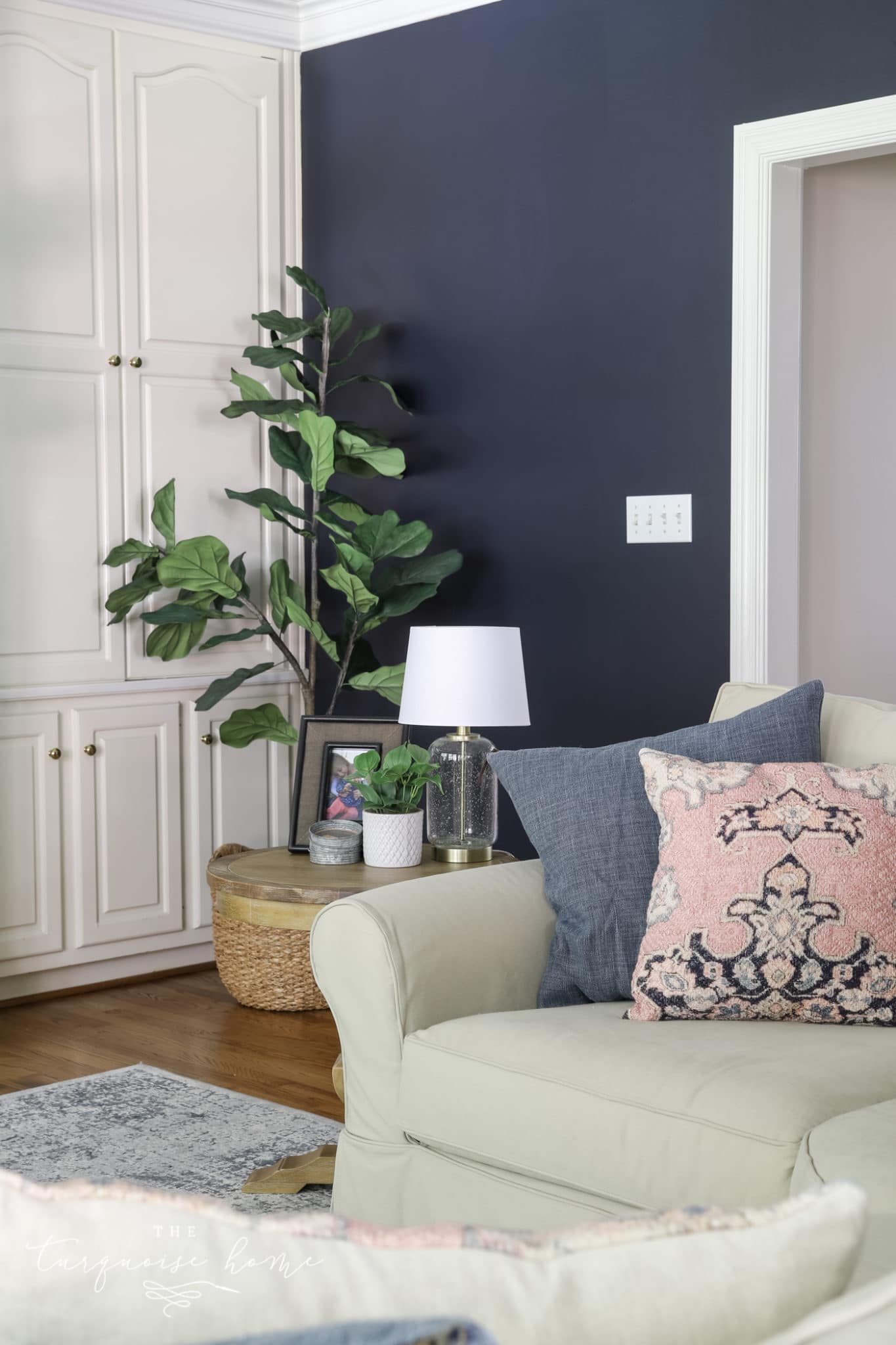
I adore this shade! I first used it on the front door of my previous house, and then on the living room in my current home.
It has the faintest hint of green, but gray dominates its undertones. Since it blends warm and cool tones, it serves as a transition shade in any room.
Because it's so dark, use it in a bright room so it doesn't make the space feel gloomy. White accents and plenty of daylight will make it look stunning!
Outerspace by Sherwin Williams (LRV: 12)
Hale Navy leans a bit bluer, while Outerspace tips slightly grayer among the dark blue grays. Don't want to overpower a room? Try a single accent wall in a deep blue gray.
It looks perfect alongside a camel leather chair and warm light wood in a tween boy's bedroom by Jen Sottosanti Design.
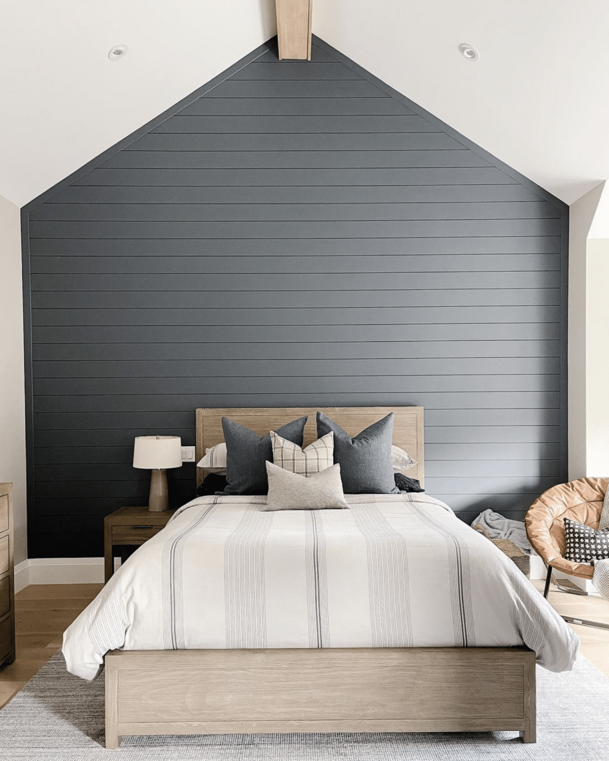
Granite Peak by Sherwin Williams (LRV: 14)
If you want drama, Granite Peak is the one. Depending on the room and lighting, it can lean bluer or grayer. It reads like a richer charcoal, which suits an accent wall or a powder room.
Mid-Tone Blue Gray Paints
LRV range: 15-45
Santorini Blue by Benjamin Moore (LRV: 45)
Santorini Blue sits right on the border between medium and dark blue grays. It takes its name from the striking blue-gray-green waters of the Greek islands. It looks gorgeous with traditional taupe tones, as shown below! It's a popular choice for a masculine bedroom.
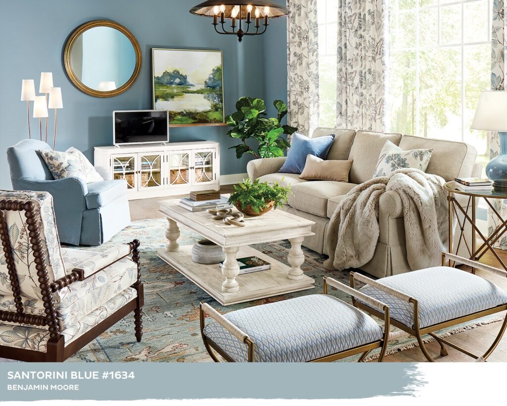
Santorini Blue by Benjamin Moore, as seen at Ballard Designs
Van Courtland Blue by Benjamin Moore (LRV: 30)
This medium-dark blue gray is timeless and suits a wide range of styles. In a west-facing room it can occasionally take on a slight green cast.
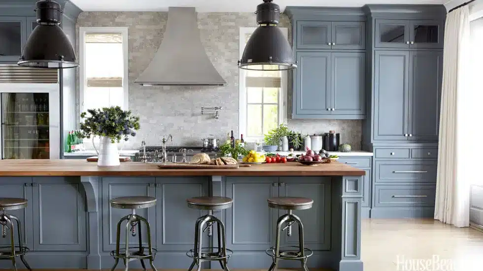
Source: House Beautiful
Storm Cloud by Sherwin Williams (LRV: 23)
Remember that cozy feeling of being cozy indoors while a storm rages outside? This color brings that same comfort into a room.
This shade leans fairly gray, looking especially refined next to bright white trim and cabinets.
Pottery Barn offers a great example of just how cozy this shade can feel.
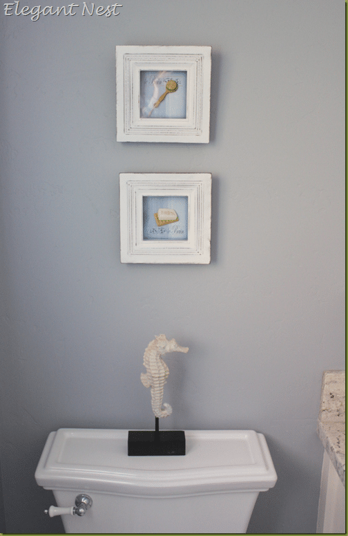
Morning Fog by Sherwin Williams (LRV: 42)
Morning Fog lives up to its name with the cool, crisp feel of a hazy dawn. It's really more of an overall gray, though the blue undertones add life to it. If you're drawn to the gray end of the blue gray spectrum, this is the one I'd choose.
As this photo from Elegant Nest shows, you still get that blue gray character, yet it works just as well as a standalone neutral gray.
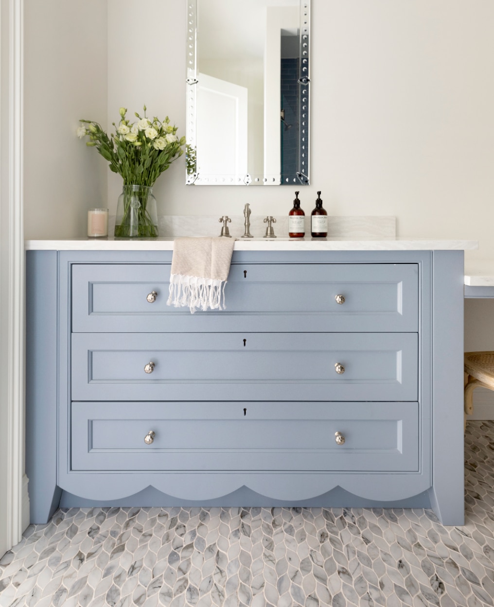
Little Falls by Benjamin Moore (LRV: 42)
This medium-to-light blue pairs beautifully with the grandmillennial style that's gaining popularity. It's a true blue with only gray undertones, so no green at all! It's lovely on bathroom or kitchen cabinets, or on the walls of a kid's room.
Boothbay Gray by Benjamin Moore (LRV: 43)
Leaning toward the lighter end of the medium grayish blues is Boothbay Gray. You've probably come across this classic, historic shade already, since it's extremely popular. It reads as gray with a strong blue undertone.
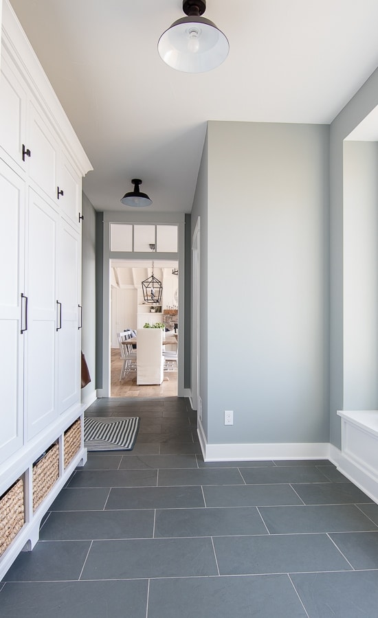
Boothbay Gray in the Lilypad Cottage Mudroom
Pale Blue Gray Paint Colors
LRV range 45-100
Smoke by Benjamin Moore (LRV: 56)
This shade leans gray, with confident blue undertones showing through. Smoke truly shines; it suits every room in the house and pairs with nearly any accent color.
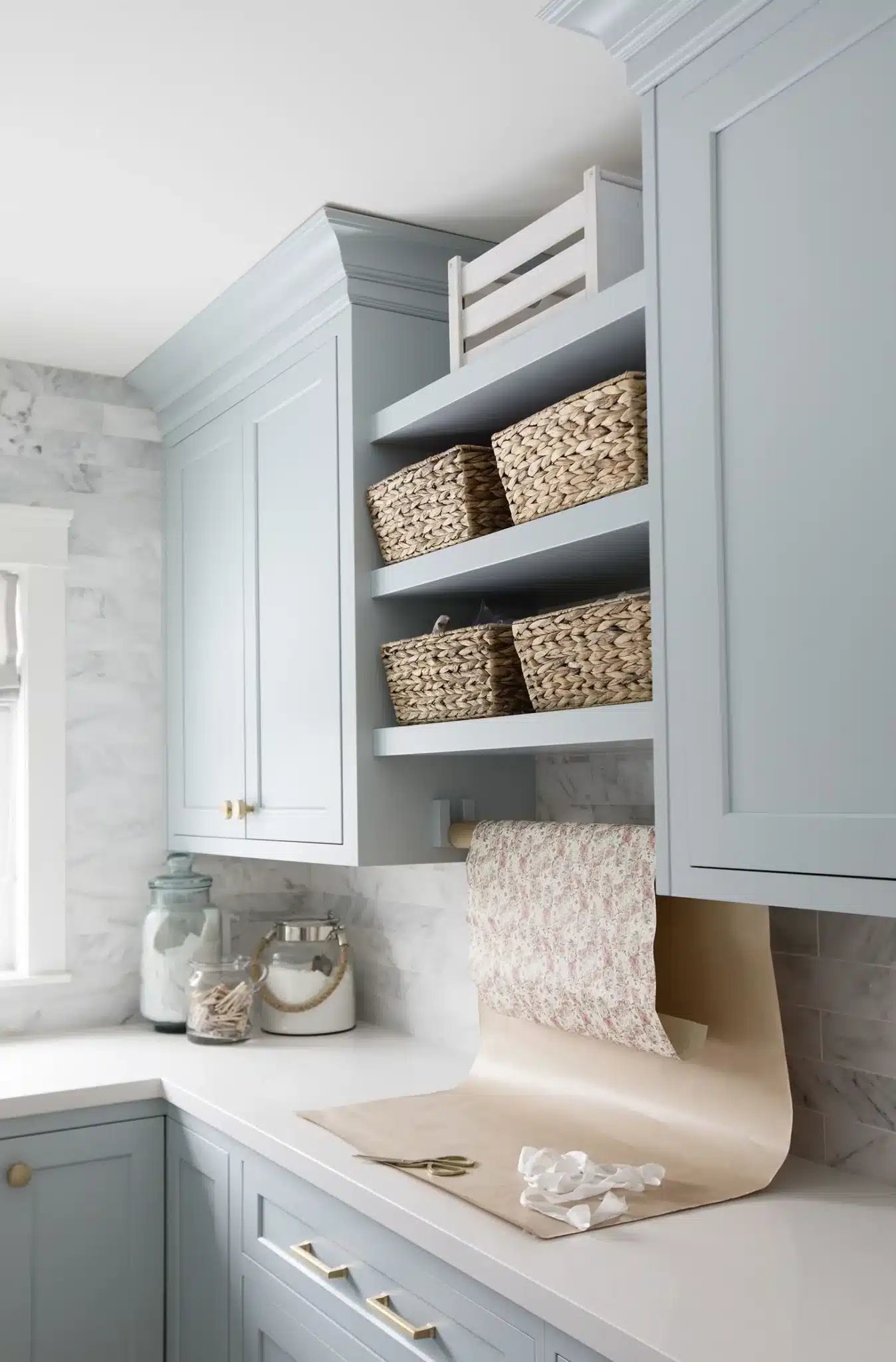
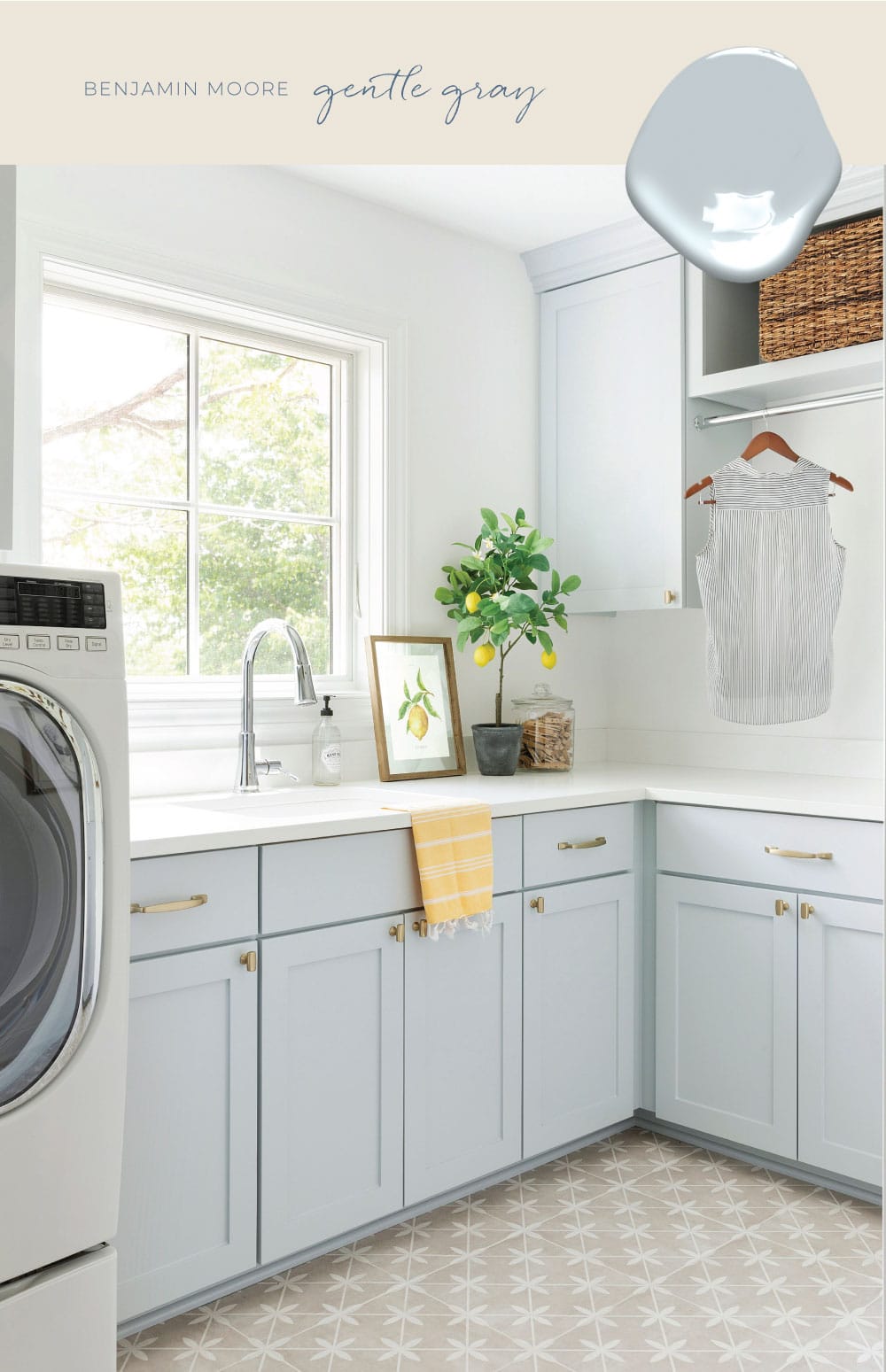
Gentle Gray by Benjamin Moore (LRV: 58)
Doesn't this feel like a warm hug from a favorite aunt? It's remarkably adaptable and works with most colors, with an aqua undertone. Many aquas can feel unrefined, but the gray in this one gives it polish. Test a swatch on your wall before you commit, since it shifts with the lighting.
Silver Mist by Benjamin Moore (LRV: 62)
Benjamin Moore's own description says it best: a silvery sheen on a very pale, whisper-soft blue, with enough gray to give it a delicate, misty finish. It's perfect!
Gray Sky by Benjamin Moore (LRV: 77)
Gray Sky edges toward pastel territory, but it reads cooler and icier in a room rather than warm and bright. Though light, it doesn't vanish into the background the way many pale neutrals do. It keeps a good deal of richness despite its light value and gray undertones.
Do you have any of these blue grays in your home? I'd love to hear how they look in real rooms!
MORE POSTS YOU'LL ENJOY: