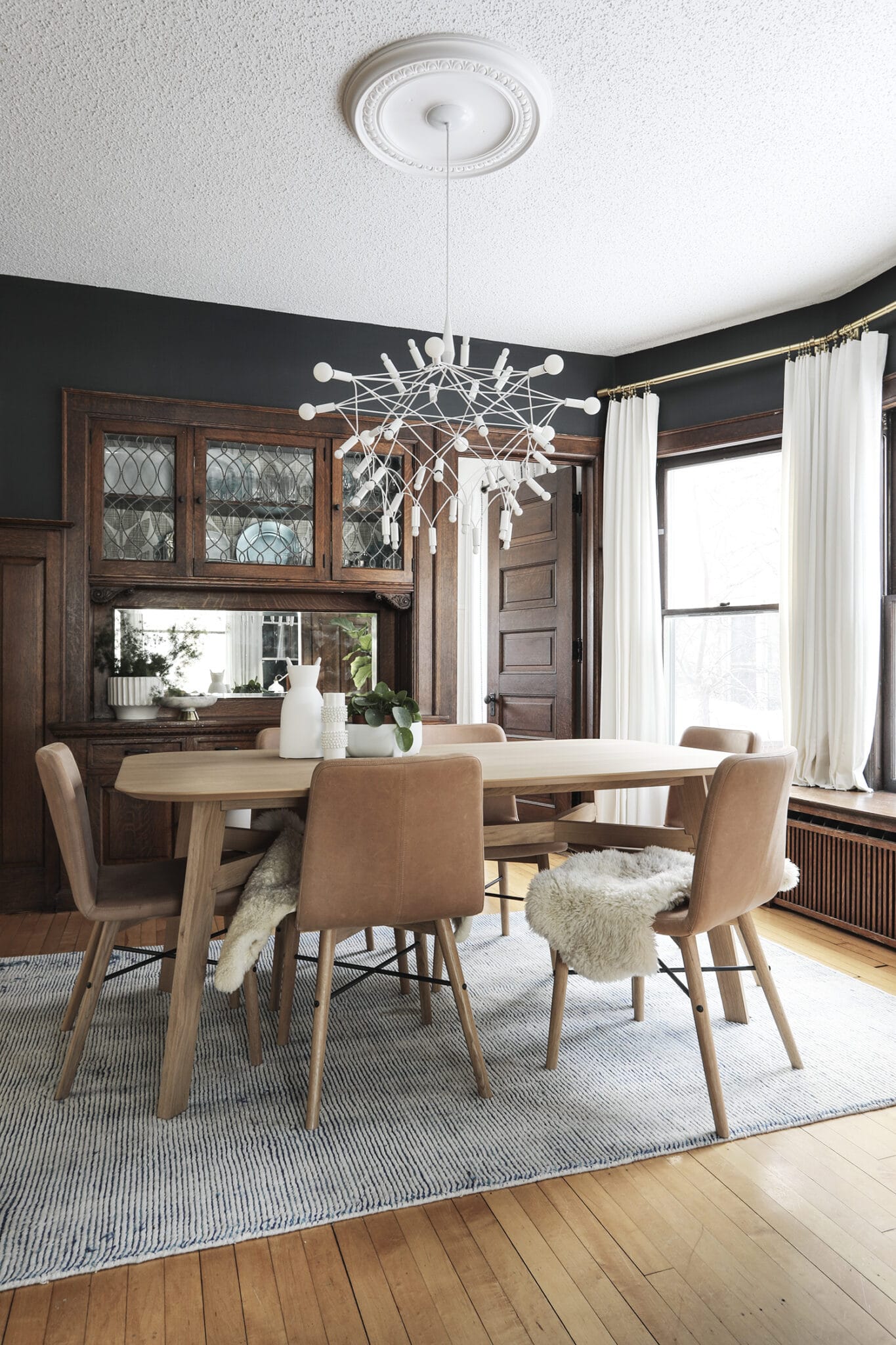
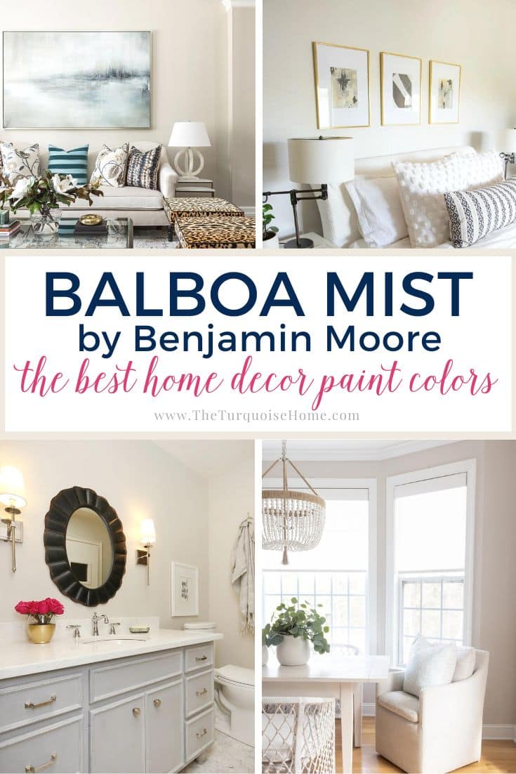
When you're hunting for that just-right warm neutral, one that feels grounded and timeless without tipping into dark, Sherwin Williams Universal Khaki (SW 6150) could be the one.
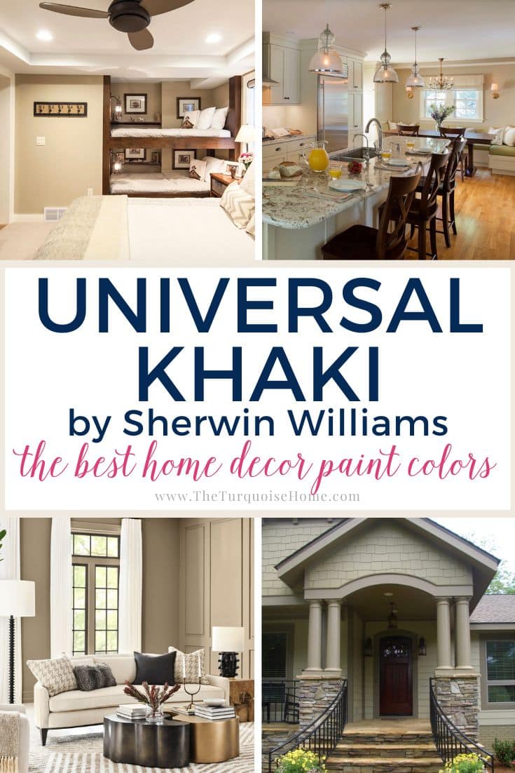
This earthy khaki-beige has been around a while (because it works in so many homes!), and it's the kind of shade that adds cozy sophistication right away. If you've ever been torn between beige and greige, this color may hit that sweet spot.
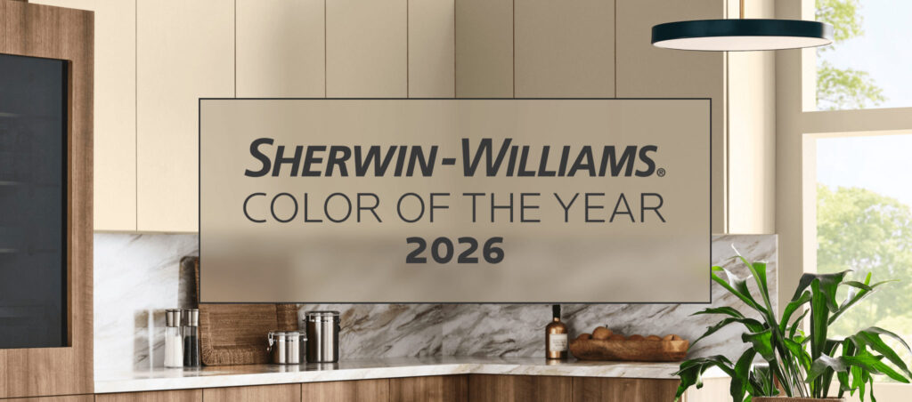
Universal Khaki is the 2026 Color of the Year from both Sherwin Williams and HGTV Home by Sherwin Williams. In an unusually unified announcement, the two sister brands have teamed up to name this neutral the single color of the coming year! I'm so excited!!
Let's take a closer look at Universal Khaki and see whether it's the perfect neutral for your space.

What Does Sherwin Williams Universal Khaki Look Like?
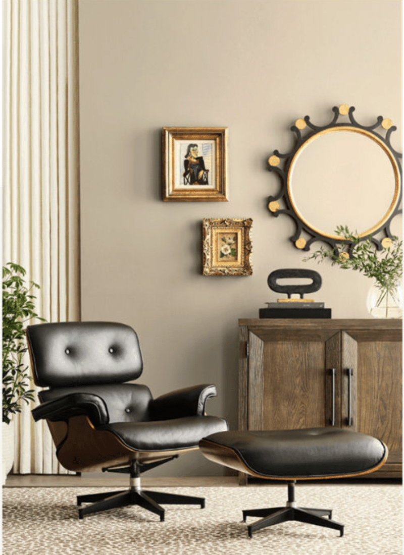
Universal Khaki is a warm, medium-depth neutral. It isn't a light beige like Accessible Beige, and it's not as dark as deeper taupes, like the Davenport Tan I'm painting in my bedroom. It lands right in the middle.
In many homes it reads as an earthy greige with a subtle green-beige undertone. That faint hint of green keeps it from looking too pink or yellow, which is a problem with some beiges.
In real life:
- In a bright, sun-filled room it looks warm and inviting, leaning more toward beige.
- In lower light or in a north-facing room, its gray-green undertones show through a little more.
It's neutral without being boring, which is why it works so well in traditional, transitional and farmhouse-style homes.
PRO Tip
Whenever you choose a new paint color, try out the real paint color in your home first!
The easiest, quickest way to do that is with Samplize! I use them exclusively for paint samples now. There's no mess and no leftover sample pots. Plus, these no-mess, peel-and-stick rectangles are made from real paint, easy to move around the room and easy to save for future reference!
Order REAL Paint Samples
Universal Khaki Undertones
Every neutral has undertones hiding beneath the surface. Universal Khaki is essentially a warm gray-beige (greige) with a slight green undertone.
- You won't see strong yellow or pink tones here, which makes it easier to pair with other finishes.
- That tiny touch of green is soft rather than bold, and most of the time it simply helps the color feel balanced and earthy.
Because it has green-beige undertones, this color plays well with a whole range of hues, including blues, violets, reds, pinks, oranges, yellows and greens. All of these accents look great alongside a neutral green-gray or greige.
Tip: If your floors, counters or furniture have strong pink or red undertones, Universal Khaki might clash. Always test a sample before painting the whole room.
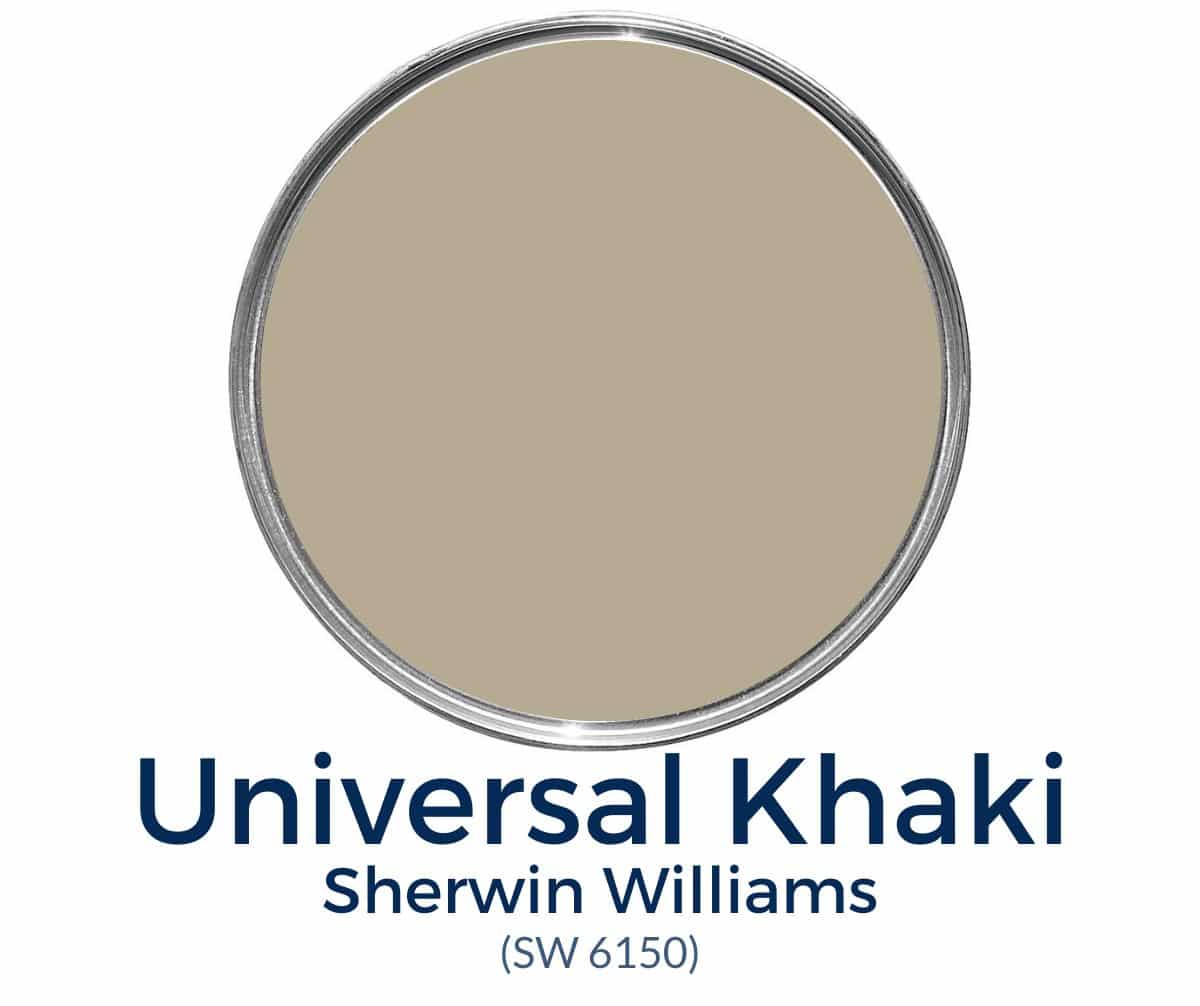
Tap HERE to get your peel & stick Universal Khaki paint swatch.
Universal Khaki LRV
Sherwin Williams Universal Khaki has an LRV (Light Reflectance Value) of 40, which places it in the medium range.
That means:
- It won't wash out in bright light the way lighter neutrals can.
- It has enough depth to add contrast against white trim.
- It isn't super dark, but it carries more "weight" than some popular whole-house neutrals.
If you want a color that feels substantial and cozy without being heavy, this one fits the bill.
Coordinating Colors for Universal Khaki
One of the best things about Universal Khaki is how flexible it is with coordinating shades. Here are a few pairings that look lovely:
- Crisp Whites – Sherwin Williams Extra White (SW 7006) or Pure White (SW 7005) make it pop.
- Soft Neutrals – Softer Tan (SW 6141) or Balanced Beige (SW 7037) for a layered, tonal palette.
- Accent Colors – Navy (Naval SW 6244), Sage (Clary Sage SW 6178) or even a muted black (Iron Ore SW 7069) add depth.
- Wood Tones – Warm oak, walnut or rustic finishes pair beautifully with this earthy neutral.
For trim and ceilings, a crisp white works best. If you like softer contrast, go with Sherwin Williams Alabaster (SW 7008).
Comparing Universal Khaki to Similar Colors
Sometimes it helps to see where a color falls next to your other favorites:
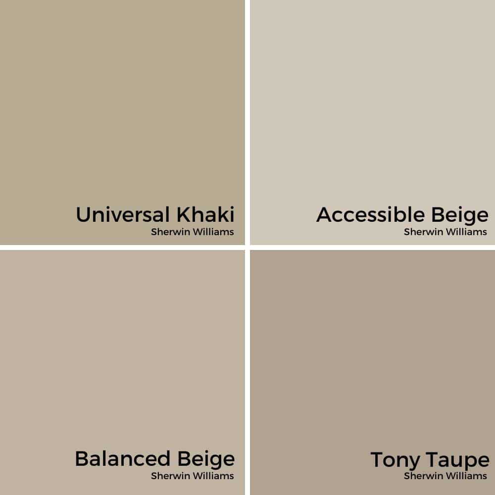
- Accessible Beige (SW 7036) – Lighter and softer, better suited to bright, airy spaces.
- Balanced Beige (SW 7037) – A step darker and warmer than Accessible Beige; similar warmth but more depth than Universal Khaki.
- Tony Taupe (SW 7038) – A little warmer and deeper than Universal Khaki; more "taupe" than "khaki."
- Universal Khaki – The middle ground: warmer than gray, softer than taupe, deeper than beige.
If you've tried lighter greiges and found them washed out, Universal Khaki may give you the grounded feel you're craving.
Where to Use Sherwin Williams Universal Khaki
Thanks to its earthy undertones, Universal Khaki feels right at home in spaces that need warmth and balance.
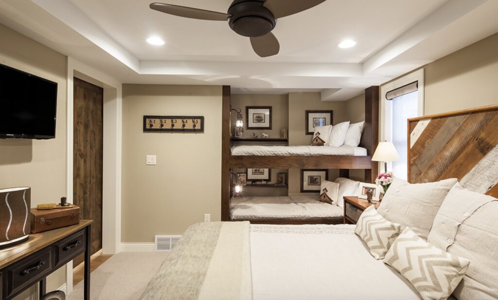
Bedrooms
Universal Khaki is relaxing without being too dark, creating a restful retreat.
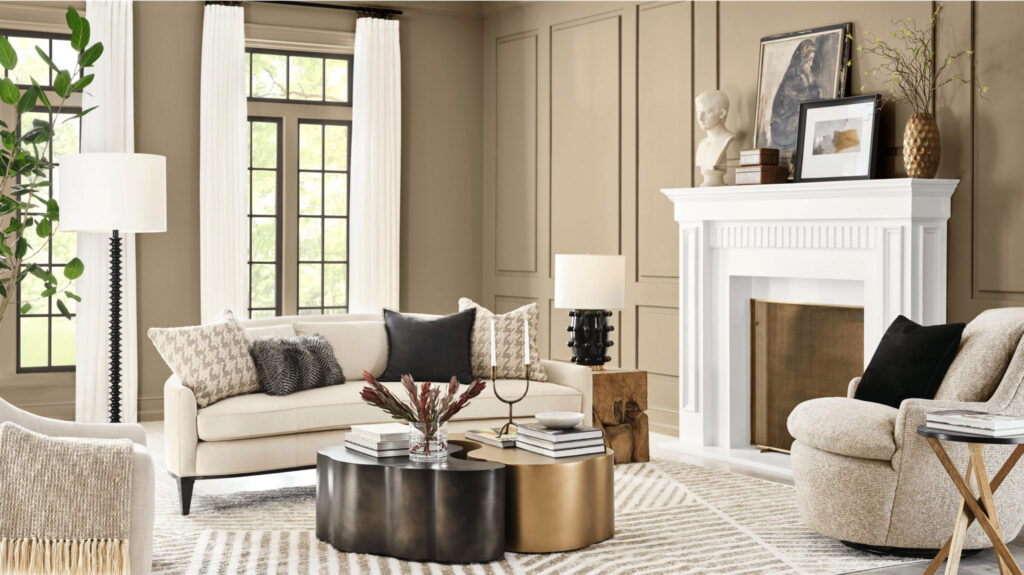
Living Rooms
Universal Khaki is a cozy, inviting color that pairs beautifully with layered textiles.
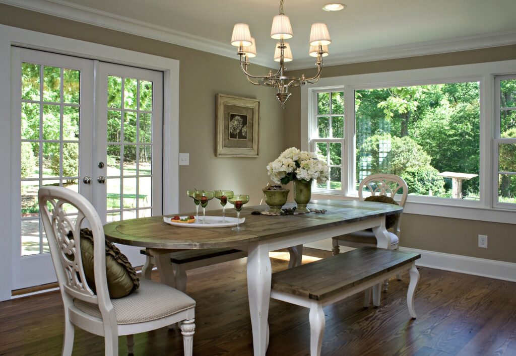
Dining Rooms
Universal Khaki brings a sophisticated style to the dining room, especially alongside white trim, wood furniture or wainscoting.
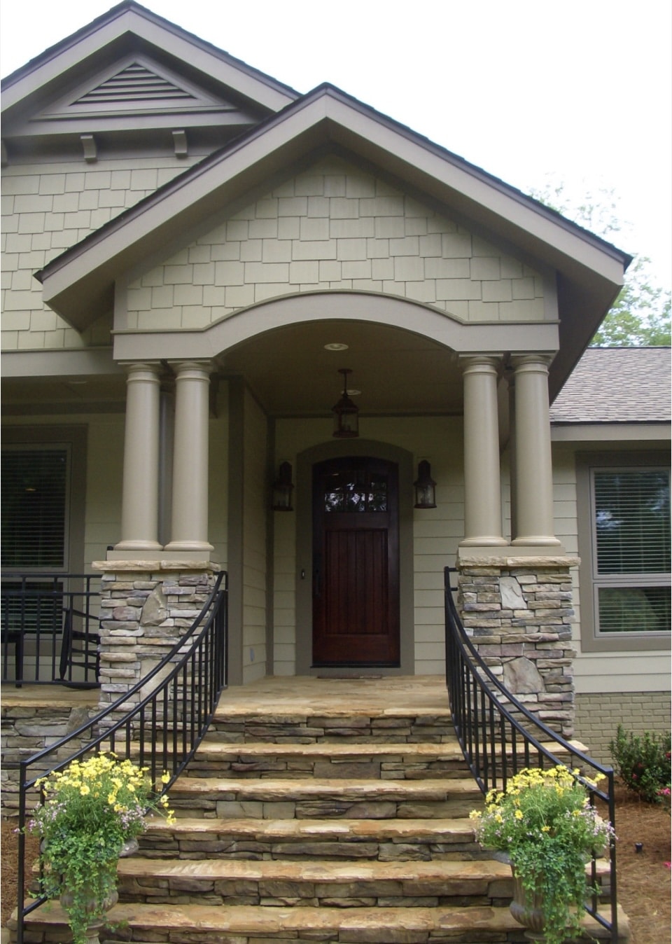
Exteriors
This paint color looks gorgeous with white trim and black shutters for a timeless look. Or try a tone-on-tone neutral scheme that blends well with nature.
Kitchen Cabinetry
A unique choice for kitchen islands or built-ins, Universal Khaki is especially striking with brass or black hardware. This would be one of my favorite uses for this color! A beautiful khaki cabinet in a country-style kitchen is simply heavenly!
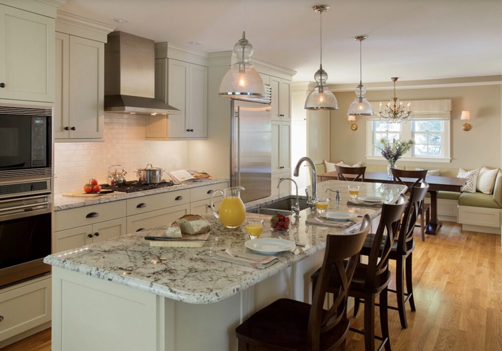
It works especially well in traditional or farmhouse-style homes, but it can also feel modern with the right accents. And with the rise of dark wood furniture, you can see how well this wall color pairs with it!
Final Thoughts on Universal Khaki
If you're after a warm, versatile neutral with a little more depth than a light greige, Sherwin Williams Universal Khaki SW 6150 is a wonderful option.
It's cozy, earthy and timeless without being too beige or too gray. Whether you use it on walls, cabinetry or even outdoors, it creates a welcoming, grounded feel that suits a wide range of styles.
Pro Tip: Always test large paint samples in your home before committing! I love using peel-and-stick samples from Samplize so I can see how the color looks with my own lighting, flooring and furnishings.
More Posts You Will Love: