Craving a moody color without committing to black? Sherwin Williams Iron Ore is the ideal middle ground. Read on to learn more about this striking paint and how to use it indoors.
Brush in hand and primer on standby, the only thing left is choosing a paint color for your home! If you've been hunting for the perfect true gray and tend to gravitate toward the moodier side, let me introduce you to Sherwin Williams Iron Ore.
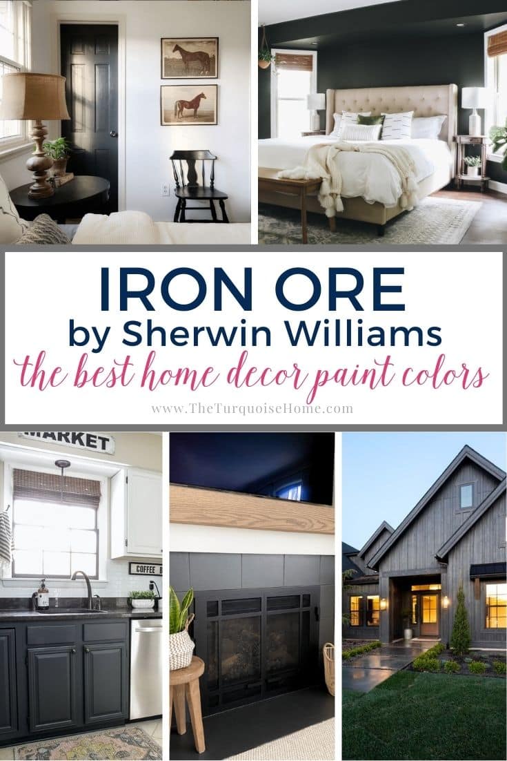
Iron Ore (SW 1069) reads as a very deep gray, nearly black in some lighting. Many people describe it as a soft black with gray undertones showing through. Used indoors, it creates a dramatic, color-rich look.
Dark shades like Iron Ore are definitely for the bold. If you're ready to step outside the usual choices, read on to learn about this daring neutral.
PRO Tip
Whenever you pick a new paint color, test the real paint color in your own home first!
The fastest, easiest way to do that is with Samplize! I use them exclusively for paint samples now. There's no mess and no leftover sample pots. Plus, these peel-and-stick rectangles are made from real paint, so they're easy to move around the room and save for later.
Order REAL Paint Samples
Undertones of Sherwin Williams Iron Ore
To an untrained eye, SW Iron Ore may look black, but it's really a true dark gray. In most lighting it appears as a soft gray, sometimes even creamy. That's why so many people call it a charcoal color.
As with any paint, light changes how it looks, even shifting through the day as the sun rises and sets. In most lighting, Iron Ore comes across as a cool paint with blue-gray undertones. Every now and then you might catch a hint of purple, brown, or green.
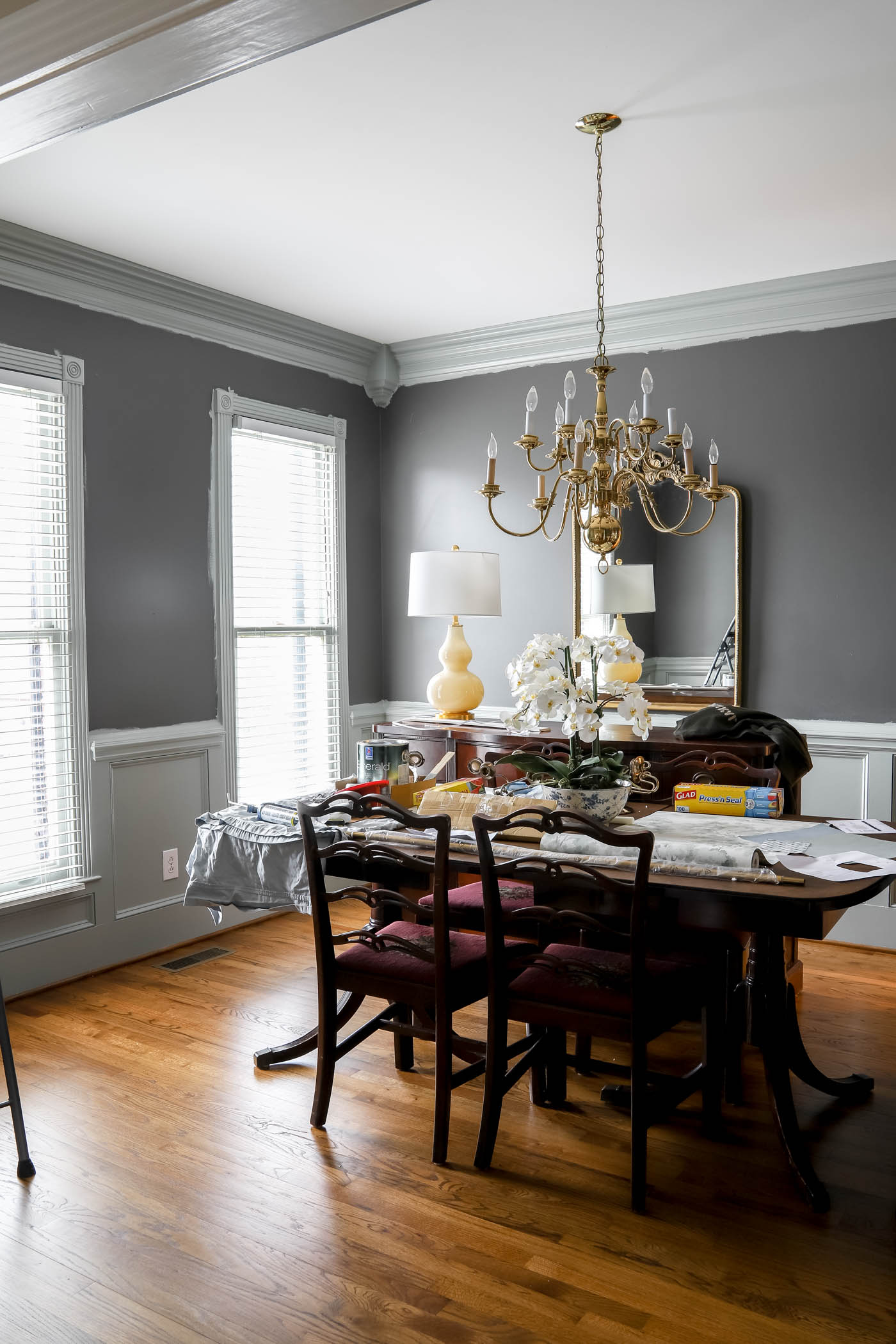
Choosing Iron Ore won't warm up a room. Instead, it's meant to make a statement. It doesn't feel too cold when you pair it with the right colors, furniture, and accents. Next to warmer palettes, it looks grayer. White trim and light wood work wonders with Iron Ore!
Light Reflectance Value of Iron Ore Paint
When you shop for paint, consider its light reflectance value (LRV). The number runs from 1 to 100, with 1 representing pure black and 100 representing pure white. The higher the number, the more light the paint will reflect.
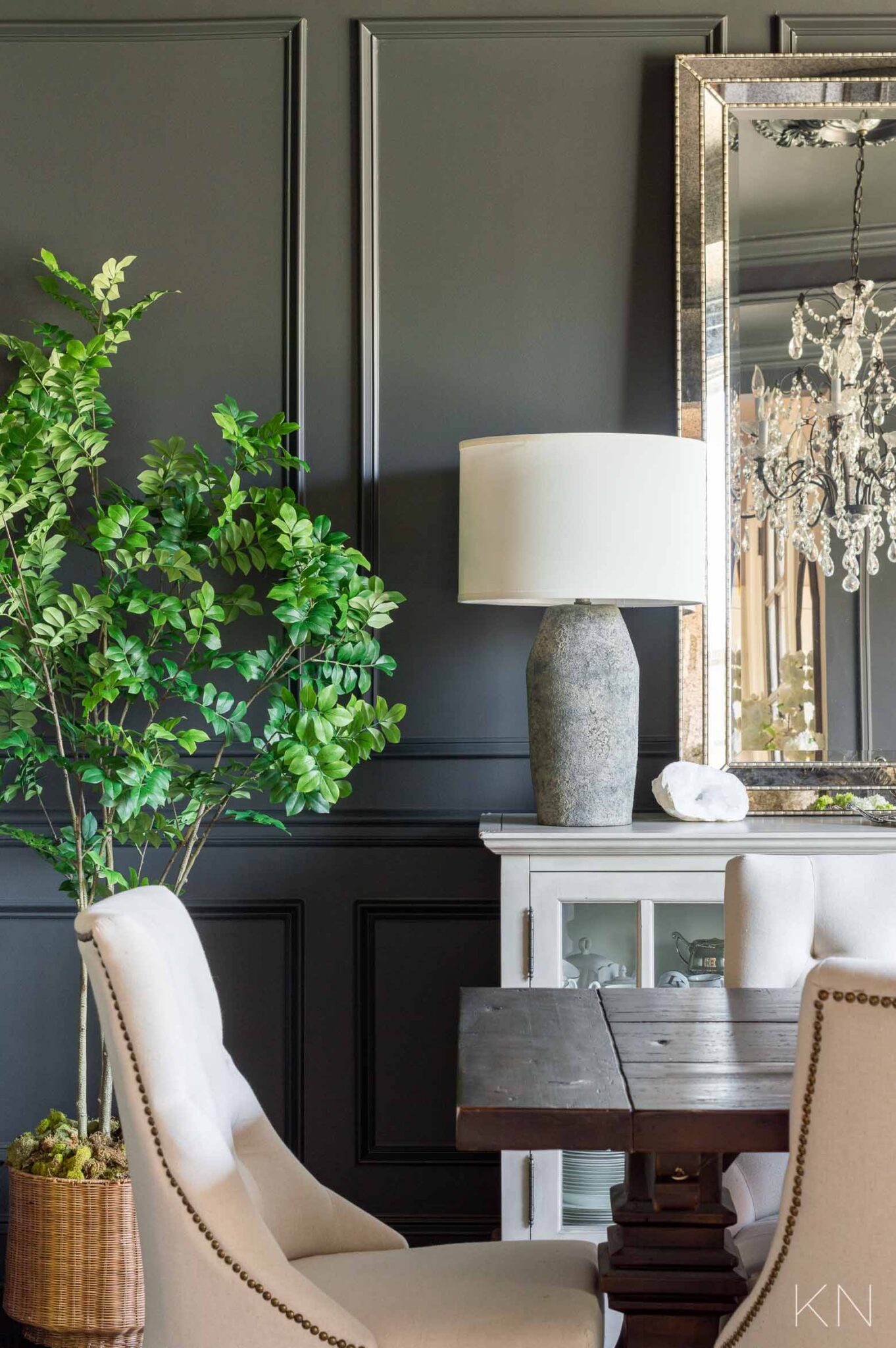
On the LRV scale, Iron Ore sits at a low 6. It's very close to black, yet you can still tell it isn't pure black and that it holds some gray undertones. Even so, don't expect it to bounce back much light.
Iron Ore works best in rooms with plenty of natural light or plenty of artificial lighting to brighten the space. In natural light, the blue undertones come through more clearly.
Complementary Colors for Sherwin Williams Iron Ore
Black, dark gray, navy, and other popular dark colors are almost always shown alongside white. A room needs some dark and some light to feel balanced.
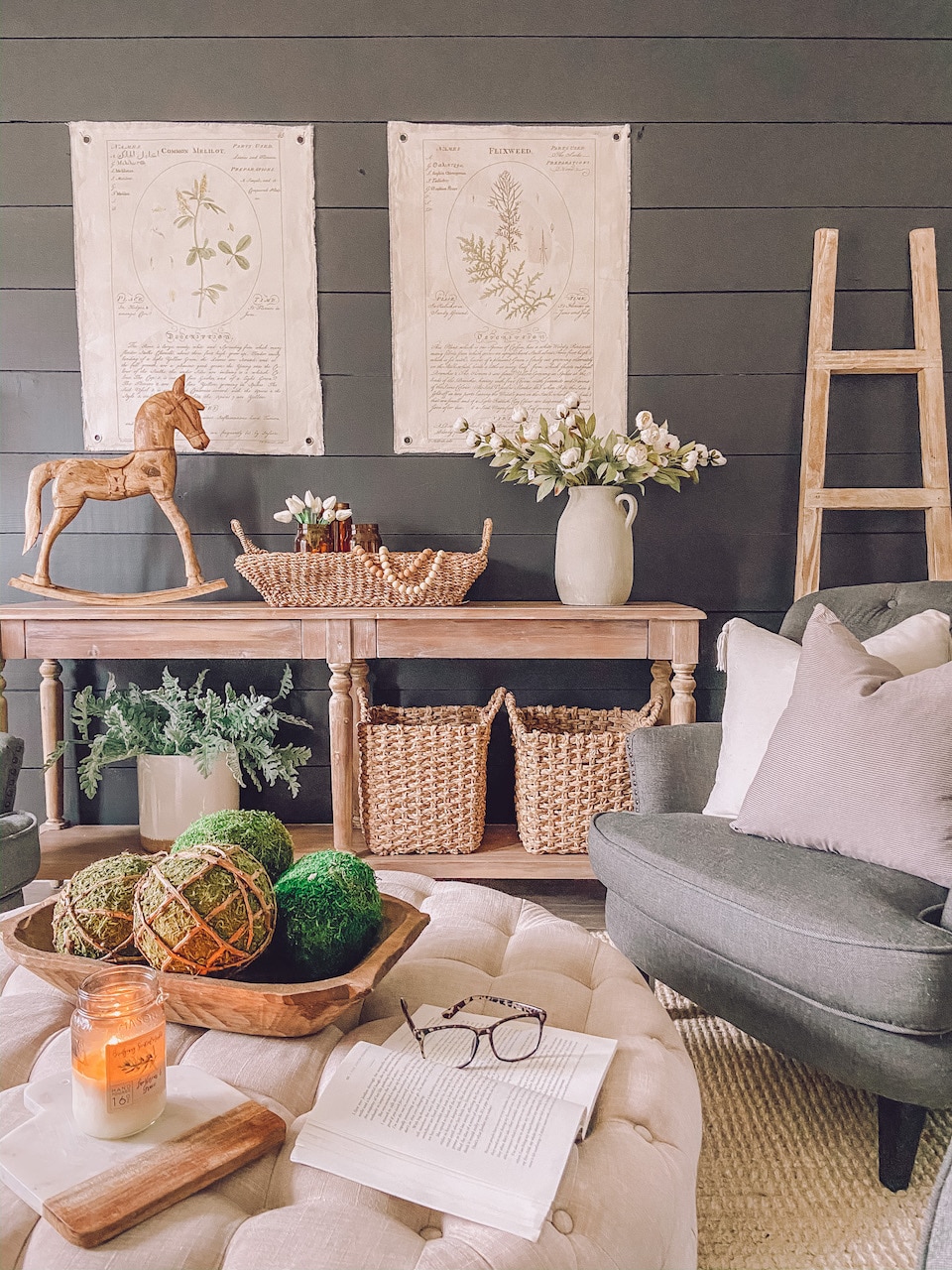
That sharp contrast also makes the true charcoal gray stand out and keeps the dark color from overpowering the room. White trim, floors, ceilings, and furniture all help create that sense of stability wherever Iron Ore lives.
Sometimes pure white creates too much contrast. Another option is a white with warmer undertones to soften the coolness of Iron Ore. SW Alabaster White works well, balancing the darkness of the paint while brightening the space.
Wood isn't technically a color, but warm, light wood finishes also make an excellent contrast with Iron Ore. They make the room feel cheerier without losing the sophistication this paint brings.
If SW Iron Ore isn't quite right but is close, you could also consider Sherwin Williams Tricorn Black or Peppercorn. SW Tricorn Black is one shade darker than Iron Ore, and SW Peppercorn is a few shades lighter. It all depends on how close to black you want to go!

Sherwin Williams Iron Ore in the Home
Enough theory. Let's look at some examples! Here are some common ways people use SW Iron Ore paint inside and outside the home.
Exterior
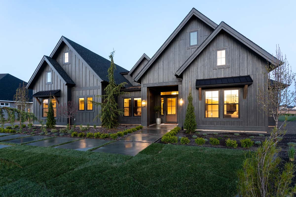
Surprisingly, this may be one of the most popular exterior paint colors Sherwin Williams offers. Dark colors are a favorite for home exteriors because they're nearly always bathed in natural light. In the sun, the exterior looks like creamy charcoal.
People also use this paint on siding, trim, shutters, and even dark decks and porches. It creates strong contrast without going all the way to black.
Cabinets
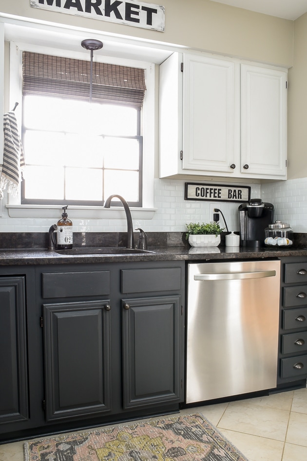
People tend to stick with neutrals for their cabinets. If black feels too harsh, Iron Ore is the perfect alternative. In a brightly lit kitchen, charcoal gray cabinets make a striking statement. Pair them with a light butcher block countertop and a simple white backsplash for a warm, modern kitchen.
This shade also works well on smaller cabinetry, such as a bathroom vanity. Add gold or brass hardware for a luxurious feel. You can also use the paint on built-ins in the office or living room.
Accent Walls
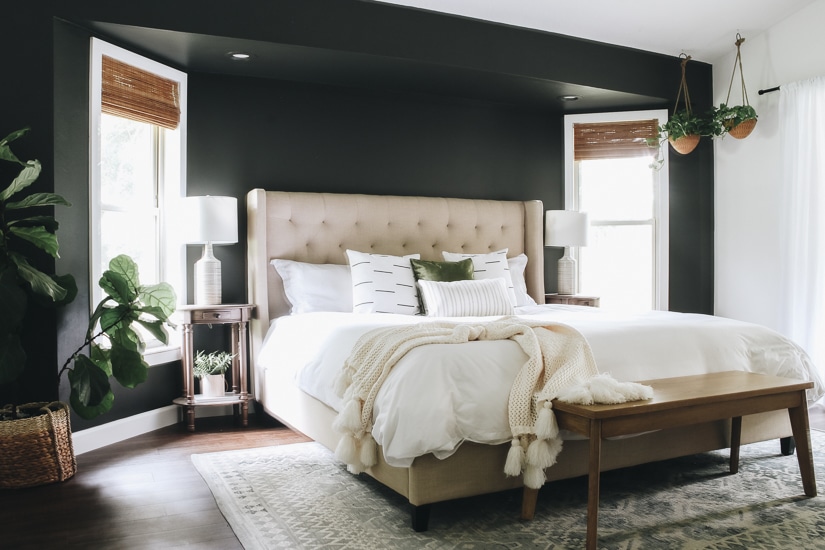
A dark accent wall might be just what your home needs. It adds a moody, sophisticated feel to any living room, den, or bedroom you paint with it. It can easily feel overwhelming, so keep it to a small space or a single wall. That said, I've seen some daring designers go fully black in a room, and that's something to admire too.
Doors
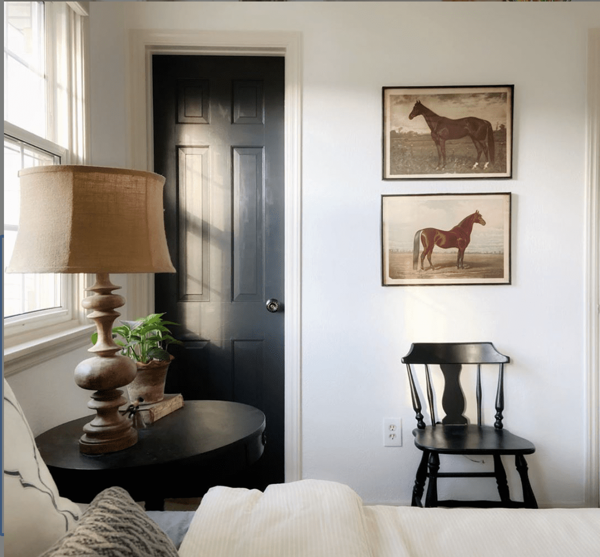
Colorful interior doors are growing in popularity and ready to make an announcement. A black accent adds depth and a bit more personality to a room. Dark doors look clean and simple while livening up a dull hallway or welcoming guests into the powder room.
Fireplace
Iron Ore always makes a clear impact near a fireplace. You can paint the shelf above the mantel, the mantel itself, or the entire surround in this dark charcoal gray. A dark fireplace adds character and drama, ready for cozy nights by the fire.
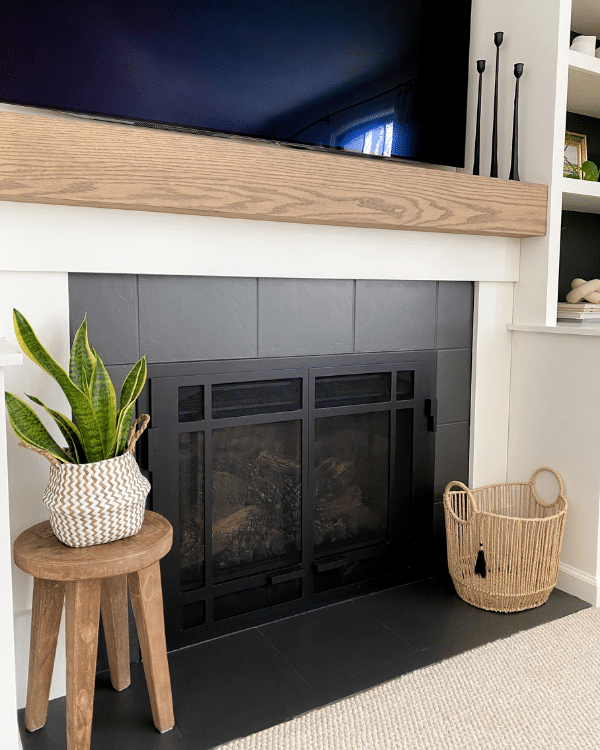
As you can see, this moody hue shines in many places. Are you ready to try it out for yourself?
More Posts You Will Love:
How to Choose A Paint Color
...Read More
Benjamin Moore Davenport Tan (HC-76) in Our Primary Bedroom
...Read More
Sherwin Williams Universal Khaki {SW 6150}
...Read More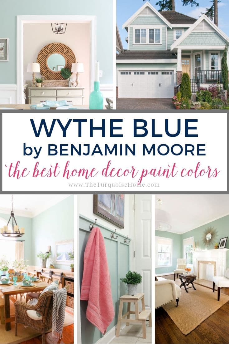
Benjamin Moore Wythe Blue (HC-143): Paint Color Review + Real Room Examples
...Read More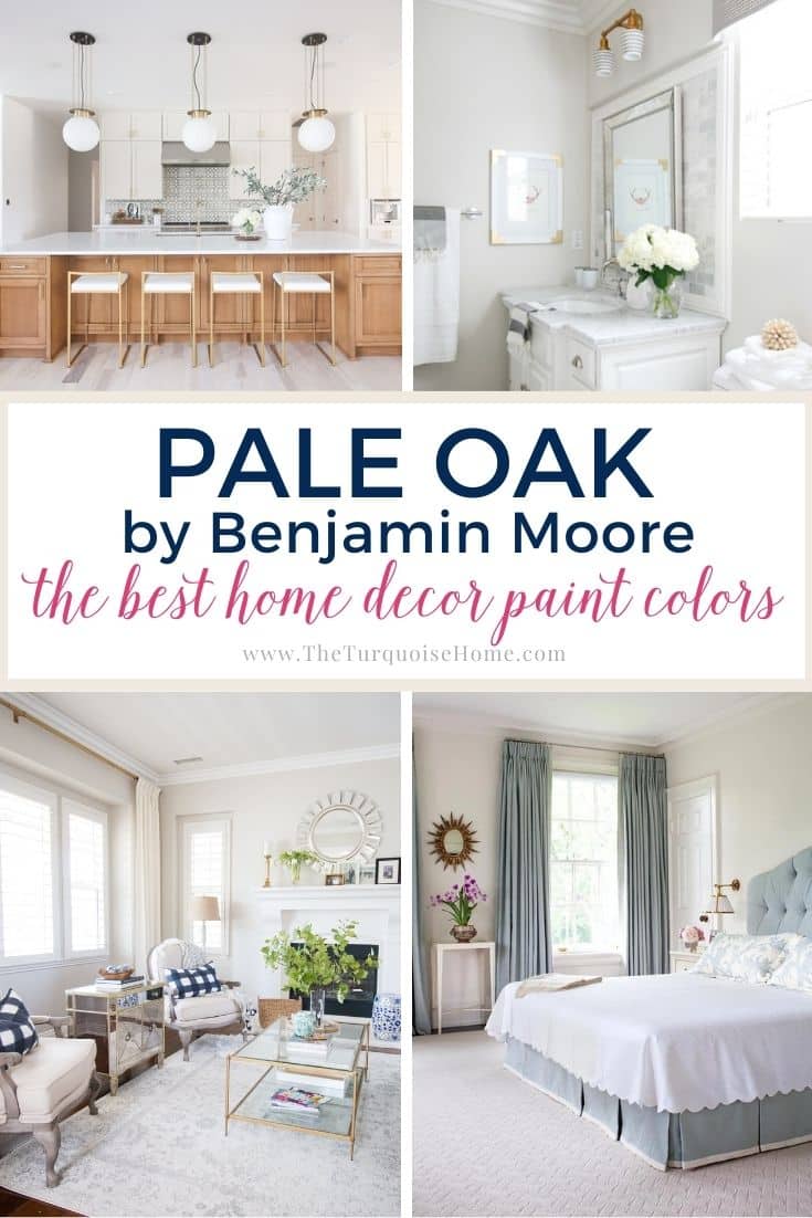
Benjamin Moore Pale Oak (OC-20): A Warm, Versatile Greige
...Read More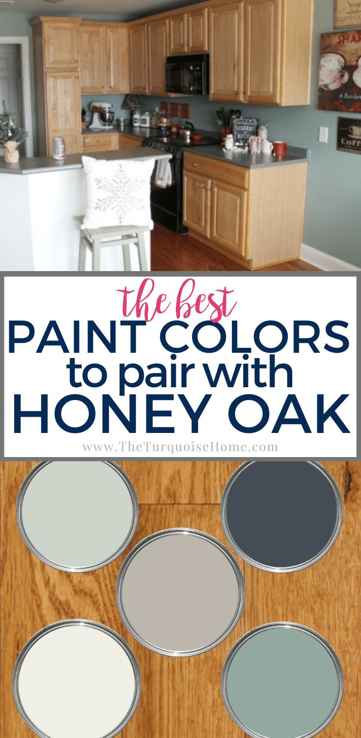
Best Paint Colors that Go with Oak Cabinets
...Read More
The Best Brown Paint Colors
...Read More
Best 15 Haint Blue Paint Colors for Porch Ceilings
...Read More