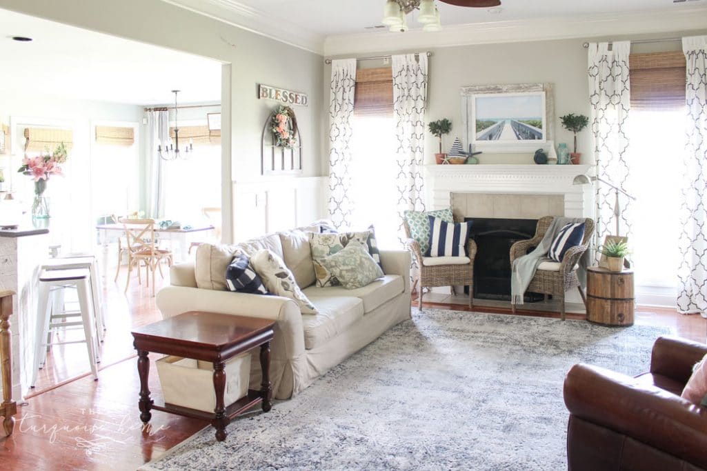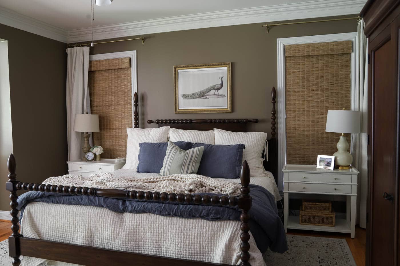
Discover the charm of Benjamin Moore Pale Oak (OC-20), a gentle, warm greige made for cozy, inviting spaces. See how it can transform any room!
If you're hunting for a warm neutral to snuggle up your space, consider Benjamin Moore Pale Oak. In today's paint color spotlight, this shade works in many different spaces and can completely change the look of a room with its subtle greige tone.
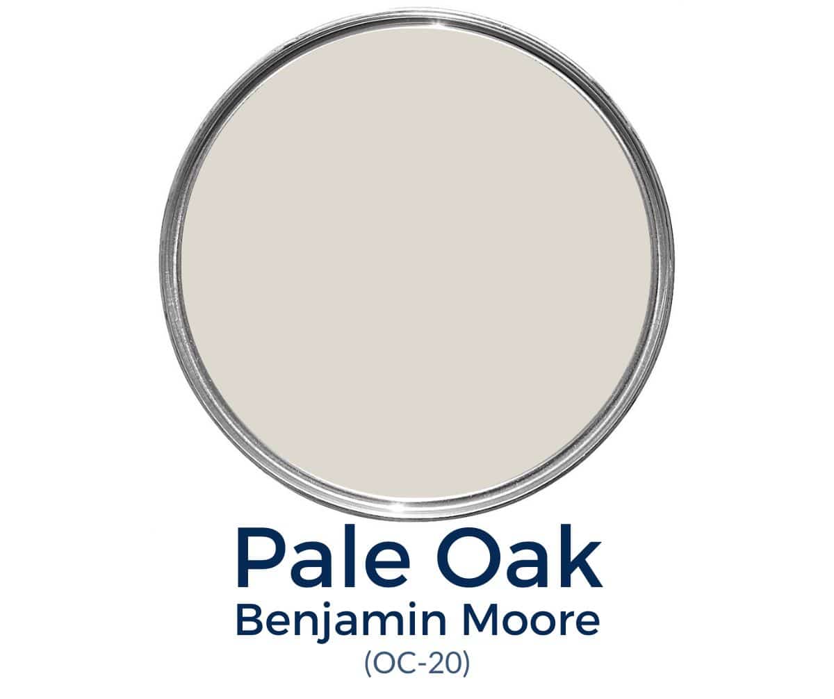
Benjamin Moore Pale Oak (OC-20) is a light neutral with a clear hint of color. Sitting somewhere between gray and beige, this taupe and greige paint color is a popular pick for anyone wanting a comfortable, welcoming room. Some people also call it a mushroom paint color.
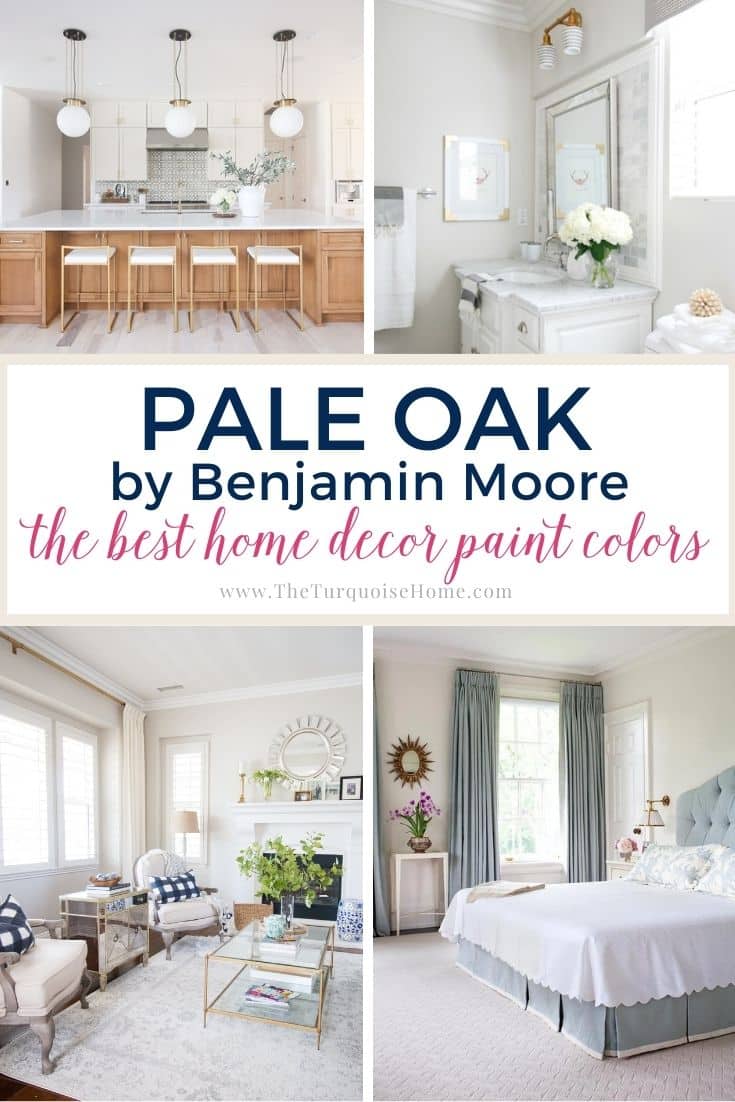
Some folks call Pale Oak by Benjamin Moore a chameleon color, since it works in so many spaces, but it always stays warm. You'll soon see just how differently it can look in various rooms!
If you're here, you're considering BM Pale Oak for your home. Let's dig into what you can expect from this popular greige paint.
PRO Tip
Whenever you choose a new paint color, try the real paint color in your home first!
The easiest and quickest way to do that is with Samplize! I use them exclusively for paint samples now. There's no mess and no leftover sample pots. Plus, these no-mess, peel-and-stick rectangles are made from real paint, so they're easy to move around the room and easy to save for later!
Order REAL Paint Samples
Benjamin Moore Pale Oak Undertones
BM Pale Oak can look very different depending on the light in your home. It's one of those paint colors you'll really want to swatch and test beforehand so you know it looks the way you want.
The most noticeable undertone is pink. Pink isn't a very popular undertone, and I'll admit you have to be careful with it. But when it's used well, it can give a room a unique glow and color.
Others note that it has yellow undertones. Yellow doesn't come through as much to my eye, but it's worth keeping an eye out for.
In most cases, Pale Oak looks like a light shade of gray rather than a true greige.
Is BM Pale Oak warm or cool?
Pale Oak is definitely a warm tone. Compared to traditional greiges, it's much warmer than you might expect. Since it isn't as cold as some, it's great for cozying things up a bit while still sticking to neutrals.
Pale Oak Light Reflectance Value (LRV)
Pale Oak has a light reflectance value (LRV) of 68.64. If you're new to LRV, the closer to 100, the lighter the color, and the closer to 0, the darker it is. Many designers use it to measure how much light a paint will reflect.
At 69, it has a pretty high LRV for a greige. With lots of natural light, it will wash out the color a bit and look like a nice, warm gray or off-white.
With little light, the warm tones of this greige shine through much more. You'll probably still want to pair it with some interior lighting, though.
As you can see, the amount of natural light really changes how this color may look in your home.
Pale Oak Color Strip
Other paint colors on the same color strip as Pale Oak include:
- Baby Fawn OC-15
- Cedar Key OC-16
- White Dove OC-17
- Dove Wing OC-18
- Seapearl OC-19
- Pale Oak OC-20
- Winter White OC-21
View this post on InstagramPost shared by Gathered (@gatheredgroup)
What colors go with Benjamin Moore Pale Oak?
If you love white paint colors, it's hard to go wrong with White Dove. It's a warm, creamy white that makes any home feel like a hug. It has gray undertones, so it never feels too yellow the way some other whites do.
As a beautiful neutral, this Benjamin Moore greige can be paired with rich accent colors. It lets those bolder shades pop, whether on an accent wall or a fireplace mantle. One of my personal favorite bold partners for it is Hale Navy, which has a gray undertone that can be brought out.
For trim, I also suggest a fresh, pure white. Sherwin Williams Alabaster White has barely any undertones and delivers that nearly impossible true white. I also highly recommend Simply White, which is the color I painted my own trim!
Benjamin Moore Pale Oak vs Other Greiges
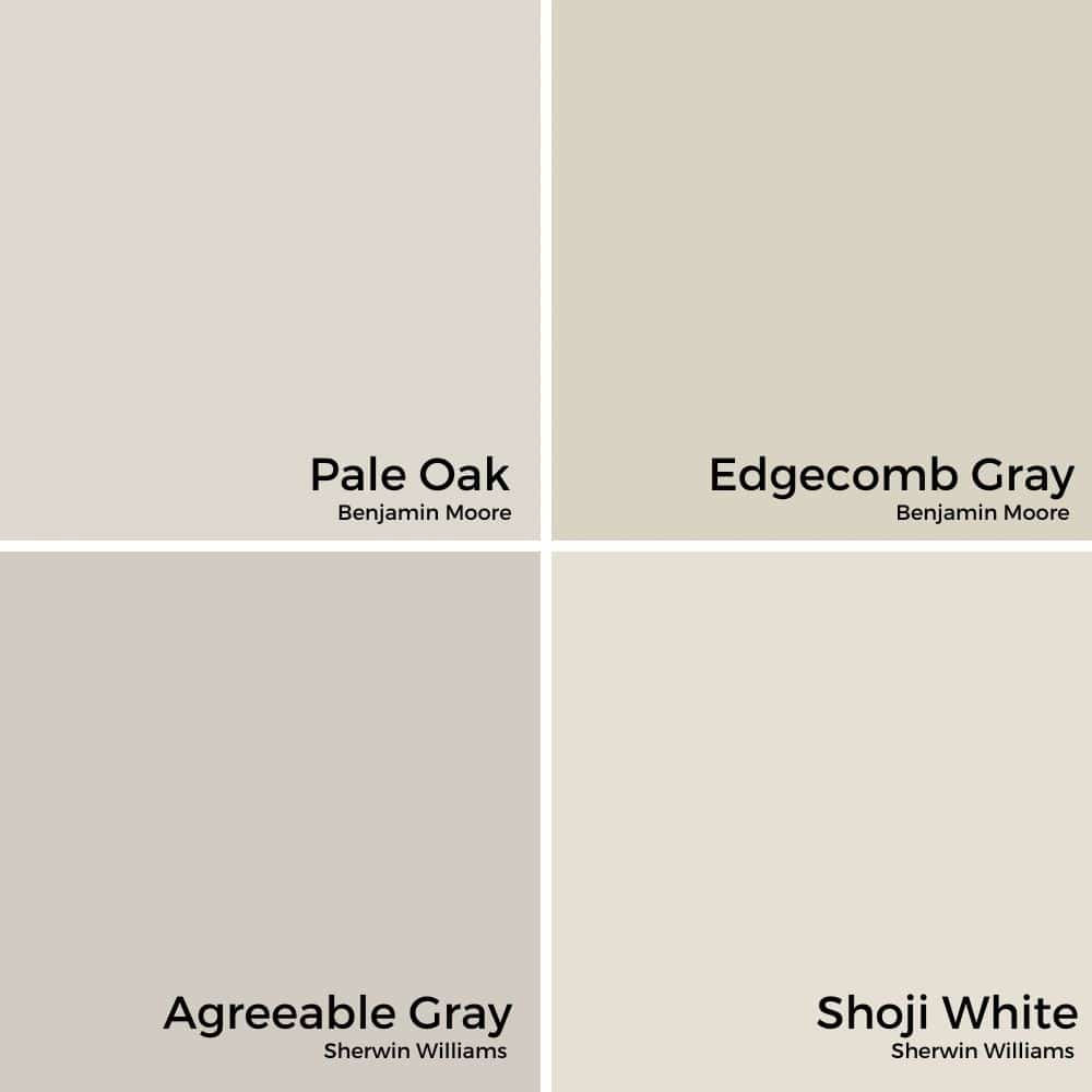
Benjamin Moore Pale Oak vs Edgecomb Gray
If Benjamin Moore Pale Oak isn't a traditional greige, then Benjamin Moore Edgecomb Gray certainly is. It can also lean gray or beige, with minimal green undertones. Sometimes it leans pink or green, but that rarely shows unless you pair it directly with green or pink.
Edgecomb Gray can look a bit dingy in dark rooms, but it won't wash out as much as Pale Oak in bright rooms. That's because it has a slightly lower LRV of 63.
Avoid pairing Pale Oak with green-beige colors like Revere Pewter or Edgecomb Gray, because their green undertones will make the pink in Pale Oak really pop. You can see that in the side-by-side comparison below.
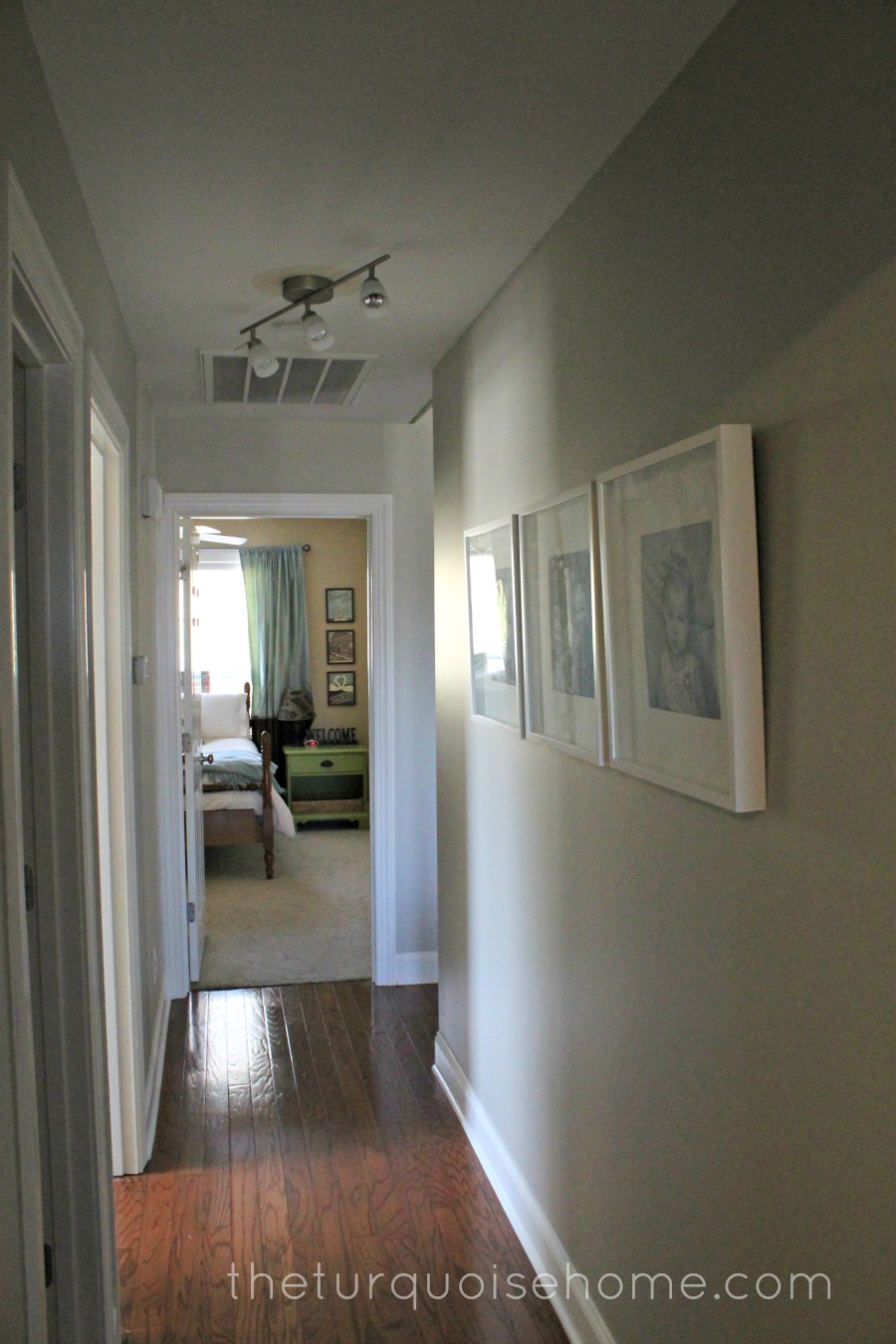
In my house, I used Edgecomb Gray in my kitchen, hallway, and entryway. It's one of my favorites! I chose to pair it with Shoji White instead of Pale Oak.
Pale Oak vs Agreeable Gray
Agreeable Gray is Sherwin Williams' number one best-selling paint color. You could say it's a popular one! Also considered a beige, Agreeable Gray can move toward the cool side rather than the warm. That's partly due to the slight purple and blue undertones in the paint.
Still, it's typically considered a warm greige. It has an LRV of 60 and is less likely to wash out in natural light.
Pale Oak vs. Shoji White
If you're deciding between Shoji White and Pale Oak, you're not alone! Both are popular choices for creating cozy, neutral backdrops, but they have a few key differences to weigh before you commit.
Shoji White by Sherwin Williams is a soft, warm white with subtle greige undertones. It leans a little toward cream without feeling yellow or dingy. Shoji White is perfect if you want a light, airy feel with just a whisper of warmth… think farmhouse kitchens, bright bedrooms, or welcoming entryways. I have it in my office.
Pale Oak by Benjamin Moore, on the other hand, is a true greige, a lovely blend of gray and beige. It's a bit deeper and moodier than Shoji White, giving your space a cozy, lived-in feel without being too dark. Pale Oak tends to show more color, especially in softer lighting, and it shifts beautifully throughout the day.
Best Trim Colors for Pale Oak?
The most popular trim color overall is white or slightly off-white. It's universally loved and makes any other wall color pop! With that said, what's the best white trim color for BM Pale Oak?
Not all white paint colors are the same. They have undertones that give them a warm or cool tint. You can find the best white paint for your space if you know how to spot those undertones. Since that would take a whole class to explain, let's start with these options:
- Simply White
- Chantilly Lace
- White Dove
How Pale Oak Looks in Different Rooms
Here are some pointers for the most common spaces where you might consider using Pale Oak paint color.
Pale Oak in Bathrooms
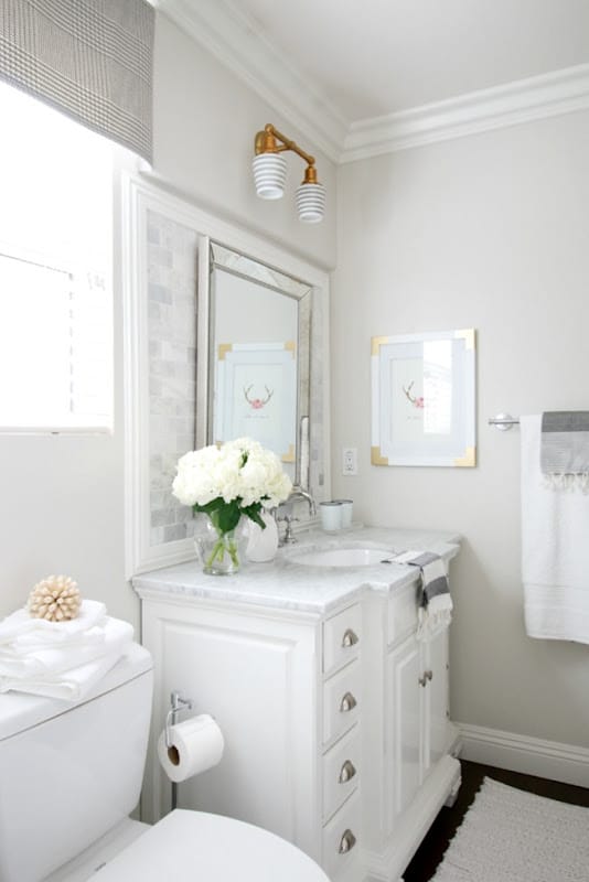
Bathrooms often have a lot of white, so you'll want something with some color on the walls. Using Pale Oak in the bathroom gives you a very clean, bright space while keeping it nice and warm.
The smaller and darker the bathroom, the warmer it will look. If you're lucky enough to have a large bathroom with lots of natural light, like this space from A Thoughtful Place Blog, BM Pale Oak will appear much grayer.
Unless you have pink towels or a pink shower curtain, you probably won't notice any undertones in the paint when it's used in the bathroom.
Pale Oak in Bedrooms
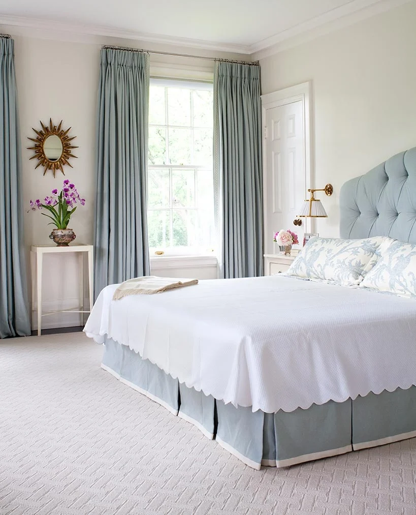
In the bedroom, you can get pretty creative with accent colors. Thanks to its neutrality, using Benjamin Moore Pale Oak as the paint color lets you pair all kinds of patterns and colors.
If you have soft blues in your bedroom, like in this design from Anne Hepfer Designs, Pale Oak pairs very well with blue and warm metallic hues. Overall, you can expect a pretty tranquil bedroom, which is what most folks are going for!
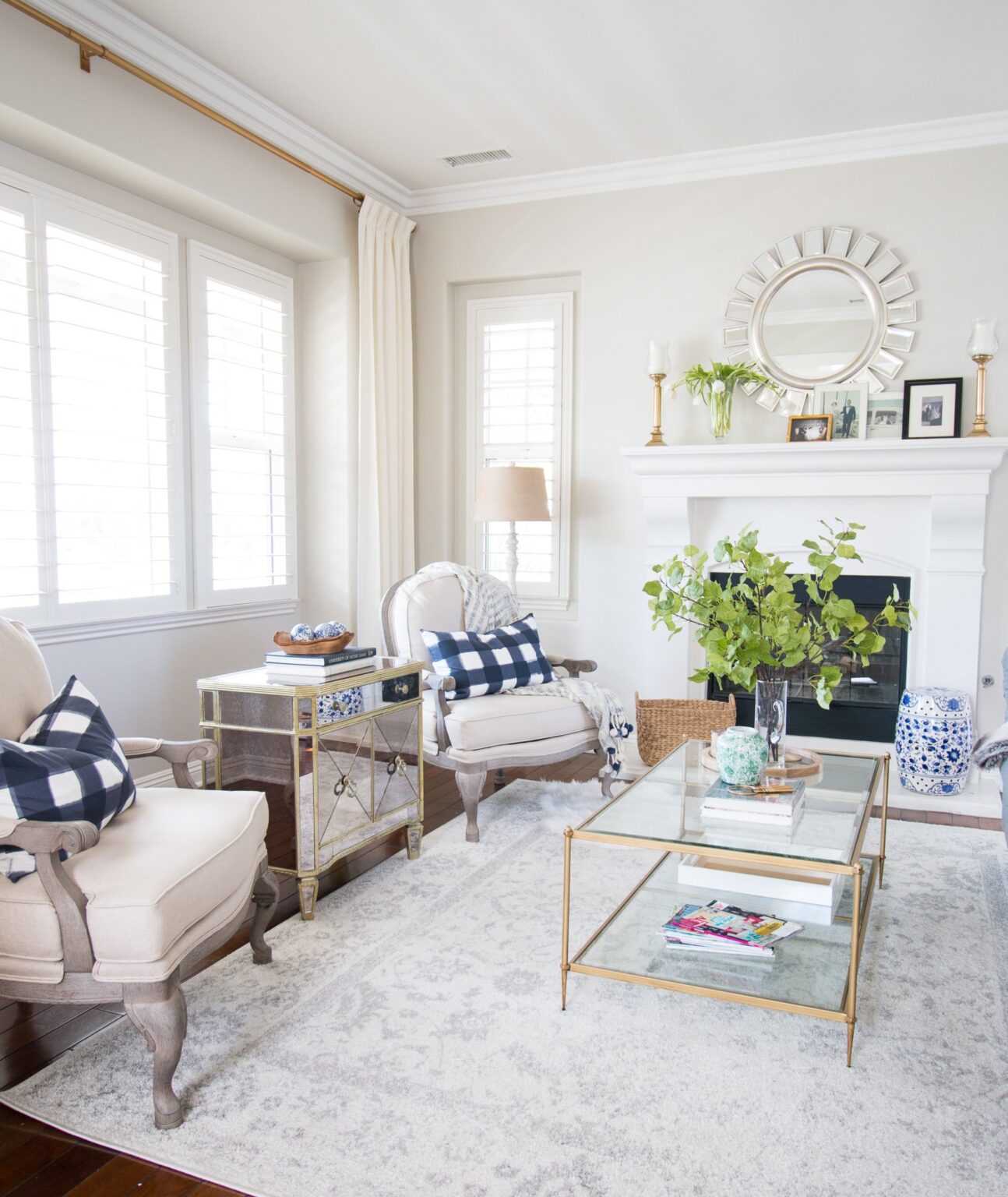
Pale Oak in the Living Room
More often than not, living rooms favor open floor plans. Pale Oak would be a great option for large or transitional spaces. It's one of the best neutral paint colors when plenty is going on!
Living rooms tend to change the most in any home. They become an entertaining space for guests one moment and a cozy night in with the family the next. They're also often decorated for the season, looking completely different at the holidays than in summer.
For ever-changing spaces, you want a soft, neutral color that can ebb and flow with the seasons, and Pale Oak can do just that for you!
This photo from A Thoughtful Place is the perfect example.
Pale Oak in Kitchens
We all know that anyone in need of an instant change should give a fresh coat of paint a try. In the kitchen, you can easily add BM Pale Oak as a warm neutral. The color looks especially good if you already have earth-toned tiled floors, backsplash, or countertops.
Warm wood also pairs well with this color if your kitchen has hardwood floors or wood cabinetry. You can even use the color on the cabinetry itself, like CC & Mike did in their remodeled space.
If you have crisp white cabinetry, which is super popular with farmhouse and modern, sleek styles, the Pale Oak paint color can add a little warmth to the kitchen.
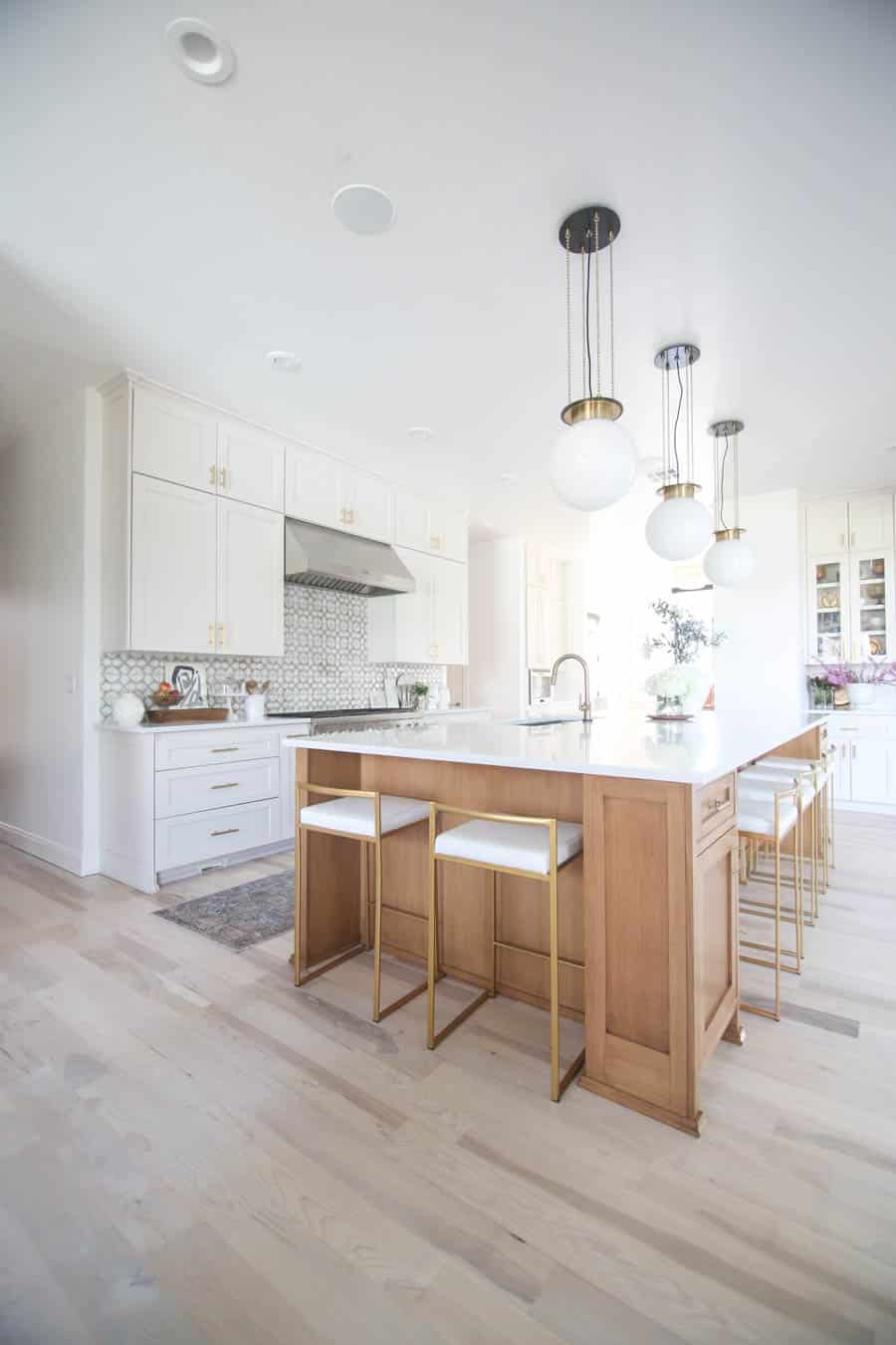
However you use it, Pale Oak by Benjamin Moore creates a warm and inviting space. If you've used it in your home, let me know how it looks in yours!
What undertones does Pale Oak have?
Pale Oak can surprise you with its undertones! You might notice a whisper of pink or even a soft yellow, depending on the lighting. It's one of those magical colors that shifts throughout the day, giving your rooms a beautiful, lived-in feel.
Does Pale Oak look gray or beige?
It really depends on the light in your home. In bright, natural light, Pale Oak leans toward a warm, light gray. In darker spaces, the beige undertones step forward, offering a soft, welcoming glow. That's what makes it such a versatile, family-friendly color!
Is Benjamin Moore Pale Oak a good choice for small rooms?
Absolutely! With its high light reflectance value (LRV) of about 69, Pale Oak can brighten up smaller spaces, making them feel larger and more open without feeling stark or cold.
Can I use Pale Oak in a kitchen or bathroom?
Yes, and yes! Pale Oak adds a soft, inviting warmth to kitchens and bathrooms. It plays beautifully with warm wood tones, creamy whites, and even cool blues for a fresh, timeless look.
More Paint Colors You'll Love
Want to check out some more paint colors? Here are some of my favorites!
Looking for more cozy neutrals? Check out Agreeable Gray and Revere Pewter! Or try a darker gray like Repose Gray. Or go with a complementary color like Hale Navy or Sea Salt.