Benjamin Moore Van Deusen Blue (HC-156) is a striking medium-to-dark blue with gray undertones that behaves like a neutral. Could it be the right paint for you? Read on to find out!
In interior design, neutrals have long been the reigning favorites. And I get why. They feel safe because most people like them, they don't come across as too loud, and they pair easily with a wide range of colors and palettes.
Still, things are changing. Designers are embracing bolder hues more and more, especially shades that offer deep, rich color AND act as neutrals! (Can you hear me cheering? I love color!)
Navy is one of those shades. You might not think of this rich blue as truly neutral at first, but think about your favorite pair of jeans and how well it goes with almost anything. Navy really can be a neutral!
Take the very popular Benjamin Moore's Hale Navy, for example. It is both bold and neutral and suits nearly any home decor style. The catch is that it's dark, really dark. For some people and some homes, it can be too dark.
So, what if you don’t want to go quite as dark? Is there a neutral navy blue that’s not quite as deep? Yes! And I have a terrific example for you today.
Say hello to Benjamin Moore Van Deusen Blue (HC-156).
This paint is a timeless, popular choice from Benjamin Moore's Historical Collections line, and it doesn't carry any unwelcome undertones that can put people off.
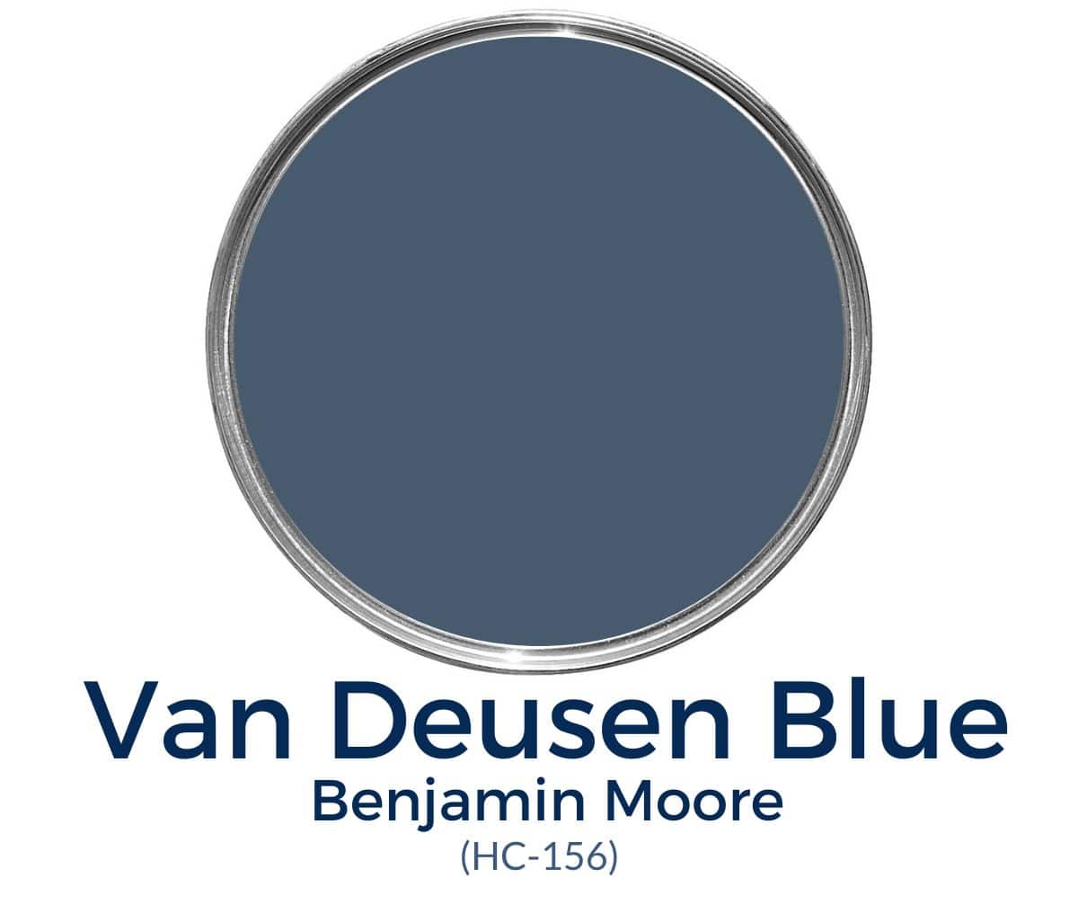
It's bold, beautiful, and neutral. Let's learn more about this classic dark blue paint!
What color is Benjamin Moore Van Deusen Blue?
Here are a few key qualities to know about this timeless shade:
- A bold, neutral blue that leans cool without feeling cold
- A dark blue (many would call it navy) with an LRV of 12
- A popular choice for walls, accents, and cabinets
- Free of unwanted undertones, and it pairs well with many other colors
PRO Tip
Whenever you choose a new paint color, try the real paint color in your home first!
The easiest and quickest way to do that is with Samplize! I use them exclusively for paint samples now. There's no mess and no leftover sample pots. These no-mess, peel-and-stick rectangles are made from real paint, so they're easy to move around the room and easy to save for future reference!
Order REAL Paint Samples
Undertones in Van Deusen Blue
This paint is very versatile. It's really a muted blue, which means it has gray undertones instead of green or purple ones. Those grays are just strong enough to keep this lovely shade from looking too bright and to give it a moody quality.
Every so often you may notice a hint of green. It's subtle, but it can show up now and then.
Even so, Van Deusen Blue from Benjamin Moore reads as blue (a rich, gorgeous blue) the vast majority of the time.
Lighting can change how a paint looks. In a room with cool-toned light (for example, north-facing light), the gray undertones show more. Warm-toned light (for example, in a south-facing room) makes Van Deusen Blue look bluer and more balanced.
LRV of Ben Moore Van Deusen Blue
Light reflectance value (LRV) measures how much light a paint color reflects or absorbs. A higher LRV means a lighter color, since it reflects more light. Put another way, an LRV of 100 is pure white and an LRV of 0 is pure black.
Van Deusen Blue has a Light Reflectance Value of 12 (11.97, to be exact).
Although Benjamin Moore Van Deusen Blue is dark, it isn't quite as dark as Hale Navy, which has an LRV of 8. At an LRV of 12, I'd say it sits on the lighter side of the dark range.
For some people, it may still be too dark to use on an entire room. However, in a room with plenty of natural light, it can look fantastic.
Keep in mind that the paint finish you choose changes how dark this shade feels. A semi-gloss will look lighter than a flat finish in the same color.

Benjamin Moore Van Deusen Blue Coordinating Colors
BM Van Deusen Blue looks great alongside many colors and makes them look good too! I think it's especially lovely with lighter blues, blue-greens, grays, pinks, yellows, browns, beiges, off-whites, and whites.
It also looks terrific with wood tones and stone.
Benjamin Moore recommends pairing it with:
- Aloe Vera
- Mt. Rainier Gray
- Yellow Freeze
Some of my personal favorite pairings are:
- Simply White
- Revere Pewter
- Gray Owl
- White Dove
- Silver Mist
- Papaya
- Cloud White
- Melted Ice Cream
- Water's Edge
Best Trim Colors to go with Van Deusen Blue
If you choose this shade for your walls, you have a few trim options. I personally love how crisp, clean white looks with Ben Moore Van Deusen Blue. I'd recommend Simply White, Chantilly Lace, or Pure White.
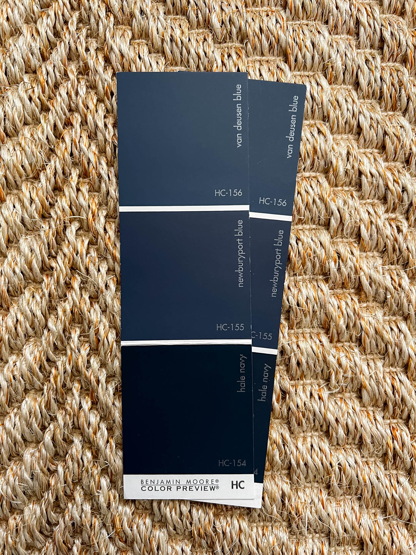
Van Deusen Blue on a Color Strip
Other paint colors on the same sale color strip as Van Deusen Blue include:
- Newburyport Blue
- Hale Navy
Where can you use Benjamin Moore Van Deusen Blue?
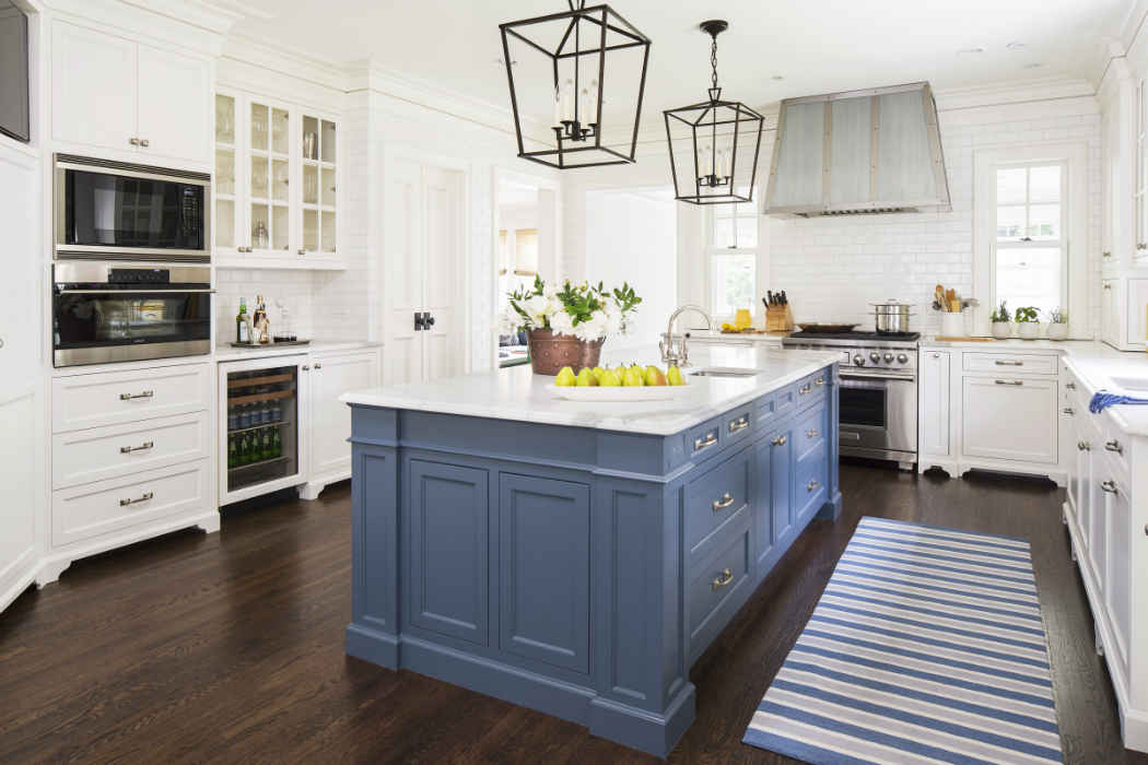
There are plenty of places to use this timeless paint. Consider it anywhere you want bold color, especially on kitchen cabinets and islands, or on a wall next to white wainscoting.
You could also try it on:
- Doors
- Cabinets
- Vanities
- Kitchen islands
- Interior walls
- Accent walls
- Exteriors
Is Benjamin Moore Van Deusen Blue a good color for cabinets?
Yes! It's a great choice for cabinets because it adds bold color without making the whole room feel too dark.
Home Styles that Work with Extra White
- Farmhouse
- Traditional
- Transitional
- Coastal
- And more
Room Examples using Benjamin Moore Van Deusen Blue
I've gathered a few examples of Ben Moore Van Deusen Blue (HC-156) to show how it looks under different lighting. Notice how dark or light it appears in each setting.
Van Deusen Blue Kitchen
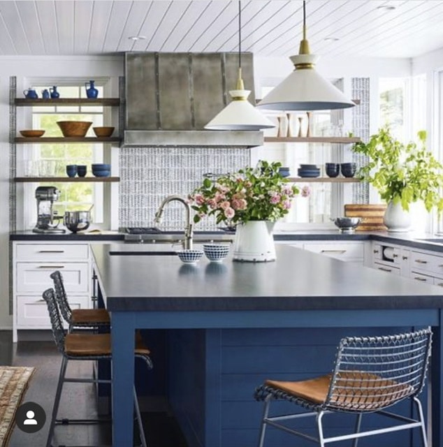
Isn't this kitchen from Studio Dearborn gorgeous? Ben Moore Van Deusen Blue makes the lower cabinets stand out and gets you saying "wow" instead of "oh, that's dark."
I love how well this blue works with the dark gray countertops, and how it adds a playful yet chic feel to the room.
Benjamin Moore Van Deusen Blue Living Room
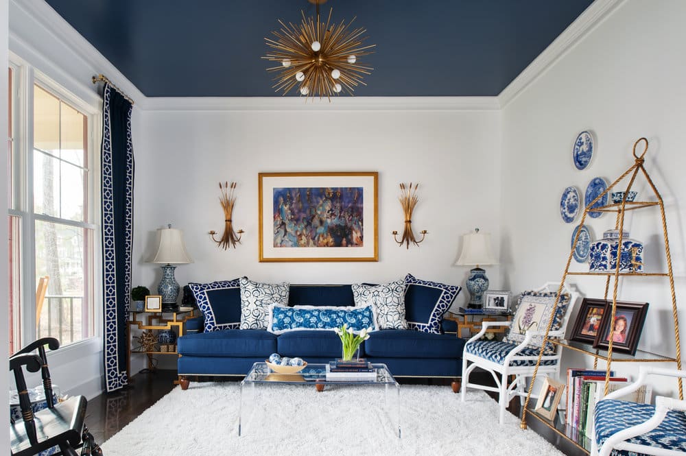
Ever wondered why some people call the ceiling the fifth wall? Look at the impact Van Deusen Blue has in this living room from Mathe Design, and you'll see why!
By keeping the walls white, painting the ceiling, and adding touches of navy around the room, the designers created an eye-catching, cohesive look (and the ceiling looks tall!).
Bedroom in Van Deusen Blue
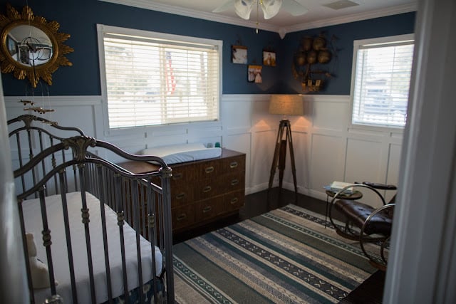
This nursery from Dream Book Design has a nautical theme, and this deep, moody blue is a perfect fit. Since the room gets little natural light, you can really see how dark (and gorgeous) Van Deusen Blue can be.
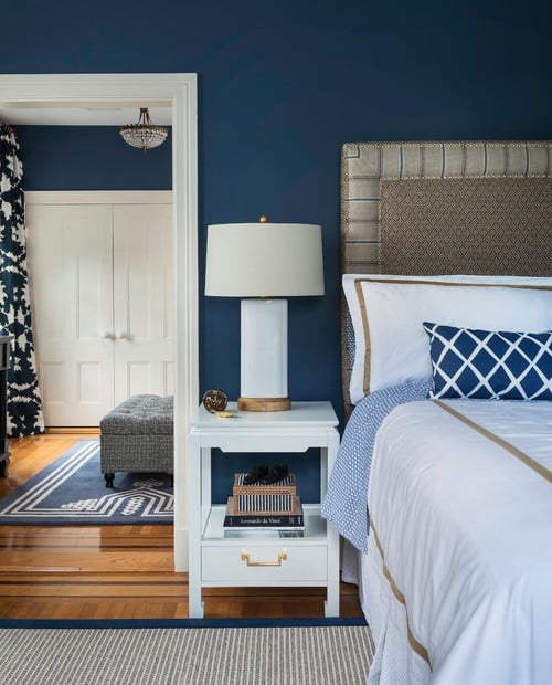
White and navy are a classic combination, and this bedroom from Digs Design Company (via Houzz) is stunning. It feels chic and timeless, like a restful escape from the world's worries.
Check out my favorite Bedroom Paint Colors and see whether Van Deusen Blue makes the cut!
Ben Moore Van Deusen Blue Home Office
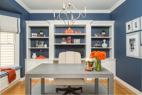
Color psychology looks at the mental and emotional effects colors have on people. Blues are energizing and grounding, and they help improve focus. That may be why Van Deusen Blue is such a good home office color, like this one from Bees Knees Design, LLC.
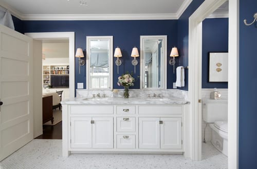
Ben Moore Blue Bathroom
Bathrooms are often small, dark spaces. But if yours gets plenty of natural light, consider this shade to create a chic room.
PKA (via Houzz) created a gorgeous master retreat with a classic navy and white color scheme.
Frequently Asked Questions
Is Benjamin Moore Van Deusen Blue warm or cool?
Blues are usually cool colors, so Van Deusen Blue leans cool, especially because of the gray undertones this shade carries.
Can I use Benjamin Moore Van Deusen Blue on my home's exterior?
Yes, and it's a terrific exterior color. The one word of caution is that dark shades tend to fade in the sun faster than light ones.
If you're considering this hue for the body of your home, it works best in overcast climates or shady spots, so you won't end up with faded patches next to more vibrant ones.
Benjamin Moore Van Deusen Blue is a great blue for any home because it delivers sophistication and timelessness. It's an ideal choice for walls, cabinets, kitchen islands, or anywhere you want bold, eye-catching color.
More Paint Colors
If you're looking for go-to shades for your home, here are a few of my favorites:
Tools to Help You Paint a Room Yourself
Here are some helpful tools for painting a room on your own. I'd start with my tips for painting a room in 5 easy steps. I do nearly all of my own painting, and these tools make the job easier and give professional-looking results!
- Paint Brush – These brushes cost a bit more than basic ones, but they're worth it! I've used these for more than a decade, and if you wash them thoroughly after each use, they'll last for years.
- Painter's Tape – A MUST-have for taping off edges. Unless you have a rock-steady hand, you'll want to tape off every edge.
- Drop Cloths – Another must-have for protecting floors and furniture from drips.
- Paint Cup – You could use any old cup, but I've come to swear by this one. The magnetic piece holds your brush cleanly in place when you take a break. It also fits my hand perfectly and keeps my grip from cramping.
- Roller Tray – This is the only paint tray I'll ever use again. The magnetic piece holds the roller so it doesn't slip into the paint. The liners may be a luxury, but I won't paint without them, because they make cleanup much faster and easier!
MORE POSTS YOU WILL LOVE: