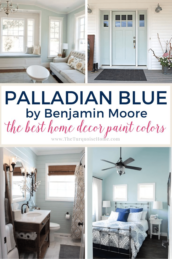
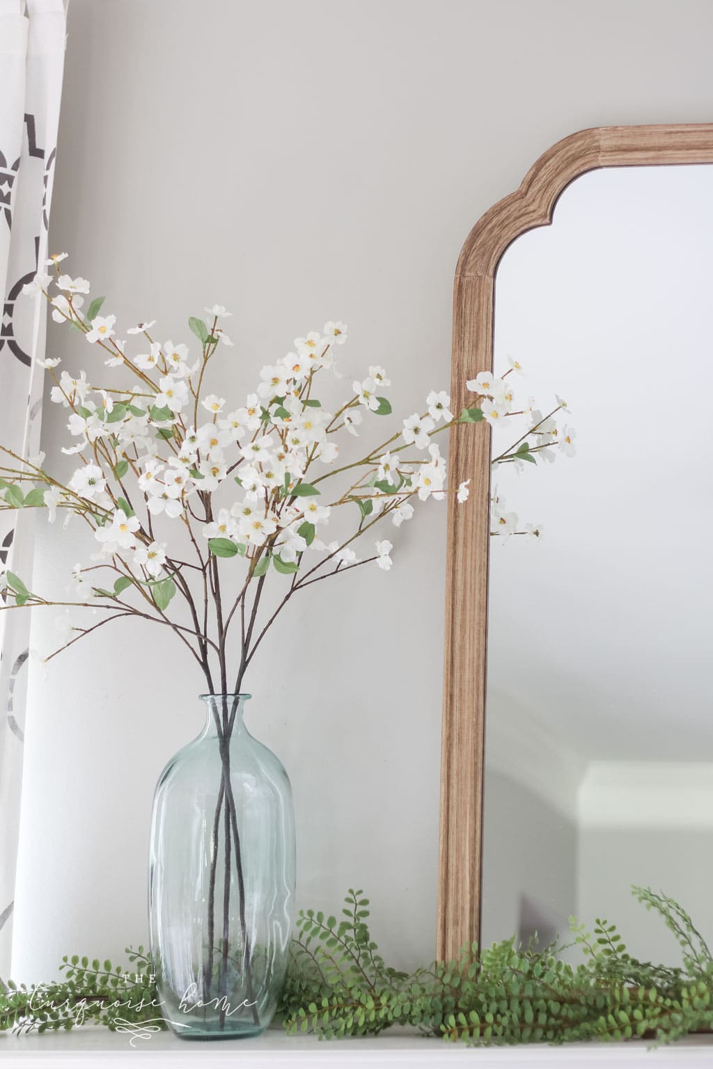
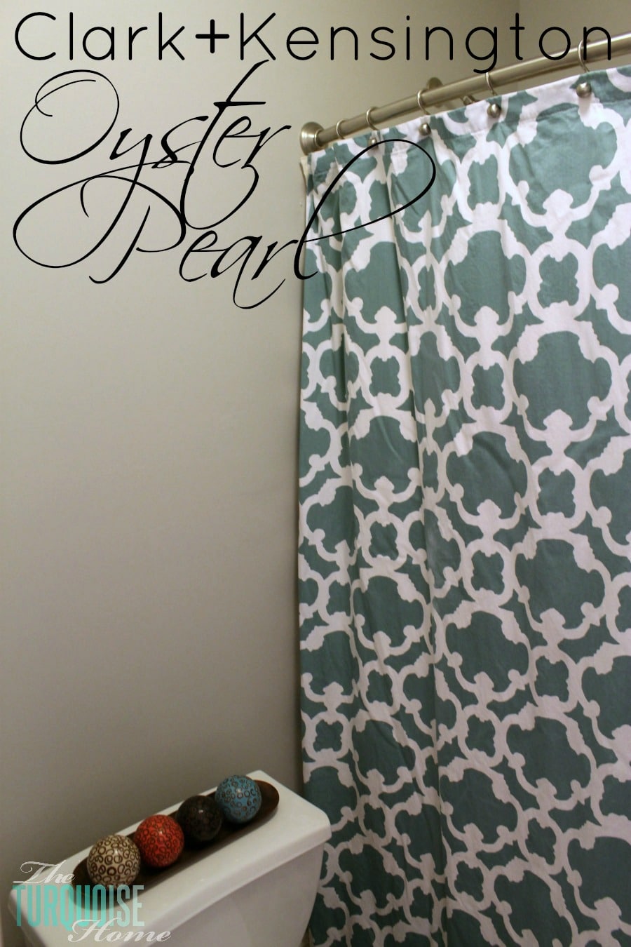
Whether your taste leans modern farmhouse or coastal glam, Benjamin Moore Stonington Gray fits right in. In today's paint feature, we'll cover everything worth knowing about this cool gray that has become a design favorite.
Choosing a paint color for your home deserves care. It takes time and money, and you'll likely live with the result for years, so the mood you create needs to be just right!
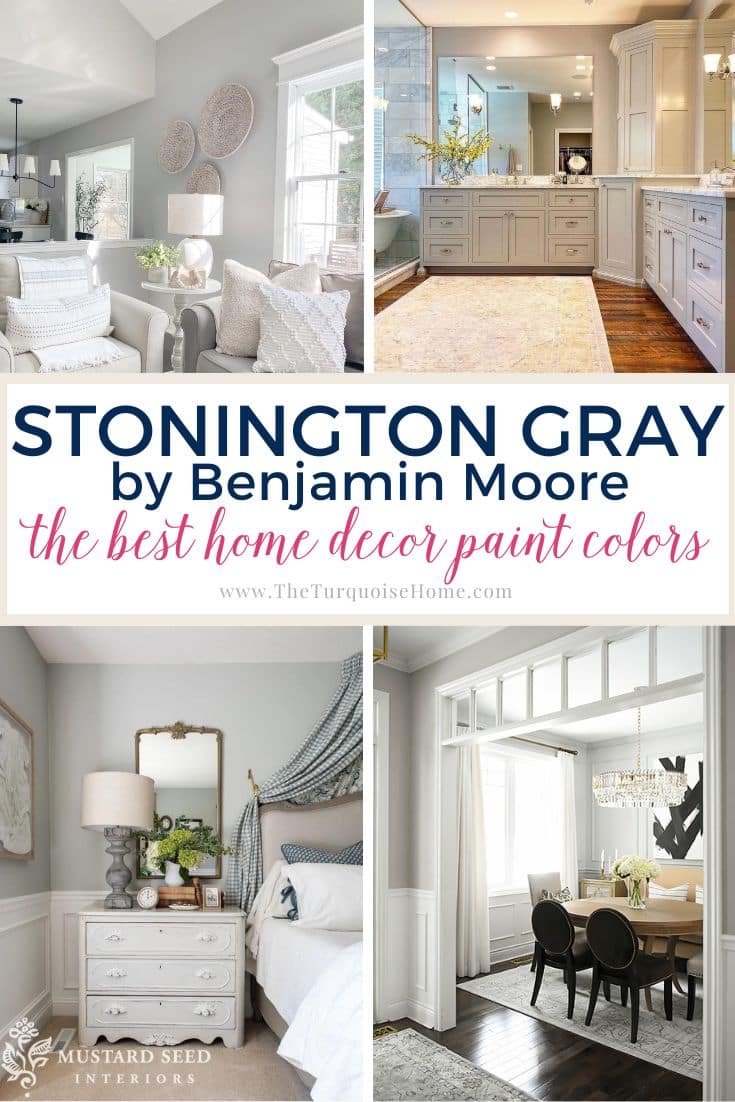
Picking a solid neutral gray is tough, given how many options there are and how differently each one reads in a home. Here's one worth considering!
Benjamin Moore Stonington Gray (BM HC-170) is among the brand's top-selling grays. It belongs to their Historical Collection, a lineup of proven favorites that look great both indoors and out.
Stonington Gray is a classic choice. It's a moody, cool gray that should keep your space looking fresh for years.
If you're thinking about using Stonington Gray at home, I'll walk you through what matters, including undertones, light reflectance value, colors that pair well with it and more.
Pro Tip
Whenever you choose a new paint color, test the actual paint in your own home before committing!
The quickest, easiest way to do that is with Samplize! I now use them exclusively for paint samples. There's no mess and no leftover pots to store. These peel-and-stick squares are made from real paint, slide easily around the room, and are simple to keep for later reference!
Order Real Paint Samples
What Undertones Does Benjamin Moore Stonington Gray Have?
Every paint carries undertones, and Stonington Gray is no different. The key is choosing a color whose undertones suit your room and your vision.
Because it leans cool, Stonington Gray reads as a more traditional gray. Still, it never feels sterile or chilly.
Stonington Gray shows mainly subtle blue undertones, though these can vanish under some lighting. You may also spot hints of green and purple, but they appear far less strongly than the blue.
In north-facing light, the blue undertones come through most strongly. As a rule, north-facing light tends to amplify whatever color is already there.
In south-facing light, the green undertones may peek through now and then.
View this post on InstagramShared on Instagram by Marian aka Miss Mustard Seed (@missmustardseed)
What Is Stonington Gray's Light Reflectance Value?
Stonington Gray has a light reflectance value (LRV) of 59.36. If LRV is new to you, professionals use it to gauge how much light a paint will bounce back. The scale runs from 0 for pure black to 100 for pure white.
At 59, Stonington Gray falls in the medium range. It doesn't lean too far toward light or dark, which makes it a flexible neutral. It won't look washed out in sunny rooms or gloomy in dim ones.
View this post on InstagramShared on Instagram by Marianne Elizabeth Design Inc. (@marianneelizabethdesign)
Which Colors Complement Benjamin Moore Stonington Gray?
BM Stonington Gray is a true neutral. In most settings it won't fight other colors in the room for attention, and its undertones blend easily with whatever else is there.
For trim, consider a gentle, warm white such as Simply White or Cloud White. A warm trim softens the mild cool undertones in Stonington Gray.
A crisp pure white like Chantilly Lace is another strong trim choice, creating clean, noticeable contrast. Benjamin Moore recommends it alongside Stonington Gray, so it's an easy win!
For a deeper partner, try a darker cool gray such as Puritan Gray. A navy like Hale Navy would also look striking. If you pair Stonington Gray with a darker shade, keep everything else in the room, like furniture, flooring, trim, ceilings and doors, light in tone.
You could also try some green paints, both light and dark, to bring out those subtle green undertones.

Benjamin Moore Stonington Gray Around the Home
Here are some examples of Stonington Gray in different rooms. As a neutral, it works in all sorts of applications.
Stonington Gray in the Kitchen & Dining Room
A neutral wall color helps a kitchen feel calm when there's already so much happening. Cabinets, flooring, backsplash, countertops, décor, appliances and furniture all vie for attention, and a neutral wall helps pull everything together.
Beyond the walls, Stonington Gray also works well for kitchen cabinets. It adds contrast and color without weighing the room down or making it feel too dark.
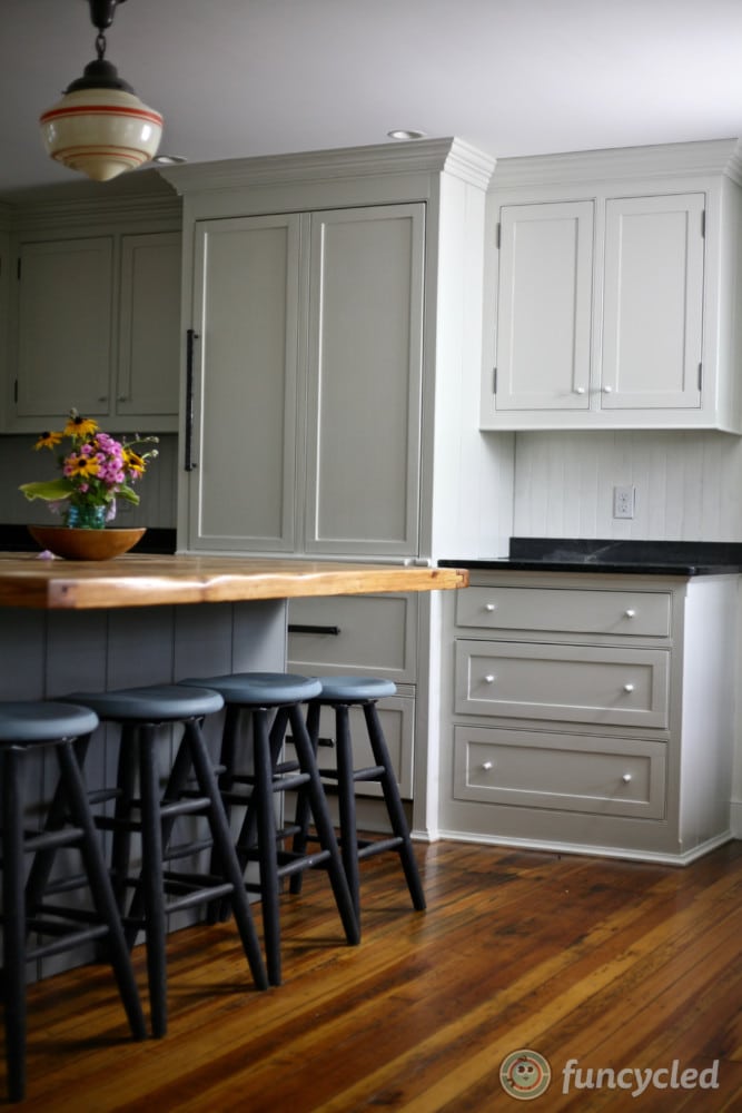
Paint Sheens in the Kitchen: Use satin on visible walls, and choose satin, semi-gloss or high-gloss for your painted cabinets. I personally like satin on my cabinets.
In the dining room, this lovely gray creates a refined setting for everyday meals and guests alike.
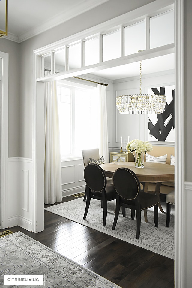
Sleeping Quarters
If you're like me, you want your bedroom to feel like a personal retreat. Thanks to its blue undertones, Stonington Gray can feel wonderfully calming.
Add bursts of color through an accent wall, a patterned duvet, a bright rug or similar touches to showcase your personality. Or follow the example below for a spa-like, serene room built from neutral and blue shades.
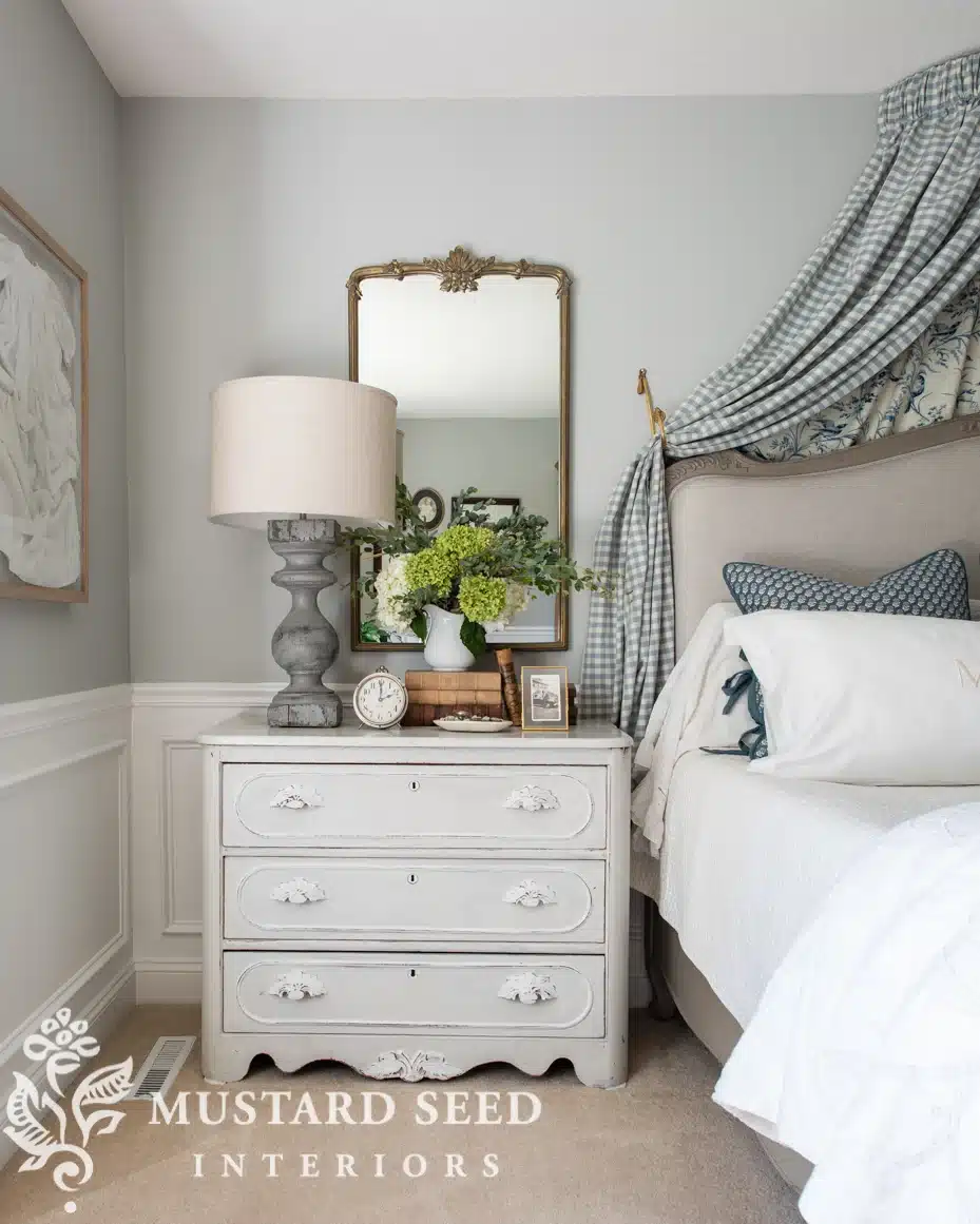
Bedroom Paint Finish: The ideal sheen for a bedroom is either satin or eggshell, depending on the room's lighting and the color you choose. I prefer eggshell on my bedroom walls.
Living Space
BM Stonington Gray tends to shine in open spaces that catch all kinds of light. A living room gets used at all hours and often receives the most natural light in the house, so you'll watch the paint shift as the sun moves across the day.
Stonington Gray in the living room gives you plenty of room to experiment with accents, whether neutral or bold.
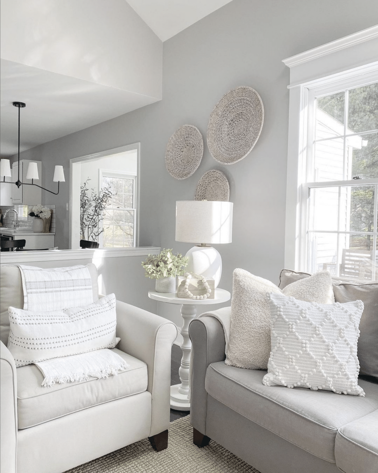
Paint Sheen in the Living Room: I suggest a practical middle-ground finish, such as eggshell or satin.
Bath Space
Cool tones work beautifully in bathrooms, creating a spa-like atmosphere that feels relaxing and indulgent.
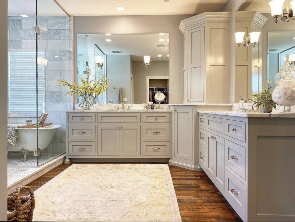
Pairing Stonington Gray with crisp white sinks and tubs looks clean and modern. For a seaside feel, add blue towels and accents. Blue tile, or tile with blue veining or undertones, also complements Stonington Gray nicely.
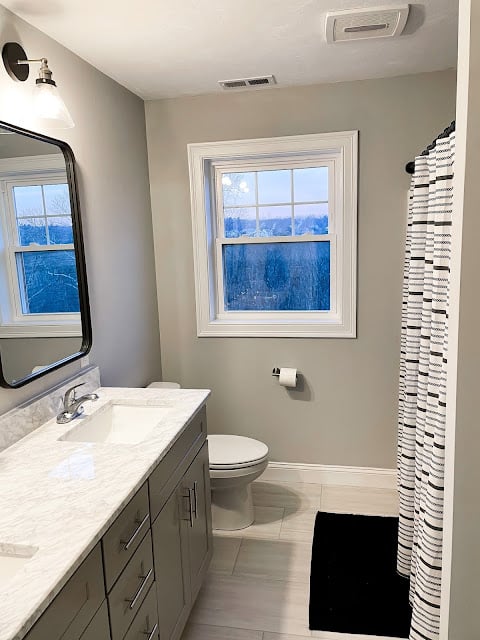
Paint Finishes for the Bathroom: Bathrooms face more humidity than most rooms, so satin is a smart choice. The powder room sees heavy traffic, and you'll want a surface you can wipe clean, which is another reason satin works well.
Other Grays Worth a Look
If you're comparing grays and Stonington Gray doesn't feel quite right, consider one of these alternatives.
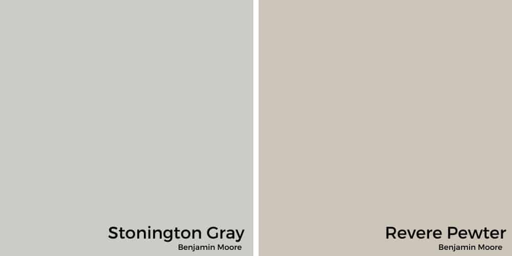
Revere Pewter
Another of Benjamin Moore's bestselling grays, Revere Pewter has an LRV of 55.5, making it a touch darker than Stonington Gray.
The main difference is that Revere Pewter is a warm gray that can look nearly beige under some lights. If you want warmth rather than coolness, it may be the better fit.
Gray Owl
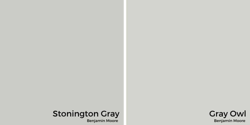
People often suggest Benjamin Moore's Gray Owl as a near match for Stonington Gray. The key difference is that Gray Owl leans slightly greener, where Stonington Gray leans bluer.
Gray Owl also carries an LRV of 65, so it reads noticeably lighter than Stonington Gray. Even though it's cool-toned, it can feel warm in rooms with little natural light.
Closing Thoughts on Benjamin Moore Stonington Gray
Stonington Gray is a versatile paint that suits many spaces. Its medium LRV means it rarely makes a room feel too bright or too dark, with only occasional exceptions.
You'll want to love blue undertones if you choose Stonington Gray, though purple and green hints may appear if you bring them forward.
It's easy to see why this one sells so well. If you use BM Stonington Gray at home, I'd love to hear how it turns out!
More Posts You Might Enjoy: