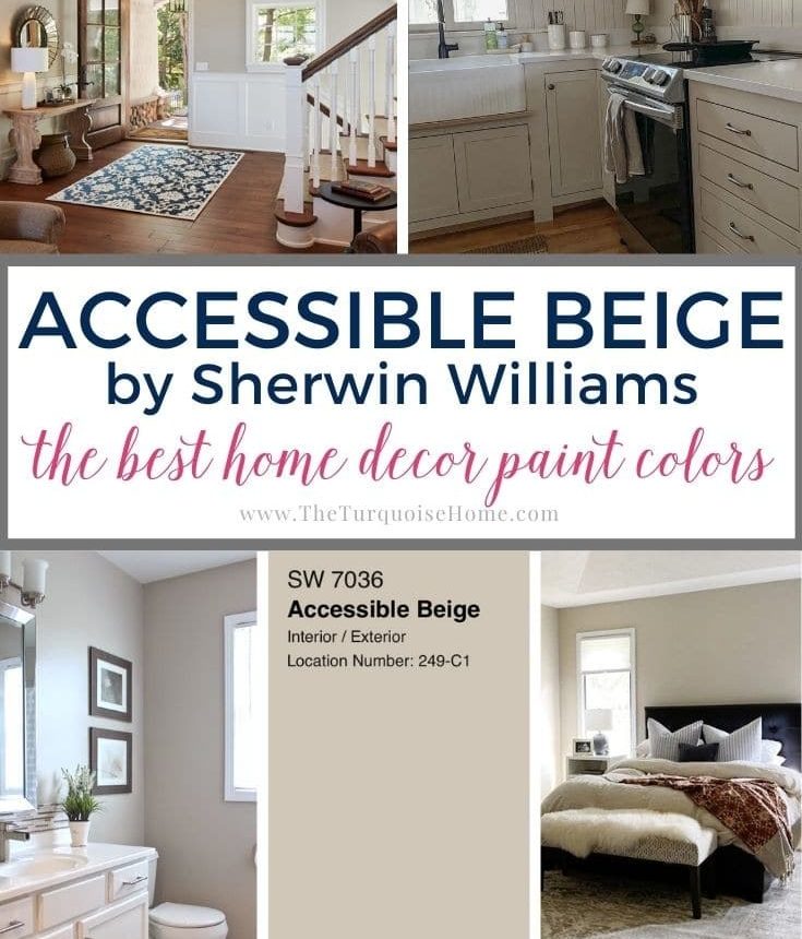
Accessible Beige is one of those rare neutral paint colors that has remained popular through changing design trends. Its warm, flexible undertones give it a timeless quality that suits both traditional and modern interiors.
Sherwin Williams Accessible Beige (SW 7036) might remind some of the beige tones from the 1990s and 2000s, but this is far from outdated—it’s a modern, refined greige that works beautifully in many settings.
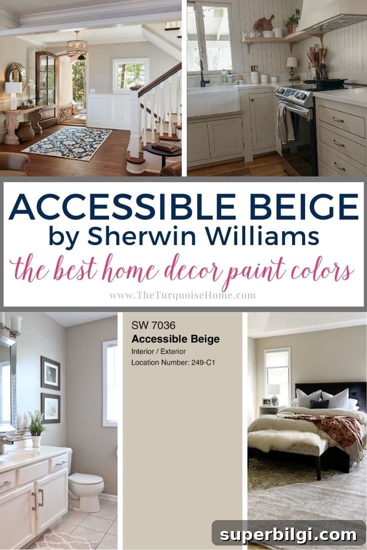
This earthy greige is a contemporary update on classic beige. Accessible Beige’s balanced warmth and subtle gray and taupe notes make it a top pick for whole-house palettes or single-room refreshes.
Considered a warm neutral, Accessible Beige feels mature and sophisticated. It avoids the overly golden tones of older beige shades and instead provides a soft warmth with gray and taupe undertones that shift with light.
Keep reading to decide whether Accessible Beige belongs in your home color palette.
This post contains affiliate links for your convenience. See full disclosure.
Updated July 2026: This guide has been refreshed with new room examples, coordinating colors, common mistakes to avoid, and answers to frequently asked questions about Sherwin Williams Accessible Beige.
Thinking about painting with Sherwin Williams Accessible Beige? Here’s what you’ll learn:
- Why Accessible Beige (SW 7036) remains one of Sherwin Williams’ most popular neutrals
- How its beige, gray and subtle green undertones shift with light
- Which rooms, styles and finishes it pairs with best
- Common mistakes to avoid before choosing this color
- How to test the color confidently before buying full gallons
Accessible Beige Sherwin Williams: What You Need to Know
If you’re considering Accessible Beige from Sherwin Williams, you’re not alone. Sherwin Williams Accessible Beige (SW 7036) has become a go-to neutral because it is versatile, warm, and pairs well with a wide range of design elements and decorating styles.
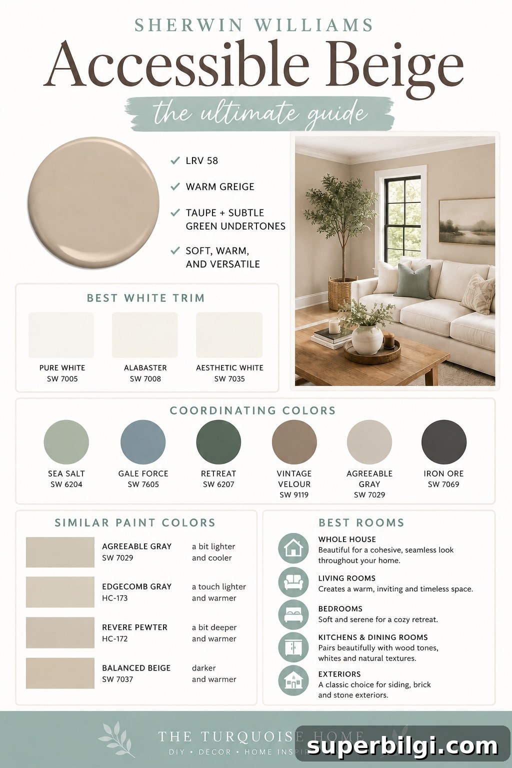
Although the name includes “beige,” Accessible Beige is best described as a warm greige—a mix of beige and gray. It contains taupe and subtle green undertones that may become more apparent depending on your home’s light and finishes. For that reason, always test a large sample in each key room before committing.
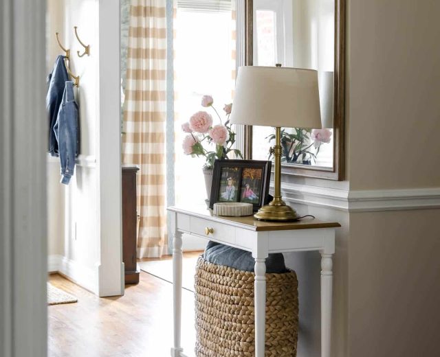
Accessible Beige complements warm wood floors, creamy white trim, brass accents, natural stone, woven textures, and layered neutrals. It adapts to traditional, transitional, farmhouse, cottage, and modern organic interiors, making it a safe long-term choice if your style evolves with time.
Like all paint colors, Accessible Beige will read differently in every home. Natural light, window orientation, flooring, countertops, furniture and bulbs can all influence how the color appears. South-facing rooms often read lighter and warmer; north-facing rooms may emphasize gray undertones.
If you want a cozy, sophisticated warm neutral that’s not overly trendy, Sherwin Williams Accessible Beige is worth testing in your space. Below you’ll find quick facts, undertones, coordinating colors, room examples, and practical testing tips to help you decide.
Quick Facts about Accessible Beige
| Color | Accessible Beige |
|---|---|
| Brand | Sherwin Williams |
| Number | SW 7036 |
| LRV | 58 |
| Undertones | Warm greige with taupe and subtle green |
| Best For | Whole-house paint, living rooms, bedrooms, exteriors |
| Pairs With | Warm whites, natural wood, muted greens and blues |
Accessible Beige Undertones
Accessible Beige differs from many traditional beiges that skew strongly golden. It blends beige and gray—often called greige—so it avoids looking overly yellow. Taupe undertones add warmth without the heavy gold of older beige shades.
In some lighting, a subtle green cast can become noticeable, giving the color an earthy feel. These undertones are influenced by surrounding colors: pairing the paint with greens or pinks can reveal more of those subtle notes.
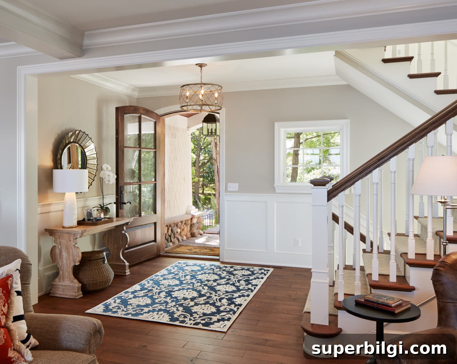
Light Reflectance Value of Accessible Beige Paint
Light Reflectance Value (LRV) indicates how much light a paint reflects. Accessible Beige has an LRV of 58 on a 0–100 scale, placing it in the light-to-medium range. It reflects a fair amount of light but won’t dramatically brighten a very dark room.
Because it’s a medium-tone, Accessible Beige often changes subtly throughout the day. In dimmer rooms it will appear richer and slightly more saturated; in bright, sunlit rooms it reads lighter and more neutral. South-facing rooms can reveal warmer and greener aspects, while north-facing rooms tend to emphasize gray notes.
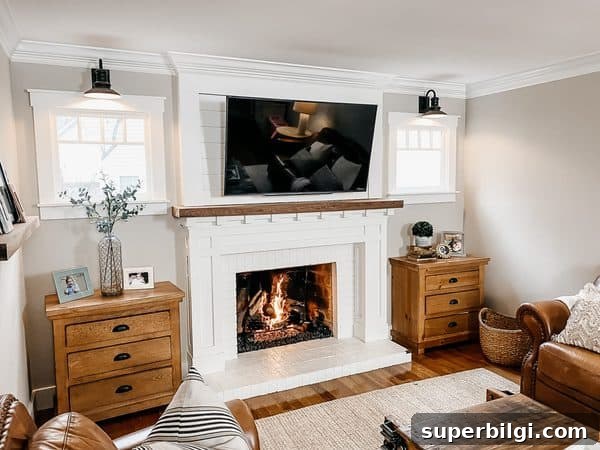
Sherwin Williams Accessible Beige Coordinating Colors
Accessible Beige harmonizes best with earthy, muted shades. Think warm whites, soft greens, muted blues, natural wood tones and warm neutrals. Muted or softened versions of colors will complement Accessible Beige better than bright, saturated hues.
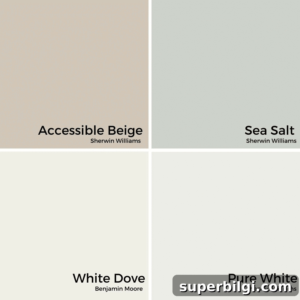
For trim, choose a warm white rather than a cool, icy white. Pairing Accessible Beige with natural wood, brass hardware, warm stone and soft green-blue accents creates a layered, inviting palette.
Agreeable Gray vs. Accessible Beige
Agreeable Gray and Accessible Beige are both popular greiges but read differently. Accessible Beige leans slightly warmer and more beige, while Agreeable Gray leans a bit cooler and grayer. Consider which undertone you prefer—warmer taupe or cooler gray—when choosing between them.
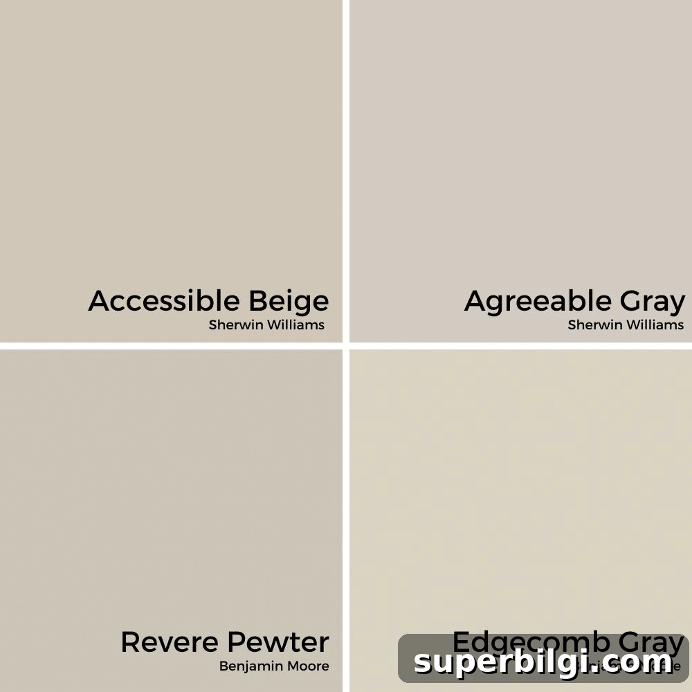
Other popular greiges and neutrals can show greener or cooler undertones; the best choice depends on the fixed finishes and natural light in your home.
Accessible Beige in Different Rooms in the Home
Accessible Beige is adaptable and works well throughout the home. Its medium-tone saturation keeps walls from feeling flat while remaining neutral enough to let furnishings and finishes shine.
Here are practical examples of how it performs in common rooms.
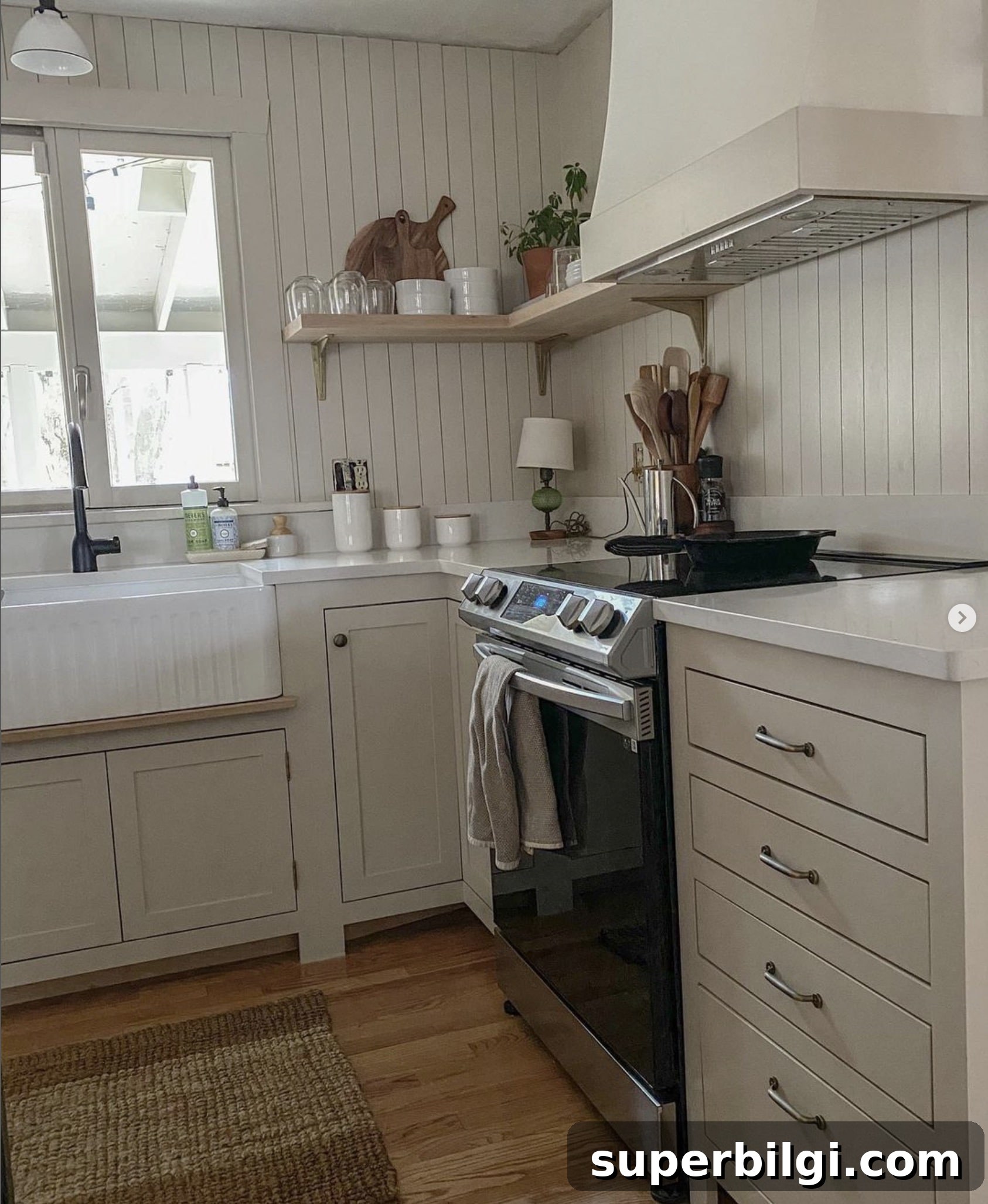
Kitchen
In farmhouse or transitional kitchens, Accessible Beige pairs nicely with white cabinetry, warm-stained floors, natural stone counters, and brass hardware. It creates a welcoming backdrop that feels timeless rather than trendy.
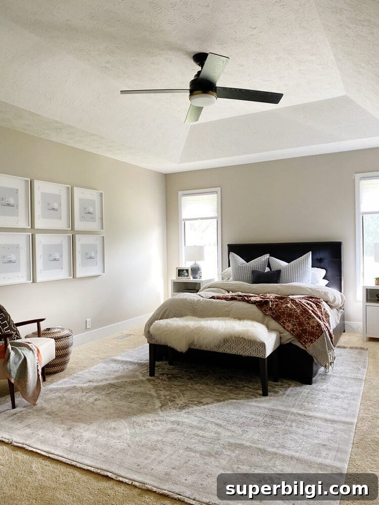
Bedroom
Accessible Beige creates a soft, calming bedroom environment. It pairs well with white linens, natural wood furniture, and muted accent colors, allowing artwork and textiles to provide color pops.
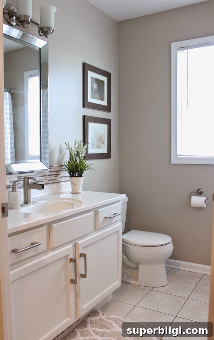
Bathroom
For spa-like bathrooms, Accessible Beige paired with white vanities and soft accents creates a serene space. It works well in both powder rooms and full baths when combined with natural textures and warm metals.
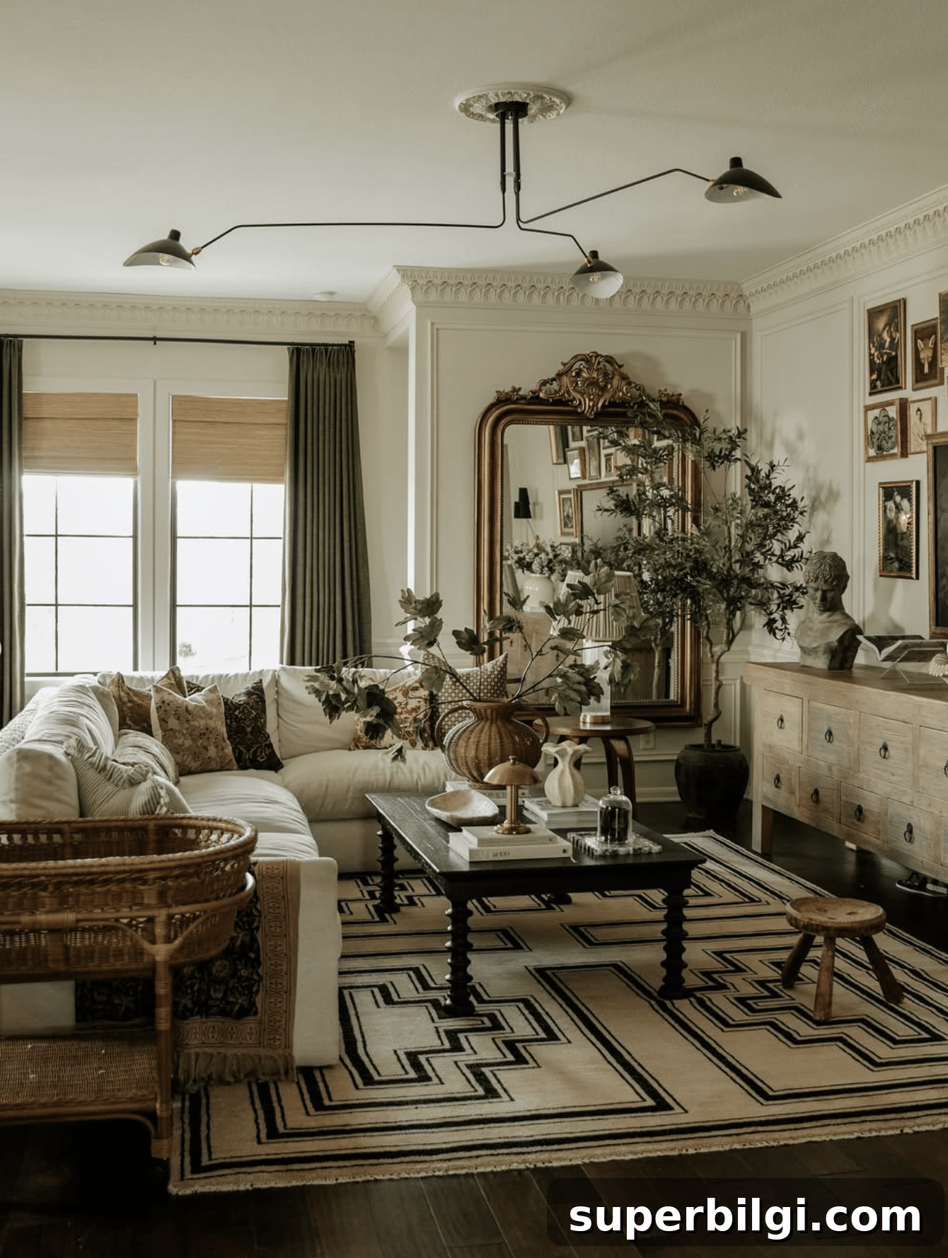
Living Room
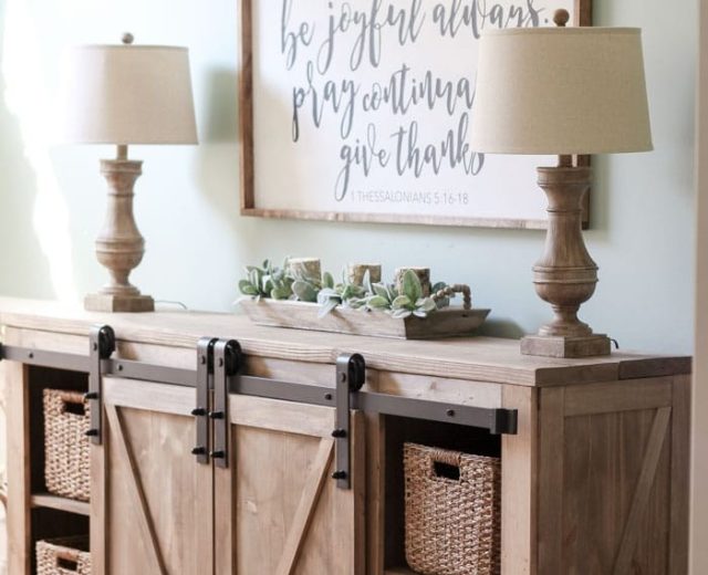
In living rooms, Accessible Beige makes a neutral backdrop that enhances wood tones, woven textures, and layered decor. It keeps spaces feeling light and inviting while allowing furniture and art to stand out.
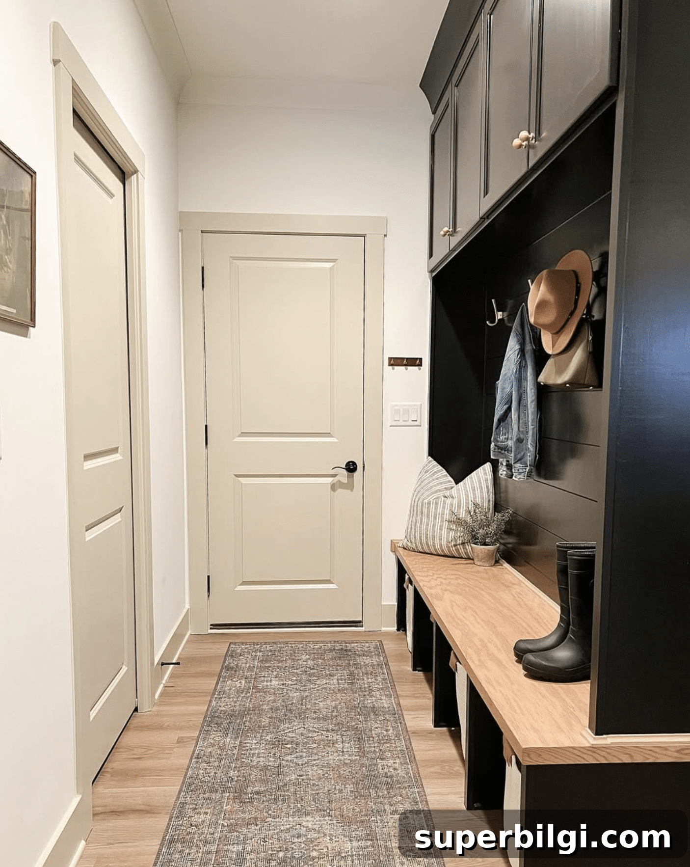
Accessible Beige Painted Trim
Accessible Beige also works well on trim and doors when paired with darker cabinetry or accent walls. Painted trim in the same family creates a cohesive, softer contrast that feels intentional and collected.
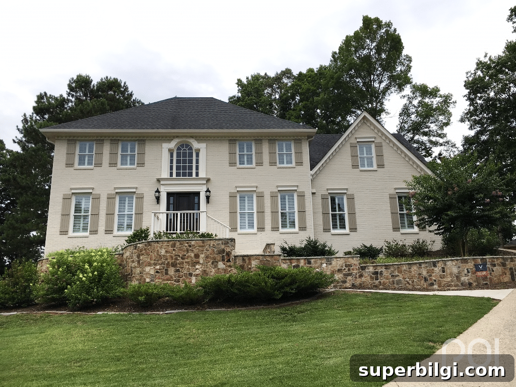
Exterior
Accessible Beige is an attractive exterior color, especially when combined with dark trim, stonework, stained wood accents, and natural landscaping. In bright exterior light it can read lighter and almost off-white, creating an elegant curb appeal.
Common Mistakes to Avoid
1. Skipping a sample
Always test Accessible Beige in the actual room. Use large painted sample boards or peel-and-stick real-paint swatches and observe the color at various times of day to see how light affects undertones.
2. Using bright cool whites
Avoid pairing Accessible Beige with icy, cool whites. Instead choose warmer whites or creams for trim to maintain harmony with the greige undertones.
3. Ignoring your flooring
Consider flooring first: large fixed elements like floors have a major impact on how Accessible Beige reads. Warm wood floors tend to complement it best; cool gray floors may shift the paint toward cooler tones.
4. Assuming every room will look identical
Don’t assume the color will read the same in every room. Orientation and light exposure make a big difference—what looks warm and bright in one room might read cooler in another.
5. Choosing the wrong sheen
Pick a sheen appropriate to the room’s use. Higher sheens show imperfections but are easier to clean; flatter sheens mask imperfections but can be harder to maintain in high-traffic spaces.
Frequently Asked Questions About Sherwin Williams Accessible Beige
Is Accessible Beige still popular?
Yes. Accessible Beige remains popular because it’s adaptable and not overly tied to fleeting trends. Its balanced warmth works in a variety of styles and stands the test of time.
Is Accessible Beige more gray or beige?
Accessible Beige leans more beige than gray, but it’s best described as a warm greige that blends both characteristics for a versatile neutral backdrop.
Does Accessible Beige look green?
Occasionally. Subtle green undertones can appear in low light or when paired with cool-toned finishes. Most of the time it reads as a warm greige rather than a green color.
Does Accessible Beige work with oak cabinets?
Yes. Accessible Beige complements light to medium oak finishes especially well, enhancing the wood’s warmth and giving kitchens a fresh, updated look without repainting cabinetry.
What trim color goes with Accessible Beige?
Warm whites like Pure White or Alabaster are excellent trim choices. They provide clean contrast without the icy feel of cool whites, and they pair naturally with the greige undertones.
Does Accessible Beige work with black windows?
Yes. The warm greige walls soften the bold contrast of black window frames, creating a balanced, timeless look that feels inviting rather than stark.
What LRV is Accessible Beige?
Accessible Beige has an LRV of 58, placing it in the light-to-medium reflectance range. It adds warmth and depth without making rooms feel dark.
Final Thoughts
Sherwin Williams Accessible Beige is a versatile warm greige that strikes a pleasing balance between beige and gray. It works well across rooms and architectural styles and pairs smoothly with warm whites, natural wood, muted greens and blues, and brass or black accents.
No single paint color suits every home, so test Accessible Beige in your actual rooms. Use large sample boards or real-paint swatches and view them at different times of day to ensure you’ll love the result for years.
Whether updating one room or painting an entire house, Accessible Beige remains a reliable, timeless neutral that’s easy to decorate around. Happy painting!
Related paint color topics to explore:
- Comparisons between Agreeable Gray, Revere Pewter, and Edgecomb Gray
- How to choose the best white trim color
- Whole-house paint palette ideas
- Tips for sampling and testing paint in your home