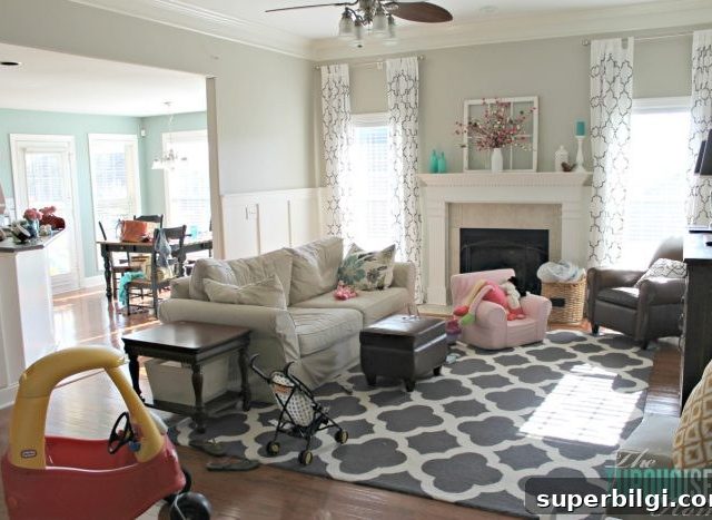
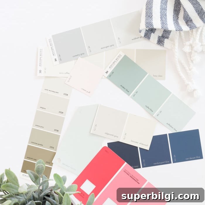
A whole-house color scheme sets the backdrop for your home and removes the guesswork from decorating. Use this step-by-step guide—rooted in color theory and practical examples—to build a cohesive palette for your entire home. Follow this process to save time, money, and stress while making confident design choices.
Choosing a color palette that runs through your whole house—from wall paint to throw pillows—can feel overwhelming. Many readers ask how to pick the right colors, how many to choose, or whether one paint color can work throughout an entire home. The answer? Yes—you can design a unified palette that still feels layered and interesting.
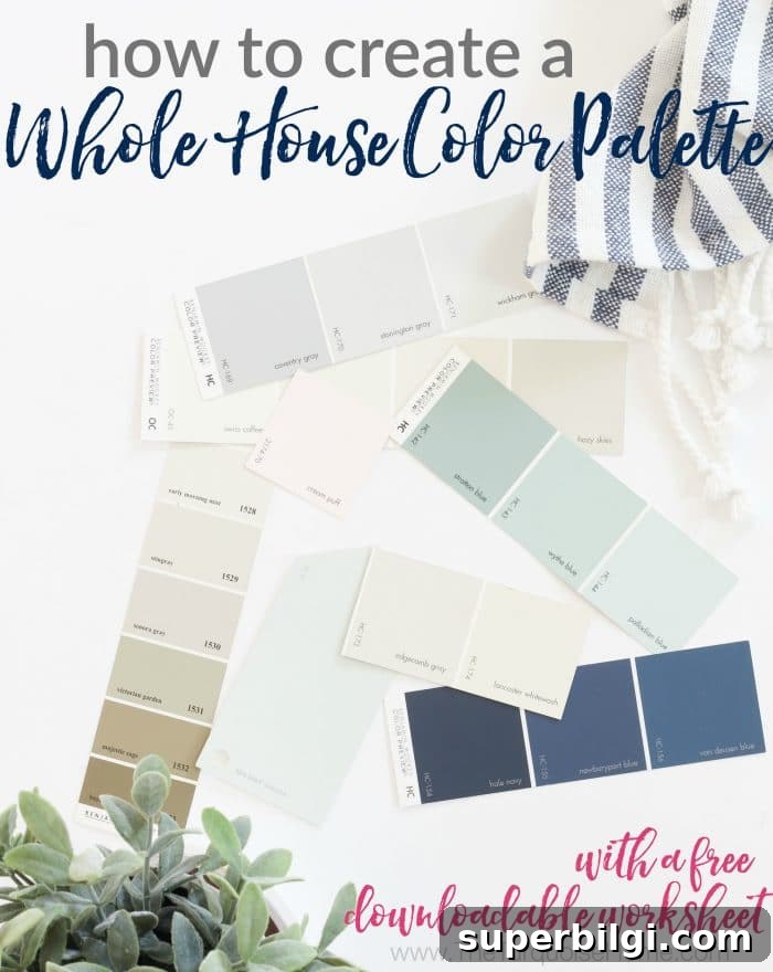
When we moved into our current home, I committed to a simple, consistent palette that would help me: make faster decorating decisions, avoid second-guessing, shop with confidence, and create a home that flows without feeling overly matchy. You don’t need to be an interior designer to choose the right paint colors—just a plan.
- Make quick design decisions for paint and decor.
- Avoid second-guessing by choosing a few foundational colors up front.
- Shop confidently for items that will work across rooms and reduce wasted purchases.
- Create a cohesive home that still feels layered and interesting.
What to Know Before You Pick Paint Colors
Your palette should consider more than wall paint. Think about floors, cabinetry, countertops, permanent finishes, furniture and textiles—these elements influence which paint undertones will work best.
1. Get Inspired
Begin by looking at colors you already love: items in your home, favorite pins on Pinterest, or the clothes in your closet. Narrow your inspiration to two or three core colors that consistently appeal to you.
2. Choose the Mood
Think about the emotional tone you want for your home. Associating moods with seasonal palettes can help:
- Spring: open, fresh, bright—pastels, light yellows, lime greens.
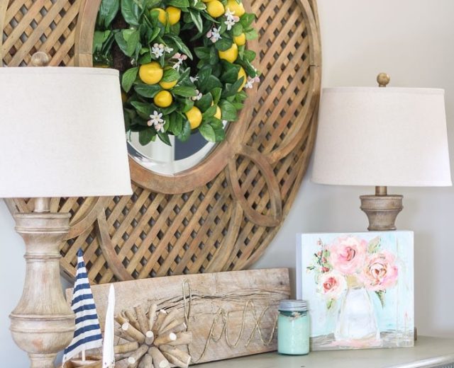
- Summer: calm, elegant—muted lavenders, mint, navy, cool greens.
- Autumn: warm, cozy—burnt oranges, deep reds, warm browns.
- Winter: bold, dramatic—ice blues, strong contrast, metallics, deep blacks.
These associations will guide your choices; you can mix elements, but you’ll often be drawn toward one overall mood.
3. Use the Color Wheel to Your Advantage
A basic understanding of color theory makes pairing colors easier:
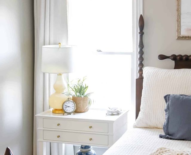
- Analogous colors (next to each other on the wheel) create harmony and a relaxed feel—ideal for bedrooms.
- Complementary colors (opposite on the wheel) deliver contrast and drama—great for accents and pops of color.
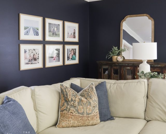
- Monochromatic schemes use shades and tones of the same hue for a cohesive, sophisticated look. You can use one base color throughout the house by varying the saturation and value in different rooms.
Warm vs. Cool Colors
Warm colors feel lively and intimate and can make rooms appear cozier. Cool colors are calming and can make spaces feel larger. Most neutrals have warm or cool undertones, so match undertones across finishes for the best result.
4. Consider Hard Finishes
Check permanent elements like flooring, cabinets, and countertops. Are your floors warm-toned or cool-toned? Do countertops pull brown, gray, or a mix? These permanent finishes should guide your neutral choices so paint works with—not against—what’s already in place.
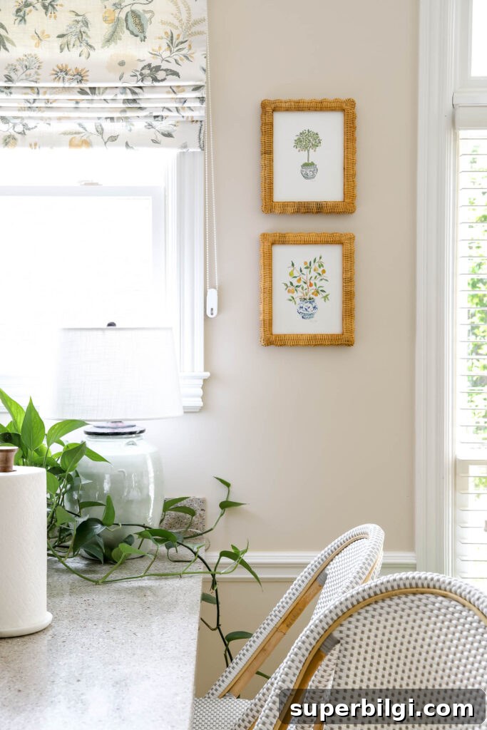
If possible, selecting medium-brown wood floors is a versatile choice—this “denim” tone pairs with most palettes.
How to Choose a Whole House Color Palette
Follow a step-by-step process to create a palette that flows across connected spaces.
1. Choose Trim and Ceiling Paint Color
Start with the trim color since it’s used throughout the house. Most people choose a clean white or creamy off-white. I use a warm creamy white on all trim and ceilings. If the home already has a trim color, decide whether to keep it and choose wall colors around it, or repaint trim to a single new white for consistency.
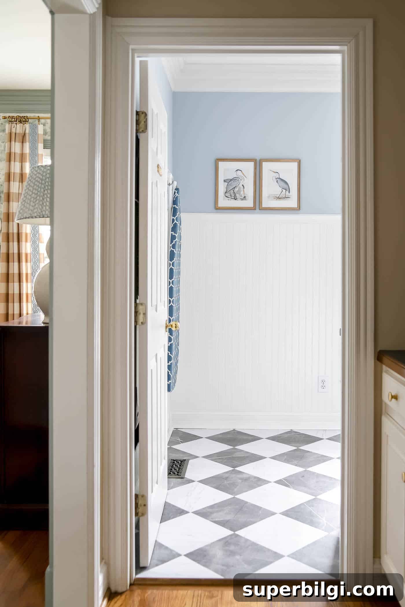
Tip: Painting walls and trim the same white can work if you use different sheens—glossier trim and matte walls—to create subtle contrast.
2. Choose a Primary Neutral for Main Spaces
Pick a neutral for common areas such as the living room, kitchen, hallways, and entry. In open floor plans, treat these zones as one large space so the color flows seamlessly. Choose a light neutral—gray, greige, beige, or a warm-tinted white—that complements your trim and hard finishes. Test samples on your walls in different lighting before committing.
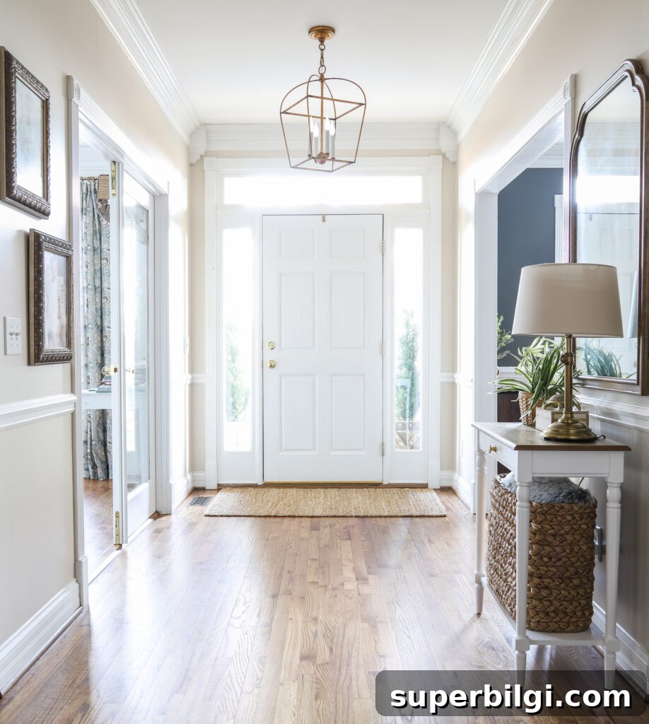
3. Choose a Secondary Color for Other Rooms
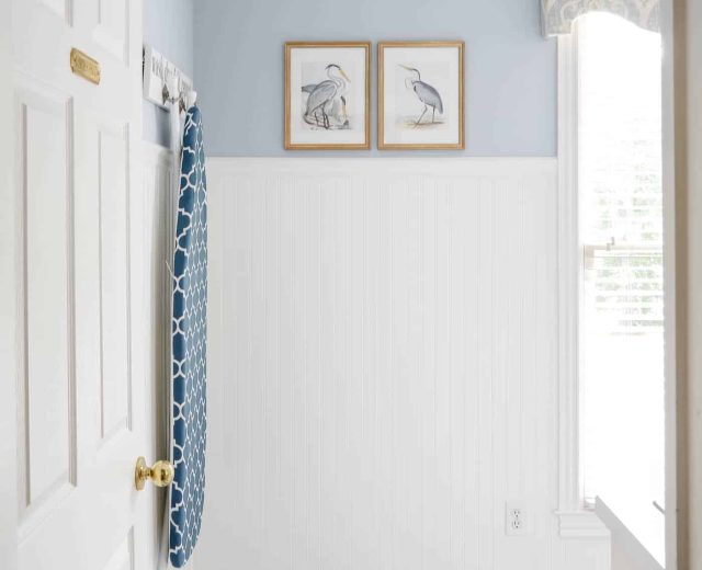
Select a second color for baths, laundry, and smaller living areas. This can be another neutral or a muted hue that ties back to your primary color. You can use different shades of the same color to maintain cohesion while giving each room its own identity.
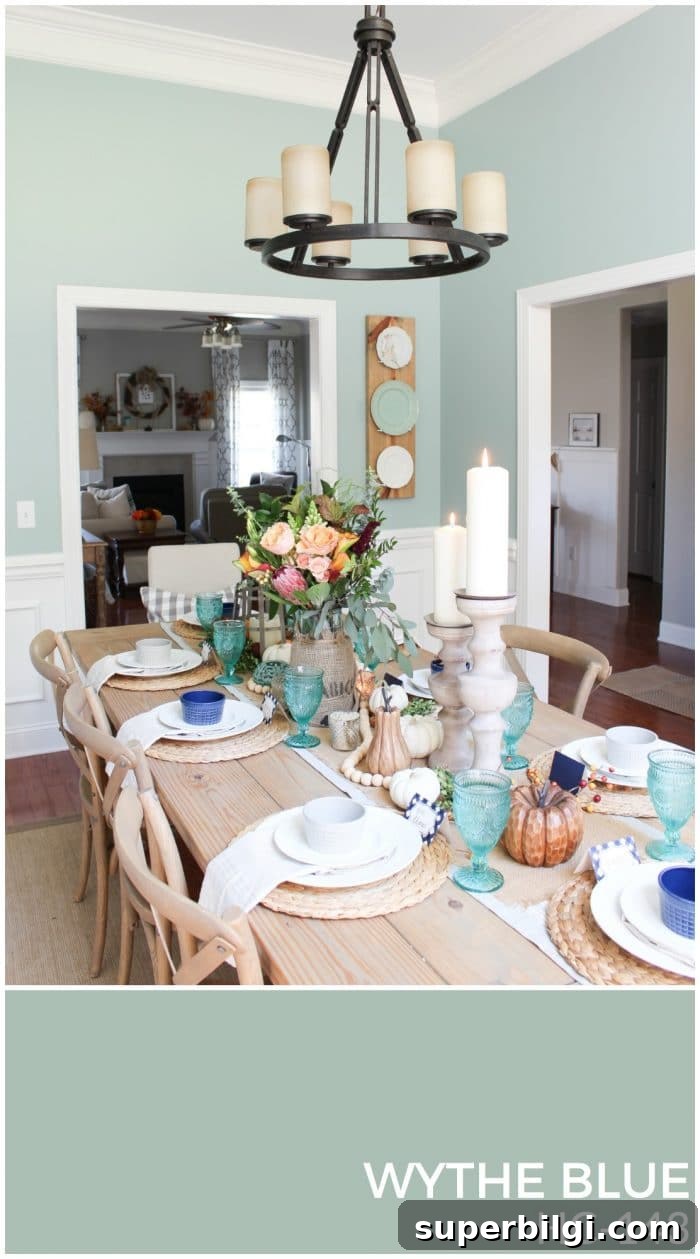
4. Choose Accent Colors for Bedrooms and Accessories
Pick one or two accent colors for bedrooms, small rooms, and accessories. Use these sparingly—on a feature wall, a door, textiles, or decor. Accents can be harmonious (next to your main color on the wheel) or complementary (opposite for contrast). Kids’ rooms are a great place to be bold without affecting the flow of shared spaces.
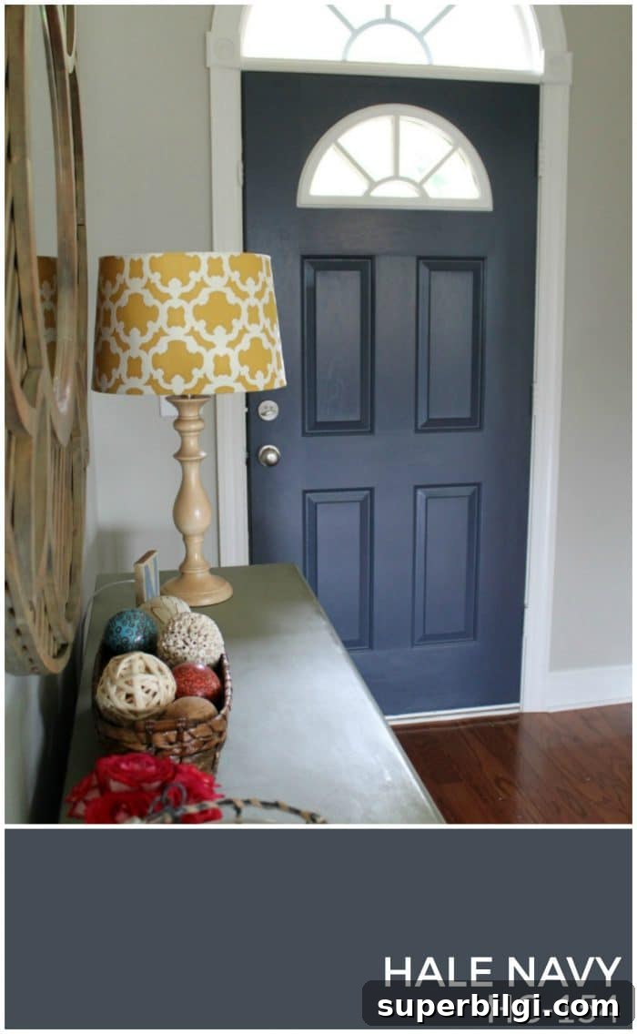
Frequently Asked Questions
Aim for 4–8 paint colors total: one trim/ceiling white, one main neutral for shared spaces, one or two secondary colors for bathrooms and smaller rooms, and one to four accent colors for bedrooms and accessories.
No. Choose trim and your primary neutral first to establish the foundation. Secondary and accent colors can be selected later as you plan each room.
A Real-Life Whole House Color Palette
Once your colors are selected, assemble a visual reference: create a digital collage or a small binder with swatches and photos of rooms. Seeing the palette in context helps you shop and decorate with confidence.
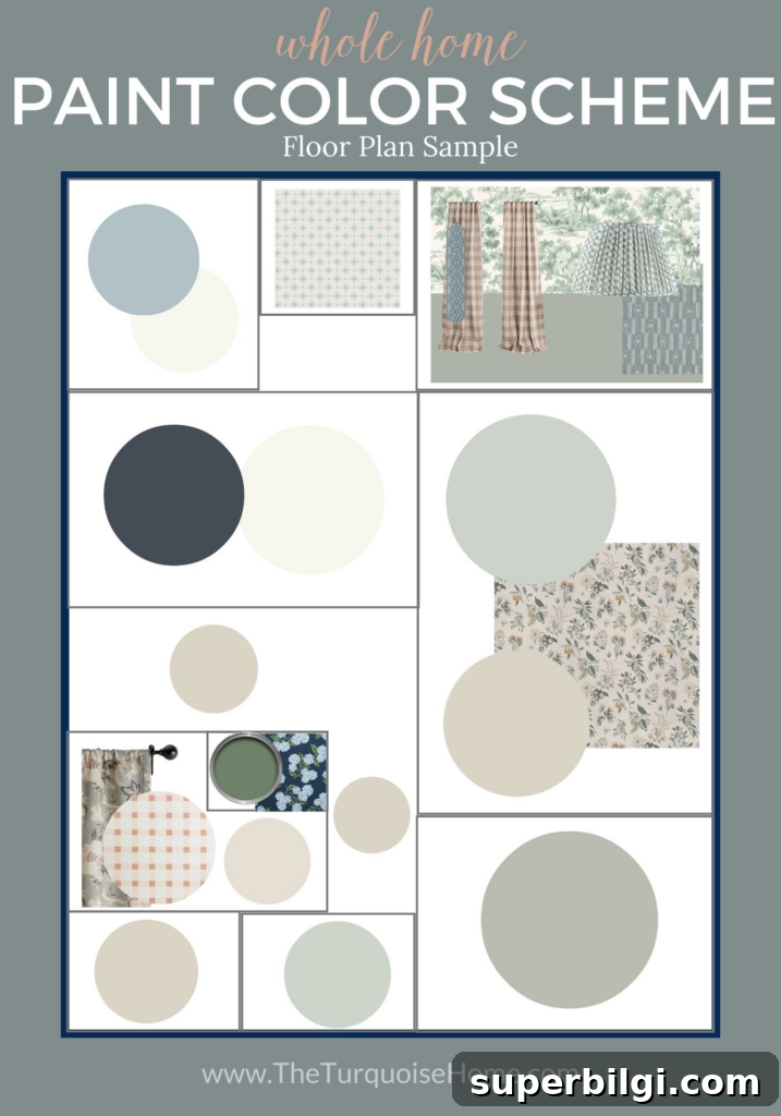
Incorporate Your Color Palette Throughout Your Home
Apply your palette consistently: use the trim color everywhere, the primary neutral in main living areas, secondary hues in other rooms, and accent colors in small doses through textiles and accessories. Create a mood board for each room to test how furniture, art, and fabrics interact with your chosen paint colors.
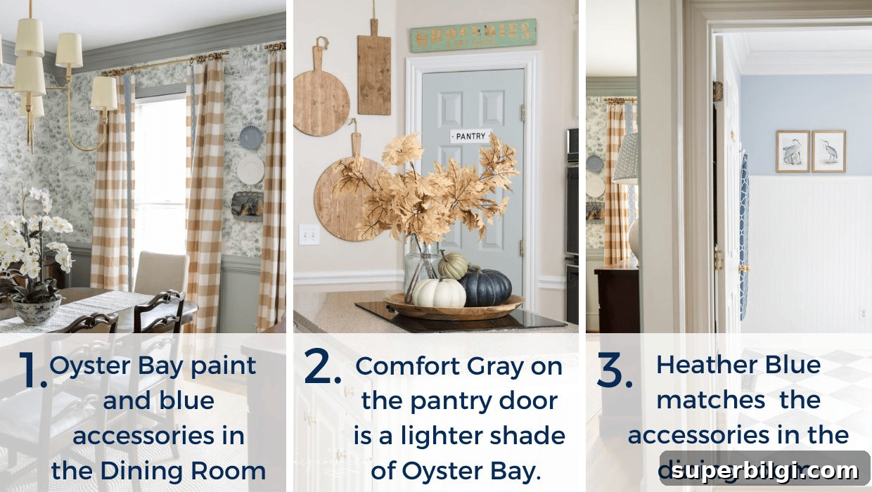
Designing a whole-house color palette gives you the freedom to shop and decorate with consistency and ease. With a clear plan—trim, primary neutral, secondary color, and accents—you’ll create a home that flows and feels intentional.
Free Whole Home Color Palette Worksheet
If you’d like a simple tool to record your chosen colors and swatches, create a worksheet or binder with paint chips and sample photos. Keep it with you when shopping to ensure every purchase fits your palette.
More posts you might enjoy:
- How to Paint a Concrete Patio
- The Best Gray Paint Colors for Your Home
- The Best Blue Paint Colors for Your Home
- How to Paint Outlet Covers
- Which Interior Paint Finishes to Use
I hope this guide helps you feel confident choosing a cohesive color palette for your whole house. With these steps, you’ll build a thoughtful foundation for decorating that makes every decision easier.