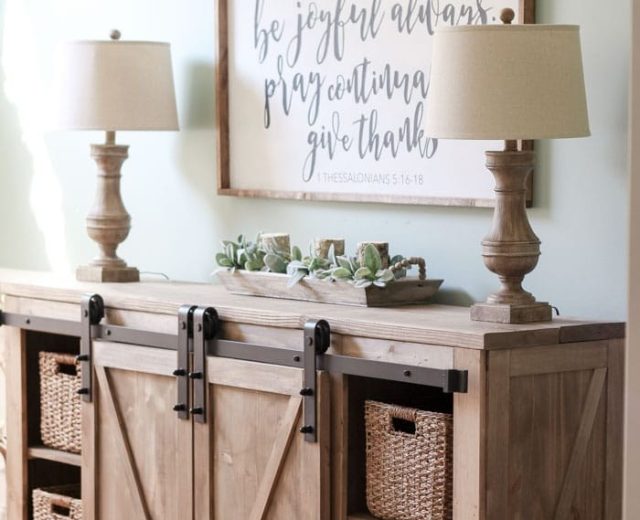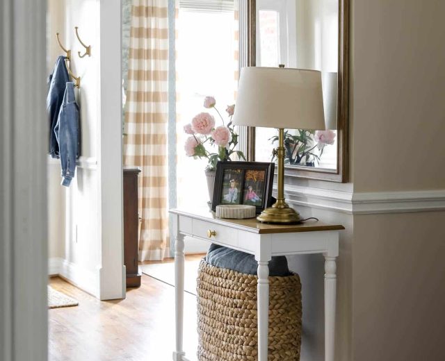
Revere Pewter is a light gray with warm undertones; this classic shade creates a comfortably sophisticated look that soothes and restores.
I finally settled on the perfect color for my open living areas and hallways: the ideal gray. After a long search and many samples, I chose a calming, versatile gray that works with both cool and warm accents. Before I reveal the final choice, here’s a short guide to how I arrived at it and why gray might be right for your home.
This post contains affiliate links for convenience. See my full disclosure policy.
Gray has become a go-to neutral for many homes — it’s trendy, timeless, and adaptable. I had previously used beige (Latte by Restoration Hardware) in my old house, and it worked well with bright accents like a red couch and turquoise accessories. My new house arrived with a neutral beige coat as well, but the flat finish and lack of sample paint made touch-ups impractical, especially with a little one in the house. That was the motivation to repaint and pick a new color for the living room, entryway, and two hallways.

Want to Save This?
Enter your email below and I’ll send it directly to your inbox!
In the end, I decided to embrace gray because I wanted to try something new — even if it’s a popular choice. Paint is one of the easiest ways to refresh a home, and if I tire of it in a couple of years, I can always revert to beige or try another color. The important thing was to be thoughtful about the selection.
Revere Pewter looked a bit washed out in a morning photo I took, but in person it reads as a warm, adaptable gray. To be thorough, I narrowed my choices to four Benjamin Moore colors: Rockport Gray, Revere Pewter, Grant Beige, and Hazy Skies. I favor Benjamin Moore for their rich palette and particularly enjoy exploring their historical colors.
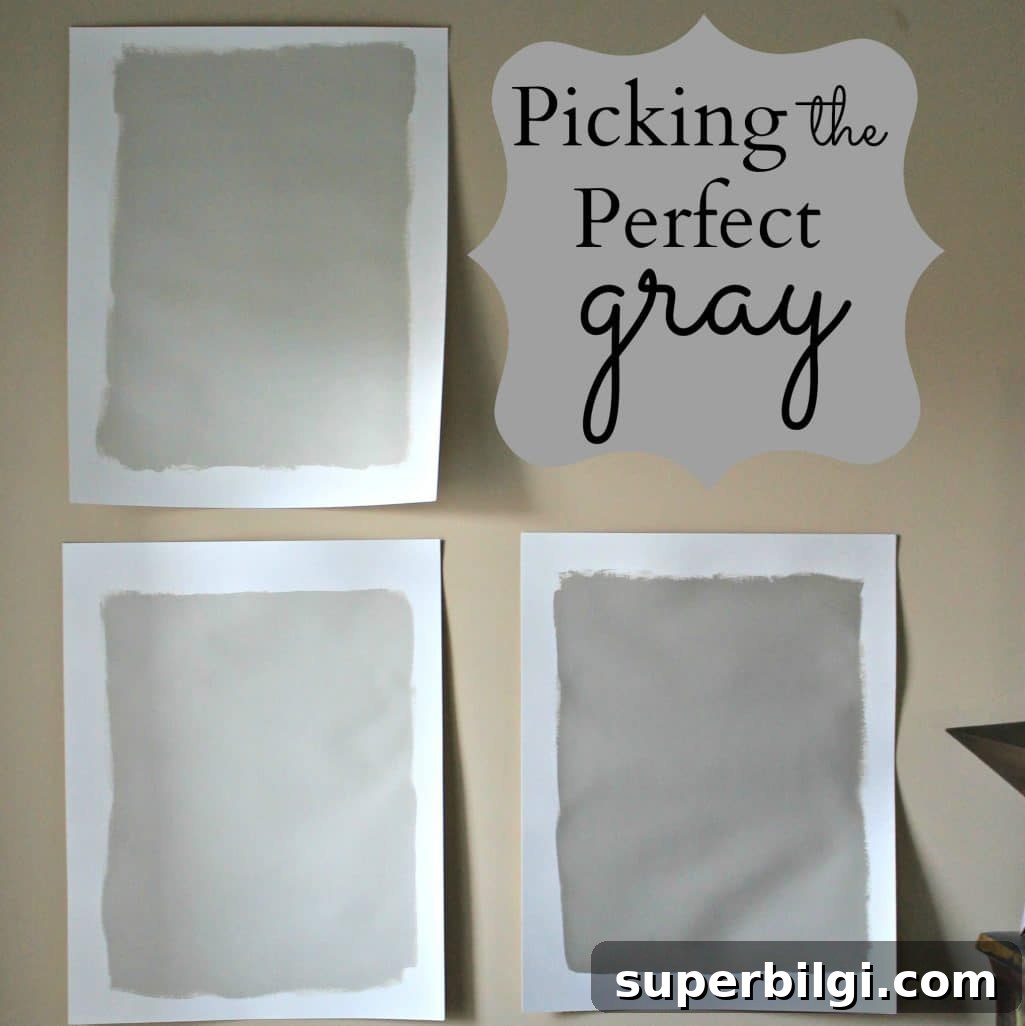
I tested Grant Beige because I wanted to include a true greige option (a blend of gray and beige), hoping it might satisfy my husband’s preference for beige. It leaned too beige for my taste, so I removed it from consideration. The other three — Hazy Skies, Revere Pewter, and Rockport Gray — all had merit. Hazy Skies reads slightly greener than Revere Pewter, while Rockport Gray is noticeably darker and moodier. My husband liked Rockport Gray, but I felt it would overpower the space on every wall.
After extensive sampling and observation, the winner was Revere Pewter.
I had been leaning toward Revere Pewter from the start, but I wanted to be methodical: gather samples, test them at different times of day, and compare them in the actual rooms. This time I didn’t just pick from a swatch — I took the process seriously and I’m glad I did. Revere Pewter ended up being the clear favorite. It’s warm without being brown, neutral without feeling cold, and it complements both cool blues and warm reds.
I’m excited to paint, but I’ve paused until after my husband’s birthday weekend when we’ll have guests. Painting a whole house while hosting would be chaotic, so I’m scheduling the work for a quieter time. The living room project has a domino effect: I plan to install board and batten trim and would prefer to paint the top gray and the bottom white before attaching the boards. That reduces trim painting later and gives a cleaner finish. I’m also considering built-ins, so there’s a lot to coordinate — painting, trim work, and any carpentry all influence each other.
A few tips from my experience selecting paint:
- Pick several top contenders rather than one immediate favorite.
- Buy sample pots and paint large swatches on poster board so you can move them around the house.
- View the samples at different times of day — morning, midday, and evening light can dramatically change how the color reads.
- Leave a white border around each sample to avoid the new color being influenced by the existing wall.
- If possible, paint directly on the wall for the most accurate sense of the color, but movable poster boards are ideal for comparing multiple rooms.
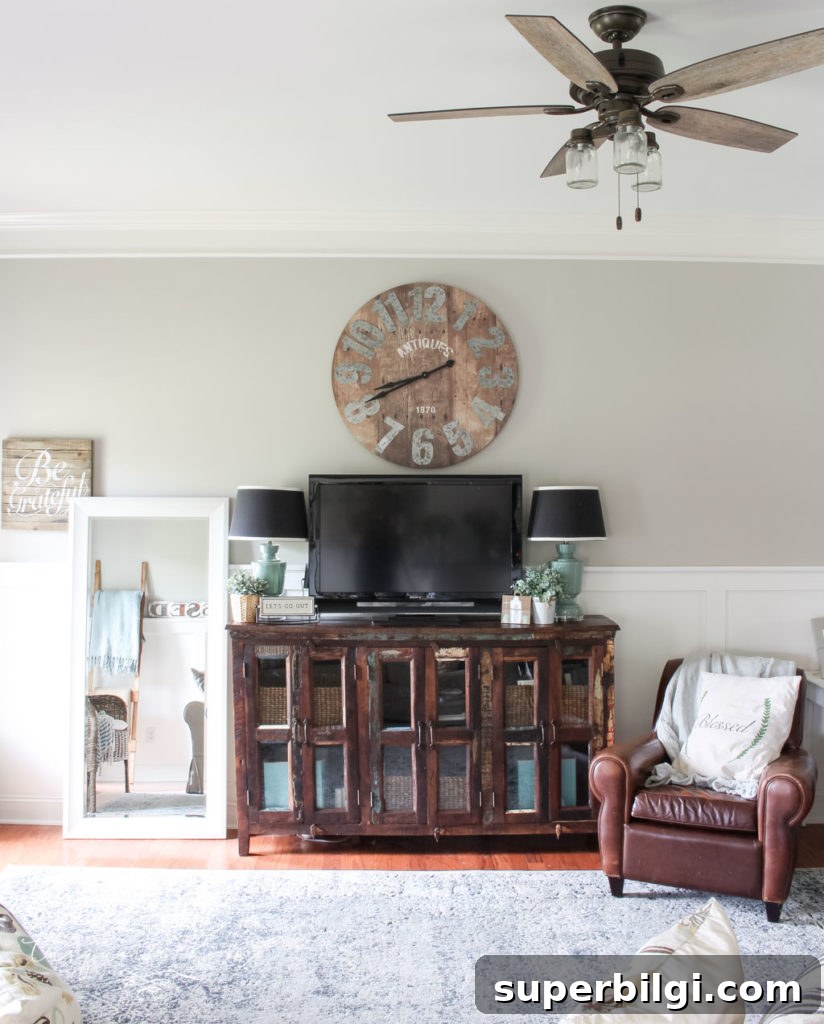
I’ve since painted my entire living room and other areas in Revere Pewter and have grown even more fond of the color. It’s elegant, versatile, and photographs beautifully with different furnishings and seasonal decor.
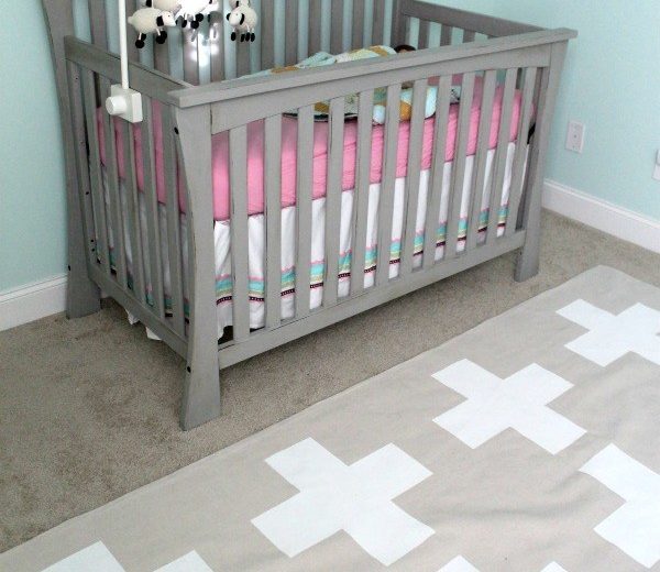
Below are images from the living room and bedroom spaces painted in Revere Pewter over the years:
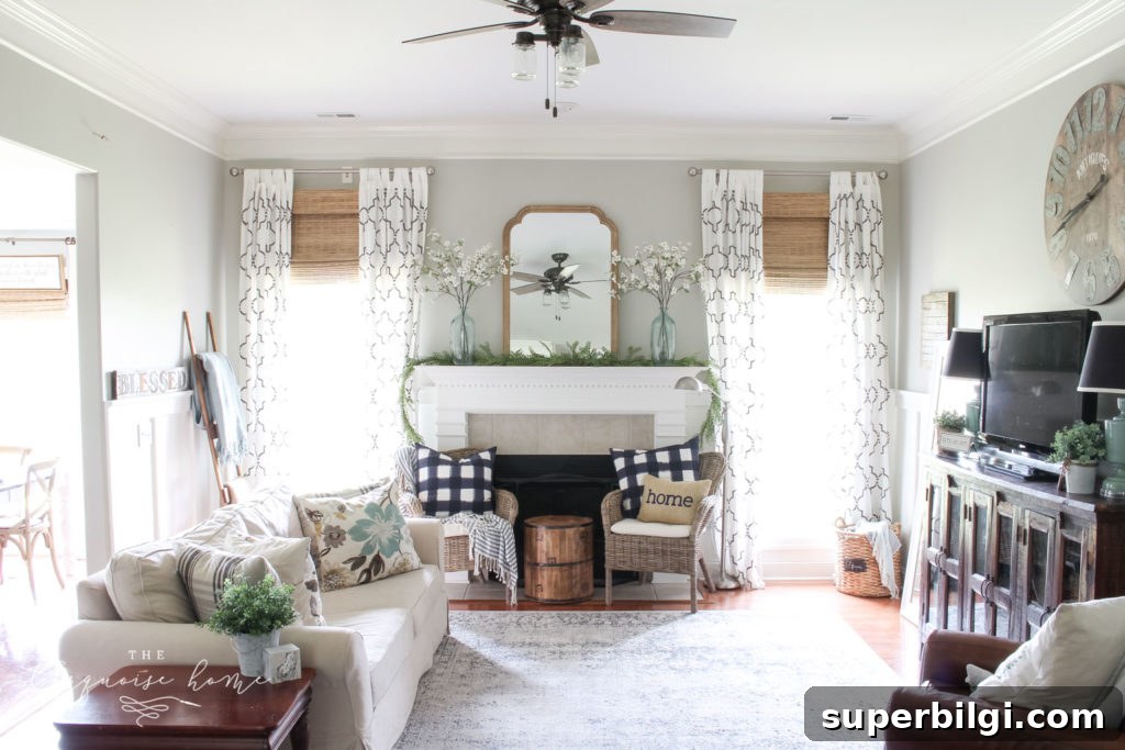
Quick & Simple Coastal Summer Mantel Decor
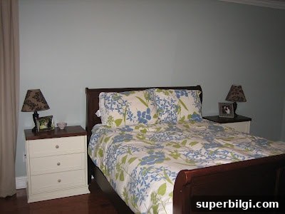
We’ve since moved to a new home, and I painted our primary bedroom Revere Pewter as well because I love the color’s calming, warm gray tone.
Our Current Bedroom painted in Revere Pewter
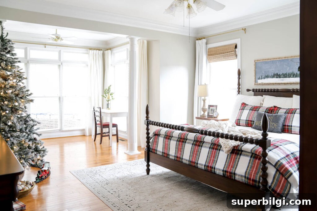
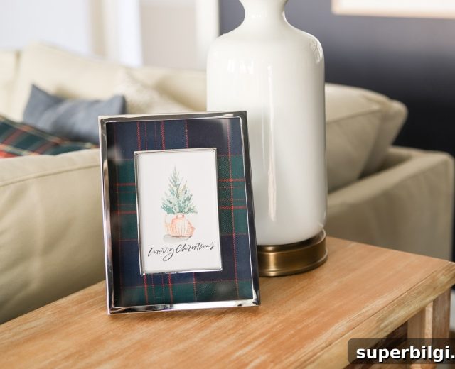
Our Primary Bedroom Decorated for Christmas
If you love Revere Pewter, you might also enjoy these related posts:
Pairing Paint Colors with Revere Pewter
Paint Colors in My Home
More Posts You Will Love:
- The Best Green Paint Colors For Your Home
- Best Living Room Paint Colors
- The Best Bedroom Paint Colors
- Sherwin Williams Extra White (SW 7006)
- Benjamin Moore Stonington Gray