

If you’re thinking about Sherwin Williams Sea Salt for your kitchen, you’re in good company. It’s a popular choice because it’s soft, calm, and versatile—never loud, but always interesting.
When I painted my kitchen Sea Salt, I wanted a gentle, airy feel that still read as lived-in and layered, not stark or clinical. After living with it for a while I learned that Sea Salt behaves a bit like a chameleon: it can read blue, green, or soft gray depending on the light, the cabinets, and the finishes nearby. That shifting quality is why so many people ask a lot of questions before committing to a paint can.
Below I share real-life photos of my Sherwin Williams Sea Salt kitchen, explain how its undertones show up in different lighting, and offer tips I wish I’d known before I started painting.
This post contains affiliate links for your convenience.

Want to Save This?
Enter your email below and I’ll send it directly to your inbox!
What Color and Undertones are in Sherwin Williams Sea Salt Paint Color?
Sherwin Williams Sea Salt is a soft blue-green with a subtle gray foundation that keeps it muted rather than bright or beachy. It’s known for shifting with the light: in strong natural light it can look more airy blue, while in warmer or dimmer light the green undertones become more noticeable. That gray base helps it remain calm and understated, which makes Sea Salt an excellent choice for kitchens, bathrooms, and open living areas where you want color without intensity.

Why I Chose Sherwin Williams Sea Salt for My Kitchen
I recently repainted my kitchen walls Sea Salt after painting the cabinets Simply White. The previous wall color felt too dark and created a stark contrast with the lighter cabinets, so I wanted a softer, complementary blue-green that would brighten the space while still feeling cozy.

I narrowed the choices down to Sea Salt and a similar soft blue from another brand. I tested swatches and followed a deliberate process to pick the right color—sampling in the room, checking the paint at different times of day, and viewing it next to the cabinets and countertops. That extra step saved me from a paint regret and helped me choose with confidence.
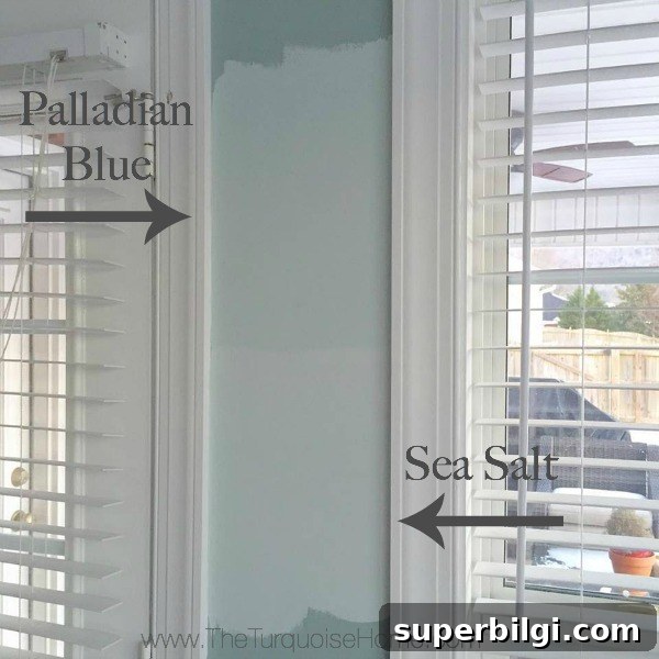
We completed the painting quickly—my mom helped and we finished the walls in a day. The result is a much lighter, brighter kitchen that still feels warm and inviting.

How Sea Salt Affects Cabinets, Countertops, and Tile
Sea Salt pairs especially well with white cabinetry and natural wood tones. Because it’s understated, it can make older countertops or mixed finishes look more intentional. In my kitchen, the existing laminate counters—while not perfect—now read better against the Sea Salt walls and white cabinets than they did before.

If you’re planning tile or a backsplash, Sea Salt gives you flexibility. A classic white subway tile looks crisp and timeless against it, while warm or mottled tiles can pull out the green or gray tones in different lighting.
Should I Install the Backsplash Now?
I’m deciding whether to install white subway tile now or wait until I can replace the countertops. Both options have pros and cons:
- Install the subway tile now with the current countertops. This will give an immediate uplift, but you may need to revisit the backsplash when new counters are installed, leaving a gap to finish later.
- Wait to do the subway tile until the new countertops are in place so everything lines up perfectly—but enjoy the Sea Salt walls above the counters until then.
If you’ve faced this choice, I’d love to hear which route you’d take. For now, I’m enjoying the new wall color while I decide.

Small Updates and Styling Ideas
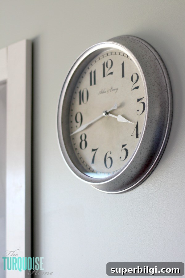
Since painting, I’ve added a few small decor touches that complement the Sea Salt walls: a galvanized-finish clock, fresh accessories, and plans to refinish the table and chairs. Lighter curtains or neutral linens can help the room feel cohesive, and adding a few metal or wood accents emphasizes the calm, coastal quality of the paint.
Sea Salt is one of those paint colors that rewards patience and testing: sample it on your walls, observe it throughout the day, and pair it with the cabinet and countertop tones you already have. It’s versatile enough for a kitchen, a bathroom, a porch ceiling, or a bedroom—wherever you want a soft, relaxed color with personality.
More posts you may enjoy:
- Sherwin Williams Sea Salt (paint color spotlight)
- How to Decorate the Kitchen for Christmas (3-step formula)
- 7 Ways to Refresh a Kitchen