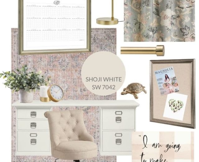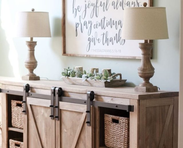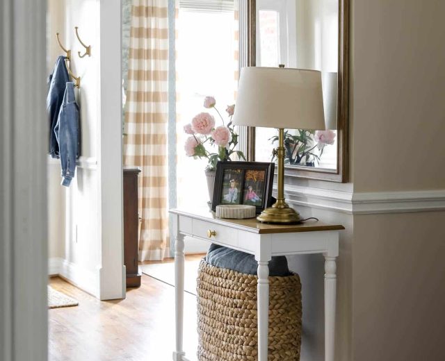
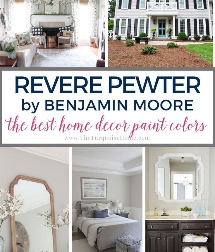
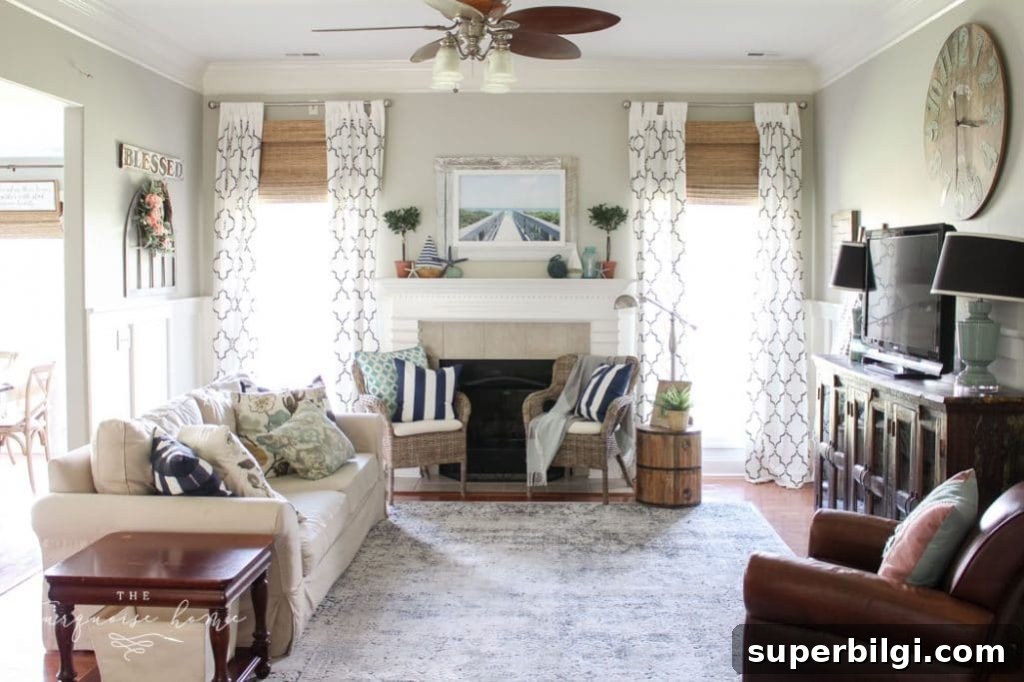
Revere Pewter is widely regarded as a quintessential greige—an inviting green-gray with a warm beige base. Its blend of warmth and subtle depth makes it a strong choice for open floor plans and transitional spaces throughout the home.
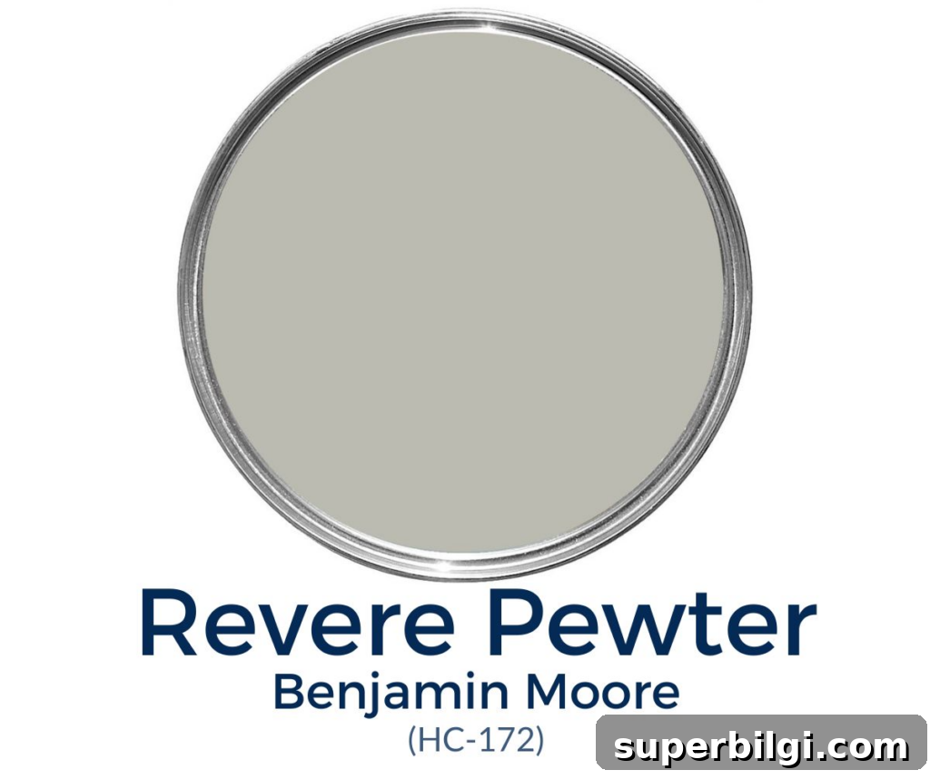
This versatile color is fun to work with because its undertones shift depending on light and surroundings. Benjamin Moore’s HC-172 keeps a cool gray presence in many lighting conditions while still delivering that comforting warmth that defines greige.
All these qualities have made Revere Pewter one of the most popular gray-beige paint colors available—and a personal favorite for many designers and homeowners. If you’re considering HC-172, test it in your space before committing; light and adjacent finishes dramatically affect how the color reads.
What Color Is Revere Pewter?
- A warm green-gray with beige undertones
- A mid-tone with a Light Reflectance Value (LRV) of 55.5
- Well-suited for open floor plans and transitional interiors
- Versatile enough to work with farmhouse, traditional, and modern styles
Revere Pewter Undertones
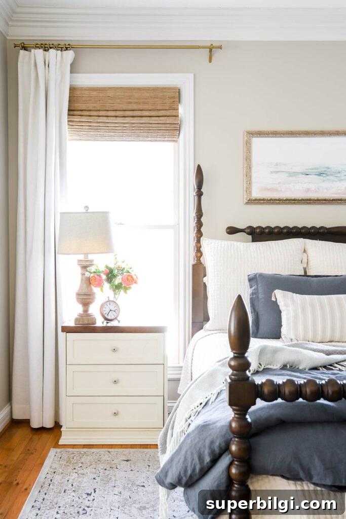
Revere Pewter is a chameleon paint color. It maintains a gray identity while leaning warmer than many popular grays. In different rooms it can read as more beige, taupe, or even slightly green—especially when paired with abundant greenery or dark flooring.
In darker, low-light spaces, Revere Pewter can take on a muddy or lifeless appearance unless you compensate with adequate lighting. Conversely, in bright rooms with plenty of natural daylight, its beige warmth can recede and a soft blue-violet undertone may emerge, producing a cleaner, more traditional gray look.
LRV of Revere Pewter
Light Reflectance Value (LRV) measures how much visible light a paint color reflects on a scale from 0 (black) to 100 (white). Revere Pewter has an LRV of 55.5, placing it in the mid-range: not too dark and not too light.
For rooms with very little natural light, consider paint colors with an LRV of 60 or above, or try Revere Pewter at a reduced strength (for example, mixed at 75%) to achieve a brighter feel while keeping a similar tone.
What Colors Pair Well with Revere Pewter?
Revere Pewter pairs beautifully with a wide range of colors. Its neutral warmth makes it an excellent backdrop for both muted and bold accents. Here are reliable pairing ideas:
- Sea Salt (Sherwin-Williams) — a soft blue-green that complements Revere Pewter’s green-gray aspects for a coastal, airy vibe.
- Hale Navy (Benjamin Moore) — a deep blue that provides dramatic contrast and timeless sophistication.
- Kendall Charcoal (Benjamin Moore) — a warm charcoal for strong, moody accents or focal walls.
- Chelsea Gray (Benjamin Moore) — similar undertones that blend harmoniously for a cohesive palette.
For a lighter feel, balance Revere Pewter with lighter grays or warm whites like Soft White, Cloud White, or Simply White. Revere Pewter is flexible enough to work with bright colors too—think coral, turquoise, or even mustard for an energetic pop.
Best Trim Colors to Pair with Revere Pewter
Choose warm or neutral whites for trim to complement Revere Pewter without creating harsh contrast. Popular options include:
- Simply White (Benjamin Moore) — a clean, slightly warm off-white
- White Dove (Benjamin Moore) — a creamy, soft white
- Pure White (Benjamin Moore) — a brighter, crisper white
- Chantilly Lace (Benjamin Moore) — a true bright white
- Alabaster (Sherwin-Williams) — a warm, inviting white
Avoid whites with excessive yellow tones; an off-white or warm white will harmonize most consistently with Revere Pewter.
Revere Pewter vs. Agreeable Gray
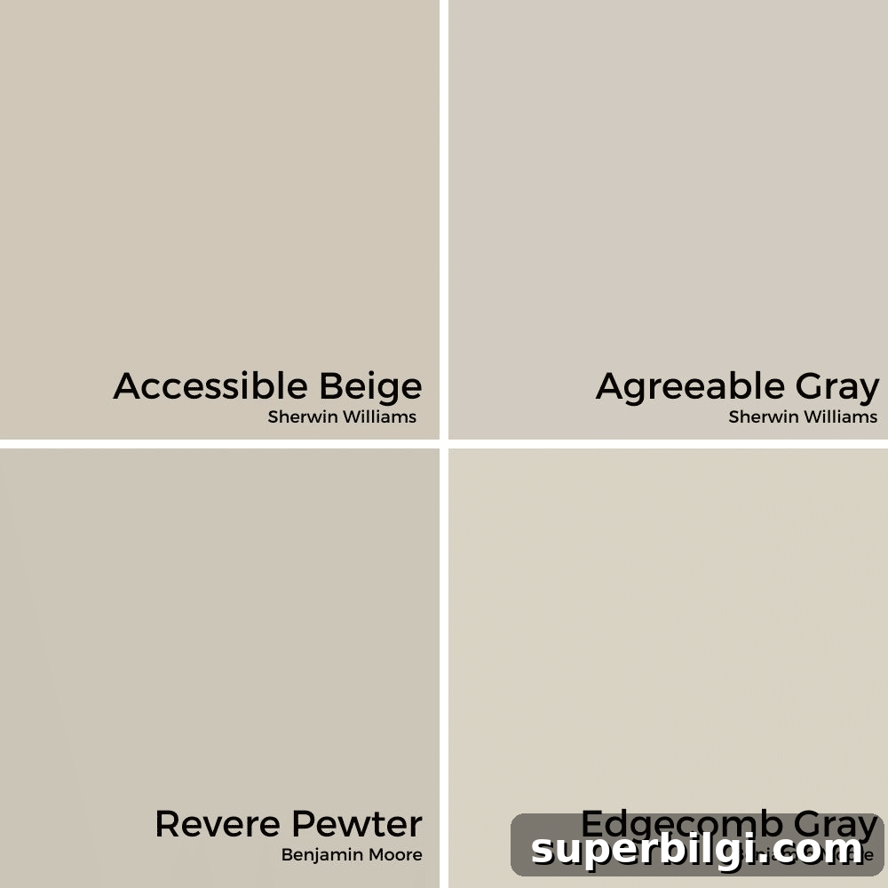
Revere Pewter is slightly darker and warmer than Sherwin-Williams’ Agreeable Gray. While both are popular greige choices, Revere Pewter often reads more taupe or warm gray depending on light. Comparable alternatives you might consider are Edgecomb Gray and Accessible Beige—each has subtle differences in undertone and warmth, so sampling is key.
Frequently Asked Questions
Yes. Revere Pewter has been a top choice for over a decade and continues to be favored by interior designers for its adaptable greige tone.
It’s versatile enough for walls, trim, cabinets, and even ceilings or floors in certain finishes. Use it anywhere you want a warm, neutral foundation.
Overall it leans warm. It may appear cooler in bright, sunlit rooms or next to very warm-toned furnishings; pairing choices and lighting influence the final effect.
Painting Tips
- Test first: Always try a large sample on poster board or order a peel-and-stick real paint sample to observe how the color behaves in your light.
- Use quality tools: Good brushes, rollers, and proper prep make a major difference in finish and durability.
- Choose the right sheen: Consider room use and cleanability when selecting sheen—eggshell or satin often works well for walls, semi-gloss for trim.
More articles you might enjoy:
- The Best Living Room Paint Colors
- Paint Colors for Bedrooms
- Best No-Fail Greige Paint Colors