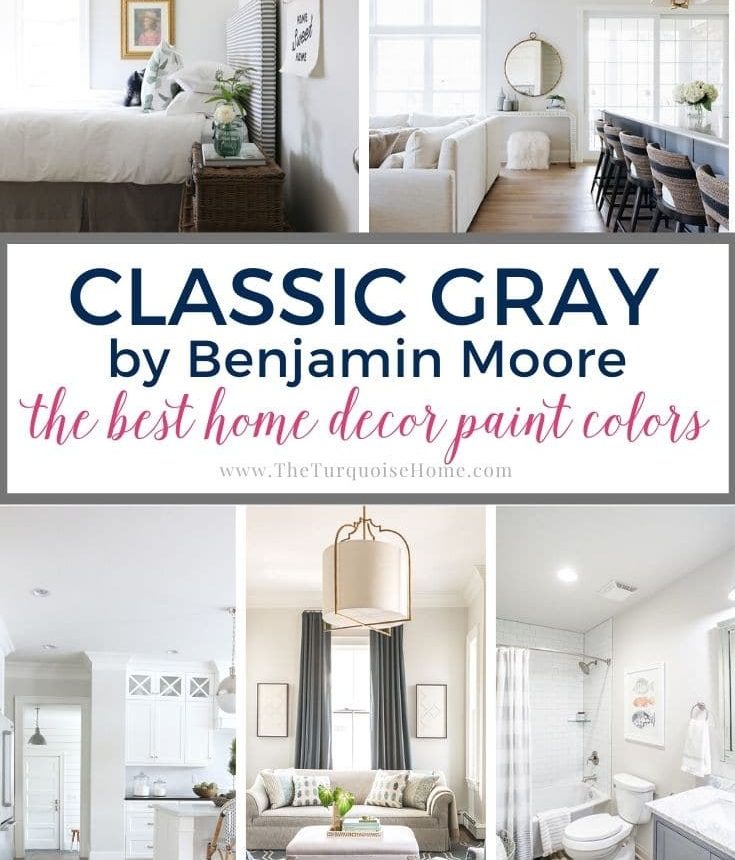
Benjamin Moore Classic Gray is a reliable, neutral greige that reads light and warm. This soft gray brings the style of gray while keeping the cozy warmth of a creamy off-white—ideal when paired with crisp white trim.
This post contains affiliate links for your convenience. See my full disclosure policy.
Choosing paint can feel overwhelming, so I use a simple method to narrow options before sampling. That said, nothing beats testing a real paint sample in your own space. Use this guide to decide which colors are worth sampling and how Classic Gray behaves in different rooms and lighting conditions.
What Color is Classic Gray OC-23?
Benjamin Moore Classic Gray OC-23 is a soft, pale gray with warm undertones that can sometimes read as a warm off-white. It sits in the mid-to-light range—not stark white, not a deep gray—making it an excellent balancing color for many styles and rooms.
This shade offers a refined, understated look that pairs beautifully with whites, other grays, and even stronger accent colors. It’s a versatile choice for both interior and exterior use and is often recommended for open floor plans because it creates a calm, cohesive backdrop.
Note: If you’re painting yourself, use proper tools and test samples on your walls before committing. Ordering peel-and-stick samples or small swatches of the actual paint helps you observe undertones and behavior in different lighting throughout the day.
Where to Install Classic Gray
Classic Gray is refined and adaptable. Consider it for:
- Cabinetry
- Walls
- Doors
- Casings and trimwork
- Furniture
- Exterior siding or trim
It works equally well indoors and out, delivering an elegant neutral canvas for many finishes and materials.
What Home Style Works Best with Classic Gray
- Transitional
- Modern
- Farmhouse
Benjamin Moore Classic Gray Undertones
Unlike many grays that skew blue or purple, Classic Gray has a warm, comforting quality. It often reads as a soft, sophisticated off-white and can shift subtly depending on light and surroundings.
In bright sunlight it may appear almost white; in dimmer rooms its warm gray identity becomes more apparent. In some settings you might notice a faint pink or soft purple hint, or it might reflect neighboring colors—brick can warm it toward pinks, while dense greenery may impart a slight green cast. Overall, its undertones are gentle and adaptable rather than bold.
Pro Tip
Always test the real paint color in your home first. Peel-and-stick samples or small real-paint swatches are ideal because they show how the color reads on your walls throughout the day without the mess of sample pots. Move the samples around to check how the shade reacts to different light and adjacent surfaces.
Is Classic Gray warm or cool in tone?
Classic Gray is a warm neutral with subtle neutral-pink or soft-purple undertones. It won’t read as strongly pink as some warm whites or as cool and green as other grays. Compared to very neutral grays, Classic Gray leans warmer and is less dark than many mid-tone grays.
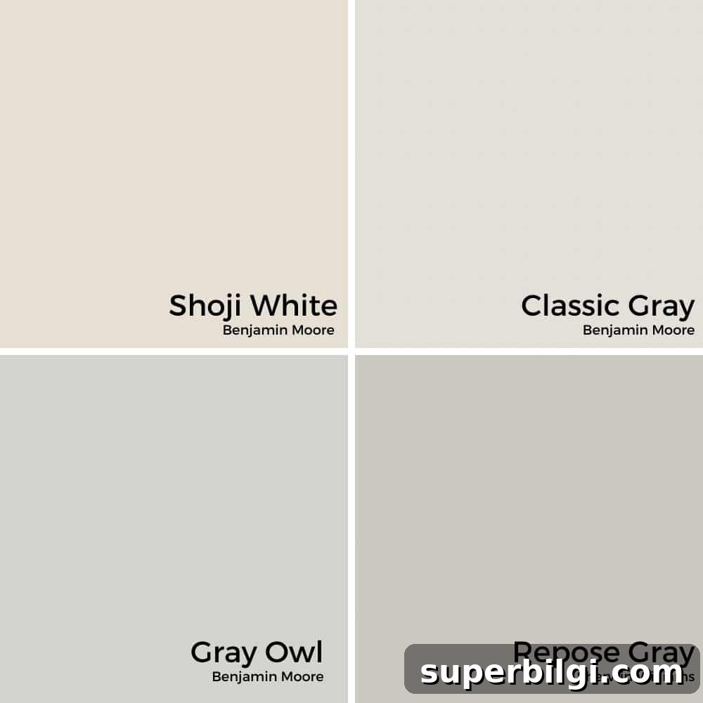
Classic Gray vs. Other Neutral Paint Colors
When choosing a neutral, it’s helpful to compare similar shades to understand subtle undertone differences and light reflectance.
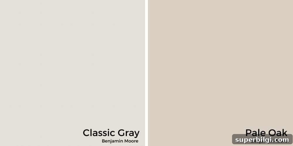
Classic Gray vs. Pale Oak
Pale Oak leans more toward taupe with a warm pink undertone and tends to read slightly darker than Classic Gray. Pale Oak often appears more beige/mushroom-like in many rooms, while Classic Gray stays cleaner and lighter.
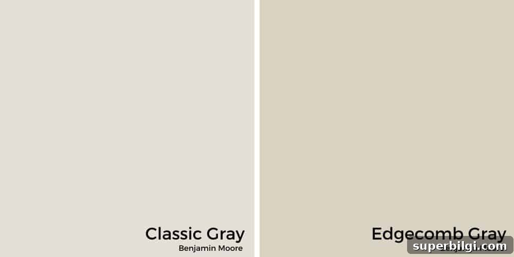
Classic Gray vs. Edgecomb Gray
Edgecomb Gray is another warm gray often chosen for open plans; it reads richer and slightly darker than Classic Gray. If you prefer a more pronounced warm neutral, Edgecomb Gray may suit well, but for a lighter, airier backdrop Classic Gray is a smarter pick.
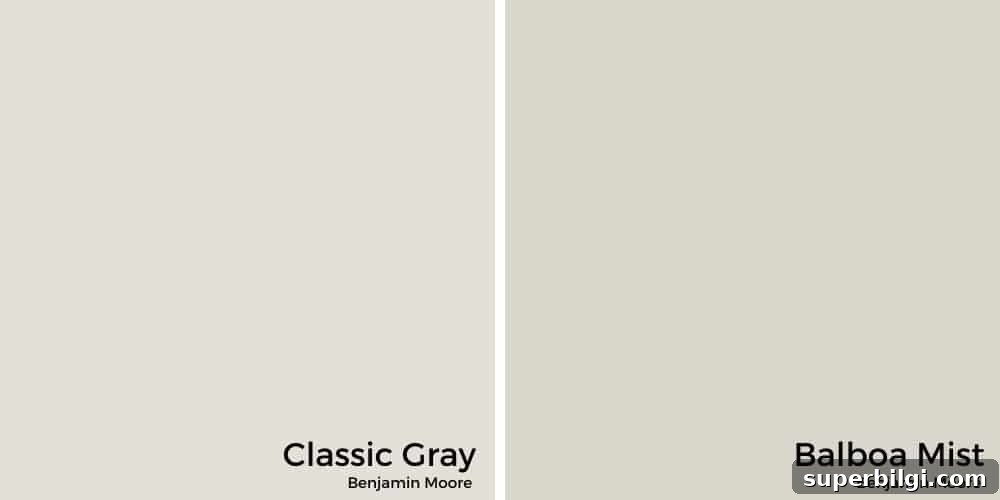
Classic Gray vs. Balboa Mist
Balboa Mist is very close to Classic Gray but reads a touch darker and has a slightly cooler, more violet tendency. Both are excellent greiges; your choice depends on whether you prefer a slightly more muted, cooler look (Balboa Mist) or a brighter warm gray (Classic Gray).
What is Classic Gray’s LRV?
LRV (Light Reflectance Value) measures how much light a paint color reflects on a scale from 0 (black) to 100 (white). Classic Gray has an LRV around 73–74, placing it in the off-white category. This means it reflects a lot of light and will make rooms feel bright and airy, especially those with moderate to good natural light.
In very bright rooms it can read nearly white; in lower-light rooms its warm gray character becomes more noticeable. Pairing it with bright white trim will highlight the subtle contrast and show the color clearly.
How Classic Gray Complements Different Rooms
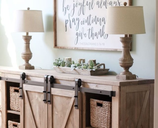
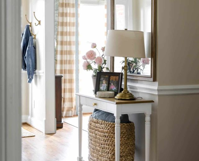
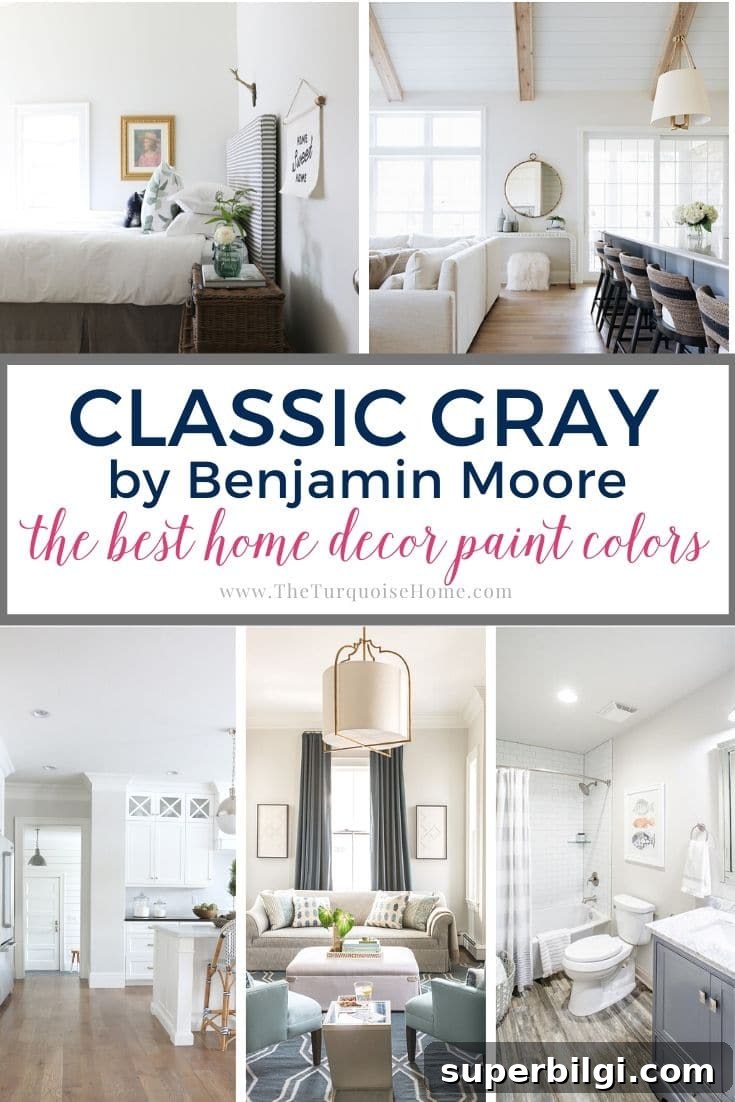
Classic Gray’s soft warmth makes it a versatile choice across bedrooms, living rooms, bathrooms, and kitchens. Below are examples of how it behaves in different spaces and pairings to inspire your decision.
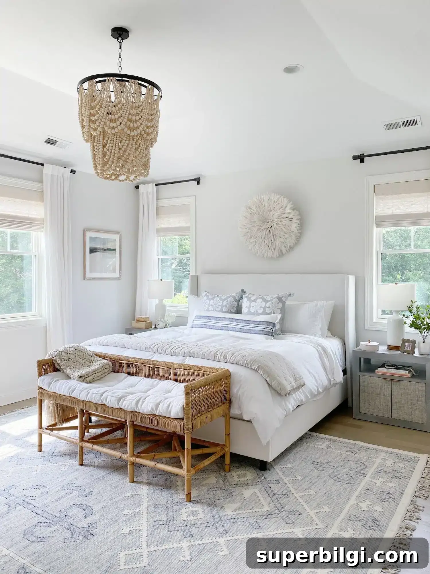
Classic Gray in Bedrooms
For bedrooms, Classic Gray promotes a calm, restful atmosphere. It complements neutral textures and layered bedding for a cozy, luxurious retreat. In rooms with ample natural light it can look crisp and nearly white; in dimmer spaces it reads as a gentle warm gray that soothes the eye.
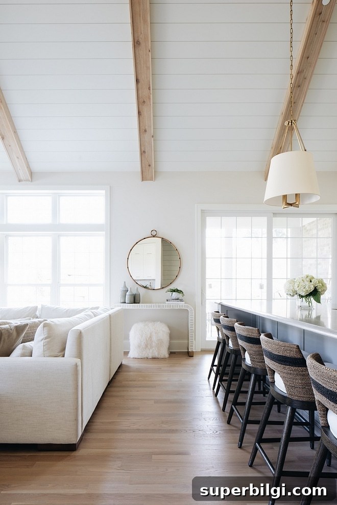
Living Rooms With Classic Gray
Classic Gray is a favorite for living rooms because it serves as a subtle backdrop that highlights artwork and accessories without competing with them. Its versatility lets you switch decor tones—from blues to warm woods—without clashing.
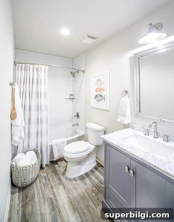
Classic Gray in the Bathroom
In bathrooms, Classic Gray creates a clean, warm backdrop that works beautifully with white tile, marble, and chrome or nickel fixtures. Its light-reflecting quality brightens smaller baths while keeping a soft, inviting tone.
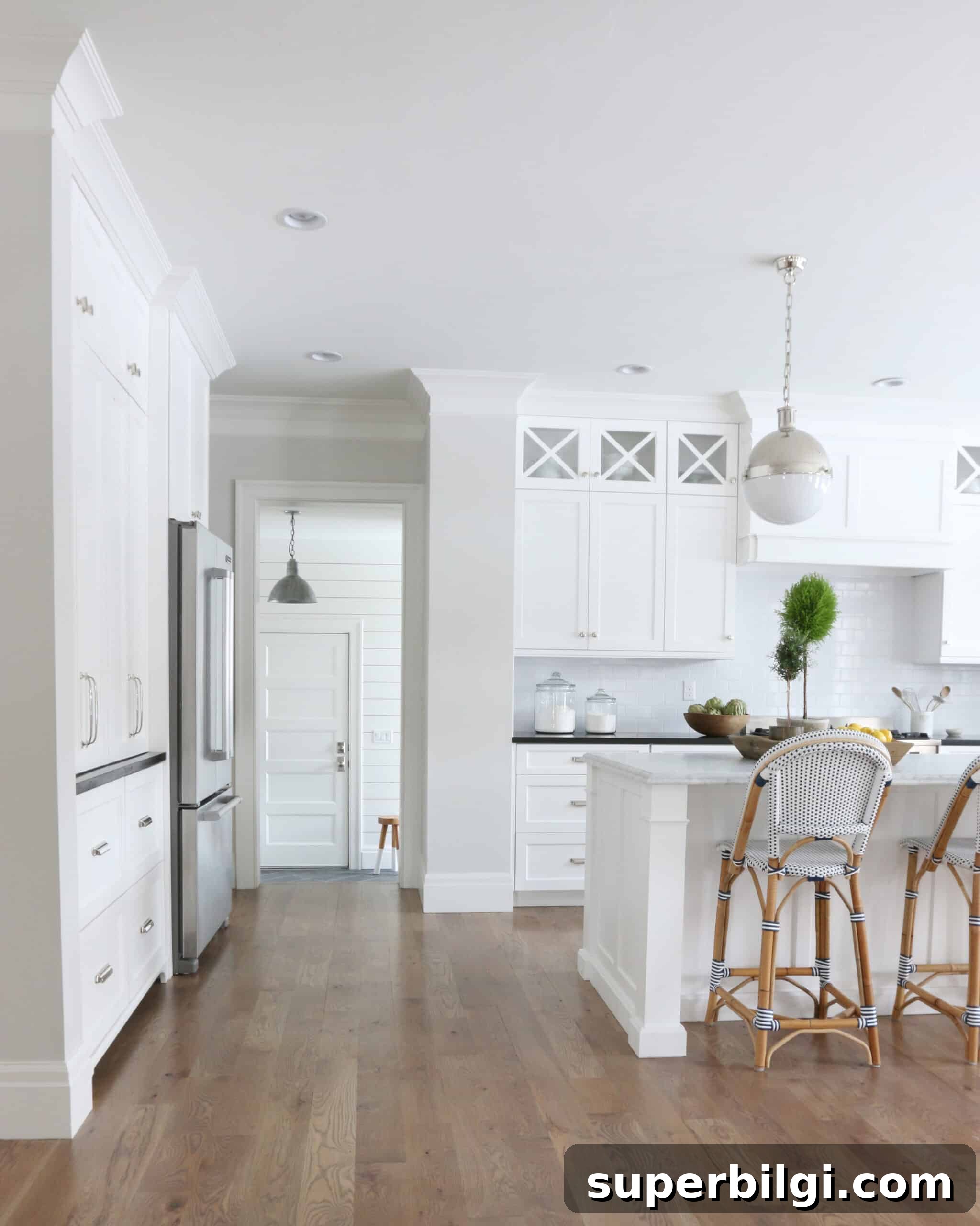
Classic Gray Featured In Kitchens
Classic Gray pairs well with white or wood cabinets and works especially well in open-plan kitchens where a consistent palette ties multiple spaces together. It keeps the kitchen bright while adding subtle warmth that complements darker counters and metal hardware.
What Colors Coordinate with Classic Gray
Classic Gray pairs beautifully with a wide range of hues. Benjamin Moore suggests coordinating with slate and midnight blues, warm beiges, and soft golds. My personal favorite pairings include:
- Bright whites for trim (Chantilly Lace, Simply White)
- White Dove for a softer trim option
- Deep navy accents for contrast
- Sea Haze and other muted greens
- Black accents for dramatic contrast
Trim Colors that Coordinate with Classic Gray
Classic Gray looks exceptionally serene with warm or bright white trim. Consider a clean bright white for ceilings and trim or a soft warm white for a gentler contrast that still feels fresh and refined.
Final Thoughts
Benjamin Moore Classic Gray is a timeless, versatile neutral that elevates many home styles. Its warm, subtle undertones and high light reflectance make it a safe, stylish choice that remains on-trend without feeling temporary. If you want a dependable, calming backdrop that works across rooms and seasons, Classic Gray is worth sampling in your home.
Tools To Help Complete A DIY Paint Project
Painting well requires the right tools. Consider investing in a sturdy roller tray, quality drop cloths, a convenient paint cup, painter’s tape for sharp lines, and a selection of good brushes. These basics will help your paintwork look professional and save time during cleanup.
Other Paint Color Posts
Explore additional posts on neutral and accent paint colors for more inspiration and guidance when choosing the right palette for your home.
MORE POSTS YOU WILL LOVE:
- The Best 15 Neutral Paint Colors
- The Best Blue Paint Colors for Your Home
- How to Choose Living Room Curtains