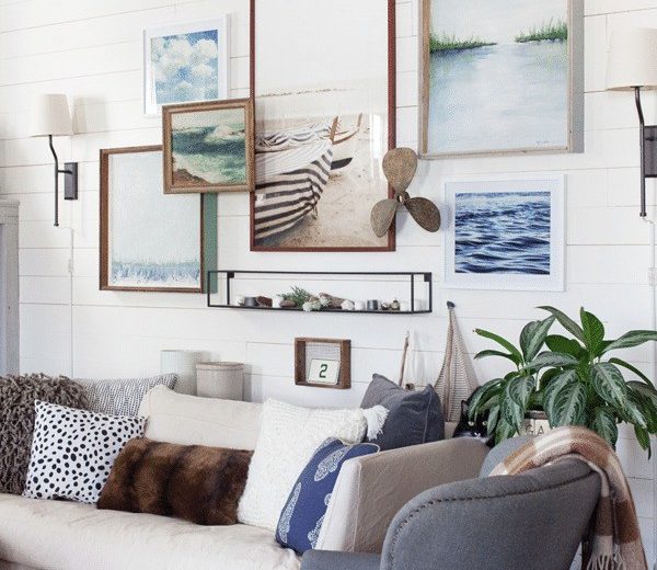
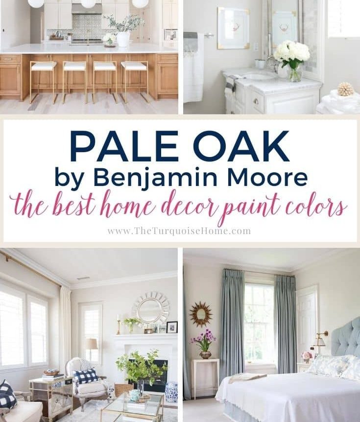
Discover the beauty of Benjamin Moore Pale Oak (OC-20), a soft, warm greige that creates cozy, inviting spaces. See how it changes the mood in every room.
If you’re searching for a warm neutral to make your home feel more inviting, consider Benjamin Moore Pale Oak. This popular greige works in many settings and can subtly transform a room with its gentle blend of gray and beige.
Benjamin Moore Pale Oak (OC-20) is a light neutral with a faint hint of color. Sitting between gray and beige, this taupe-like greige (sometimes described as a mushroom tone) is a favorite for creating comfortable, welcoming interiors.
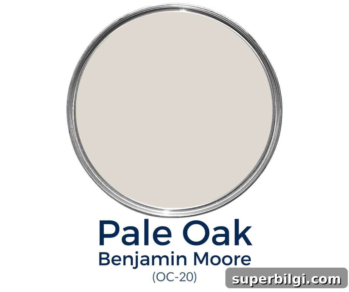
Many designers call Pale Oak a chameleon color: it adapts to its surroundings while maintaining a warm core. Depending on lighting and adjacent finishes, it can look noticeably different from one room to the next.
If you’re considering BM Pale Oak for your home, read on to learn about its undertones, light reflectance, best pairings, and how it performs in bathrooms, bedrooms, kitchens, and living rooms.
Benjamin Moore Pale Oak Undertones
Pale Oak shifts depending on the light and surroundings. Its most noticeable undertone is a soft pink, which can give the color a subtle, warm glow. In some situations a gentle yellow undertone becomes visible, but it’s usually less prominent than the pink.
In bright, natural light Pale Oak often reads as a warm, light gray rather than a straight greige. In lower light it reveals its warmer beige qualities more clearly. Because of these shifts, testing actual samples in your space is essential.
Is BM Pale Oak Warm or Cool?
Pale Oak is definitely on the warm side of the spectrum. Compared with many greiges, it leans warmer, making it a great choice for creating a cozy atmosphere while staying within a neutral palette.
Pale Oak Light Reflectance Value (LRV)
Pale Oak has a light reflectance value (LRV) of about 68.64. LRV measures how much light a color reflects on a scale from 0 (black) to 100 (white). At roughly 69, Pale Oak has a relatively high LRV for a greige, so it brightens spaces while retaining warmth.
In rooms with abundant natural light, the color may appear more like a warm gray or off-white. In dimmer rooms, its beige and warm undertones become more evident, which can make a space feel snug and intimate. For best results, view large samples in both daytime and evening lighting.
Pale Oak Color Strip
Pale Oak sits alongside several neighboring colors in the Benjamin Moore OC series, including Baby Fawn (OC-15), Cedar Key (OC-16), White Dove (OC-17), Dove Wing (OC-18), Seapearl (OC-19), Pale Oak (OC-20), and Winter White (OC-21). These tones offer complementary options for pairing walls, trim, or accent areas.
What Colors Go with Benjamin Moore Pale Oak?
White Dove is a reliable warm white that pairs beautifully with Pale Oak; its soft, creamy quality complements the greige without feeling too yellow. For trim, a clean true white or slightly warm off-white will create crisp edges and let Pale Oak read as the warm neutral it is.
Pale Oak also plays well with richer accent colors. Deep navy tones, such as Hale Navy, create striking contrast and bring out subtle gray undertones. Warm wood finishes, bronze or brass metals, and soft blues all harmonize nicely with Pale Oak’s versatility.
When choosing trim, aim for whites with minimal competing undertones. Popular trim choices that pair well with Pale Oak include Simply White, Chantilly Lace, and White Dove—options that keep trim clean and let the walls feel soft and inviting.
Benjamin Moore Pale Oak vs Other Greiges
Pale Oak vs Edgecomb Gray
Edgecomb Gray is a classic greige that can lean slightly green at times, while Pale Oak’s warmer pink undertone sets it apart. Edgecomb Gray has a lower LRV, so it won’t wash out as much in bright spaces, and it can feel a touch cooler or more traditional compared to Pale Oak’s softer warmth.
Because Edgecomb Gray and similar green-leaning neutrals can emphasize Pale Oak’s pink undertone, avoid pairing them directly if you want Pale Oak to read more neutral or gray.
Pale Oak vs Agreeable Gray
Agreeable Gray (a Sherwin-Williams bestseller) is a beige-forward greige with faint blue or purple undertones that can pull it slightly cooler. With an LRV around 60, Agreeable Gray is less likely to wash out in bright light and generally reads as a calm, neutral beige-gray, while Pale Oak offers a bit more warmth and subtle color variation throughout the day.
Pale Oak vs Shoji White
Shoji White is a soft, warm white with greige influence that feels slightly creamier and airier than Pale Oak. If you want a very light, bright backdrop with just a touch of warmth, Shoji White is a great option. Pale Oak, on the other hand, is deeper and moodier, giving rooms a cozy, lived-in character without becoming dark.
Best Trim Colors for Pale Oak
White or off-white trim is universally flattering with Pale Oak. Choose a white with subtle undertones that won’t clash with Pale Oak’s warmth. Simply White, Chantilly Lace, and White Dove are popular choices that create a crisp, polished look when paired with Pale Oak walls.
How Pale Oak Looks in Different Rooms
Pale Oak’s versatility makes it suitable for many rooms. Below are practical tips for common spaces.
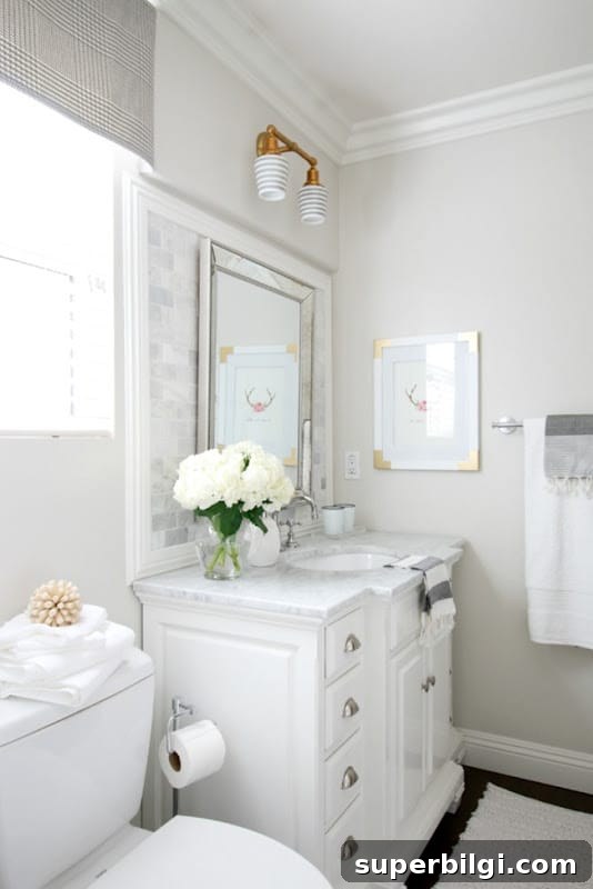
Pale Oak in Bathrooms
Used in bathrooms, Pale Oak keeps the space feeling clean, bright, and warm. In smaller, darker bathrooms it will read warmer and cozier; in large, sunlit bathrooms it tends to look grayer and more neutral. Because bathrooms often include white fixtures and towels, Pale Oak usually plays a subtle supporting role without obvious undertones.
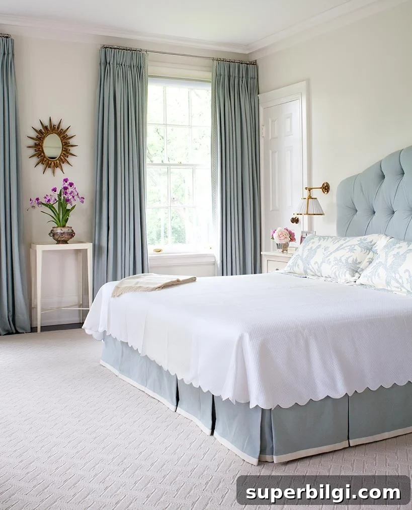
Pale Oak in Bedrooms
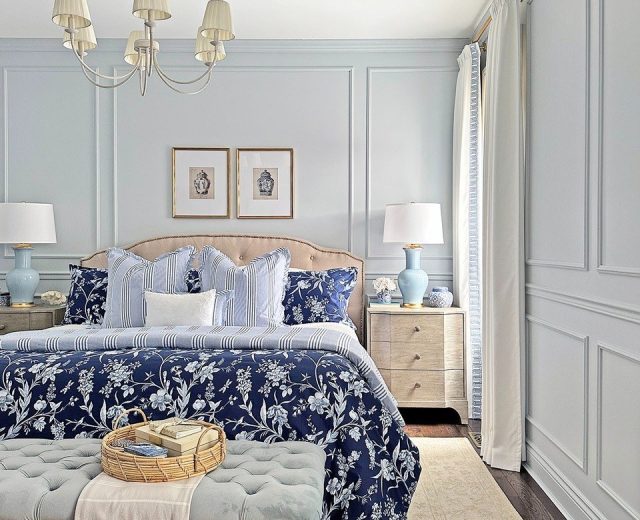
In bedrooms, Pale Oak creates a tranquil backdrop that supports many accent choices—from soft blues and greens to warm metallics. Its neutrality allows patterned textiles and layered textures to shine while maintaining a restful atmosphere.
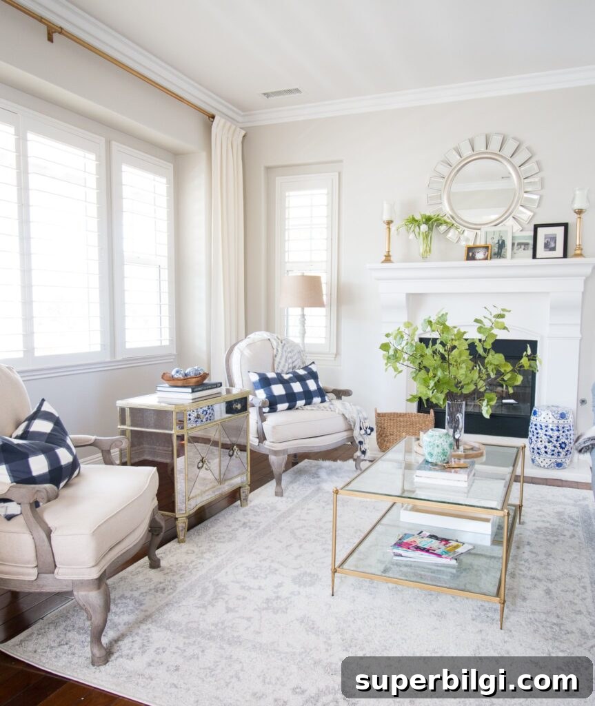
Pale Oak in the Living Room
Pale Oak suits open-plan living areas and rooms that change with the seasons. It’s neutral enough to anchor a variety of decor styles while offering inviting warmth for family gatherings and cozy evenings.
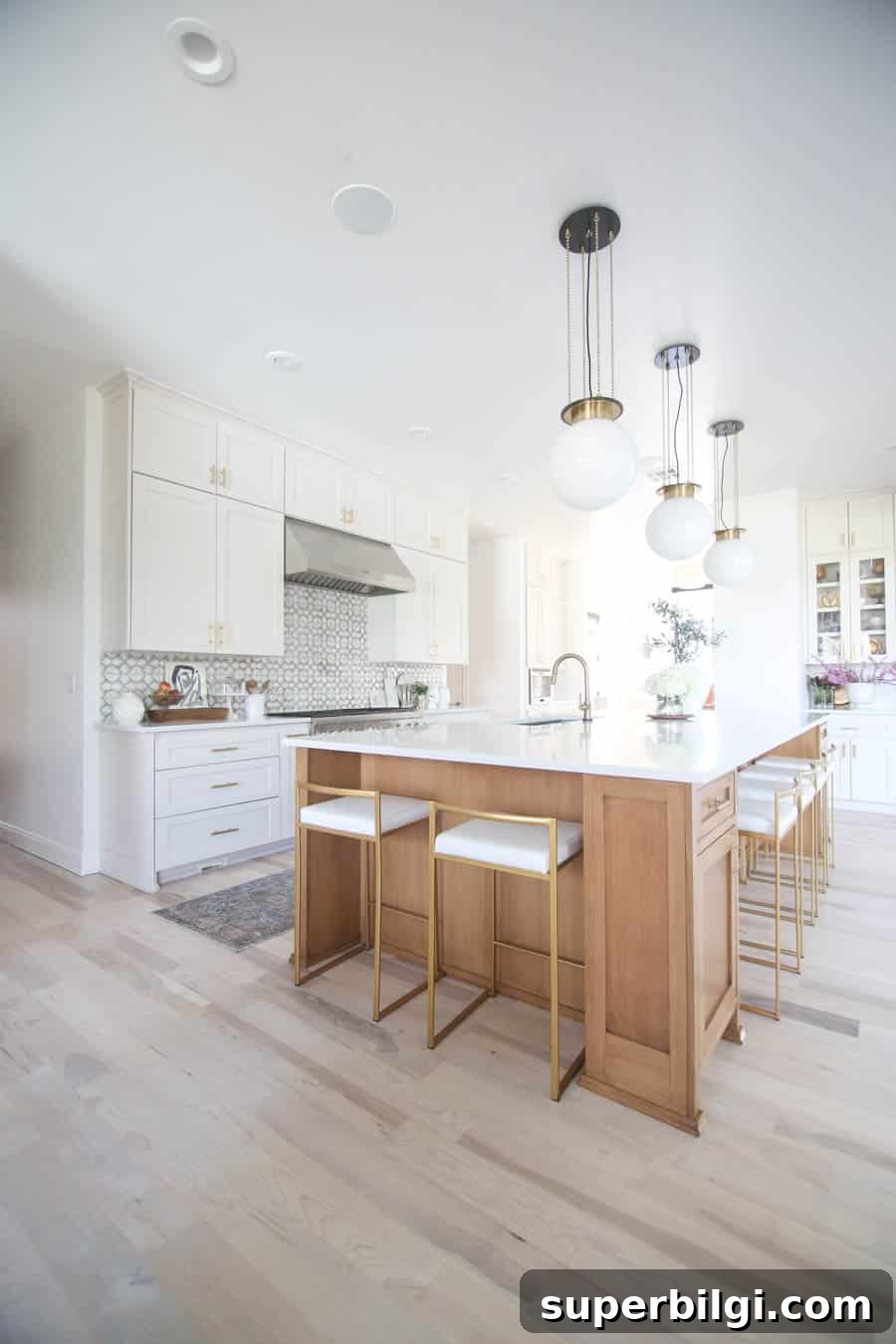
Pale Oak in Kitchens
Pale Oak works well in kitchens, complementing warm wood floors, earth-toned tile, and cream or white cabinetry. It can be used on walls or even on cabinetry for a warm, timeless look that pairs with brass, bronze, or matte black hardware.
Overall, Benjamin Moore Pale Oak creates warm, approachable interiors that adapt gracefully to light and decor. If you test it in your home, view samples at different times of day to be sure you’ll love the way it shifts with your light and furnishings.
Pale Oak often shows a soft pink undertone and occasionally a subtle yellow depending on lighting. These undertones give the paint a gentle warmth that changes throughout the day.
It depends on light: in bright natural light Pale Oak leans toward a warm, light gray; in darker spaces its beige warmth becomes more pronounced.
Yes. With an LRV around 69, Pale Oak brightens smaller rooms while keeping them warm and inviting.
Absolutely. Pale Oak adds soft warmth to kitchens and bathrooms and pairs nicely with warm woods, creamy whites, and cool accent colors.
More Paint Colors to Consider
If you like cozy neutrals, explore colors such as Agreeable Gray, Revere Pewter, Repose Gray, or consider bold complementary choices like Hale Navy or muted coastal tones like Sea Salt. Each offers a different mood while working well alongside Pale Oak in layered, thoughtful designs.