
Wythe Blue by Benjamin Moore is a sophisticated blue-green paint with gray undertones. Part of the Historic Color collection, Benjamin Moore Wythe Blue is a popular choice for farmhouse, traditional, and coastal interiors.
I’m excited to share one of my favorite paint colors: Wythe Blue from Benjamin Moore. I used this shade prominently in a recent room makeover, and it’s one I recommend trying at home.
You’ll notice Wythe Blue the moment you enter my house. After reading this review and seeing the photos, I’m confident you’ll appreciate why it’s so beloved.

Wythe Blue was added to Benjamin Moore’s Historic Color collection in 1976. The shade has a timeless quality that complements both classic and contemporary homes. In 2012, Benjamin Moore named Wythe Blue (HC-143) as its Color of the Year, praising blue’s calming influence and enduring popularity:
Much more versatile than you may think, blue is truly a classic color. It has universal appeal, never goes out of style, and is overwhelmingly chosen as a color favorite across North America. It evokes the sea and sky, physically calms us, and symbolizes trust and commitment. Because of the influence that blue has in our world today, we have chosen Wythe Blue (HC-143) as Benjamin Moore’s 2012 Color of the Year. It’s a beautiful, calming hue that has an element of heritage and offers grounding rootedness, providing comfort and stability.
Benjamin Moore
Wythe Blue reads as a calm blue-green that can cover all four walls or serve as a striking accent. Below you’ll find details about its undertones, coordinating colors, comparisons with similar paints, and real-room examples showing how it behaves in different light.
Note: If you plan to paint yourself, testing real paint samples in your home is essential to see how the color reacts to your light and furnishings.
Benjamin Moore Wythe Blue Undertones
On a swatch, Wythe Blue shows strong gray and green influences. Once applied to a wall, the blue tone usually becomes the most noticeable element, while the green or gray undertones appear more or less prominently depending on lighting and surrounding decor.
Wythe Blue will pick up gray from furniture and accents, shifting toward a bluer-gray appearance in spaces dominated by cool neutrals. In rooms with warmer, yellow-toned light—especially west-facing spaces—the green undertones become more apparent. In low-light settings the color can deepen and reveal richer green or gray characteristics.
Pairing Wythe Blue with lighter blues tends to draw out its green side, while pairing with cool grays emphasizes gray undertones. At night, when colors deepen, the green becomes more noticeable in many settings.
Colors That Pair Well with Benjamin Moore Wythe Blue
Wythe Blue sits near the middle of the Light Reflective Value (LRV) scale, making it quite versatile. It pairs nicely with many neutrals and color accents. Some Benjamin Moore shades that coordinate well include Olivetint 519, Shaker Gray 1594, Van Buren Brown HC-70, Distant Gray 2124-70, Palladian Blue HC-144, and Edgecomb Gray HC-173.
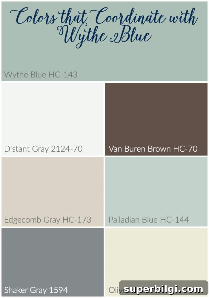
Wythe Blue also complements most whites and works well with bright accents—reds, yellows, greens and even vibrant tangerine can add exciting contrast. It’s flexible enough to be used as an all-over wall color or as an accent in more neutral rooms.
Wythe Blue vs. Other Blue-Green Paint Colors
Wythe Blue vs. Palladian Blue
Wythe Blue and Palladian Blue both offer soft blue-green vibes, but Palladian Blue is lighter and airier with stronger green undertones, making it feel very coastal. Wythe Blue contains more gray and reads deeper and more grounded—an ideal choice if you want a refined, timeless mood.
- Palladian Blue: lighter, fresher, coastal
- Wythe Blue: deeper, muted, more sophisticated
Tip: Rooms with abundant natural light favor Palladian Blue; more intimate or moody spaces benefit from Wythe Blue’s depth.
Wythe Blue vs. Stratton Blue
Stratton Blue is darker and richer with a stronger green leaning, making it dramatic and cozy for accent walls or bold spaces. Wythe Blue is softer and more versatile for full-room coverage without feeling heavy.
- Stratton Blue: deeper, bolder, greener
- Wythe Blue: lighter, softer, versatile
Wythe Blue vs. Sea Salt
Compared to Sherwin-Williams Sea Salt, Wythe Blue reads richer and more neutral. Sea Salt often appears lighter and greener, while Wythe Blue balances blue, green and gray for a more historic or traditional feel.
- Sea Salt: light, airy, green-leaning
- Wythe Blue: richer, balanced blue-gray-green
Rooms Painted with Benjamin Moore Wythe Blue
Wythe Blue is versatile enough for bedrooms, bathrooms, kitchens, living rooms, and even exteriors. Below are examples showing how the shade shifts with light and context.
Wythe Blue in Bedrooms
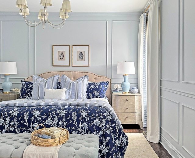
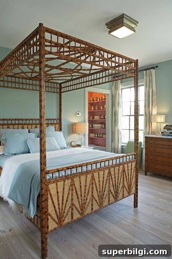
In bedroom settings Wythe Blue can appear crisp and fresh or soft and intimate, depending on light and furnishings.
Wythe Blue in Bathrooms
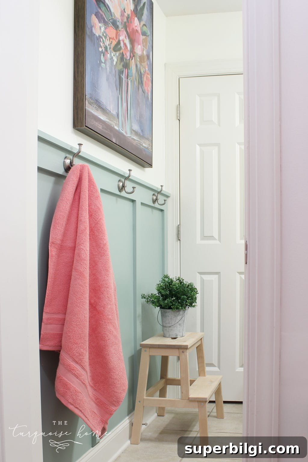
Wythe Blue makes beautiful bathrooms—from board-and-batten walls to spa-like retreats. In darker bathrooms the green undertones can become very apparent; in brighter spaces the color reads bluer and calmer.
Kitchens with Wythe Blue
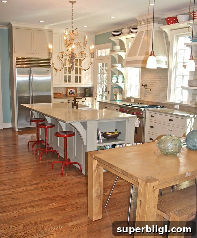
Used as cabinets, a beadboard backsplash, or an accent, Wythe Blue anchors kitchens beautifully. It pairs well with white and gray cabinetry and can make accent colors—like reds—pop.
Wythe Blue in Living Rooms
Living rooms show Wythe Blue’s full range: in some corners it will read green, in others blue or gray, depending on light and furnishings. The color can feel neutral and slightly warm when the room receives soft light.
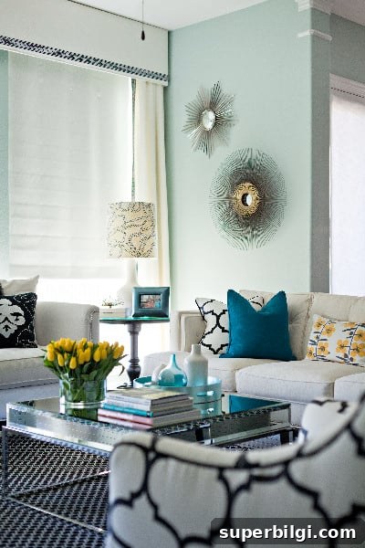
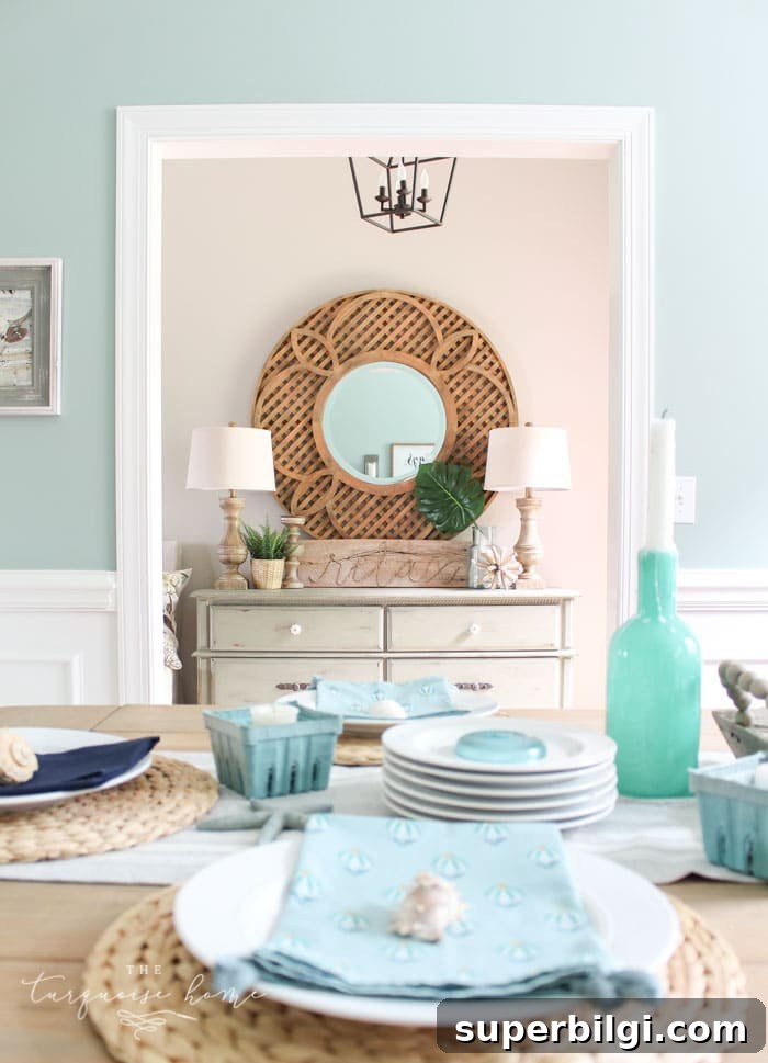
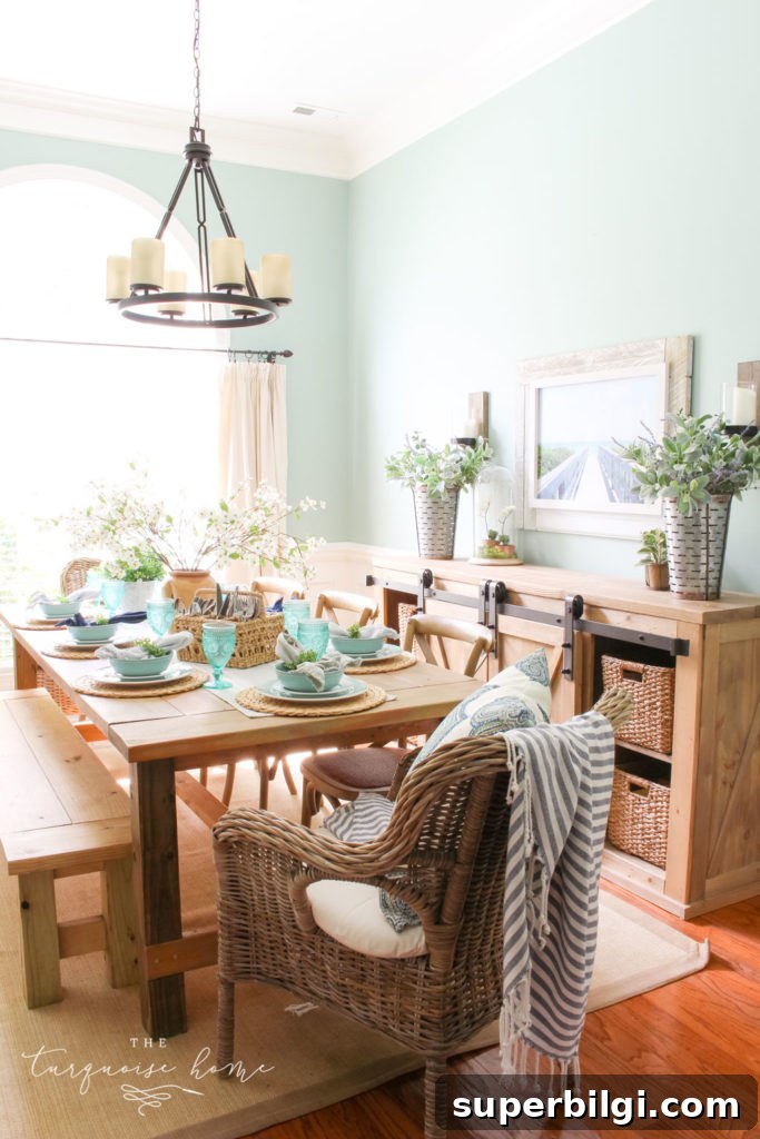
My Dining Room with Wythe Blue Walls
My dining room, painted Wythe Blue, faces west and picks up warm yellow-brown tones, which bring out the green undertones—something I love about the color.
Exteriors with Benjamin Moore Wythe Blue
If you want a subtle touch outside, painting a front door or shutters Wythe Blue adds charm and personality. A Wythe Blue door is welcoming and timeless.
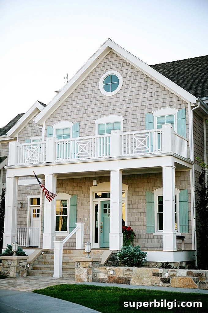
Which room will you try Wythe Blue in? Many designers recommend bathrooms and entryways, but the color works beautifully almost anywhere.
Tools to Help You Paint a Room Yourself
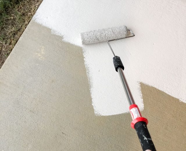
If you’re painting at home, a few reliable tools make the job easier: quality paint brushes, painter’s tape, drop cloths, a comfortable paint cup, and a user-friendly roller tray with liners. Investing in good tools speeds up the process and improves the finish.
Final thought: Always test Wythe Blue on your walls with real paint samples before committing—lighting and room elements will determine how the color truly appears in your home.