
Today I’m introducing a color you may not have heard of but should definitely consider: Sherwin Williams Comfort Gray. Read on to learn what makes this serene gray-green so special and how it performs in different rooms of the house.

When you want a major but relatively easy update, start with paint. It’s an affordable way to refresh a room and much less expensive than replacing furniture—or moving. The hardest part is choosing the right color.
Should you choose a warm tone, a cool tone, a classic gray, or a greige? To simplify that decision, I’ve been sharing reliable, versatile paint colors so you can spend less time spinning and more time enjoying your space.
PRO Tip
Any time you’re choosing paint, always test the real paint color in your home first. Real samples let you see how the color shifts with your light and furnishings. Peel-and-stick real-paint samples are a no-mess, convenient option for trying colors in multiple locations and saving references for later.
Choose The Best Color For You
I love a good neutral—Edgecomb Gray is one of my favorites—but colors in the blue-green family are having a moment. A well-chosen blue-green can feel soothing, fresh, and utterly livable. That’s where Sherwin Williams Comfort Gray fits in beautifully.
Sherwin Williams Comfort Gray evokes a calm, coastal feeling. When I see it in a room, I get that instant “ahhh” of relaxation. It’s peaceful and serene—qualities the name itself suggests.
Comfort Gray in My Home
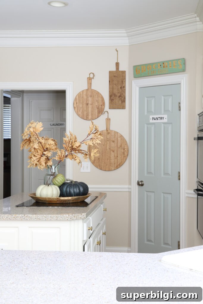
I first fell for Comfort Gray when searching for a pantry door color. Painting a single door a different shade is a small change that can breathe new life into a room. I’ve been enjoying it in my kitchen; while I’m not sure it’s permanent, it’s been a delightful update so far.
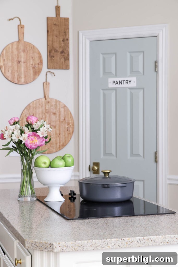
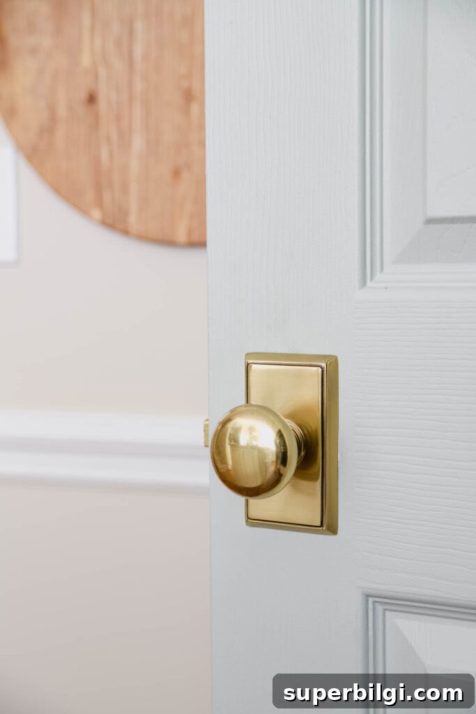
Comfort Gray looks especially lovely paired with brass hardware and warm metallic accents, which add a touch of warmth against the cool, calm base color.
What You Need to Know About Sherwin Williams Comfort Gray
At first glance, Comfort Gray can read as a minty color, but it’s more complex than a single label suggests. It’s a chameleon-like shade that sits between gray, green, and blue. Depending on the light and the surrounding finishes, it can lean more blue-green or more green-blue.
If you’re familiar with Sherwin Williams Sea Salt, Comfort Gray is essentially a slightly deeper, more muted cousin. It has that soft sea-glass quality—cool and calming—making it ideal for balancing warm, south-facing light or adding a coastal vibe to interiors.
Comfort Gray Undertones
Comfort Gray is technically in the gray family, but the visible blue and green undertones make it a fantastic option for anyone wanting a neutral backdrop with a subtle pop of color. It’s an ever-changing, easygoing shade that complements many decor styles while still adding visual interest.
What Colors Coordinate with Sherwin Williams Comfort Gray
The chameleon nature of Comfort Gray gives it remarkable versatility. It pairs well with warm sand tones, caramel and bronze hues, teal, terra cotta, and even brighter accents like coral or watermelon. It also harmonizes well with classic neutrals and many other Sherwin Williams shades.
Here are several specific colors that coordinate nicely with Comfort Gray:
- Dover White (SW 6385)
- Spare White (SW 6203)
- Snowbound (SW 7004)
- Foxy (SW 6333)
- Bagel (SW 6114)
- Moody Blue (SW 6221)
- Greek Villa (SW 7551)
- Amazing Gray (SW 7044)
- Rain (SW 6219)
- Retreat (SW 6207)
- Special Gray (SW 6277)
- Balanced Beige (SW 7037)
- Virtual Taupe (SW 7039)
- Mystical Shade (SW 6276)
Comfort Gray is so adaptable that listing every compatible hue would be overwhelming. If you have a specific color in mind, test it alongside Comfort Gray in your room to see how the pairing reads in your unique light.
Comfort Gray in Action in Different Rooms
To choose confidently, see the color in real settings. Below are examples of Comfort Gray used in kitchens, dining rooms, bedrooms, living rooms, bathrooms, and stairways to show how lighting and surrounding finishes influence its character.
Sherwin Williams Comfort Gray in Kitchens
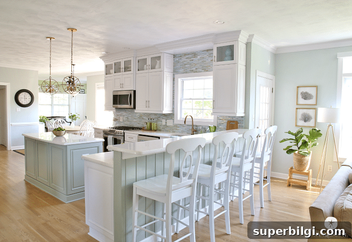
Comfort Gray is a perfect fit for bright, relaxed coastal kitchens. If you prefer a subtler approach, add it in small doses—like painting a pantry or interior door—to introduce color without overwhelming the space.
Comfort Gray in the Dining Room
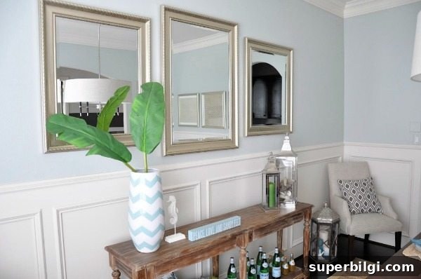
In dining rooms with cooler lighting, Comfort Gray can read more blue than green. It pairs beautifully with silver, blue accents, and crisp whites to create an elegant, tranquil dining space.
SW Comfort Gray in Bedrooms
Comfort Gray’s versatility lets it work with many tones—gold, brown, white, black, and soft rose all coexist comfortably with this shade. Bedrooms painted in Comfort Gray feel restful and composed, offering a peaceful retreat even in rooms with abundant natural light.

Comfort Gray in Living Rooms
A neutral that isn’t boring, Comfort Gray helps tie together varied decor pieces across a home. It works well with warm sand tones and layered textures, and it performs equally well in traditional, transitional, and coastal interiors.

Sherwin Williams Comfort Gray in Bathrooms
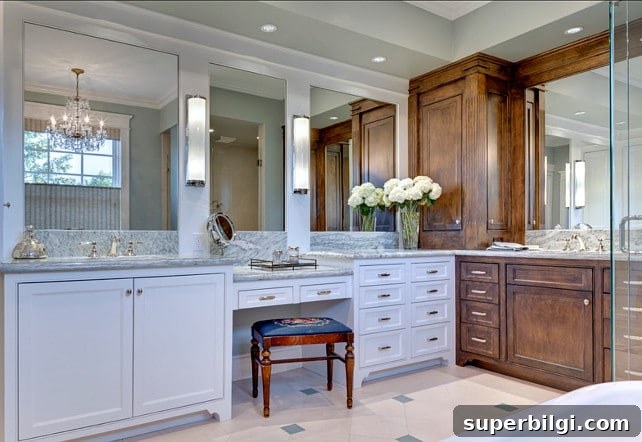
In bathrooms, Comfort Gray can appear almost pastel and luminous depending on the lighting. It unifies whites, browns, and grays in a way that feels fresh and elegant—ideal for a calming, spa-like space.
Comfort Gray Stairways
Comfort Gray is subtle and elegant in entryways and stairwells. It complements dark banisters, pewter finishes, creams, and wood tones while maintaining a refined, cohesive backdrop throughout transitional spaces.

In short, Sherwin Williams Comfort Gray is a versatile, calming paint color that works in nearly any room. If you’re looking for a neutral with personality—one that changes with light and pairs well with a wide range of finishes—this might be the color to try.
Explore other favorite, reliable paint colors to help narrow your choices:
- Agreeable Gray
- Gray Owl
- Repose Gray
- Hale Navy
- White Dove
- Revere Pewter
- Wythe Blue