Let’s talk about my favorite paint color and the search term that most often brings people to this blog: Revere Pewter. Homeowners and designers alike are drawn to this versatile, soft gray. One of the questions I hear most is, “What colors work best with Revere Pewter?” So I’m sharing the combinations I use and recommend, based on how I’ve paired it throughout my home.
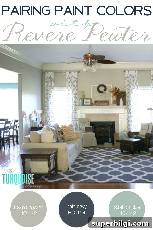
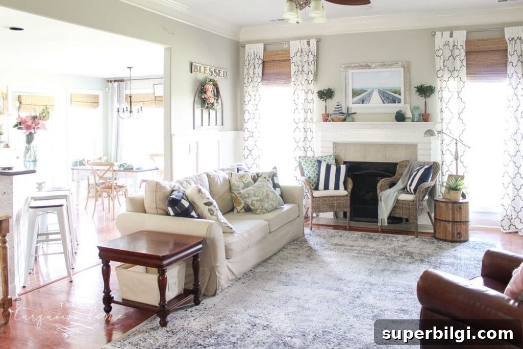
In my experience, Revere Pewter pairs beautifully with almost every color family—warm or cool. It’s a flexible neutral with a balanced undertone, which is why it works so well in open-plan homes where sightlines connect multiple rooms and finishes. I use it as the primary wall color in my open living space because it coordinates with wood furniture, blue-greens, and bolder accent hues without competing for attention.
Want to Save This?
Enter your email below and I’ll send it directly to your inbox!
If you favor a calm, cohesive base, Revere Pewter is an excellent choice. Here are the color pairings I rely on and why they work:
1. Blues and Blue-Greens
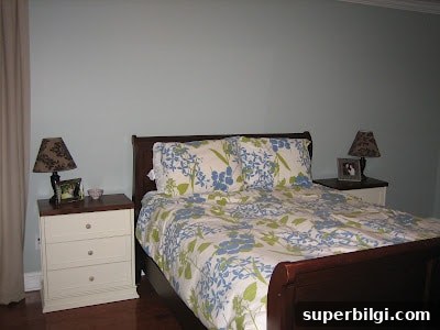
Blues complement Revere Pewter beautifully, especially turquoise and muted blue-greens. In my home the rooms adjacent to the Revere Pewter walls are painted Wythe Blue and Stratton Blue (both Benjamin Moore), and the transition feels natural and soothing. A blue accent wall or textiles in teal or turquoise will feel fresh against RP.
2. Wood Tones
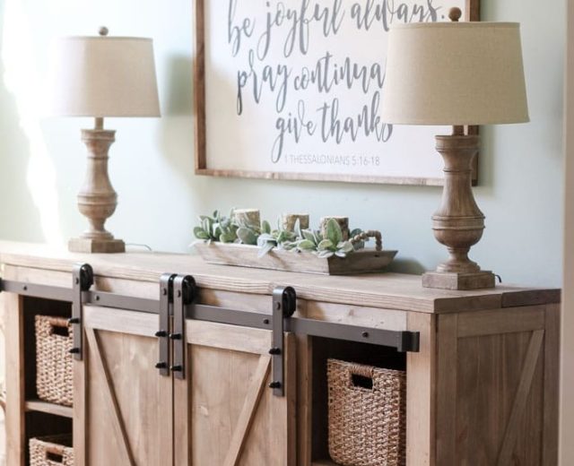
Warm woods—oak, walnut, or reclaimed wood—look rich and grounded next to Revere Pewter. The gray creates a neutral backdrop that allows the grain and warmth of the wood to stand out, so furniture and built-ins become focal points without clashing.
3. Soft Pastels and Pinks
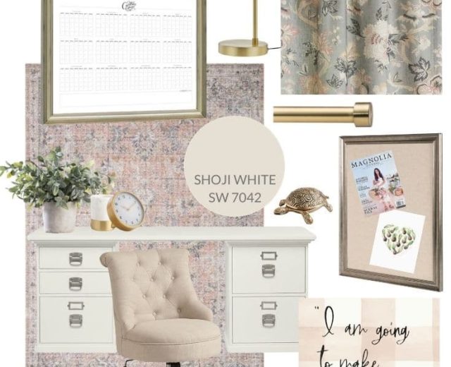
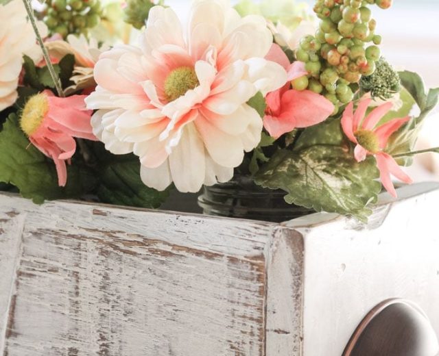
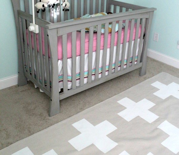
Soft pinks and blush tones create a delicate, modern contrast when paired with Revere Pewter. These hues add a feminine, contemporary touch without overwhelming the space.
4. Greens and Natural Hues
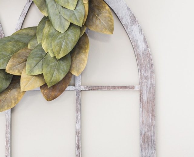
Whether you prefer sage, olive, or brighter chartreuse accents, greens pair well with RP’s subtle warmth. Plants, textiles, and decorative accessories in green bring a natural, organic vibe to gray walls.
5. Seasonal Accents
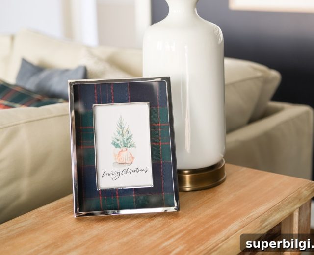
One of the great benefits of Revere Pewter is how easily it adapts to seasonal decor. In spring and summer, I use lighter greens, blues, and yellows. In fall, I add deeper rusts, reds, and burnt orange accents for a cozy layered look.
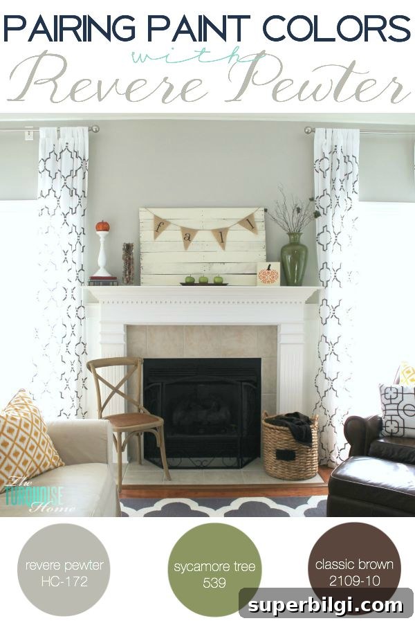
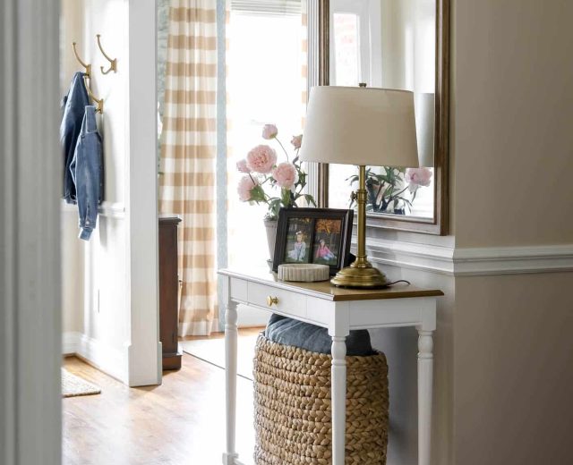
If you prefer a neutral palette, keep furnishings and large pieces in warm creams, tans, or charcoal, then introduce color with pillows, rugs, artwork, and window treatments. That lets you refresh the look seasonally or whenever you want a new accent without repainting the walls.
I’ve also tried Revere Pewter on several mantel areas and paired each one with different accent colors and trim choices to see what felt right. The result has been consistently flexible: Revere Pewter reads as a warm gray in some light and a cooler gray in different lighting, so testing samples in your space is always a good idea.
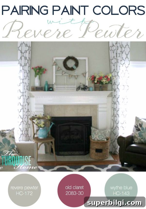
Have you found a go-to wall color that you keep coming back to? Are you as in love with Revere Pewter as I am? If you’re choosing finishes for an open-plan home, Revere Pewter is a dependable option because it harmonizes with a broad palette of colors and materials.
PS — All the paint colors mentioned here are Benjamin Moore. In my main living space I use Hale Navy, Wythe Blue, Stratton Blue, and Revere Pewter together, and that combination continues to be my favorite.
More Posts You Will Love:
- The Best Bedroom Paint Colors
- Best Living Room Paint Colors
- The Best 15 Neutral Paint Colors
- Create a Whole House Color Palette
- The Best Blue Gray Paint Colors