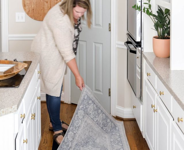

Sea Salt by Sherwin Williams is a popular blue-green-gray paint that pairs beautifully with white and many trending home colors. Often called a coastal neutral, it’s versatile enough to work in almost any style of home.
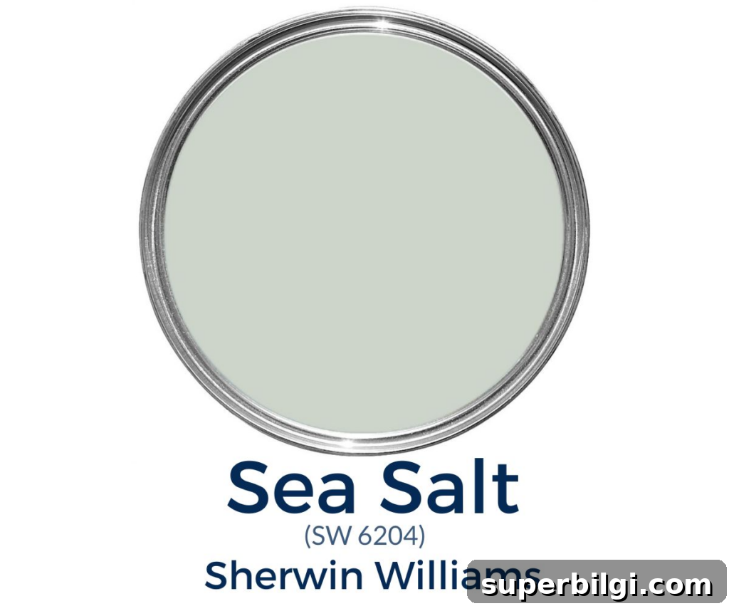
I love Sea Salt and have used it repeatedly in my homes—on porch ceilings, laundry rooms, kitchens, bedrooms, and bathrooms. It’s one of those colors I always find a place for because of its soft, calming presence.
If you’re testing paint in your home, try real paint samples on poster boards or peel-and-stick samples so you can move them around and see the color in different light throughout the day.
What Color is Sea Salt?
Sea Salt (Sherwin Williams) is a soft blue-green with subtle gray undertones. It evokes the muted tones of ocean water—cool and slightly weathered with a faint warmth reminiscent of sand and sun. The result is a calming, understated color that works well as a neutral accent in many rooms.
This hue is one of the most popular paint choices for homes because it complements whites and grays and pairs nicely with deeper shades like navy. Sea Salt adds a gentle pop of color while maintaining a tranquil, airy feel.
Sherwin Williams Sea Salt Undertones
Sea Salt reads primarily as a green with distinct blue and gray undertones. It behaves like a chameleon paint color: the dominant undertone you see changes with lighting, time of day, and surrounding finishes.
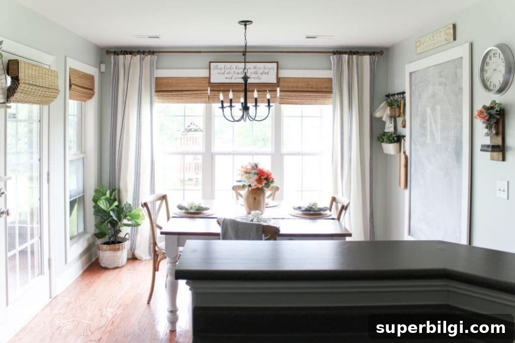
Warm indoor lighting can bring out the green aspects, while soft natural or filtered light often makes the color appear more blue-green or even slightly blue. In bright, direct light the color can look washed out and very pale, which is ideal if you want a subtle, neutral look but less desirable if you want a deeper, moodier hue.
Because Sea Salt shifts based on light, sample it on different walls and observe it at various times of day before committing to painting an entire room.
LRV of Sea Salt by Sherwin Williams
Light Reflectance Value (LRV) measures how much visible light a paint color reflects. Sea Salt has an LRV of 63, which places it in the lighter mid-range—bright enough to keep rooms feeling open while still showing its subtle color.
Is It a Warm or Cool Color?
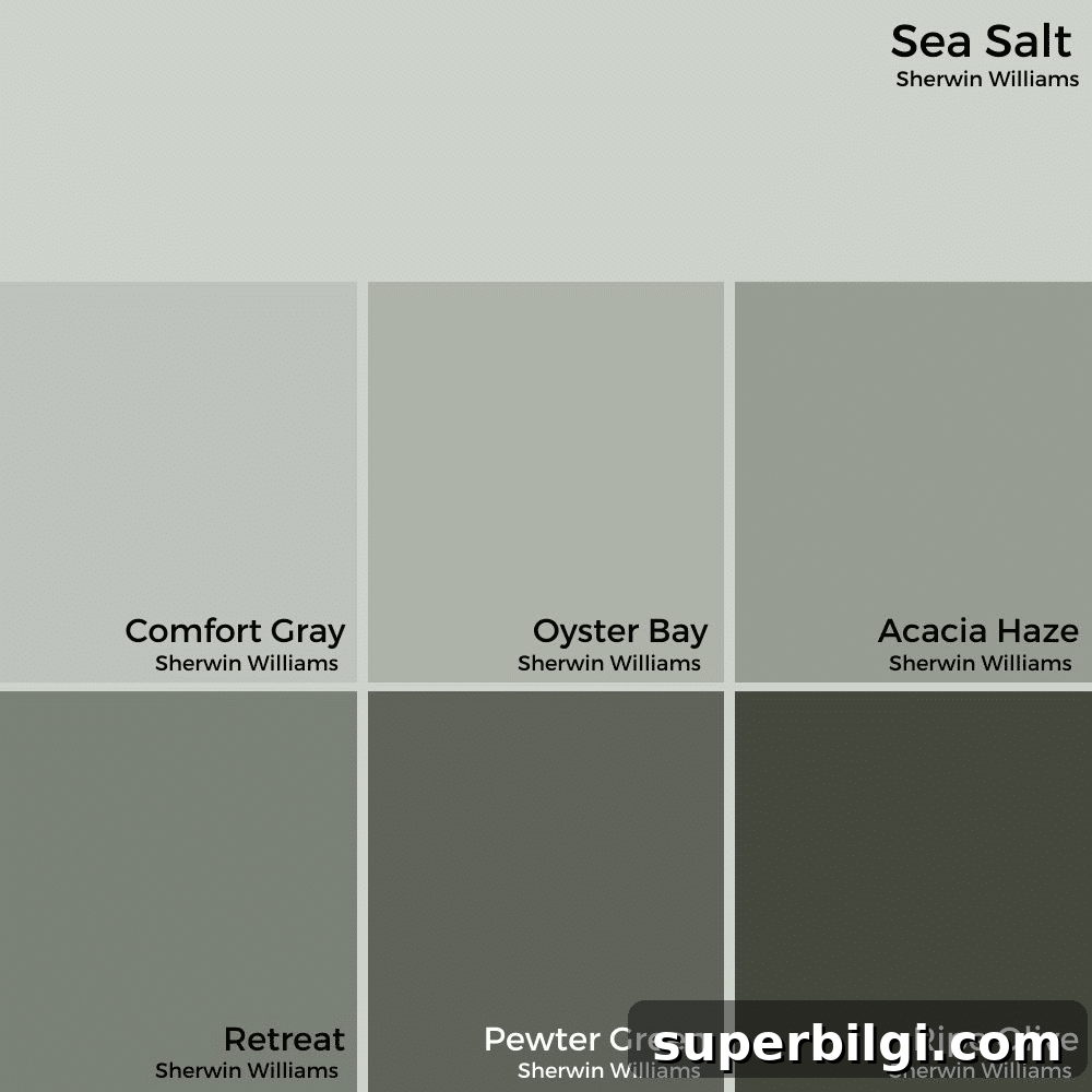
Sea Salt is primarily a cool color with faint warm undertones. As a cool hue it creates a calm, bright, and spacious feeling—perfect for bedrooms, bathrooms, and living spaces where you want to relax. At the same time, its slight warmth allows it to pair nicely with warm neutrals like taupe and beige.
What Colors Go with Sherwin Williams Sea Salt?
Sea Salt coordinates well with a wide range of trim, cabinet, and accent colors. Popular pairings include:
- Accessible Beige
- Agreeable Gray
- Comfort Gray
- Spare White
- Fleur de Sel
- Summit Gray
It also pairs well with Benjamin Moore neutrals like Revere Pewter and classic whites such as Simply White or White Dove for trim and ceilings.
Sherwin Williams Sea Salt in Real Rooms
Sea Salt is extremely versatile and can look great in kitchens, bathrooms, living rooms, and even on exterior features like front doors and porch ceilings. Below are examples of how the color performs in different spaces.
SW Sea Salt in Kitchens
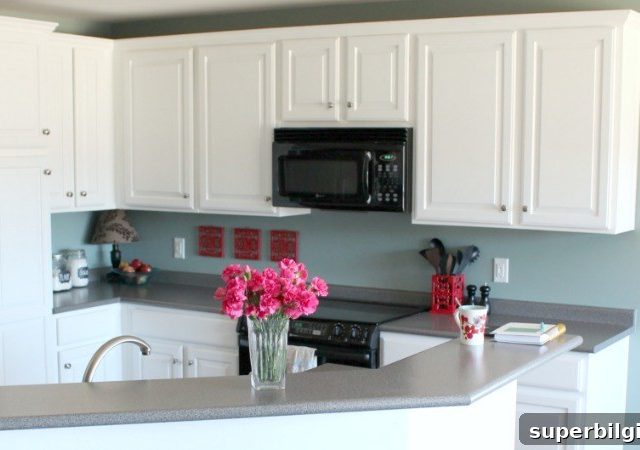
Sea Salt is a lovely choice for kitchens where you want a gentle color that still reads neutral. In kitchens with varying light sources it can appear blue-gray in some areas and more green in others. It works beautifully with white cabinets and natural wood accents.
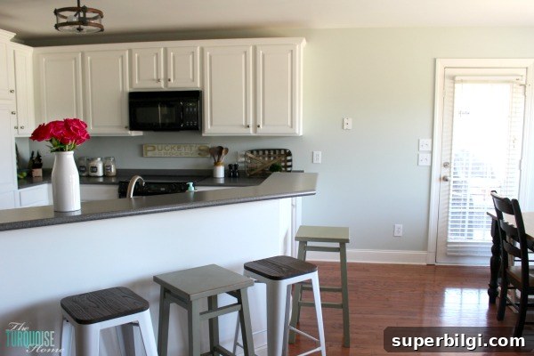
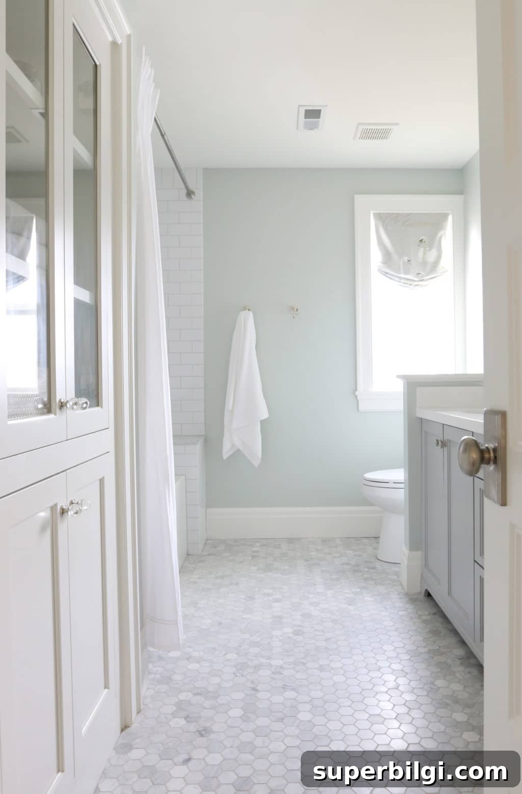
Sherwin Williams Sea Salt in Bathrooms
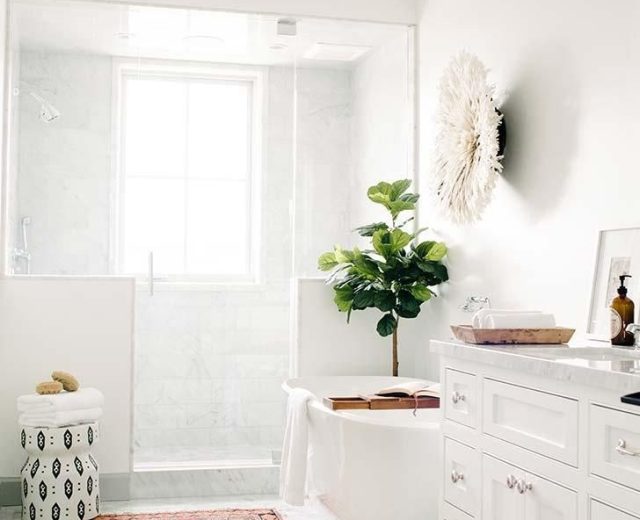
Bathrooms are an ideal spot for Sea Salt: the color enhances a clean, watery vibe and pairs well with white tile, natural stone, and chrome or brass fixtures. It’s a great way to create a spa-like atmosphere without being overtly coastal.
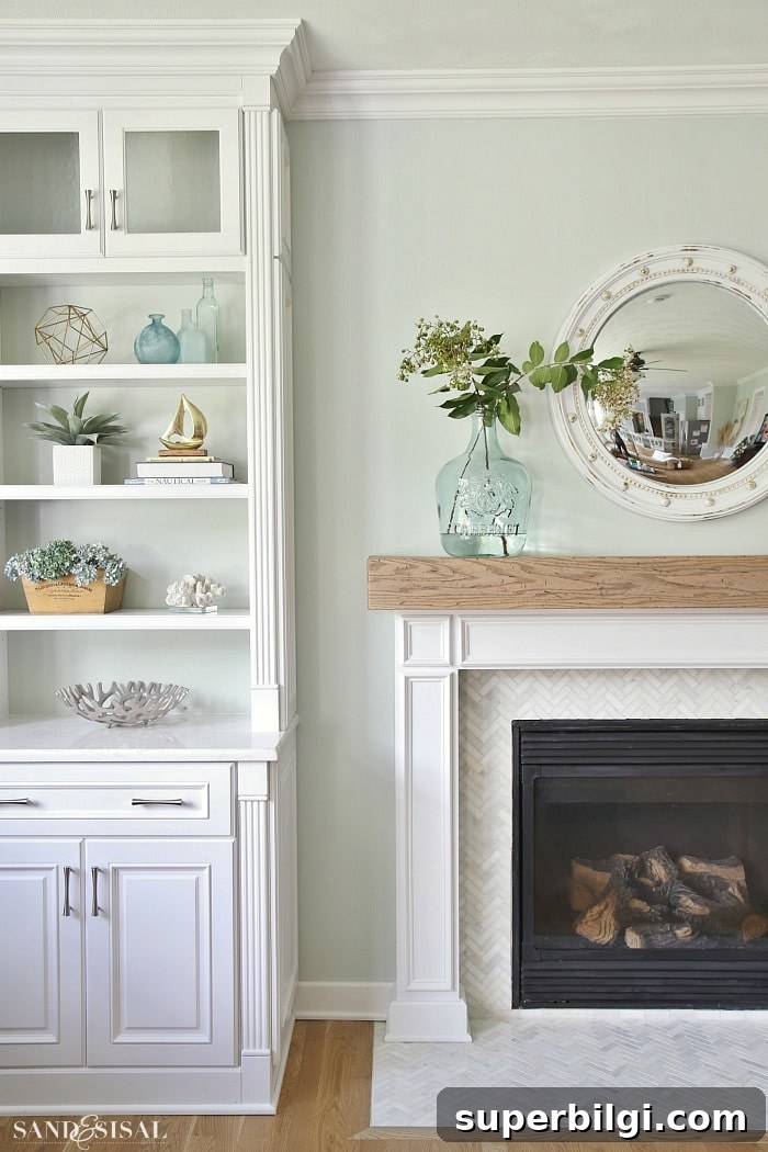
Sea Salt in Living Rooms
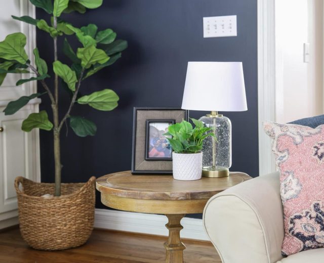
For living rooms, Sea Salt can act as a livable green that keeps the space soft and inviting. It balances nicely with coastal or transitional decor and allows furniture and artwork to stand out without overpowering the room.
Sea Salt for Front Doors
If you want curb appeal with personality, Sea Salt makes a great front-door color. It’s fresh and welcoming without being overly bold, and it complements many exterior palettes.

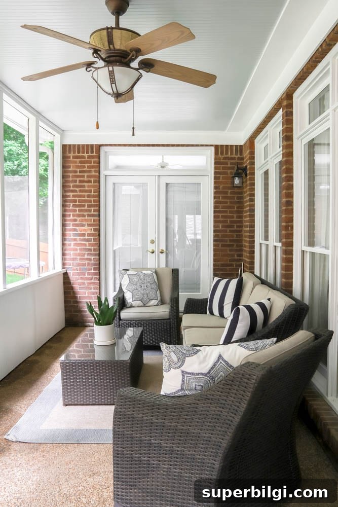
Sea Salt on the Ceiling
Sea Salt is popular for porch ceilings—sometimes called haint blue in Southern traditions—because it adds a subtle blue-green wash that looks lovely in daylight and under evening light. It’s soft enough not to overpower, yet adds interest and charm.
What Trim Color Works Best with Sea Salt?
Sea Salt pairs well with both crisp true whites and warm off-whites. Popular trim choices include Pure White for a stark contrast or Simply White for a softer look. Either option will keep Sea Salt feeling fresh and cohesive.
When Should I Use Sea Salt?
Use Sea Salt when you want a gentle pop of color that functions like a neutral. It’s ideal for small or large rooms, and for spaces where you want a calming, coastal-inspired palette without committing to a bold color.
Is Sherwin Williams Sea Salt Blue or Green?
Sea Salt is a muted blue-green that can read more blue, green, or gray depending on light and orientation. North-facing rooms with less natural light often make the color appear slightly bluer.
Sea Salt in My Kitchen — A Personal Note
When sampling paint, I recommend testing several options on the wall and living with them for a day or two. A color that looks right in the store or on a small swatch can change dramatically in real room light. For me, Sea Salt won out after sampling—it felt perfect across different lighting and became a go-to color in multiple rooms.
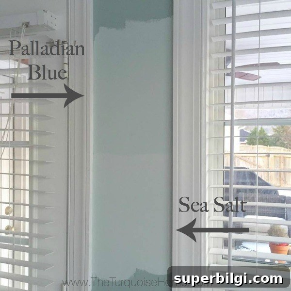
Final Thoughts
Sea Salt is a chameleon-like paint color that delivers a soft, sophisticated touch in most rooms. It provides a subtle hint of color while keeping spaces light and airy—perfect for those who want a calm, coastal-inspired palette without a full beach-house look. If you’re looking for a flexible, serene paint choice, Sherwin Williams Sea Salt is worth sampling in your home.
More paint color ideas to consider:
- Iron Ore
- Repose Gray
- Gray Owl
- Wythe Blue
- Alabaster