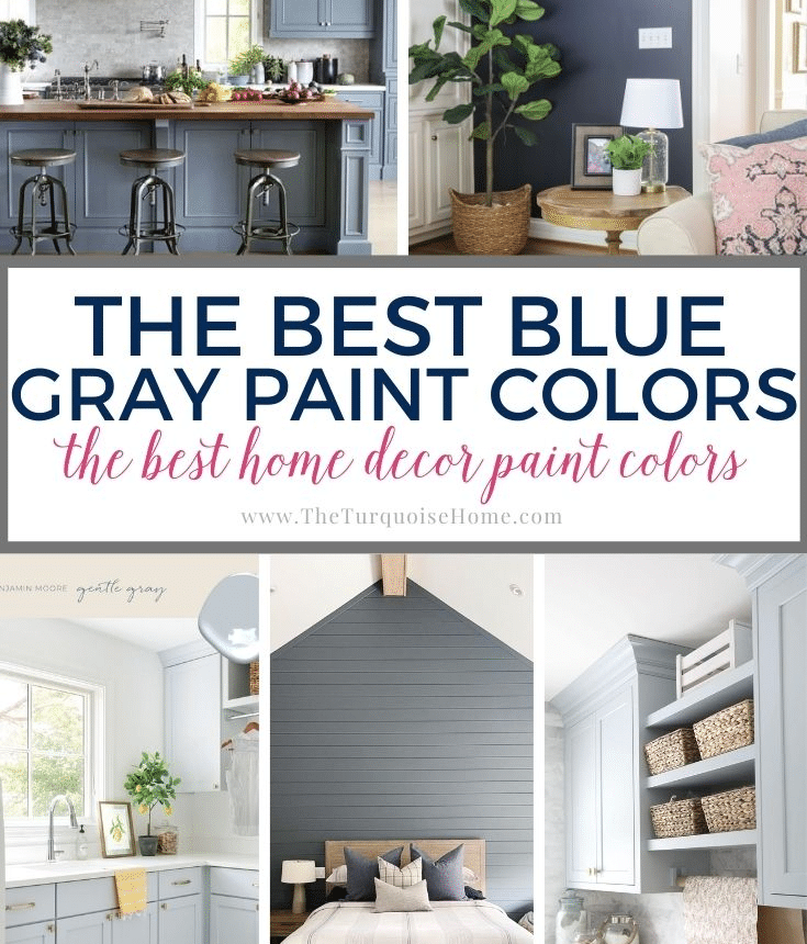
There are few colors as versatile as blue gray. Whether you want a subtle shade for a bedroom or a bolder tone for a living room accent wall, blue gray paint colors offer options for every style and space.
If you crave a soothing, comfortable atmosphere but hesitate to embrace vivid color, blue gray is an ideal middle ground. The blue provides depth and character while the gray mutes its intensity, creating a color that feels calm rather than overwhelming.
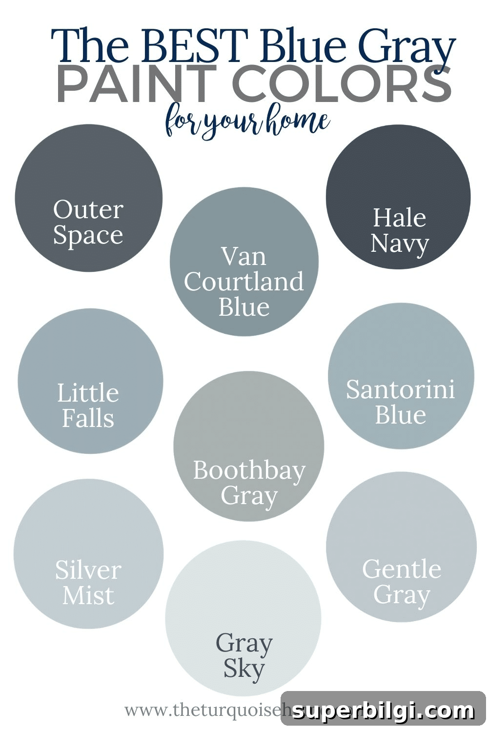
Thanks to their gray undertones, many blue gray shades function like neutrals and coordinate easily with other colors and materials. Some lean more blue, others more gray—think of the range like denim tones, from indigo to faded jean. Blue grays pair well with whites, natural woods, leather accents, and warm metals.
Dive in and find the right blue gray for any room in your home.
What is a Blue Gray Color?
Blue gray refers to either a gray with clear blue undertones or a blue with strong gray undertones. To identify the undertone, study a full paint swatch and compare the deeper tones—if the darkest areas read navy or charcoal with a blue cast, you’re viewing a blue gray. Try to avoid shades with green undertones if you want a true blue-gray look rather than something that reads blue-green.
Why Are Blue Gray Paint Colors Popular?
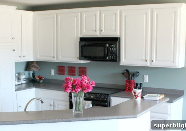
Blue is inherently calming, but when it’s heavily saturated it can feel youthful or overly bright. Mixing blue with gray balances the hue, creating a timeless, versatile color that works in bedrooms, bathrooms, kitchens, and cabinetry. Blue gray pairs especially well with crisp white trim, producing a classic, polished contrast.
Because it reads as both color and neutral, blue gray suits many design directions—from coastal and traditional to modern and transitional. It’s a dependable choice for a boy’s room, a cozy living room, or moody accent walls.
The Most Popular Gray Blue Colors for Your Home
At a glance many blue gray paints look similar, but side-by-side comparisons reveal subtle differences in warmth, depth, and undertone. Below are popular blue-gray paint options grouped by Light Reflectance Value (LRV), which indicates how much visible light a color reflects. A higher LRV means the color reflects more light and appears lighter in a space.
I’ve grouped colors by LRV ranges — dark (LRV 0–15), medium (LRV 15–45), and light (LRV 45–100). Always test with swatches and paint a small sample on your wall before committing, since lighting and surrounding finishes change how a paint reads.
Dark Blue Gray Paint Colors
LRV: 0–15
Hale Navy by Benjamin Moore (LRV: 6.3)
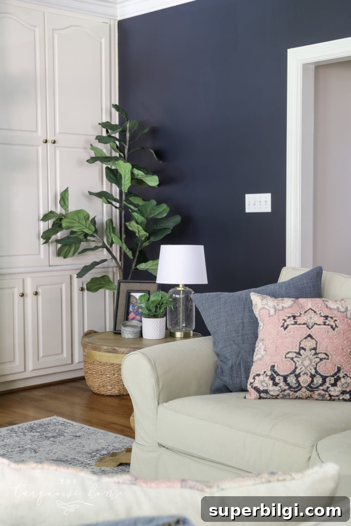
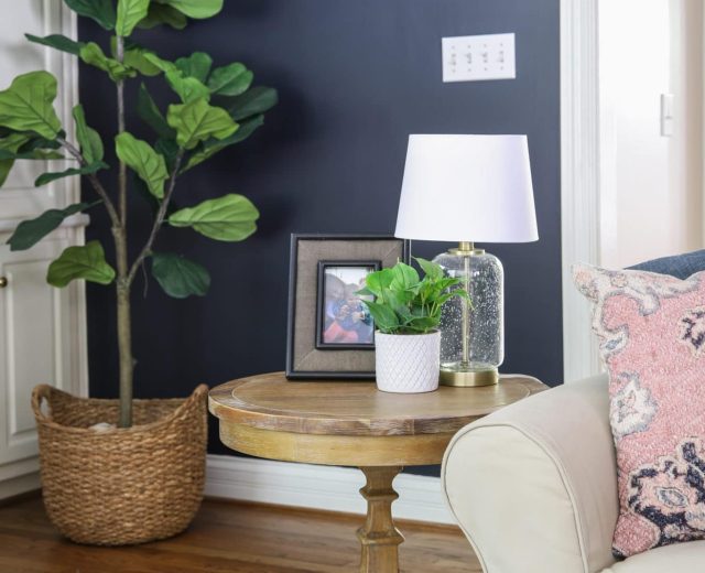
Hale Navy is a rich, dramatic blue-gray that I’ve used on doors and full rooms. It contains subtle green hints at times but generally reads as a balanced blue-gray. Because it’s quite deep, use Hale Navy in spaces with abundant natural light or pair it with bright white trim and reflective finishes to avoid making the room feel too dark.
Outerspace by Sherwin-Williams (LRV: 12)
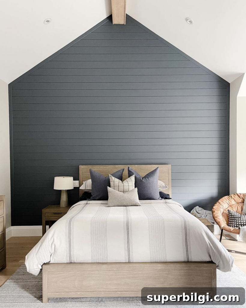
Outerspace leans slightly more gray than blue, making it an excellent option for accent walls or spaces where you want depth without overwhelming color. It pairs beautifully with warm leather and light wood tones for a cozy, layered look.
Granite Peak by Sherwin-Williams (LRV: 14)
Granite Peak offers drama and sophistication. Depending on light, it can read bluer or grayer, and often feels like a colorful charcoal. It’s a strong choice for powder rooms, accent walls, or anywhere you want a moody focal point.
Medium Blue Gray Paints
LRV: 15–45
Santorini Blue by Benjamin Moore (LRV: 45)
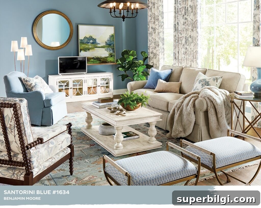
Santorini Blue sits on the cusp of medium and dark. Its name evokes the blue-gray-green waters of the Greek isles—this shade looks stunning with taupe and traditional tones and is a popular choice for masculine bedrooms or trim-focused schemes.
Van Courtland Blue by Benjamin Moore (LRV: 30)
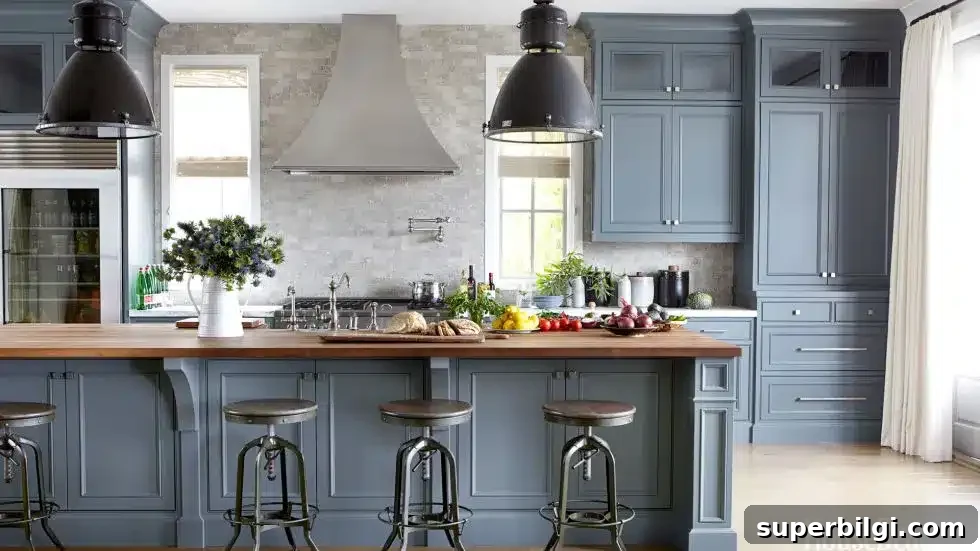
Van Courtland Blue is a timeless, medium-dark blue-gray that adapts to many styles. In west-facing rooms it may show a slight green cast, so swatch carefully to ensure it complements your light and decor.
Storm Cloud by Sherwin-Williams (LRV: 23)
Storm Cloud evokes coziness—the feeling of being wrapped up inside while rain falls outside. It leans more gray than blue and feels very refined when paired with crisp white cabinetry and trim.
Morning Fog by Sherwin-Williams (LRV: 42)
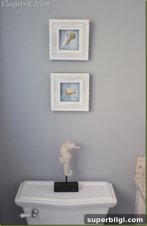
Morning Fog is aptly named: it brings a cool, crisp feel similar to a hazy morning. Although it reads overall as gray, the blue undertone adds subtle vibrancy. If you prefer a gray-leaning blue gray, this is a dependable option.
Little Falls by Benjamin Moore (LRV: 42)
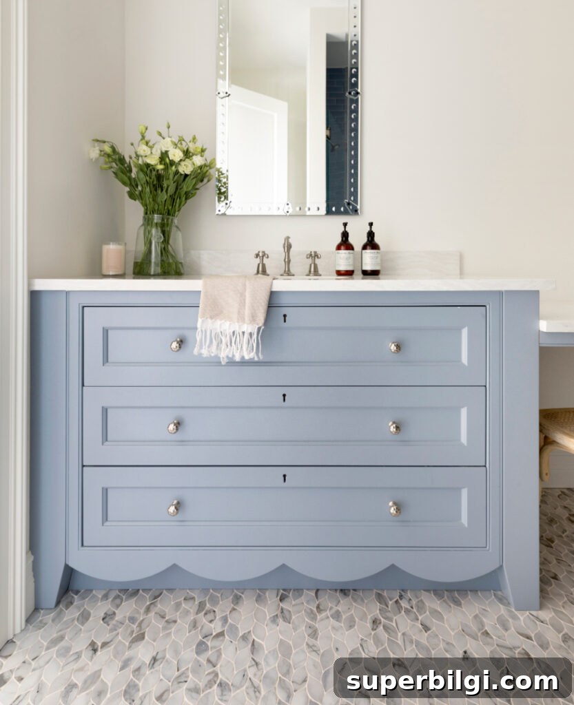
Little Falls is a medium-light blue with gentle gray undertones and no green cast. It suits cabinetry, bathrooms, kitchens, and kids’ rooms—especially where a classic, slightly nostalgic blue tone is desired.
Boothbay Gray by Benjamin Moore (LRV: 43)
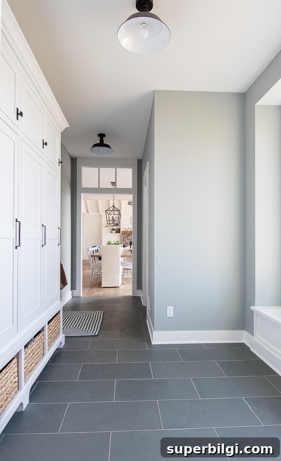
Boothbay Gray is a popular, historic-feeling color that often reads as a gray with a strong blue undertone. It’s a reliable, versatile shade for entryways, mudrooms, and more traditional interiors.
Light Blue Gray Paint Colors
LRV: 45–100
Smoke by Benjamin Moore (LRV: 56)
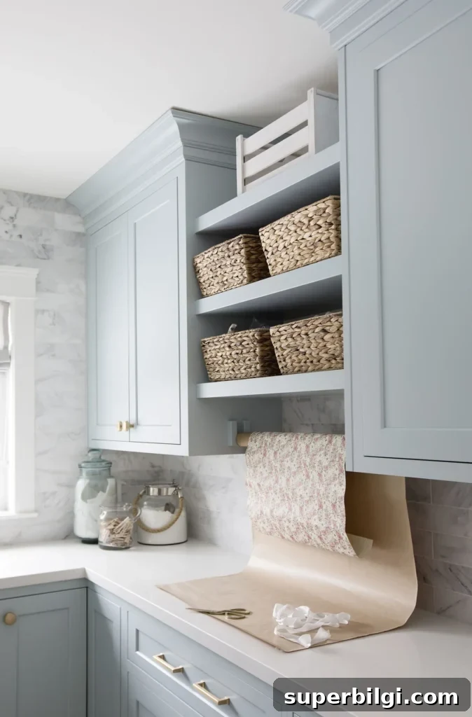
Smoke leans toward gray while allowing blue undertones to peek through. It’s exceptionally versatile, pairing well with nearly any accent color and working in kitchens, bedrooms, and living spaces alike.
Gentle Gray by Benjamin Moore (LRV: 58)
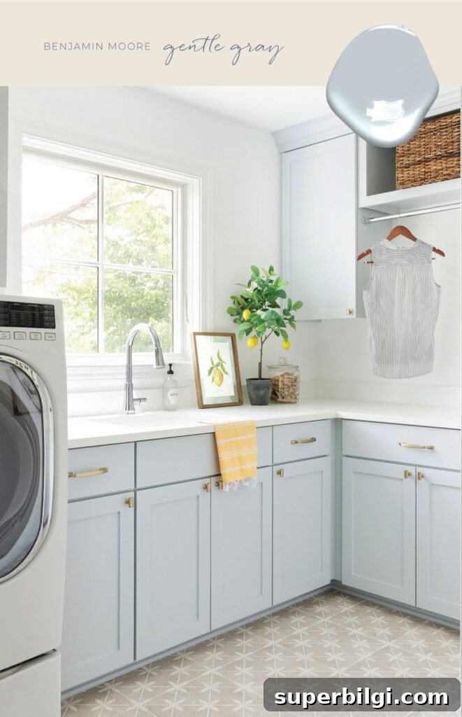
Gentle Gray feels soft and comforting, with a subtle aqua undertone that keeps it fresh. It’s a sophisticated choice for spaces that need a light, airy backdrop with just enough color to feel intentional. As always, test a swatch in your lighting before committing.
Silver Mist by Benjamin Moore (LRV: 62)
Silver Mist is a very pale, whisper-soft blue with a silvery shimmer. Its generous gray base gives it a misty, delicate quality that reads as an elegant, neutral-leaning blue.
Gray Sky by Benjamin Moore (LRV: 77)
Gray Sky sits at the lighter edge of blue gray shades. It feels cool and slightly icy rather than warm like a pastel, and it maintains subtle saturation so it remains visible without overpowering a room.
Have you used any of these blue gray paint colors in your home? Observing real-life results is one of the best ways to decide which shade will work in your space—share your experiences and photos to help others visualize these tones in different lighting and layouts.
More posts you might enjoy:
- How to Choose the Best White Paint Color
- The Best 17 Sage Green Paint Colors For Your Home
- 20 Best Nursery Paint Colors and Accent Wall Ideas
- How to Paint Countertops to Look Like Marble
- The Best 15 Neutral Paint Colors