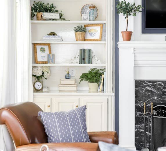
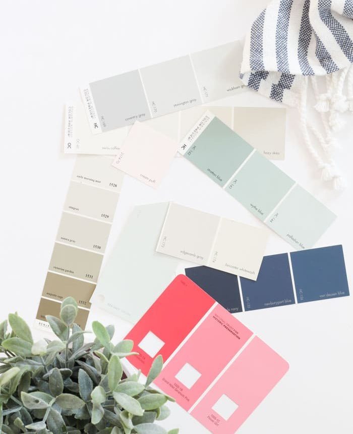
One of the questions I hear most often is, “What paint color is that?” I love sharing these colors because they really transform a home—and many of them will work well in your space too.
Choosing the right paint can completely change how a room feels. Below I’ve gathered the exact paint colors used throughout my house so you can find the perfect shade for your home.
This post was originally written in 2014 and updated with new information in 2018.
🏡 In 2019 we moved into a new home. If you’re looking for those paint colors, you can find them on my updated home color list.
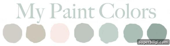
I wanted to collect all the “what color is that?” answers in one place to make it easier for you to pick a shade. You might discover a new favorite right here.

Want to Save This?
Enter your email below and I’ll send these colors straight to your inbox.
Sign up on my site to get this list delivered to your inbox and to receive occasional updates and styling tips. (Form removed for clarity.)
Living Room & Entry Way Paint Color – Revere Pewter by Benjamin Moore
Our living room and entryway are painted Revere Pewter by Benjamin Moore. The room features board and batten trim painted Simply White by Benjamin Moore, but the main wall color is Revere Pewter. It’s one of the most popular neutral grays—and for good reason.
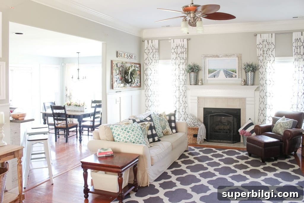
Revere Pewter reads as a soft, taupe-tinted gray that doesn’t skew strongly blue or green. That balance makes it versatile—pairing beautifully with both warmer and cooler accents throughout the house.
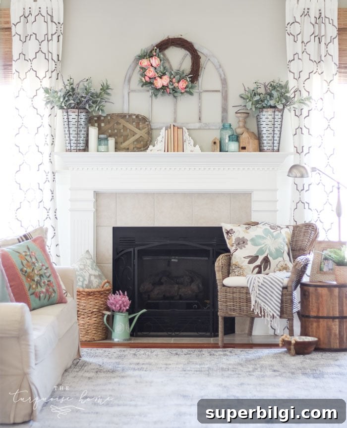
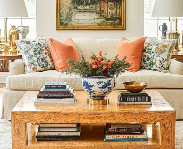
Scroll the images above to explore styling ideas for the living room.
Other neutral grays worth considering include Repose Gray and Mindful Gray from Sherwin Williams and Edgecomb Gray from Benjamin Moore—each offers a slightly different undertone to complement your home’s palette.
Related resources:
- How I picked the perfect gray for my living room
- Tips for pairing paint colors with Revere Pewter
Dining Room Paint Color – Wythe Blue by Benjamin Moore
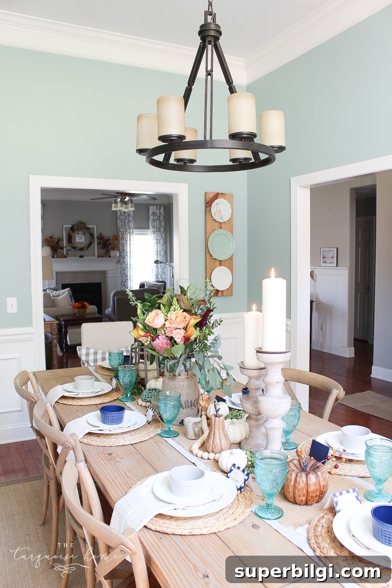
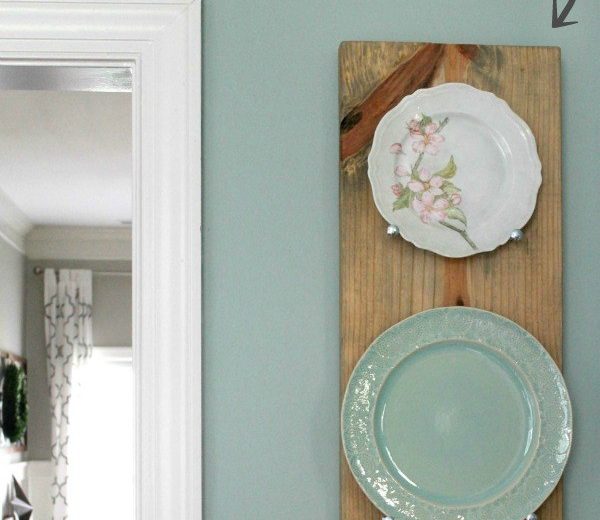
The dining room is painted Wythe Blue by Benjamin Moore. I chose this sophisticated blue-green early on—drawn to a photo of a beautiful front door that inspired the shade. Placing Wythe Blue near Revere Pewter creates a cohesive, welcoming entry sequence.
Kitchen Paint Color – Sea Salt by Sherwin Williams
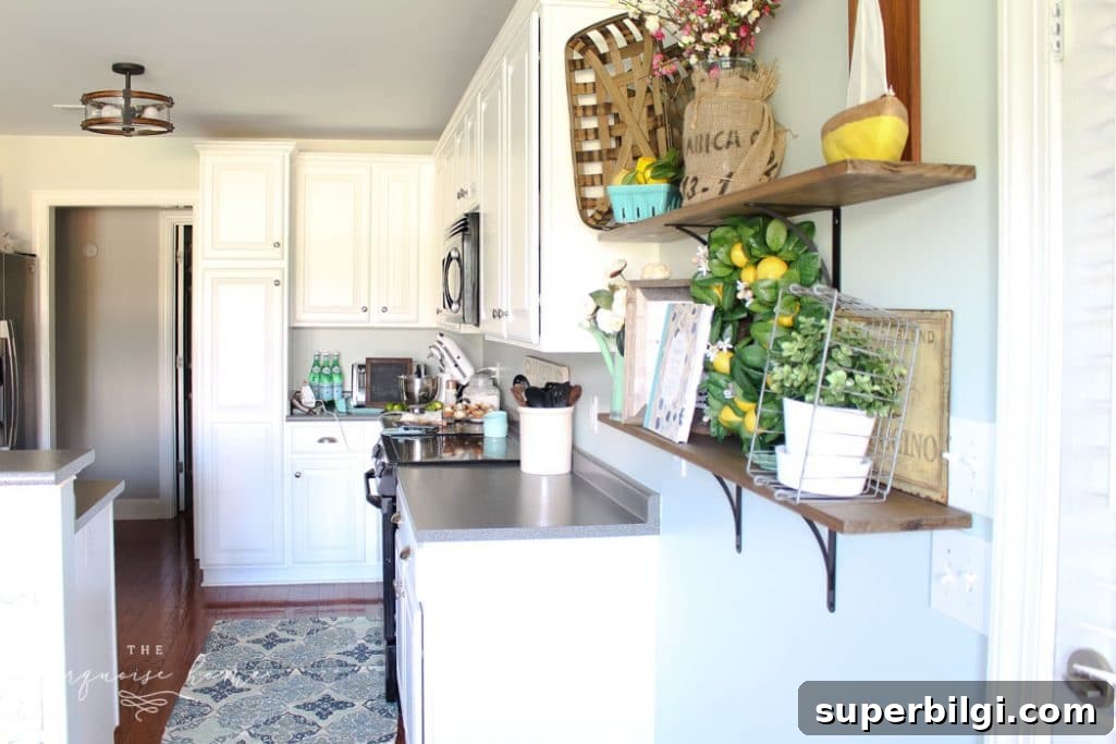
The kitchen originally had a deeper blue-green called Stratton Blue, which I used to add contrast against beige walls and cabinets. Later, after painting the cabinets Simply White by Benjamin Moore, the darker wall color felt heavy. I tested a couple of lighter shades and ultimately chose Sea Salt by Sherwin Williams.
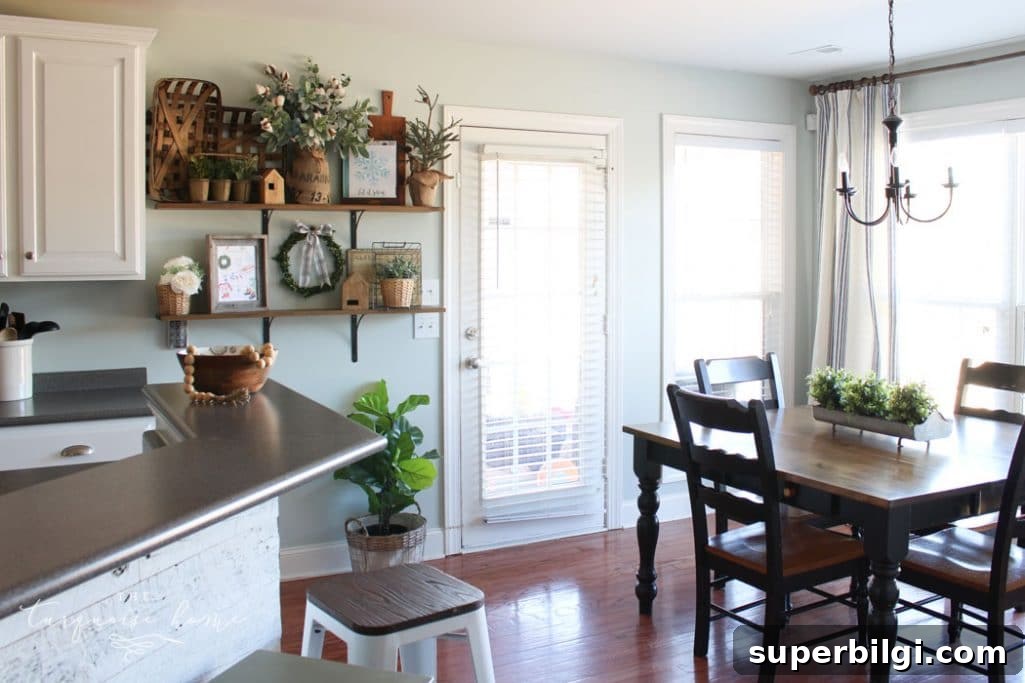
Sea Salt is a soft green-blue that reads fresh and subtle next to Revere Pewter. Because the two colors meet at the kitchen doorway, choosing shades that harmonize was important for a smooth visual flow.
Master Bedroom Paint Color – Palmetto Gray by Porter Paint
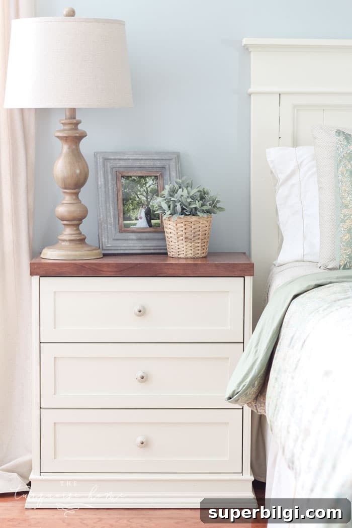
The master bedroom is painted Palmetto Gray by Porter Paints. This muted gray-blue-green has a soft, calming presence—less bright than a classic robin’s egg but still soothing. Note: this exact Porter paint is discontinued; Restoration Hardware’s Silver Sage is a similar option.
Digital photos can shift color slightly, so the real-life tone is a touch more muted and green-gray than it may appear online.
Nursery Paint Color – Lido Green by Benjamin Moore
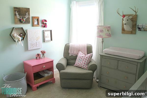
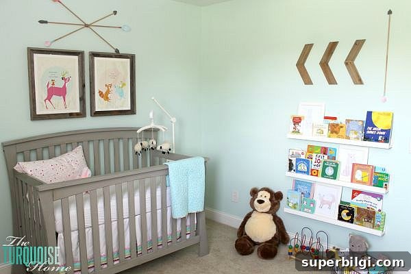
Our baby girl’s nursery is Lido Green by Benjamin Moore. I picked the color palette around an animal-themed art piece above the crib and tested a few shades before settling on Lido Green. It leans greener than the other mint and aqua tones in the house and feels playful and fresh—perfect for a nursery.
Girl’s Room Paint Color – Cream Puff by Benjamin Moore
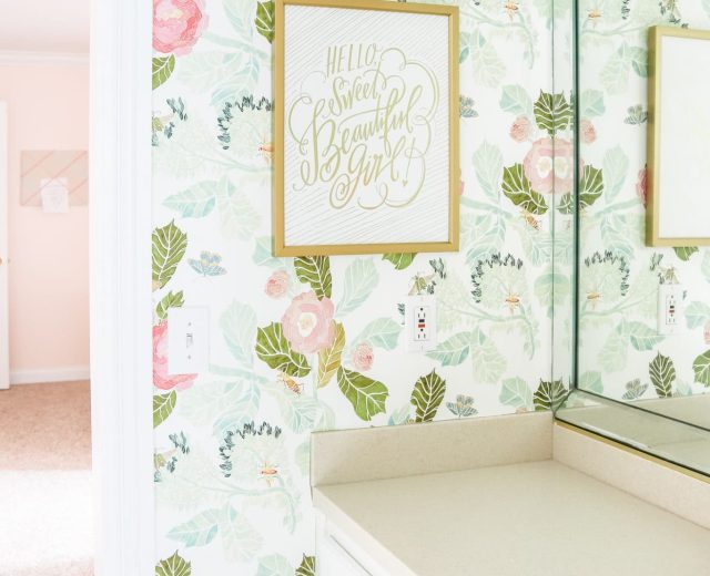
My older daughter’s room is painted Cream Puff by Benjamin Moore. It’s a soft, pale pink that reads sweet without being overpowering. Even as the room’s decor has changed over time, the wall color has remained a favorite.
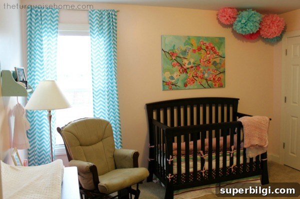
Guest Bathroom Paint Color – Oyster Pearl from Clark+Kensington
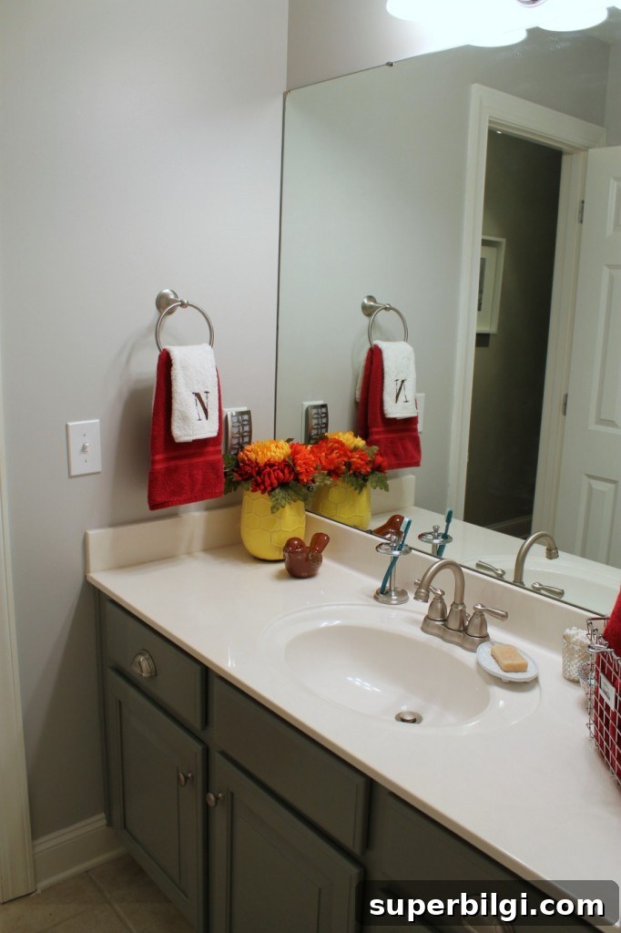
The guest bathroom is painted Oyster Pearl from Clark+Kensington. It’s a pleasant gray, but in this space the surrounding gray cabinets and hallway make the room feel a bit muted. I’m considering repainting it a lighter shade—like Sea Salt—to brighten the space.
Office & Guest Room Paint Color – Simply White by Benjamin Moore
My office and the guest room are painted Simply White by Benjamin Moore. This creamy white provides a neutral backdrop that lets colorful decor and artwork stand out while still feeling warm and inviting.
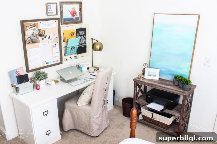
Laundry Room Paint Color – Wythe Blue by Benjamin Moore (tweaked)
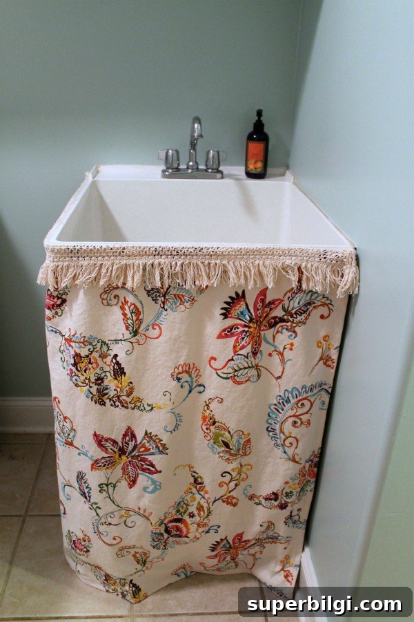
Our laundry room is a walk-through space that connects to the garage, so I wanted it bright and cheerful despite limited natural light. I mixed leftover Wythe Blue with white to create a lighter version for this room. The closest standard match is Palladian Blue by Benjamin Moore.
Final Thoughts
Thanks for reading through this roundup of the paint colors used in my home. If you notice a pattern, my palette leans toward blues and grays with a single soft pink—variations of a favorite color family help create a cohesive, calming look throughout the house.
If you try any of these shades in your home, I’d love to see a photo—feel free to share it with me. Happy painting!

More posts you might enjoy:
- The Best Brown Paint Colors
- Cozy Navy Living Room Reveal
- Best Things to Buy at Hobby Lobby
- How to Remove Wall Anchors
- Colorful Kitchen Island Ideas