

Sherwin Williams Snowbound is one of the most popular white paint colors available. It’s a soft, bright white that lightens a space without feeling too stark or clinical.
Choosing a white paint might sound simple, but subtle undertones and differences in light reflection make selecting the right white surprisingly challenging. Rather than experimenting with a new white for every room, many designers recommend keeping a small set of reliable go-to whites that work across different lighting and styles.

If you’re exploring white options, this review focuses on Sherwin Williams Snowbound (SW 7004). It’s a neutral white that reads clean and crisp in most conditions while retaining a soft, slightly creamy feel—making it a frequent choice for walls, trim, ceilings, and even exteriors.
PRO Tip
Always test a real paint sample in the room where you’ll use it before committing. Peel-and-stick samples made with actual paint are an easy, low-mess way to see how a color reacts to your lighting and surrounding finishes. Move samples around the room and observe them at different times of day to understand how the color shifts.
What color is Sherwin Williams Snowbound?
Quick highlights about Snowbound:
- Neutral off-white with subtle cool-gray undertones
- Light white with a Light Reflectance Value (LRV) of 83
- Frequently used on walls, ceilings, trim, and exteriors
- Soft white that’s neither overly bright nor creamy
Undertones in Snowbound
Snowbound is a versatile white that carries very mild gray undertones. On walls it rarely looks gray; instead, the gray softens the white so it doesn’t read as icy or stark. You might also notice a subtle taupe or pink-lilac influence—very faint, but enough to warm the shade slightly and prevent it from feeling cold.
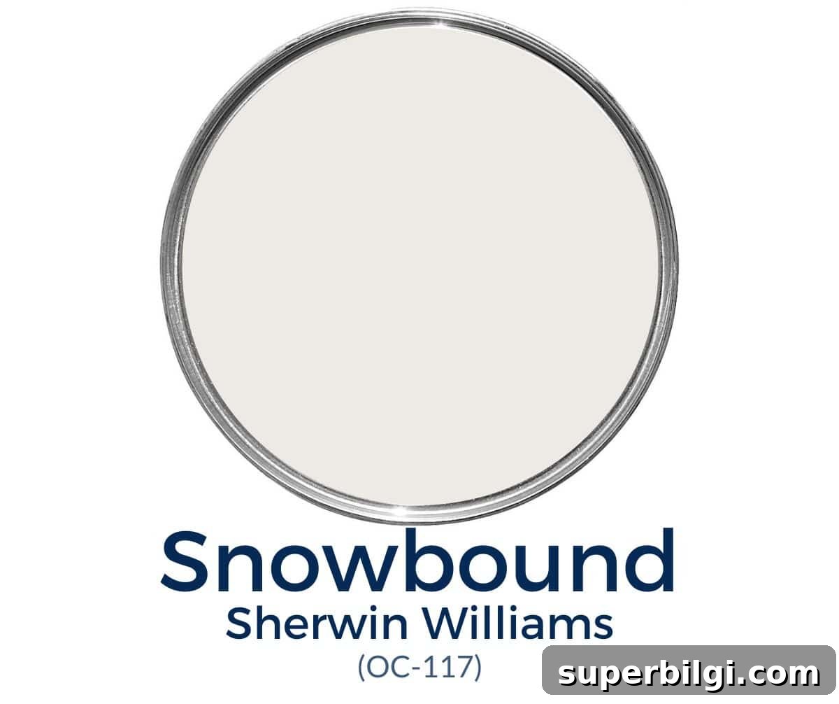
Lighting and neighboring colors strongly affect how Snowbound appears: in cool, northern light you’ll notice its muted, gray side; in warmer, southern light it reads cleaner and brighter, sometimes showing the slightest taupe hint in evening light. It does not inherently contain yellow undertones typical of creamier whites, so it stays crisp next to cool grays and blues.
LRV of SW Snowbound
Light Reflectance Value (LRV) measures how much light a paint color reflects (0 = pure black, 100 = pure white). Snowbound has an LRV of 83, which makes it a bright color that still reads softer than a high-reflective white. In bright natural light it reads white; in low light it can appear more muted or off-white.
Sherwin Williams Snowbound coordinating colors
Snowbound pairs best with cool or gray-tinged shades rather than warm beiges. Consider gray-based neutrals and blues for a cohesive palette. Some recommended pairings include:
- Colonnade Gray
- Autumn Orchard
- Repose Gray
- Mindful Gray
- Silver Strand
- Aqua-Sphere
- Copen Blue
- Argos
- Naval
- Sea Salt
Best trim colors to go with Snowbound
If you use Snowbound on walls, you can either paint trim the same color for a seamless look or choose a brighter white for contrast. Painting trim and walls in the same shade and using different finishes is a subtle way to distinguish them—semi-gloss on trim makes it appear brighter while eggshell on walls keeps the wall tone slightly softer.
For a crisper contrast, pick a true bright white for trim, such as High Reflective White or Chantilly Lace, or other popular bright whites that read clean and fresh next to Snowbound.
Snowbound vs. other white paints
Pairing whites together can be tricky because undertones matter. Here’s how Snowbound compares with a few common whites:
Snowbound vs. Alabaster
Alabaster leans warmer with beige undertones, while Snowbound is cooler with subtle gray/taupe tones. Alabaster pairs well with warm creams and beiges; Snowbound pairs better with cool grays and blue-grays.
Snowbound vs. Simply White
Simply White is creamier and can read slightly yellow compared to Snowbound. Because of the temperature difference, they are not ideal partners side by side.
Snowbound vs. Extra White
Extra White reads more blue-white and will emphasize cool undertones next to Snowbound. For a truer bright white companion, consider Sherwin Williams Pure White instead.
Where can you use Sherwin Williams Snowbound?
Snowbound is a timeless neutral that works across many applications. Use it for:
- Wall molding
- Trim
- Ceilings
- Interior walls
- Exterior siding and trim
Is Snowbound a good color for cabinets?
Snowbound isn’t always my first choice for cabinets because its undertones can clash with some countertops and backsplashes. It does work well with dark countertops that lack peach, pink, or warm greige tones.
Home styles that work with Snowbound
Snowbound adapts to many design styles, including:
- Farmhouse
- Traditional
- Transitional
- Contemporary
Room examples using Sherwin Williams Snowbound
Below are examples that show Snowbound in different rooms and lighting. Note how decor and natural light influence the way the color reads.
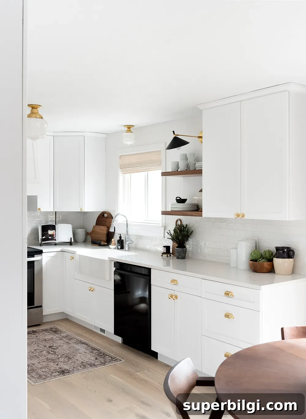
Kitchen painted with Snowbound
Snowbound can unify multiple whites in an all-white kitchen by providing a soft, cohesive backdrop that keeps the space light without feeling cold.
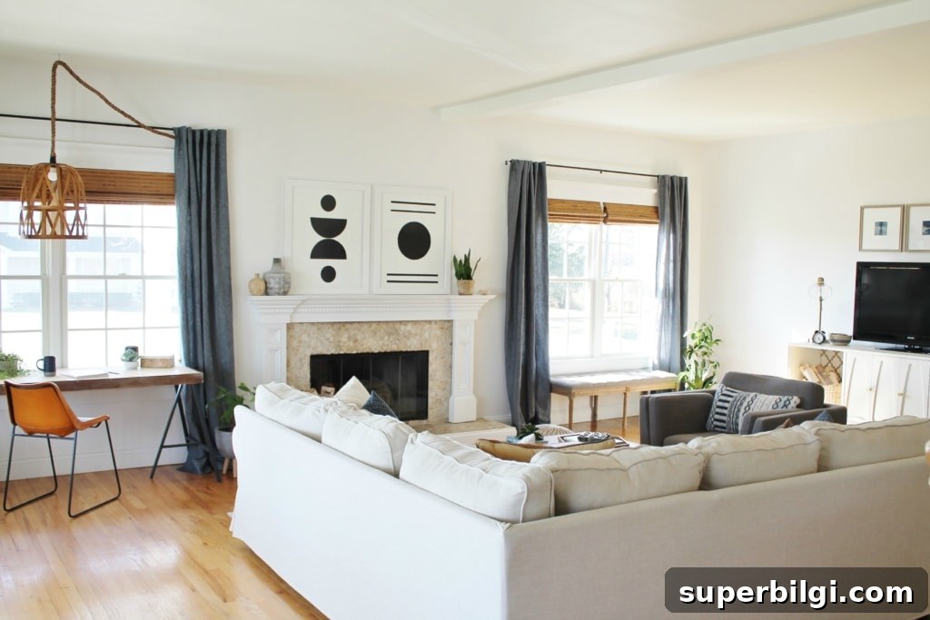
Living room
Snowbound creates a bright, comfortable living room that looks clean without glaring in natural light—an excellent choice for family spaces.
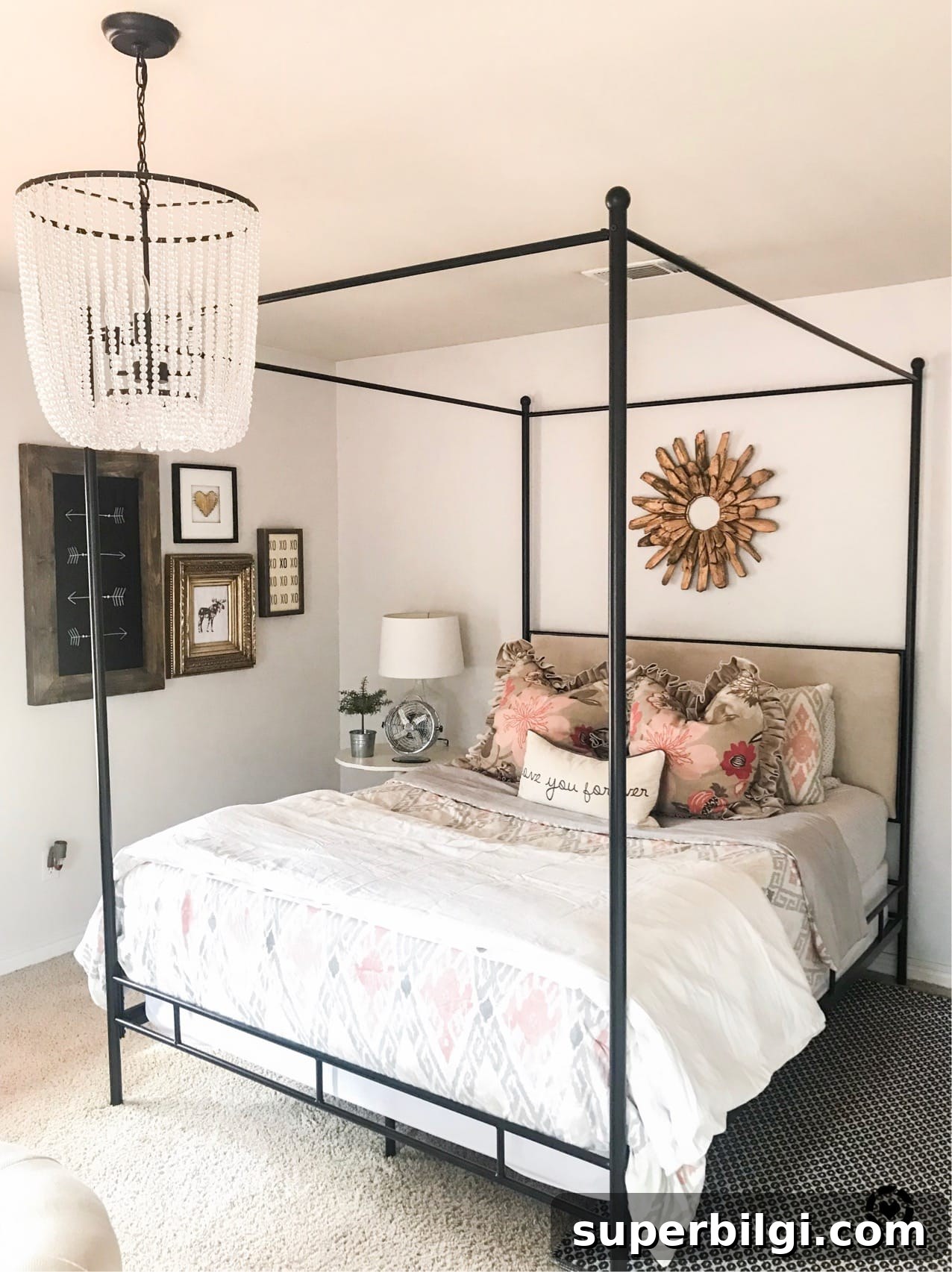
Bedroom
Snowbound is calming and light, making it a great bedroom color. It provides a soft neutral background that encourages rest without making the room feel dark.
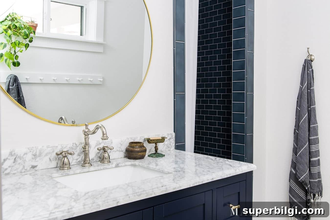
Bathroom
Snowbound pairs beautifully with bold accents like navy. In bathrooms with limited natural light, it helps the room feel bright and spacious.
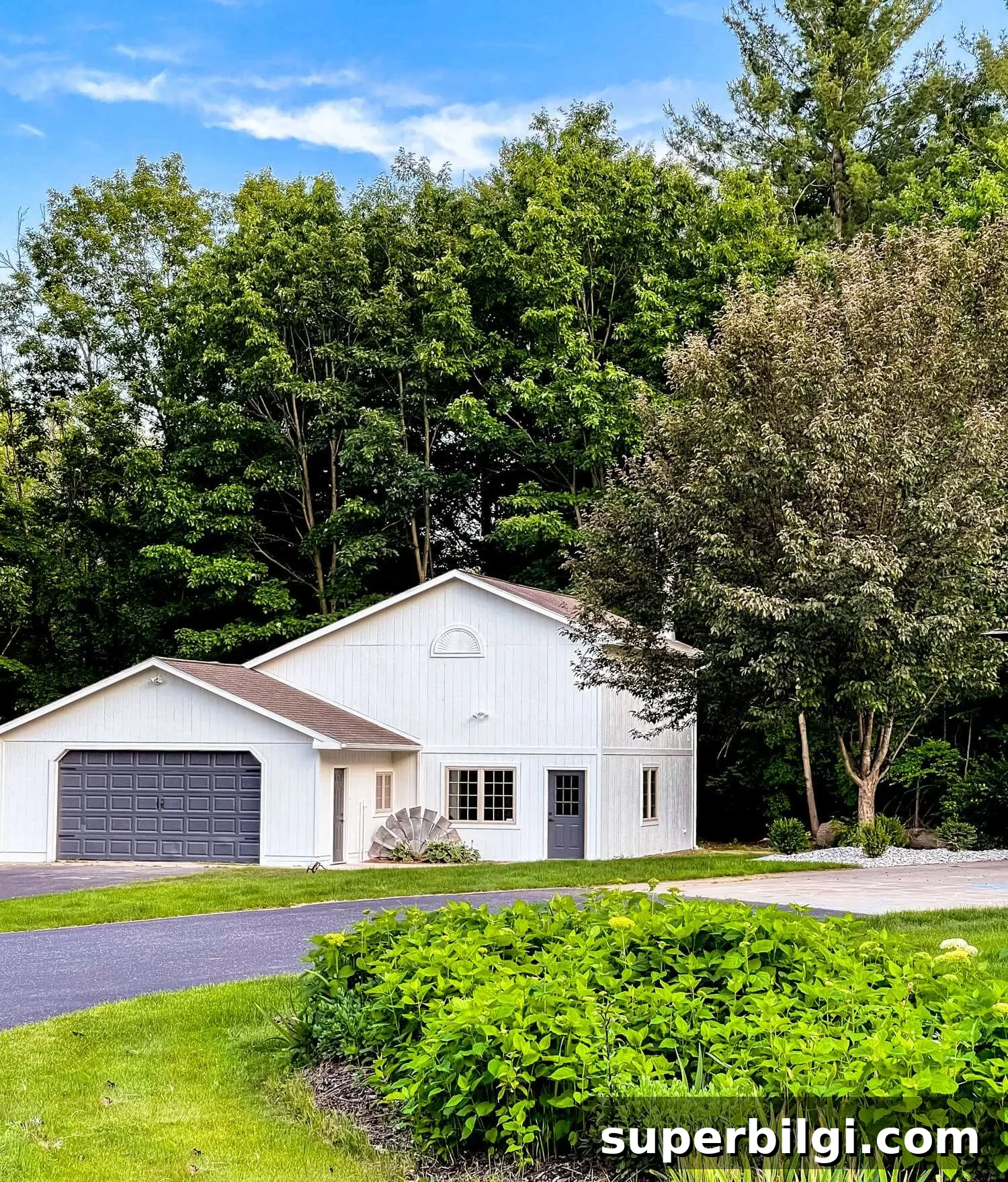
Exterior
Snowbound is an excellent choice for exteriors: it reads bright and fresh without becoming glaring in full sun, making it a popular option for curb appeal.
Frequently Asked Questions
Is Sherwin Williams Snowbound warm or cool?
Snowbound leans slightly warm because of faint taupe hints, but its mild gray undertones keep it looking soft and muted rather than overtly warm.
Does Snowbound look yellow?
No. Snowbound does not have the yellow undertones of creamier whites; it reads more neutral with cool-gray and subtle taupe influences.
How do I choose a white paint color?
Test real paint samples in your space to see how lighting and surrounding finishes change the color. Observe samples at different times of day and next to your flooring, furniture, and countertops before deciding.
Sherwin Williams Snowbound is a lovely neutral white for anyone seeking a soft, bright paint that’s not overwhelmingly crisp. It’s especially helpful when you want a clean white that still feels warm and inviting.
More paint colors
If you want a shortlist of reliable shades to pair with Snowbound or use elsewhere, consider these favorites:
- Hale Navy
- Repose Gray
- Agreeable Gray
- Sea Salt
- Revere Pewter
Tools to help paint a room yourself
Painting your own room is manageable with a few good tools. Essentials include quality paint brushes, painter’s tape, drop cloths, a comfortable paint cup, and a sturdy roller tray with liners to make cleanup easier. Proper preparation and the right tools help achieve a professional-looking finish.
More posts you may enjoy:
- The Best Bedroom Paint Colors
- Best Living Room Paint Colors
- Best No-Fail Greige Paint Colors
- The Best Blue Gray Paint Colors