

Sherwin Williams Sea Salt is a versatile blue-green-gray paint that pairs beautifully with white and many on-trend home colors. Often described as a coastal neutral, it’s subtle enough to work in a variety of styles and rooms—from porches and bathrooms to kitchens and bedrooms.
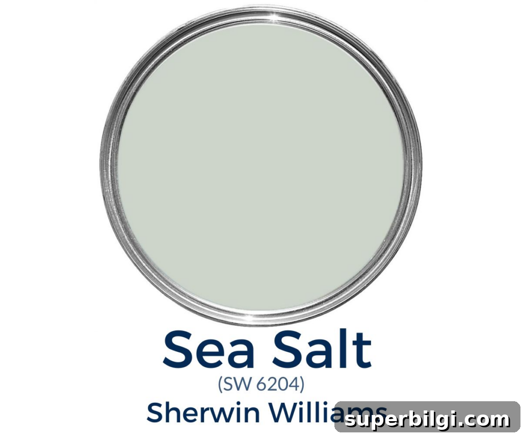
I’ve used Sea Salt several times in my own homes and keep finding new places for it—on a porch ceiling, in a laundry room, a kitchen, a bedroom or a bathroom. Its gentle, muted tone makes it easy to love and easy to live with.
What Color is Sea Salt?
Sea Salt (Sherwin Williams) is a soft blue-green paint with gray undertones. It captures the subdued tones of ocean waters—muted blues and greens blended with cool gray, and a whisper of warmth that recalls sand and sunlight.
This paint is hugely popular because it reads like a neutral while still offering a calm, refreshing color. Sea Salt works well with whites, grays and navy, and it brings a peaceful pop of color to any space without feeling overwhelming.
Sherwin Williams Sea Salt Undertones
Sea Salt is primarily green-leaning with blue and gray undertones. It’s a chameleon color: lighting, direction and surrounding finishes will shift how those undertones show. Warm indoor lighting often emphasizes the green side, while diffused natural light can make it appear more blue-green or slightly blue-gray.
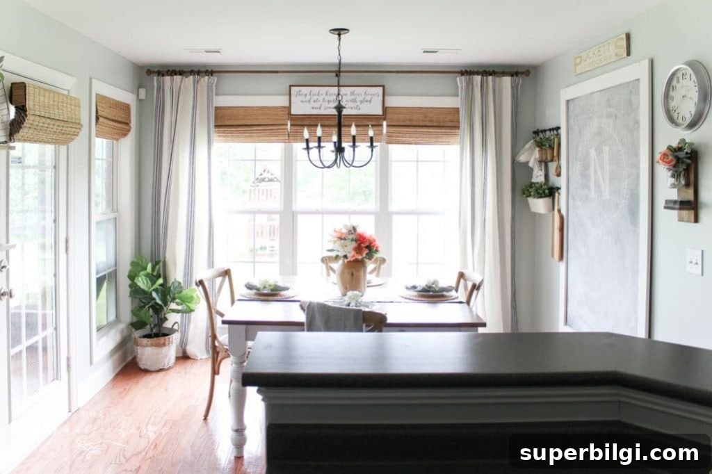
In bright rooms Sea Salt can read very light and subtle—almost washed out—so it’s not the best choice if you want a deep, moody color. Because it changes with evening light and artificial lighting, it’s wise to test samples in your actual space before committing.
A practical sampling method is to paint a poster board or use peel-and-stick samples made from real paint. Move those samples around the room and view them at different times of day to see how the color behaves.
LRV of Sea Salt by Sherwin Williams
Light Reflectance Value (LRV) measures how much visible light a color reflects. Higher numbers reflect more light. Sea Salt has an LRV of 63, which places it on the lighter side of the scale and helps it keep rooms feeling bright and open.
Is It a Warm or Cool Color?
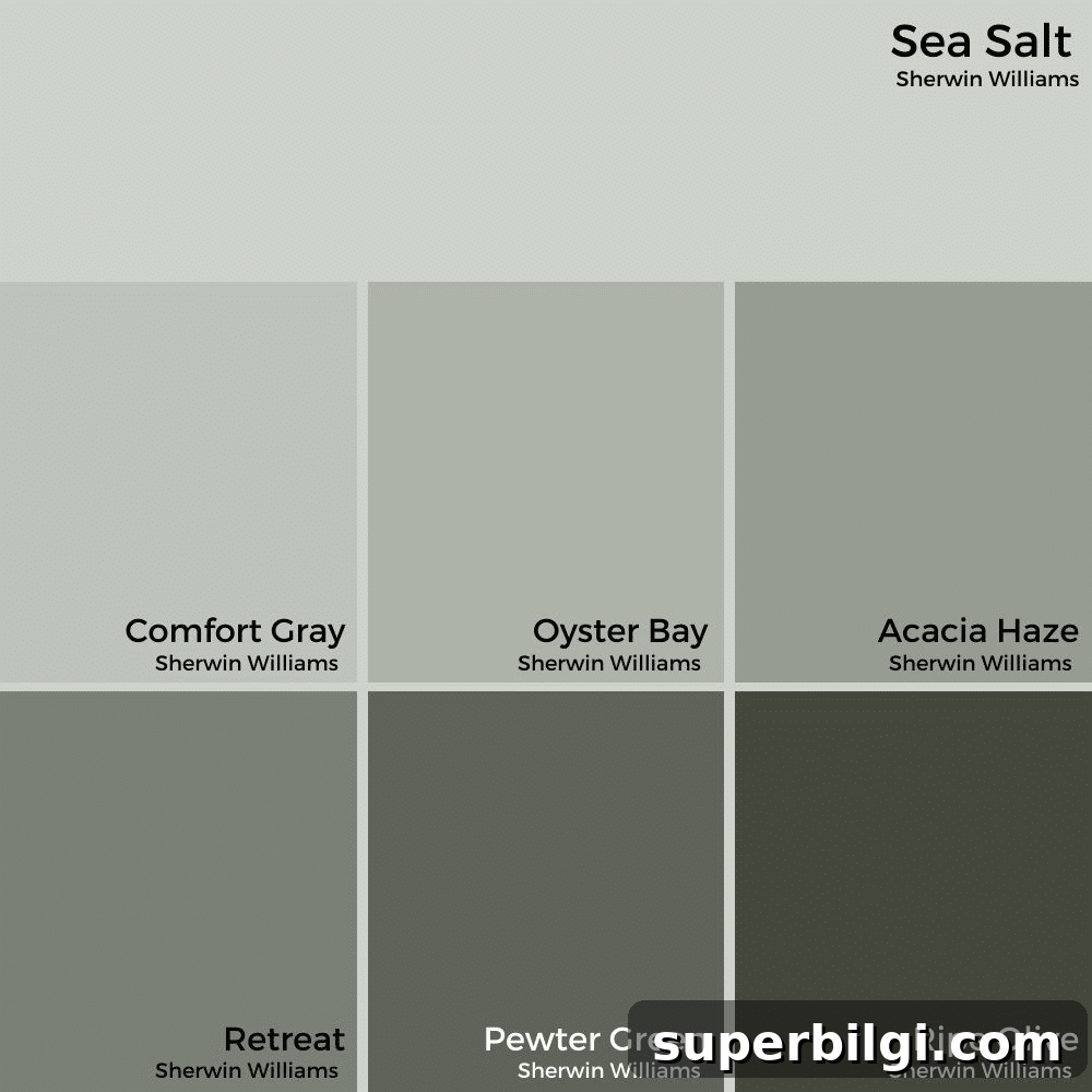
Sea Salt reads as a cool color overall, but it carries subtle warmth in its undertones. As a cool hue, it creates a calm, airy feeling and can visually expand a space. Its balance of coolness and gentle warmth makes it easy to pair with warm neutrals like taupe and beige.
What Colors Go with Sherwin Williams Sea Salt?
Sea Salt coordinates well with many neutral and complementary shades. Popular pairings include:
- Accessible Beige
- Agreeable Gray
- Comfort Gray
- Spare White
- Fleur de Sel
- Summit Gray
Benjamin Moore Colors that Coordinate Well with Sea Salt
- Hale Navy
- Revere Pewter
- Simply White
- White Dove
Sea Salt looks great with pure whites or warm off-whites on trim and ceilings; I often pair it with a soft white for a clean, crisp contrast.
Sherwin Williams Sea Salt in Real Rooms
Sea Salt performs differently depending on the room and its light. Below are examples of common uses and how the color reads in each space.
Sea Salt in Kitchens
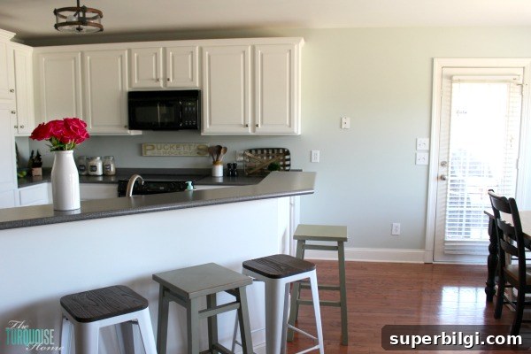
Sea Salt is a favorite for kitchens. In some kitchens it reads blue-gray, while in others it leans greener or lighter on different walls—lighting and wall orientation make a notable difference. It pairs especially well with white cabinets and natural wood accents.
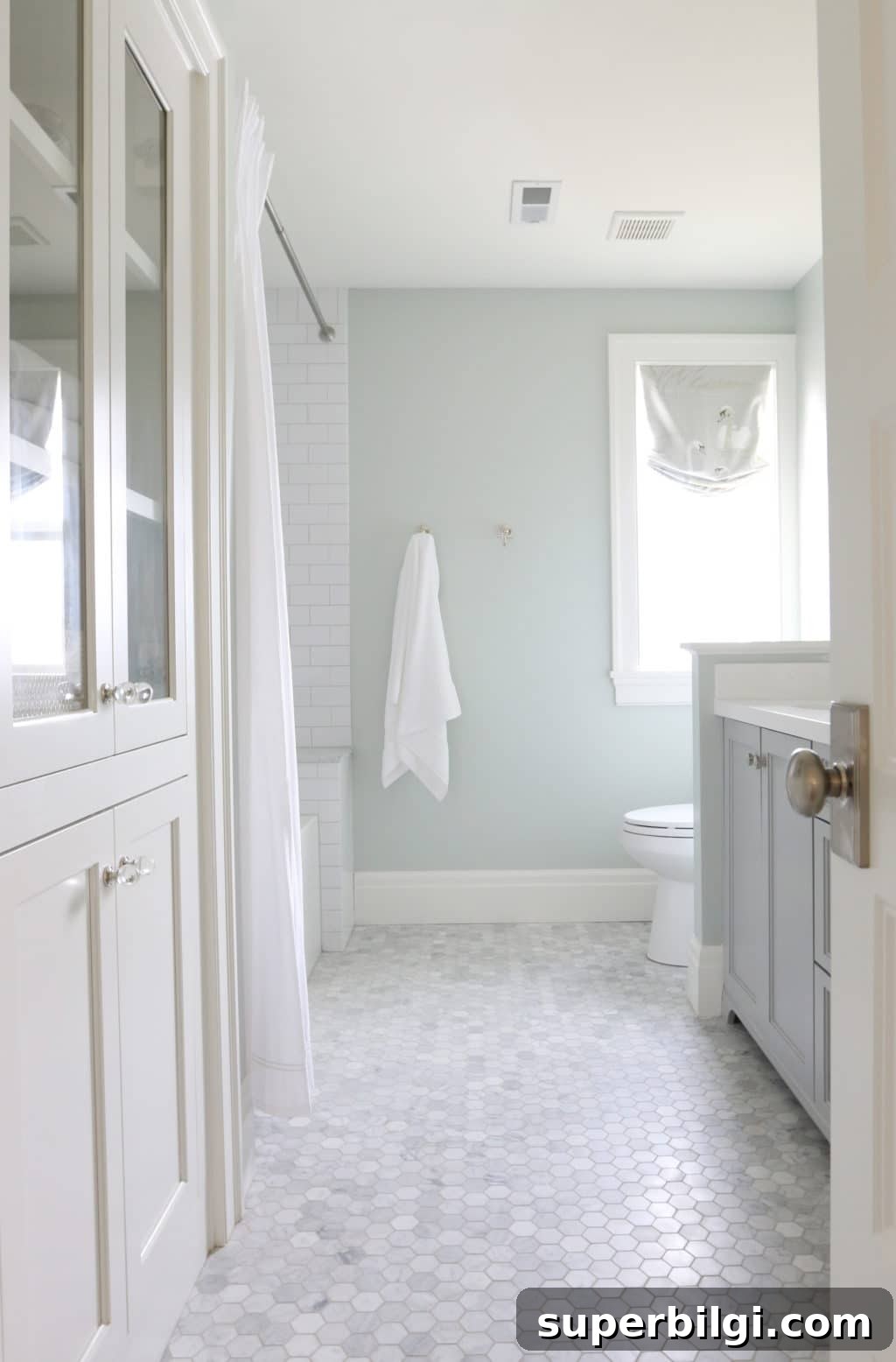
Sea Salt in Bathrooms
Sea Salt suits bathrooms perfectly, creating a fresh, aquatic mood that feels clean and spa-like. It’s an excellent choice for walls around tubs, vanities, or full bathrooms where a serene atmosphere is desired.
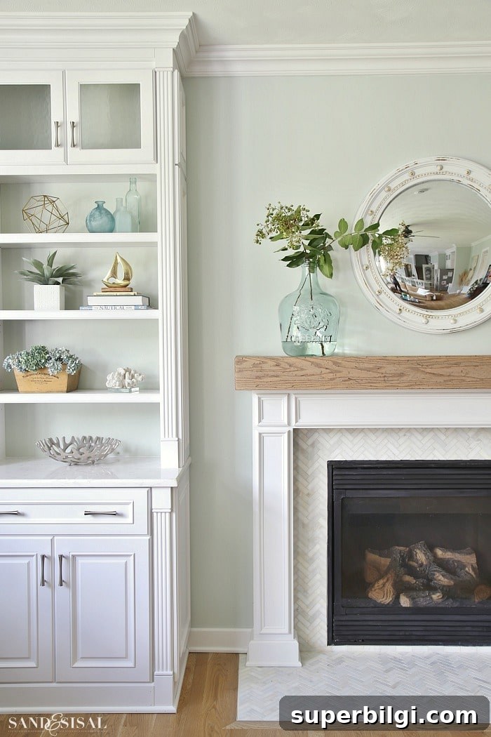
Sea Salt in Living Rooms
Used on living room walls, Sea Salt can read as a comfortable, livable green that still reads neutral. It’s a strong contender if you want color without dominating the space—especially in open-plan areas that need cohesion with adjoining rooms.
Sea Salt for Front Doors
If you’re unsure where to add this fresh color, consider a front door. Sea Salt adds approachable curb appeal and a soft pop of color without clashing with common exterior palettes.

Sea Salt on the Ceiling
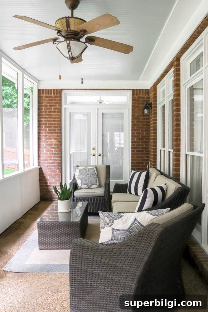
Using Sea Salt on a porch ceiling gives a soft haint-blue feel—subtle from a distance and pleasantly unexpected up close. It’s a gentle way to introduce color without overpowering exterior or screened porch spaces.
What Trim Color Works Best with Sea Salt?
You can pair Sea Salt with a true bright white or a warm off-white. Both approaches look great: a crisp white offers high contrast and a modern feel, while an off-white keeps the overall palette soft and cohesive.
When Should I Use Sea Salt?
Choose Sea Salt when you want a subtle color that behaves like a neutral—versatile for small or large spaces, and ideal when you want color without overwhelming the room. It’s especially effective where a calm, airy atmosphere is desired.
Is Sherwin Williams Sea Salt Blue or Green?
Sea Salt is a muted blue-green that can appear more blue, more green, or more gray depending on lighting and wall orientation. North-facing rooms with limited natural light tend to make it read bluer.
SW Sea Salt in My Kitchen
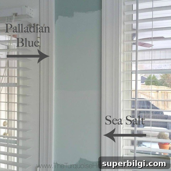
When I tested colors for my kitchen, I sampled several options and left the swatches up to observe them throughout the day. Sea Salt won me over after seeing how it shifted in different lights. That sampling step saved me from choosing a color I wouldn’t love, and it’s why I recommend testing at least two or three shades on-site before painting an entire room.
Final Thoughts
Sea Salt is a chameleon paint that’s surprisingly easy to live with. It brings a light, calming color to spaces without shouting “coastal” and can anchor a room as a soft neutral. If you want a fresh, understated color that works across rooms and styles, Sea Salt is worth sampling.
Related paint colors to consider:
- Iron Ore
- Repose Gray
- Gray Owl
- Wythe Blue
- Alabaster