

Today I want to introduce a color you may not know but should: Sherwin Williams Comfort Gray. Read on to learn everything about this lovely gray-green shade and how it appears in different rooms and lighting.

If you’re planning a refresh, paint is one of the easiest and most cost-effective ways to update a room. It’s affordable, relatively quick, and gives a striking visual change without the expense of new furniture or a remodel. The hardest part is choosing the right color.
Should you choose a warm shade, a cool tone, gray, beige, greige, or a crisp white? It’s easy to get overwhelmed. That’s why this paint-color guide exists — to highlight reliable, beautiful hues so you can enjoy the process and make a confident decision.
PRO Tip
Always test the real paint color in your home before committing. The easiest way to do that is with actual paint samples placed on your walls in different spots and viewed at different times of day. Peel-and-stick samples made from real paint are a tidy, convenient option for seeing how the color interacts with your light and furnishings.
Choose The Best Color For You
I appreciate a good neutral — Edgecomb Gray and similar tones are favorites — but blue-green shades are getting plenty of attention right now. A well-chosen blue-green can bring calm and subtle color into a space without overwhelming it. Enter Sherwin Williams Comfort Gray.
Comfort Gray often produces an instant “ahhh” feeling because it conveys calm and balance. The name is fitting: this is a soft, restorative color that reads as serene and grounded in many interiors.

Comfort Gray in My Home
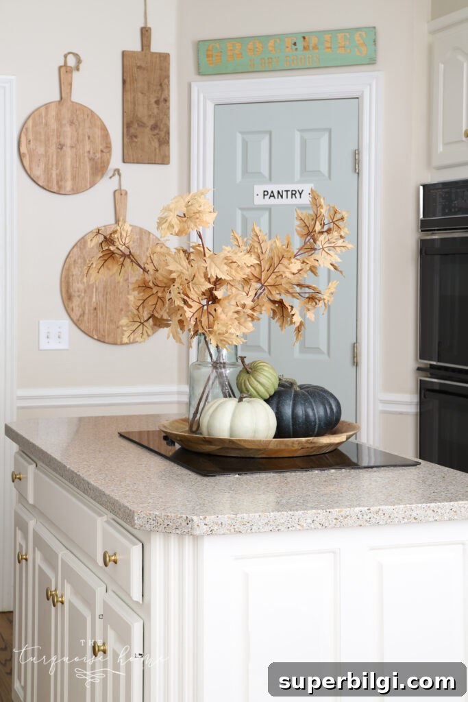
I first fell for Comfort Gray while choosing a pantry door color. Painting a door a contrasting shade is a fun, low-commitment way to introduce color. I’m enjoying it in my kitchen — it pairs beautifully with warm brass hardware and the surrounding neutrals.
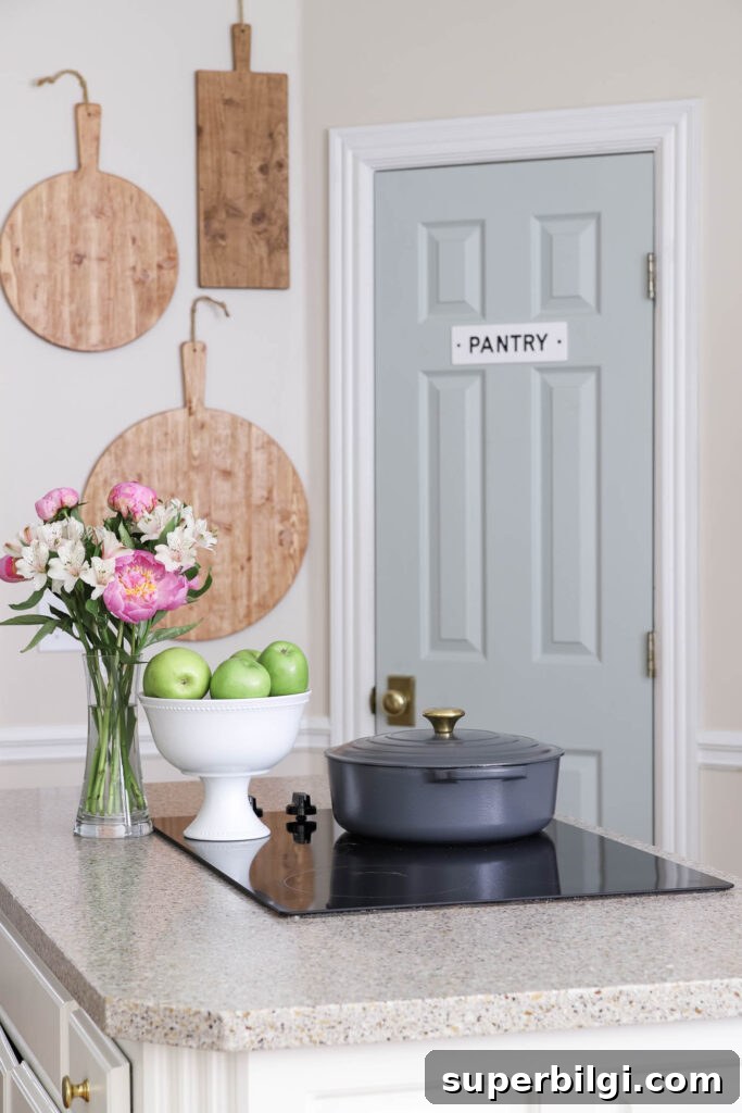
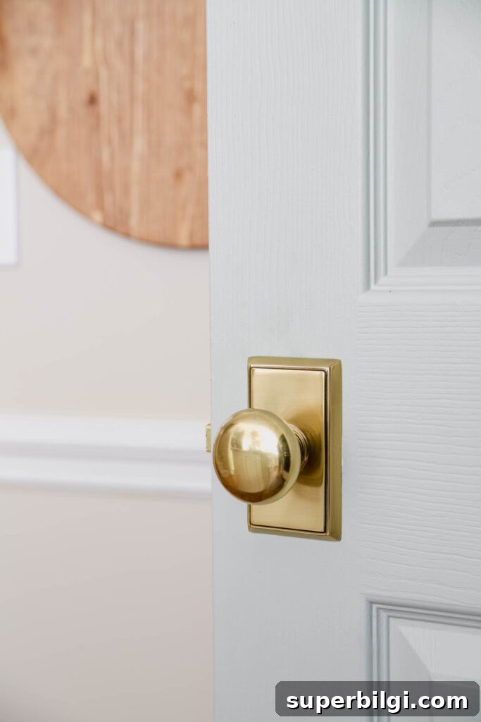
What You Need to Know About Sherwin Williams Comfort Gray
At first glance Comfort Gray can read minty, but it’s more complex than a single label. It’s a chameleon-like shade that shifts between blue-green and green-blue depending on lighting and surrounding colors.
Comfort Gray is slightly deeper than Sherwin Williams Sea Salt, and it often evokes the calming hues of sea glass. Because it trends cool, it’s especially effective at balancing warm, sunlit rooms — much like cool blue-green glass complements the warmth of sandy shores.
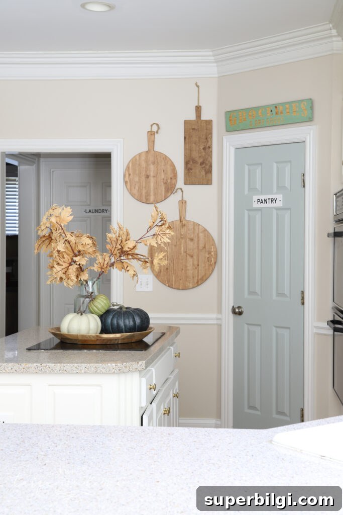
Comfort Gray Undertones
While Comfort Gray belongs to the gray family, its green and blue undertones make it a wonderful choice for anyone who wants a neutral that still offers personality. It’s an adaptable backdrop that can appear almost neutral in some lighting and subtly colored in others.
What Colors Coordinate with Sherwin Williams Comfort Gray
One of Comfort Gray’s greatest strengths is versatility. Its shifting undertones allow it to pair well with many palettes. In general, it works beautifully with sand tones, caramel and bronze hues, teal and terra cotta, as well as brighter accents like coral or watermelon.
Here are some Sherwin Williams shades that coordinate nicely:
- Dover White (SW 6385)
- Spare White (SW 6203)
- Snowbound (SW 7004)
- Foxy (SW 6333)
- Bagel (SW 6114)
- Moody Blue (SW 6221)
- Greek Villa (SW 7551)
- Amazing Gray (SW 7044)
- Rain (SW 6219)
- Retreat (SW 6207)
- Special Gray (SW 6277)
- Balanced Beige (SW 7037)
- Virtual Taupe (SW 7039)
- Mystical Shade (SW 6276)
Comfort Gray will look good with many other colors too; testing swatches in your room is the best way to decide.
Comfort Gray in Action in Different Rooms
To narrow your choices, it helps to see the color in real rooms and lighting conditions. Below are examples showing how Comfort Gray performs in kitchens, dining rooms, bedrooms, living rooms, bathrooms, and stairways.
Sherwin Williams Comfort Gray in Kitchens
Comfort Gray is ideal for a bright, relaxed coastal look. It can fill a whole room with soft color or be used sparingly, like painting a single pantry door to add character and depth without overwhelming the space.
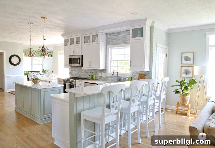
Comfort Gray in the Dining Room
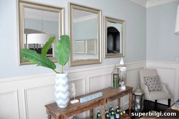
In some dining rooms, Comfort Gray reads more blue than green depending on the lighting. Pair it with silver or blue accents for a cohesive, elegant look.
SW Comfort Gray in Bedrooms
Comfort Gray is flexible enough to coordinate with gold, brown, white, black, and rose tones, making it a smart choice for bedrooms. It helps create calm, restorative spaces that aren’t too bright even with ample natural light.


Comfort Gray in Living Rooms
Comfort Gray works well in neutral, transitional, and coastal interiors. It pulls together varied decor elements and supports both warm and cool accent colors.


Sherwin Williams Comfort Gray in Bathrooms
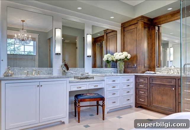
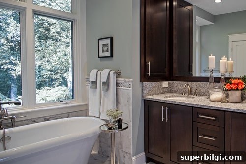
In bathrooms, Comfort Gray often reads softer and lighter, taking on a pastel quality in flattering light. It ties together whites, grays, and warm wood or bronze tones with quiet sophistication.
Comfort Gray Stairways
Comfort Gray is an elegant choice for entryways and stairwells. It harmonizes with a range of finishes from wood and black metal to creamy trim, providing a subtle, sophisticated backdrop.

Overall, Sherwin Williams Comfort Gray is a dependable, flexible color that’s well worth considering for almost any room. Test it in your space under your lighting to see how it shifts and which coordinating colors best suit your aesthetic.
More favorite paint colors in the Best Home Paint Colors series:
- Agreeable Gray
- Gray Owl
- Repose Gray
- Hale Navy
- White Dove
- Revere Pewter
- Wythe Blue