
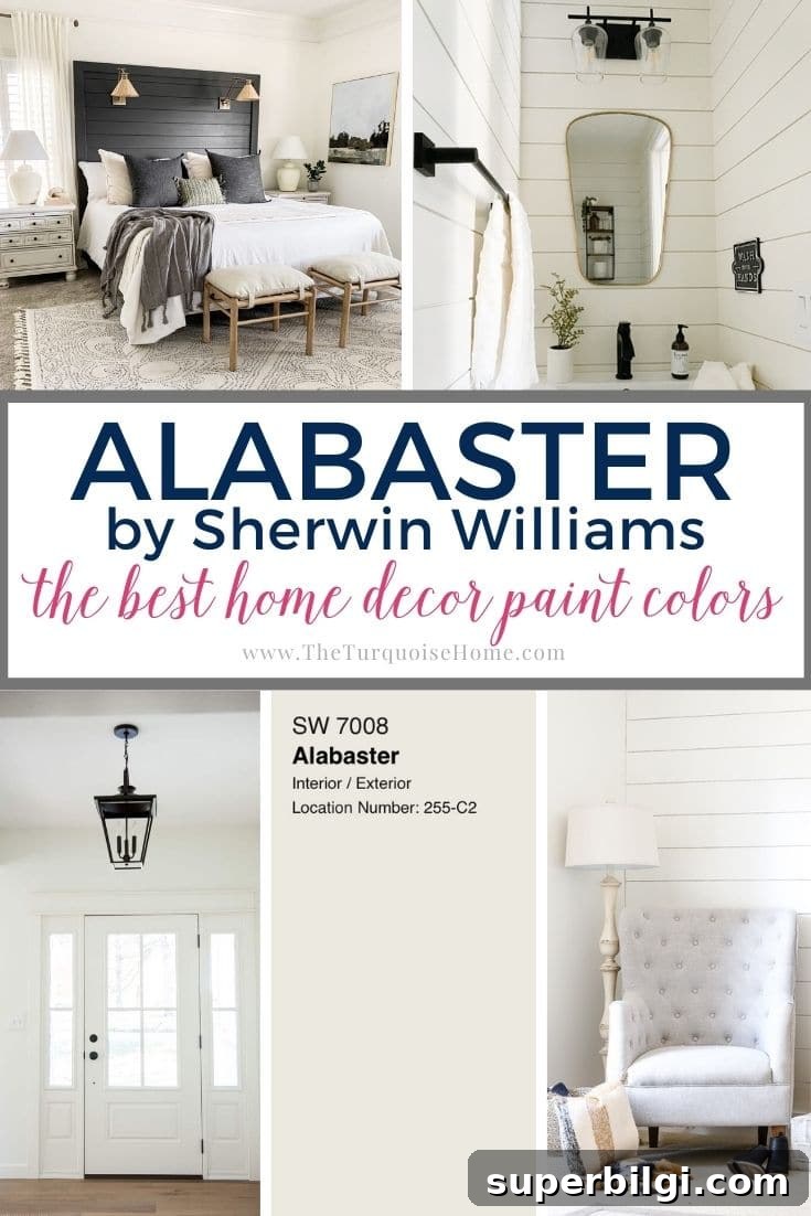
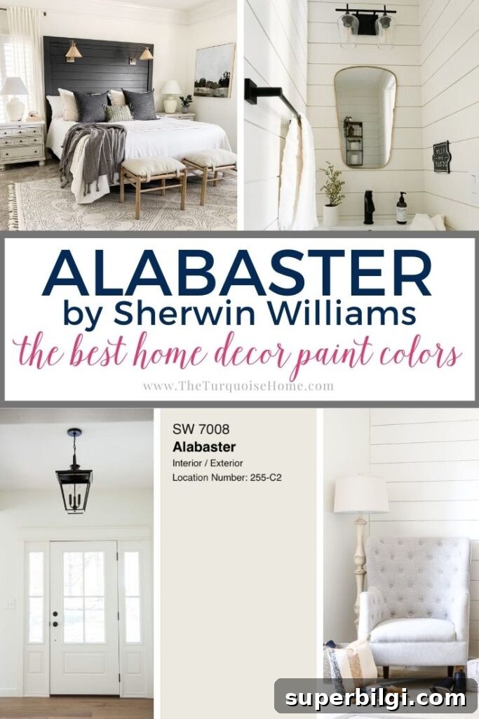
Sherwin Williams Alabaster White (SW 7008) is celebrated for its soft, creamy tone. This warm neutral was named Sherwin Williams’ 2016 Color of the Year and has remained a top choice for homeowners and designers ever since.
Alabaster’s enduring popularity isn’t a passing trend. Its balanced warmth and subtle undertones make it extremely versatile—suitable for interiors, exteriors, and cabinetry. If you’re searching for a dependable, flattering white, Alabaster is one of the first shades I recommend.
Pro Tip
Always test the actual paint color in your home before committing. Paint can look different depending on light, adjacent colors, and finishes. Try real paint samples on the wall in several spots and observe them at different times of day to confirm the undertone and value work for your space.
What makes Sherwin Williams Alabaster White most appealing is its restrained undertone. It isn’t stark or icy, nor overly creamy or yellow. Because the undertones are so subtle, Alabaster pairs well with both warm finishes like brass and wood, and cooler palettes featuring grays or blues.
What Color Is Alabaster?
Sherwin Williams describes Alabaster as “neither stark nor overly warm, but rather an understated and alluring hue of white.” In practice, it reads as a soft white with a touch of warmth that keeps it from feeling clinical. It’s a versatile neutral that complements many design styles.
Alabaster White Undertones
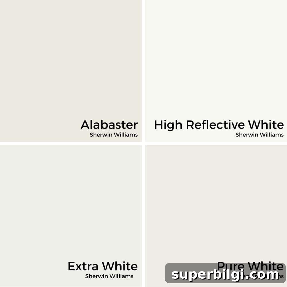
Although Alabaster is technically a warm white, it does not skew heavily yellow. Instead, its greige undertones (a blend of gray and beige) lend a creamy, balanced appearance that works with both warm and cool color schemes. In some lighting conditions the beige shows more, while in others the gray side becomes more noticeable.
Compared to true whites that often show cool or blue undertones, Alabaster reads as softer and more approachable—white, but not stark. When viewed alongside other whites, the differences become clearer; on its own, Alabaster appears as a gentle, inviting white rather than a clinical bright.
LRV of Sherwin Williams Alabaster White
Light Reflectance Value (LRV) measures how much visible light a paint color reflects. Alabaster White has an LRV of 82, meaning it reflects a good amount of light and will help brighten spaces.
Lighting orientation affects how the color reads: north-facing rooms often make paints appear cooler and slightly muted, while south- and west-facing rooms emphasize warmth and glow. Expect Alabaster to look brightest and warmest in sunlit spaces.
Alabaster vs. White Dove and Simply White
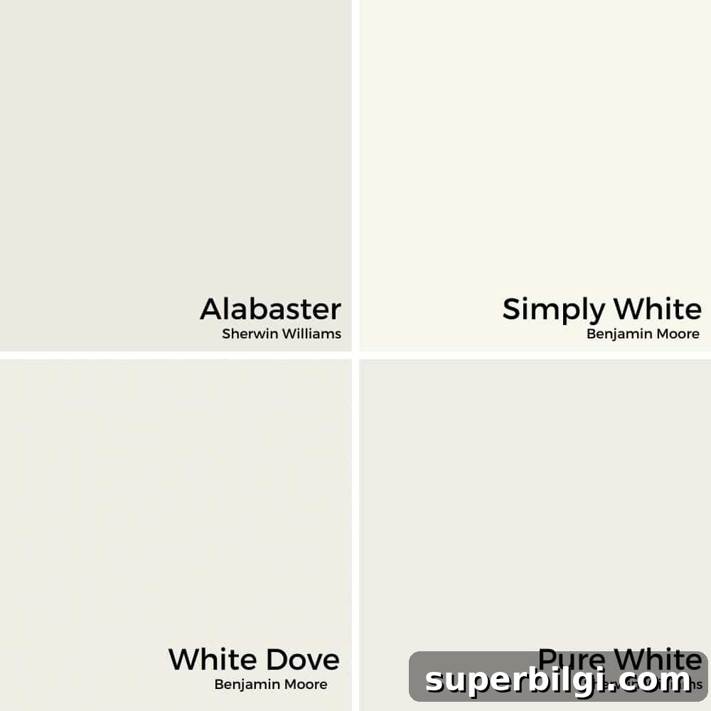
Alabaster is often compared with other popular whites like Benjamin Moore’s White Dove and Simply White. Alabaster is slightly warmer and a touch darker than White Dove (LRV 85) and is less yellow than Simply White. If you favor Benjamin Moore tones, White Dove is a close alternative to Alabaster.
Complementary Colors for Alabaster
One reason designers love Alabaster is how well it pairs with other colors. It serves as a neutral backdrop that allows both warm and cool hues to shine. Consider pairing it with cool blue-grays like Sherwin Williams Sea Salt for a calming contrast, or with a deep navy—such as Benjamin Moore’s Hale Navy—for striking contrast and depth.
Sherwin Williams themselves recommend pairing Alabaster with shades like Townhall Tan (7690) and Dakota Wheat (9023), showing how well it complements warmer neutrals. Because Alabaster is so adaptable, the range of attractive combinations is extensive.
Using Alabaster White in the Home
Walls
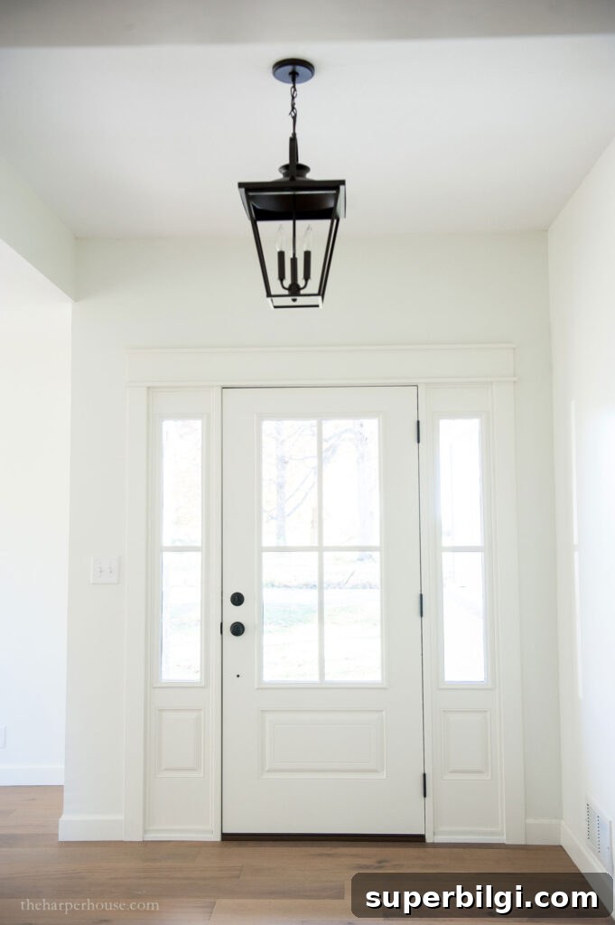
Alabaster is an excellent choice for walls when you want a bright, welcoming room that doesn’t feel harsh. It’s neutral enough to let furnishings and artwork take center stage while providing a warm, cohesive backdrop that works across styles—from modern to traditional.
Trim and Molding
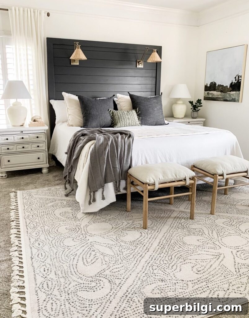
Alabaster also works beautifully on trim and moldings. Using slightly different whites for walls and trim creates a subtle, layered look. Choosing a glossier finish for trim—such as semi-gloss—can elevate a room’s details and add contrast without clashing.
Cabinets
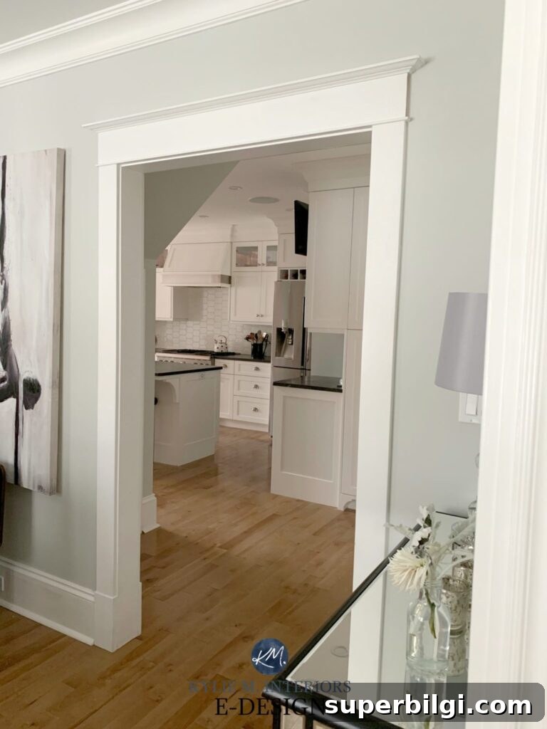
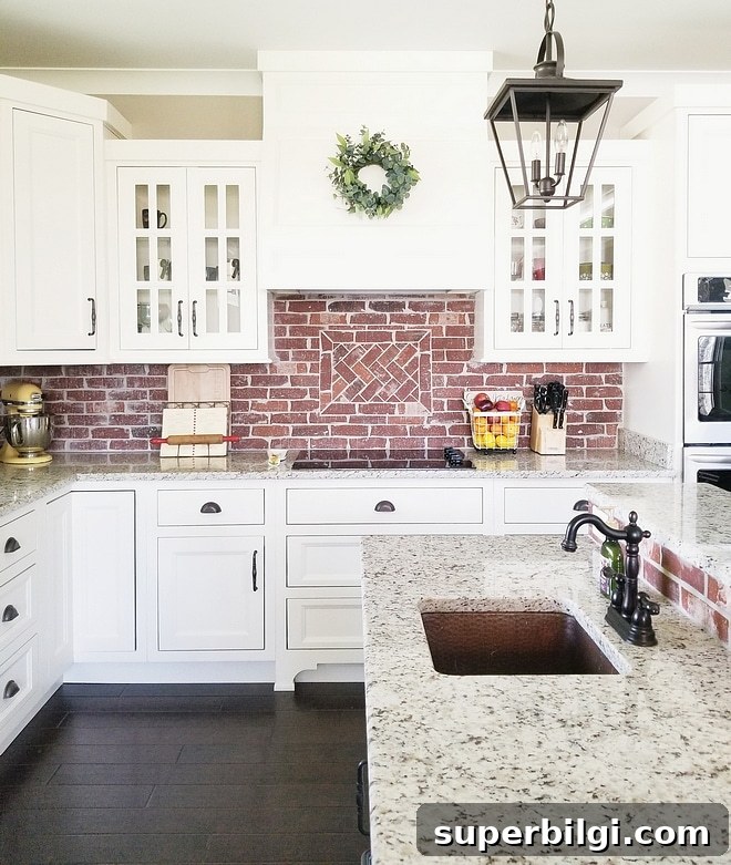
Alabaster is a popular cabinet color for kitchens, bathrooms, and laundry rooms. It provides a softer alternative to stark, true white cabinets—bright and clean without feeling overly clinical—making it easy to coordinate countertop, backsplash, and hardware choices.
Shiplap
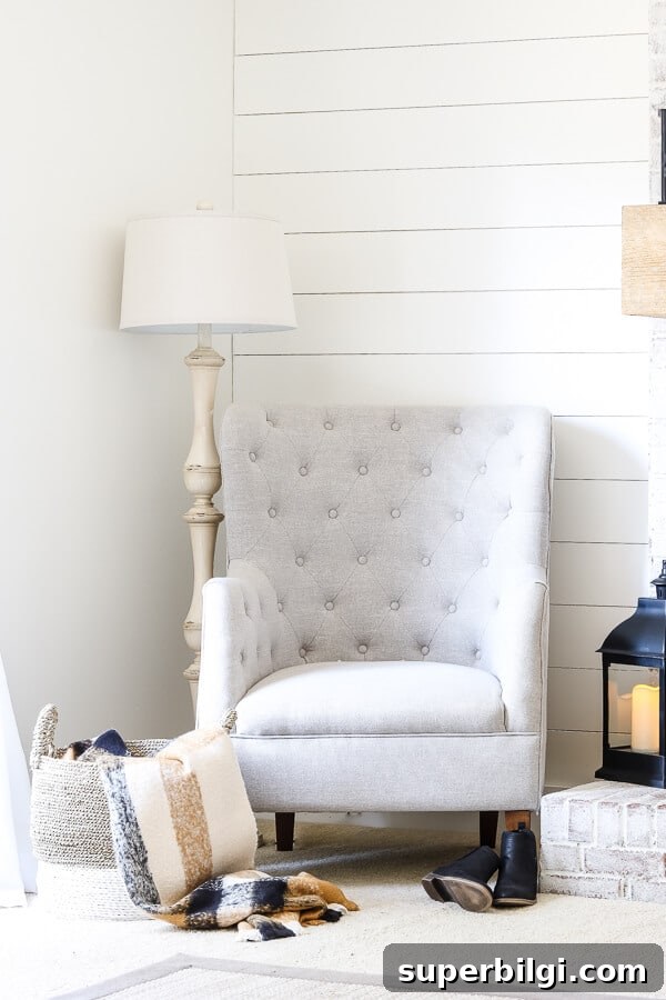
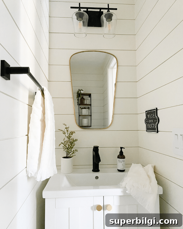
For farmhouse or coastal looks, Alabaster is a natural match for shiplap. Its warmth prevents shiplap from feeling too stark and gives a cozy, lived-in feel that complements rustic and modern farmhouse styles alike.
Exterior
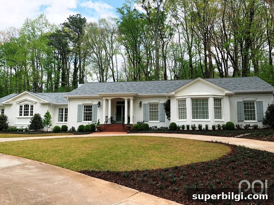
Alabaster performs well on exterior facades. Its high LRV helps keep the exterior bright without the glare of a pure white, and the subtle warmth adds curb appeal. It’s a reliable choice for homes that receive varying light conditions.
Have you considered using Sherwin Williams Alabaster White in your home? It’s a safe, stylish choice that simplifies decorating and pairs beautifully with many palettes. Test a real paint sample on your wall to be sure the undertone works with your lighting and finishes before painting an entire room.
Other colors to explore: Gray Owl, Revere Pewter, Hale Navy, Shoji White, Sea Salt.
More inspiration: Discover paint ideas for nurseries, sage greens, greige tones, paint finishes, and interior door colors to help refine your palette and design choices.