
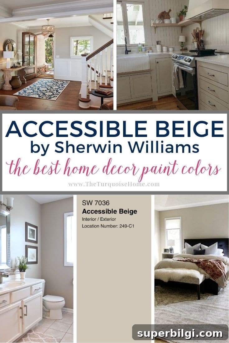
Accessible Beige is a versatile neutral that has maintained popularity across changing design trends. Its warm, subtle undertones give it a timeless, elegant feel that complements both traditional and contemporary interiors.
Sherwin Williams Accessible Beige (SW 7036) may recall the beige palettes of the 1990s and 2000s, but this is a modern, updated greige—not the heavy yellowish beige of the past.
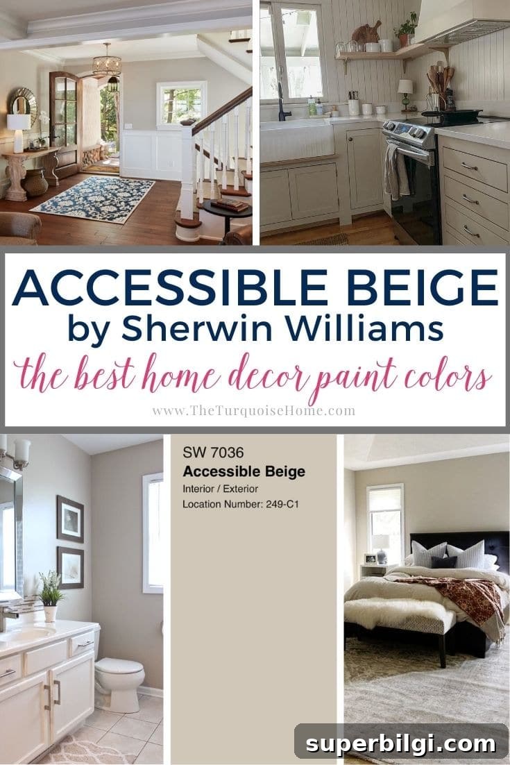
This warm, earthy greige blends beige and gray with faint taupe and green hints, creating a soft backdrop that feels inviting without appearing too yellow or too cool. Its adaptability is a major reason it remains a top choice for homeowners and designers.
Read on to learn how Accessible Beige behaves in different lighting, which finishes and palettes pair best with it, common mistakes to avoid, and tips for testing the color before you commit to buying paint.
Updated July 2026: This guide has been refreshed with new room examples, coordinating colors, common mistakes to avoid, and answers to frequently asked questions about Sherwin Williams Accessible Beige.
Thinking about painting with Sherwin Williams Accessible Beige? Here’s what you’ll learn:
- Why Accessible Beige (SW 7036) remains a popular neutral
- How its beige, gray and subtle green undertones shift with light
- Which rooms, styles, and finishes it complements best
- Common mistakes to avoid when choosing the color
- Practical tips for sampling and testing the paint in your home
Accessible Beige Sherwin Williams: What You Need to Know
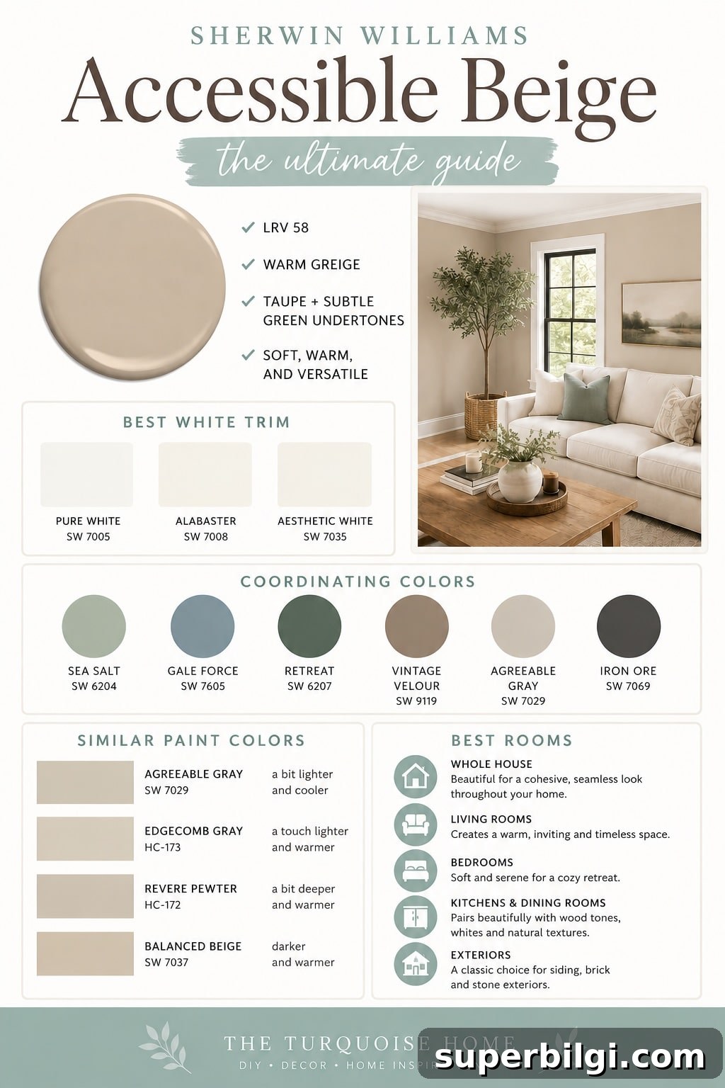
Sherwin Williams Accessible Beige (SW 7036) is often described as a warm greige: a balanced blend of beige and gray with soft taupe and faint green undertones. It’s not a stark white or a strongly yellow beige—rather, it sits comfortably in the middle, offering warmth and neutrality that work well across many decorating styles.
Accessible Beige pairs particularly well with warm wood floors, creamy white trim, natural stone, brass and warm metal accents, woven textures, and layered neutrals. Its versatility makes it suitable for traditional, transitional, farmhouse, cottage, and modern organic interiors, so it’s a safe choice if you plan to evolve your decor over time.
Keep in mind that natural light, room orientation, flooring, countertops, furniture, and light bulb temperature will all affect how the paint appears. South-facing rooms often read lighter and warmer, while north-facing rooms tend to bring out more of the gray undertone. Testing the color in your specific space is always recommended.
Quick Facts about Accessible Beige
| Color | Accessible Beige |
|---|---|
| Brand | Sherwin Williams |
| Number | SW 7036 |
| LRV | 58 |
| Undertones | Warm greige with taupe and subtle green |
| Best For | Whole-house paint, living rooms, bedrooms, exteriors |
| Pairs With | Warm whites, soft greens, natural wood, muted blues, brass |
Accessible Beige Undertones
Accessible Beige differs from traditional beiges that tend to carry obvious golden or yellow tones. Instead, it features a taupe-driven base that reads as greige—warmer than pure gray but cooler than classic beige. The taupe softens the color and keeps it from feeling overly yellow.
In some lighting conditions, especially in lower light or when paired with cool materials, you may detect a faint green or earthy hint. These subtle shifts are normal and are part of what makes the color adaptable; pairing it with different accent shades can emphasize either the warmer or cooler qualities.
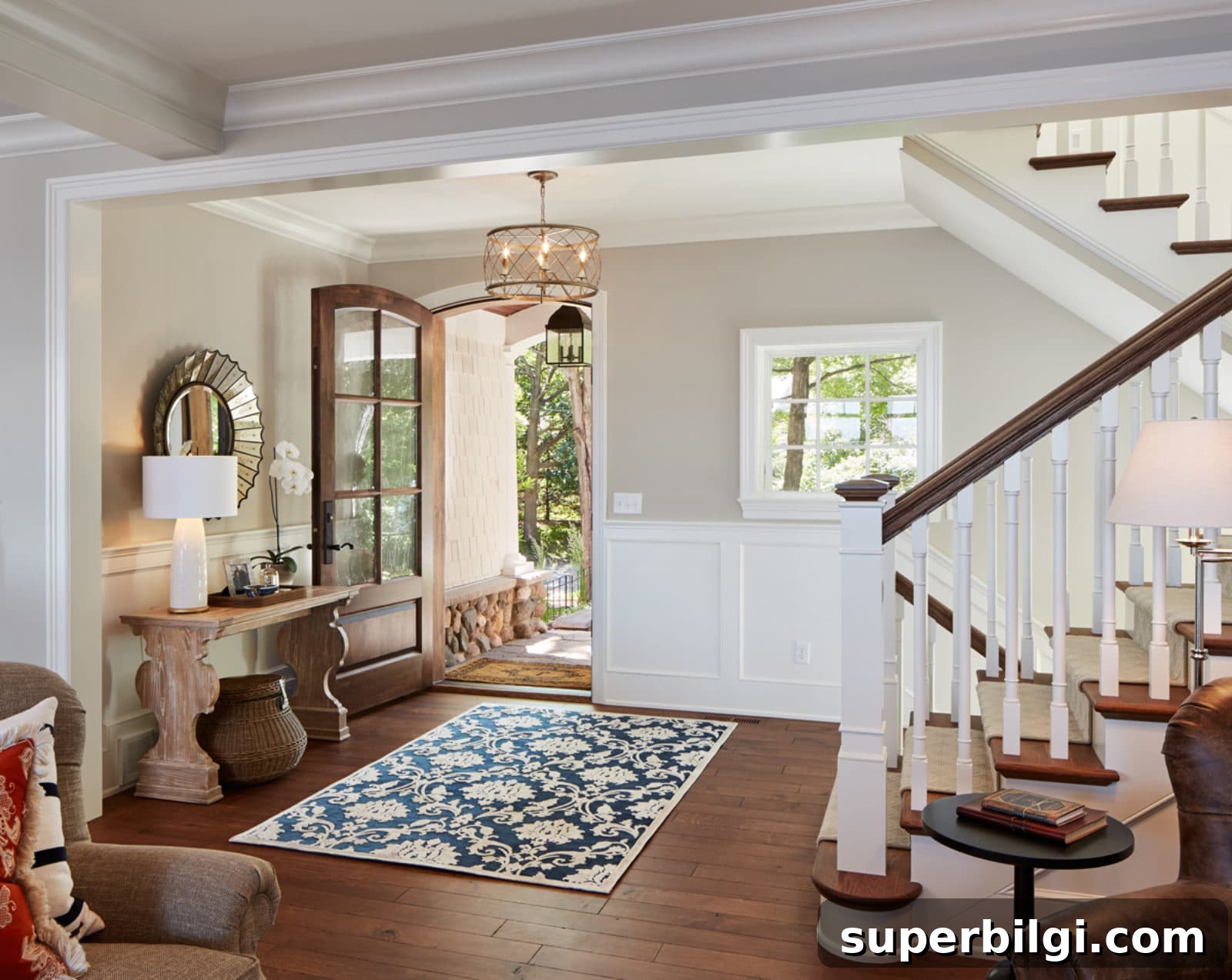
Light Reflectance Value (LRV) of Accessible Beige
Accessible Beige has an LRV of 58 on a scale where 0 is pure black and 100 is pure white. That places it in the light-to-medium range: it reflects a fair amount of light without appearing washed out. It won’t brighten a very dark room dramatically, but it won’t make a space feel gloomy either.
Because it sits in the middle range, Accessible Beige often reads differently throughout the day: it can feel warmer and slightly more saturated in dim light and cooler or more gray in bright, north-facing light. Testing samples on different walls at multiple times of day is the best way to predict how it will behave in your rooms.
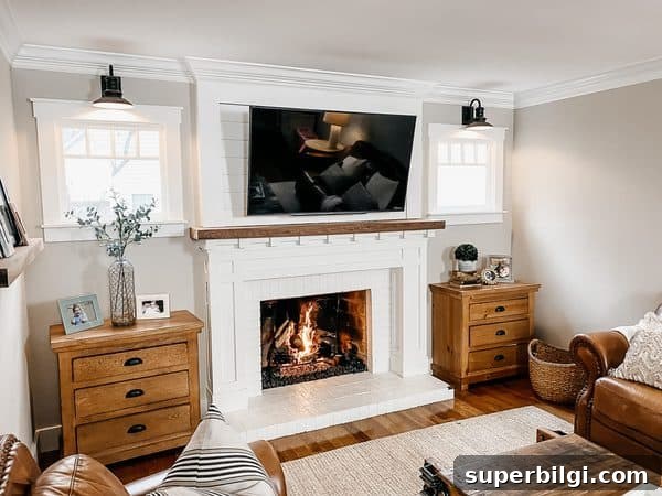
Coordinating Colors for Accessible Beige
Accessible Beige complements earthy palettes beautifully. Muted greens, soft blues, warm browns, and creamy whites enhance its natural warmth. Avoid bright, highly saturated colors; instead, choose softened or desaturated variations for a balanced, cohesive look.
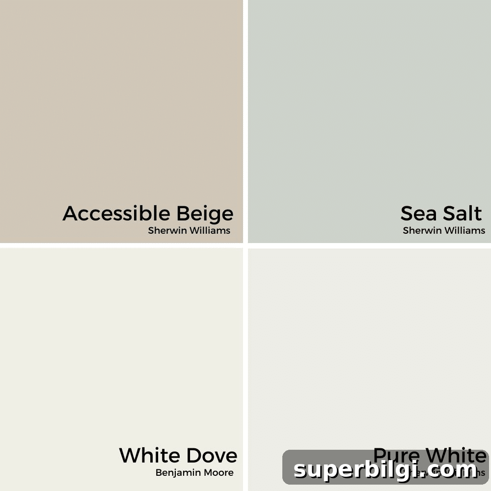
Warm whites like Pure White, Alabaster, or Aesthetic White offer a clean contrast without feeling icy. Soft greens such as muted sea green tones pair especially well, and warm wood finishes and brass hardware create a timeless layered palette.
Agreeable Gray vs. Accessible Beige
Agreeable Gray and Accessible Beige are both popular greige options, but they read differently. Accessible Beige leans more toward beige and warmth, while Agreeable Gray leans slightly cooler and grayer. Their LRVs are close—Accessible Beige at 58 and Agreeable Gray around 60—so the main distinction is undertone rather than depth.
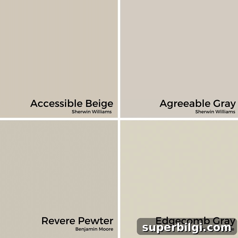
If you prefer a warmer, cozier neutral, Accessible Beige is a strong choice. If you want a slightly lighter, more contemporary neutral, Agreeable Gray may suit better. Always view both in your lighting before deciding.
Accessible Beige in Different Rooms
Accessible Beige is versatile enough for nearly every room. Its warm greige base creates a calm, inviting backdrop that works with varied furnishings and finishes. Below are practical examples of how it performs in common spaces.
Kitchen
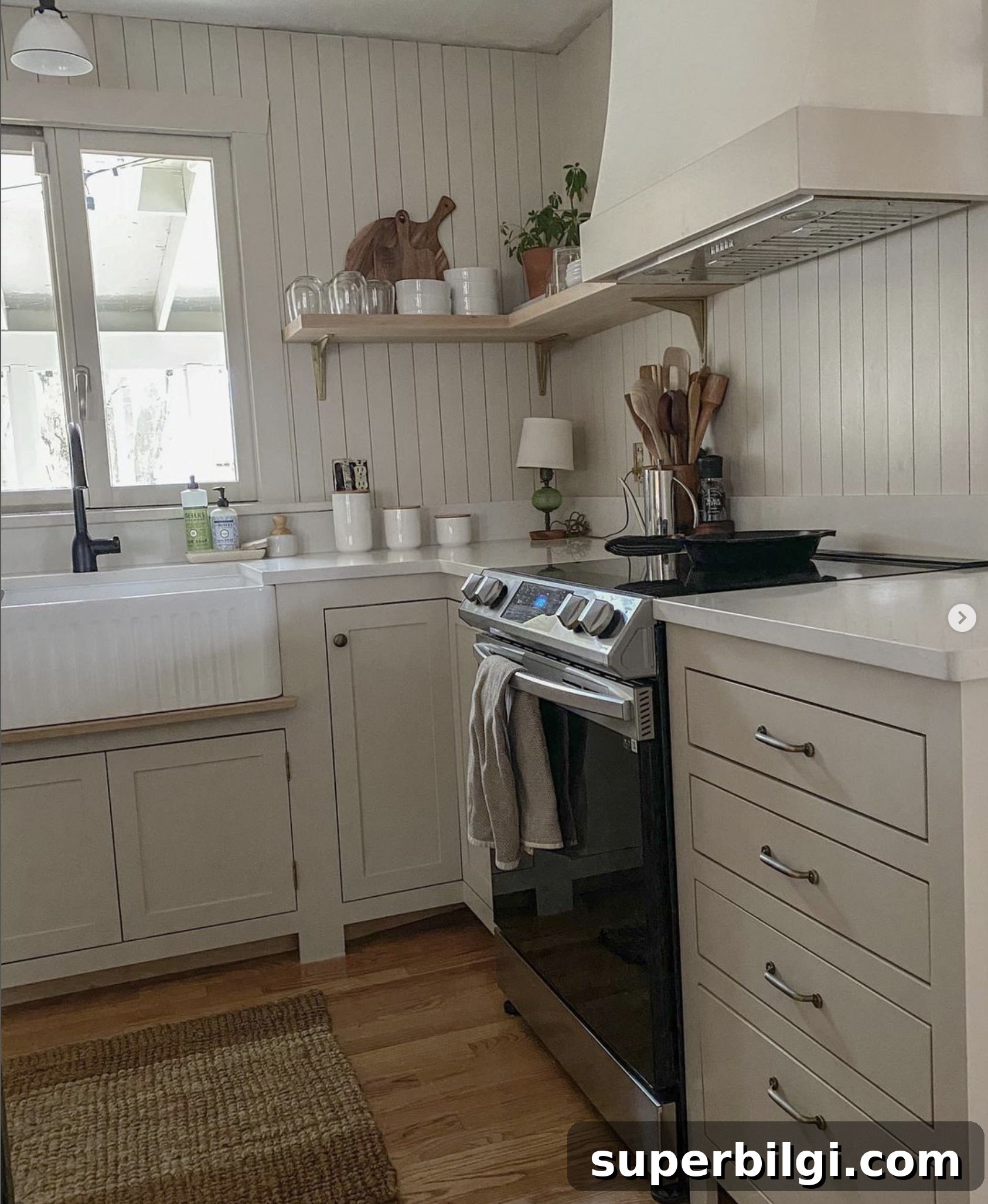
In kitchens, Accessible Beige pairs nicely with white cabinets, light to medium oak or natural wood tones, and warm metal hardware. It supports a farmhouse or transitional aesthetic while remaining low-risk and long-lasting.
Bedroom
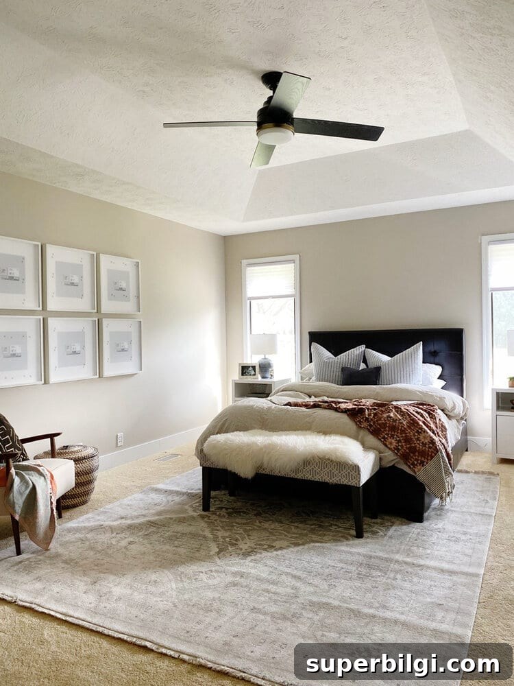
For bedrooms, Accessible Beige fosters a restful, cozy atmosphere that complements white bedding, soft linens, and natural textures. It allows artwork and furnishings to stand out without competing for attention.
Bathroom
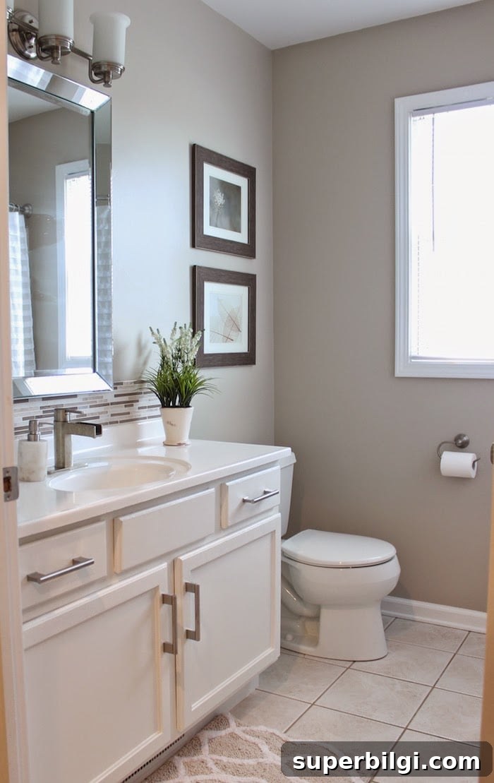
Accessible Beige creates a spa-like, relaxed bathroom palette. It looks great with white vanities, light stone countertops, and subtle accent textiles for a clean, inviting powder room.
Living Room
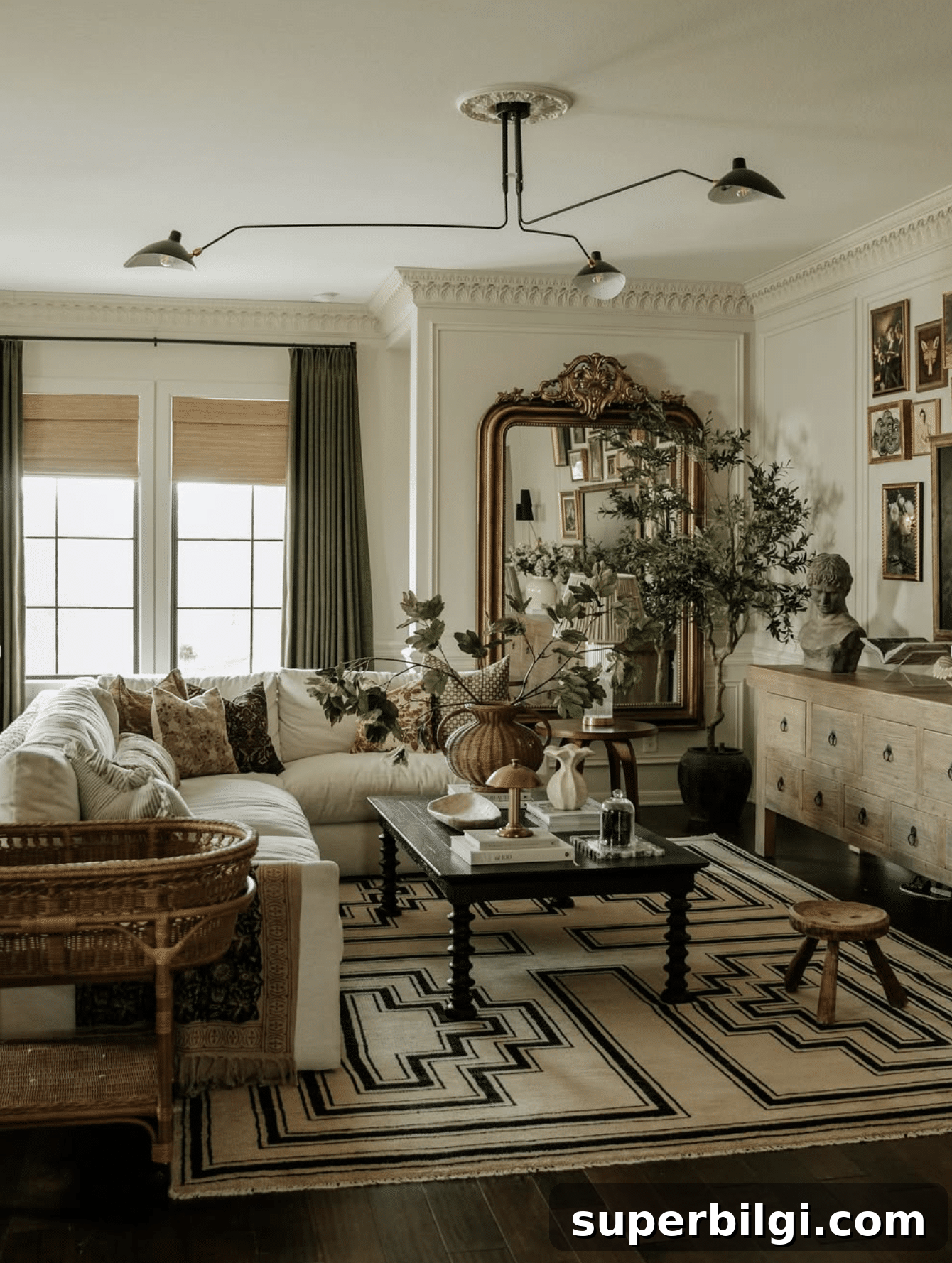
As a living room backdrop, Accessible Beige supports layered textures, warm woods, and vintage accents while keeping the space bright and welcoming. It provides a neutral base that allows furnishings to take center stage.
Trim and Doors
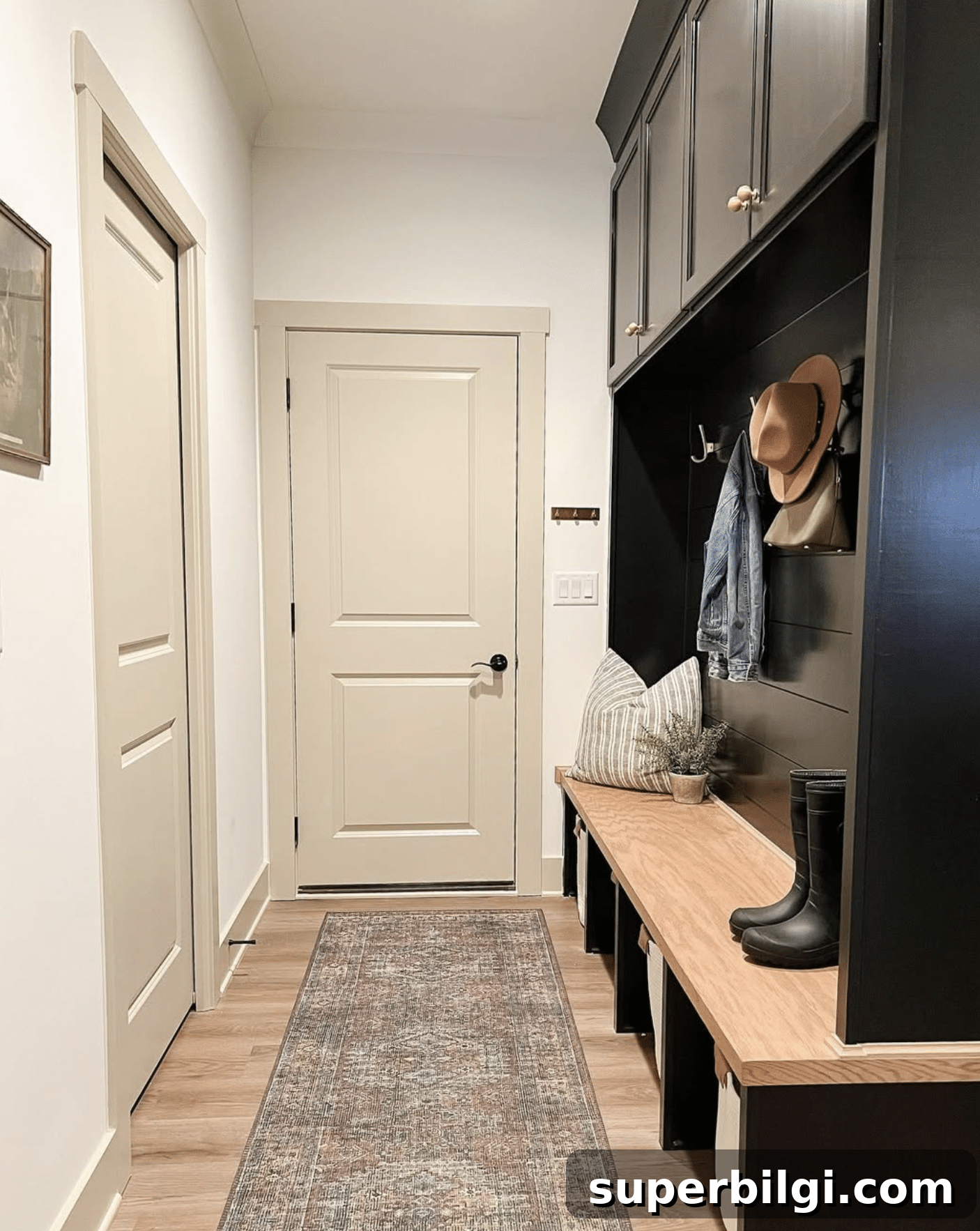
Accessible Beige can also be used on trim or doors in certain applications. When paired with darker cabinetry or accent walls, the greige trim softens contrasts while harmonizing with wood floors and natural finishes.
Exterior
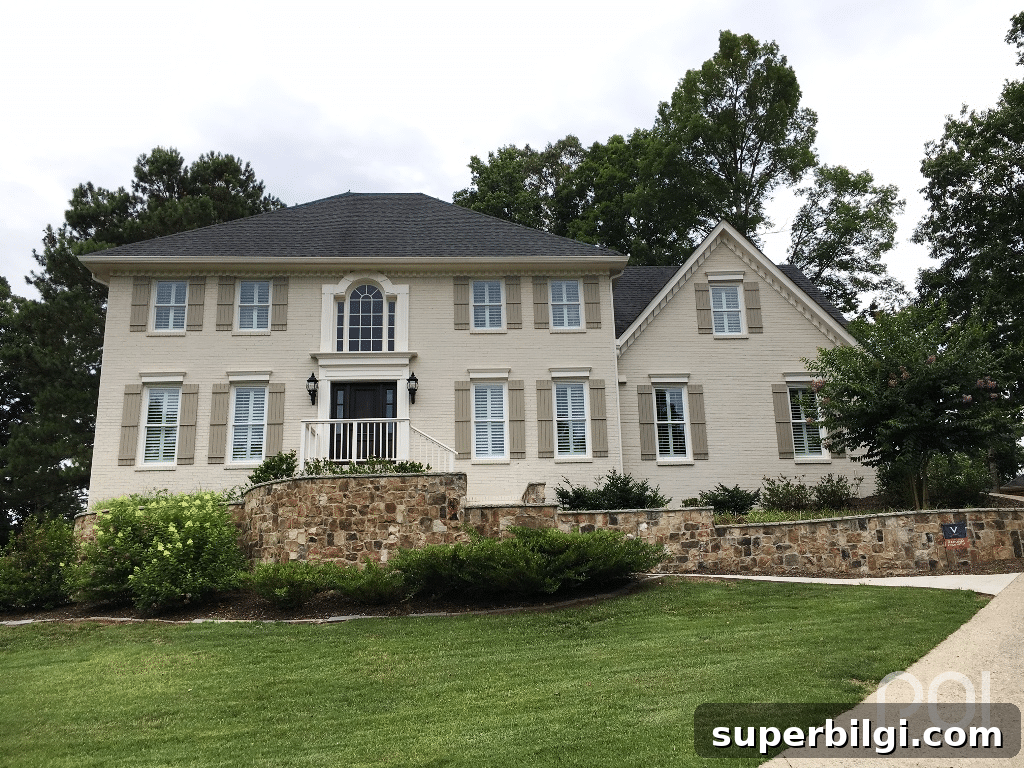
Accessible Beige is a strong exterior color choice, appearing lighter and more greige in bright outdoor light. It looks attractive with dark trim, stained wood elements, and stonework for a natural, cohesive exterior palette.
Common Mistakes to Avoid
1. Skipping a sample
Always test the paint in your own space. Use large sample boards or peel-and-stick samples and move them around the room to see how the color shifts with different light and positions.
2. Using bright cool whites
Pair Accessible Beige with warmer or neutral whites rather than stark, cool whites to maintain a cohesive, welcoming palette.
3. Ignoring your flooring
Flooring is a large fixed surface that strongly influences how a wall color reads. Test Accessible Beige alongside your flooring to ensure undertones work together.
4. Expecting every room to look identical
Different orientations and lighting conditions will change how Accessible Beige appears; embrace the variation and test samples in each room you plan to paint.
5. Choosing the wrong sheen
Select a sheen appropriate for the room’s function and surface. Higher sheens are easier to clean for high-traffic areas; lower sheens hide imperfections on textured walls.
Frequently Asked Questions About Sherwin Williams Accessible Beige
Is Accessible Beige still popular?
Yes. Accessible Beige remains a reliable, enduring neutral because it isn’t overly trendy and adapts well to changing decor styles. Its balanced undertones make it appropriate for a wide range of homes.
Is Accessible Beige more gray or beige?
Accessible Beige leans more toward beige while maintaining gray influences—hence its classification as a greige. The result is a warm, versatile neutral.
Does Accessible Beige look green?
Occasionally, faint green undertones can appear in certain lighting or when paired with cool surfaces. In most settings it reads as a warm greige rather than a green color.
Does Accessible Beige work with oak cabinets?
Yes—Accessible Beige complements light to medium oak by harmonizing with the wood’s natural warmth. If your cabinets are strongly red or dark, test a sample to confirm the overall effect.
What trim color goes with Accessible Beige?
Warm whites such as Pure White, Alabaster, or Aesthetic White pair well, offering clean contrast without appearing icy. These combinations work across traditional and contemporary styles.
Does Accessible Beige work with black windows?
Yes. The warm greige walls soften the bold contrast of black window frames, creating a balanced, timeless look.
What LRV is Accessible Beige?
Accessible Beige has a Light Reflectance Value (LRV) of 58, placing it in the light-to-medium range—reflective enough to keep spaces feeling open while providing warmth and depth.
Final Thoughts
Sherwin Williams Accessible Beige is an excellent option if you want a warm, adaptable neutral that stands the test of time. Its greige undertones create a versatile backdrop for many palettes and styles. Because light and surrounding finishes influence its appearance, always test large samples in the rooms you plan to paint to ensure you’ll be happy with the result.
With the right coordinating colors and finishes, Accessible Beige can provide a cohesive, inviting foundation for your home—whether you’re painting a single room or the entire house. Happy painting!