
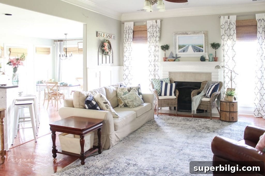
Revere Pewter is my go-to paint color and the search term that brings so many readers to this blog. It’s a versatile, polished gray that feels crisp without being cold. One of the questions I hear most is: what colors work well with Revere Pewter? Over the years I’ve tested it in an open living space and found it pairs beautifully with a wide range of hues—everything from warm neutrals to cool blues and greens.
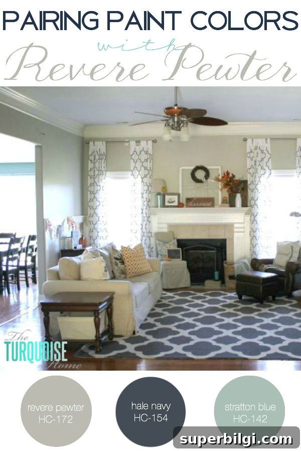
In my home Revere Pewter sits in the heart of an open-plan living area, so it needs to harmonize with adjoining rooms and varied furnishings. I’ve found it plays well with both warm and cool tones because it reads as a neutral that carries subtle undertones without overwhelming other colors. It complements natural wood finishes, muted pastels, and richer saturated shades, which makes it ideal when you want a backdrop that allows decor accents to shine.

Want to Save This?
Bookmark the color names below or note them for future reference.
If you’re wondering which specific pairings I recommend, I start with blues. Revere Pewter is wonderfully compatible with turquoise and teal tones, which is why it works so well in a home that features blue-green accents. In my layout, the kitchen and dining room walls sit next to Revere Pewter and are painted in two similar Benjamin Moore hues: Wythe Blue and Stratton Blue. Those cool blue tones balance the gray and give the open plan a cohesive, calm look.
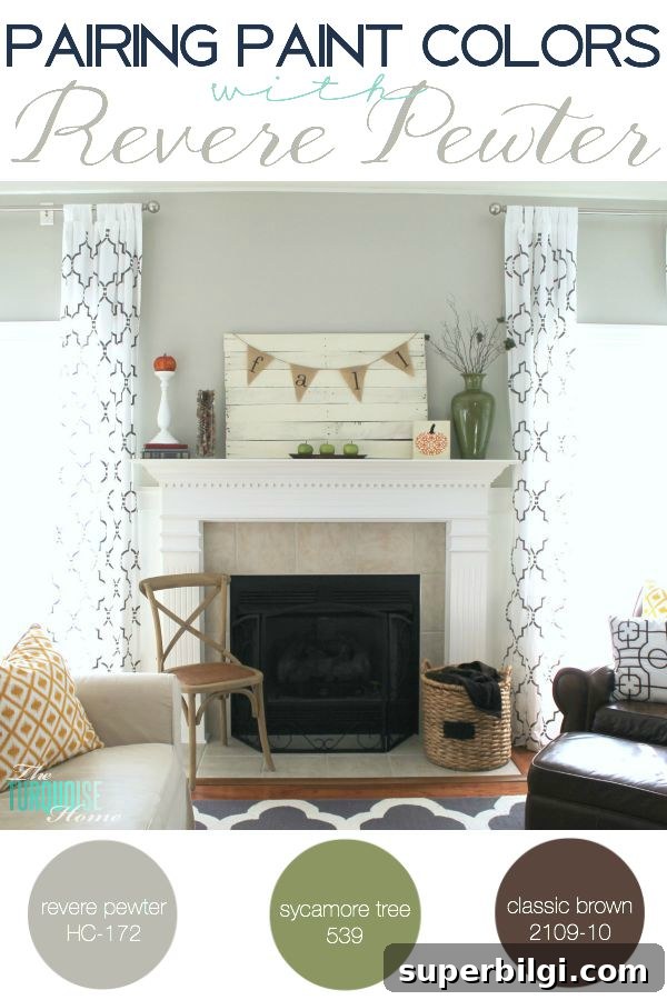
I also lean into deeper accent shades for contrast. Navy tones add depth and drama when paired with Revere Pewter—think a painted mantel or an accent wall in a rich navy to ground the room. For lighter, softer looks, I choose pastel accents or warm neutrals in furniture and textiles. The beauty of Revere Pewter is that it lets you switch your accent colors seasonally: bright pinks and yellows or fresh greens for spring and summer, then richer reds and burnt oranges for fall.
On the topic of furnishings: neutral upholstery, natural wood, and textured fabrics work especially well with this gray. If you prefer a minimal aesthetic, keep furnishings in a neutral palette and introduce color through pillows, artwork, and smaller decor pieces. This approach makes it easy to refresh the space without repainting.
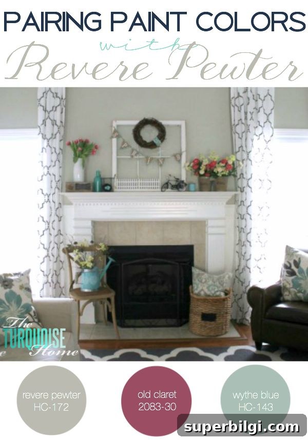
I’ve also used bolder colors on mantels and smaller architectural features to see how they sit next to Revere Pewter—and those touches can make a big visual impact. Whether you choose a saturated accent or a gentle, muted shade, test paint samples in the actual space at different times of day so you can observe how light changes the way the color reads.
A few practical tips when working with Revere Pewter:
- Sample first: paint large swatches on your walls and observe them in morning, midday, and evening light.
- Coordinate trim and ceilings with lighter neutrals to keep the room feeling open and fresh.
- Use textiles and accessories to introduce seasonal or trend-driven colors without committing to a repaint.
- Pair with both wood tones and cool metals—Revere Pewter is flexible enough to support varied finishes.
PS – all of the paint colors I mention are Benjamin Moore shades. In my main living space I use Revere Pewter alongside Hale Navy, Wythe Blue, and Stratton Blue. That combination gives me the balance of calm neutrals and strong accents that I love.
More Posts You Will Love:
- The Best Bedroom Paint Colors
- Best Living Room Paint Colors
- The Best 15 Neutral Paint Colors
- Create a Whole House Color Palette
- The Best Blue Gray Paint Colors