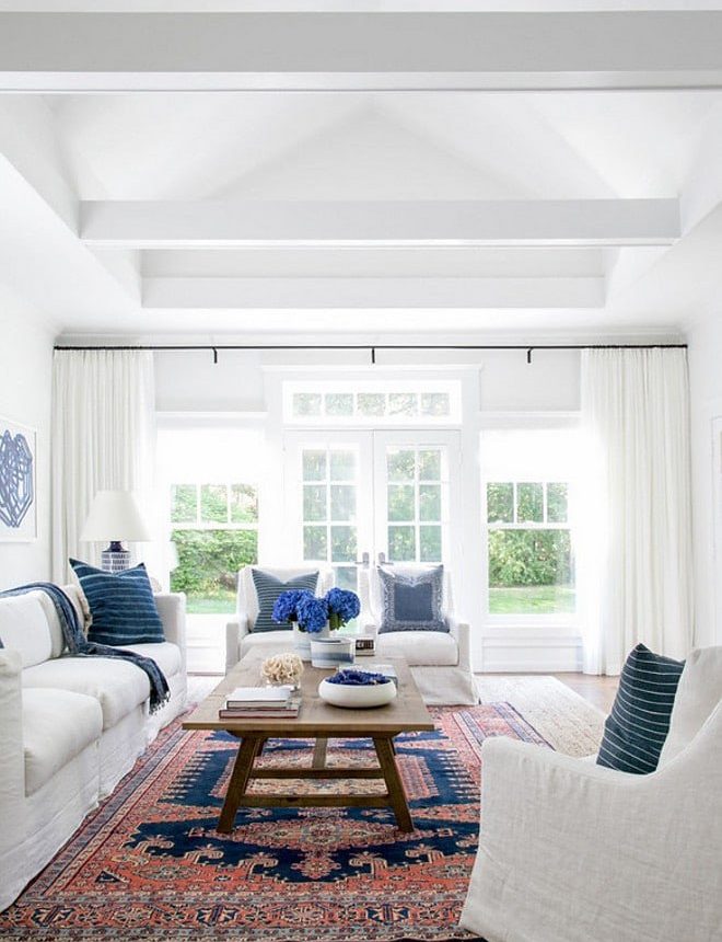
If you’ve ever tried to choose a white paint color, you’ve likely discovered this truth: not all whites are the same. If you haven’t, you might assume “white is white,” but nothing could be further from the truth. Choosing the right white involves balancing undertones, lighting, and surrounding finishes to create the look you want.
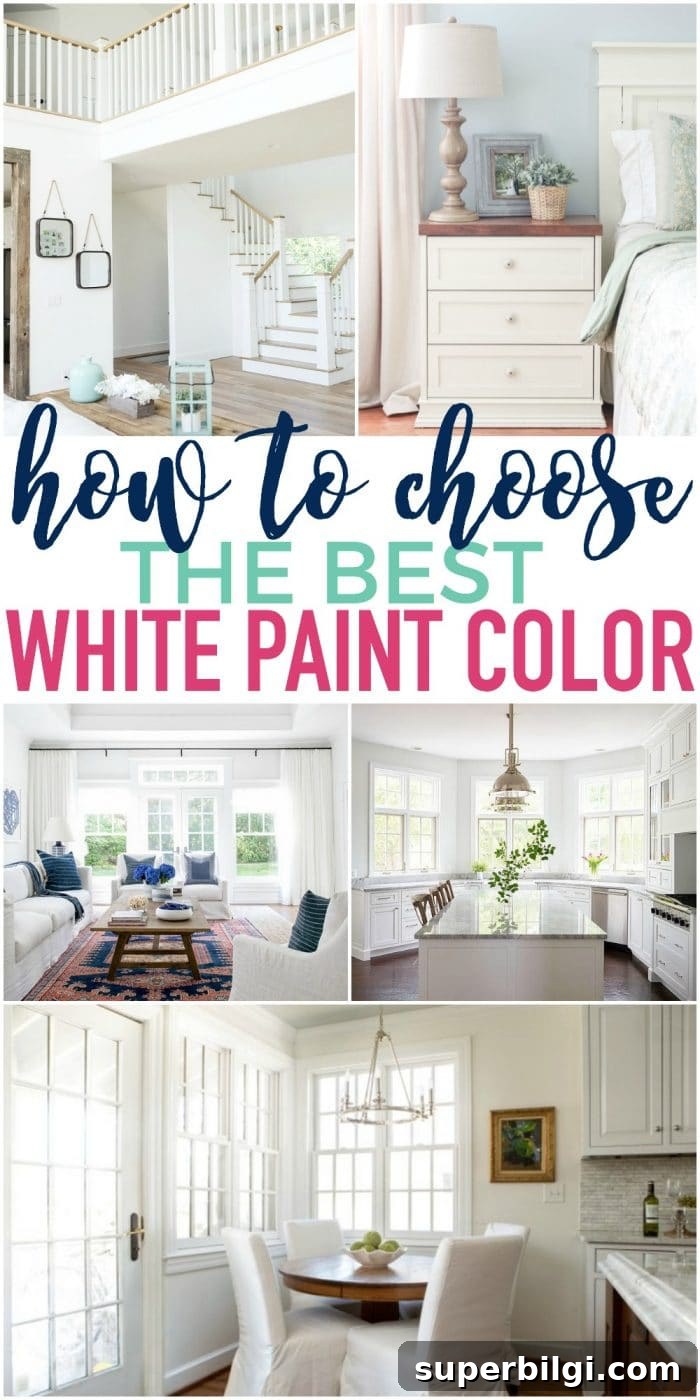
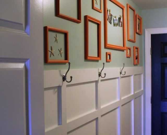
I remember the first time I needed a white paint: I was prepping the lower portion of my living room for a board-and-batten installation and wanted the walls to match my trim. The trim looked like “plain white,” so I grabbed an off-the-shelf can and started painting. The result was a blinding, fluorescent white—nothing like the trim. That experience taught me that finding the right white often takes a bit of investigation and testing.
This post contains affiliate links for your convenience. See my full disclosure policy.
PRO Tip
Test the real paint on your walls before committing to a full can.
The fastest, cleanest way to test colors is with peel-and-stick real paint samples. They’re mess-free, easy to move around the room, and simple to save for future reference. They allow you to observe how a color behaves in different light throughout the day.
Note: If you’re painting yourself, the right tools make the job easier and neater. A good brush, tape, drop cloths, and a quality roller tray matter. If you want step-by-step guidance, check my post on painting a room in five easy steps for practical tips that make the process faster and cleaner.
After my hardware-store mishap, I realized choosing the right white would be a process: look, research, sample, and test in place. Below are practical tips and a curated list of popular and reliable white paint colors to help narrow your choices.
Tips for Choosing the Best White Paint Color
1. Find Inspiration Online
Start by searching for rooms painted in the whites you’re considering. Pinterest and Google image searches can show how a color performs in real spaces and help you eliminate options you don’t like. Keep in mind that photos can be edited or taken in unusual lighting, so they’re a starting point—not the final answer.
2. Inspect Color Swatches Closely
White swatches online often reveal subtle undertones that photos obscure. When you view swatches, you can see whether a white leans warm (yellow/cream), cool (blue/gray), or neutral. Understanding the undertone helps predict how the color will shift under your home’s lighting.
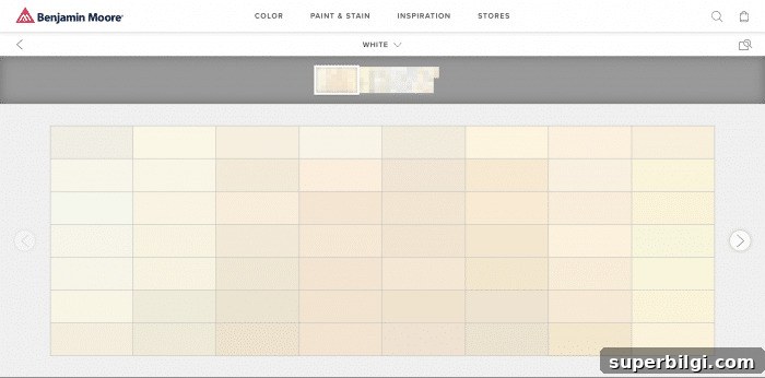
Swatches rarely look like pure white on a screen; they let you see the undertones and how subtle shifts could affect the final result. Whites can skew blue, green, or yellow depending on light and neighboring colors, so swatch inspection helps anticipate those shifts.
3. Get Real Samples and Apply Them
Because whites are so nuanced, testing a paint sample on your wall is essential. Paint several large swatches—either directly on the wall or on poster boards you can move—and observe them across different times of day and types of light. A color that looks perfect at noon might read differently in evening light.
If you need help deciding whether a cool or warm white works with your home’s palette, consult guidance on creating a whole-house color palette. Mildly warm whites often work best on walls because they feel inviting without appearing yellow.
Top 10 Favorite White Paint Colors for Your Home
To simplify your search, here are ten widely used and loved white paint colors. These options are popular among designers and homeowners because they perform well in a variety of settings. Test any of them in your own space before committing.
1. Decorator’s White — Benjamin Moore
Decorator’s White reads like a clean, slightly cool white with faint gray undertones. It often reads as a true white in most light and is a consistent favorite among builders and designers for a crisp, neutral look.
2. Shoji White — Sherwin-Williams
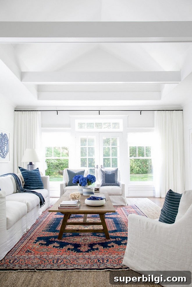
Shoji White is a soft, understated white with subtle gray-green undertones. It can look pale gray in some rooms and more white in others, so it’s one you should sample on your walls. It pairs beautifully with deeper accent colors.
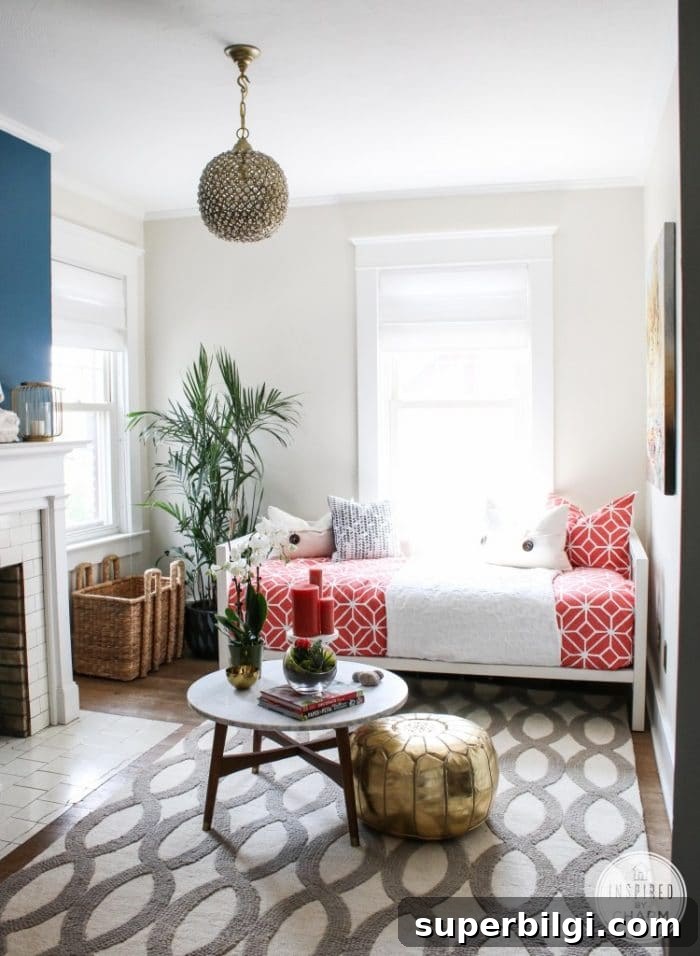
3. Extra White — Sherwin-Williams
If you want a bright, pure white that makes colors pop, Extra White is a strong choice. It’s excellent when you want a clean, contemporary backdrop.
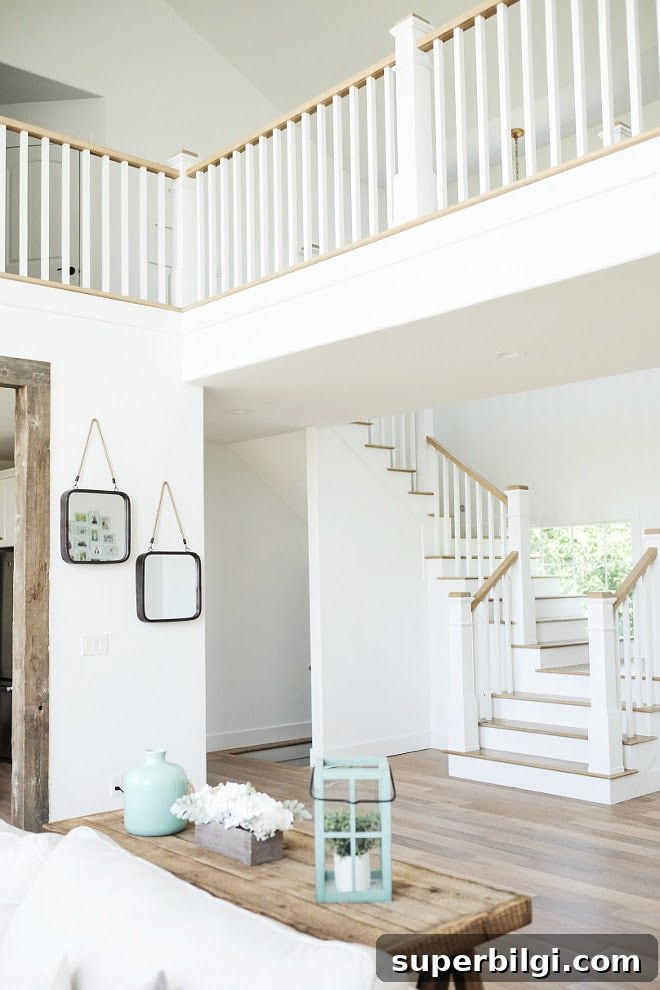
4. White Dove — Benjamin Moore
White Dove is a gentle, cool white with a very subtle undertone that rarely reads yellow. It’s a top pick among designers and often used for both walls and trim when a soft, classic white is desired.
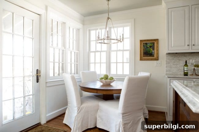
5. Simply White — Benjamin Moore
Simply White is my personal go-to. It’s a subtle, warm white with a soft glow that doesn’t read yellow. I’ve used it on cabinets, board-and-batten, and walls throughout my home. It was Benjamin Moore’s 2016 Color of the Year and remains a versatile, timeless choice.
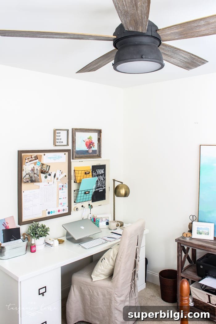
6. Paper White — Benjamin Moore
Paper White leans pale gray and pairs beautifully with cool tones like blue and violet. It’s an elegant, subdued option for walls that want to read slightly cooler without feeling stark.
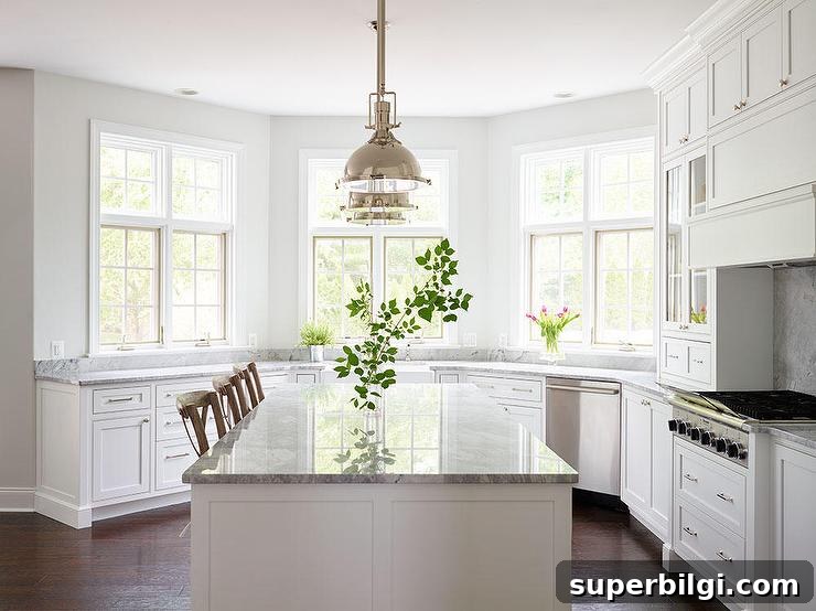
7. Dover White — Sherwin-Williams
Dover White is a softly warm white that works exceptionally well on cabinets and trim. If you like a warmer white but not one that’s overtly yellow, Dover White is a great option.
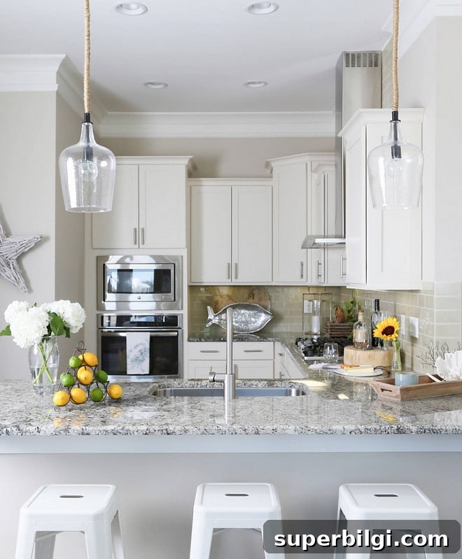
8. Alabaster — Sherwin-Williams
Alabaster is an off-white with a subtle warm yellow undertone. It was Sherwin-Williams’ 2016 Color of the Year and pairs nicely with slightly warmer trim and furniture. (Note: Benjamin Moore’s Alabaster is different—be sure to confirm which formula you’re sampling.)
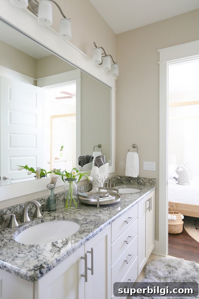
9. Antique White — Sherwin-Williams
True to its name, Antique White has a warm, creamy undertone that reads as soft and slightly aged. It’s lovely on furniture or in farmhouse and vintage-inspired interiors where a warmer, softer white is desirable.
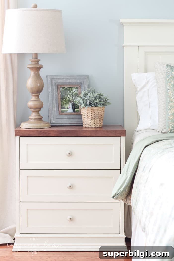
10. Snowbound — Sherwin-Williams
Snowbound is a soft, slightly warm white with faint gray undertones. It reads as a gentle white without glaring in natural light and is a popular choice for walls, ceilings, trim, and exteriors.
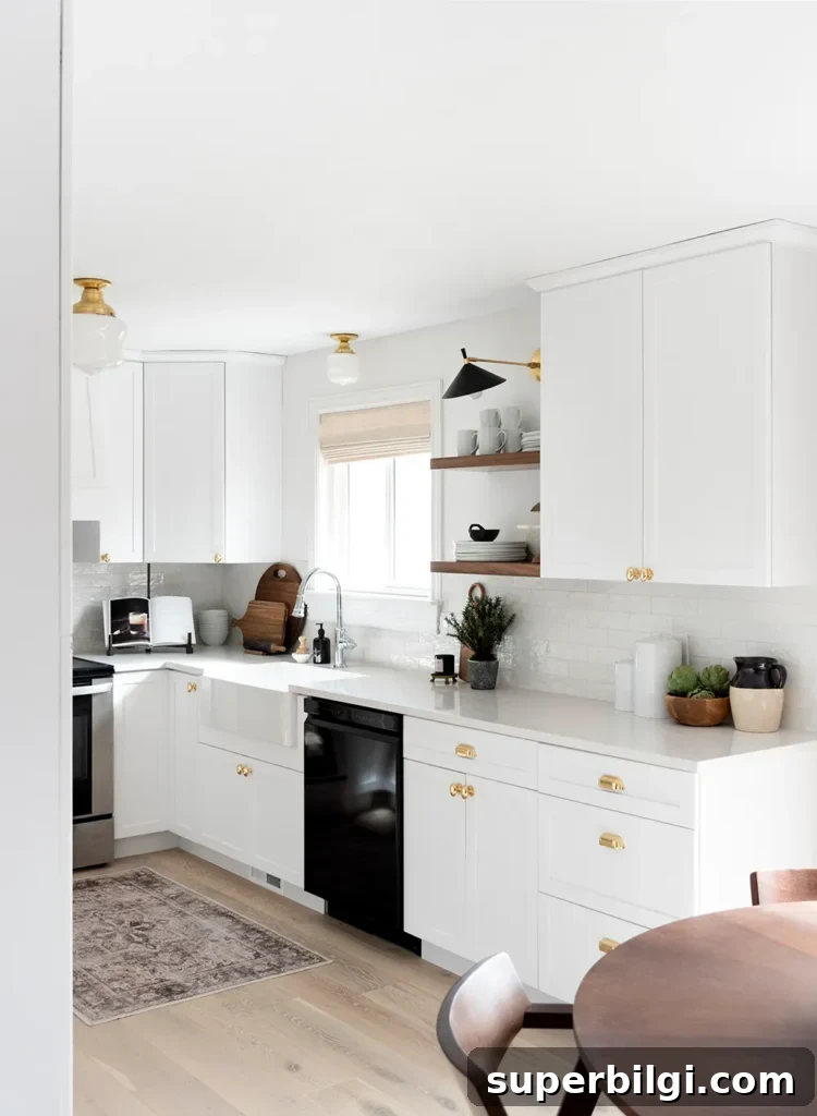
I hope this roundup makes choosing your white paint easier. With careful sampling and a bit of patience, you’ll find a white that complements your home’s lighting, trim, and furnishings. You’ll love the result.
Bonus tip: To make walls and trim feel cohesive, use the same paint color in different sheens—eggshell for walls and semi-gloss for trim. Different sheens won’t look like different colors when they’re the same formula, but they will reflect light differently and read perfectly together.
More recommended paint colors
- Agreeable Gray
- Repose Gray
- Sea Salt
- Hale Navy
- Revere Pewter
- Gray Owl
- Wythe Blue
- White Dove
Tips for Painting a Room Yourself
If you’re tackling the paint yourself, gather the right tools and follow a straightforward process. My post on painting a room in five easy steps covers preparation, cutting in, rolling technique, and cleanup. The basics you’ll want include:
- Quality paint brush — well-made brushes last longer and produce cleaner lines when cared for properly.
- Painter’s tape — essential for crisp edges if you don’t have a steady hand.
- Drop cloths — protect floors and furniture.
- Paint cup — a comfortable, well-designed cup can make painting less tiring.
- Roller tray and liners — liners make cleanup much easier and help keep a tidy workspace.
More posts you might like:
- The Best Green Paint Colors For Your Home
- Best Living Room Paint Colors
- The Best Bedroom Paint Colors
- How to Paint Outlet Covers
- Beautiful Interior Door Paint Colors