
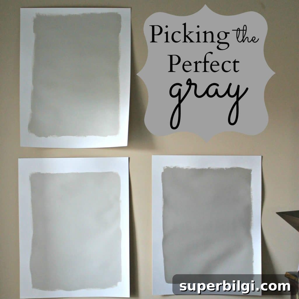
Revere Pewter is a light gray with warm undertones; this classic shade creates a comfortably sophisticated look that soothes and restores.
After a long search, I finally found the perfect color to paint my open living areas and hallways: a warm, balanced gray. Before I share my final choice, here’s a short guide to how I narrowed it down and why Revere Pewter stood out.
This post originally included affiliate links for convenience.
Gray is the go-to neutral right now, and while trends change, a well-chosen gray can feel timeless. I had previously used a warm beige called Latte and liked how it worked with bright accents like a red couch and turquoise accessories. However, the new house arrived with a neutral beige in flat paint, which wasn’t practical with a small child in the home. That pushed me to repaint and choose a durable, beautiful neutral I’d be happy with long-term.

Want to Save This?
Enter your email below and I’ll send it directly to your inbox!
I decided to try gray because I wanted to experiment with a look I hadn’t used in my own home before. Paint is reversible, and if I tire of it in a few years I can always change it. I enjoy the process of painting, so it felt like a fun update rather than a risk.
After extensive research—hours of reading, comparing online swatches, and staring at paint chips—I narrowed my test colors to four Benjamin Moore options: Rockport Gray, Revere Pewter, Grant Beige, and Hazy Skies. I prefer Benjamin Moore’s palette for its depth and historical shades.
Grant Beige seemed promising as a greige mix, but in person it leaned too beige for my goals. My husband prefers beige, so I included a few greige samples to bridge our tastes, but Grant Beige didn’t make the final cut.
Hazy Skies and Revere Pewter are close cousins: both are subtle, warm grays. Hazy Skies reads slightly greener, while Revere Pewter has the warm neutral balance I wanted. Rockport Gray appealed to us for its depth, but it was noticeably darker and risked feeling heavy across every wall.
The winner: Revere Pewter.
I’d been leaning toward Revere Pewter from the beginning, but testing other options confirmed it was the right choice. To make a confident decision, I recommend sampling several favorites and painting them on poster board or directly on the wall. I used inexpensive poster board and had the paint store tint small sample pots to the Benjamin Moore colors. That allowed me to move swatches around the house and observe them at different times of day.
When testing, keep a white border around each swatch to neutralize the influence of the existing wall color. I also moved samples to hallways with little direct sunlight to see how they behaved in low light. Lighting makes a dramatic difference, and a color that looks perfect in bright rooms can feel dull in shadowed spaces.
I’m excited to paint my living room, entryway, and hallways in Revere Pewter, but I’m pausing for timing—my husband’s birthday and some visiting friends are coming up, and painting the whole house with company around would be chaotic. There’s also a domino effect with the living room plans: I’m installing board and batten and want to paint the upper portion gray and the lower portion white before attaching trim. That minimizes extra trim painting and will help the finished result look crisp. I’m also considering built-ins, so several decisions depend on each other and will need to be planned together.
If you’re choosing a neutral: take your time, test samples on boards or walls, observe them in varying light, and consider how other elements—trim, furniture, and built-ins—will interact with the paint. Revere Pewter struck the right balance of warmth and neutrality for my home, and once I painted my living room, I fell even more in love with it.
Below are images showing Revere Pewter used in living and bedroom spaces over the years. These examples demonstrate how the color adapts to different lighting, furnishings, and seasons.
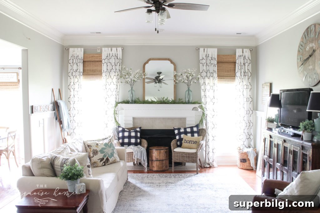
Quick & Simple Coastal Summer Mantel Decor
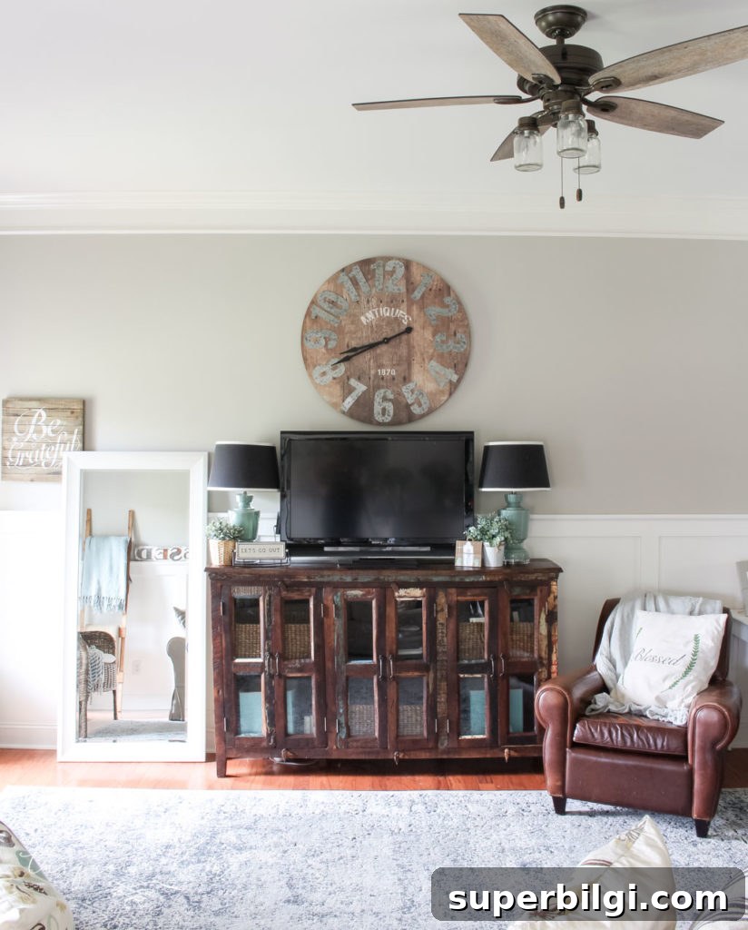
When we moved, I painted our primary bedroom in Revere Pewter too. It creates a calm, sophisticated backdrop that complements linens and natural textures beautifully.
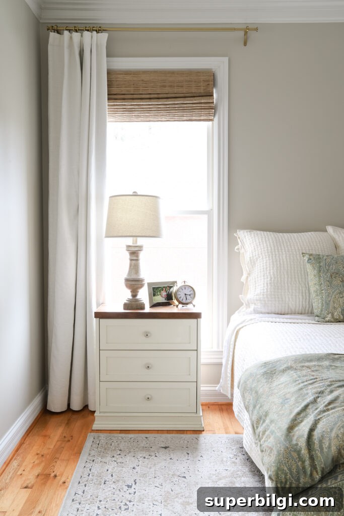
Our current bedroom painted in Revere Pewter
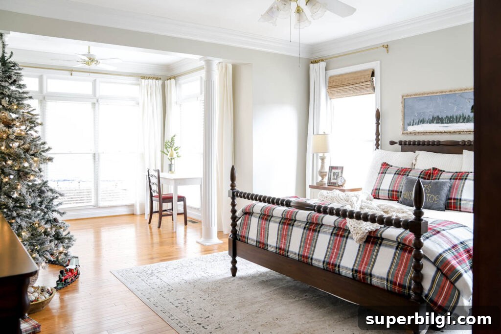
Our primary bedroom decorated for Christmas
If you like Revere Pewter, you might also be interested in pairing options and other favorite paint selections for living rooms and bedrooms. Thoughtful coordination of trim, accent colors, and finishes makes a neutral like Revere Pewter feel intentional and warm.
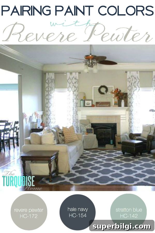
Pairing Paint Colors with Revere Pewter

Paint colors used throughout my home
More posts you might like:
- The Best Green Paint Colors For Your Home
- Best Living Room Paint Colors
- The Best Bedroom Paint Colors
- Sherwin Williams Extra White (SW 7006)
- Benjamin Moore Stonington Gray