

Benjamin Moore Van Deusen Blue (HC-156) is a striking medium-to-dark blue with gray undertones that reads as a neutral. Could this be the perfect paint for your space? Read on to find out.
Neutral colors have long dominated interior design because they feel safe, versatile, and easy to pair with many styles and palettes. Lately, designers are embracing richer, bolder hues that still function like neutrals—deep, sophisticated colors that ground a room while allowing other finishes and furnishings to shine.
Navy and deep blues are excellent examples of this trend. Although they feel bold, many navy tones behave like neutrals in practice, much like a favorite pair of denim pairs effortlessly with a variety of colors. If you want the depth of navy without the almost-black intensity of the deepest blues, Benjamin Moore Van Deusen Blue (HC-156) is a superb middle ground.
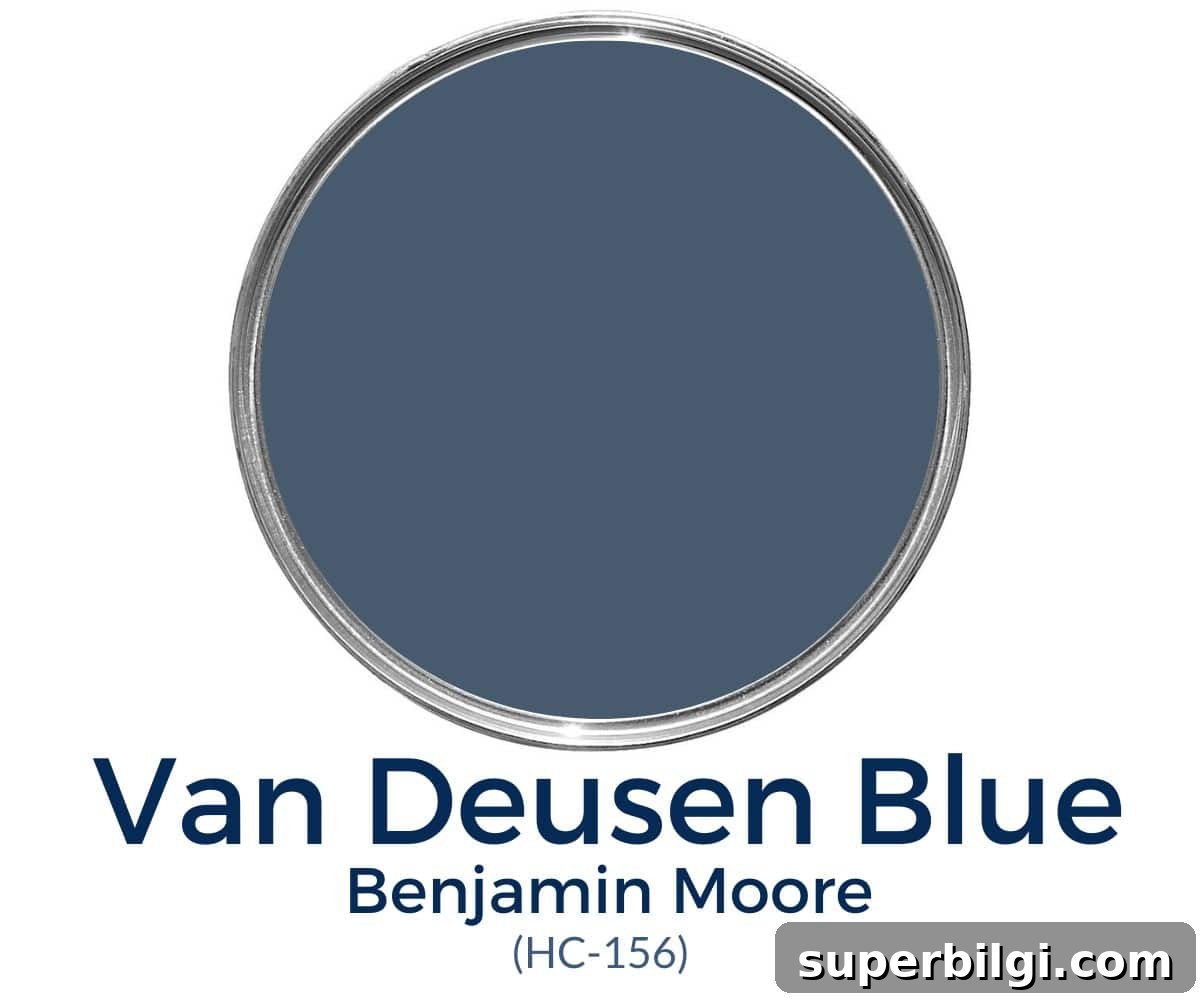
Van Deusen Blue is a classic from Benjamin Moore’s Historical Collections. It reads as a rich, neutral blue without obvious green or purple casts, making it a highly versatile choice for many interior and exterior applications.
What color is Benjamin Moore Van Deusen Blue?
Key characteristics of Van Deusen Blue:
- Bold yet neutral blue that leans cool without feeling icy
- Deep blue—many consider it a navy—with a Light Reflectance Value (LRV) of 12
- Popular for walls, accents, cabinetry, and trim contrasts
- Subtle gray undertones that keep it balanced and moody rather than bright
PRO Tip
Always test the actual paint in your space before committing. Peel-and-stick real-paint samples or painted swatches viewed in different lighting will give you the best sense of how Van Deusen Blue performs at various times of day.
Undertones in Van Deusen Blue
Van Deusen Blue is best described as a muted, moody blue. Its dominant undertones are gray, which softens the intensity and prevents the hue from feeling overly bright. In some lighting situations you might detect a very subtle hint of green, but that tint is usually faint and not the defining quality.
Lighting has a large effect on how this paint reads. North-facing rooms and cool light will emphasize the gray undertones, making the color feel moodier. South-facing rooms or warmer artificial light will bring out more of the blue character and make the shade appear brighter and more balanced.
LRV of Benjamin Moore Van Deusen Blue
Light Reflectance Value (LRV) measures how much light a color reflects on a scale from 0 (black) to 100 (white). Van Deusen Blue has an LRV of approximately 12, which places it on the darker side but not as deep as some other navy tones. For example, some very dark navies have LRVs below 10, so Van Deusen Blue reads rich without being nearly black.
Because it is relatively dark, consider the room’s natural light before applying this shade to all four walls. In rooms with ample natural light, Van Deusen Blue can create dramatic yet welcoming spaces. Paint finish also affects perceived darkness: glossier sheens reflect more light and will look lighter than flat or matte finishes in the same color.

Benjamin Moore Van Deusen Blue — Coordinating Colors
Van Deusen Blue plays beautifully with a wide range of hues. It pairs especially well with lighter blues and blue-greens, soft grays, warm neutrals, pale pinks, mustard and muted yellows, and natural wood tones and stone.
Benjamin Moore suggests complementary pairings such as Aloe Vera, Mt. Rainier Gray, and Yellow Freeze. Popular and reliable matches include:
- Simply White, White Dove, or Cloud White for crisp trim and accents
- Revere Pewter or Gray Owl for softer gray coordinates
- Silver Mist or Water’s Edge for a soothing palette
- Warm beiges, wood tones, and subtle pinks or papaya accents for contrast
Best Trim Colors to Pair with Van Deusen Blue
Crisp, clean whites create a classic contrast with Van Deusen Blue. Consider Benjamin Moore shades such as Simply White, Chantilly Lace, or Pure White for trim, baseboards, and ceilings to keep the overall look fresh and defined.
Van Deusen Blue on a Color Strip
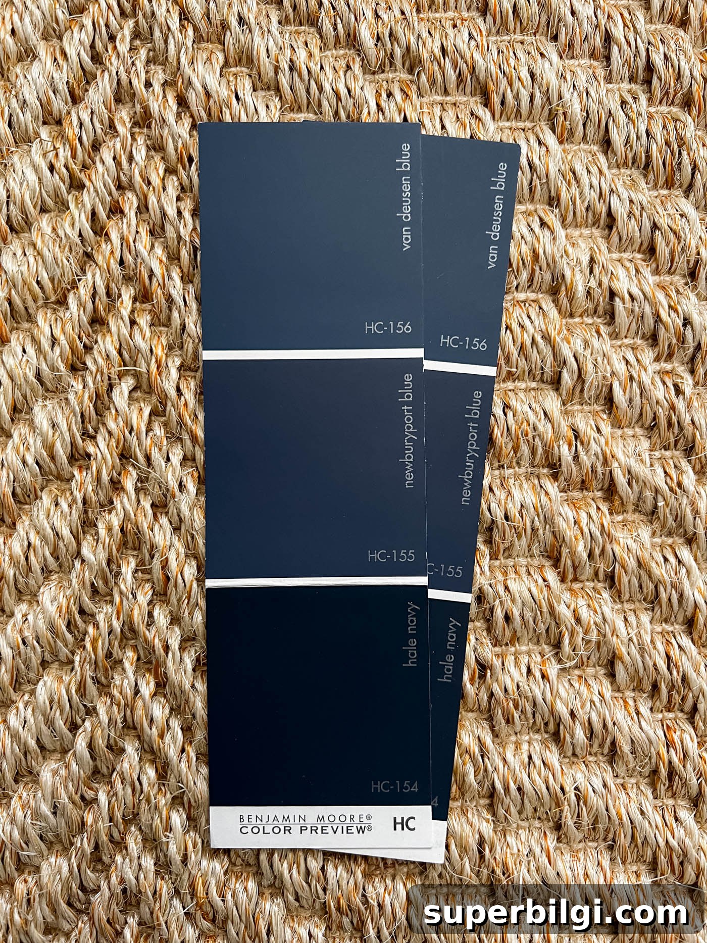
On Benjamin Moore sample strips, Van Deusen Blue commonly appears near other deep blues such as Newburyport Blue and Hale Navy. Those adjacent colors can help you compare strengths of blue and choose the depth that best suits your project.
Where to Use Benjamin Moore Van Deusen Blue
This shade is incredibly versatile. Use it anywhere you want bold color that remains refined. Popular applications include:
- Kitchen cabinets and islands
- Doors and trim accents
- Bathroom vanities
- Interior and accent walls
- Exterior siding, shutters, and front doors (with attention to sun exposure and fading)
Is Van Deusen Blue a good color for cabinets?
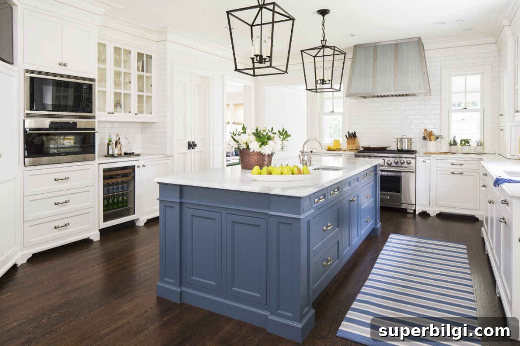
Yes. It’s a favorite for cabinetry because it offers depth and character without overwhelming the room. On lower cabinets or islands, Van Deusen Blue provides a focal point while still coordinating with a range of countertops and hardware finishes.
Home Styles That Work with This Blue
- Farmhouse
- Traditional
- Transitional
- Coastal
- Modern classics and eclectic interiors
Room Examples Using Van Deusen Blue
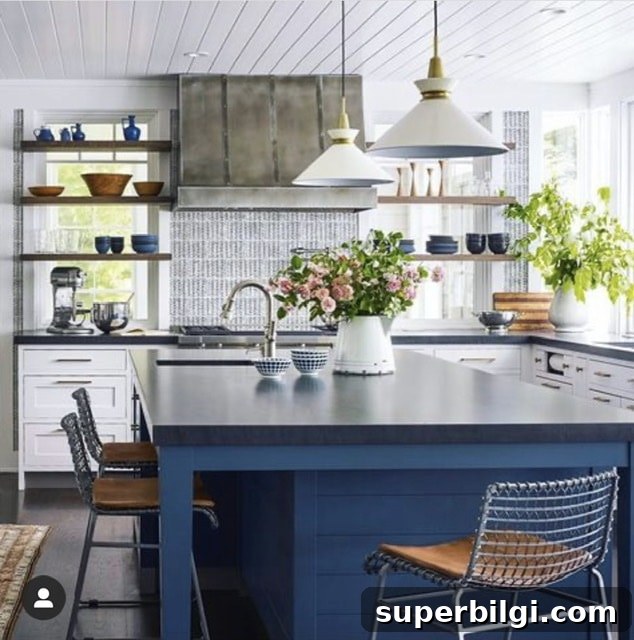
Below are a few typical applications showing how Van Deusen Blue appears in different lighting and design contexts. Notice how the shade shifts with light and surrounding finishes.
Van Deusen Blue Kitchen
On lower cabinets and islands, this blue creates drama and polish. Paired with gray or white countertops, it becomes a standout anchor that still feels sophisticated and approachable.
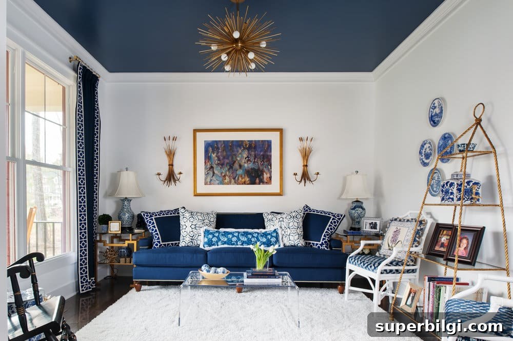
Van Deusen Blue Living Room
Used on a ceiling or in accents, Van Deusen Blue can add unexpected depth and create a cohesive look when paired with white walls and navy accessories. A painted ceiling in this hue can also visually raise perceived ceiling height when balanced correctly.
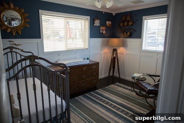
Bedroom in Van Deusen Blue
In bedrooms or nurseries, Van Deusen Blue creates a restful, classic atmosphere. In spaces with limited natural light it will read darker and moodier; in bright rooms it will feel rich and balanced.
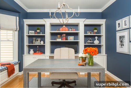
Home Office
Blue tones support focus and calm, making Van Deusen Blue an excellent choice for a home office where concentration and elegance are desired.
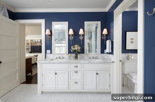
Bathroom
Van Deusen Blue can work beautifully in bathrooms with good natural light. When balanced with white tile, bright fixtures, or brass accents, it creates a timeless, spa-like feel.
Frequently Asked Questions
Is Benjamin Moore Van Deusen Blue warm or cool?
Van Deusen Blue is generally considered a cool blue due to its gray undertones, though it can feel balanced and inviting in warmer light settings.
Can I use Van Deusen Blue on an exterior?
Yes. It makes a sophisticated exterior color, but keep in mind that dark paints exposed to strong sun can fade faster than lighter colors. For exteriors with heavy sun exposure, expect gradual fading and plan for upkeep or protective finishes accordingly.
Overall, Benjamin Moore Van Deusen Blue (HC-156) is a refined, timeless blue that adds elegance whether used on walls, cabinets, doors, or trim. Its muted gray undertones keep it versatile and easy to coordinate with many palettes and finishes.
More Paint Colors to Consider
If you’re exploring other dependable shades, consider neutral and popular choices such as Swiss Coffee, Repose Gray, Agreeable Gray, Accessible Beige, Comfort Gray, Mindful Gray, and Iron Ore.
Tools to Help You Paint a Room Yourself
For a DIY paint job, helpful tools include quality paint brushes, painter’s tape, drop cloths, a paint cup or bucket with brush holder, a reliable roller tray and liners, and real paint samples to test color in your lighting before purchasing gallons.
Final note: Always sample Van Deusen Blue in the actual room and observe it at different times of day. That will ensure you get the exact look and mood you want.