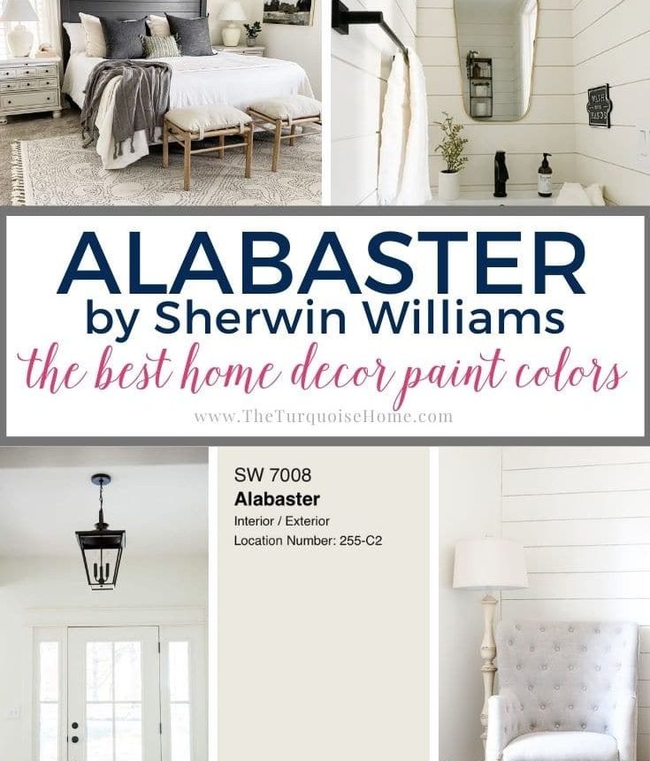
Sherwin Williams Alabaster White (SW 7008) is celebrated for its soft, creamy tone. This gentle white has been a favorite for years and was even named Sherwin Williams’ Color of the Year in 2016.
Alabaster has proven its longevity and remains one of Sherwin Williams’ most popular whites. Its balanced warmth and subtlety make it a versatile choice for a wide range of spaces.
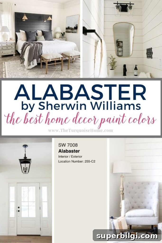
White walls are a timeless option for the home. Neutral paint choices like Alabaster remain stylish across decades because they provide a clean backdrop that complements a variety of design elements and color palettes.
PRO Tip
Always test the real paint color in your own space before committing to a full purchase.
The easiest way to preview a paint color is to apply a real paint sample or use a peel-and-stick sample made from the actual paint. These samples let you observe the color at different times of day and under various lighting conditions. Save the sample for future reference so you can compare it to fabrics, flooring, and other finishes in your room.
What makes Sherwin Williams Alabaster White so appealing is how faint its undertones are. Because it doesn’t heavily favor warm or cool tones, it pairs nicely with warm brass and wood finishes as well as with the gray and blue hues that are popular today.
Alabaster works well on interior walls, exterior siding, and kitchen cabinets. It’s a reliable, approachable white that won’t overpower a room or appear too stark.
What Color Is Alabaster?
Sherwin Williams describes Alabaster as an understated, alluring white—not stark and not overly warm. In practice, it reads as a soft white that sits comfortably between warm and cool on the spectrum, making it an easy match for many design choices.
Alabaster White Undertones
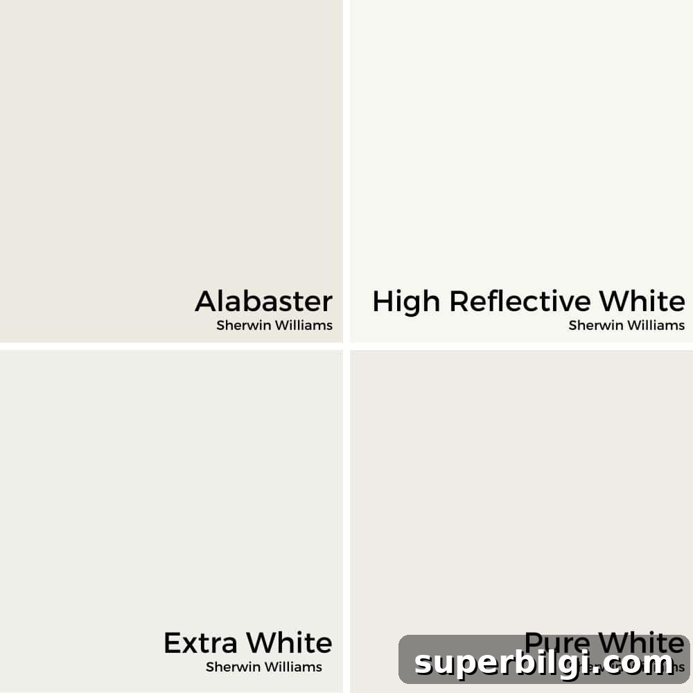
Although Alabaster is technically classified as a warm white, it rarely reads as strongly yellow. Its undertones are subtle—many people notice a gentle greige quality (a blend of gray and beige) that creates a creamy, balanced appearance. Depending on lighting and adjacent colors, either the gray or beige qualities may become more apparent.
When compared side by side with true, cool whites (which often have blue undertones), Alabaster will show a softer, creamier character. On its own, Alabaster will appear mostly white with a slight warmth, rather than a stark, clinical white.
LRV of Sherwin Williams Alabaster White
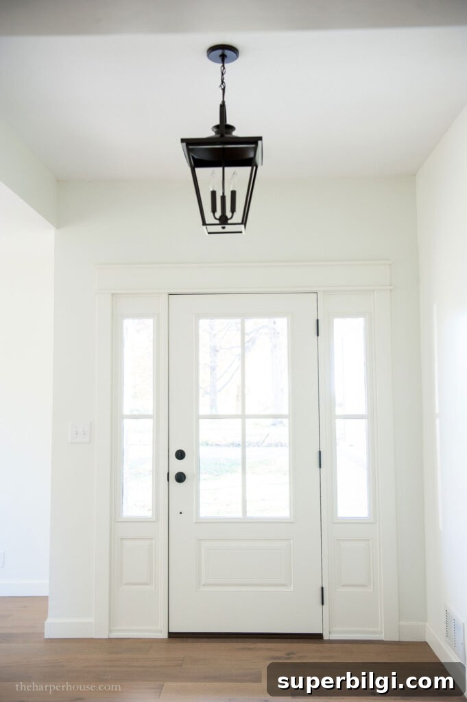
Light Reflectance Value (LRV) measures how much visible light a color reflects. Higher LRVs indicate more reflectance and a brighter appearance. Alabaster has an LRV of 82, which means it reflects a significant amount of light and will brighten spaces without feeling glaring.
Lighting direction changes the way Alabaster reads: north-facing rooms tend to make colors feel cooler and more muted, while south-, east-, and west-facing exposures bring out warmer tones. West-facing rooms often emphasize warm highlights most strongly, so Alabaster will tend to glow warmly in those settings.
Alabaster vs. White Dove and Simply White
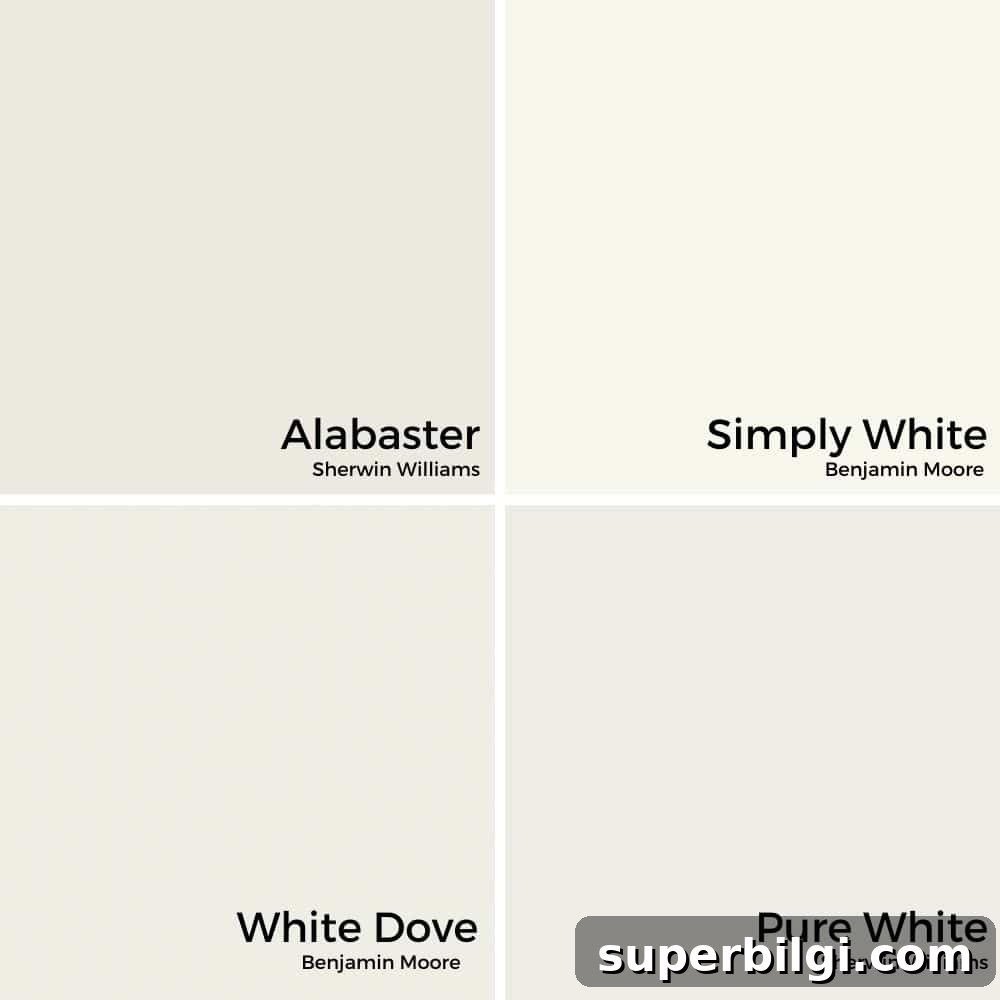
Alabaster is often compared to other popular whites like Benjamin Moore’s White Dove and Simply White. Alabaster is slightly warmer and a touch darker than White Dove (LRV 85), and it typically shows less yellow than Simply White. If you prefer Benjamin Moore finishes, White Dove is one of the closest matches to the Alabaster look.
Complementary Colors for SW Alabaster White
Because Alabaster is so neutral, it pairs well with a wide range of colors. Testing paint combinations is always recommended before committing, but here are some easy starting points:
- Soft blue-greys and seafoam hues for a calming palette.
- Warm beige and tan tones to emphasize a cozy, traditional feel.
- Deep, saturated colors—like navy or charcoal—to create crisp contrast and make Alabaster look even brighter.
- Earthy tans such as townhome or wheat-inspired shades for a harmonious warm combination.
Using Alabaster White in the Home
Wall Colors
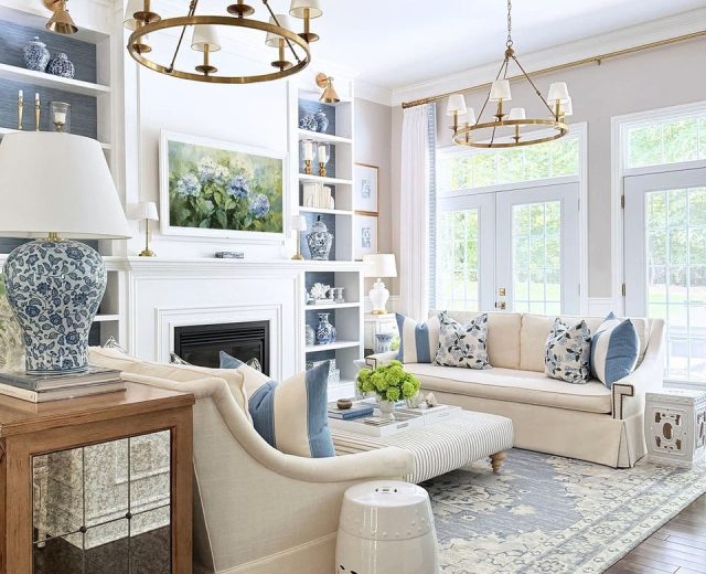
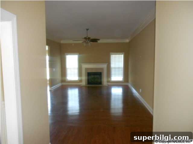
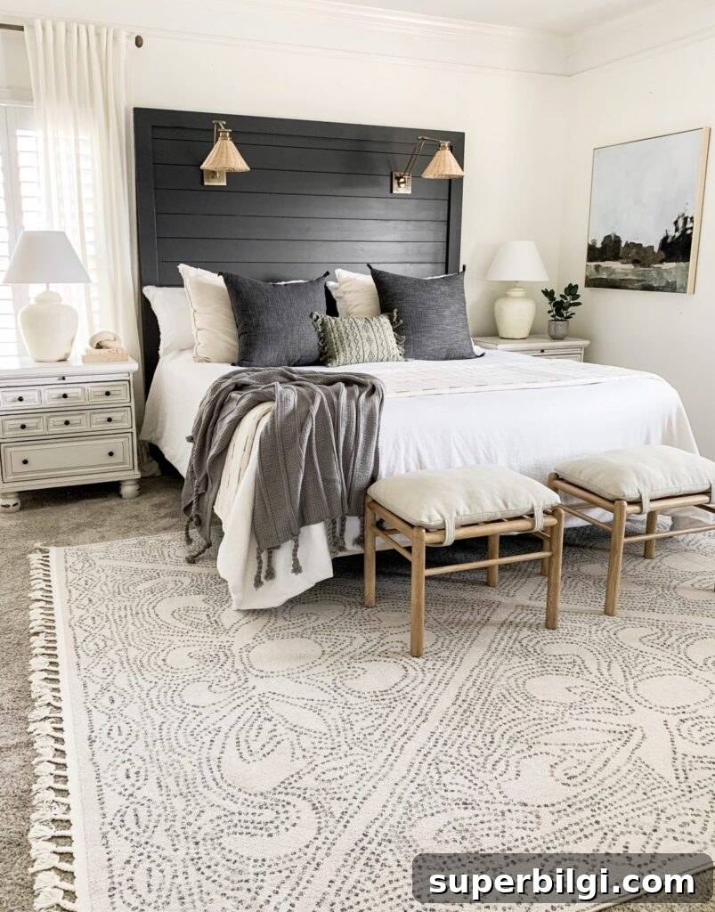
Alabaster is an excellent choice for walls in almost any room. It is bright without being stark, and its subtle warmth allows furnishings and décor to take center stage. If you want a worry-free, designer-friendly base that adapts well as you change your décor, Alabaster is a strong contender.
Trim and Molding
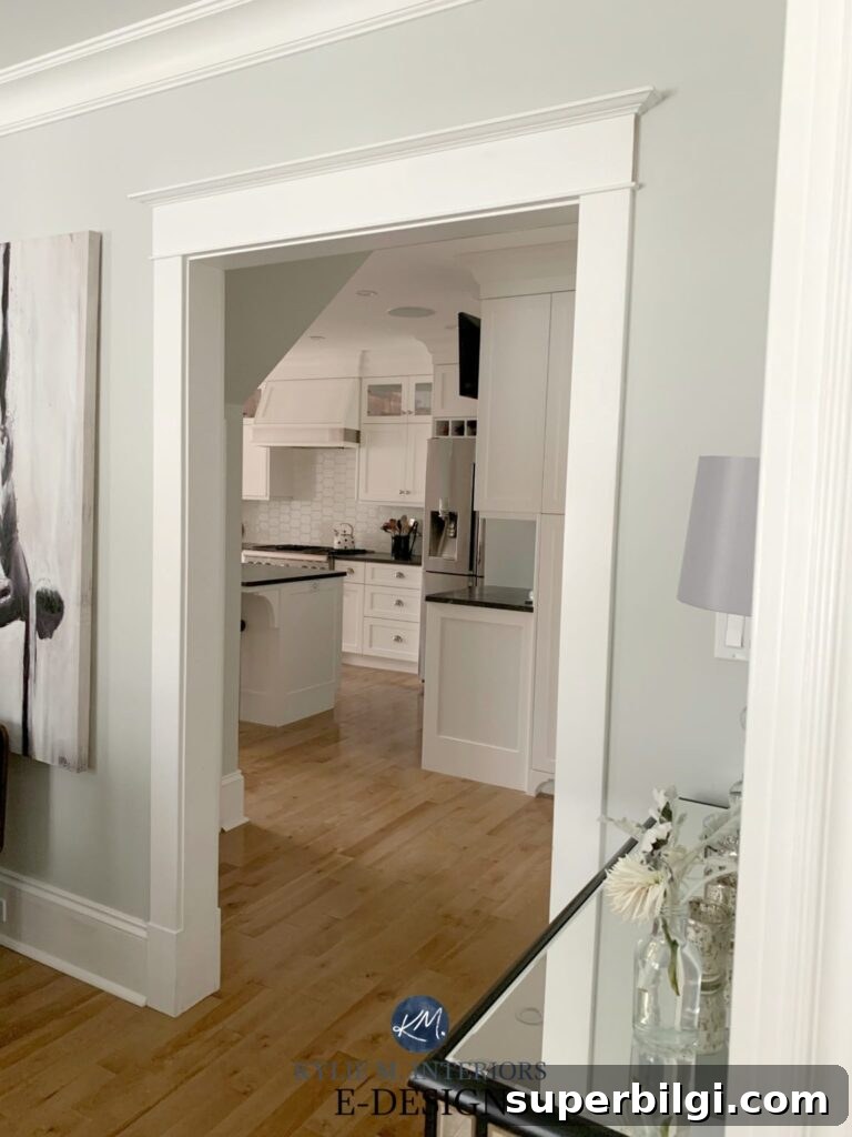
Alabaster also works beautifully on trim and molding. Pairing slightly different whites—for example, a wall painted in Alabaster and trim in a crisper white or a semi-gloss finish—creates a subtle, elevated contrast that reads as intentional and refined.
Cabinets
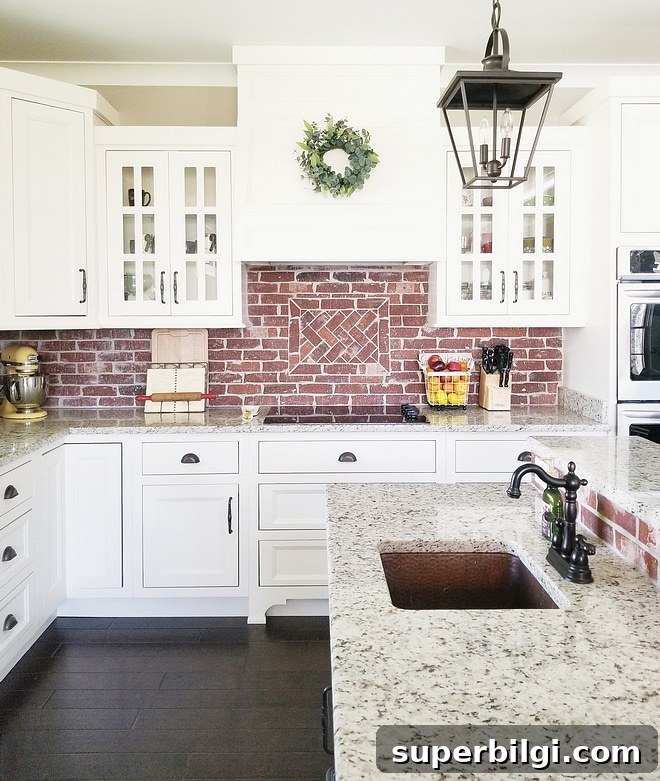
Alabaster is a lovely cabinet color for kitchens, bathrooms, and laundry rooms. It offers a clean look without the harshness of a pure white, making it appealing in both traditional and modern spaces.
Shiplap
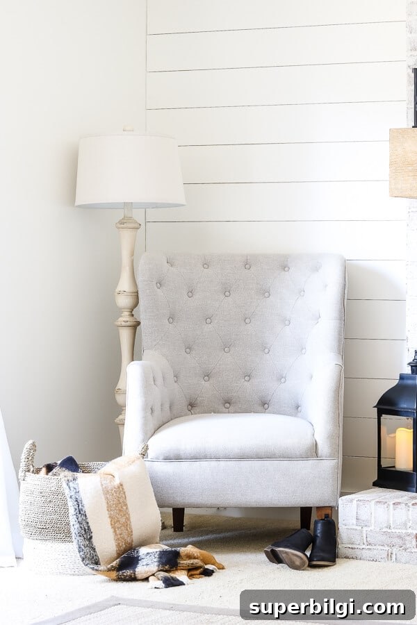
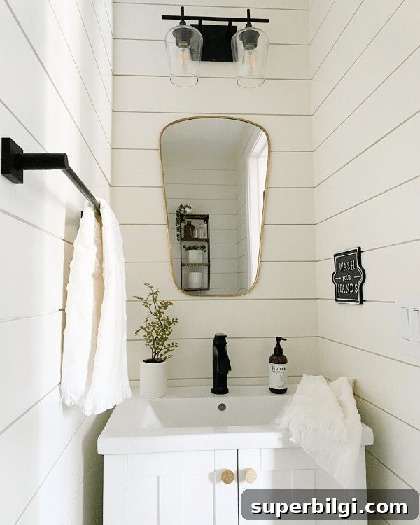
Alabaster suits shiplap and farmhouse-style interiors well. A true, stark white can sometimes look too clinical on textured wood; Alabaster’s warmth gives shiplap a softer, more inviting appearance.
Exterior Use
Alabaster also translates well outdoors. Its high LRV helps a home appear bright and fresh without the glare of a true brilliant white. For shaded exteriors or homes with varied siding and trim, Alabaster provides a flattering, enduring finish.
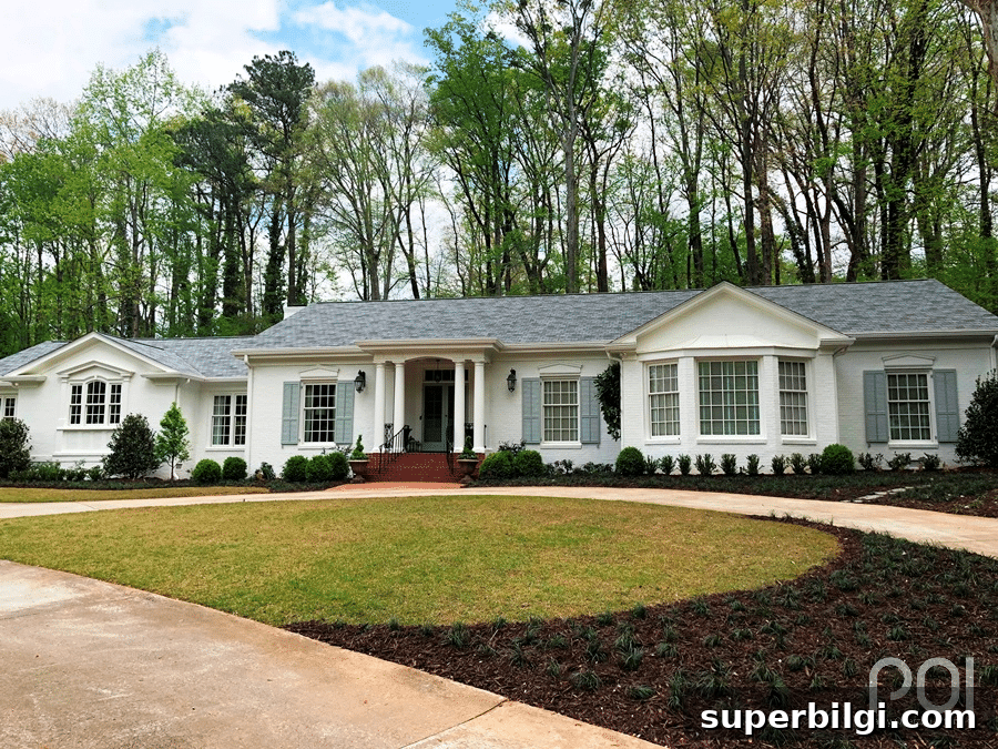
If you’re considering Sherwin Williams Alabaster White for your home, try real paint samples in the actual rooms where the color will be used. Observe the color throughout the day and with your existing furnishings to be confident in your choice.
Other paint colors you might like:
- Gray Owl
- Revere Pewter
- Hale Navy
- Shoji White
- Sea Salt
More posts you may enjoy:
- 20 Best Nursery Paint Colors And Accent Wall Ideas
- The Best 17 Sage Green Paint Colors For Your Home
- Best No-Fail Greige Paint Colors For Your Home
- Which Interior Paint Finishes to Use? (+ Where To Use Them)
- Beautiful Interior Door Paint Colors