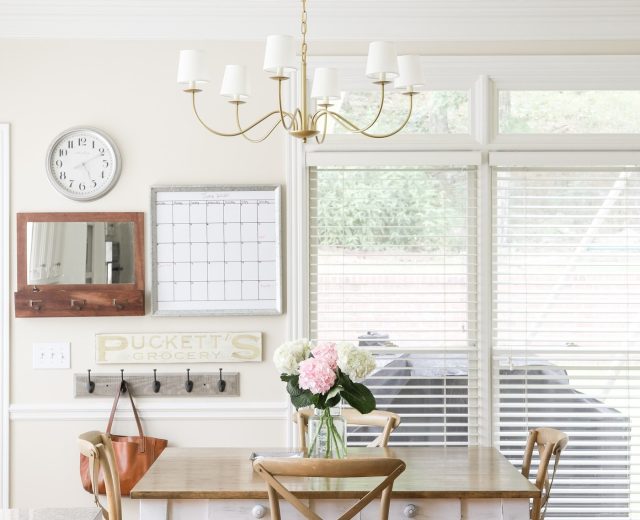

Repose Gray by Sherwin Williams is one of the most popular gray shades for good reason: it adapts beautifully to many settings. Regardless of architectural style, lighting conditions, or accent choices, Repose Gray consistently creates a calm, polished backdrop.
Sherwin Williams Repose Gray
Repose Gray is a very approachable, livable neutral that avoids feeling cold or sterile. It’s a slightly warm gray with subtle taupe undertones—what many call a “greige”—but its overall effect leans soft gray. Like any paint, its appearance shifts with natural and artificial light, so it will present differently from room to room. Despite this variability, it typically performs exceptionally well in a wide variety of spaces.

In north-facing rooms, especially those surrounded by trees or abundant greenery, Repose Gray can pick up a very faint greenish cast. In other lighting, you may notice a whisper of purple undertone; that muted purple is part of what gives the color its cozy, lived-in quality. Because the undertones are so subtle, they add depth rather than dominating the space.
Note: If you plan to paint yourself, having the right tools and testing real paint samples in your home will make a big difference.
What Colors Go with Repose Gray?
Repose Gray pairs well with a broad spectrum of colors. Sherwin Williams highlights a few coordinating options, which work particularly well together:
- Elder White SW 7014
- Pavestone SW 7642
- Coral Clay SW 9005
Repose Gray vs. Revere Pewter
Repose Gray and Revere Pewter are two of the most reliable greige choices for interiors. Both are excellent for creating a neutral, all-over palette that appeals to a wide range of tastes and complements many décor styles. That said, they aren’t identical: Repose Gray tends to read a touch grayer, while Revere Pewter usually reveals a warmer, more taupe-heavy greige. Either one is a safe bet when staging a home or selecting paint for an entire house.
Repose Gray Room Examples
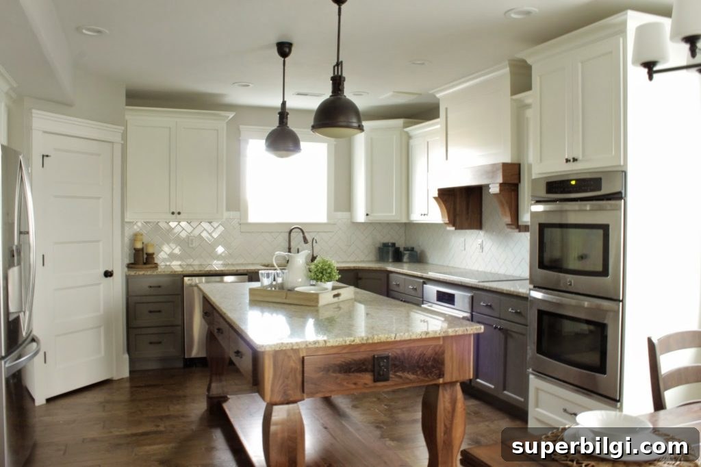
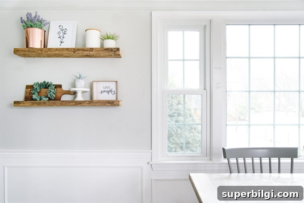
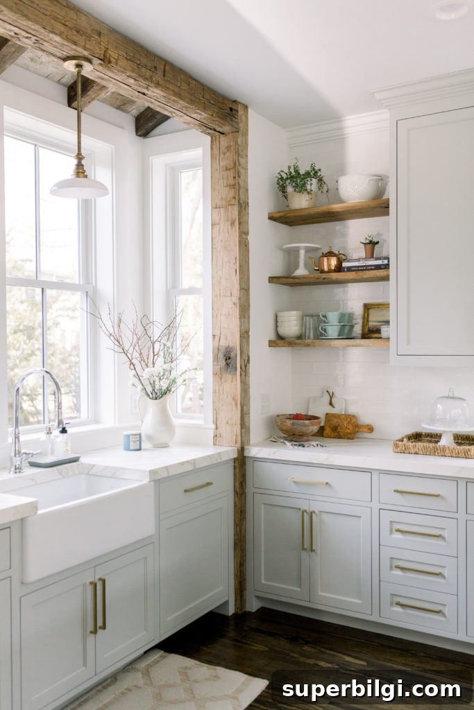
Here are practical examples of how Repose Gray performs in real rooms. Keep in mind that a paint swatch on your own wall is always the best test, but these images can give you a helpful starting point.
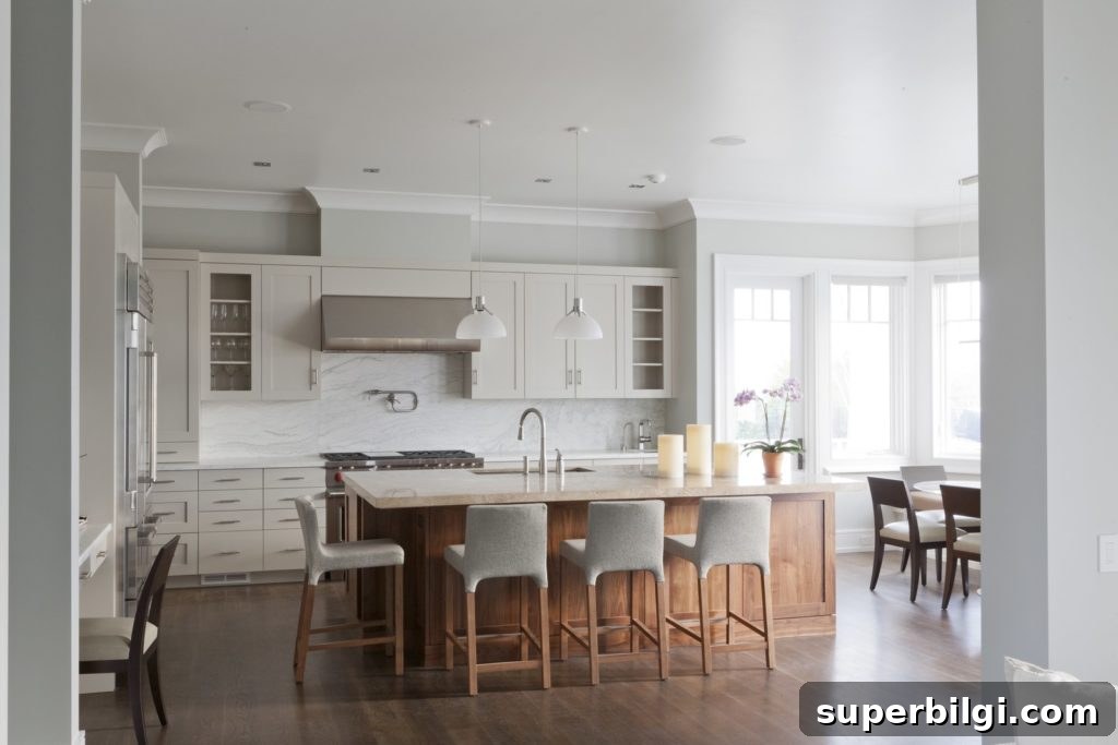
Kitchens with Repose Gray
Repose Gray is one of the rare paint colors versatile enough to work on walls, trim and cabinets. In kitchens it provides a neutral backdrop that makes white cabinets and wood accents stand out, and it pairs beautifully with marble countertops. Using it on the ceiling can also create a cozy, cohesive feel throughout the room.
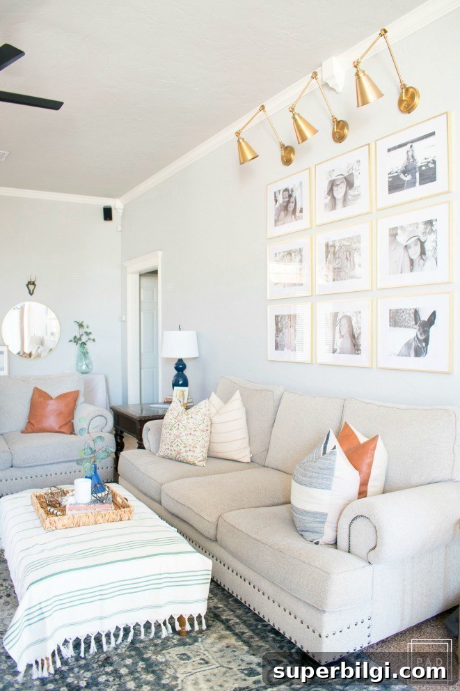
Repose Gray in Living Rooms
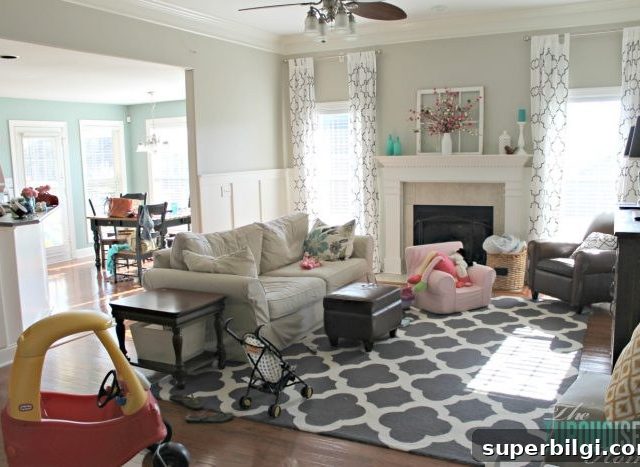
For open-concept homes or anyone seeking a consistent whole-house palette, Repose Gray is a strong choice. It keeps rooms feeling light and airy while providing visual interest through its subtle undertones. In some living rooms the greenish hint appears faintly, and in combination with metallic accents or wood finishes it can create a sophisticated, layered look.
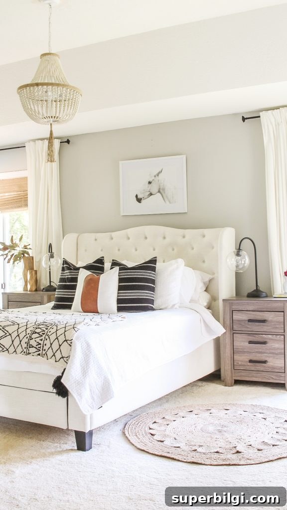
Repose Gray in Bedrooms
Neutral and calming, Repose Gray is an excellent bedroom choice. It creates a restful backdrop that allows textiles, furniture and artwork to shine without competing for attention. Because it’s so versatile, you can change accent colors and accessories without worrying about them clashing with the wall color.
If you’re considering Repose Gray, test large swatches in several spots in the room and observe them at different times of day. That will reveal how the undertones behave with your light and furnishings.
More Excellent Home Paint Colors
- Agreeable Gray
- Sea Salt
- Hale Navy
- Revere Pewter
- Gray Owl
- Wythe Blue
- White Dove
Tips for Painting a Room Yourself
A few practical tools and habits make DIY painting much easier: a high-quality paint brush, painter’s tape for clean edges, reliable drop cloths to protect floors, a good paint cup or handle for comfort, and a sturdy roller tray with liners to speed cleanup. Prepare surfaces, use primer where needed, and paint a few test swatches to be confident in your final choice.
In summary: Repose Gray is a flexible, neutral gray with subtle warm undertones that works across kitchens, living rooms, bedrooms and more. Test it in your home under your lighting conditions, and you’ll likely find it to be a dependable, elegant choice.
This article originally referenced product recommendations and paint-sampling techniques; please test real paint swatches in your own space before committing to a full paint job.