
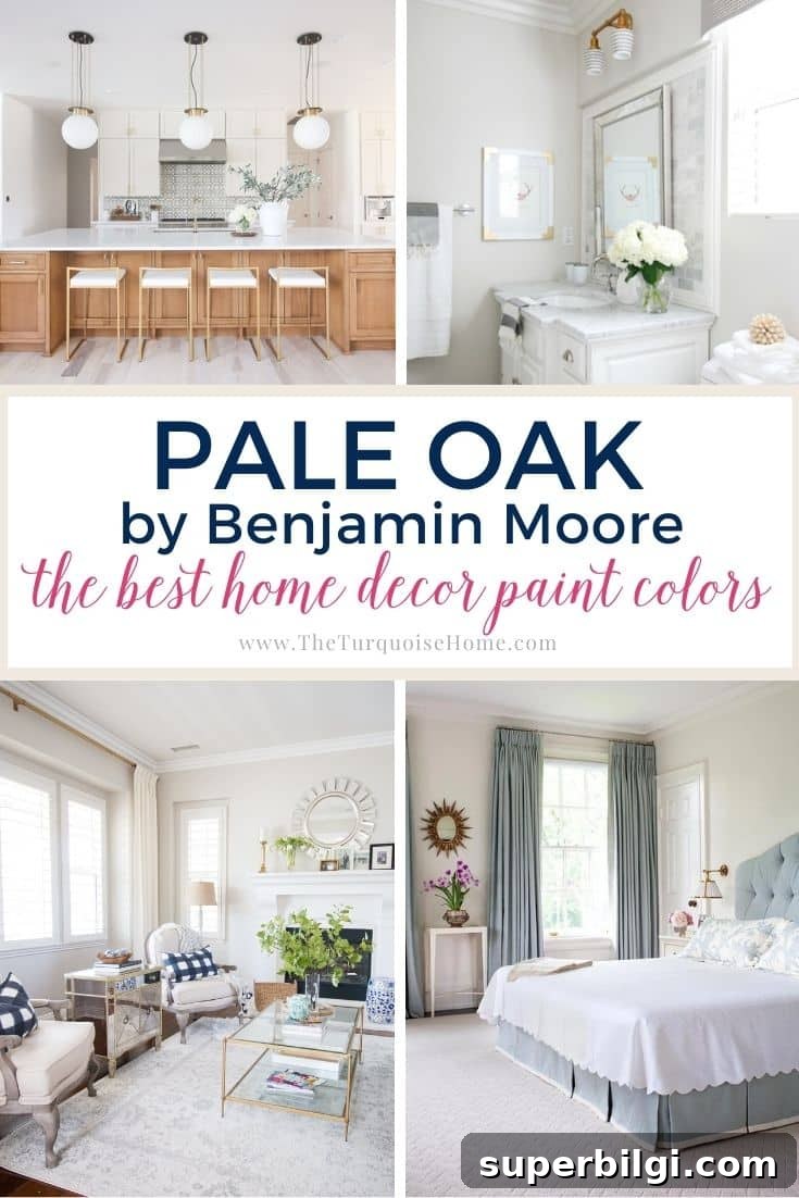
Discover the warmth and versatility of Benjamin Moore Pale Oak (OC-20), a soft greige that creates cozy, inviting rooms. See how this subtle, chameleon-like hue performs in different spaces.
If you’re searching for a warm neutral to make your home feel welcoming, Benjamin Moore Pale Oak is worth considering. This paint color is a gentle mix of gray and beige—commonly called a greige or mushroom tone—and it adapts to different lighting conditions, transforming the mood of a room.
Benjamin Moore Pale Oak (OC-20) sits between gray and beige with a faint, clear color note. It’s known for being flexible: in bright natural light it can appear more like a light gray or off-white, while in softer or limited light its warmer beige and pinkish undertones become more apparent.
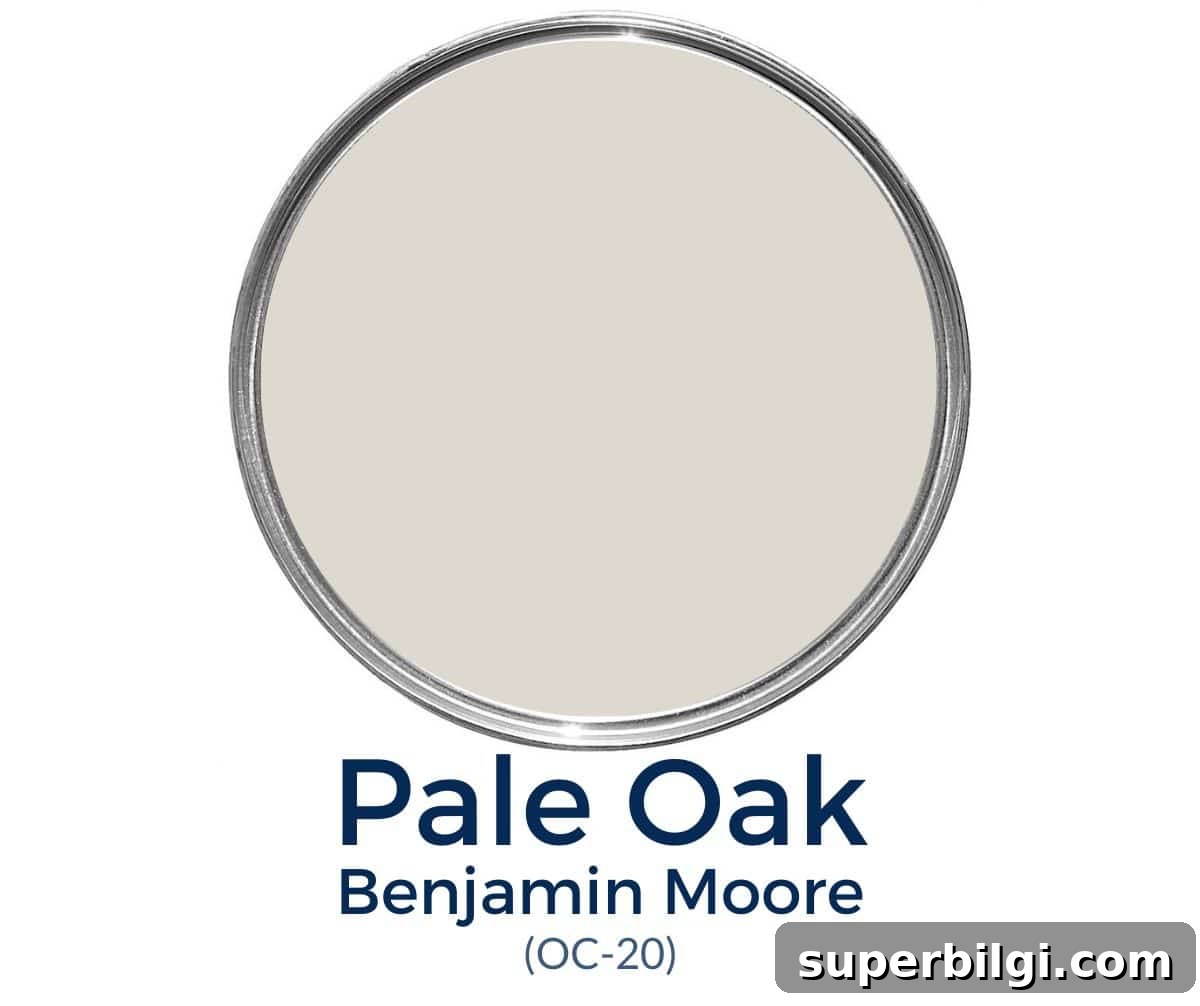
Many designers call Pale Oak a chameleon color because it shifts depending on its surroundings, but it consistently reads as warm rather than cool. Below we’ll break down its undertones, light reflectance, ideal pairings, and how it performs in bathrooms, bedrooms, kitchens, and living rooms.
Benjamin Moore Pale Oak Undertones
Pale Oak’s appearance depends largely on lighting. The most commonly observed undertone is a soft pink. While pink undertones can be surprising, when used thoughtfully they lend a subtle glow and softness that many homeowners appreciate. Some people also detect slight yellow undertones in certain lights, though these are usually less obvious.
In many settings, Pale Oak reads as a light gray with warmth rather than a true greige, which makes it highly adaptable for neutral, family-friendly interiors.

Pro tip: Always test the real paint color in your own home. Swatches or peel-and-stick paint samples are invaluable because they show how the color reacts to your room’s natural and artificial light throughout the day.
Is BM Pale Oak warm or cool?
Pale Oak is a warm tone. Compared to many greiges, it leans considerably toward warmth, making it an excellent choice when you want a neutral that adds softness and comfort without feeling cold or stark.
Pale Oak Light Reflectance Value (LRV)
Pale Oak has a light reflectance value (LRV) of 68.64. LRV measures how much light a paint color reflects on a scale from 0 (black) to 100 (white). With an LRV around 69, Pale Oak is relatively light for a greige: it brightens spaces and can read almost off-white in rooms with generous natural light.
In darker rooms or at night, its warmer undertones become more noticeable, so plan your interior lighting accordingly if you want to emphasize warmth or keep things neutral.
Pale Oak Color Strip
On Benjamin Moore’s OC series color strip around Pale Oak, you’ll find neighboring shades such as:
- Baby Fawn OC-15
- Cedar Key OC-16
- White Dove OC-17
- Dove Wing OC-18
- Seapearl OC-19
- Pale Oak OC-20
- Winter White OC-21
What colors go with Benjamin Moore Pale Oak?
Pale Oak pairs beautifully with warm, creamy whites and richer accent colors. A warm white—like White Dove—creates a cozy, cohesive palette for trim and ceilings without appearing overly yellow. For bolder accents, deep navy hues such as Hale Navy provide contrast and depth while still complementing Pale Oak’s gray undertone.
For trim, a clean white with minimal undertones works best if you want a crisp contrast. Popular options include Simply White and Chantilly Lace; these help define architectural details without clashing with the subtle warmth of Pale Oak.
Benjamin Moore Pale Oak vs Other Greiges
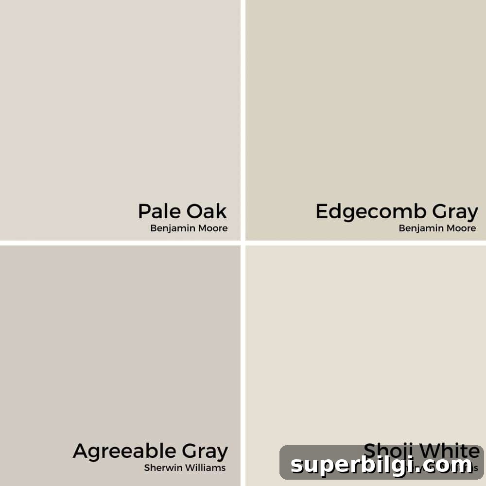
Pale Oak vs Edgecomb Gray
Edgecomb Gray is another beloved greige that tends to read a bit more traditionally neutral. It can lean toward green in some lights and has an LRV lower than Pale Oak, which helps it avoid washing out in bright rooms. Because Edgecomb Gray carries faint green undertones, pairing it next to Pale Oak can make Pale Oak’s pink tones more noticeable, so choose pairings carefully.
Pale Oak vs Agreeable Gray
Sherwin-Williams Agreeable Gray is a bestseller known for its approachable beige-gray balance. It often reads slightly cooler than Pale Oak due to subtle blue or purple undertones and has a lower LRV (about 60), making it less likely to wash out under bright light.
Pale Oak vs Shoji White
Shoji White is a soft, warm white with gentle greige undertones—lighter and creamier than Pale Oak. If you prefer a whisper of warmth without much visible color, Shoji White might be the better choice. Pale Oak, by contrast, offers a cozier, slightly deeper greige that reveals more color variation depending on lighting.
Best Trim Colors for Pale Oak
White or slightly off-white trim is the most popular choice with Pale Oak. Not all whites are the same—undertones matter—so opt for whites with neutral or slightly warm profiles to keep the overall palette cohesive. Favorites for trimming Pale Oak include Simply White, Chantilly Lace, and White Dove.
How Pale Oak Looks in Different Rooms
Pale Oak adapts gracefully across rooms. Below are practical notes for common spaces where this color is frequently used.
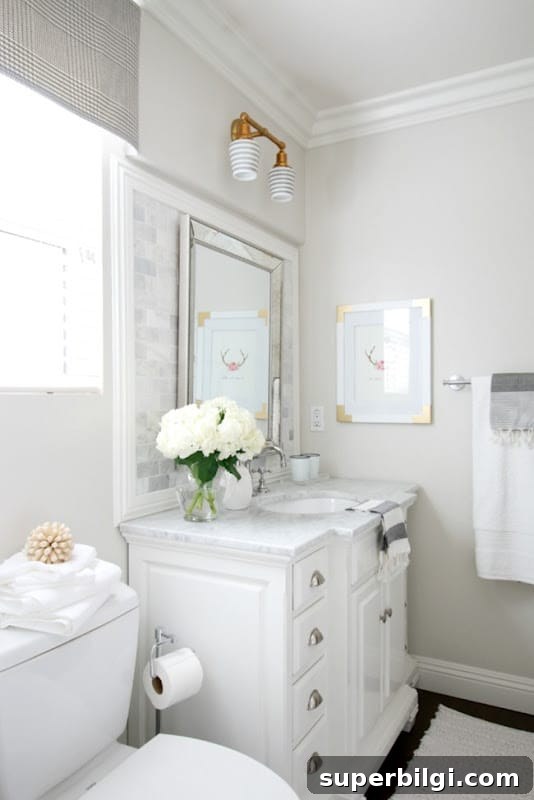
Pale Oak in Bathrooms
In bathrooms, Pale Oak provides a clean, warm backdrop that pairs well with white fixtures and warm wood accents. In bright, sunlit bathrooms it will appear lighter and more gray; in small or darker baths its warmth will be more pronounced.
Pale Oak in Bedrooms
Used as a bedroom wall color, Pale Oak creates a tranquil, versatile backdrop that accommodates a wide range of textiles and accent colors—from soft blues to warm metallics—resulting in a restful, layered space.
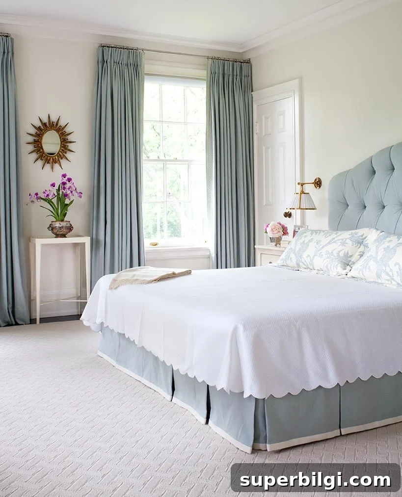
Pale Oak in the Living Room
For open plans or transitional living rooms, Pale Oak is a reliable neutral that flows across connected spaces. It supports seasonal decor changes and lets furniture, textiles, and feature pieces stand out without competing with them.
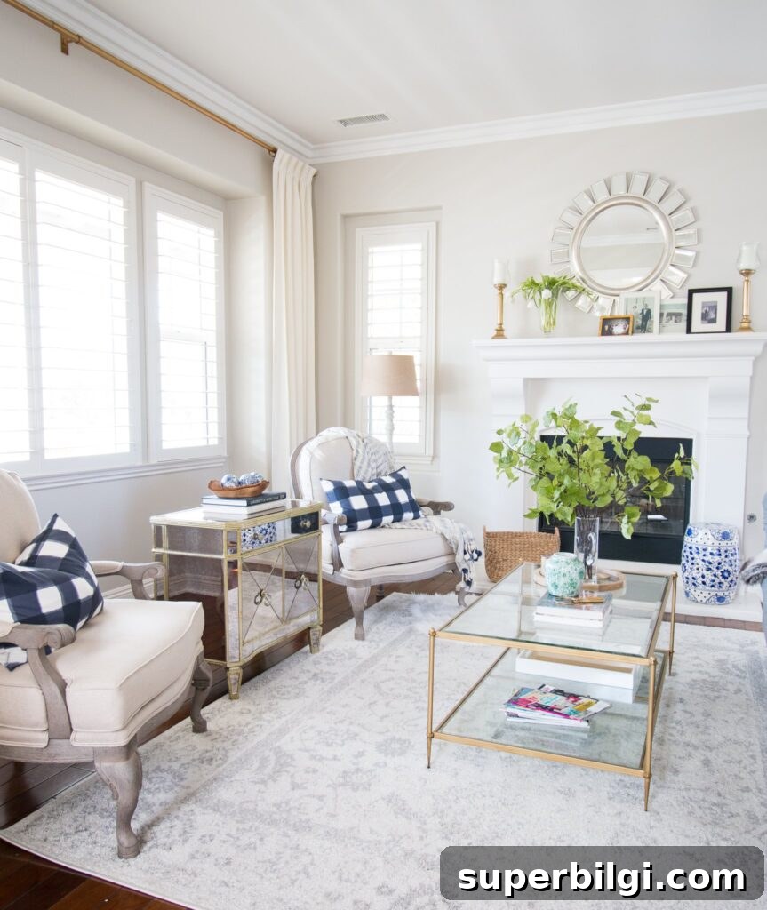
Pale Oak in Kitchens
Pale Oak works wonderfully in kitchens, whether on walls or cabinets. It pairs nicely with warm wood floors and earth-toned tile, and it can temper stark white cabinetry with a soft, lived-in warmth for a welcoming kitchen atmosphere.
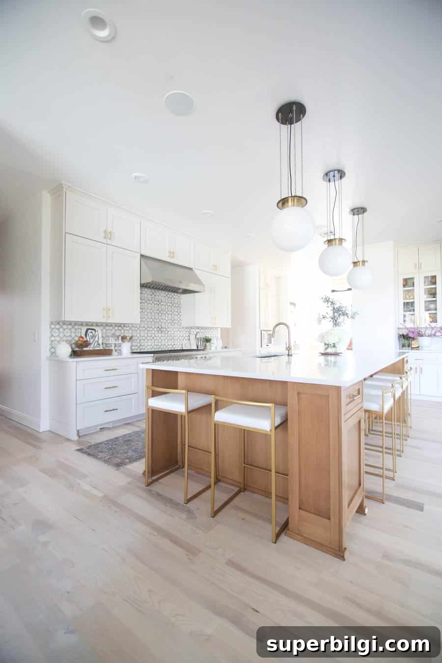
Overall, Pale Oak by Benjamin Moore is a flexible, family-friendly neutral that adapts to many styles and lighting conditions. If you’re considering it for your home, try full-size samples in several rooms before committing so you can see how the color shifts throughout the day.
Pale Oak commonly shows a soft pink undertone and occasionally a warm yellow in certain lighting. These subtle undertones give the color a gentle glow that changes with the light.
It depends on light: in bright natural light it often reads as a warm light gray; in dimmer or warmer-lit rooms, its beige and pink undertones become more pronounced.
Yes. With a high LRV of about 68.64, Pale Oak can brighten small spaces while retaining warmth and subtle color depth.
Absolutely. Pale Oak works well in kitchens and bathrooms, complementing warm woods, creamier whites, and cool blues to create timeless, comfortable spaces.
More Paint Colors to Consider
If you like cozy neutrals, explore similar tones such as Agreeable Gray, Revere Pewter, or Repose Gray. For stronger contrast, try deep blues like Hale Navy or muted greens such as Sea Salt. Always test samples in your own home to confirm undertones and light interaction before painting.