
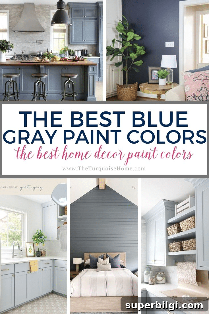
There are few colors as versatile as blue gray. Whether you want a subtle, calming bedroom hue or a bold accent for your living room, blue gray paint colors offer options for every style and space.
If you’re drawn to soothing, comfortable palettes but don’t want to commit to bright color, blue gray is an excellent compromise. The blue brings personality and depth while the gray mutes the intensity, creating a balanced, refined tone that won’t overwhelm a room.
Many blue grays perform like neutrals thanks to their gray undertones. Some shades read more blue, others more gray — think of them like the rich denim of a favorite pair of jeans. These tones pair beautifully with a wide range of materials and palettes, from crisp white trim to warm wood and leather.
Explore this curated list to find the blue gray that suits your home, and remember to test swatches on your walls before committing — lighting can dramatically change how a color reads.
What is a Blue Gray Color?
A blue gray is simply a gray with noticeable blue undertones or a blue that carries strong gray undertones. You can usually spot the dominant undertone by viewing the full swatch and observing the deeper shades — if the darker areas feel navy or charcoal, you’re seeing a blue gray. It’s also helpful to avoid green undertones if you prefer a true blue-gray rather than a blue-green.
Why Are Blue Gray Paint Colors Popular?
Blue is inherently calming, but pure blues can sometimes feel youthful or pastel. Adding gray grounds the blue, giving you a sophisticated, versatile color that works across rooms. Blue-gray with white trim is a timeless combination that works particularly well in bedrooms, bathrooms, kitchens, and even cabinetry. These tones are adaptable for modern, traditional, and transitional interiors alike.
The Most Popular Gray-Blue Colors for Your Home
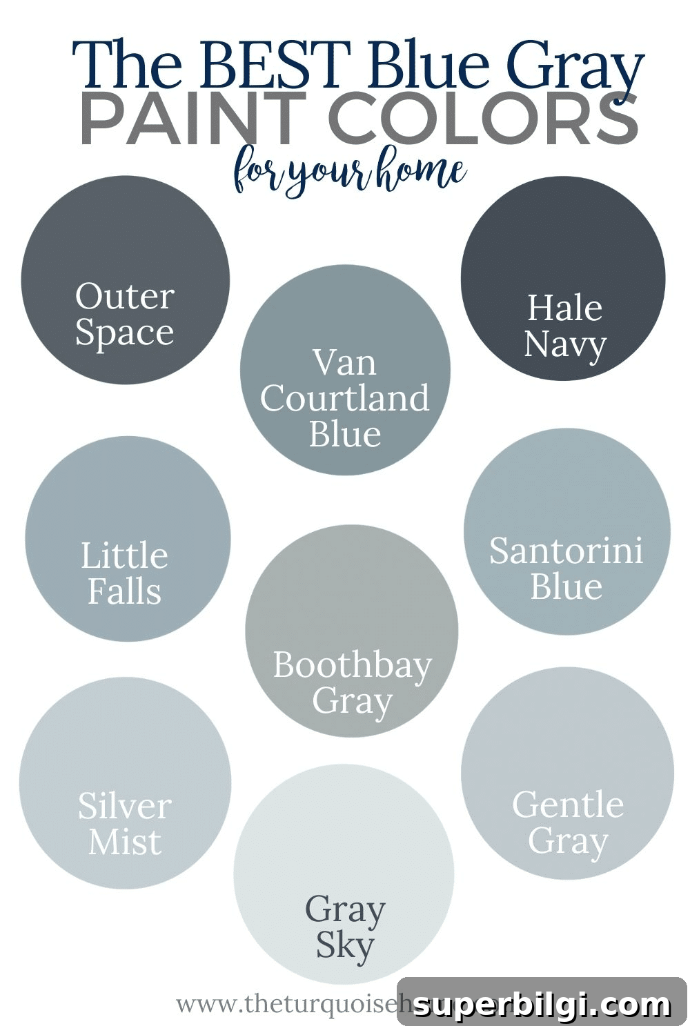
At first glance many blue grays appear similar, but side-by-side you’ll notice subtle differences in warmth, depth, and undertone. Below are popular options organized by Light Reflectance Value (LRV). LRV measures how much visible light a paint reflects (higher = more reflective). I’ve grouped colors into dark (LRV 0–15), medium (LRV 15–45), and light (LRV 45–100) so you can match shade to the amount of natural light in your room.
Dark Blue Gray Paint Colors
LRV: 0–15
Hale Navy by Benjamin Moore (LRV: 6.3)
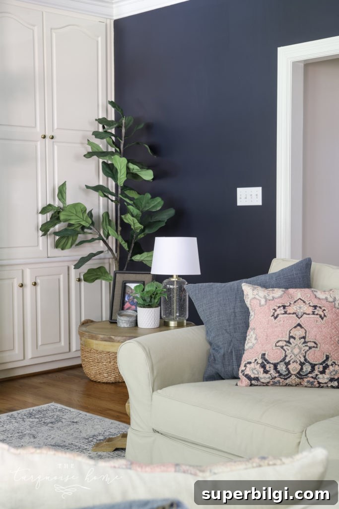
Hale Navy is a favorite for its depth and versatility. It carries faint green undertones at times, but gray undertones dominate, allowing it to act as a transitional color between warm and cool palettes. Because it’s quite dark, use it in spaces with ample light, or as an accent wall to avoid making a room feel too heavy. White trim and bright accents make it sing.
Outerspace by Sherwin-Williams (LRV: 12)
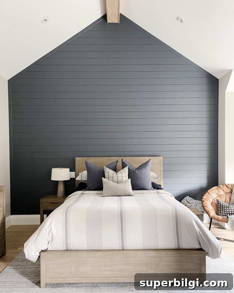
Outerspace leans more toward gray than Hale Navy. It’s an excellent choice when you want the moody depth of a dark blue-gray without an overwhelmingly blue cast. Try it on an accent wall or in a cozy bedroom paired with neutral furnishings and warm woods.
Granite Peak by Sherwin-Williams (LRV: 14)
Granite Peak delivers dramatic, charcoal-like depth with blue or gray emphasis depending on lighting. It’s a strong choice for powder rooms, accent walls, or anywhere you want a bold, contemporary statement.
Medium Blue Gray Paints
LRV: 15–45
Santorini Blue by Benjamin Moore (LRV: 45)
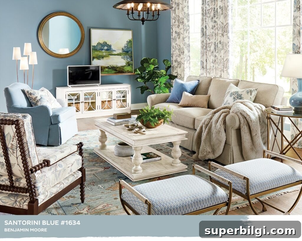
Santorini Blue evokes the cool blue-gray waters of the Greek isles. Straddling the line between medium and dark, it pairs beautifully with taupe and traditional tones and is a popular choice for masculine bedrooms or feature cabinetry.
Van Courtland Blue by Benjamin Moore (LRV: 30)
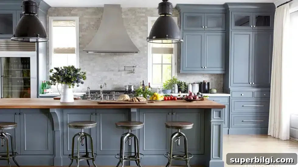
Timeless and adaptable, Van Courtland Blue can read slightly green in west-facing rooms, so swatch and observe it throughout the day. It suits traditional and modern spaces alike.
Storm Cloud by Sherwin-Williams (LRV: 23)
Storm Cloud offers a cozy, enveloping feel that’s perfect for rooms meant to feel intimate and calm. It leans toward gray and looks sophisticated paired with bright white trim and cabinetry.
Morning Fog by Sherwin-Williams (LRV: 42)
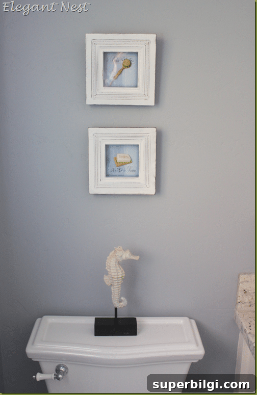
Morning Fog reads mostly gray with cool blue undertones that add vibrancy. If you prefer the gray side of blue-gray tones, this is an excellent, neutral-forward choice.
Little Falls by Benjamin Moore (LRV: 42)
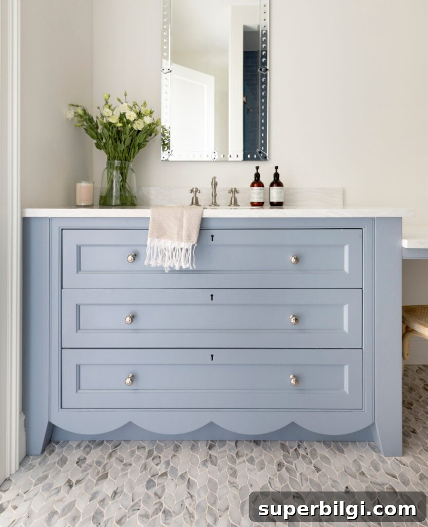
Little Falls is a clear, true blue with subtle gray undertones and no green shift. It’s a lovely choice for cabinetry, bathrooms, or playful yet refined kids’ rooms, especially in the growing grandmillennial aesthetic.
Boothbay Gray by Benjamin Moore (LRV: 43)
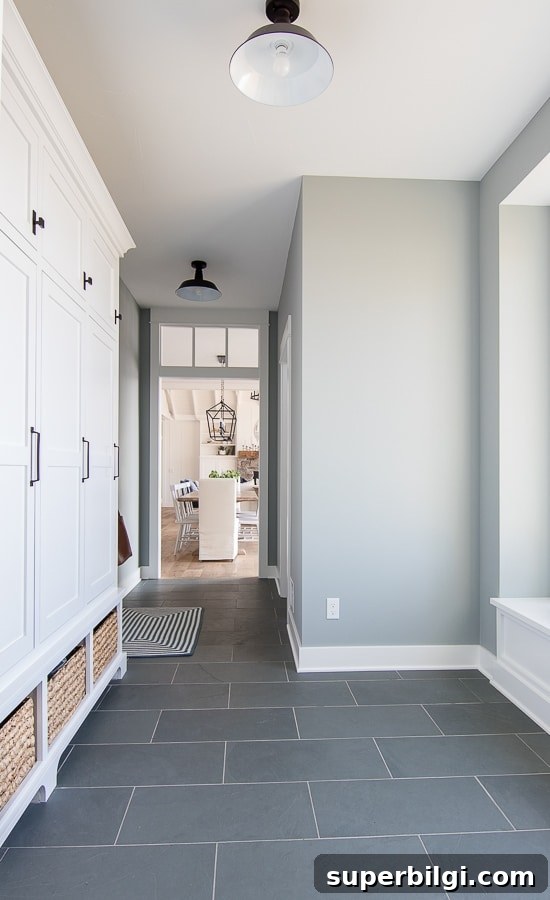
Boothbay Gray is a widely loved historic shade that reads gray with a strong blue undertone. It’s a versatile choice for mudrooms, entryways, and anywhere you want a timeless, slightly coastal vibe.
Light Blue Gray Paint Colors
LRV: 45–100
Smoke by Benjamin Moore (LRV: 56)
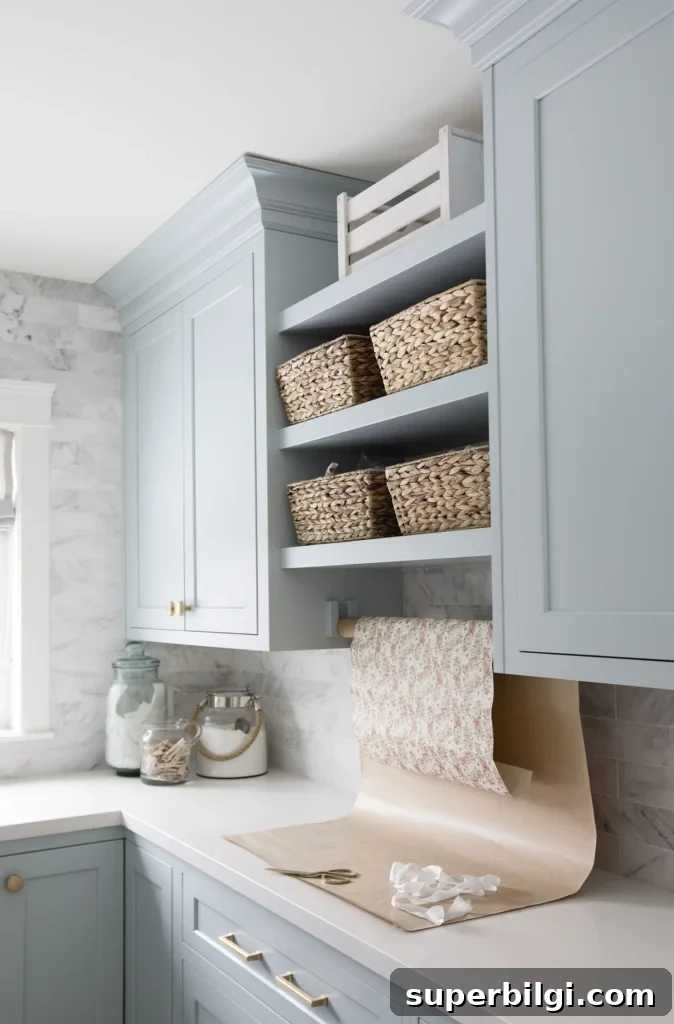
Smoke leans more toward gray but with distinct blue undertones that make it exceptionally versatile. It performs well across rooms and pairs effortlessly with most accent colors.
Gentle Gray by Benjamin Moore (LRV: 58)
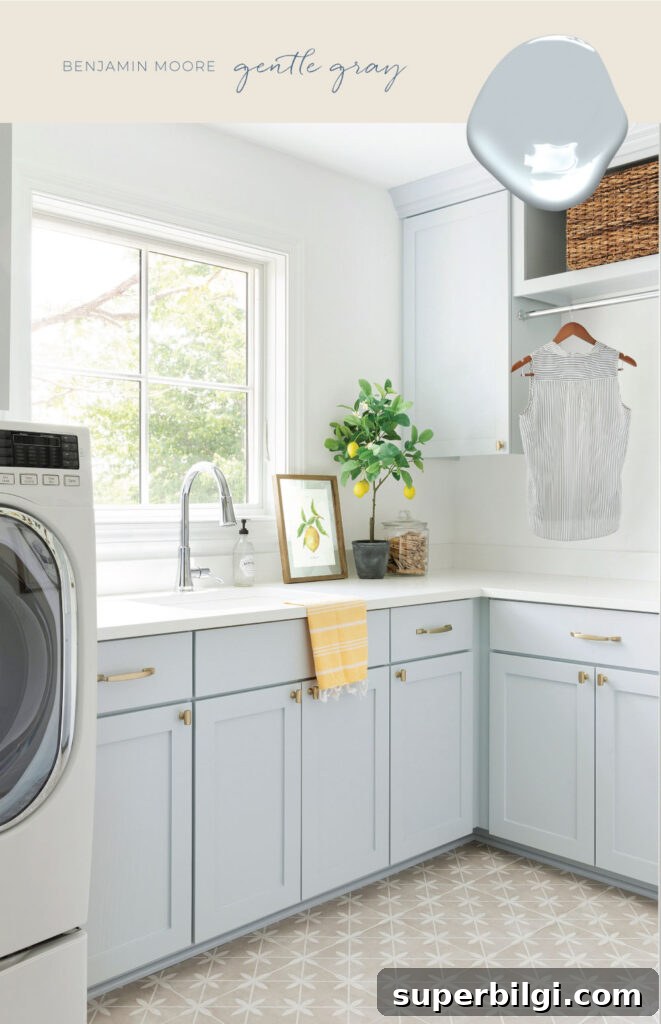
Gentle Gray feels warm and comforting while carrying an aqua tint. The gray tonality keeps it sophisticated, but lighting can influence its appearance, so test it on-site before committing.
Silver Mist by Benjamin Moore (LRV: 62)
Silver Mist is a pale, whisper-soft blue with a silvery shimmer. It’s delicate and misty, relying on gray to achieve a light, ethereal quality that reads fresh and refined in bright spaces.
Gray Sky by Benjamin Moore (LRV: 77)
Gray Sky approaches pastel territory but maintains a cool, crisp character. It retains noticeable saturation despite its lightness and can offer a cool, airy backdrop without fading into the background.
Have you used any of these blue-gray paint colors in your home? Share how they looked in real-life lighting — seeing colors in context helps others choose with confidence.
More posts you may enjoy:
- How to Choose the Best White Paint Color
- The Best 17 Sage Green Paint Colors For Your Home
- 20 Best Nursery Paint Colors And Accent Wall Ideas
- How to Paint Countertops to Look Like Marble
- The Best 15 Neutral Paint Colors