

Wythe Blue by Benjamin Moore is a beautiful blue-green paint color with gray undertones. Part of the Historic Color collection, Benjamin Moore Wythe Blue is a popular choice for farmhouse, traditional, and coastal decor styles.
Wythe Blue is one of my favorite paint colors. I used it prominently in a recent room makeover and it greets you as soon as you enter my home. After reading this review and seeing the photos, I think you’ll understand why it’s so widely loved.

Introduced in 1976 as part of Benjamin Moore’s Historic Color collection, Wythe Blue has a timeless appeal that works well in both traditional and modern homes, as well as historic restorations. The color was highlighted by Benjamin Moore as a notable hue in their 2012 announcements because of its versatility and classic, calming quality.
Wythe Blue is a calm blue-green that can anchor an entire room or serve as an accent to draw the eye. Below is a detailed look at its undertones, complementary colors, and real-room examples that show how it behaves in different lighting and styles.
Benjamin Moore Wythe Blue Undertones
On a swatch, Wythe Blue shows strong gray and green influences. Once applied to walls, however, the blue typically becomes the dominant impression. Whether the green or gray undertones show up more depends on the room’s lighting, nearby furnishings, and other finishes.
If a room contains many gray accents or has cool lighting, Wythe Blue will reflect more of its gray side. In west-facing rooms with warm, yellow sunlight, the green undertones can become more apparent. Sparse decor or dim lighting often allows the gray to read stronger.
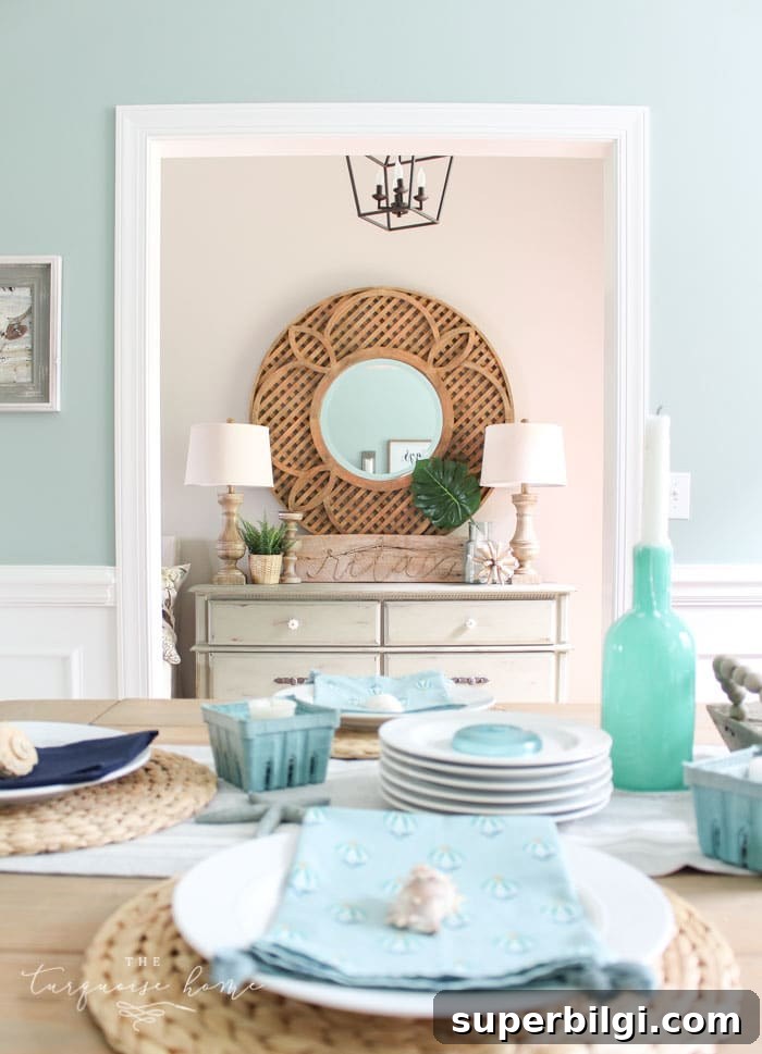
Pairing Wythe Blue with lighter blues can help emphasize its green side, while warm woods, yellow-toned light, or white fixtures will also influence whether the green or gray leans forward. At night, colors often deepen and green tones can appear richer under artificial lighting.
Colors That Pair Well with Benjamin Moore Wythe Blue
Wythe Blue sits near the middle of the Light Reflective Value (LRV) scale, which makes it versatile with many colors. It pairs particularly well with warm and neutral grays, creamy whites, and muted browns. Some coordinating Benjamin Moore suggestions include:
- Olivetint 519
- Shaker Gray 1594
- Van Buren Brown HC-70
- Distant Gray 2124-70
- Palladian Blue HC-144 (similar family)
- Edgecomb Gray HC-173
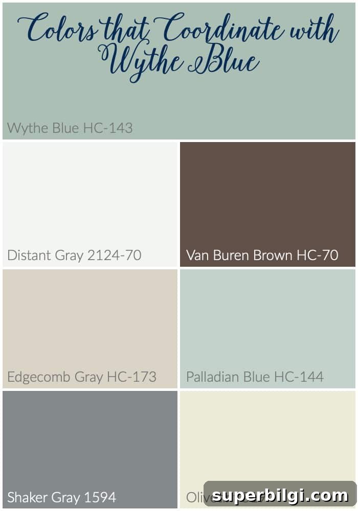
Wythe Blue works beautifully with most whites, making it easy to combine with classic trim colors. It also complements vivid accents — reds, yellows and even tangerine can pop against this blue-green, while greens and softer blues create a harmonious palette.
Wythe Blue vs. Other Blue-Green Paint Colors
Wythe Blue vs. Palladian Blue
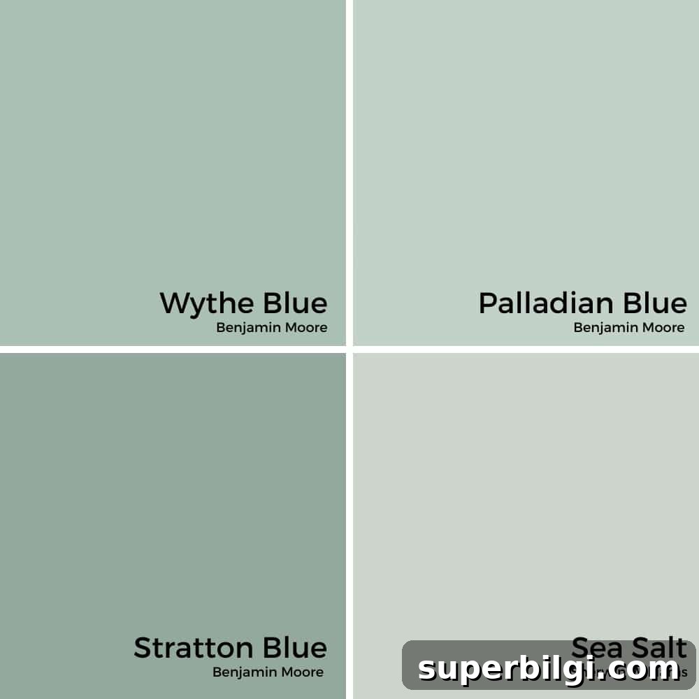
Wythe Blue and Palladian Blue share a soft blue-green character but read differently. Palladian Blue tends to be lighter and airier with stronger green undertones, making it ideal for a breezy coastal vibe. Wythe Blue contains more gray, giving it a deeper, more grounded presence — a sophisticated option for rooms that need a timeless, slightly more muted tone.
- Palladian Blue: lighter, greener, coastal feeling
- Wythe Blue: deeper, grayer, classic and grounded
If your room receives abundant natural light, Palladian Blue will stay bright and beachy; for a cozy, composed atmosphere, Wythe Blue provides richer depth.
Wythe Blue vs. Stratton Blue
Stratton Blue is darker, richer, and more saturated with green undertones, making it a strong choice for dramatic spaces or an accent wall. Wythe Blue is softer and more versatile for all-over walls. Choose Stratton Blue for moody, statement spaces and Wythe Blue for rooms that need an inviting, flexible hue.
- Stratton Blue: deeper, bolder, more green
- Wythe Blue: lighter, softer, ideal for full-room color
Wythe Blue vs. Sea Salt
Compared with popular soft hues like Sea Salt, Wythe Blue reads richer and grayer. Sea Salt tends to look lighter and greener in many lights and works beautifully in bathrooms and laundry rooms for a fresh, spa-like feel. Wythe Blue brings a more traditional, classic look suited for dining rooms, front doors, or spaces that benefit from a deeper anchor color.
- Sea Salt: light, airy, green-leaning
- Wythe Blue: deeper, balanced between blue, gray and green
Rooms Painted with Benjamin Moore Wythe Blue
Wythe Blue is rich enough for bedrooms, formal enough for dining rooms, and neutral enough for exteriors. It performs well across different room types and decorating styles. Below are real examples showing how the color behaves in various settings.
Wythe Blue in Bedrooms
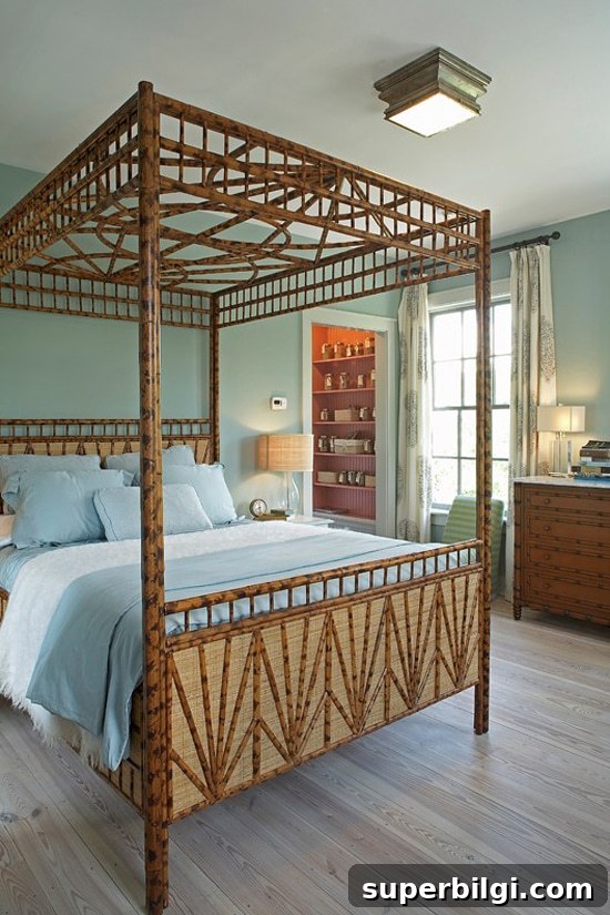
In bedrooms, Wythe Blue can read crisp and calming, with just enough green to keep the space feeling fresh without overwhelming the palette.
BM Wythe Blue in Bathrooms
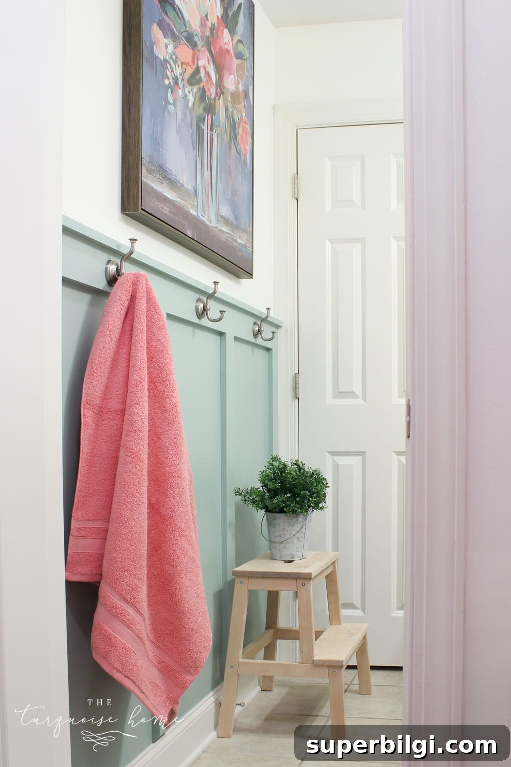
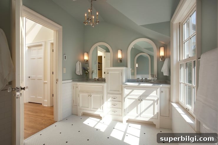
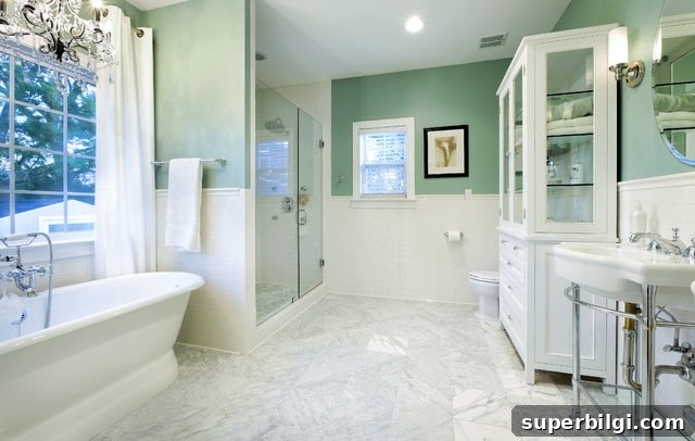
Wythe Blue is a lovely choice for bathrooms. It pairs beautifully with white tile, board-and-batten details, and marble for a spa-like look. In darker lighting it may reveal its green or gray undertones in different areas of the room.
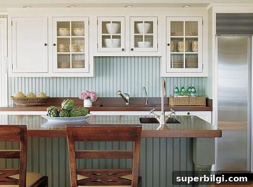
Kitchens with Wythe Blue
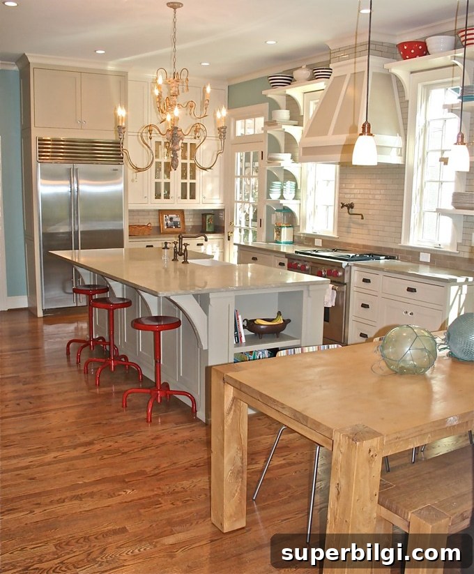
Used as an accent or on cabinetry, Wythe Blue can anchor a kitchen and allow bold accents—like red or warm woods—to stand out. It adapts to both modern and country styles and plays well with dark islands or neutral cabinetry.
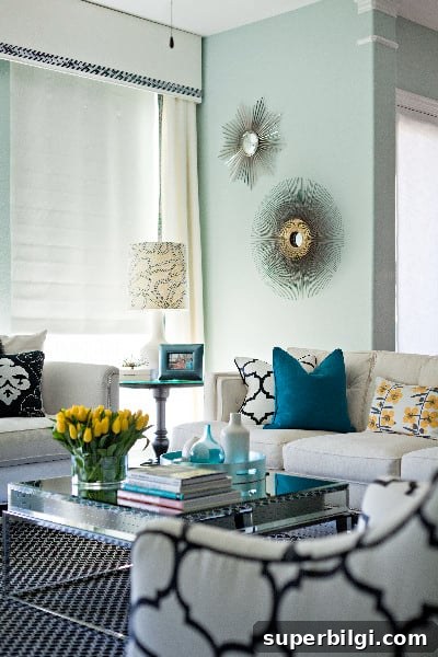
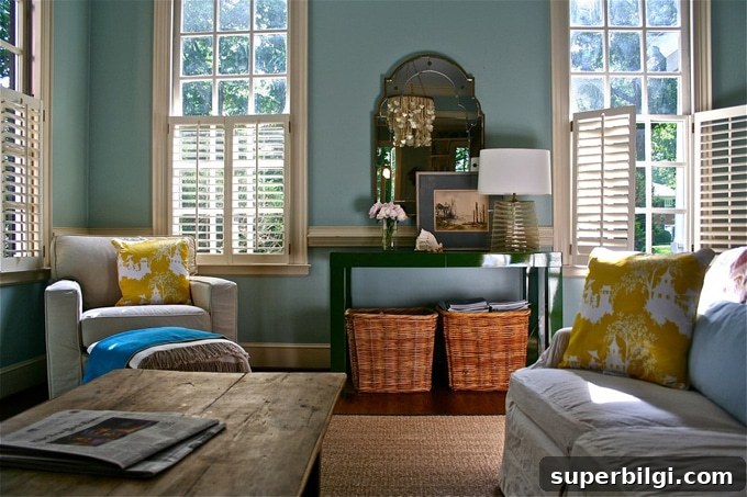
Wythe Blue Painted Living Rooms
In living rooms, Wythe Blue can appear as a balanced mix of blue, green, and gray depending on light. Natural light softens the tone; darker rooms may bring out greener or grayer moods. It works well with both light and dark furnishings.
My Dining Room with Wythe Blue Walls
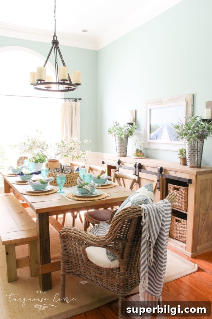
My dining room, painted in Wythe Blue, faces west and pulls greener tones because of the warm afternoon light and surrounding wood elements. I find the effect comforting and lively, making the space feel cozy and welcoming.
Exteriors with BM Wythe Blue
Wythe Blue makes an excellent exterior accent. A painted front door or shutters in this hue can add welcoming personality and timeless charm to a home’s facade.
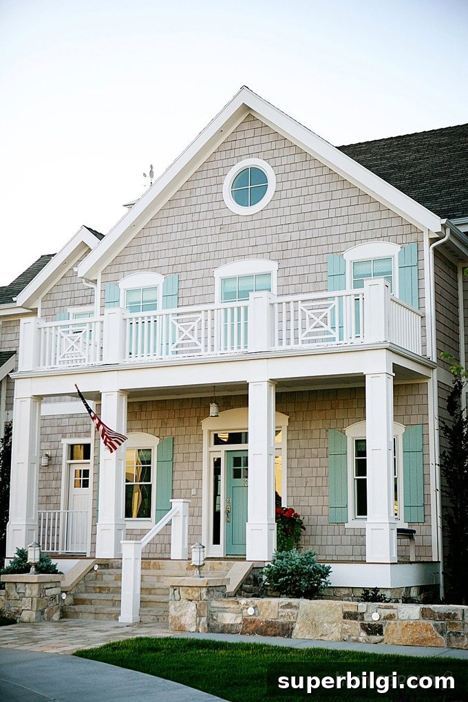
Which room will you try Wythe Blue in? Bathrooms and entryways are especially charming with this color, but it can work beautifully almost anywhere.
Tools to Help Paint a Room Yourself
If you plan to paint yourself, having the right tools makes the job faster and the finish better. Essential tools include quality paint brushes, painter’s tape, drop cloths, a comfortable paint cup, and a reliable roller tray with liners for easier cleanup. Testing real paint samples on your walls before committing is also highly recommended to see how Wythe Blue reads in your specific light.
- Quality paint brushes — worth investing in for smoother edges and longer life.
- Painter’s tape — essential for crisp, clean lines.
- Drop cloths — protect floors and furniture.
- Paint cup — ergonomic cups with brush holders make the work easier.
- Roller tray and liners — liners speed cleanup and extend the life of the tray.
More color ideas to explore: Gray Owl, Revere Pewter, Hale Navy, Repose Gray, Agreeable Gray, and Sea Salt are all excellent companions or alternatives depending on the mood you want to create.