
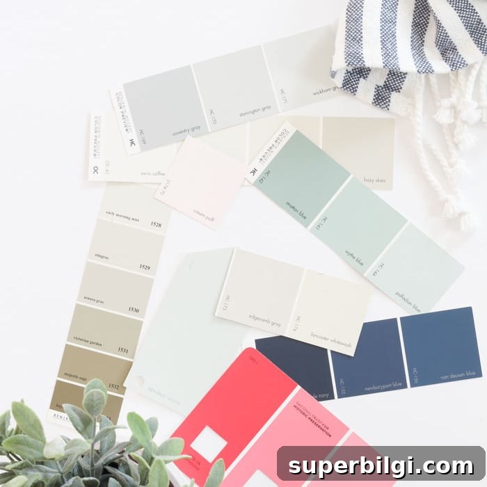
A whole-house color scheme sets the backdrop for your home and removes the guesswork from decorating. Follow this step-by-step guide—rooted in color theory and practical examples—to create a cohesive whole-home color palette that will save you time, money, and stress.
Choosing a cohesive color palette for your entire home—from painted walls to throw pillows—can feel overwhelming. Many readers ask how to decide on the right colors, or whether they can use a single paint color throughout the whole house. The short answer: yes, you can. The key is a plan that guides your decisions and keeps your spaces flowing together without feeling overly matchy.

When I moved into my current home, I decided to create a simple, straightforward color palette to help me:
- Make quick, confident design choices for wall paint and decor.
- Avoid second-guessing by choosing a small set of core colors up front.
- Shop with purpose—spending less time on impulse purchases and returning less often to the store.
- Create a cohesive home that still feels varied and interesting.
What to Know Before You Pick Paint Colors
This includes wall paint as well as floors, cabinets, countertops, furniture and accessories—anything that contributes color to a room.
1. Get Inspired
Look at the colors you already own: favorite pieces of furniture, artwork, or textiles. Check your Pinterest boards or decor saved items to spot patterns. Take a quick glance in your closet—do you wear mostly neutrals or bold colors? Narrow your inspiration down to two or three favorite colors from these sources.
2. Choose the Mood
Think about the mood you want your home to convey. Associating color palettes with seasonal moods can help:
- Spring – open, creative, contemporary: light, bright colors and pastels.
- Summer – calm and elegant: cool, delicate, muted tones such as lavender, mint, navy and green.
- Autumn – warm and earthy: rich muted tones like burnt umber, warm reds and browns.
- Winter – strong and dramatic: cool, clear or intense colors—ice blues, high-contrast neutrals and metallics.
These categories are guides, not rules. You may blend moods, but most people find they naturally gravitate toward one overall direction.
3. Use the Color Wheel to Your Advantage
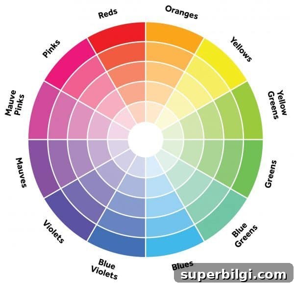
Color theory helps you see how colors interact. Use the color wheel to plan complementary or harmonious combinations:
- Analogous colors (next to each other on the wheel) create harmony and a relaxed feel—great for bedrooms and casual spaces.
- Complementary colors (opposite on the wheel) create contrast and drama—perfect for accent pieces and pops of color.
- Monochromatic schemes use tones of the same color across the home. Using different shades and saturations keeps a monochromatic scheme interesting and layered.
Warm vs. Cool Colors
Know whether a color reads warm or cool. Most neutrals have undertones that pull warm or cool, and that affects how they coordinate with other finishes:
- Warm colors feel energetic and inviting; they can visually make a room feel cozier.
- Cool colors feel calming and can make spaces feel more expansive.
Mixing warm and cool tones thoughtfully gives depth—cool base colors with warm accents (or vice versa) often feel balanced and dynamic.

4. Consider Hard Finishes
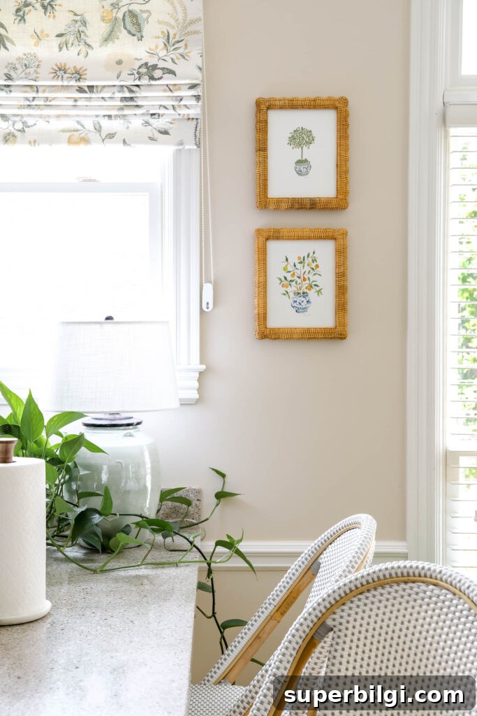
Account for permanent finishes such as flooring, cabinets and countertops. Do your wood floors pull warm or cool? Are your cabinets warm wood tones or cool painted colors? Countertops often include multiple tones—match your wall color to harmonize rather than fight them. A mid-tone wood floor is a practical choice because it coordinates well with many color schemes.
How to Choose a Whole House Color Palette
Follow a logical order so your choices build a cohesive palette:
1. Choose Trim and Ceiling Paint Color
Pick your trim color first because it will be used throughout the home—often a clean white or soft off-white. A common approach is to use the same white on trim, ceilings and cabinetry for continuity. If your home’s existing trim is not a true white, select wall colors that work with that undertone, or plan to repaint trim if you want a different look.
Tip: Painting both trim and walls the same color can work well if you use different sheens—semi-gloss for trim and eggshell or flat for walls—so the paint reads differently.
2. Choose Your Primary Neutral Color for Main Spaces
Select a neutral for common areas—living room, kitchen, hallways and entry—especially important in open floor plans where rooms flow together. Popular neutrals include warm beiges, gray-greiges, and soft whites, but you can choose any lighter color that coordinates with your finishes. Always test paint on your walls, because lighting and surrounding elements change how a color reads.
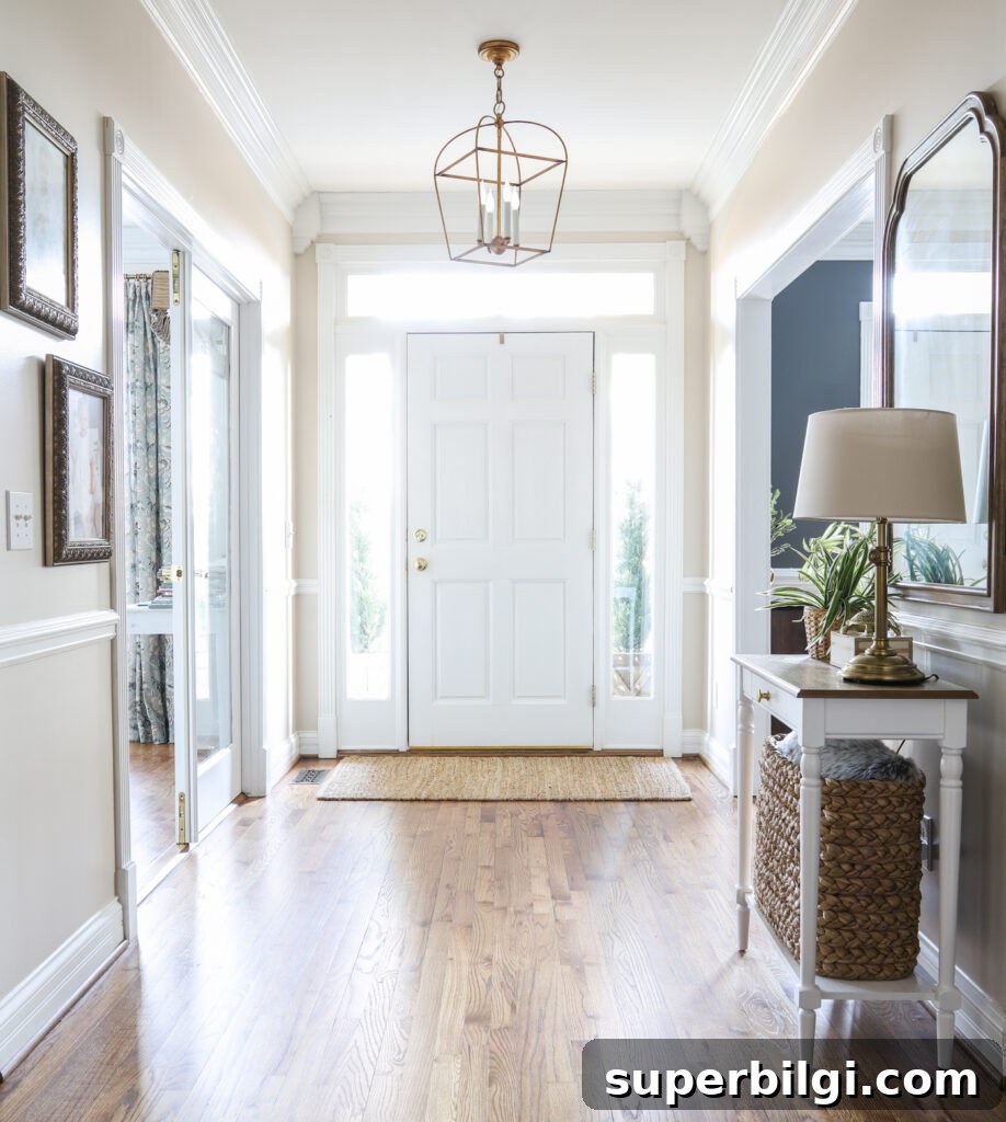
Popular Neutral Paint Colors
- Alabaster
- Swiss Coffee
- Sea Salt
- Repose Gray
- Gray Owl
- Agreeable Gray
Always test colors in the actual room. The easiest method is to use real paint samples applied to the walls to see the color in different light and at different times of day.
3. Choose Another Color for Secondary Rooms
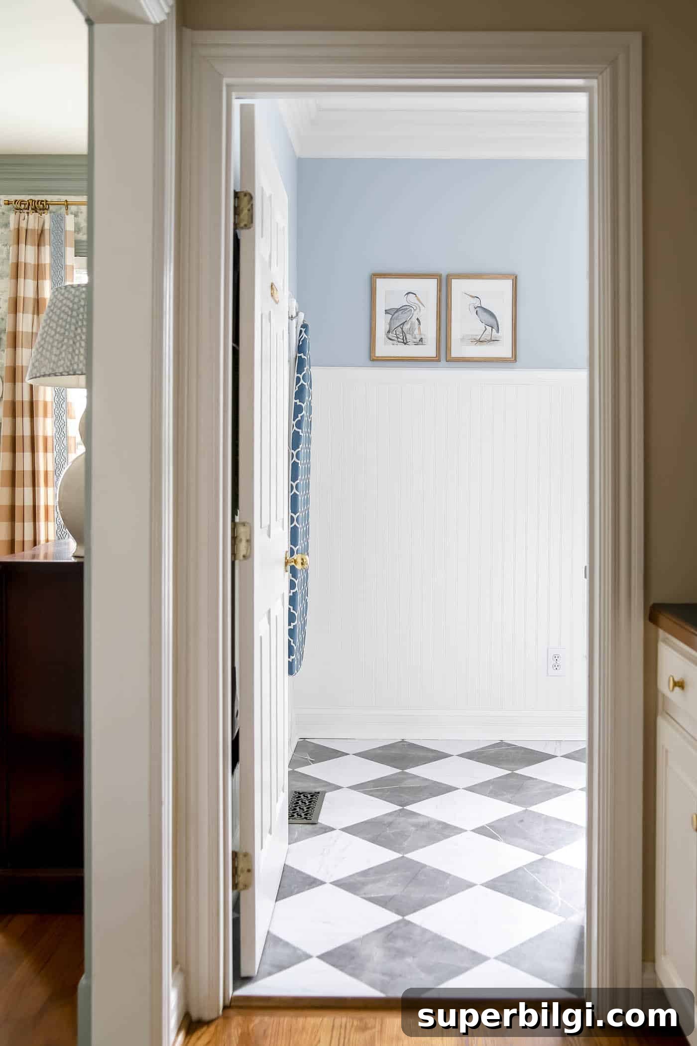
For bathrooms, laundry rooms and secondary living spaces, pick a second color that complements your primary neutral and mood. This may be another neutral or a soft color—blues, greens, or warm taupes are common choices. Use varying shades of the same color to keep cohesion while adding visual interest.
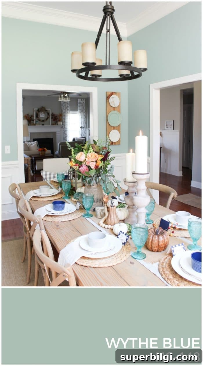
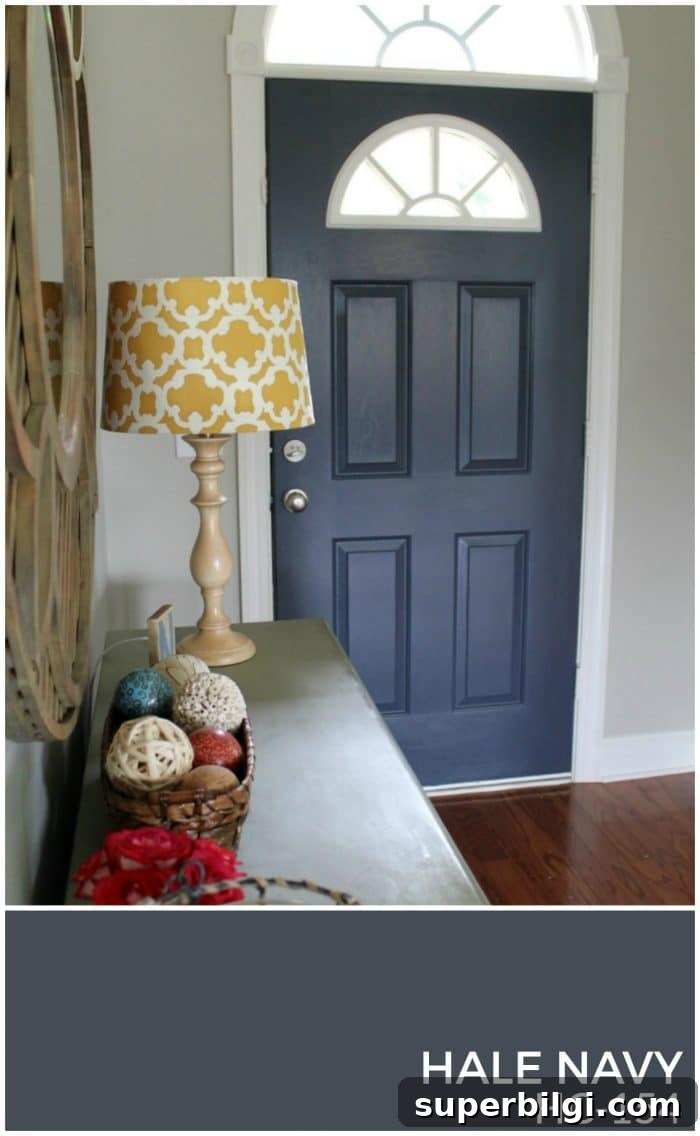
4. Choose an Accent Color for Bedrooms and Accessories
Pick an accent color for smaller rooms, accent walls, doors or decor. Use it sparingly for pops of personality—perfect for kids’ rooms or a statement wall that won’t compete with the main living areas. You can choose a color adjacent to your main color on the color wheel for harmony or opposite for contrast.
Frequently Asked Questions
How many colors should be in a whole-house paint color scheme?
A whole-house color scheme typically includes 4–8 paint colors:
- 1 white for trim and ceilings
- 1 neutral for main living spaces
- 1–2 additional colors for secondary rooms
- 1–4 accent colors for bedrooms, accessories and small areas
Do I have to choose all paint colors at once?
No. Decide your trim and primary neutral early to set the foundation. Then select secondary and accent colors as needed.
A Real-Life Whole-House Color Palette
Once you select your palette, create a visual reference: a printed collage, a Canva mock-up, or a small binder with paint swatches and fabric samples. I made a simple floor plan with the paint colors placed in each room to visualize how the palette flows.
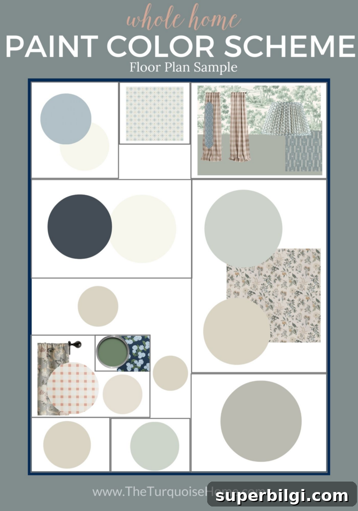
Carry this palette with you when shopping—either physically or on your phone—so you can buy with confidence and mix pieces that truly belong together.
Incorporate Your Color Palette Throughout Your Home
Start by painting trim and main spaces with the core neutral. For other rooms, introduce colors through textiles, rugs, artwork and accessories first—then decide whether a painted wall is necessary. Use different tones and saturations of your core colors across rooms to maintain cohesion while keeping each space distinct.
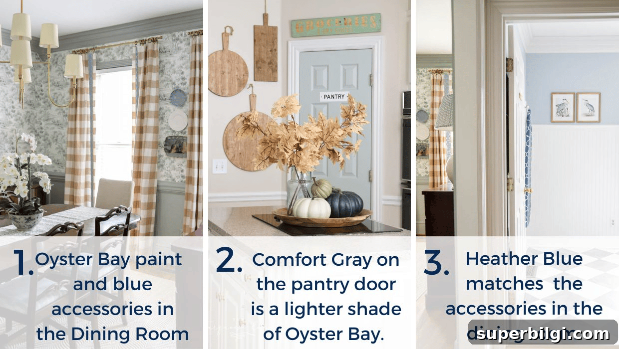
Knowing your home’s color palette simplifies decorating: if an item matches one of your chosen colors, you can buy it without hesitation and expect it to work across multiple rooms.
Free Whole-Home Color Palette Worksheet
If you want a simple tool to collect and record your colors, create a worksheet or binder with swatches for each step of this process. Keep photos of rooms, paint chip numbers, and fabric or wallpaper samples together so you can reference them while shopping.
More posts you may like:
- How to Paint a Concrete Patio
- The Best Gray Paint Colors for Your Home
- The Best Blue Paint Colors for Your Home
- How to Paint Outlet Covers
- Which Interior Paint Finishes to Use
I hope this guide gives you the confidence to choose a paint palette for your entire home and to enjoy the creative process. With a clear plan, decorating becomes easier and more enjoyable.