
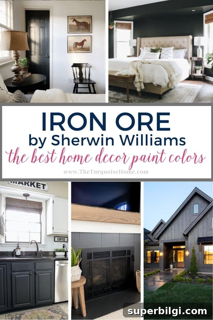
If you want a moody, sophisticated color without committing to pure black, Sherwin Williams Iron Ore is an excellent compromise. Read on to discover this sultry shade and practical tips for using it around the home.
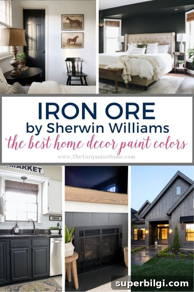
With brush in hand and primer at the ready, choosing the right paint color is the big decision. If you are drawn to deep neutrals and want something darker than a standard gray but not as stark as black, Sherwin Williams Iron Ore (SW 1069) deserves a closer look. In many light conditions it reads as an almost-black charcoal; in others the subtle gray undertones come forward, revealing depth and nuance that make it a dramatic and versatile choice.
PRO Tip
Always test a real paint sample on your walls before committing. The easiest way is to use actual paint swatches or peel-and-stick samples made with real paint so you can move them around the room and observe the color throughout the day. Testing in the specific light and with your furnishings ensures you get the result you expect.
Undertones of Sherwin Williams Iron Ore
At first glance, Iron Ore can appear nearly black, but it is a true dark gray. In bright, warm light the color can look softer and even slightly creamy, which is why many people describe it as a charcoal rather than a flat black. In cooler light the paint often reveals blue-gray undertones; under certain conditions you may notice hints of purple, brown, or green, though those are subtle and depend on surrounding colors and lighting.
Because Iron Ore leans cool in most lighting, it’s not a color that will warm a room on its own. Instead, it makes a strong visual statement. When combined with warm accents—such as light wood tones, soft textiles, and brass or gold hardware—it balances beautifully and embraces both sophistication and comfort. Crisp white trim and light floors are particularly effective at framing the depth of Iron Ore and preventing a space from feeling too heavy.
Light Reflectance Value of Iron Ore Paint
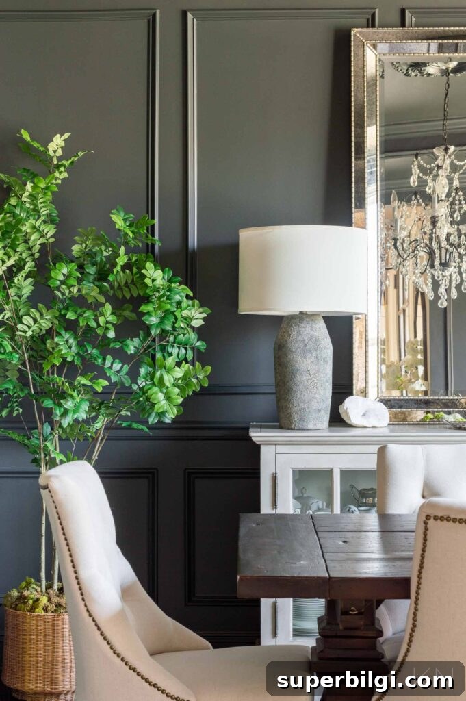
Light Reflectance Value (LRV) measures how much light a paint color reflects on a scale from 0 to 100, where 0 is absolute black and 100 is pure white. SW Iron Ore has a low LRV of 6, placing it very close to black in its light absorption. That means it will not bounce much light back into a room and can make spaces feel cozy and intimate—but it also has the gray depth that separates it from a true black.
Because of its low LRV, Iron Ore performs best in rooms with abundant natural light or strong artificial lighting. When exposed to daylight, the blue-gray undertones become more apparent. In darker rooms, the color will read more like a deep, enveloping charcoal and may absorb light, so plan lighting and lighter accents accordingly.
Complementary Colors for Sherwin Williams Iron Ore
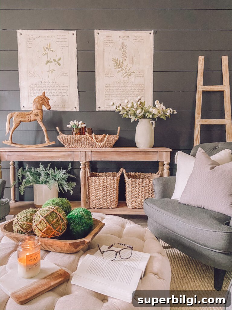
Dark grays and near-black tones pair beautifully with lighter neutrals. High-contrast combinations—Iron Ore with crisp white trim, ceilings, or furniture—help the charcoal tone read clearly and prevent it from dominating the room. If stark white feels too clinical, choose whites with warm undertones, such as a soft off-white, to balance Iron Ore’s cool depth.
Warm light woods and natural finishes make excellent partners, bringing brightness and a welcoming feel without diminishing the color’s sophistication. Metallic accents in brass, gold, or warm bronze add luxury and warmth when paired with these deep gray walls.
If you want to adjust how close the look is to black, Sherwin Williams offers nearby shades: Tricorn Black is a step darker than Iron Ore, while Peppercorn is a few shades lighter. Choosing among them depends on how much contrast and darkness you want in the final result.
Sherwin Williams Iron Ore in the Home
Iron Ore is surprisingly versatile. Below are popular applications where this dramatic charcoal works especially well.
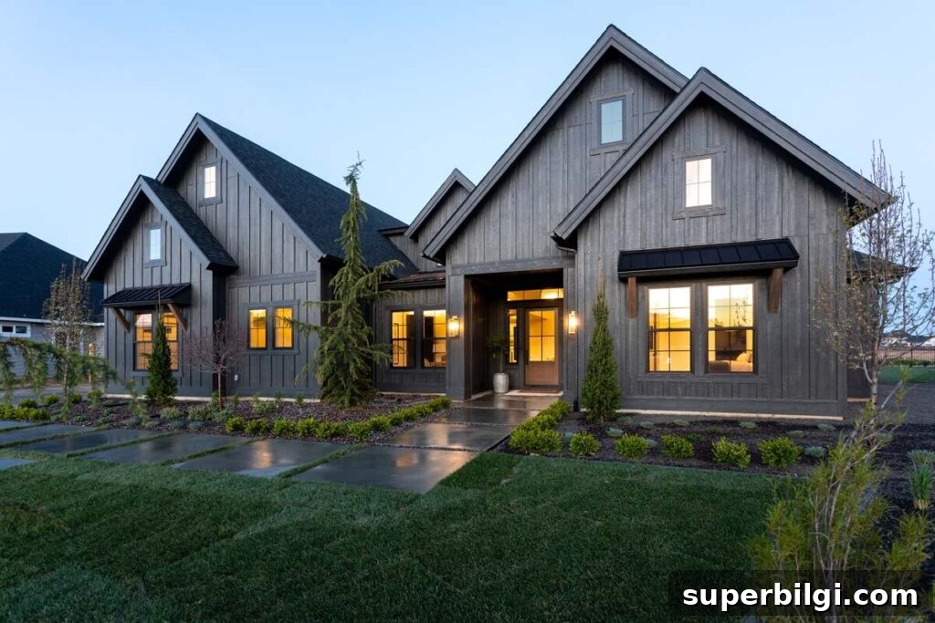
Exterior
Iron Ore is frequently used on home exteriors. Sunlight softens the shade, often making it appear as a creamy charcoal on siding. It’s a popular choice for siding, shutters, trim accents, and porches—delivering a bold curb appeal without the severity of pure black.
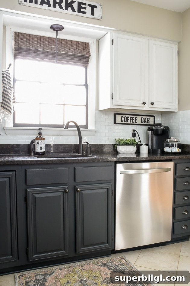
Cabinets
For cabinetry, Iron Ore offers a refined alternative to black. In a bright kitchen, charcoal lower cabinets paired with lighter upper cabinets, a pale backsplash, or a warm butcher-block counter create a modern, grounded look. In bathrooms, an Iron Ore vanity paired with brass hardware and light countertops creates a luxe, moody contrast. It’s also a great choice for built-ins, shelving, or office cabinetry.
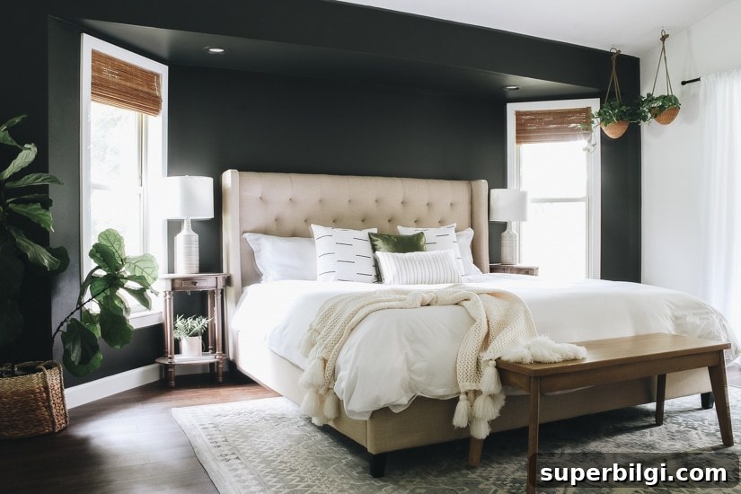
Accent Walls
An Iron Ore accent wall brings drama and sophistication to a living room, den, or bedroom. Because the color is strong, limit it to a single wall or a focused area unless you intend a full, dramatic embrace of darkness for the entire room. When used sparingly, the effect is moody and modern without being overwhelming.
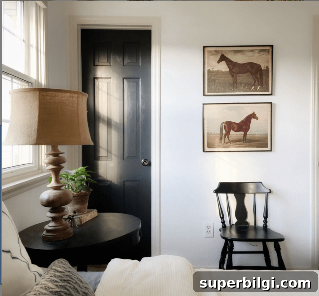
Doors
Painting interior doors in Iron Ore is a simple way to introduce contrast and depth. Dark doors create a crisp, modern statement in hallways, powder rooms, and entryways. They draw the eye and add architectural interest without a major renovation.
Fireplace
Iron Ore around a fireplace—on the surround, mantle, or built-in shelving—creates an instant focal point and a cozy, dramatic backdrop for relaxing evenings. The deep tone emphasizes flickering firelight and pairs well with natural textures like stone, wood, and woven textiles.
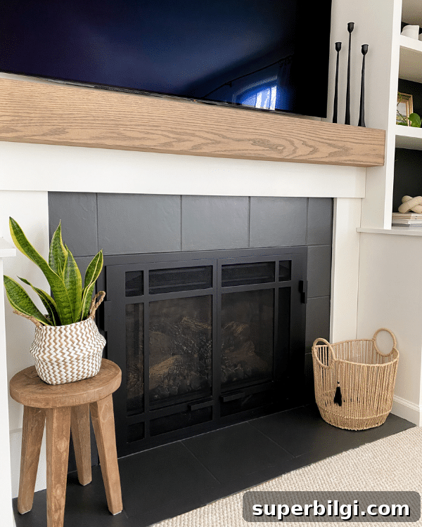
Iron Ore is a bold, elegant choice that suits both contemporary and traditional homes. With proper lighting and complementary finishes—whites, warm woods, and metallics—it brings character and sophistication wherever it’s applied. Ready to try it out? Test a real swatch in your space and observe how the color changes through the day before you commit.
More Posts You Will Love: