
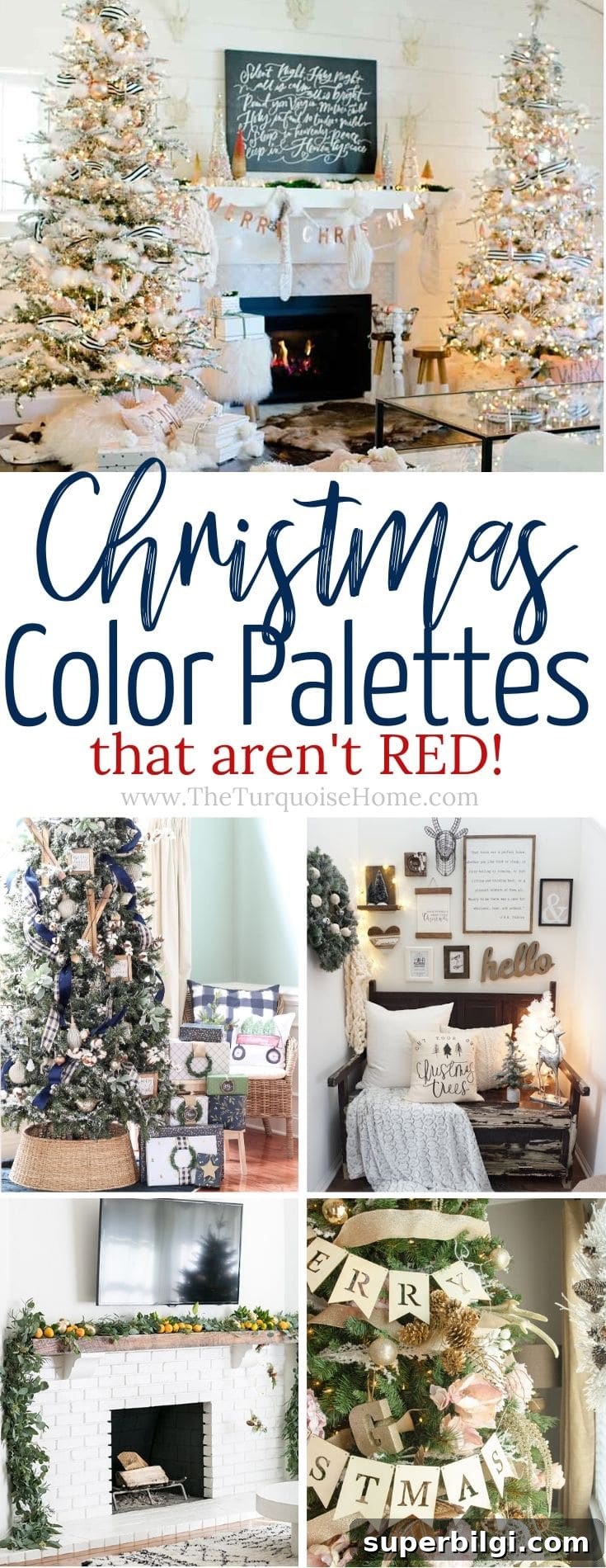
These Christmas color palettes rethink the classic red, white, and green. Try one of these modern, unexpected holiday color schemes for a fresh twist on traditional Christmas decor.
With the holidays approaching, now is the perfect time to decide on a color scheme and order wrapping paper, ribbons, and accents. Choosing a thoughtful palette each year makes decorating easier and creates a cohesive look from the tree to the mantel and the packages underneath.
I often include small pops of red in my decor, but red isn’t my default color. Over the years I’ve enjoyed experimenting with non-traditional palettes that feel modern, calming, or elegant. Below are my favorite Christmas color trends that move away from classic red while keeping all the festivity.
Christmas Color Schemes That Don’t Include Classic Red
There are many reasons to decorate without traditional red and green. For me, it’s simply that these alternative palettes are gorgeous and deserve to be used. They can transform your home into a serene, sophisticated, or playful holiday space depending on the colors you choose.
Below are several inspiring palettes and practical tips for pulling each look together.
Wintery Blues
Blue and white mixed with touches of gold or brass creates a cool, elegant holiday style. This palette is ideal for homes with classic or neutral interiors where bright red would feel out of place. Use white trees or flocked greenery, blue ornaments in varying shades, and metallic accents to warm the scheme. Layer ribbons, different finishes of blue glass ornaments, and warm gold to balance the cooler tones.
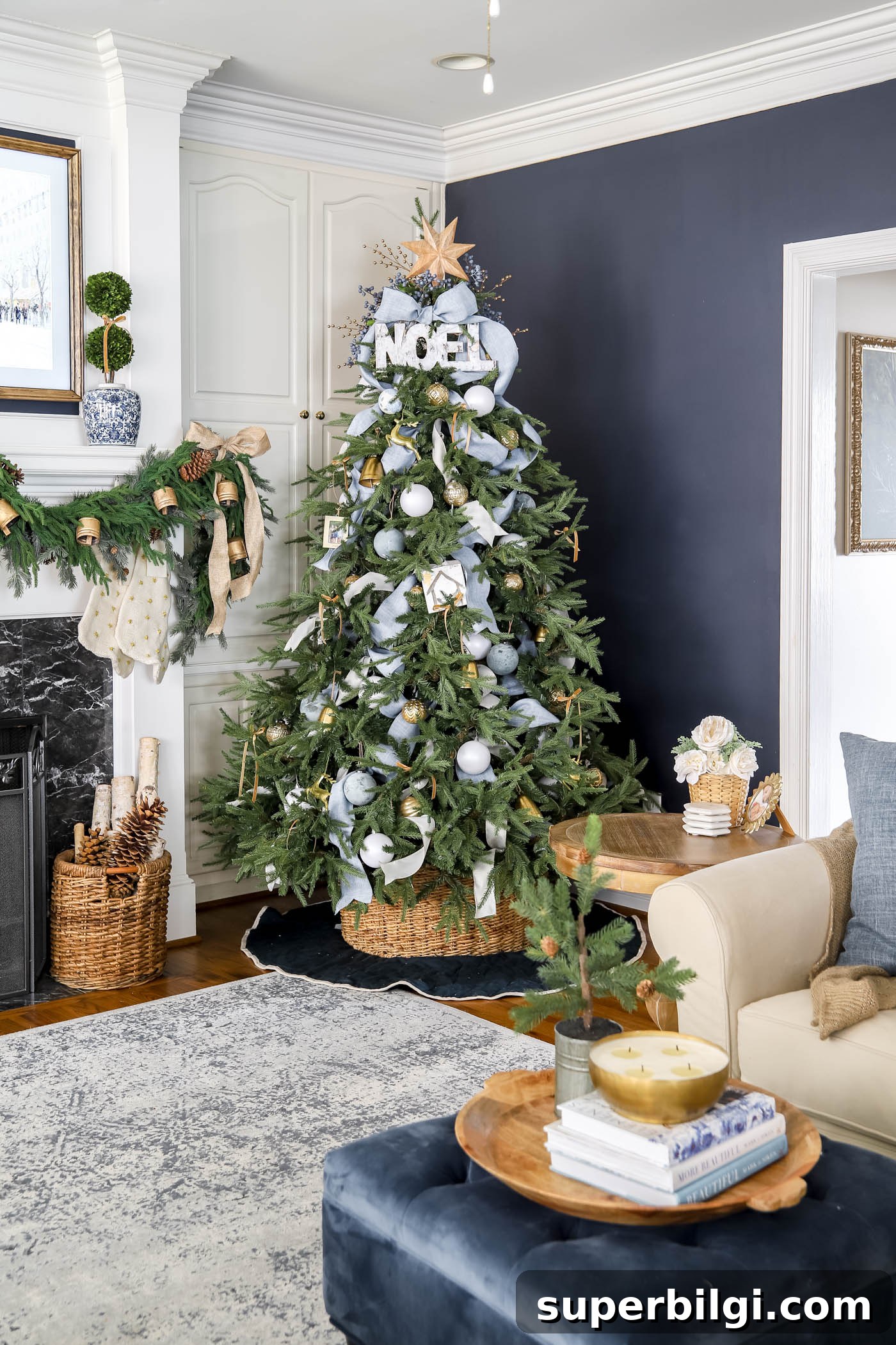
This is a palette I’m planning to bring back—it’s timeless and unexpectedly festive.
Copper and Blush
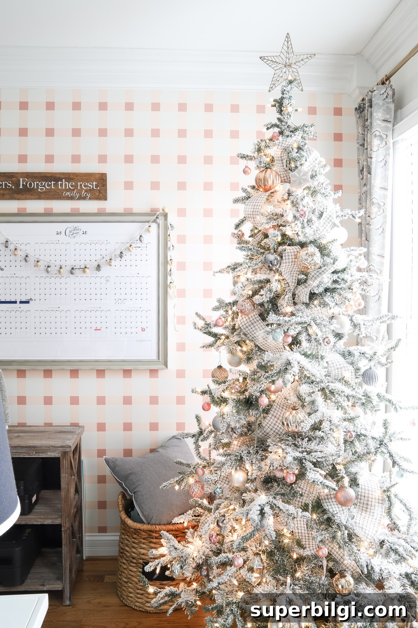
A mix of copper, white, and blush gives a warm, modern, feminine look. The soft pink tones paired with the rich metallic of copper create depth and texture. Incorporate textured pillows, layered ribbons, and complementary neutrals like cream or soft gray to let blush stand out without overwhelming the space. Large trees and balanced layered decor help this palette read as intentional and elegant.
The Allure of Winter Whites
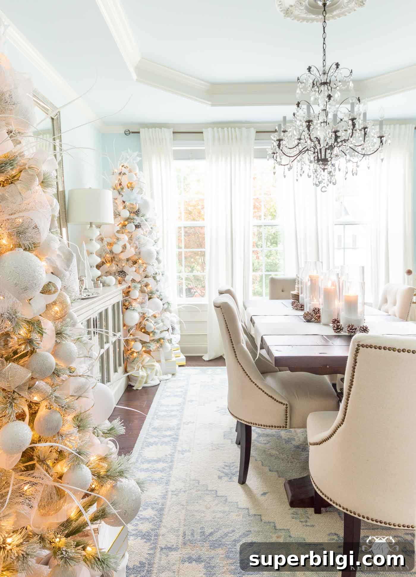
Winter white is a versatile and refined choice that mirrors the quiet purity of the season. Using white as a dominant color creates a blank canvas for textural accents—think frosted branches, white ornaments, ivory ribbons, and subtle silver or icy blue highlights. This palette gives a serene, cohesive feel that allows a few standout decorative elements to become focal points.
Black and White with Gold Accents
Black and white is a striking, modern option for holiday decorating. This chic, neutral pairing allows luxe accents—gold, silver, or brass—to shine. Try black-and-white ribbons, mix matte black ornaments with glossy white and metallics, and add frosted greenery to soften the contrast. The result feels sophisticated and dramatic without losing the warmth of the season.
Jewel Tones for a Luxurious Look
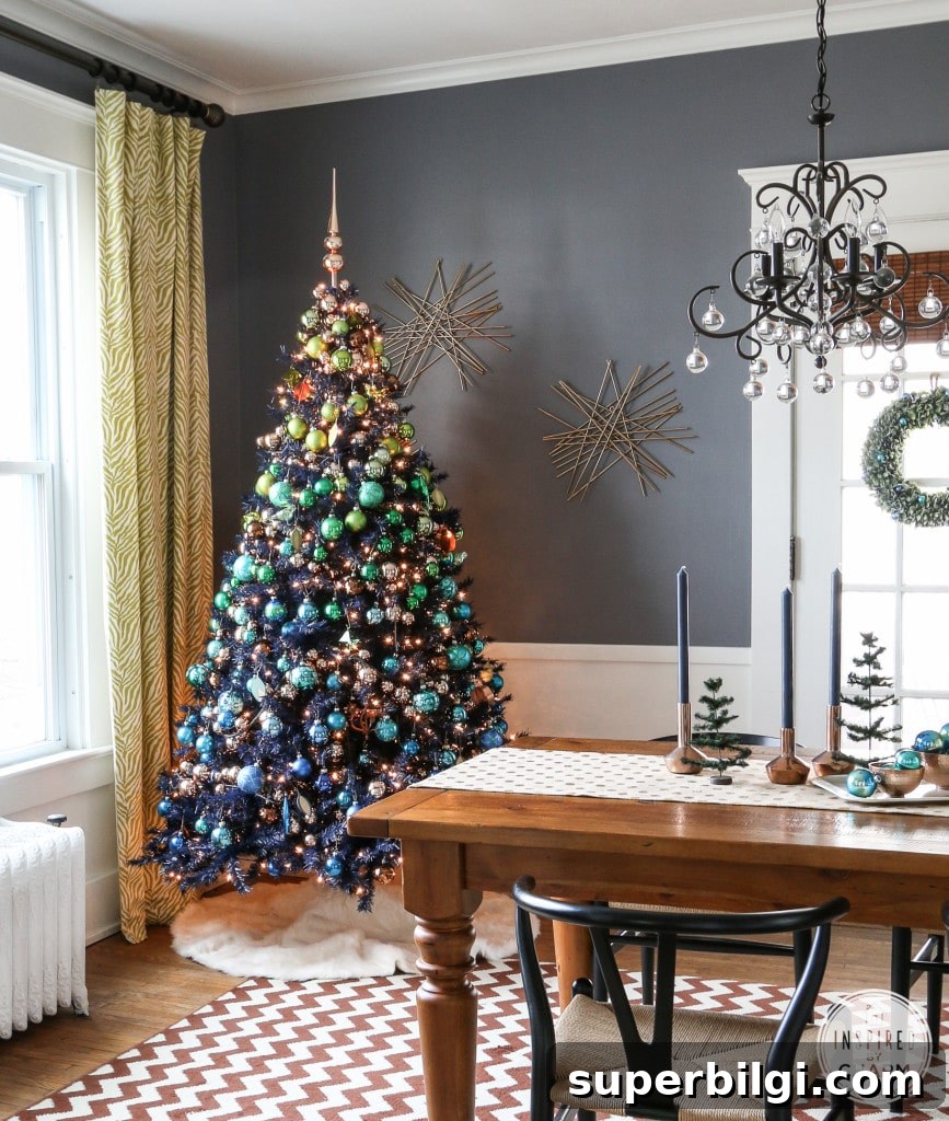
Rich jewel tones—emerald, sapphire, amethyst, and deep teal—bring opulence and drama to holiday decor. These colors work exceptionally well when layered: choose a dominant hue and add coordinating shades for depth. Jewel tones are especially effective in velvet textures, glass ornaments, and glossy finishes. The result is festive, bold, and memorable.
Greenery & Pops of Color
Natural greens, eucalyptus garlands, and unexpected pops—like bright orange or citrus—create a fresh, modern look. Use natural elements such as pinecones, dried fruit, or branches alongside simple white or neutral backdrops. These natural accents feel welcoming and organic, and a bright contrast color can provide visual excitement without leaning on traditional red.
Playful Pink for a Whimsical Twist
Pastel pinks, mint, and pale blues offer a whimsical, lighthearted approach to Christmas decor. Large floral picks, soft ribbons, and mixed textures—like matte ornaments and glitter—help these colors feel festive rather than candy-colored. Consider warm white or amber lighting to keep the pastel palette cozy and inviting.
Blue and Silver Christmas Decorations
Blue and silver make an elegant alternative to classic red and green. Light blues paired with silver give a slightly rustic or icy effect depending on texture choices. Mix matte and shiny ornaments, add silver accents, and incorporate natural elements for contrast. This palette works well in both contemporary and traditional homes.
These examples demonstrate just how many directions your holiday decor can take when you move beyond traditional red. Whether you prefer serene neutrals, luxe jewel tones, or playful pastels, choosing a palette that reflects your style will make your home feel intentional and festive.
Final Thoughts
From elegant winter whites and jewel-toned drama to soft pastels and natural greenery, there’s a non-traditional Christmas palette for every taste. The key is to choose colors that resonate with you, layer textures and finishes, and balance accents so the overall look feels cohesive. Have fun experimenting—your unique color choices will make the season feel even more special.
More Posts You Will Love:
- How to Put Lights on a Christmas Tree (so it glows!)
- How to Decorate the Kitchen for Christmas (3-Step Formula)
- The Best Artificial Christmas Trees
- Christmas Bedroom Decor Ideas & Inspiration
- How to Organize Christmas Decorations