
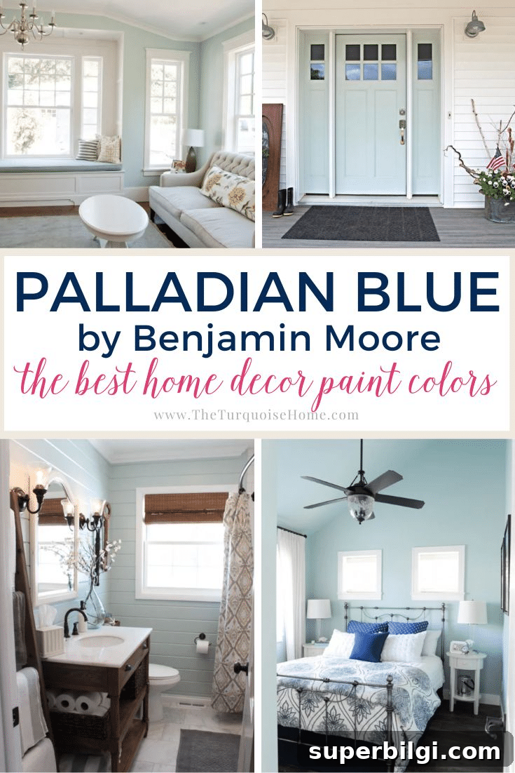
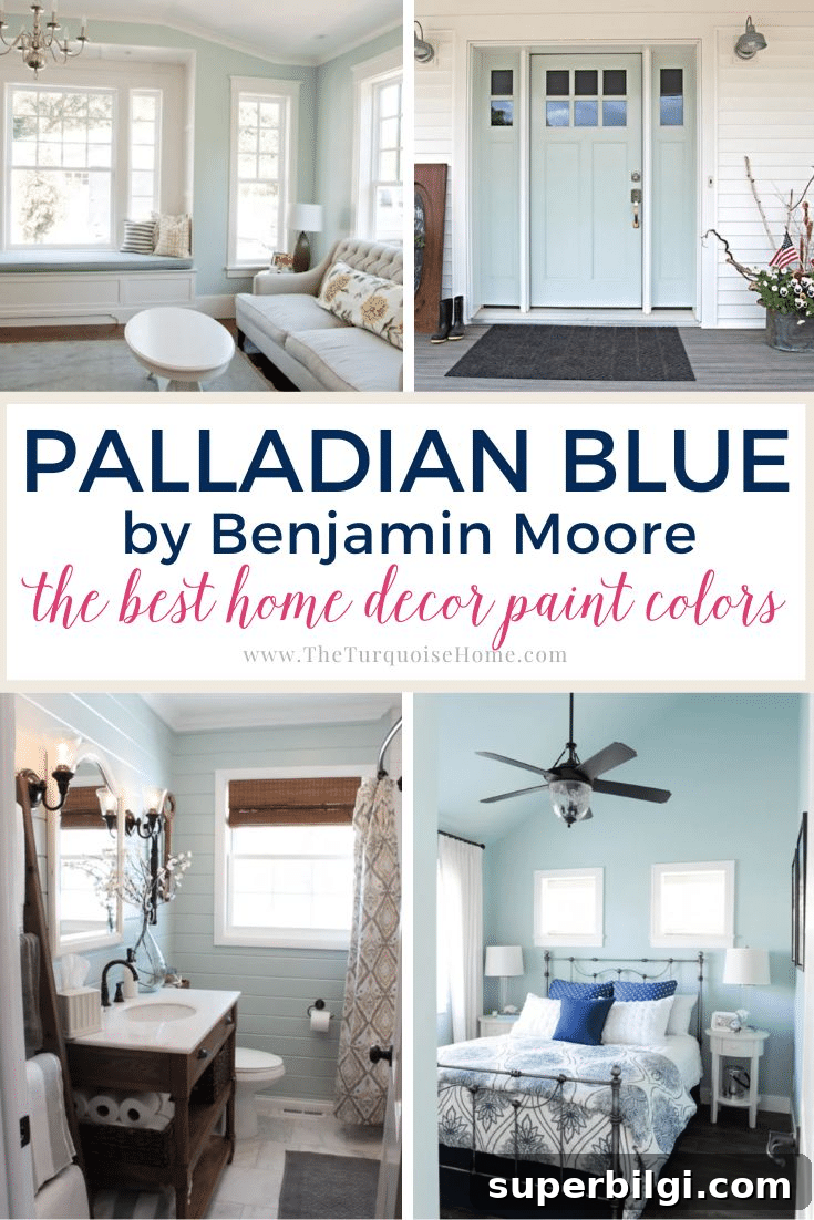
Palladian Blue by Benjamin Moore is a beloved muted blue‑green paint that brings a calm, spa‑like feeling to a room. Its soft, cool tone makes it a popular choice for walls, cabinetry, doors, and trims when you want an elegant but relaxed color.
Benjamin Moore Palladian Blue (HC‑144) leans cool toward blue‑green with subtle gray undertones. That balance gives it a crisp, sophisticated appearance that rarely reads too cold. Depending on lighting, the color can lean slightly bluer or greener, making it especially adaptable in a variety of interiors.
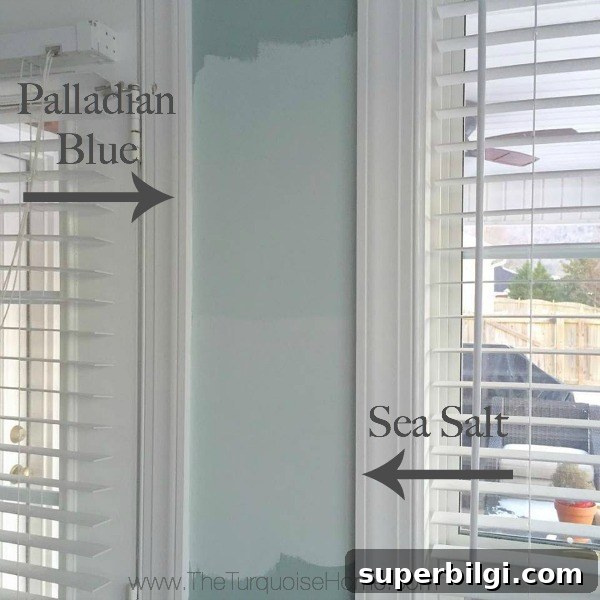
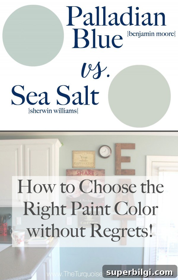
Palladian Blue is close in spirit to other popular soft blue‑greens (for example, Sherwin‑Williams Sea Salt), though it is generally a touch deeper and with a more pronounced coolness. If you want a light, stylish hue that works across coastal, farmhouse, traditional, and transitional homes, this is a shade worth sampling.
What color is Benjamin Moore Palladian Blue?
Quick facts about Palladian Blue:
- Cool‑leaning blue‑green with gray undertones
- Light to medium light shade with a Light Reflectance Value (LRV) of 60.4
- Ideal for walls, kitchen cabinets, doors, bathrooms, and exteriors
- Highly versatile; pairs well with neutrals and warm accent tones
- Creates a calming, restorative atmosphere in a room
Palladian Blue undertones
Palladian Blue is a muted blue‑green, and because it contains both blue and green elements as well as gray, it will shift with different lighting. In cool, north‑facing light it often reads bluer and slightly softer; in warm, south‑facing light the green undertones will become more apparent. The gray keeps it grounded so it won’t feel overly bright or candy‑colored.
Tip: Before committing to a full paint job, test real paint swatches on the walls where you plan to paint. Seeing the color at different times of day is the only reliable way to know how it will behave in your space.
LRV of BM Palladian Blue
Light Reflectance Value (LRV) measures how much light a paint color reflects. White is 100 and black is 0. Palladian Blue has an LRV of 60.4, placing it in the light category. That means it reflects a fair amount of light and can brighten a room, though in very bright direct light it can appear more washed out. Conversely, in lower light it maintains enough color to read clearly as a soft blue‑green rather than a near‑white.
Coordinating colors for Palladian Blue
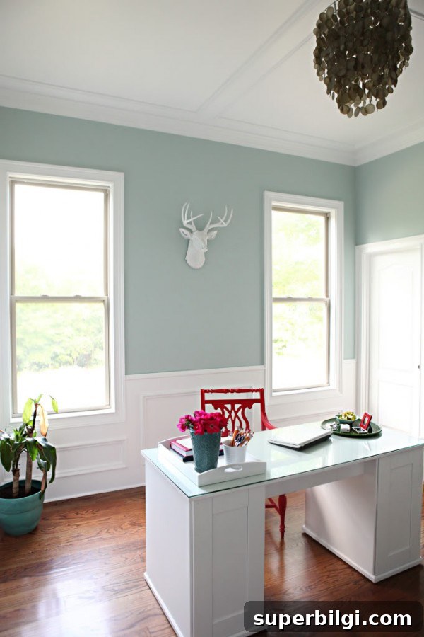
Palladian Blue pairs beautifully with many neutrals and saturated tones. Benjamin Moore suggests combining it with lighter whites and soft browns, and it also works well alongside creams, greiges, and darker accent colors. A few complementary colors to consider include:
- Warm, clean whites for trim to provide crisp contrast
- Soft grays and greiges for a calm, layered palette
- Deeper navy or charcoal accents to provide depth
- Muted corals or wood tones for warm contrast
Trim colors that create a fresh, refined look include very clean whites such as Chantilly Lace or the slightly warmer White Dove style whites. These crisp trims help the Palladian Blue stand out while keeping the overall feel light and polished.
Comparisons: Palladian Blue vs. Sea Salt and Wythe Blue
Sea Salt (another popular soft blue‑green) tends to be a touch lighter and less blue than Palladian Blue. Sea Salt can read airier and often has slightly stronger green leanings depending on light. Palladian Blue is generally richer and a bit cooler.
Wythe Blue reads darker and more saturated (with an LRV around 48), so it will feel heavier in lower‑light rooms. Palladian Blue’s higher LRV makes it more forgiving in spaces without abundant natural light, while Wythe Blue can be a great choice for very bright rooms where you want more presence and color depth.
Where to use Palladian Blue
Palladian Blue is versatile and complements many rooms and styles. Common uses include:
- Interior walls in living rooms, bedrooms, and home offices
- Kitchen cabinets or islands for a soft, distinctive look
- Bathrooms where a soothing, spa‑like atmosphere is desired
- Accent walls and interior doors
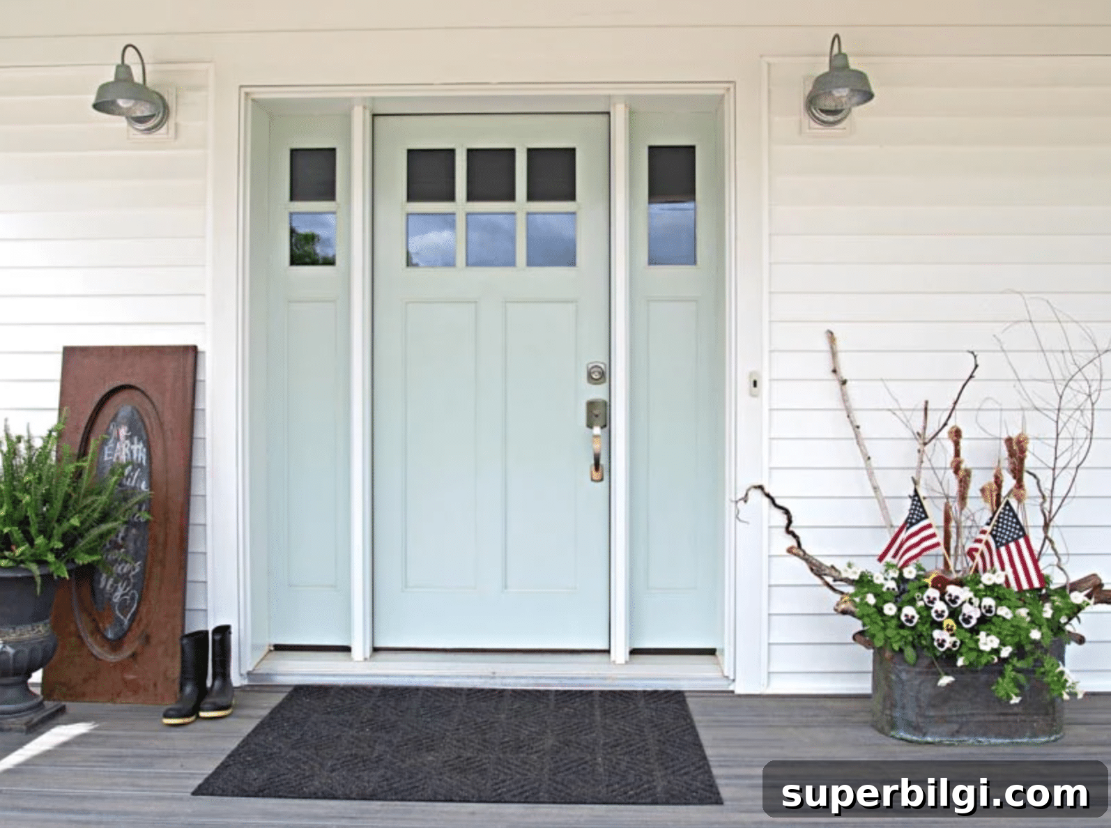
- Exterior doors for a subtle pop of color
Home styles that benefit from Palladian Blue include traditional, transitional, coastal, farmhouse, and classic interiors. Its muted quality makes it easy to mix with both rustic and refined finishes.
Room examples using Palladian Blue
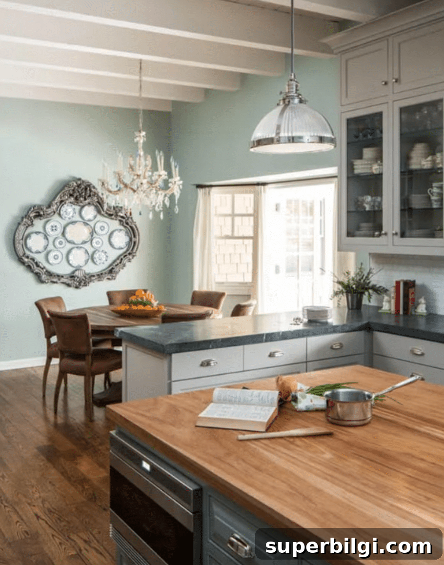
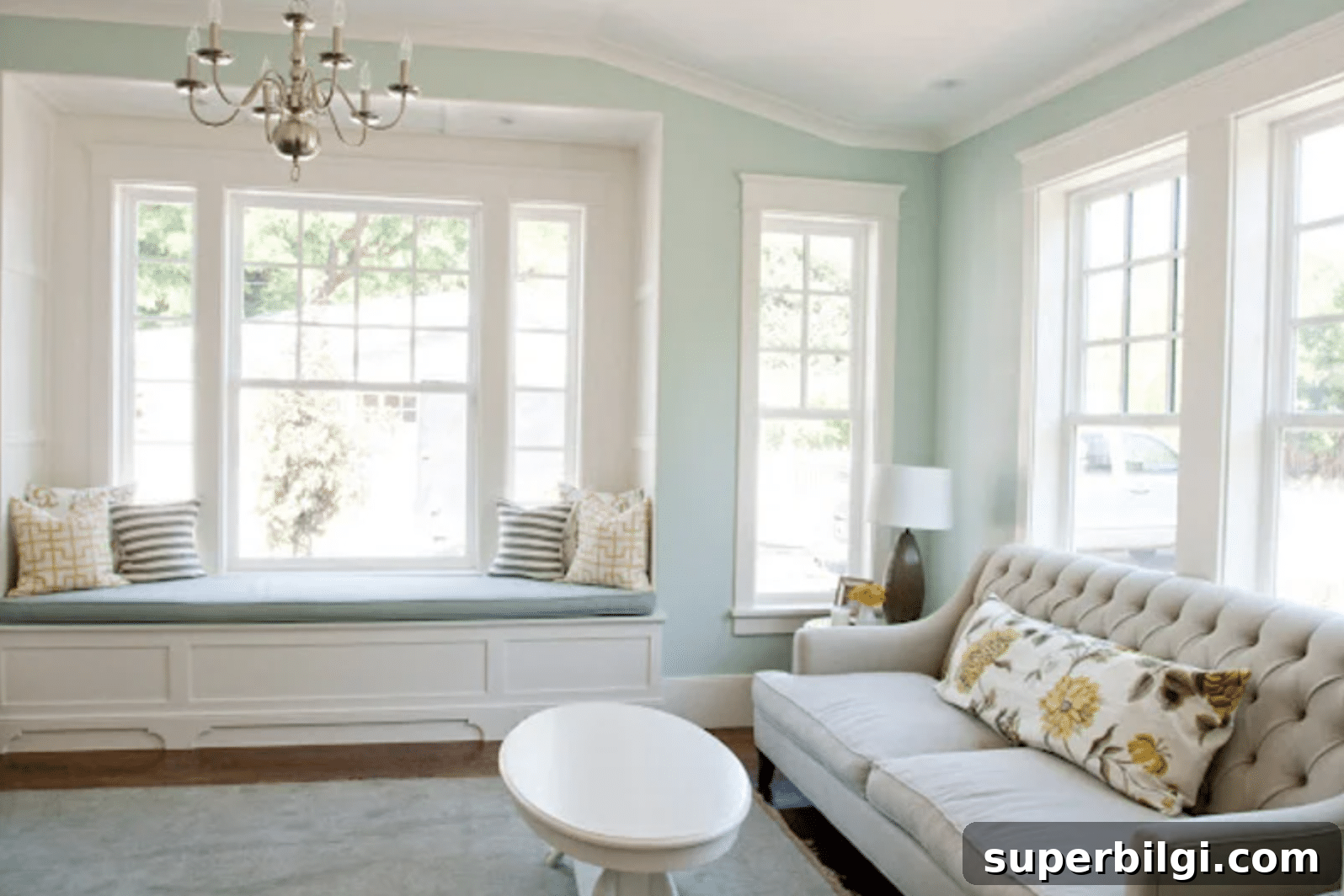
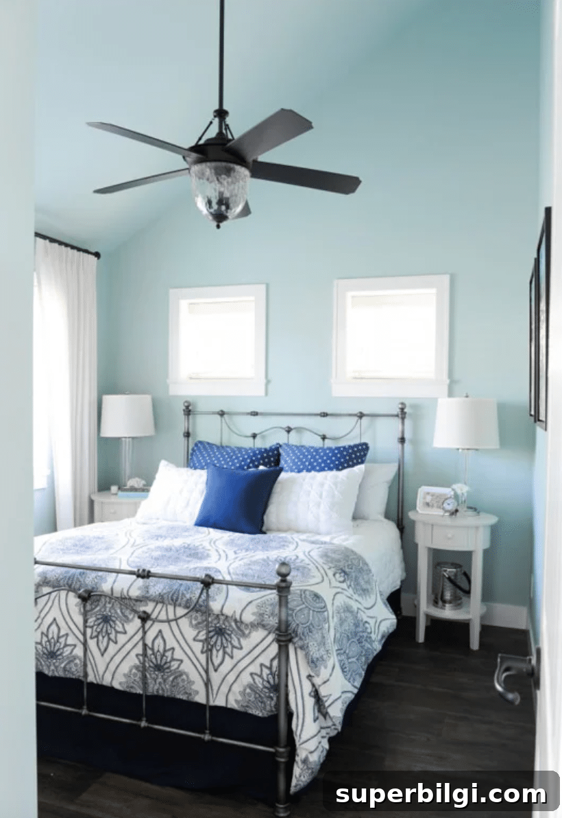
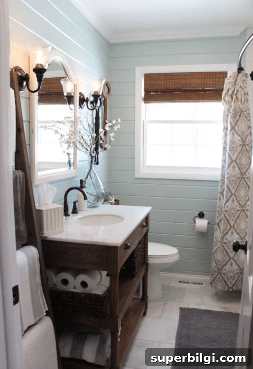
Seeing Palladian Blue used in real rooms is the best way to decide if it’s right for you. In kitchens it ties together wood floors, white ceilings, and stainless fixtures with a balanced cool tone. In living rooms and bedrooms the color reads soft and restorative under bright natural light. On shiplap or textured walls it gains depth and visual interest. As an exterior door color, it provides a tasteful, welcoming accent without overwhelming the façade.
Frequently asked questions
Palladian Blue is a cool‑leaning blue‑green with gray undertones. It maintains a soothing coolness without feeling icy or unwelcoming.
Is Palladian Blue more green or blue?
It’s a balanced mix. In some light it reads more blue; in warmer light it reveals green undertones. This flexibility is one of its strengths.
How to choose a paint color
Selecting paint is easier when you research several shades and then test them with real paint samples on your walls. View samples by day and night so you can see how natural and artificial lighting affect the color. Use your swatches to build a cohesive palette for the whole house, matching trim, accents, and furnishings before you buy full‑quantity paint.
Tools to help you paint a room
If you plan to paint yourself, invest in quality tools for the best finish: good brushes, painter’s tape, drop cloths, a comfortable paint cup, and a sturdy roller tray with liners. These basics will save time and improve your final result.
Further reading
- Guides on paint finishes and where to use them
- Advice for pairing wall colors with dark wood trim
- Curated lists of popular living room paint colors
Palladian Blue is an elegant, versatile choice when you want a soft blue‑green that feels fresh without being faddish. Sample it in your home and observe it at different times of day to see whether it’s the right calm, restorative tone for your space.