

Looking for a blue-green paint that feels calm, cozy, and timeless? Sherwin Williams Oyster Bay (SW 6206) is a popular coastal-inspired color that strikes a beautiful balance between blue, green, and gray. Its muted depth makes it versatile for a range of spaces while still offering personality and warmth.

In this complete Oyster Bay review, I’ll walk through the undertones, coordinating colors, best rooms to use it in, real-life examples, and a few practical tips to consider before painting.
This post contains affiliate links for your convenience. See full disclosure on the original site.
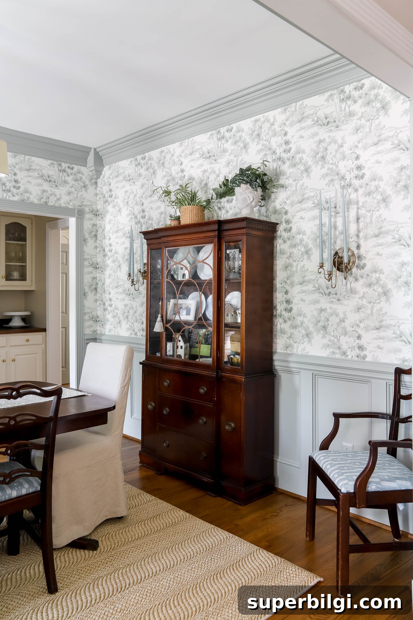
I used Oyster Bay in a recent dining room makeover to create a traditional, cozy feel that complements my grandmother’s dining set. The color worked beautifully as paint for wainscoting and trim, providing contrast with off-white wallpaper and richer red furnishings while keeping the space relaxed and refined.
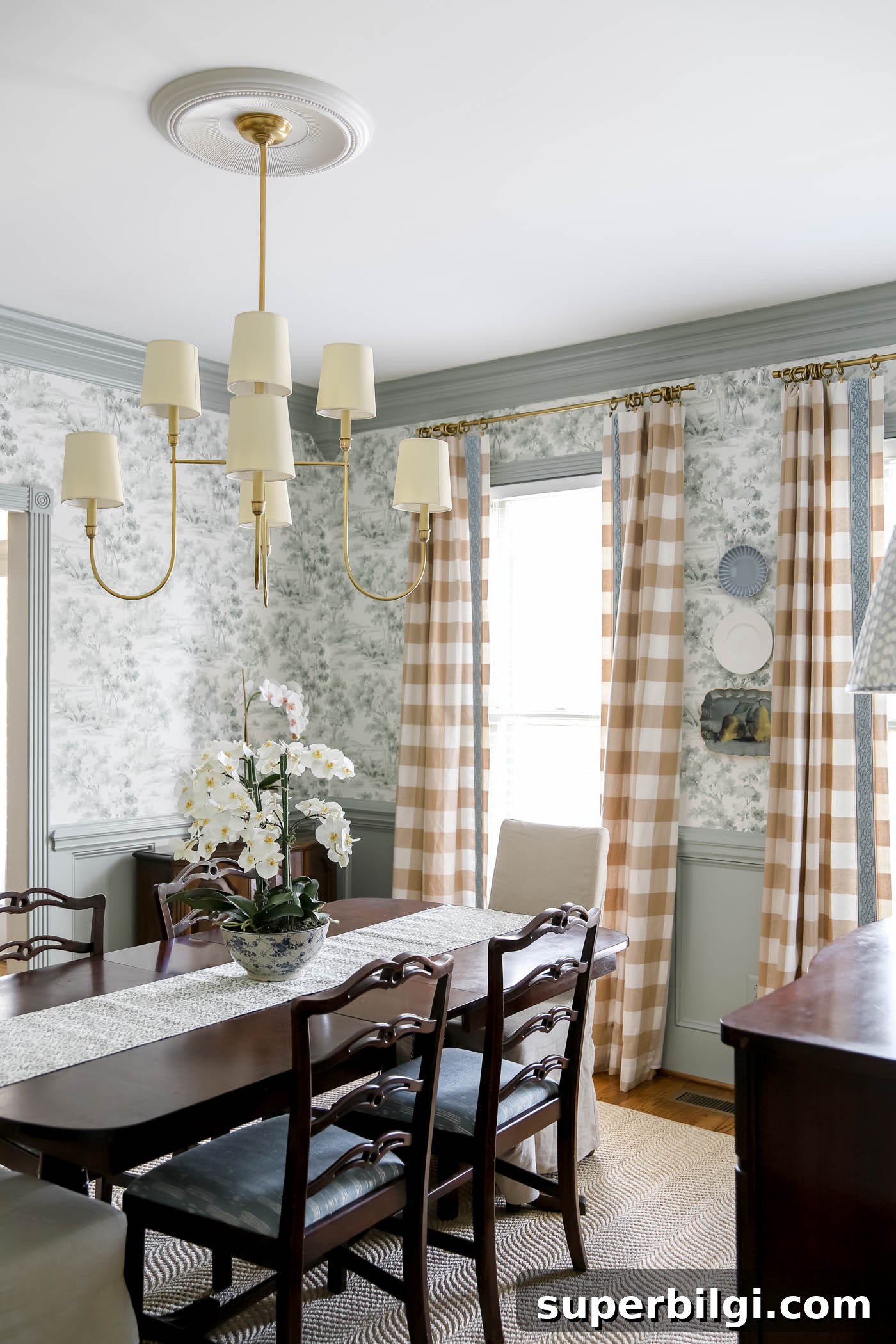
Sherwin Williams Oyster Bay at a Glance
| Detail | Value |
|---|---|
| Color Name | Oyster Bay |
| Color Number | SW 6206 |
| LRV | 44 |
| Color Family | Blue-Green |
| Undertones | Green, Blue, Gray |
| Best Rooms | Bedrooms, bathrooms, kitchens, exteriors, cabinets, doors |
Undertones of Sherwin Williams Oyster Bay
At first glance Oyster Bay appears as a soft green with a medium depth, but it reveals different undertones depending on the light and surrounding colors. The gray in the paint softens the green, giving it a spa-like, soothing quality. There are also subtle blue undertones that become more noticeable when you pair Oyster Bay with cooler blues and grays.
That subtle interplay of green, gray, and blue is why Oyster Bay feels nuanced and adaptable: it reads fresh and coastal in bright light, yet can feel more grounded and earthy with warm accents.
Pro Tip
Always test the real paint color in your home before committing. The same swatch can look very different in morning light, afternoon light, and under artificial lighting. Peel-and-stick real paint samples or small trial pots are the best way to evaluate the color in the actual space.
Is Oyster Bay Warm or Cool?
Oyster Bay is considered a cool color because of its blue and gray undertones, which make interiors feel calm and airy. However, the green element gives it an earthy warmth that allows it to pair nicely with warmer neutrals like tan or beige, making it feel almost neutral in certain combinations.
What Is the LRV of Oyster Bay?
Sherwin Williams Oyster Bay has a Light Reflectance Value (LRV) of 44. On a 0–100 scale where 0 is pure black and 100 is pure white, a 44 LRV places Oyster Bay in the medium range. It absorbs more light than it reflects, so in smaller, darker rooms it benefits from ample natural light or bright white trim to keep the space feeling open.
Because of its mid-tone nature, Oyster Bay is often used as an accent color, on cabinetry, doors, or wainscoting, or in rooms where the mood calls for a cozier, more grounded tone rather than an all-over wall color.
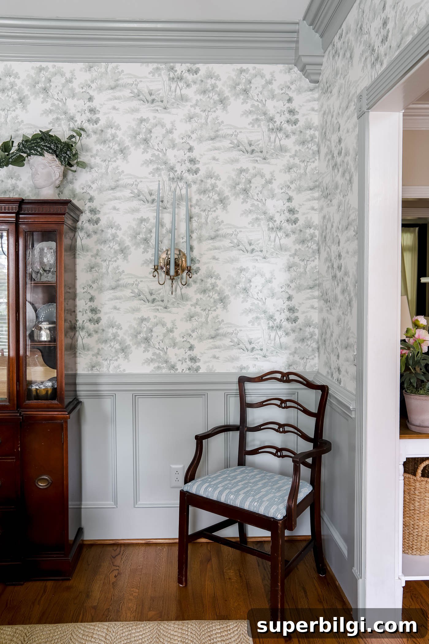
What Colors Go with Oyster Bay?
Oyster Bay pairs beautifully with a wide palette. Try:
- Soft whites and warm off-whites for trim and ceilings to create contrast and crisp edges.
- Greiges and warm neutrals like Accessible Beige or Edgecomb Gray to anchor the room.
- Blues and deeper greens for a tonal, monochromatic effect.
- Natural textures—wood, rattan, linen—and warm metallic hardware such as brass or aged gold to add warmth and richness.
Because Oyster Bay contains cool undertones, pairing it with a warm white trim often provides the clean, balanced look most homeowners prefer.
Where Does Sherwin Williams Oyster Bay Work Best?
Oyster Bay is versatile and works in many rooms. Below are common and successful applications:
Dining Room
Used on wainscoting or an accent wall, Oyster Bay adds a soft pop of color without overpowering the room. In the dining room, it can tone down warm wood furniture and complement patterned wallpapers or textiles.
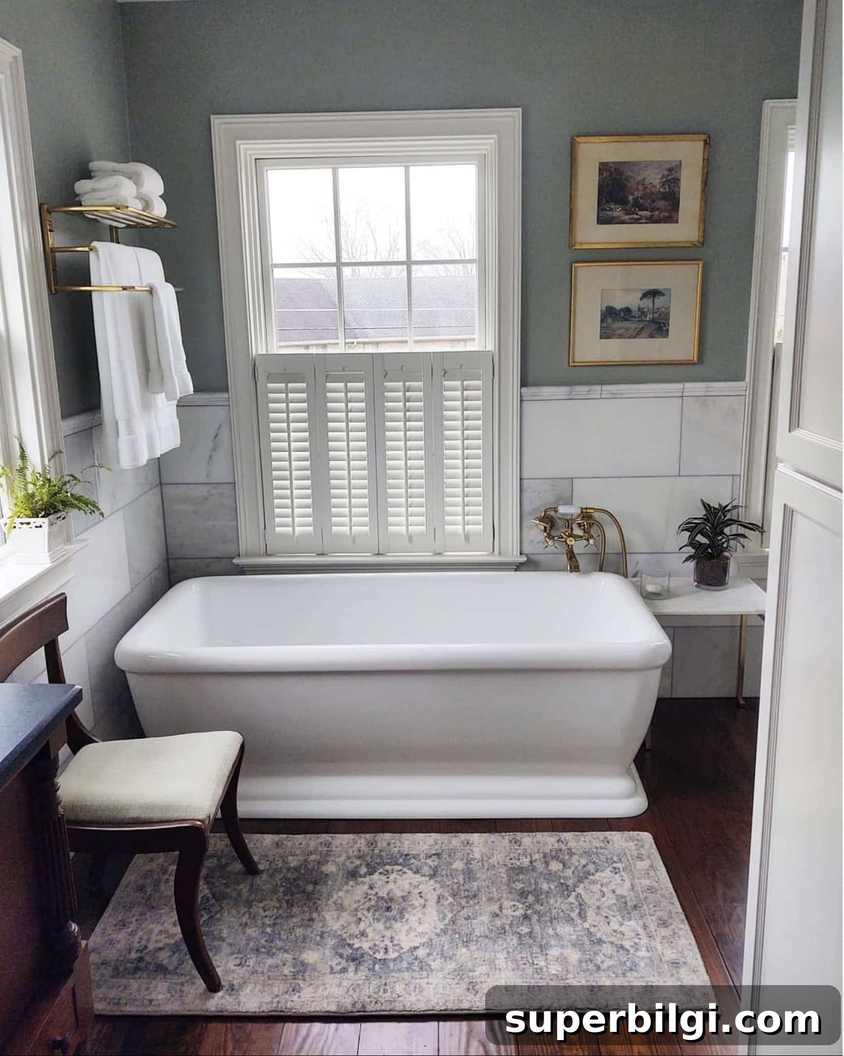
Bathrooms
Its calming, spa-like quality makes Oyster Bay an excellent choice for bathrooms and powder rooms. In tighter spaces, pair it with plenty of white trim, reflective surfaces, or good natural light to keep the room feeling bright.
Bedrooms
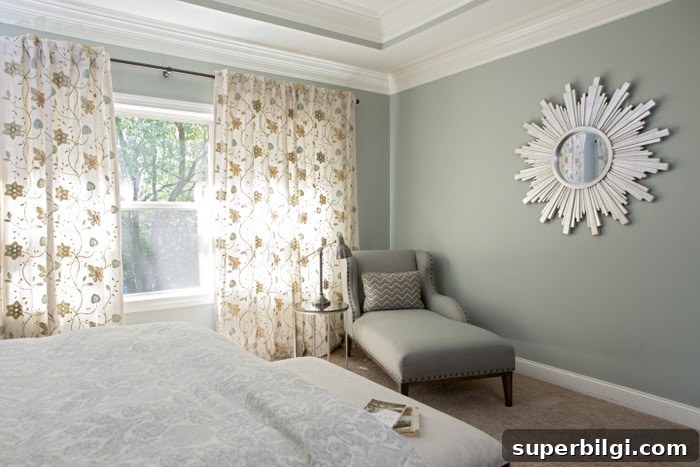
Oyster Bay creates a tranquil bedroom palette that supports relaxation. It’s versatile enough to work with varied bedding textures, window treatments, and personal décor items, allowing each room to reflect individual style.
Cabinets
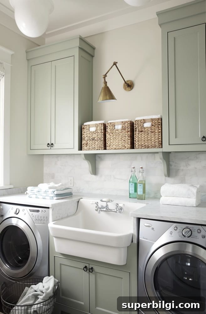
Applied to kitchen or laundry cabinets, Oyster Bay introduces color without overwhelming the space. It pairs especially well with natural wood countertops, white tile, and brass hardware for a balanced, inviting kitchen or utility room.
Exterior and Interior Doors
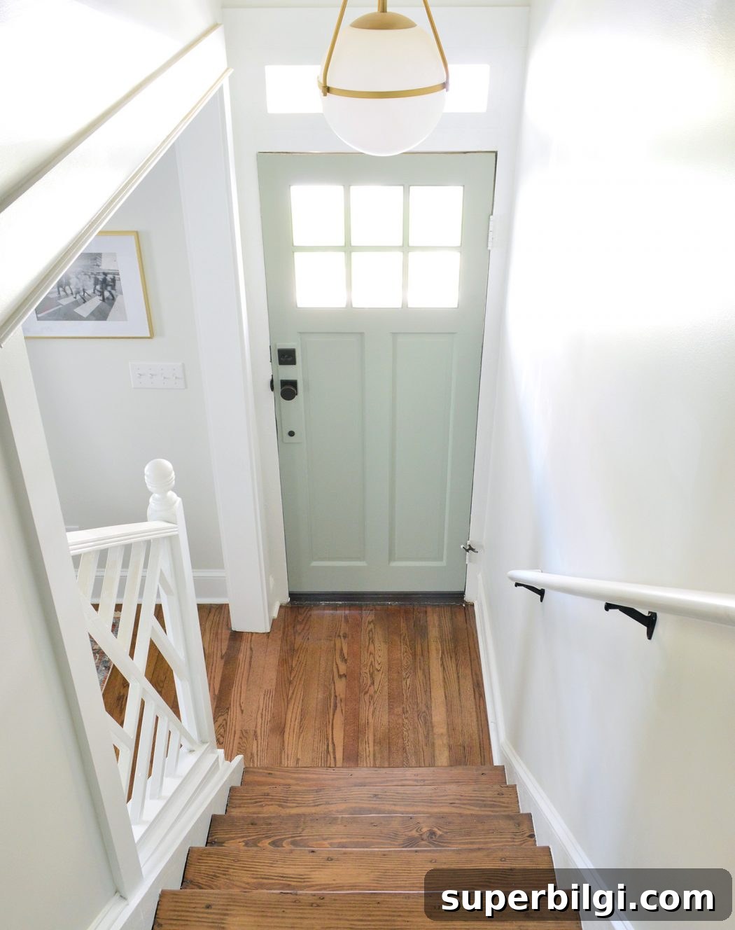
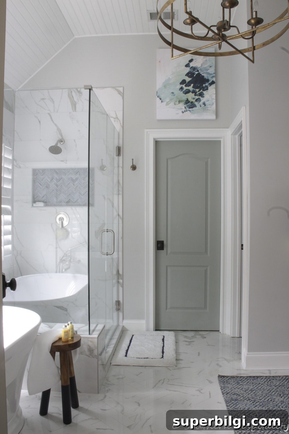
Oyster Bay can make a cheerful front door color in a bright entryway or introduce subtle color by painting interior doors. It’s particularly effective on doors that receive generous natural light.
Final Thoughts
Sherwin Williams Oyster Bay is a flexible, layered color that can read coastal, earthy, or neutral depending on its pairing and light. Its balanced blend of green, blue, and gray makes it an excellent choice for accent walls, cabinetry, doors, and whole rooms when you want a calm, lived-in feel. Test real samples in your home, consider lighting and trim choices, and you’ll likely find Oyster Bay delivers the quiet sophistication many homeowners seek.
More posts you may enjoy:
- Create a Whole House Color Palette
- The Best Bedroom Paint Colors
- Paint a Room Like a Pro in 5 Easy Steps
- How to Paint Trim: A Step-by-Step Guide
- Comparing Sea Salt and Palladian Blue