

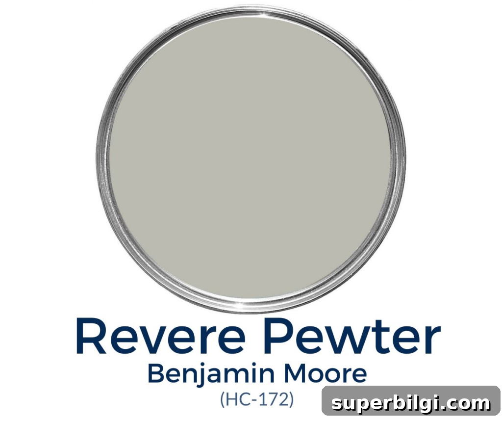
Revere Pewter is widely regarded as the perfect greige — a warm green-gray with a strong beige base. Its warmth and balanced depth make it an excellent transitional color, especially for open floor plans.
This versatile shade is fun to work with because its undertones shift depending on light and surrounding elements. Benjamin Moore HC-172 keeps a consistent gray presence in most lighting while offering subtle warmth that adapts to your space.
This post contains affiliate links for your convenience. See my full disclosure policy.
Revere Pewter’s popularity is no accident — its balance of warmth and neutrality makes it a top-selling gray. Below I cover what this color looks like in different conditions, how its undertones behave, appropriate LRV considerations, best color pairings, trim choices, and practical painting tips to help you decide if HC-172 is right for your home.
What Color is Revere Pewter?
- Warm green-gray with beige undertones
- Medium tone with an LRV (Light Reflectance Value) of 55.5
- Ideal for open floor plans, thanks to its neutral, unifying quality
- Extremely versatile — pairs well with a wide range of styles from farmhouse to modern
Revere Pewter Undertones
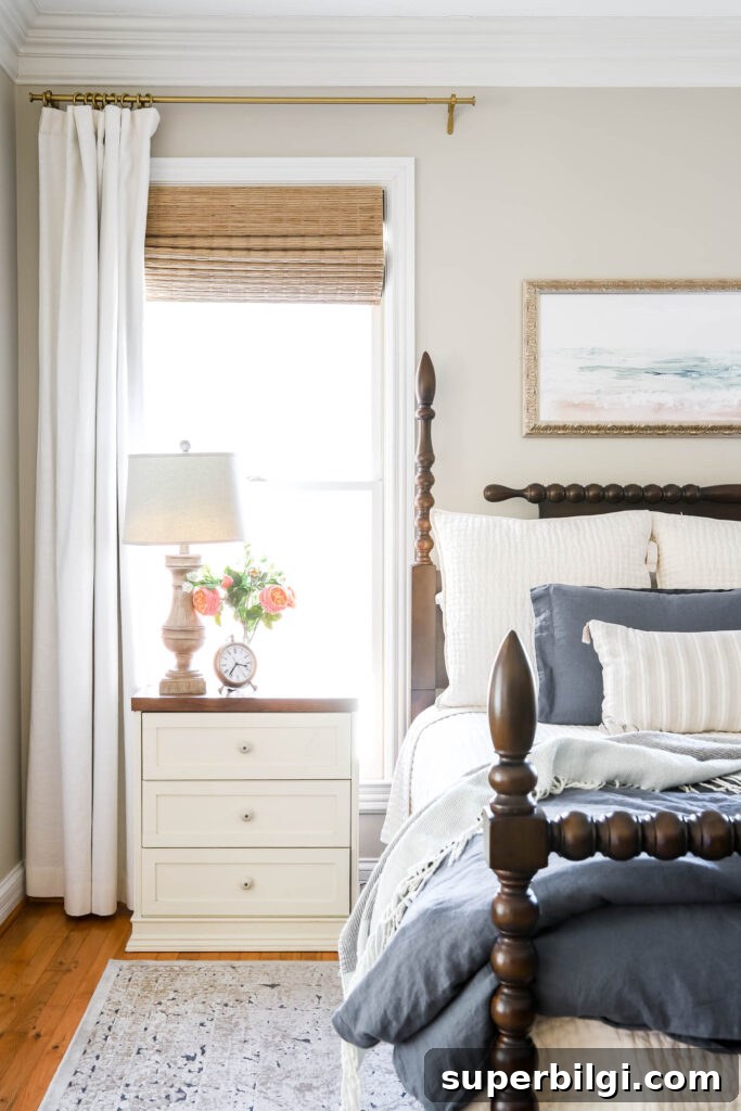
Revere Pewter is something of a chameleon. It reliably reads as a warm gray, but its undertones can shift based on light, furnishings, and the room’s exposure. In some settings it emphasizes its beige or taupe base, creating a cozy, earthy feel. In other setups — particularly rooms with ample natural light — it can pick up subtle blue-violet undertones and read cooler.
Because it contains a subtle green cast, Revere Pewter can lean slightly green when paired with lots of greenery outside a window or when installed over dark flooring. In low-light rooms or narrow hallways, the color may appear muddier or more tan. Conversely, in bright, airy rooms it can look more traditionally gray while retaining a soft warmth.
LRV of Revere Pewter
Light Reflectance Value (LRV) measures how much light a paint color reflects on a scale from 0 (black) to 100 (white). Revere Pewter has an LRV of 55.5, placing it squarely in the mid-range. That means it reflects a fair amount of light but is not as bright as higher-LRV neutrals.
For rooms with very little natural light, consider a paint with an LRV of 60 or higher to keep the space from feeling dim. If you love Revere Pewter but need more brightness, you could choose a lighter greige like Edgecomb Gray or use Revere Pewter at a reduced strength.
What Colors Go with Revere Pewter?
One of Revere Pewter’s strengths is how easily it pairs with other colors. It works well with muted blues, soft greens, deeper charcoals, and many warm neutrals. Here are some solid pairing ideas:
- Sea Salt (soft blue-green gray) — similar LRV and green-gray undertone for a light, airy vibe.
- Hale Navy — dramatic deep blue that contrasts beautifully with Revere Pewter.
- Kendall Charcoal — a warm dark gray that grounds a space when paired with HC-172.
- Chelsea Gray — shares compatible undertones and creates a cohesive look.
For a lighter, airier feel, balance Revere Pewter with warm whites such as Soft White, Cloud White, or Simply White. If you want a bold pop, bright colors like coral or turquoise can create striking accents against this neutral backdrop.
Trim Colors to Pair Together
Off-whites and warm whites make the best trim choices with Revere Pewter. These trims maintain warmth without clashing or making the walls look dingy. Recommended trim colors include:
- Simply White — a clean off-white that complements walls and cabinetry
- White Dove — a soft, creamy white
- Pure White — a bright neutral white for a crisper contrast
- Chantilly Lace — a pure, bright white option
- Alabaster — a warm, subtle white that blends nicely

Revere Pewter vs. Agreeable Gray
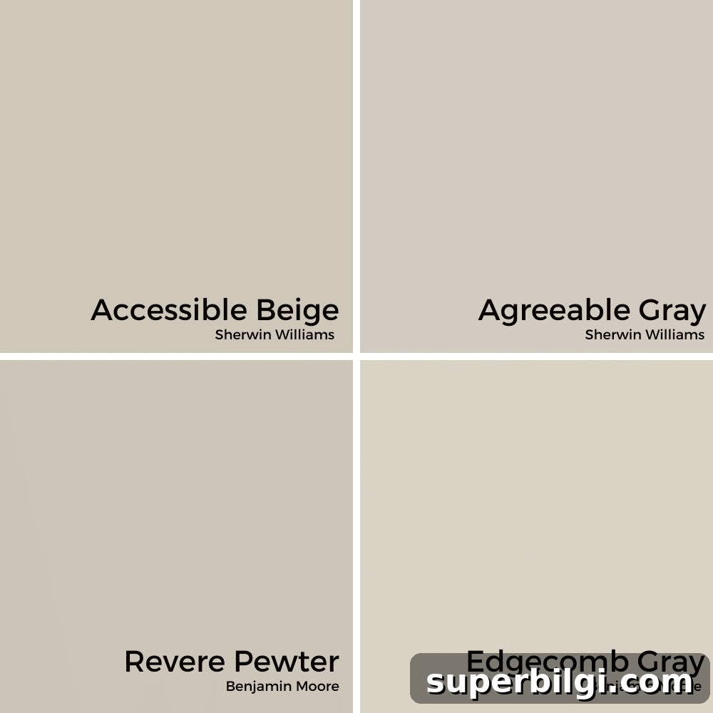
Revere Pewter (HC-172) is slightly darker and warmer than Sherwin-Williams’ Agreeable Gray. They are often compared because both are popular greige choices, but Revere Pewter typically reads a touch more taupe. Comparable alternatives include Edgecomb Gray and Accessible Beige — all solid greige options that differ subtly in undertone and warmth.
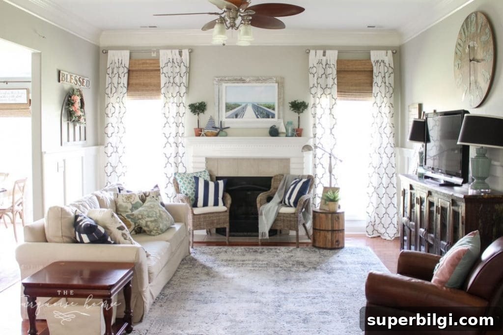
In many homes, Revere Pewter delivers a cozy, inviting atmosphere without overwhelming the space. I used it in a former living room and loved how the natural light brought out its warm, taupe undertones while still allowing gray to come through.
Frequently Asked Questions
Yes. Revere Pewter has remained popular for more than a decade and continues to be a go-to neutral for many interior designers and homeowners.
It’s very versatile — suitable for walls, trim, cabinets, and even ceilings or floors in certain applications.
Revere Pewter leans warm. It will only appear cooler when paired with very warm, dark tones like deep chocolate browns.
Painting Tips
- Try a sample: Always test Revere Pewter in your space. Large swatches on poster board or peel-and-stick real-paint samples will show how the color shifts with light and furnishings.
- Use quality tools: Good brushes, rollers, and primer make a big difference in finish and coverage.
- Choose the right sheen: Match the sheen to the surface — eggshell or satin for walls, semi-gloss for trim and cabinets.
More posts you may like:
- The Best Living Room Paint Colors
- The Best Bedroom Paint Colors
- Best No-Fail Greige Paint Colors For Your Home